HCI-Focused Web Design: A Case Study of Sydney Toll Roads Portal
VerifiedAdded on 2023/06/15
|18
|787
|421
Report
AI Summary
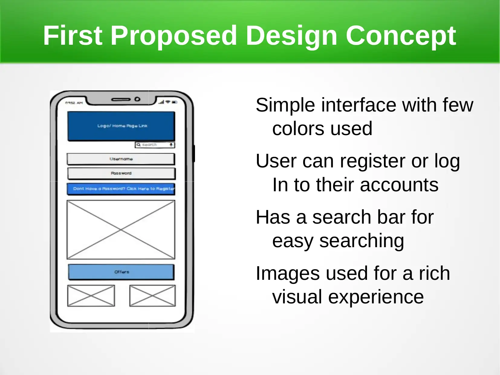
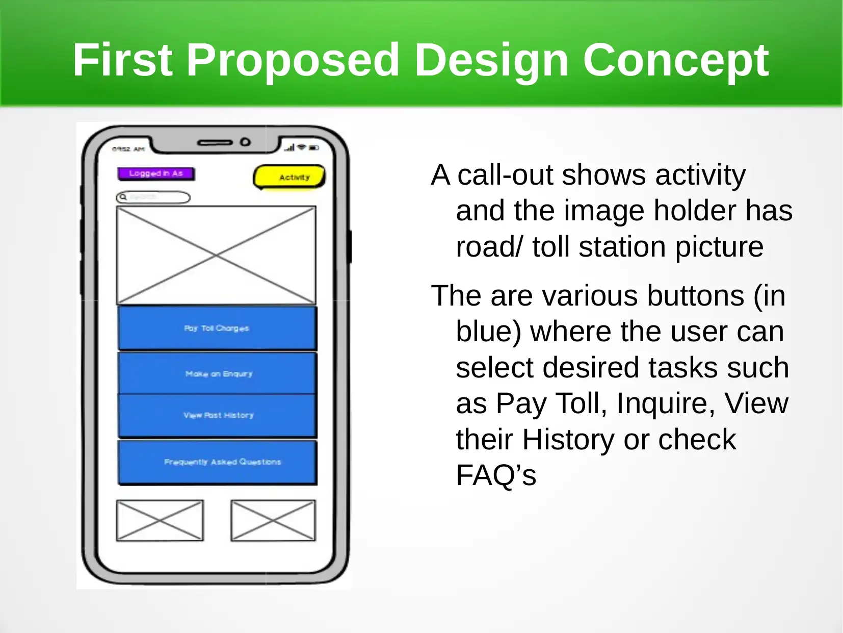
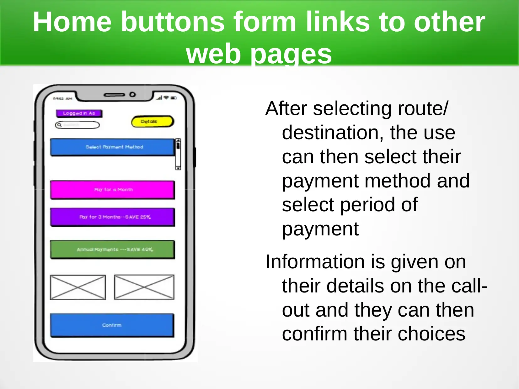
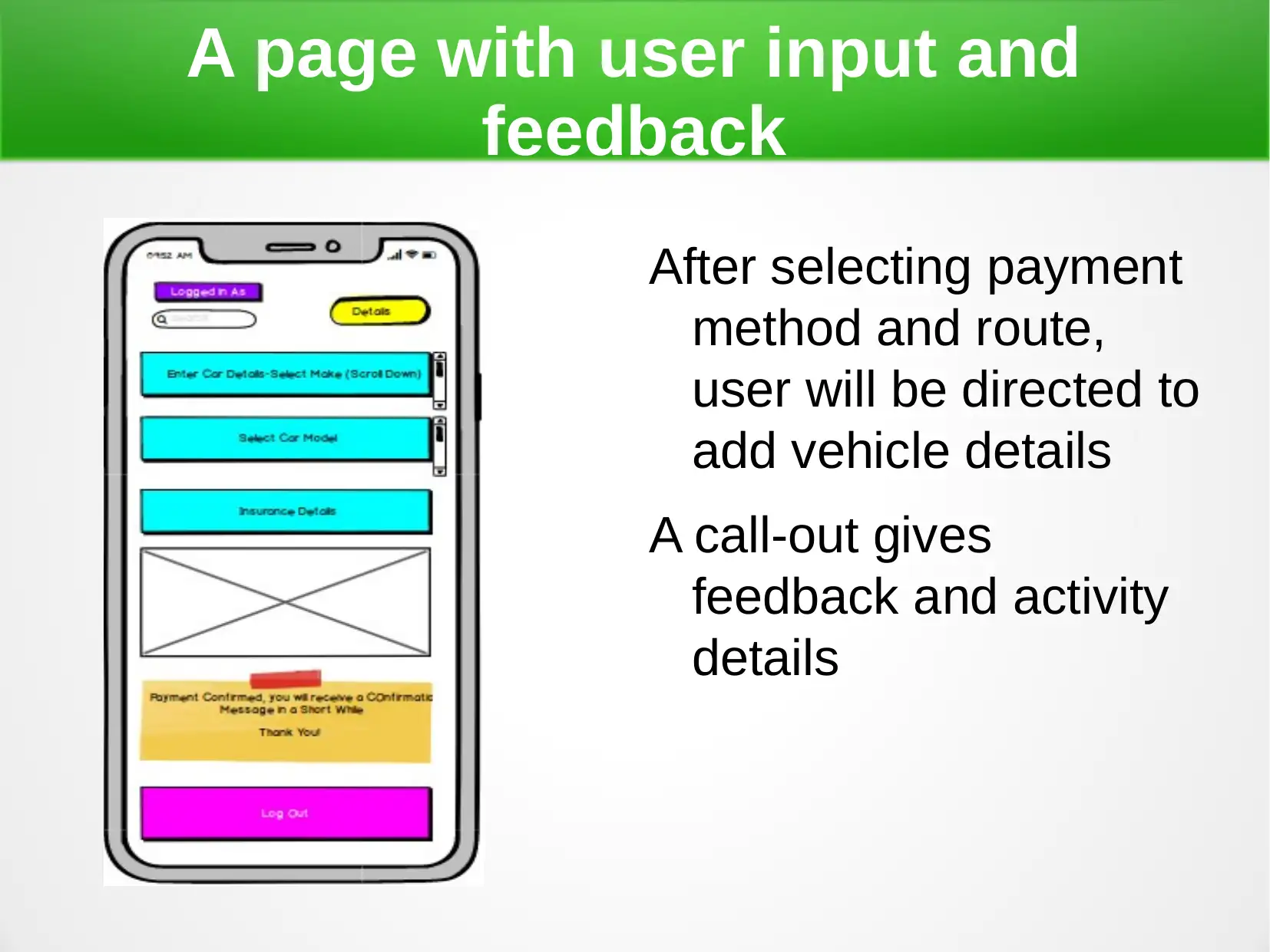
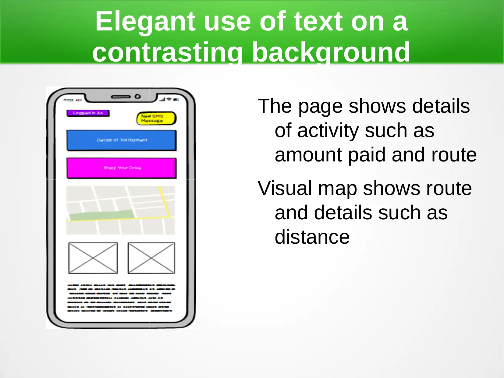
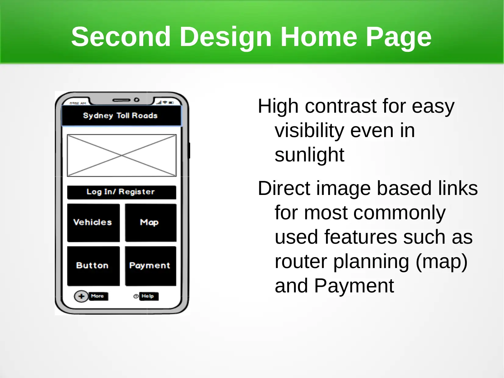
This report presents two design concepts for a web portal for Sydney Toll Roads, focusing on Human Computer Interaction (HCI) principles. The first design emphasizes simplicity and visual richness with features like user registration, search, and interactive maps for toll payment. The second design prioritizes ease of use and familiarity with high contrast, image-based links, and predictive design elements. The chosen design, Design Two, adheres to key HCI principles such as learnability, ergonomics, consistency, and robustness, ensuring a user-friendly and efficient experience for road users.

Human Computer Interaction: Web Design for
Sydney Toll Roads
Sydney Toll Roads
Paraphrase This Document
Need a fresh take? Get an instant paraphrase of this document with our AI Paraphraser

Introduction
Sydney Toll Roads is seeking a web portal to
interact with road users and other stakeholders
The design of the mobile web interface
(application) must both be functional and easy to
use
Interface must be easy to learn and navigate
through
Requires use of HCI (human computer interaction)
principles
Sydney Toll Roads is seeking a web portal to
interact with road users and other stakeholders
The design of the mobile web interface
(application) must both be functional and easy to
use
Interface must be easy to learn and navigate
through
Requires use of HCI (human computer interaction)
principles

Introduction
Some important principles in HCI include;
Familiarity/ learn-ability
Ergonomics
Consistency and standards
Robustness
All these must be adhered to during web design
Some important principles in HCI include;
Familiarity/ learn-ability
Ergonomics
Consistency and standards
Robustness
All these must be adhered to during web design
⊘ This is a preview!⊘
Do you want full access?
Subscribe today to unlock all pages.

Trusted by 1+ million students worldwide

First Proposed Design Concept
Simple interface with few
colors used
User can register or log
In to their accounts
Has a search bar for
easy searching
Images used for a rich
visual experience
Simple interface with few
colors used
User can register or log
In to their accounts
Has a search bar for
easy searching
Images used for a rich
visual experience
Paraphrase This Document
Need a fresh take? Get an instant paraphrase of this document with our AI Paraphraser

First Proposed Design Concept
A call-out shows activity
and the image holder has
road/ toll station picture
The are various buttons (in
blue) where the user can
select desired tasks such
as Pay Toll, Inquire, View
their History or check
FAQ’s
A call-out shows activity
and the image holder has
road/ toll station picture
The are various buttons (in
blue) where the user can
select desired tasks such
as Pay Toll, Inquire, View
their History or check
FAQ’s

First Proposed Design Concept
Selecting pay brings a new page with a
calendar to choose date and an
interactive map that self updates
depending on location and planned
trip
User can search for their destination
easily
A feedback button helps them know
their progress
Selecting a route gives toll stations at
the bottom section automatically
Map features inbuilt to enable easy use
⊘ This is a preview!⊘
Do you want full access?
Subscribe today to unlock all pages.

Trusted by 1+ million students worldwide

Home buttons form links to other
web pages
After selecting route/
destination, the use
can then select their
payment method and
select period of
payment
Information is given on
their details on the call-
out and they can then
confirm their choices
web pages
After selecting route/
destination, the use
can then select their
payment method and
select period of
payment
Information is given on
their details on the call-
out and they can then
confirm their choices
Paraphrase This Document
Need a fresh take? Get an instant paraphrase of this document with our AI Paraphraser

A page with user input and
feedback
After selecting payment
method and route,
user will be directed to
add vehicle details
A call-out gives
feedback and activity
details
feedback
After selecting payment
method and route,
user will be directed to
add vehicle details
A call-out gives
feedback and activity
details

Elegant use of text on a
contrasting background
The page shows details
of activity such as
amount paid and route
Visual map shows route
and details such as
distance
contrasting background
The page shows details
of activity such as
amount paid and route
Visual map shows route
and details such as
distance
⊘ This is a preview!⊘
Do you want full access?
Subscribe today to unlock all pages.

Trusted by 1+ million students worldwide

Second Design Concept Proposal
Balanced home page with buttons and legible text
easy to learn
Image holders on home page are links to other pages
Easily legible and reachable help button and a button
to access more menu items
Predictive design where most used features are
shown on the home page
Easy to learn and smooth interface
Balanced home page with buttons and legible text
easy to learn
Image holders on home page are links to other pages
Easily legible and reachable help button and a button
to access more menu items
Predictive design where most used features are
shown on the home page
Easy to learn and smooth interface
Paraphrase This Document
Need a fresh take? Get an instant paraphrase of this document with our AI Paraphraser

Second Design Home Page
High contrast for easy
visibility even in
sunlight
Direct image based links
for most commonly
used features such as
router planning (map)
and Payment
High contrast for easy
visibility even in
sunlight
Direct image based links
for most commonly
used features such as
router planning (map)
and Payment

Clicking button leads to another
page
Uniform use of buttons
Buttons placed at the same place in all instances
This ensures familiarity and continuity
Use of high contrast between text/ images and the
background
This makes navigation easy
Feedback and interaction where a user can
calculate charges
page
Uniform use of buttons
Buttons placed at the same place in all instances
This ensures familiarity and continuity
Use of high contrast between text/ images and the
background
This makes navigation easy
Feedback and interaction where a user can
calculate charges
⊘ This is a preview!⊘
Do you want full access?
Subscribe today to unlock all pages.

Trusted by 1+ million students worldwide
1 out of 18
Related Documents

Your All-in-One AI-Powered Toolkit for Academic Success.
+13062052269
info@desklib.com
Available 24*7 on WhatsApp / Email
Unlock your academic potential
Copyright © 2020–2025 A2Z Services. All Rights Reserved. Developed and managed by ZUCOL.