Evaluating Usability and Human-Computer Interaction of a Website

Verified

Added on  2020/04/07

|6
|1172
|290
Essay
AI Summary
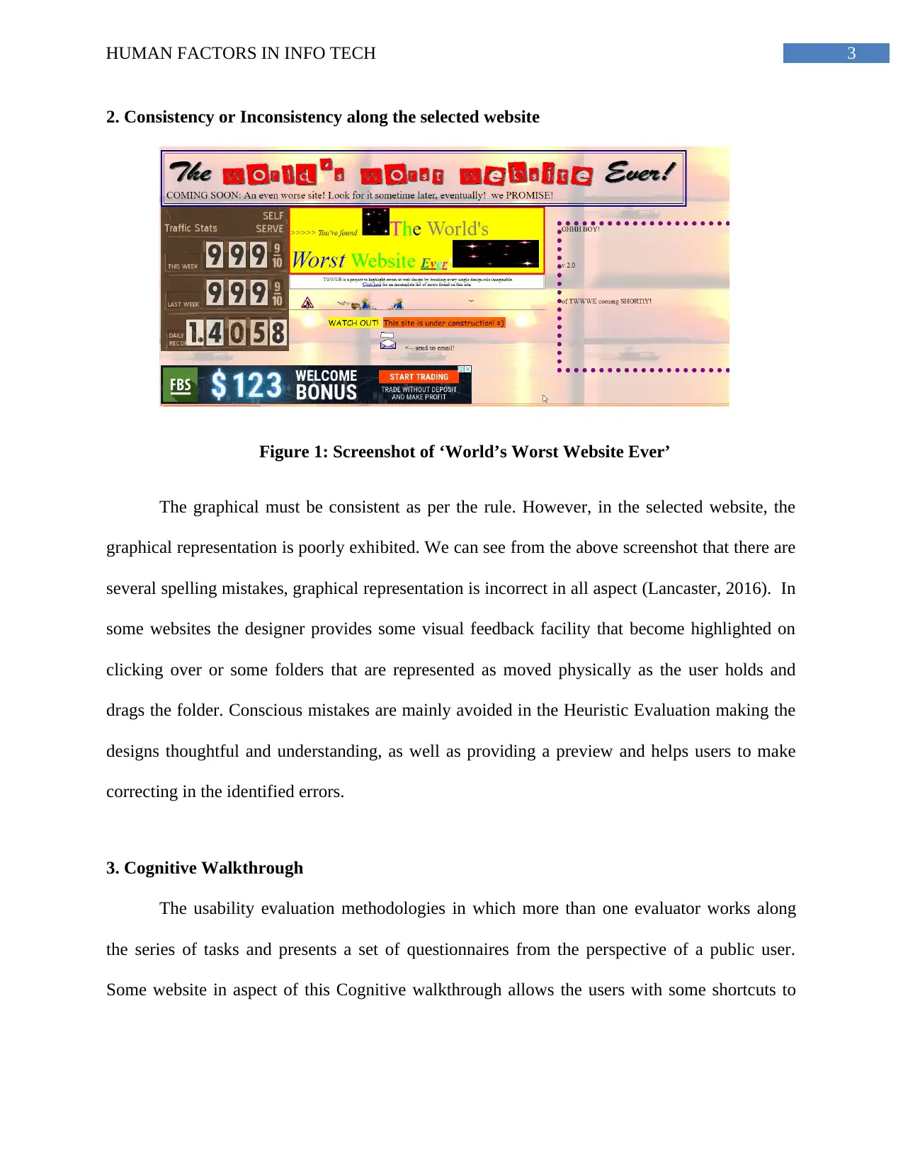
The assignment critically reviews the usability of a notoriously poor-designed website, http://www.theworldsworstwebsiteever.com/, by applying heuristic evaluation methods based on the Eight Golden Rules for Interface Design. These rules include striving for consistency, providing informative feedback, designing dialogues that yield closure, handling errors effectively, permitting reversal of actions, supporting an internal locus of control, reducing short-term memory load, and creating shortcuts for universal usability. The analysis highlights significant usability issues through inconsistency in graphical representation, increased cognitive load due to poorly optimized content, and lack of helpful features like shortcuts or system status visibility. Additionally, the cognitive walkthrough methodology is employed to evaluate how real users might interact with the website and struggle with completing tasks due to its flawed design. By examining these aspects, the assignment illustrates common mistakes in web design that can severely impact user experience.
Document Page
Running head: HUMAN FACTORS IN INFO TECH
HUMAN FACTORS IN INFO TECH
Name of the Student
Name of the University
tabler-icon-diamond-filled.svg

Paraphrase This Document

Need a fresh take? Get an instant paraphrase of this document with our AI Paraphraser
Document Page
1HUMAN FACTORS IN INFO TECH
Introduction
The usability inspecting method for computer software and websites, which may helps to
identify the usability issues in the user interface (UI) design. This technique includes evaluators
that examine the judgmental of compliances and interfaces with the recognized principle of
usability.
The website with URL “http://www.theworldsworstwebsiteever.com/” has been selected
for critical review and analysis of the content. This website is said to be under construction since
it has been determined as the world’s worst website. The significant purpose of the website is to
provide the worst outline of a website and to break every rule of website designing. This website
is a basic educational tool that aims to highlight the thing s that once can possibly mistake while
designing a website. We are going the write this report in the basis of heuristic evaluation,
consistency, and cognitive walkthrough focusing upon the Eight Golden Rules.
1. Website analysis of the heuristics based on Eight Golden rules
Heuristic evaluation originally introduced by Nielsen and Molich match the sets of
usability heuristics (Bader, Schön & Thomaschewski, 2017). The main aim was to evaluate how
to well design the software supporting the learning of users to use the websites correctly. Higher
level heuristics are introduced later by Ben Shneiderman’s 'Eight Golden Rules of Interface
Design', is one of the most valuable learning we can get for website designing, which includes
productive and frustration-free user interfaces. This was published for the users to identify and
learn to improve the interface of the website. The eight golden rule of Interface Designing:
I. Strive for Consistency
Document Page
2HUMAN FACTORS IN INFO TECH
II. Shortcuts to Seek universal usability
III. Informative Feedback
IV. Design dialogue for yielding closure
V. Error handling
VI. Permit reversal of actions
VII. Support internal locus of control
VIII. Reduce short-term memory load
The attempt was mainly to prevent the designer for the reinvention of the wheel to every
design of the website (Soyer & Hogarth, 2015). The interaction design literature and the
cognitive psychology literature helps in analyzing some similar designing and then the result is
applied in Heuristic Evaluation. Some predictive models are also built initially to evaluate the
interface design that has been planned to carry out further.
The part that has the maximum Cognitive load are in the designing, but minimizing the
cognitive load helps in maximizing the usability of the website. The cognitive load or the
quantity of mental processing power required to use a website, affecting the ease of users to find
the contents and complete the task. Here in the given site the cognitive load has been increased in
the strive to elimination, that is extraneous cognitive load (Wang et al., 2014). Because of the
chunky contents that may help in optimizing the responsibility thus is aimed to minimize the
cognitive load. Avoiding visual clutters, Building existing mental models and Offloaded tasks
can mainly be used to minimizing cognitive load in the ‘World’s Worst Website Ever’ website.
Document Page
3HUMAN FACTORS IN INFO TECH
2. Consistency or Inconsistency along the selected website
Figure 1: Screenshot of ‘World’s Worst Website Ever’
The graphical must be consistent as per the rule. However, in the selected website, the
graphical representation is poorly exhibited. We can see from the above screenshot that there are
several spelling mistakes, graphical representation is incorrect in all aspect (Lancaster, 2016). In
some websites the designer provides some visual feedback facility that become highlighted on
clicking over or some folders that are represented as moved physically as the user holds and
drags the folder. Conscious mistakes are mainly avoided in the Heuristic Evaluation making the
designs thoughtful and understanding, as well as providing a preview and helps users to make
correcting in the identified errors.
3. Cognitive Walkthrough
The usability evaluation methodologies in which more than one evaluator works along
the series of tasks and presents a set of questionnaires from the perspective of a public user.
Some website in aspect of this Cognitive walkthrough allows the users with some shortcuts to
tabler-icon-diamond-filled.svg

Paraphrase This Document

Need a fresh take? Get an instant paraphrase of this document with our AI Paraphraser
Document Page
4HUMAN FACTORS IN INFO TECH
jump pages or to take a screen shot and copy paste things for the ease of workplace (Johannessen
& Hornbæk, 2014).
Since, the selected website is not consistent and has many drawbacks due to its haphazard
manner, users may not able to find the shortcuts. Visibility of the system status must always be
kept users informed about what is going through proper feedback within reasonable limit of time.
High frequency tasks are mostly used in the begging for the organization to attract the customers
and making addition advantage of the website.
For best HCI practice we can take an example of a web site where human-computer
interaction principle must be applied to remake the site most user friendly and successful as
much as possible by: Clearly defining the purpose of the website, Knowing the audiences and
design accordingly and planning the organization of the website.
Bibliography
Bader, F., Schön, E. M., & Thomaschewski, J. (2017). Heuristics Considering UX and Quality
Criteria for Heuristics. International Journal of Interactive Multimedia and Artificial
Intelligence, 4(6), 48-53.
Holt, B., Bornholt, J., Zhang, I., Ports, D., Oskin, M., & Ceze, L. (2016, October). Disciplined
inconsistency with consistency types. In Proceedings of the Seventh ACM Symposium
on Cloud Computing (pp. 279-293). ACM.
Johannessen, G. H. J., & Hornbæk, K. (2014). Must evaluation methods be about usability?
Devising and assessing the utility inspection method. Behaviour & Information
Technology, 33(2), 195-206.
Document Page
5HUMAN FACTORS IN INFO TECH
Lancaster, A. (2016, October). Responding to writing through instructor screencasts: Cognitive
walkthrough, reader response, and student-centered access. In Professional
Communication Conference (IPCC), 2016 IEEE International (pp. 1-5). IEEE.
Soyer, E., & Hogarth, R. M. (2015). The golden rule of forecasting: objections, refinements, and
enhancements. Journal of Business Research, 68(8), 1702-1704.
Wang, Q., Yang, S., Liu, M., Cao, Z., & Ma, Q. (2014). An eye-tracking study of website
complexity from cognitive load perspective. Decision support systems, 62, 1-10.
chevron_up_icon
1 out of 6
circle_padding
hide_on_mobile
zoom_out_icon
[object Object]