HI6007 Statistics for Business Decisions Group Assignment T3 2019
VerifiedAdded on 2022/08/20
|15
|1895
|11
Homework Assignment
AI Summary
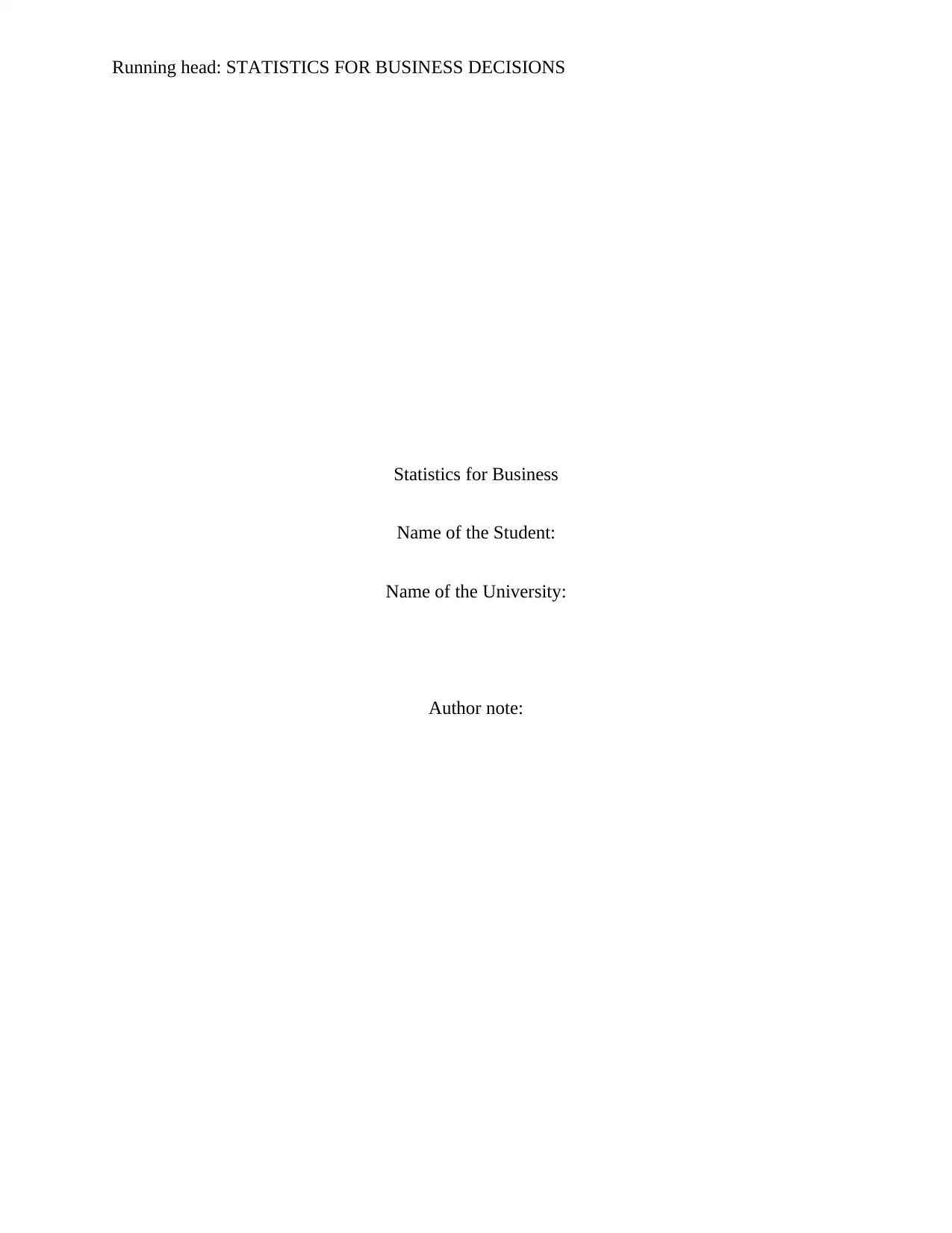
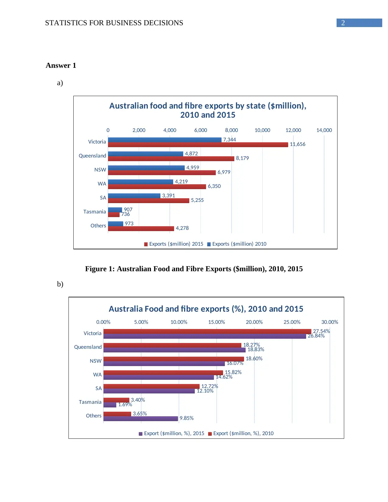
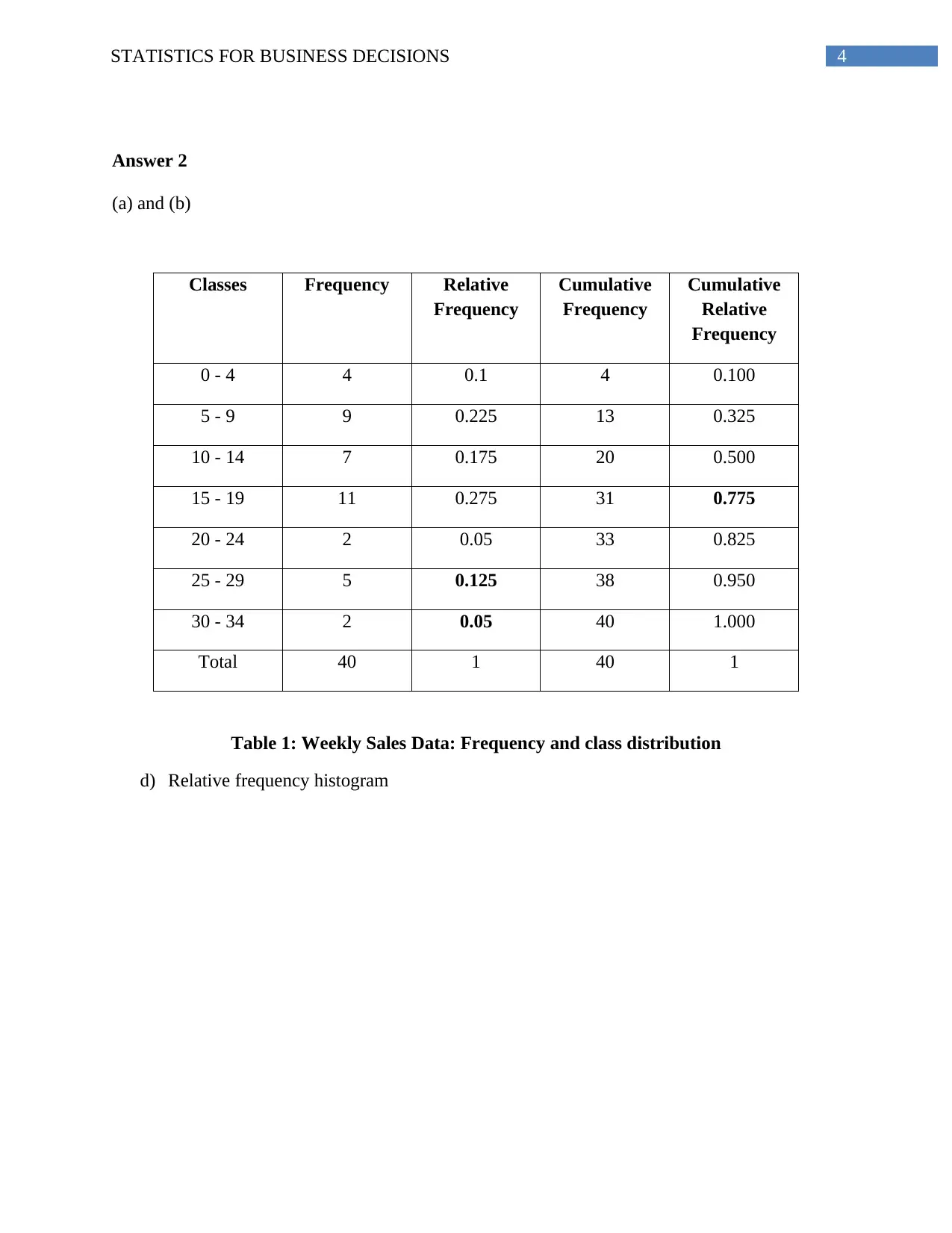
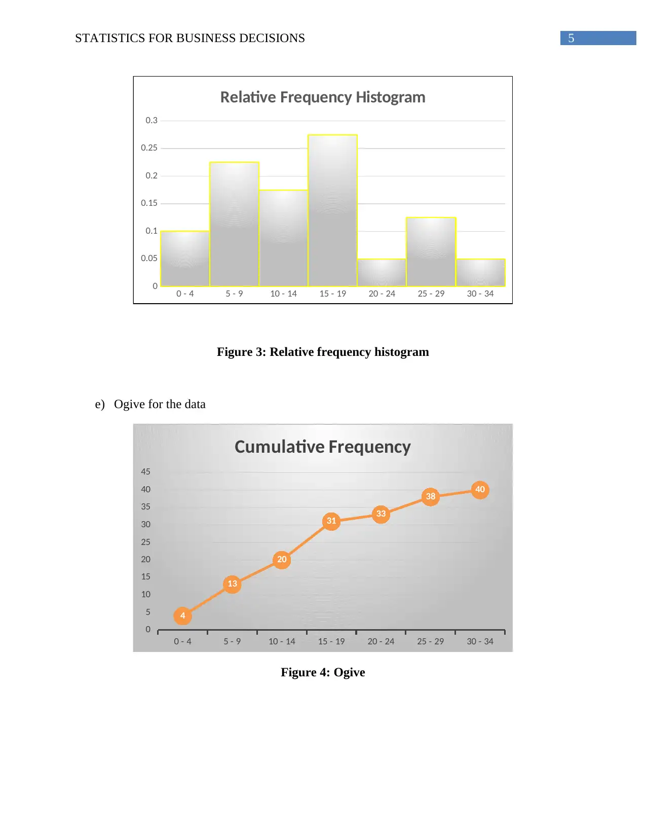
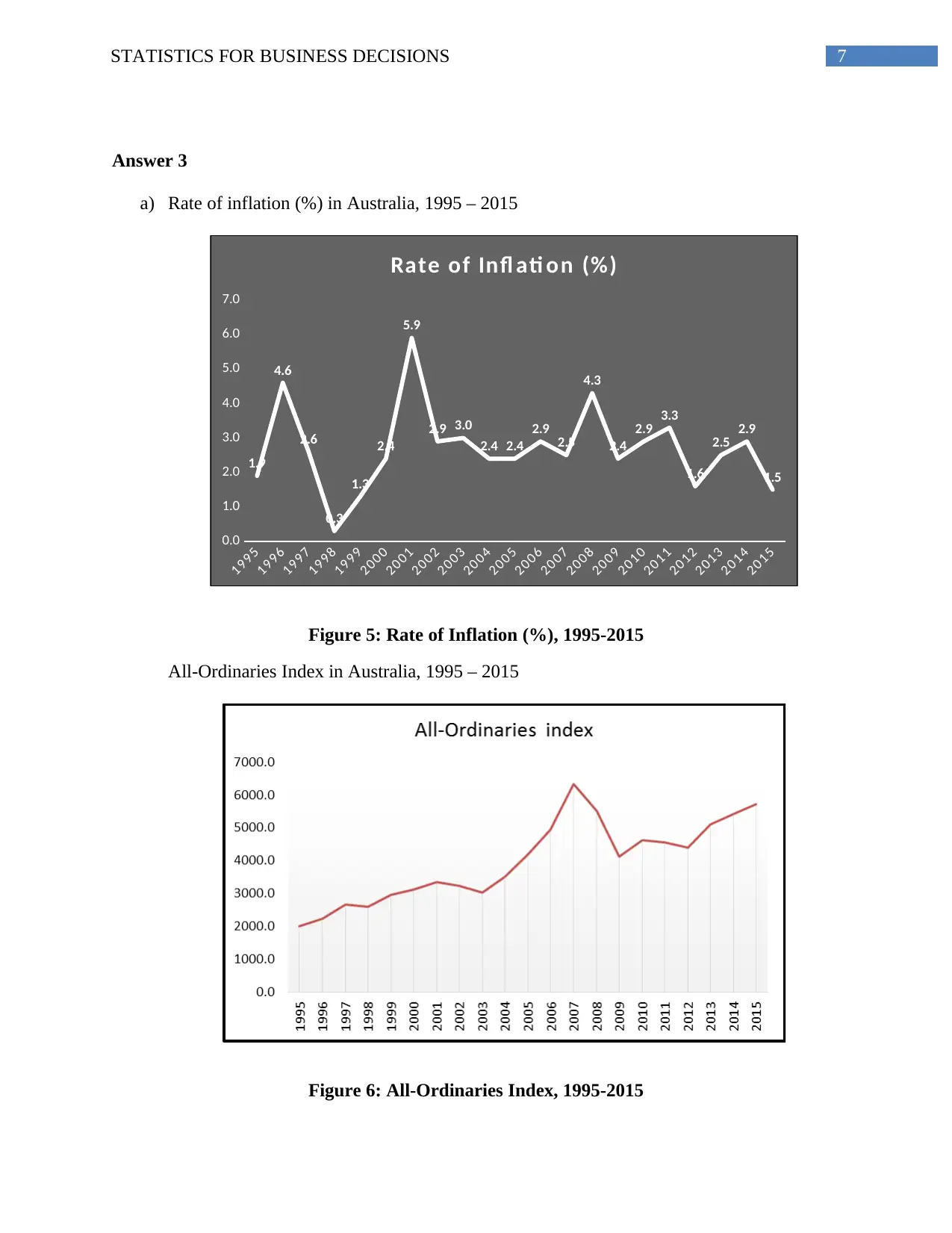
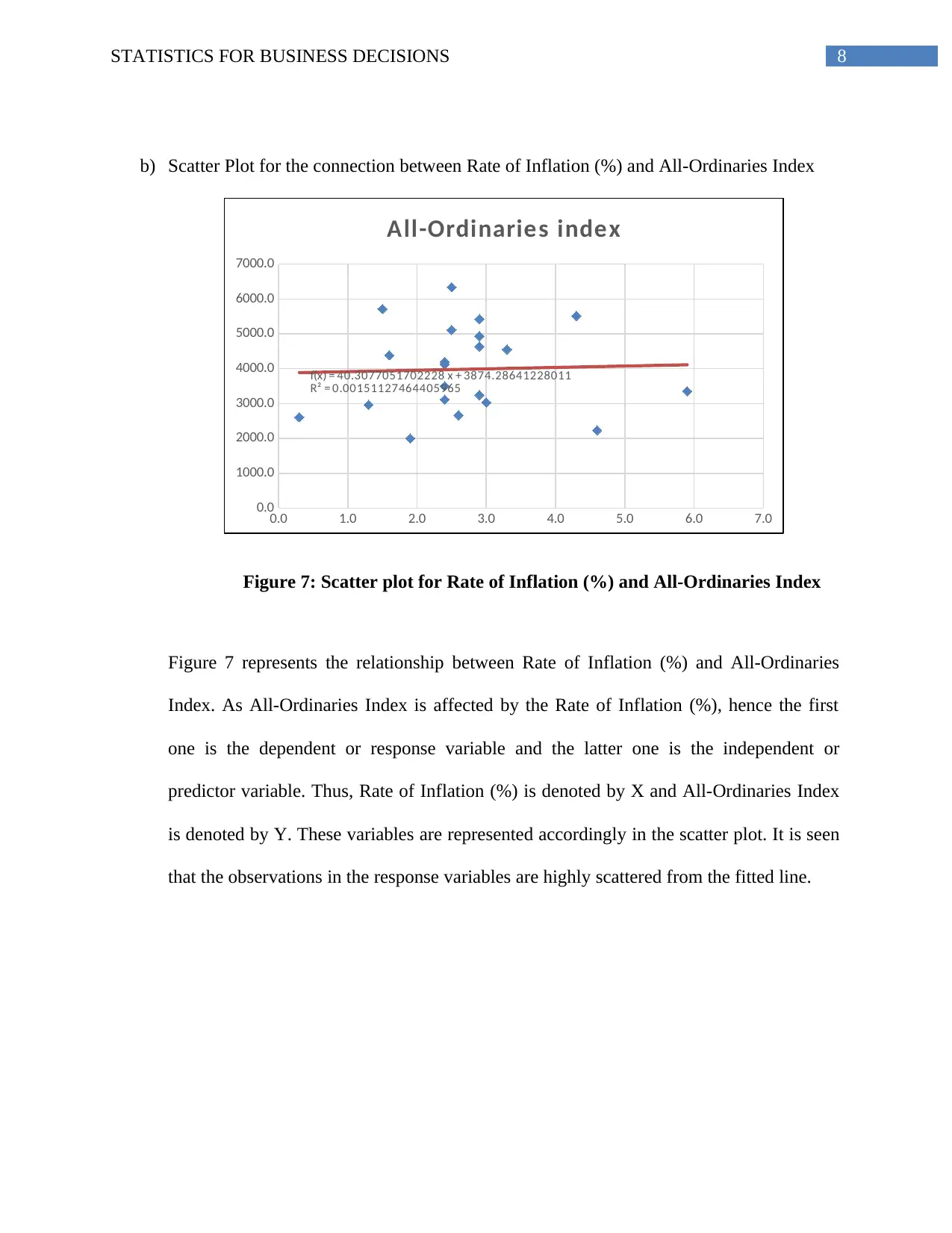
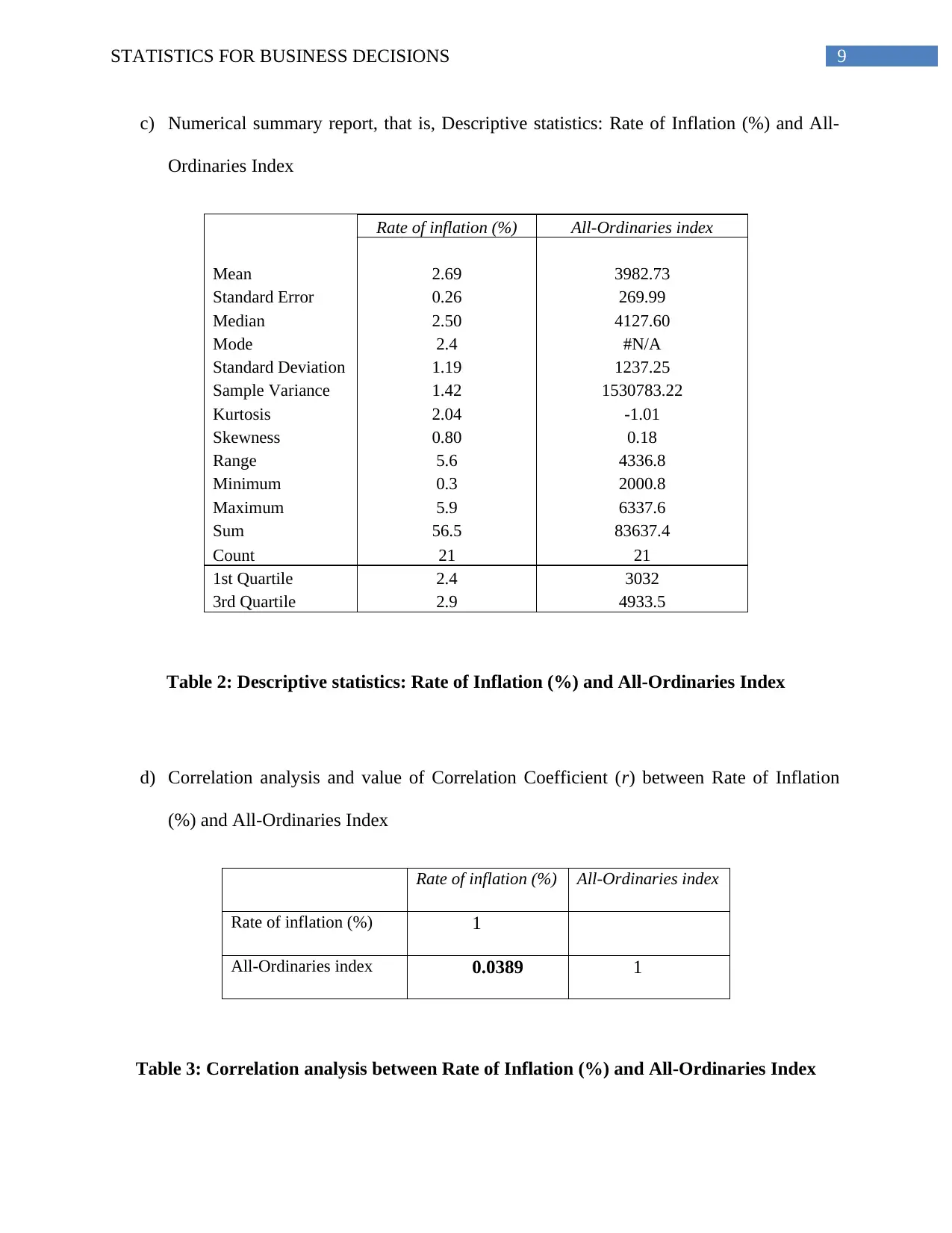
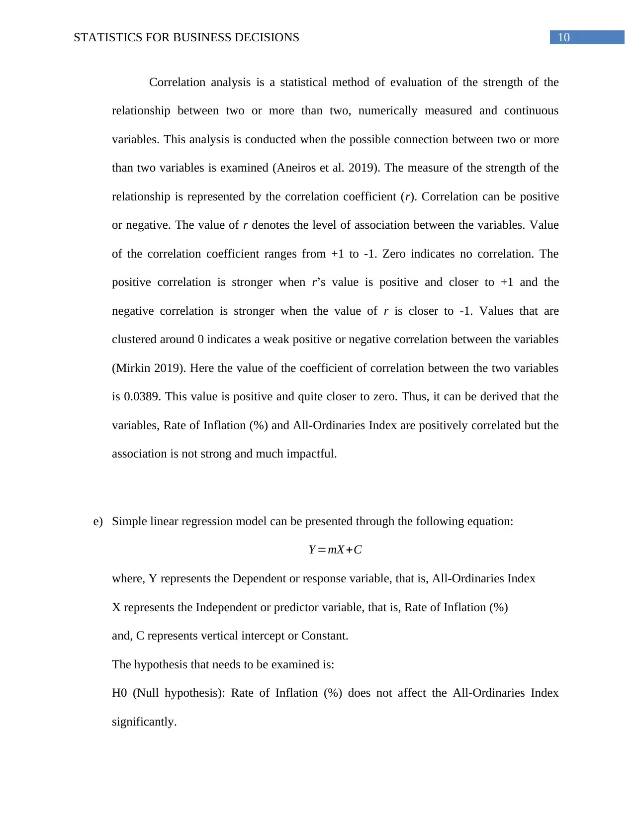
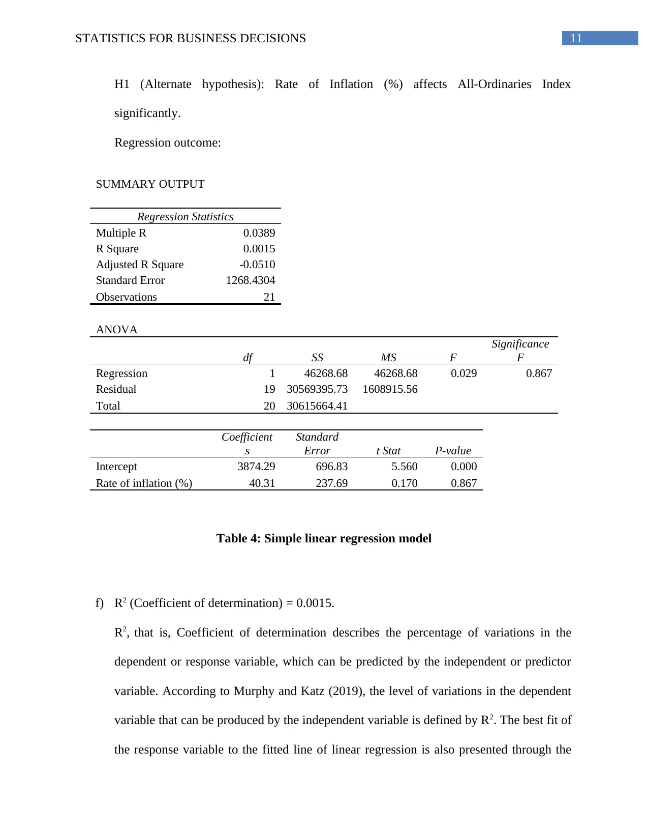
This document presents a group assignment solution for the HI6007 Statistics for Business Decisions course. The assignment includes three main answers. The first answer involves the comparison of Australian Food and Fibre Exports between 2010 and 2015 using bar graphs, analyzing export values in both millions of dollars and percentages across different states and regions. The second answer focuses on a frequency distribution analysis of weekly sales data, including the creation of frequency tables, relative frequency histograms, and ogives, along with calculations of cumulative frequencies and proportions. The third answer explores the relationship between the rate of inflation and the All-Ordinaries Index in Australia, using scatter plots, descriptive statistics, correlation analysis, and a simple linear regression model. The analysis includes the calculation of the correlation coefficient, hypothesis testing, and interpretation of the regression output, including R-squared and standard error, to determine the impact of inflation on the stock market index.

Running head: STATISTICS FOR BUSINESS DECISIONS
Statistics for Business
Name of the Student:
Name of the University:
Author note:
Statistics for Business
Name of the Student:
Name of the University:
Author note:
Paraphrase This Document
Need a fresh take? Get an instant paraphrase of this document with our AI Paraphraser

1STATISTICS FOR BUSINESS DECISIONS
Table of Contents
Answer 1..........................................................................................................................................2
Answer 2..........................................................................................................................................4
Answer 3..........................................................................................................................................6
References......................................................................................................................................13

2STATISTICS FOR BUSINESS DECISIONS
Answer 1
a)
Victoria
Queensland
NSW
WA
SA
Tasmania
Others
0 2,000 4,000 6,000 8,000 10,000 12,000 14,000
7,344
4,872
4,959
4,219
3,391
907
973
11,656
8,179
6,979
6,350
5,255
736
4,278
Australian food and fibre exports by state ($million),
2010 and 2015
Exports ($million) 2015 Exports ($million) 2010
Figure 1: Australian Food and Fibre Exports ($million), 2010, 2015
b)
Victoria
Queensland
NSW
WA
SA
Tasmania
Others
0.00% 5.00% 10.00% 15.00% 20.00% 25.00% 30.00%
27.54%
18.27%
18.60%
15.82%
12.72%
3.40%
3.65%
26.84%
18.83%
16.07%
14.62%
12.10%
1.69%
9.85%
Australia Food and fibre exports (%), 2010 and 2015
Export ($million, %), 2015 Export ($million, %), 2010
⊘ This is a preview!⊘
Do you want full access?
Subscribe today to unlock all pages.

Trusted by 1+ million students worldwide

3STATISTICS FOR BUSINESS DECISIONS
Figure 2: Australian Food and Fibre Exports ($million, %), 2010, 2015
c) Figure 1 and 2 compares the total export value of the Australian Food and Fibre in
$million and in percentage values for 2010 and 2015 for each state of Australia and other
regions of Australia. Both bar graphs display that among all the Australian states,
Victoria has provided the maximum in the total export value in $million and in
percentage values as well. It is found from the Figure 1 that the total export value of food
and fibre for each of the states has increased substantially in 2015 than in 2010. The
growth in the value of export in $million has been consistent for all the Australian states
for both the years. All the states show export growth from 2010 to 2015. The regions
under ‘Others’ category have contributed higher than Tasmania.
Figure 2 displays shows the percentage contribution of all the Australian states in
the food and fibre exports for 2010 and 2015. In 2015, the total value of export was much
higher for all the states from that in 2010 and that has influenced the percentage value of
the contribution made by the states in the food and fibre exports. The bar graph displays
that, the percentage contribution of all the states was higher in 2010 than in 2015. As the
total export value has increased quite significantly in 2015, the proportion of the
contribution of the states has changed too. The percentage contribution of the states were
higher in 2010 than in 2015 except for Queensland due to the difference in total value.
Paraphrase This Document
Need a fresh take? Get an instant paraphrase of this document with our AI Paraphraser

4STATISTICS FOR BUSINESS DECISIONS
Answer 2
(a) and (b)
Classes Frequency Relative
Frequency
Cumulative
Frequency
Cumulative
Relative
Frequency
0 - 4 4 0.1 4 0.100
5 - 9 9 0.225 13 0.325
10 - 14 7 0.175 20 0.500
15 - 19 11 0.275 31 0.775
20 - 24 2 0.05 33 0.825
25 - 29 5 0.125 38 0.950
30 - 34 2 0.05 40 1.000
Total 40 1 40 1
Table 1: Weekly Sales Data: Frequency and class distribution
d) Relative frequency histogram

5STATISTICS FOR BUSINESS DECISIONS
0 - 4 5 - 9 10 - 14 15 - 19 20 - 24 25 - 29 30 - 34
0
0.05
0.1
0.15
0.2
0.25
0.3
Relative Frequency Histogram
Figure 3: Relative frequency histogram
e) Ogive for the data
0 - 4 5 - 9 10 - 14 15 - 19 20 - 24 25 - 29 30 - 34
0
5
10
15
20
25
30
35
40
45
4
13
20
31 33
38 40
Cumulative Frequency
Figure 4: Ogive
0 - 4 5 - 9 10 - 14 15 - 19 20 - 24 25 - 29 30 - 34
0
0.05
0.1
0.15
0.2
0.25
0.3
Relative Frequency Histogram
Figure 3: Relative frequency histogram
e) Ogive for the data
0 - 4 5 - 9 10 - 14 15 - 19 20 - 24 25 - 29 30 - 34
0
5
10
15
20
25
30
35
40
45
4
13
20
31 33
38 40
Cumulative Frequency
Figure 4: Ogive
⊘ This is a preview!⊘
Do you want full access?
Subscribe today to unlock all pages.

Trusted by 1+ million students worldwide

6STATISTICS FOR BUSINESS DECISIONS
e) Proportion of data less than 20 = 0.775 (gained from the cumulative relative frequency of
data less than 20)
f) Proportion of data more than 24 = 1 – 0.825 = 0.175 (gained from the cumulative relative
frequency of data more than 24)
e) Proportion of data less than 20 = 0.775 (gained from the cumulative relative frequency of
data less than 20)
f) Proportion of data more than 24 = 1 – 0.825 = 0.175 (gained from the cumulative relative
frequency of data more than 24)
Paraphrase This Document
Need a fresh take? Get an instant paraphrase of this document with our AI Paraphraser

7STATISTICS FOR BUSINESS DECISIONS
Answer 3
a) Rate of inflation (%) in Australia, 1995 – 2015
199 5
199 6
199 7
199 8
199 9
200 0
200 1
200 2
200 3
200 4
200 5
200 6
200 7
200 8
200 9
201 0
201 1
201 2
201 3
201 4
201 5
0.0
1.0
2.0
3.0
4.0
5.0
6.0
7.0
1.9
4.6
2.6
0.3
1.3
2.4
5.9
2.9 3.0
2.4 2.4
2.9 2.5
4.3
2.4
2.9 3.3
1.6
2.5 2.9
1.5
Rate of Infl ati on (%)
Figure 5: Rate of Inflation (%), 1995-2015
All-Ordinaries Index in Australia, 1995 – 2015
Figure 6: All-Ordinaries Index, 1995-2015

8STATISTICS FOR BUSINESS DECISIONS
b) Scatter Plot for the connection between Rate of Inflation (%) and All-Ordinaries Index
0.0 1.0 2.0 3.0 4.0 5.0 6.0 7.0
0.0
1000.0
2000.0
3000.0
4000.0
5000.0
6000.0
7000.0
f(x) = 40.3077051702228 x + 3874.28641228011
R² = 0.00151127464405965
All-Ordinaries index
Figure 7: Scatter plot for Rate of Inflation (%) and All-Ordinaries Index
Figure 7 represents the relationship between Rate of Inflation (%) and All-Ordinaries
Index. As All-Ordinaries Index is affected by the Rate of Inflation (%), hence the first
one is the dependent or response variable and the latter one is the independent or
predictor variable. Thus, Rate of Inflation (%) is denoted by X and All-Ordinaries Index
is denoted by Y. These variables are represented accordingly in the scatter plot. It is seen
that the observations in the response variables are highly scattered from the fitted line.
⊘ This is a preview!⊘
Do you want full access?
Subscribe today to unlock all pages.

Trusted by 1+ million students worldwide

9STATISTICS FOR BUSINESS DECISIONS
c) Numerical summary report, that is, Descriptive statistics: Rate of Inflation (%) and All-
Ordinaries Index
Rate of inflation (%) All-Ordinaries index
Mean 2.69 3982.73
Standard Error 0.26 269.99
Median 2.50 4127.60
Mode 2.4 #N/A
Standard Deviation 1.19 1237.25
Sample Variance 1.42 1530783.22
Kurtosis 2.04 -1.01
Skewness 0.80 0.18
Range 5.6 4336.8
Minimum 0.3 2000.8
Maximum 5.9 6337.6
Sum 56.5 83637.4
Count 21 21
1st Quartile 2.4 3032
3rd Quartile 2.9 4933.5
Table 2: Descriptive statistics: Rate of Inflation (%) and All-Ordinaries Index
d) Correlation analysis and value of Correlation Coefficient (r) between Rate of Inflation
(%) and All-Ordinaries Index
Rate of inflation (%) All-Ordinaries index
Rate of inflation (%) 1
All-Ordinaries index 0.0389 1
Table 3: Correlation analysis between Rate of Inflation (%) and All-Ordinaries Index
Paraphrase This Document
Need a fresh take? Get an instant paraphrase of this document with our AI Paraphraser

10STATISTICS FOR BUSINESS DECISIONS
Correlation analysis is a statistical method of evaluation of the strength of the
relationship between two or more than two, numerically measured and continuous
variables. This analysis is conducted when the possible connection between two or more
than two variables is examined (Aneiros et al. 2019). The measure of the strength of the
relationship is represented by the correlation coefficient (r). Correlation can be positive
or negative. The value of r denotes the level of association between the variables. Value
of the correlation coefficient ranges from +1 to -1. Zero indicates no correlation. The
positive correlation is stronger when r’s value is positive and closer to +1 and the
negative correlation is stronger when the value of r is closer to -1. Values that are
clustered around 0 indicates a weak positive or negative correlation between the variables
(Mirkin 2019). Here the value of the coefficient of correlation between the two variables
is 0.0389. This value is positive and quite closer to zero. Thus, it can be derived that the
variables, Rate of Inflation (%) and All-Ordinaries Index are positively correlated but the
association is not strong and much impactful.
e) Simple linear regression model can be presented through the following equation:
Y =mX +C
where, Y represents the Dependent or response variable, that is, All-Ordinaries Index
X represents the Independent or predictor variable, that is, Rate of Inflation (%)
and, C represents vertical intercept or Constant.
The hypothesis that needs to be examined is:
H0 (Null hypothesis): Rate of Inflation (%) does not affect the All-Ordinaries Index
significantly.

11STATISTICS FOR BUSINESS DECISIONS
H1 (Alternate hypothesis): Rate of Inflation (%) affects All-Ordinaries Index
significantly.
Regression outcome:
SUMMARY OUTPUT
Regression Statistics
Multiple R 0.0389
R Square 0.0015
Adjusted R Square -0.0510
Standard Error 1268.4304
Observations 21
ANOVA
df SS MS F
Significance
F
Regression 1 46268.68 46268.68 0.029 0.867
Residual 19 30569395.73 1608915.56
Total 20 30615664.41
Coefficient
s
Standard
Error t Stat P-value
Intercept 3874.29 696.83 5.560 0.000
Rate of inflation (%) 40.31 237.69 0.170 0.867
Table 4: Simple linear regression model
f) R2 (Coefficient of determination) = 0.0015.
R2, that is, Coefficient of determination describes the percentage of variations in the
dependent or response variable, which can be predicted by the independent or predictor
variable. According to Murphy and Katz (2019), the level of variations in the dependent
variable that can be produced by the independent variable is defined by R2. The best fit of
the response variable to the fitted line of linear regression is also presented through the
⊘ This is a preview!⊘
Do you want full access?
Subscribe today to unlock all pages.

Trusted by 1+ million students worldwide
1 out of 15
Related Documents

Your All-in-One AI-Powered Toolkit for Academic Success.
+13062052269
info@desklib.com
Available 24*7 on WhatsApp / Email
Unlock your academic potential
Copyright © 2020–2025 A2Z Services. All Rights Reserved. Developed and managed by ZUCOL.