HI6007 Statistics and Research Methods Group Assignment - Analysis
VerifiedAdded on 2022/10/18
|15
|3064
|17
Project
AI Summary
This group assignment for HI6007 Statistics and Research Methods for Business Decision Making presents a comprehensive statistical analysis. The assignment begins with an analysis of Australian export data, comparing export volumes and percentage changes across different countries between 2004-05 and 2014-15, highlighting the significant growth in exports to China. The second part focuses on analyzing umbrella sales data, constructing frequency, relative frequency, and cumulative frequency distributions, along with histograms and ogives to visualize the data and determine proportions. The final part of the assignment involves time series analysis of retail turnover per capita and final consumption expenditure from September 1983 to March 2016, including the construction of time series plots, boxplots, and scatter plots. The analysis explores the correlation between the two variables, followed by a regression analysis to determine the impact of retail turnover per capita on final consumption expenditure. The document includes detailed numerical summaries, tables, and figures to support the findings.

1
Assessment Type: Assessment 2
Assessment Title: Group Assignment
Assessment Type: Assessment 2
Assessment Title: Group Assignment
Paraphrase This Document
Need a fresh take? Get an instant paraphrase of this document with our AI Paraphraser
2
Answer 1
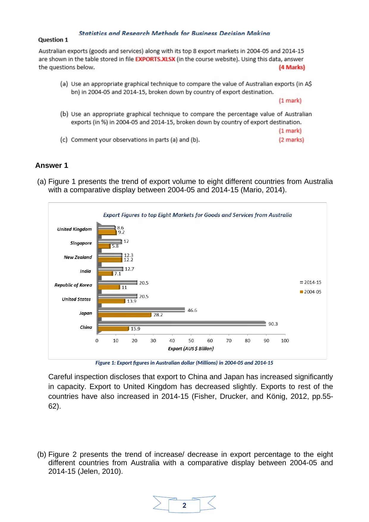
(a) Figure 1 presents the trend of export volume to eight different countries from Australia
with a comparative display between 2004-05 and 2014-15 (Mario, 2014).
Figure 1: Export figures in Australian dollar (Millions) in 2004-05 and 2014-15
Careful inspection discloses that export to China and Japan has increased significantly
in capacity. Export to United Kingdom has decreased slightly. Exports to rest of the
countries have also increased in 2014-15 (Fisher, Drucker, and König, 2012, pp.55-
62).
(b) Figure 2 presents the trend of increase/ decrease in export percentage to the eight
different countries from Australia with a comparative display between 2004-05 and
2014-15 (Jelen, 2010).
Answer 1
(a) Figure 1 presents the trend of export volume to eight different countries from Australia
with a comparative display between 2004-05 and 2014-15 (Mario, 2014).
Figure 1: Export figures in Australian dollar (Millions) in 2004-05 and 2014-15
Careful inspection discloses that export to China and Japan has increased significantly
in capacity. Export to United Kingdom has decreased slightly. Exports to rest of the
countries have also increased in 2014-15 (Fisher, Drucker, and König, 2012, pp.55-
62).
(b) Figure 2 presents the trend of increase/ decrease in export percentage to the eight
different countries from Australia with a comparative display between 2004-05 and
2014-15 (Jelen, 2010).
3
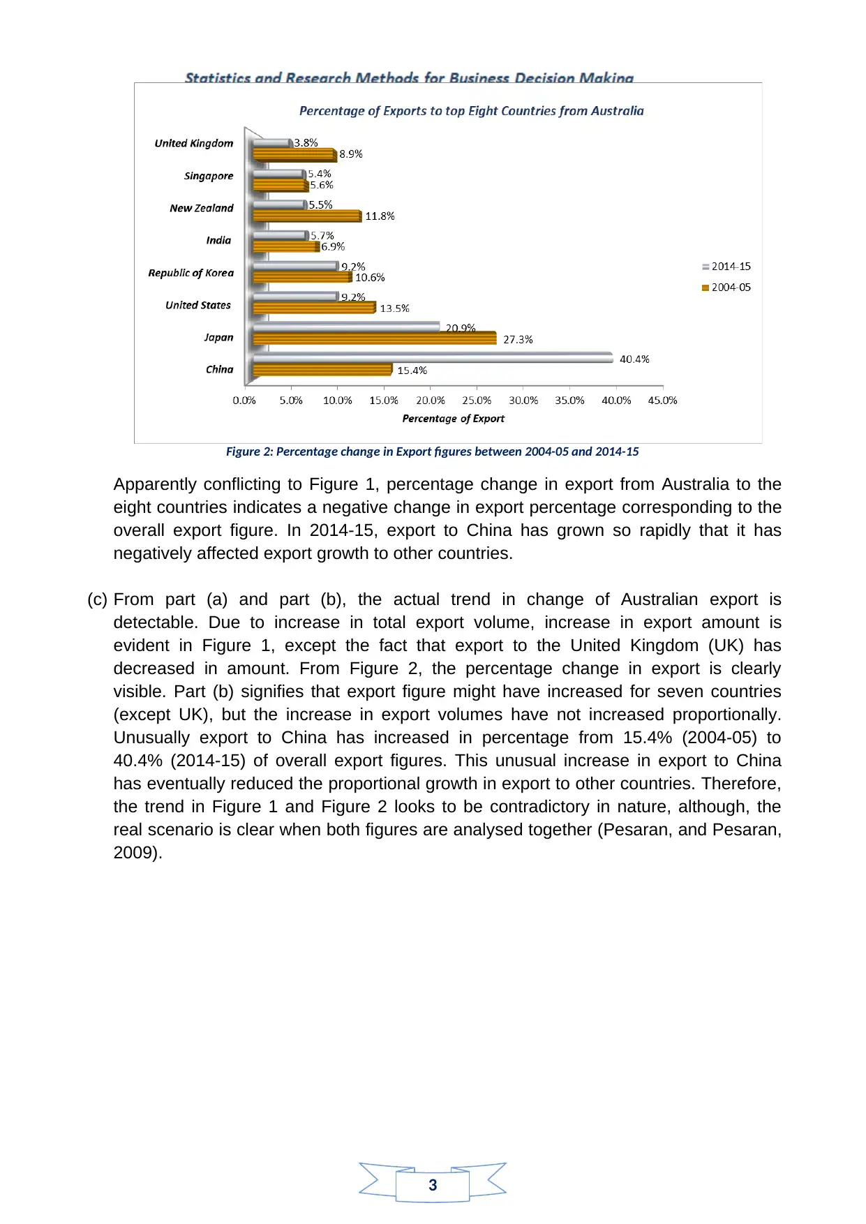
Figure 2: Percentage change in Export figures between 2004-05 and 2014-15
Apparently conflicting to Figure 1, percentage change in export from Australia to the
eight countries indicates a negative change in export percentage corresponding to the
overall export figure. In 2014-15, export to China has grown so rapidly that it has
negatively affected export growth to other countries.
(c) From part (a) and part (b), the actual trend in change of Australian export is
detectable. Due to increase in total export volume, increase in export amount is
evident in Figure 1, except the fact that export to the United Kingdom (UK) has
decreased in amount. From Figure 2, the percentage change in export is clearly
visible. Part (b) signifies that export figure might have increased for seven countries
(except UK), but the increase in export volumes have not increased proportionally.
Unusually export to China has increased in percentage from 15.4% (2004-05) to
40.4% (2014-15) of overall export figures. This unusual increase in export to China
has eventually reduced the proportional growth in export to other countries. Therefore,
the trend in Figure 1 and Figure 2 looks to be contradictory in nature, although, the
real scenario is clear when both figures are analysed together (Pesaran, and Pesaran,
2009).
⊘ This is a preview!⊘
Do you want full access?
Subscribe today to unlock all pages.
Trusted by 1+ million students worldwide
4
Answer 2
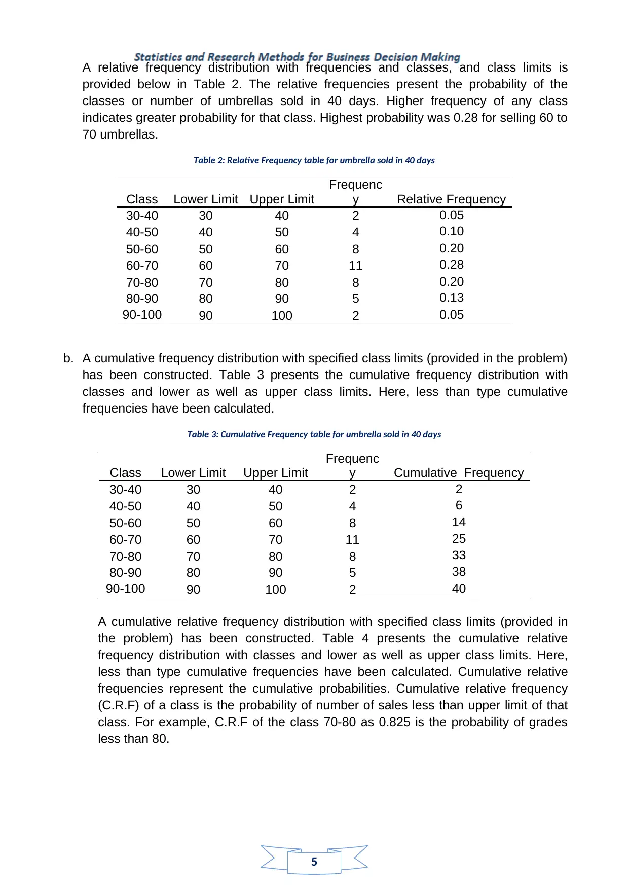
a. A frequency distribution with specified class limits (provided in the problem) has been
constructed. Table 1 presents the frequency distribution with classes and lower as well
as upper class limits.
Table 1: Frequency table for umbrella sold in 40 days
Class Lower Limit Upper Limit
Frequenc
y
30-40 30 40 2
40-50 40 50 4
50-60 50 60 8
60-70 60 70 11
70-80 70 80 8
80-90 80 90 5
90-
100 90 100 2
Inspection of the above table indicates that on most number of days (N = 11), umbrella
sales was between 60 and 70. Subsequently there were 8 days on which 70 to 80
umbrellas were sold (Remenyi, Onofrei, and English, 2011, pp.13-35).
.
Answer 2
a. A frequency distribution with specified class limits (provided in the problem) has been
constructed. Table 1 presents the frequency distribution with classes and lower as well
as upper class limits.
Table 1: Frequency table for umbrella sold in 40 days
Class Lower Limit Upper Limit
Frequenc
y
30-40 30 40 2
40-50 40 50 4
50-60 50 60 8
60-70 60 70 11
70-80 70 80 8
80-90 80 90 5
90-
100 90 100 2
Inspection of the above table indicates that on most number of days (N = 11), umbrella
sales was between 60 and 70. Subsequently there were 8 days on which 70 to 80
umbrellas were sold (Remenyi, Onofrei, and English, 2011, pp.13-35).
.
Paraphrase This Document
Need a fresh take? Get an instant paraphrase of this document with our AI Paraphraser
5
A relative frequency distribution with frequencies and classes, and class limits is
provided below in Table 2. The relative frequencies present the probability of the
classes or number of umbrellas sold in 40 days. Higher frequency of any class
indicates greater probability for that class. Highest probability was 0.28 for selling 60 to
70 umbrellas.
Table 2: Relative Frequency table for umbrella sold in 40 days
Class Lower Limit Upper Limit
Frequenc
y Relative Frequency
30-40 30 40 2 0.05
40-50 40 50 4 0.10
50-60 50 60 8 0.20
60-70 60 70 11 0.28
70-80 70 80 8 0.20
80-90 80 90 5 0.13
90-100 90 100 2 0.05
b. A cumulative frequency distribution with specified class limits (provided in the problem)
has been constructed. Table 3 presents the cumulative frequency distribution with
classes and lower as well as upper class limits. Here, less than type cumulative
frequencies have been calculated.
Table 3: Cumulative Frequency table for umbrella sold in 40 days
Class Lower Limit Upper Limit
Frequenc
y Cumulative Frequency
30-40 30 40 2 2
40-50 40 50 4 6
50-60 50 60 8 14
60-70 60 70 11 25
70-80 70 80 8 33
80-90 80 90 5 38
90-100 90 100 2 40
A cumulative relative frequency distribution with specified class limits (provided in
the problem) has been constructed. Table 4 presents the cumulative relative
frequency distribution with classes and lower as well as upper class limits. Here,
less than type cumulative frequencies have been calculated. Cumulative relative
frequencies represent the cumulative probabilities. Cumulative relative frequency
(C.R.F) of a class is the probability of number of sales less than upper limit of that
class. For example, C.R.F of the class 70-80 as 0.825 is the probability of grades
less than 80.
6
Table 4: Cumulative Relative Frequency table for umbrella sold in 40 days
Class Lower
Limit
Upper
Limit Frequency Cumulative
Frequency
Cumulative Relative
Frequency
30-40 30 40 2 2 0.05
40-50 40 50 4 6 0.15
50-60 50 60 8 14 0.35
60-70 60 70 11 25 0.625
70-80 70 80 8 33 0.825
80-90 80 90 5 38 0.95
90-100 90 100 2 40 1
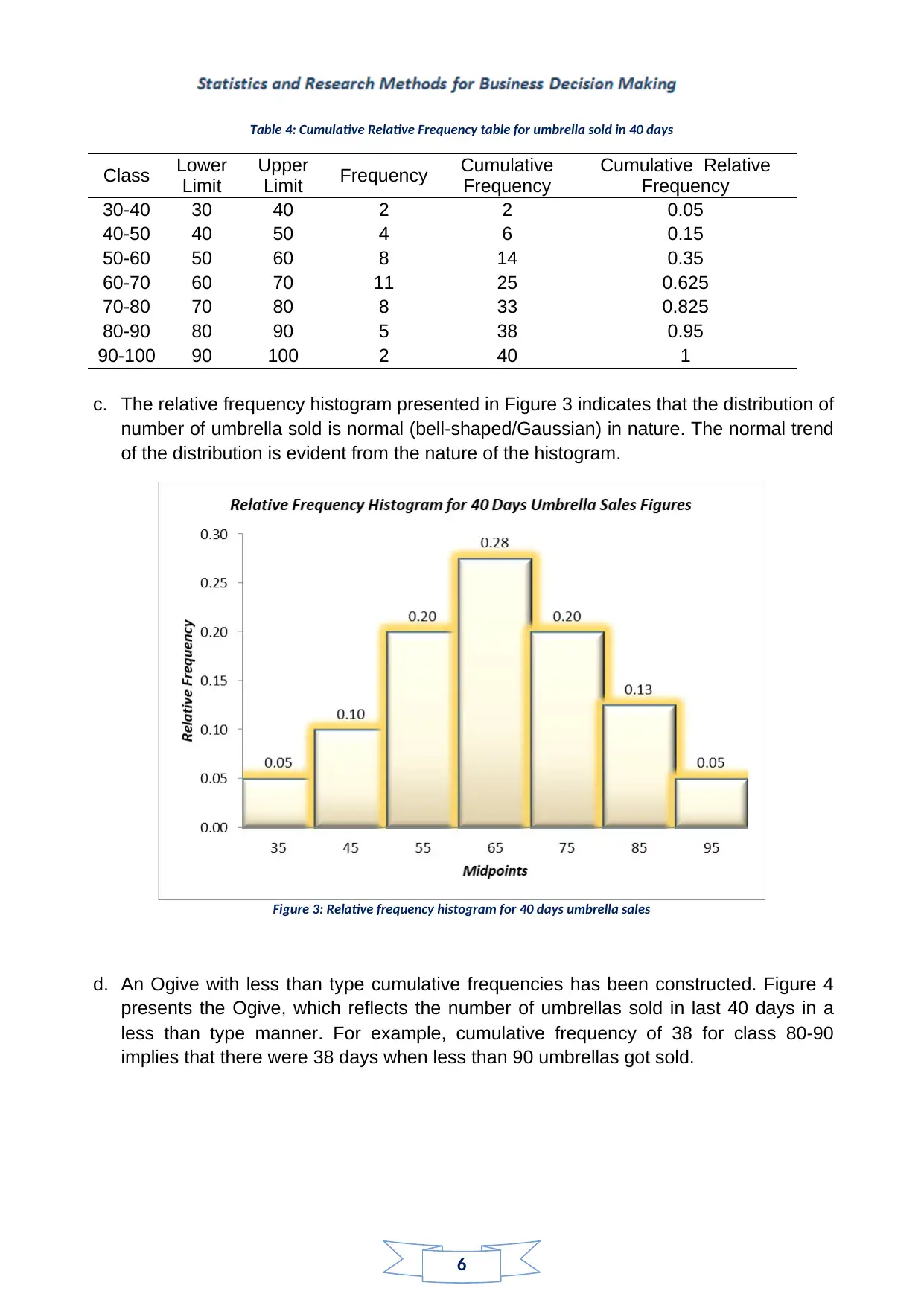
c. The relative frequency histogram presented in Figure 3 indicates that the distribution of
number of umbrella sold is normal (bell-shaped/Gaussian) in nature. The normal trend
of the distribution is evident from the nature of the histogram.
Figure 3: Relative frequency histogram for 40 days umbrella sales
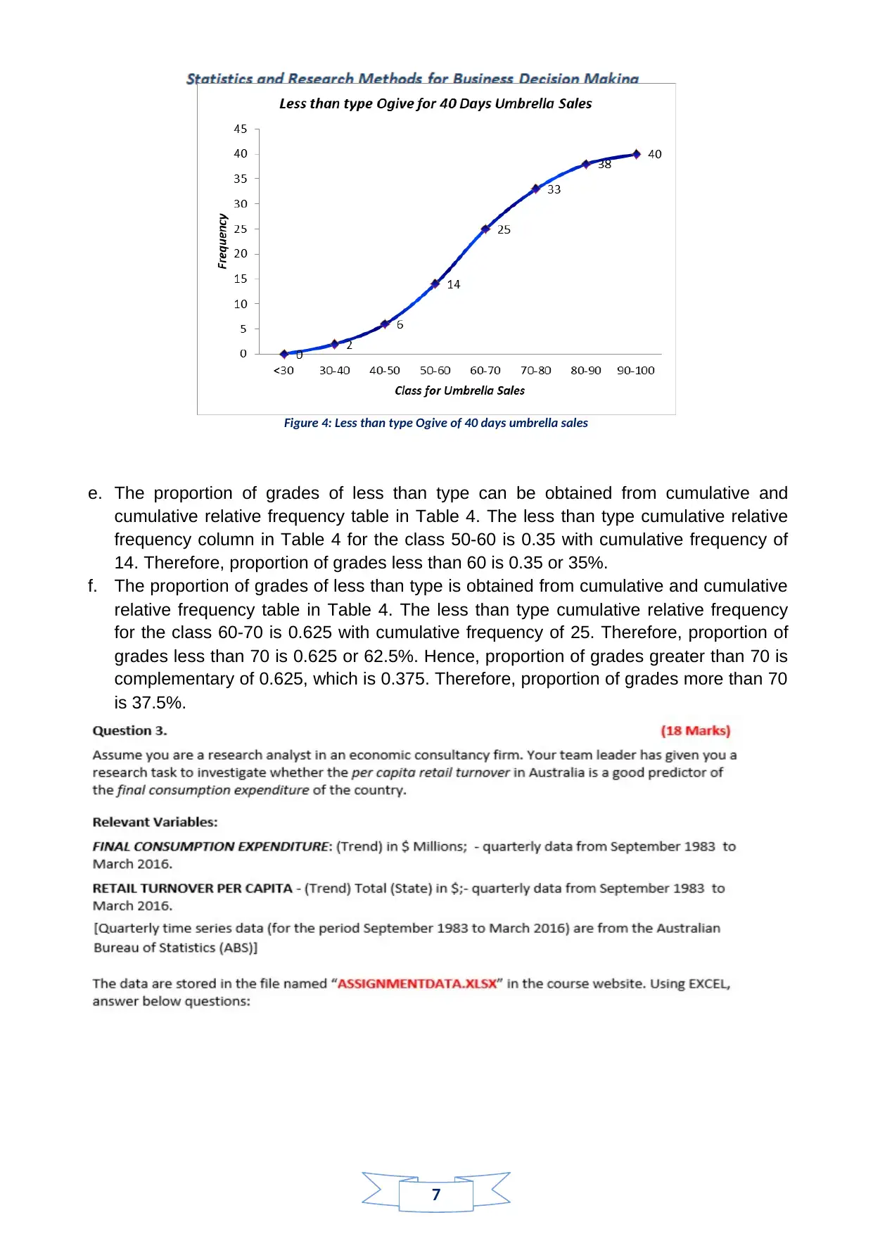
d. An Ogive with less than type cumulative frequencies has been constructed. Figure 4
presents the Ogive, which reflects the number of umbrellas sold in last 40 days in a
less than type manner. For example, cumulative frequency of 38 for class 80-90
implies that there were 38 days when less than 90 umbrellas got sold.
Table 4: Cumulative Relative Frequency table for umbrella sold in 40 days
Class Lower
Limit
Upper
Limit Frequency Cumulative
Frequency
Cumulative Relative
Frequency
30-40 30 40 2 2 0.05
40-50 40 50 4 6 0.15
50-60 50 60 8 14 0.35
60-70 60 70 11 25 0.625
70-80 70 80 8 33 0.825
80-90 80 90 5 38 0.95
90-100 90 100 2 40 1
c. The relative frequency histogram presented in Figure 3 indicates that the distribution of
number of umbrella sold is normal (bell-shaped/Gaussian) in nature. The normal trend
of the distribution is evident from the nature of the histogram.
Figure 3: Relative frequency histogram for 40 days umbrella sales
d. An Ogive with less than type cumulative frequencies has been constructed. Figure 4
presents the Ogive, which reflects the number of umbrellas sold in last 40 days in a
less than type manner. For example, cumulative frequency of 38 for class 80-90
implies that there were 38 days when less than 90 umbrellas got sold.
⊘ This is a preview!⊘
Do you want full access?
Subscribe today to unlock all pages.
Trusted by 1+ million students worldwide
7
Figure 4: Less than type Ogive of 40 days umbrella sales
e. The proportion of grades of less than type can be obtained from cumulative and
cumulative relative frequency table in Table 4. The less than type cumulative relative
frequency column in Table 4 for the class 50-60 is 0.35 with cumulative frequency of
14. Therefore, proportion of grades less than 60 is 0.35 or 35%.
f. The proportion of grades of less than type is obtained from cumulative and cumulative
relative frequency table in Table 4. The less than type cumulative relative frequency
for the class 60-70 is 0.625 with cumulative frequency of 25. Therefore, proportion of
grades less than 70 is 0.625 or 62.5%. Hence, proportion of grades greater than 70 is
complementary of 0.625, which is 0.375. Therefore, proportion of grades more than 70
is 37.5%.
Paraphrase This Document
Need a fresh take? Get an instant paraphrase of this document with our AI Paraphraser
8
Answer 3
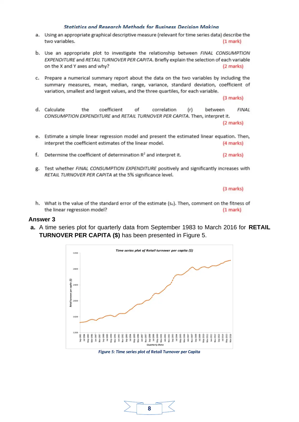
a. A time series plot for quarterly data from September 1983 to March 2016 for RETAIL
TURNOVER PER CAPITA ($) has been presented in Figure 5.
Figure 5: Time series plot of Retail Turnover per Capita
Answer 3
a. A time series plot for quarterly data from September 1983 to March 2016 for RETAIL
TURNOVER PER CAPITA ($) has been presented in Figure 5.
Figure 5: Time series plot of Retail Turnover per Capita
9
The trend of Retail Turnover per Capita from September 1983 to March 2016 is noted
as increasing from almost $1450 to $ 3000 mark. A gradual but persisting increasing
trend is present in Retail Turnover per Capita in the specified time span. The
descriptive details can be identified from Boxplot in Figure 6, and the Median of Retail
Turnover per Capita is noted approximately at $ 2200 (Krzywinski, and Altman, 2014,
pp.119-120).
Figure 6: Boxplot for Retail Turnover per Capita
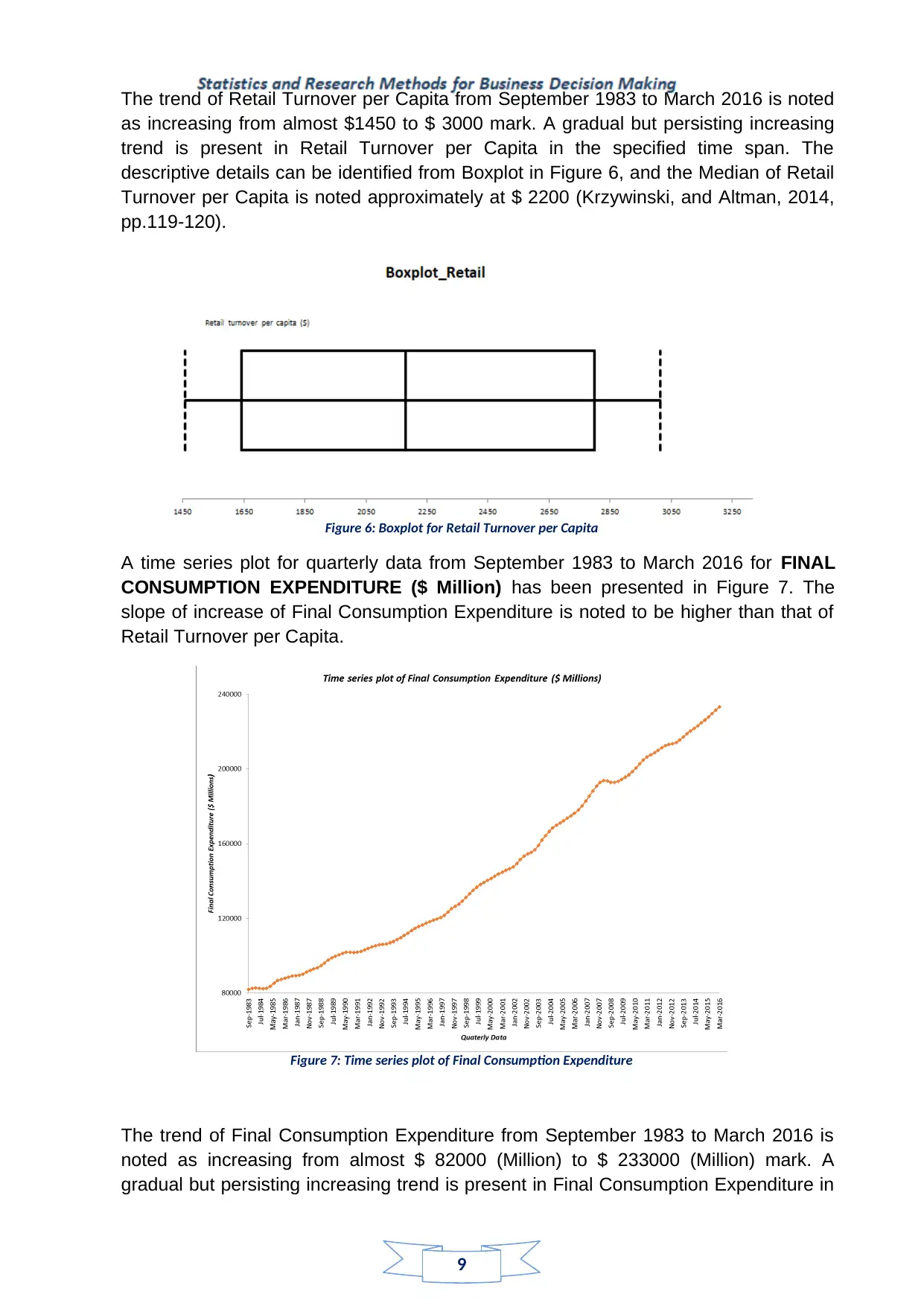
A time series plot for quarterly data from September 1983 to March 2016 for FINAL
CONSUMPTION EXPENDITURE ($ Million) has been presented in Figure 7. The
slope of increase of Final Consumption Expenditure is noted to be higher than that of
Retail Turnover per Capita.
Figure 7: Time series plot of Final Consumption Expenditure
The trend of Final Consumption Expenditure from September 1983 to March 2016 is
noted as increasing from almost $ 82000 (Million) to $ 233000 (Million) mark. A
gradual but persisting increasing trend is present in Final Consumption Expenditure in
The trend of Retail Turnover per Capita from September 1983 to March 2016 is noted
as increasing from almost $1450 to $ 3000 mark. A gradual but persisting increasing
trend is present in Retail Turnover per Capita in the specified time span. The
descriptive details can be identified from Boxplot in Figure 6, and the Median of Retail
Turnover per Capita is noted approximately at $ 2200 (Krzywinski, and Altman, 2014,
pp.119-120).
Figure 6: Boxplot for Retail Turnover per Capita
A time series plot for quarterly data from September 1983 to March 2016 for FINAL
CONSUMPTION EXPENDITURE ($ Million) has been presented in Figure 7. The
slope of increase of Final Consumption Expenditure is noted to be higher than that of
Retail Turnover per Capita.
Figure 7: Time series plot of Final Consumption Expenditure
The trend of Final Consumption Expenditure from September 1983 to March 2016 is
noted as increasing from almost $ 82000 (Million) to $ 233000 (Million) mark. A
gradual but persisting increasing trend is present in Final Consumption Expenditure in
⊘ This is a preview!⊘
Do you want full access?
Subscribe today to unlock all pages.
Trusted by 1+ million students worldwide
10
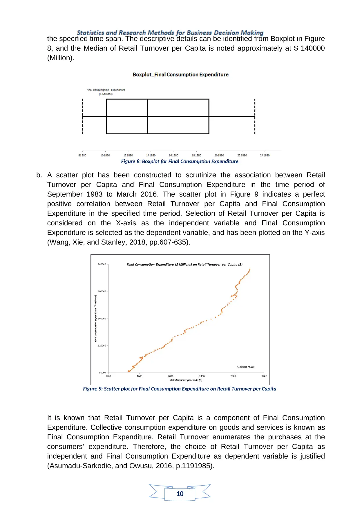
the specified time span. The descriptive details can be identified from Boxplot in Figure
8, and the Median of Retail Turnover per Capita is noted approximately at $ 140000
(Million).
Figure 8: Boxplot for Final Consumption Expenditure
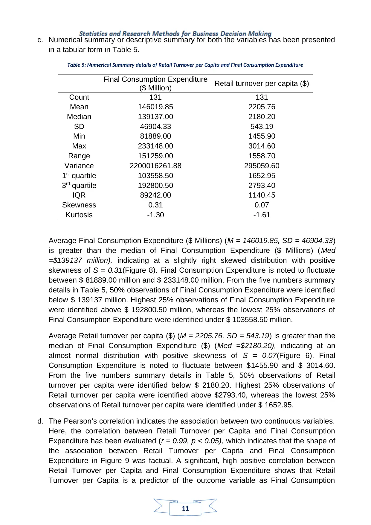
b. A scatter plot has been constructed to scrutinize the association between Retail
Turnover per Capita and Final Consumption Expenditure in the time period of
September 1983 to March 2016. The scatter plot in Figure 9 indicates a perfect
positive correlation between Retail Turnover per Capita and Final Consumption
Expenditure in the specified time period. Selection of Retail Turnover per Capita is
considered on the X-axis as the independent variable and Final Consumption
Expenditure is selected as the dependent variable, and has been plotted on the Y-axis
(Wang, Xie, and Stanley, 2018, pp.607-635).
Figure 9: Scatter plot for Final Consumption Expenditure on Retail Turnover per Capita
It is known that Retail Turnover per Capita is a component of Final Consumption
Expenditure. Collective consumption expenditure on goods and services is known as
Final Consumption Expenditure. Retail Turnover enumerates the purchases at the
consumers’ expenditure. Therefore, the choice of Retail Turnover per Capita as
independent and Final Consumption Expenditure as dependent variable is justified
(Asumadu-Sarkodie, and Owusu, 2016, p.1191985).
the specified time span. The descriptive details can be identified from Boxplot in Figure
8, and the Median of Retail Turnover per Capita is noted approximately at $ 140000
(Million).
Figure 8: Boxplot for Final Consumption Expenditure
b. A scatter plot has been constructed to scrutinize the association between Retail
Turnover per Capita and Final Consumption Expenditure in the time period of
September 1983 to March 2016. The scatter plot in Figure 9 indicates a perfect
positive correlation between Retail Turnover per Capita and Final Consumption
Expenditure in the specified time period. Selection of Retail Turnover per Capita is
considered on the X-axis as the independent variable and Final Consumption
Expenditure is selected as the dependent variable, and has been plotted on the Y-axis
(Wang, Xie, and Stanley, 2018, pp.607-635).
Figure 9: Scatter plot for Final Consumption Expenditure on Retail Turnover per Capita
It is known that Retail Turnover per Capita is a component of Final Consumption
Expenditure. Collective consumption expenditure on goods and services is known as
Final Consumption Expenditure. Retail Turnover enumerates the purchases at the
consumers’ expenditure. Therefore, the choice of Retail Turnover per Capita as
independent and Final Consumption Expenditure as dependent variable is justified
(Asumadu-Sarkodie, and Owusu, 2016, p.1191985).
Paraphrase This Document
Need a fresh take? Get an instant paraphrase of this document with our AI Paraphraser
11
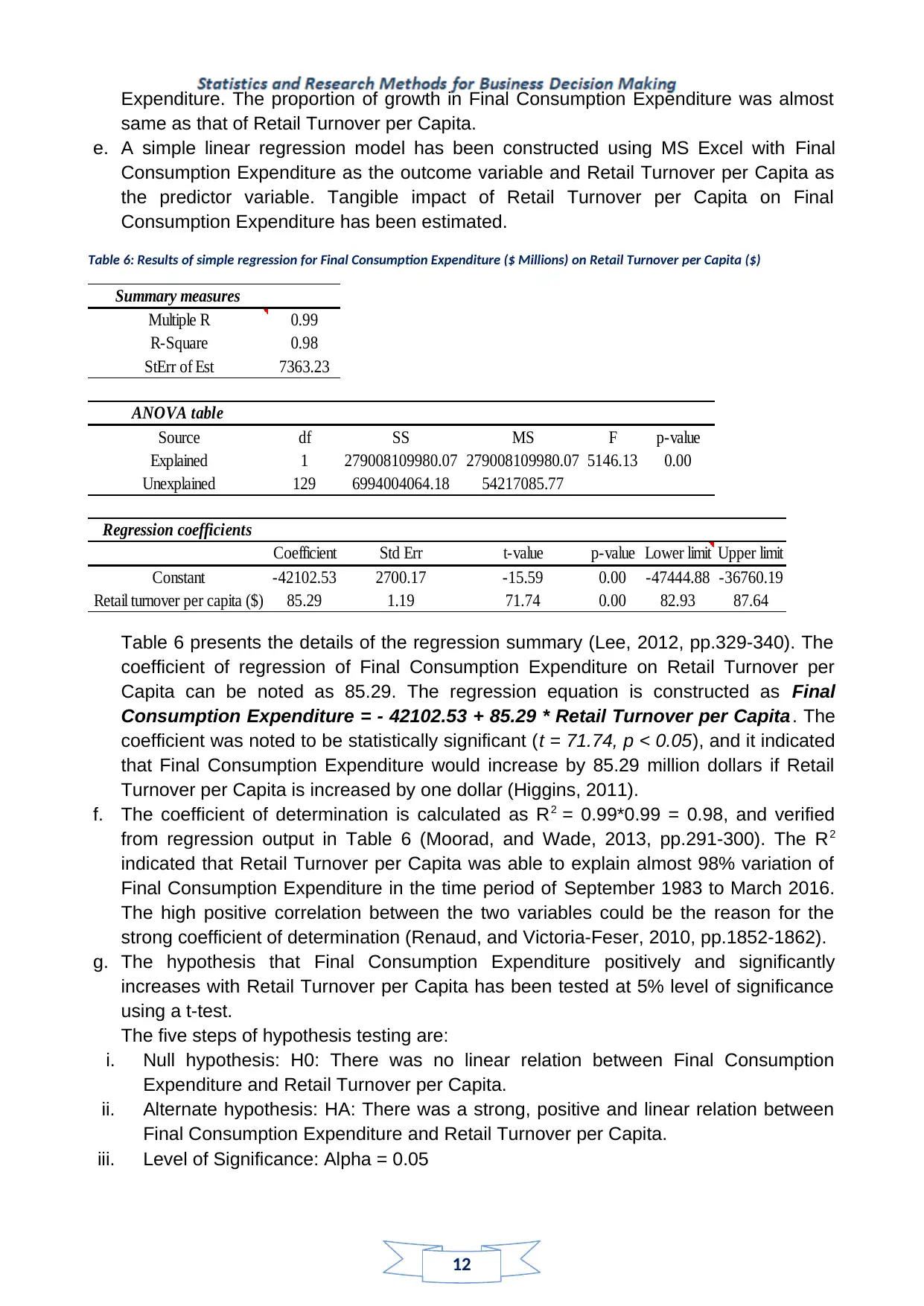
c. Numerical summary or descriptive summary for both the variables has been presented
in a tabular form in Table 5.
Table 5: Numerical Summary details of Retail Turnover per Capita and Final Consumption Expenditure
Final Consumption Expenditure
($ Million) Retail turnover per capita ($)
Count 131 131
Mean 146019.85 2205.76
Median 139137.00 2180.20
SD 46904.33 543.19
Min 81889.00 1455.90
Max 233148.00 3014.60
Range 151259.00 1558.70
Variance 2200016261.88 295059.60
1st quartile 103558.50 1652.95
3rd quartile 192800.50 2793.40
IQR 89242.00 1140.45
Skewness 0.31 0.07
Kurtosis -1.30 -1.61
Average Final Consumption Expenditure ($ Millions) (M = 146019.85, SD = 46904.33)
is greater than the median of Final Consumption Expenditure ($ Millions) (Med
=$139137 million), indicating at a slightly right skewed distribution with positive
skewness of S = 0.31(Figure 8). Final Consumption Expenditure is noted to fluctuate
between $ 81889.00 million and $ 233148.00 million. From the five numbers summary
details in Table 5, 50% observations of Final Consumption Expenditure were identified
below $ 139137 million. Highest 25% observations of Final Consumption Expenditure
were identified above $ 192800.50 million, whereas the lowest 25% observations of
Final Consumption Expenditure were identified under $ 103558.50 million.
Average Retail turnover per capita ($) (M = 2205.76, SD = 543.19) is greater than the
median of Final Consumption Expenditure ($) (Med =$2180.20), indicating at an
almost normal distribution with positive skewness of S = 0.07(Figure 6). Final
Consumption Expenditure is noted to fluctuate between $1455.90 and $ 3014.60.
From the five numbers summary details in Table 5, 50% observations of Retail
turnover per capita were identified below $ 2180.20. Highest 25% observations of
Retail turnover per capita were identified above $2793.40, whereas the lowest 25%
observations of Retail turnover per capita were identified under $ 1652.95.
d. The Pearson’s correlation indicates the association between two continuous variables.
Here, the correlation between Retail Turnover per Capita and Final Consumption
Expenditure has been evaluated (r = 0.99, p < 0.05), which indicates that the shape of
the association between Retail Turnover per Capita and Final Consumption
Expenditure in Figure 9 was factual. A significant, high positive correlation between
Retail Turnover per Capita and Final Consumption Expenditure shows that Retail
Turnover per Capita is a predictor of the outcome variable as Final Consumption
12
Expenditure. The proportion of growth in Final Consumption Expenditure was almost
same as that of Retail Turnover per Capita.
e. A simple linear regression model has been constructed using MS Excel with Final
Consumption Expenditure as the outcome variable and Retail Turnover per Capita as
the predictor variable. Tangible impact of Retail Turnover per Capita on Final
Consumption Expenditure has been estimated.
Table 6: Results of simple regression for Final Consumption Expenditure ($ Millions) on Retail Turnover per Capita ($)
Summary measures
Multiple R 0.99
R-Square 0.98
StErr of Est 7363.23
ANOVA table
Source df SS MS F p-value
Explained 1 279008109980.07 279008109980.07 5146.13 0.00
Unexplained 129 6994004064.18 54217085.77
Regression coefficients
Coefficient Std Err t-value p-value Lower limit Upper limit
Constant -42102.53 2700.17 -15.59 0.00 -47444.88 -36760.19
Retail turnover per capita ($) 85.29 1.19 71.74 0.00 82.93 87.64
Table 6 presents the details of the regression summary (Lee, 2012, pp.329-340). The
coefficient of regression of Final Consumption Expenditure on Retail Turnover per
Capita can be noted as 85.29. The regression equation is constructed as Final
Consumption Expenditure = - 42102.53 + 85.29 * Retail Turnover per Capita. The
coefficient was noted to be statistically significant (t = 71.74, p < 0.05), and it indicated
that Final Consumption Expenditure would increase by 85.29 million dollars if Retail
Turnover per Capita is increased by one dollar (Higgins, 2011).
f. The coefficient of determination is calculated as R2 = 0.99*0.99 = 0.98, and verified
from regression output in Table 6 (Moorad, and Wade, 2013, pp.291-300). The R2
indicated that Retail Turnover per Capita was able to explain almost 98% variation of
Final Consumption Expenditure in the time period of September 1983 to March 2016.
The high positive correlation between the two variables could be the reason for the
strong coefficient of determination (Renaud, and Victoria-Feser, 2010, pp.1852-1862).
g. The hypothesis that Final Consumption Expenditure positively and significantly
increases with Retail Turnover per Capita has been tested at 5% level of significance
using a t-test.
The five steps of hypothesis testing are:
i. Null hypothesis: H0: There was no linear relation between Final Consumption
Expenditure and Retail Turnover per Capita.
ii. Alternate hypothesis: HA: There was a strong, positive and linear relation between
Final Consumption Expenditure and Retail Turnover per Capita.
iii. Level of Significance: Alpha = 0.05
⊘ This is a preview!⊘
Do you want full access?
Subscribe today to unlock all pages.
Trusted by 1+ million students worldwide
1 out of 15
Related Documents


Your All-in-One AI-Powered Toolkit for Academic Success.
+13062052269
info@desklib.com
Available 24*7 on WhatsApp / Email
![[object Object]](/_next/static/media/star-bottom.7253800d.svg)
Unlock your academic potential
Copyright © 2020–2026 A2Z Services. All Rights Reserved. Developed and managed by ZUCOL.