Analysis and Redesign of DC Metro Ticketing Kiosk Using HCI Principles
VerifiedAdded on 2021/04/17
|11
|2107
|39
Report
AI Summary
This report provides a comprehensive analysis of the human-computer interaction (HCI) design of the DC Metro ticketing kiosk. It begins by identifying the usability challenges faced by users, particularly new users, highlighting issues such as complexity, lack of user-friendliness, and violations of HCI principles. The report examines the current design's adherence to Schneiderman's theories and the eight golden rules of interface design, as well as the application of Gestalt principles of grouping. The analysis reveals a significant gulf of execution and evaluation, leading to potential errors and a poor user experience. The report then proposes a redesigned interface, focusing on simplicity, interactivity, and adherence to HCI and user interface design guidelines. The redesigned system features a touch-based screen with a streamlined, intuitive workflow. Finally, the report outlines a usability evaluation plan, including methods like user interviews, lab evaluations, and observations, to assess the performance of the redesigned interface, ensuring consistency, improved usability, and user satisfaction. This evaluation will use both qualitative and quantitative data to refine the final design.
HUMAN COMPUTER INTERFACE DESIGN: DC METRO TICKETING KIOSK 1
Human Computer Interface Design: DC Metro Ticketing Kiosk
Name
Date
Human Computer Interface Design: DC Metro Ticketing Kiosk
Name
Date
Paraphrase This Document
Need a fresh take? Get an instant paraphrase of this document with our AI Paraphraser
HUMAN COMPUTER INTERFACE DESIGN: DC METRO TICKETING KIOSK 2
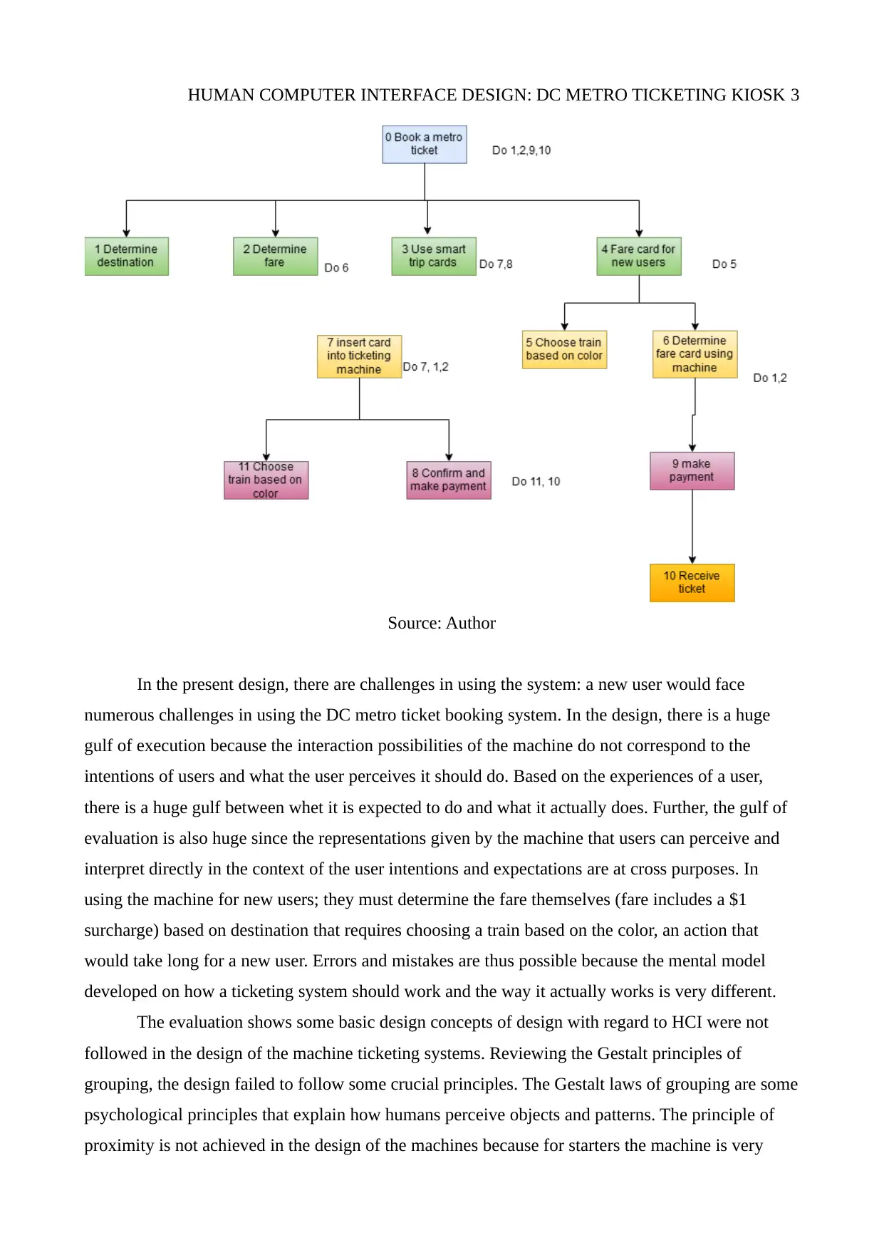
Problem analysis
The DC Metro ticketing machines are large, bulky, and complicated pieces of electronic
equipment that can be intimidating to a first time user, even those that have been using metro
ticketing machines in other parts of the world. Part from being complicated, it is also not user
friendly to use, particularly for someone that has never used it before. The machine so much
information, yet based on the numbers appearing on the screen, only three steps are needed to get
oneself a ticket. The design of such equipment must take into consideration human computer
interaction (HCI). When at the ticketing machine, especially a new user can feel ‘lost’, and the
pressures of others waiting in line and having to contend with train arrival times can make the
experience stressful. According to Kurosu (2014), the theories of HCI according to Schneiderman
require that designers must first recognize diversity when making designs. Based on this, the eight
interface design golden rules must be adhered to: these include striving for consistency, enable
shortcuts for frequent users, provide feedback, design dialogs for closure, provide error prevention
and error handling, allow easy actions reversal, support for internal control locus, and ensure short
term memory load is reduced (Valverde, 2011). However, these golden rules are not adhered to;
there is no consistency, error prevention and handling is not inbuilt, action reversal is not easy at all,
there is a lot of required short term memory, and internal locus of control is weak. Looking at the
DC metro tickets, essentially, only three steps are needed to purchase, but the DC metro system has
about eight steps as depicted in the hierarchical diagram below;
HUMAN COMPUTER INTERFACE DESIGN: DC METRO TICKETING KIOSK 3
Source: Author
In the present design, there are challenges in using the system: a new user would face
numerous challenges in using the DC metro ticket booking system. In the design, there is a huge
gulf of execution because the interaction possibilities of the machine do not correspond to the
intentions of users and what the user perceives it should do. Based on the experiences of a user,
there is a huge gulf between whet it is expected to do and what it actually does. Further, the gulf of
evaluation is also huge since the representations given by the machine that users can perceive and
interpret directly in the context of the user intentions and expectations are at cross purposes. In
using the machine for new users; they must determine the fare themselves (fare includes a $1
surcharge) based on destination that requires choosing a train based on the color, an action that
would take long for a new user. Errors and mistakes are thus possible because the mental model
developed on how a ticketing system should work and the way it actually works is very different.
The evaluation shows some basic design concepts of design with regard to HCI were not
followed in the design of the machine ticketing systems. Reviewing the Gestalt principles of
grouping, the design failed to follow some crucial principles. The Gestalt laws of grouping are some
psychological principles that explain how humans perceive objects and patterns. The principle of
proximity is not achieved in the design of the machines because for starters the machine is very
⊘ This is a preview!⊘
Do you want full access?
Subscribe today to unlock all pages.
Trusted by 1+ million students worldwide
HUMAN COMPUTER INTERFACE DESIGN: DC METRO TICKETING KIOSK 4
large with action panes being very widely spaced: The action panes are the exact places where the
user must press or input information in order to proceed to the next step to complete a ticket
booking accurately. According to the gestalt principles, proximity posits that shapes of objects that
are close to each other appear to form a group (Marcus, 2013). In the ticket machines, the various
actions to be taken and the action points are too widely spaced, courtesy of the large machine.
While there is some degree of similarity, the design of the machines, even the interface and the
appearance of the entire ticketing kiosk make it look like something for any other purpose other
than a self-ticketing machine. The principle of similarity perception lends itself to observing stimuli
that have physical resemblance so that they appear to be part of the same object. This principle
explains how people differentiate between overlapping and adjacent objects based on the
resemblance and texture of the items. A screen shot of the ticketing kiosk is shown below, showing
the high level of dissimilarity, including color, appearance, and the user interface (Marcus, 2013).
The design also violates the cardinal Gestalt principle of good continuation; the principle
posits that people have the tendency to perceive every object, when two or more objects intersect, as
a single uninterrupted object (Johnson, 2010). In this case study, the new user must first determine
the fare, then select their destination, and entails back and forth processes instead of a seamless
flow, such as entering destination, then the fare is automatically computed, and then a payment
made and receipt received. The processes of tasks that culminate in the ticket being given and the
appearance of the entire kiosk grossly violate this cardinal principle. The principle of common fate
is also not achieved in the kiosk design; the appearance of the screen is more intimidating than
inviting the user to explore. This is made worse by the time constraints where the train can arrive
any time, the fear of missing the right train, and the possibility of others, who may have used the
system before, standing behind a user. All these issues and facts mean that a user is likely to make
mistakes, because the design of the kiosk interface and the flow of buttons, color, and even tasks
fail to obey basic psychological principles as proposed by Gestalt (Johnson, 2010). A new user
would be lost; there are three color codes to choose from, and these have to be gotten correctly,
without any feedback from the machine or guidelines on how to get it correctly. Usually, an
attendant has to come help someone, especially a new user.
Development of a better Interface
People are living in the information age, where the use of smart phones, tablets, and
computers has proliferated, so a well-designed system should be a breeze to use. The proposed
design after this analysis is to completely replace the existing kiosk with a touch based computer
screen that is much smaller. Further, the system should have instructions so that a new user can get
to quickly use the system and understand what needs to be done to obtain a ticket. Importantly, the
Paraphrase This Document
Need a fresh take? Get an instant paraphrase of this document with our AI Paraphraser
HUMAN COMPUTER INTERFACE DESIGN: DC METRO TICKETING KIOSK 5
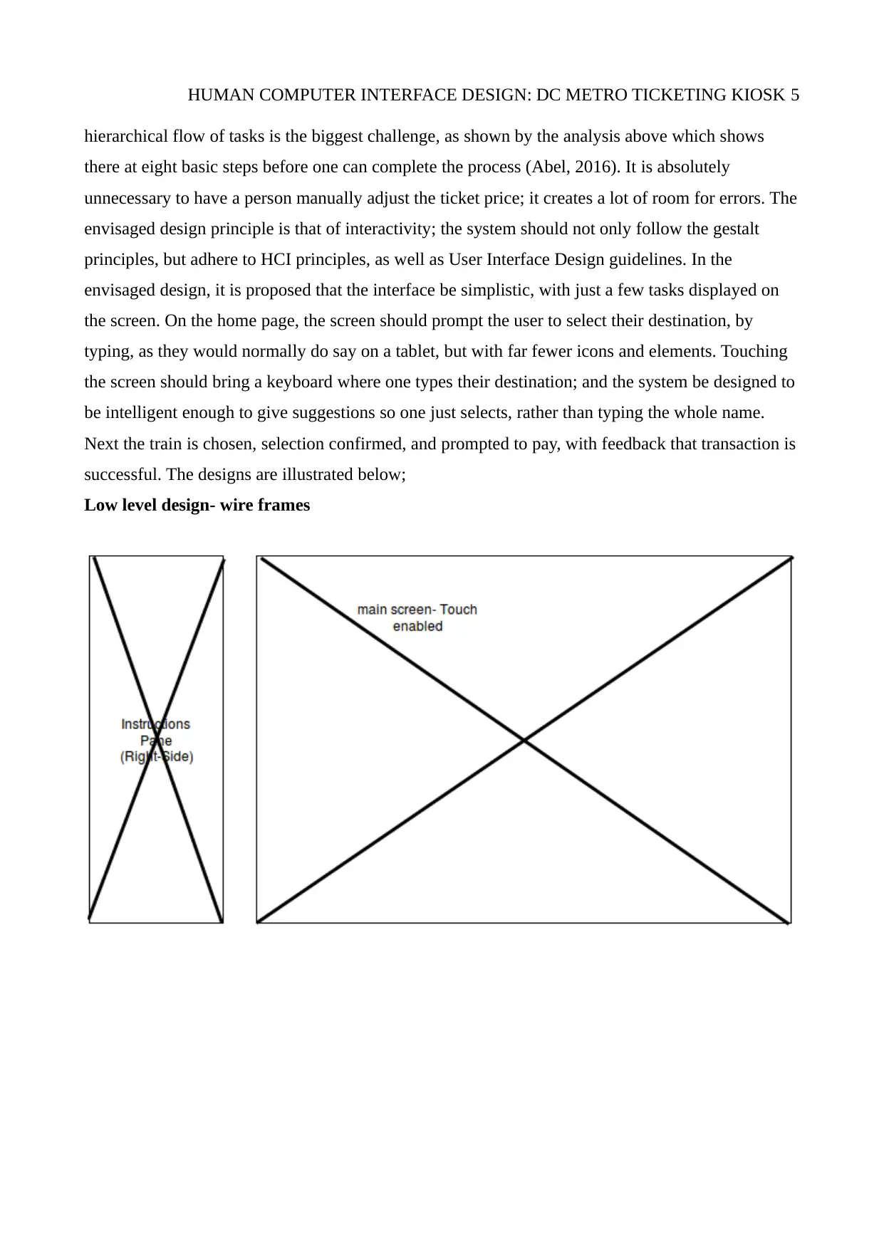
hierarchical flow of tasks is the biggest challenge, as shown by the analysis above which shows
there at eight basic steps before one can complete the process (Abel, 2016). It is absolutely
unnecessary to have a person manually adjust the ticket price; it creates a lot of room for errors. The
envisaged design principle is that of interactivity; the system should not only follow the gestalt
principles, but adhere to HCI principles, as well as User Interface Design guidelines. In the
envisaged design, it is proposed that the interface be simplistic, with just a few tasks displayed on
the screen. On the home page, the screen should prompt the user to select their destination, by
typing, as they would normally do say on a tablet, but with far fewer icons and elements. Touching
the screen should bring a keyboard where one types their destination; and the system be designed to
be intelligent enough to give suggestions so one just selects, rather than typing the whole name.
Next the train is chosen, selection confirmed, and prompted to pay, with feedback that transaction is
successful. The designs are illustrated below;
Low level design- wire frames
HUMAN COMPUTER INTERFACE DESIGN: DC METRO TICKETING KIOSK 6
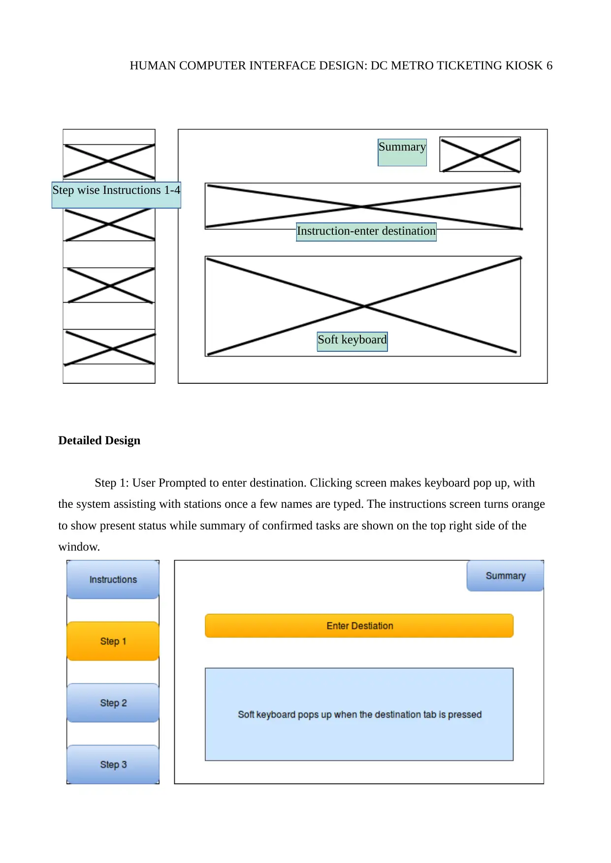
Detailed Design
Step 1: User Prompted to enter destination. Clicking screen makes keyboard pop up, with
the system assisting with stations once a few names are typed. The instructions screen turns orange
to show present status while summary of confirmed tasks are shown on the top right side of the
window.
Step wise Instructions 1-4
SummarySummary
Instruction-enter destination
Soft keyboard
⊘ This is a preview!⊘
Do you want full access?
Subscribe today to unlock all pages.
Trusted by 1+ million students worldwide
HUMAN COMPUTER INTERFACE DESIGN: DC METRO TICKETING KIOSK 7
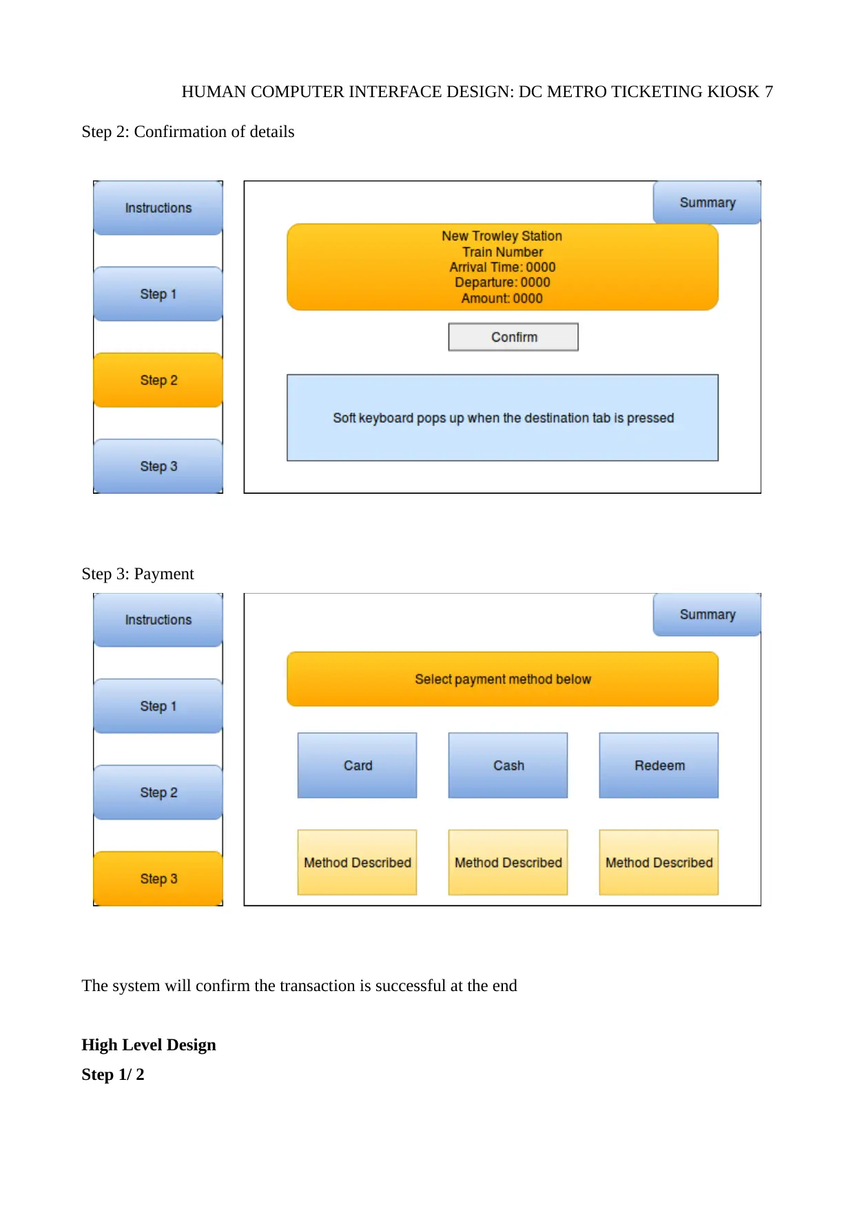
Step 2: Confirmation of details
Step 3: Payment
The system will confirm the transaction is successful at the end
High Level Design
Step 1/ 2
Step 2: Confirmation of details
Step 3: Payment
The system will confirm the transaction is successful at the end
High Level Design
Step 1/ 2
Paraphrase This Document
Need a fresh take? Get an instant paraphrase of this document with our AI Paraphraser
HUMAN COMPUTER INTERFACE DESIGN: DC METRO TICKETING KIOSK 8
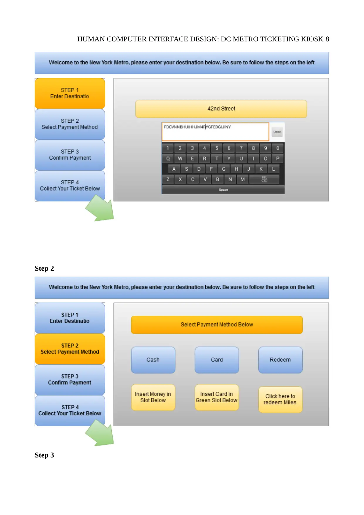
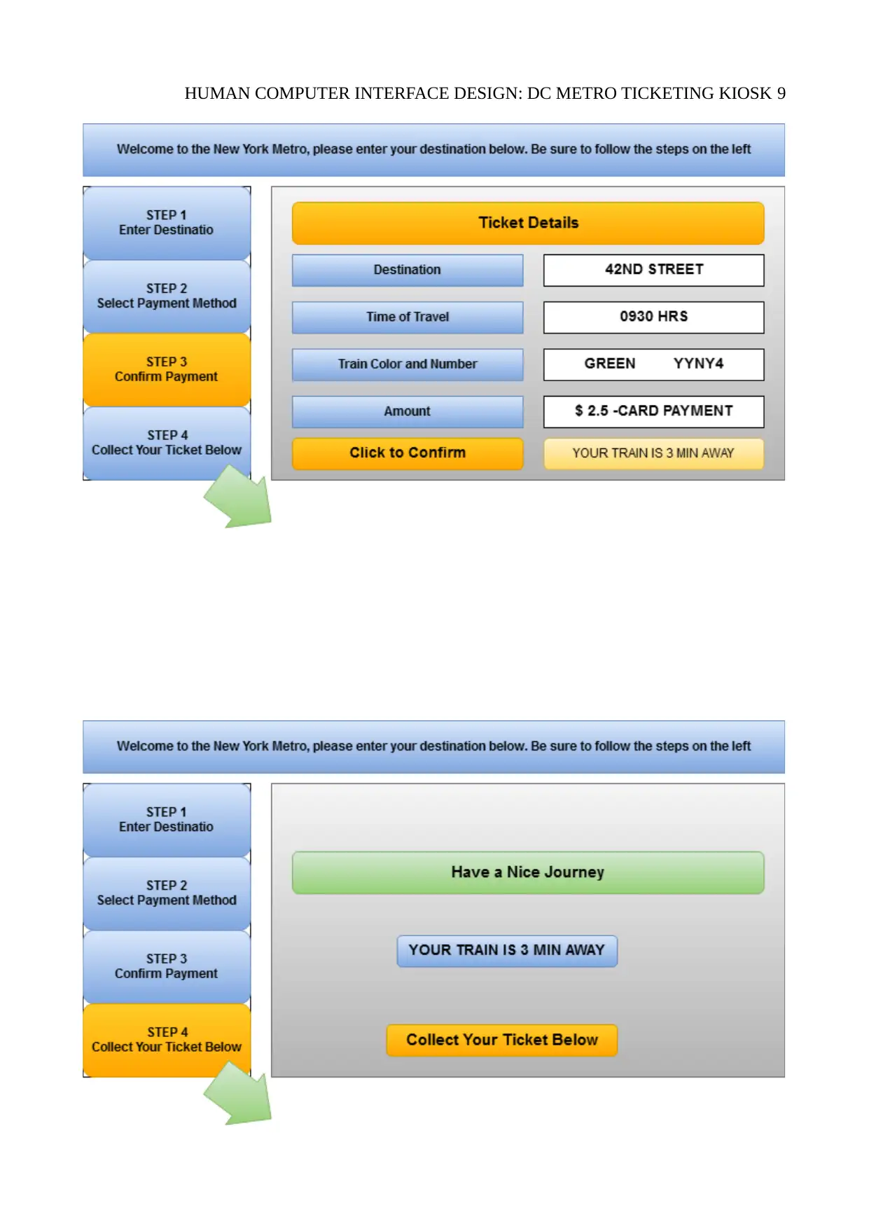
Step 2
Step 3
Step 2
Step 3
HUMAN COMPUTER INTERFACE DESIGN: DC METRO TICKETING KIOSK 9
⊘ This is a preview!⊘
Do you want full access?
Subscribe today to unlock all pages.
Trusted by 1+ million students worldwide
HUMAN COMPUTER INTERFACE DESIGN: DC METRO TICKETING KIOSK 10
Analysis of Design Performance Outcomes
The analysis will center on usability; to perform an effective evaluation, usability will first
be defined, and the parameters that constitute usability set, such as the ease of learning,
memorability, efficiency of use, error frequency and error severity, and subjective satisfaction. The
evaluation will be done to help identify problems and have these resolved in good time (Treu,
2012). The evaluation will start with goals being set: the high level goals include checking to make
sure the interface has consistency for every task window, investigate how use practices are affected
by technology, and improve the existing product usability. To evaluate the usability, users will be
sought to get their views and issues such as the attitudes of the customers to the new interface for
those that have used the existing system and new users; their opinions on its usability will also be
sought (Yuan et al., 2013).
For this design, the evaluation method will entail an interview of users that have used the
system, and whether it meets the design goals, an evaluation of the website at the lab/ development
site, based on HCI and Gestalt design principles, and observation. The survey will generate
qualitative (and quantitative) data that will be used to evaluate the proposed design, and based on
these, changes can be made. Users will be selected randomly in line with the principles of research
reliability and validity and be told the goals of the survey and what the findings will be used for.
The survey will entail a questionnaire and/ or an interview with the selected users and evaluators.
These will be considered before a final design can be developed; whose performance will also be
evaluated (Yuan et al., 2013).
Paraphrase This Document
Need a fresh take? Get an instant paraphrase of this document with our AI Paraphraser
HUMAN COMPUTER INTERFACE DESIGN: DC METRO TICKETING KIOSK 11
References
Abel, C. (2016). The Extended Self: Architecture, Memes and Minds. Oxford: Manchester
University Press.
Johnson, J. C. (2010). Designing with the mind in mind: Simple guide to understanding user
interface design rules. Amsterdam: Morgan Kaufmann Publishers/Elsevier.
Kurosu, M. (2014). Human-Computer Interaction. Theories, Methods, and Tools: 16th
International Conference, HCI International 2014, Heraklion, Crete, Greece, June 22-27,
2014, Proceedings, Part I. Cham: Springer.
Marcus, A. (2013). Design, user experience, and usability. Berlin: Springer.
Treu, S. (2012). User interface evaluation: A structured approach. New York: Plenum Press.
Valverde, R. (2011). Principles of human computer interaction design. Saarbrücken: LAP Lambert
Academic Publishing.
Yuan, M., Finley, G., Long, J., Mills, C. and Johnson, R. (2013). Evaluation of User Interface and
Workflow Design of a Bedside Nursing Clinical Decision Support System. Interactive
Journal of Medical Research, 2(1), p.e4.
1 out of 11
Your All-in-One AI-Powered Toolkit for Academic Success.
+13062052269
info@desklib.com
Available 24*7 on WhatsApp / Email
![[object Object]](/_next/static/media/star-bottom.7253800d.svg)
Unlock your academic potential
Copyright © 2020–2026 A2Z Services. All Rights Reserved. Developed and managed by ZUCOL.