HS2031: Comparative Analysis of Website HCI Principles Report
VerifiedAdded on 2020/03/04
|7
|1622
|89
Report
AI Summary
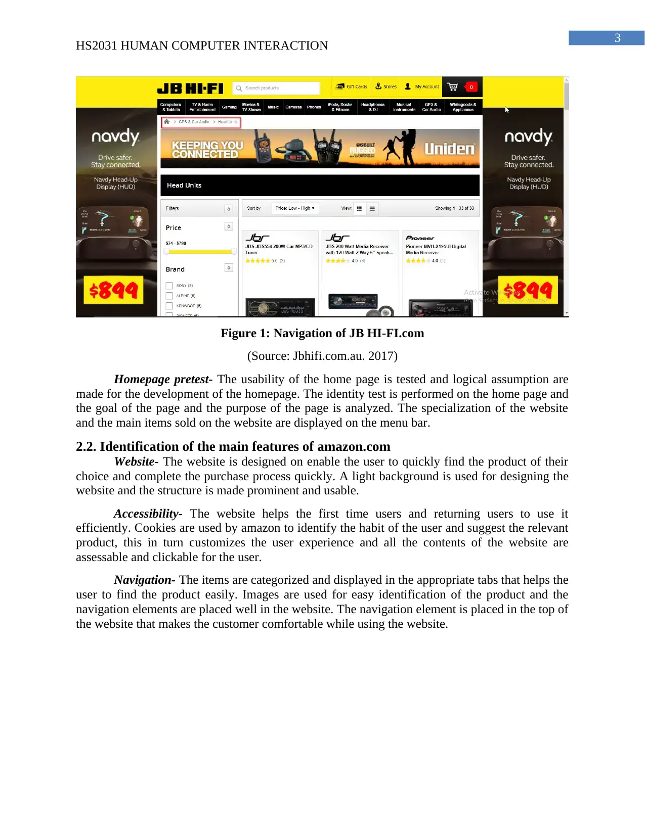
This report provides a comparative analysis of two websites, jbhifi.com.au and amazon.com, focusing on human-computer interaction (HCI) principles. The report begins with an introduction outlining the purpose and objectives, which include assessing the websites' usability, navigation, and design. The discussion section details the main features of each website, including accessibility, navigation, and homepage design, along with visual aids. The analysis employs Shneiderman's Eight Golden Rules of Interface Design to compare and contrast the two sites, highlighting differences in color schemes, font usage, and the application of usability principles. Recommendations are made for improving both websites, such as increasing white space, adding calls to action, and using bullets for better information presentation. The conclusion summarizes the findings, emphasizing the importance of simplicity and usability in website design, and the report references relevant literature on HCI. The goal is to provide insights into effective web design and user experience.

Running head: HS2031 HUMAN COMPUTER INTERACTION
Human Computer Interaction
Name of the Student
Name of the University
Author’s Note
Human Computer Interaction
Name of the Student
Name of the University
Author’s Note
Paraphrase This Document
Need a fresh take? Get an instant paraphrase of this document with our AI Paraphraser

1
HS2031 HUMAN COMPUTER INTERACTION
Table of Contents
1. Introduction......................................................................................................................2
1.1. Purpose.....................................................................................................................2
1.2. Objectives.................................................................................................................2
2. Discussion........................................................................................................................2
2.1. Identification of the main features of jbhifi.com.au.................................................2
2.2. Identification of the main features of amazon.com..................................................3
2.4. Comparison and contrast of the two websites..........................................................4
3. Recommendations............................................................................................................5
4. Conclusion.......................................................................................................................5
Bibliography........................................................................................................................6

2
HS2031 HUMAN COMPUTER INTERACTION
1. Introduction
1.1. Purpose
Two websites are compared with each other and are listed below
1. https://www.jbhifi.com.au/
2. https://www.amazon.com/
The navigation of the website and the visual effect used for designing the website are
analyzed for identification of the human computer interaction. The design and the functionality
of the website are compared and contrasted with each other for the preparation of the report. The
report includes the analysis of the navigation and the performance of the website in terms of
usability. The user interface design principles are evaluated for analysis of the design.
1.2. Objectives
The main objectives of the report are as follows:
To compare and contrast the websites based on the usability, navigation and design
principles
To evaluate the interface design principles and compare the websites for analyzing the
usability
To evaluate the computer system comparing the human computer interaction strategies
2. Discussion
2.1. Identification of the main features of jbhifi.com.au
Website- The website is designed on readymade platform and on the first impression the
website looks attractive and enriched with relevant pictures sold on the website. A yellow and
black colour contrast is used for designing the webpage and all the contents in the website are
clickable.
Accessibility- The contents and the products placed in the website are accessible and the
user can view the details of the product by selecting it. The user can add the item on the cart
from the home page and proceed to checkout. A user account is required for purchasing a
product from the site. The details of the product and the review of the product can also be get
from the product information page of the website.
Navigation- The clickable contents are examined and the placement of the navigation is
consistent and some of the menus have missing hovering action like “stores” and “My account”
on the menu bar. The search bar is optimized for searching relevant product from the website and
it can be refined using some filters.
⊘ This is a preview!⊘
Do you want full access?
Subscribe today to unlock all pages.

Trusted by 1+ million students worldwide

3
HS2031 HUMAN COMPUTER INTERACTION
Figure 1: Navigation of JB HI-FI.com
(Source: Jbhifi.com.au. 2017)
Homepage pretest- The usability of the home page is tested and logical assumption are
made for the development of the homepage. The identity test is performed on the home page and
the goal of the page and the purpose of the page is analyzed. The specialization of the website
and the main items sold on the website are displayed on the menu bar.
2.2. Identification of the main features of amazon.com
Website- The website is designed on enable the user to quickly find the product of their
choice and complete the purchase process quickly. A light background is used for designing the
website and the structure is made prominent and usable.
Accessibility- The website helps the first time users and returning users to use it
efficiently. Cookies are used by amazon to identify the habit of the user and suggest the relevant
product, this in turn customizes the user experience and all the contents of the website are
assessable and clickable for the user.
Navigation- The items are categorized and displayed in the appropriate tabs that helps the
user to find the product easily. Images are used for easy identification of the product and the
navigation elements are placed well in the website. The navigation element is placed in the top of
the website that makes the customer comfortable while using the website.
Paraphrase This Document
Need a fresh take? Get an instant paraphrase of this document with our AI Paraphraser

4
HS2031 HUMAN COMPUTER INTERACTION
Figure 1: Navigation of Amazon.com
(Source: Amazon.com. 2017)
Homepage pretest- The home page of amazon is designed in two folds where the
elements catches the eye of the customer. The layout of the home page is clean with the
navigational section in the left hand side and the search option on the top of the webpage. The
exclusive products are displayed on the home page and the product are shown in categories on
the home page for making it simple for the first time user using the website.
2.4. Comparison and contrast of the two websites
The websites are compared based on the Shneiderman’s Eight Golden Rules of Interface
Design. The eight principles consist of Strive for consistency, Enable frequent users to use
shortcuts, Offer informative feedback, Design dialog to yield closure, Offer simple error
handling, Permit easy reversal of actions, Support internal locus of control and reducing the
short-term memory load.
In case of jbhifi.com.au the colours and the font used for designing the website are awful
and prompt menu and help screen are used in the design of the webpage. The margin and the
padding of the webpage are kept auto and thus the different pages open in the web browser at
different scale and it does not meet the expectation of the user. The home page of the website is
designed with proper line spacing but the font size are not maintained throughout the webpage.
The content of the website is required to be kept short and readable and bullet points are required
to be used such that the user can read the content at a glance.
The website of Amazon.com is kept simple and it is targeted for the first time users to use
the website. The simplicity of the website and the increased use of the white space is the key
factor for the success of the amazon website. Amazon uses the cookies for identification of the
habit of the user and suggest the best product that the user can purchase from the website. The
images used in the website are compressed and thus the loading time is less and provides faster
response than the Jbhifi.com. It also offers simple error handling and the user cannot input error
value in the system and the webpage can detect the error automatically. Informative feedback are

5
HS2031 HUMAN COMPUTER INTERACTION
provided to the user on each and every action which results in a satisfactory result for the
customer.
3. Recommendations
After analyzing both of the website it is recommended that both the websites can be
improved and made unique for attracting more number of customers.
Increased use of white space – For increasing the attention of the user the text and the
titles is required to be covered with a white space. It adds modern look to the website and a
balance between the text and the image is required to be maintained for designing the website.
Addition of calls to action- visual cues is required to be provided such that the user can
determine the content by seeing the image. Colour variation is also important and different
colours is required to be used for different messages. The buttons should also be labelled with
appropriate text for creating a psychological trigger and create a connection between the user and
the website.
Use of bullets- Bullets are required to be used for enabling the user to quickly identify the
information. Cool icons can also be used as bullets and making the website unique from other e
commerce websites.
4. Conclusion
From the above report it can be concluded that the two website are compared are
contrasted according to their usability and design and the main reason behind the success of the
amazon website is the simplicity in the design. The design of jbhifi.com.au is made attractive and
the user may feel that the products and service are forced to them. The shopper might also feel
uncomfortable while using the website because the margin, border and the padding used for the
different pages are different and sometimes inappropriate contents are shown on the website. The
preference of the user is dependent on the usability and simplicity of the website. The interaction
of the people with the computer is analyzed for the identification of the visual effect and the
design principles followed for the development of the websites.
⊘ This is a preview!⊘
Do you want full access?
Subscribe today to unlock all pages.

Trusted by 1+ million students worldwide

6
HS2031 HUMAN COMPUTER INTERACTION
Bibliography
Amazon.com. (2017). Amazon.com: Online Shopping for Electronics, Apparel, Computers,
Books, DVDs & more. [online] Available at: https://www.amazon.com/ [Accessed 19 Aug.
2017].
Jbhifi.com.au. (2017). Auto Navigation, Sound, AV & More at Hot Prices | JB Hi-Fi. [online]
Available at: https://www.jbhifi.com.au/gps-car-audio/ [Accessed 19 Aug. 2017].
Lazar, J., Feng, J.H. and Hochheiser, H., 2017. Research methods in human-computer
interaction. Morgan Kaufmann.
Satyavathy, G. and RachelBlessie, M., 2017. Human–Computer Interaction. Digital Signal
Processing, 9(1), pp.4-6.
Webdesignref.com. (2017). Web Design - The Complete Reference: Chapter 5: Evaluating Web
Sites - Introduction. [online] Available at: http://webdesignref.com/chapters/ch05.htm [Accessed
19 Aug. 2017].
1 out of 7
Related Documents

Your All-in-One AI-Powered Toolkit for Academic Success.
+13062052269
info@desklib.com
Available 24*7 on WhatsApp / Email
Unlock your academic potential
Copyright © 2020–2025 A2Z Services. All Rights Reserved. Developed and managed by ZUCOL.