IMAT 5209 Human Factors: User Interaction Evaluation Report
VerifiedAdded on 2023/06/13
|16
|3742
|75
Report
AI Summary
This report presents a comprehensive user interaction evaluation of Argos and Rakuten, two e-commerce websites, focusing on usability, functionality, visibility, and interface. Using the cognitive walkthrough method, the evaluation assesses the websites from a user's perspective, examining factors like visibility of options, usability of features, interface enjoyment, and functionality effectiveness. The report includes an evaluator's perception of both websites, highlighting their strengths and weaknesses, such as Argos's superior search algorithm and Rakuten's library-style formatting. Through detailed analysis and comparison, the report identifies areas for improvement in both websites to enhance user experience. Desklib provides access to this and many similar assignments for students.
Running head: USER INTERACTION EVALUATION OF ARGOS VS RAKUTEN
USER INTERACTION EVALUATION OF ARGOS VS RAKUTEN
Name of the Student
Name of the University
Author Note
USER INTERACTION EVALUATION OF ARGOS VS RAKUTEN
Name of the Student
Name of the University
Author Note
Paraphrase This Document
Need a fresh take? Get an instant paraphrase of this document with our AI Paraphraser
1USER INTERACTION EVALUATION OF ARGOS VS RAKUTEN
TABLE OF CONTENTS
Interactive system & its users....................................................................................................2
Use cases....................................................................................................................................3
Evaluation methodology............................................................................................................4
Evaluation..................................................................................................................................6
Findings & summary:...............................................................................................................12
Bibliography:............................................................................................................................14
Figure 1: Use case of Online Shopping Websites...................................................................3
2USER INTERACTION EVALUATION OF ARGOS VS RAKUTEN
Interactive system & its users
HCI (Human Computer Interface) has proved itself to be one of the most innovative
technological advancement of the current era. HCI has adopted many different mode and one
of them is the HWI (Human Website Interaction). The objective of the deemed report is to
evaluate two e-commerce website. To attain the discussed objective, the paper has considered
argos.co.uk & rakuten.com as its subject. Both of the subjects are e-commerce shopping
websites however, there offerings are mostly similar to each other. The reason for selecting
websites with same offering lays on the fact that it will be a justifiable competition. While the
first subject (Argos), has its focus on general requirements of day to day life such as clothing,
home appliances & decorative for all age groups. On the contrary, the second subject is
popular for its gaming & relevant offering, even though it offers all the needed services such
as clothing, electronics and others. Argos is popular among a mass group of shoppers while
Rakuten gains its most of the traffic from the game & electronics lovers. The report will
evaluate & compare the usability, functionality, visibility, interface and other crucial factors
of the websites.
⊘ This is a preview!⊘
Do you want full access?
Subscribe today to unlock all pages.
Trusted by 1+ million students worldwide
3USER INTERACTION EVALUATION OF ARGOS VS RAKUTEN
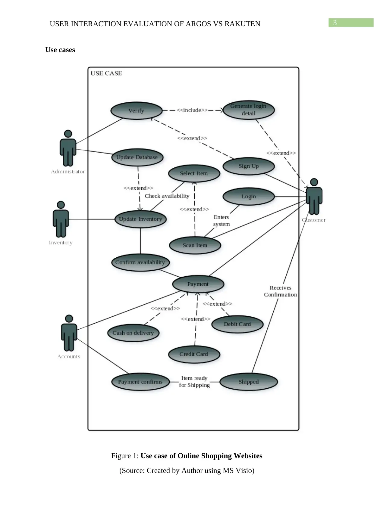
Use cases
Figure 1: Use case of Online Shopping Websites
(Source: Created by Author using MS Visio)
Use cases
Figure 1: Use case of Online Shopping Websites
(Source: Created by Author using MS Visio)
Paraphrase This Document
Need a fresh take? Get an instant paraphrase of this document with our AI Paraphraser
4USER INTERACTION EVALUATION OF ARGOS VS RAKUTEN
The use case diagram above has showed the process of signup to the order shipment
of a general online e-commerce website. The process starts with the customer signing up to
the online shopping which is verified and update in the database by the administrator. After
which the customer scans & selects the item and on getting confirmed about the availability
of the item (which is done by the inventory system) they proceed to the payment option
where they select the mode of payment. After confirmation from accounts department the
order is shipped and the customer gets the confirmation.
Evaluation methodology
Outline : There are various methods for evaluating a website and one of them
is Cognitive walkthrough (CW) method. It has emerged as one of the favourite evaluation
methodology for the evaluators. The reason for the popularity that the user enjoys lays basis
on the simplicity to complex tasks offered by the system. The evaluator in the discussed
methodology evaluates the system from a user’s perspective by answering a set of questions
that has been designed to understand the functionality, usability, visibility and interface of the
system. The following sections and paragraphs offers an insight into the discussed
methodology and how the evaluation method works.
The first step of the deemed evaluation process starts with the perception of the
evaluator who explains his perspective on visiting the website for the first. As the evaluator is
aware of the technical aspects of the website hence, he/she/they judges the website
theoretically and explains their thought. The author perception is not part of the evaluation
but it is done to develop a platform for the real evaluation process. The perception of the
author is taken in consideration to develop the questions that need to be answered from the
perspective of a first time user.
5USER INTERACTION EVALUATION OF ARGOS VS RAKUTEN
The questions that the user answers from the perspective of the user are associated
with four factor. The four factors that formulates the base of the questions in the cognitive
walkthrough evaluation method are visibility, usability, interface and functionality. The
visibility factors discuss the answer to the question of whether or not the options are readily
visible to the first time user. The usability discusses whether or not the evaluated system is
offering the options that the user desires from the interactive system while the interface
decides the comfort that the user enjoys. Finally, the functionality discusses the response
from the available options, are they effective or random.
The question based on the above discussion and the purpose of the report would be as
follows:
Which system offers a clearer and precise visibility to its visitors?
Which of the subject is more structured in the usability department?
Which of the two websites offers more enjoyable interface to the users?
Which of the two discussed system have a clearer and more precisely defined
functionality?
The questions are designed as such because in the discussed report two system are
being evaluated and hence the former are designed to take both the subjects in consideration
by evaluating them individually on the cognitive factors and then compare them to
summarise the results.
The discussed evaluation method is adopted because of the significant benefit offered
by it. The most prominent benefit offered by the cognitive walkthrough evaluation method is
that it offers very little chance of developing any ethical issue as the data from the evaluation
cannot be manipulated. Additionally, the method not only evaluates the challenges but also
offers remedial measures for it. Another significant benefit from the system is
⊘ This is a preview!⊘
Do you want full access?
Subscribe today to unlock all pages.
Trusted by 1+ million students worldwide
6USER INTERACTION EVALUATION OF ARGOS VS RAKUTEN
inexpensiveness and quick evaluation while taking explicit consideration of the user’s work.
The selection of the evaluation method is based on the benefits offered by the methods as
discussed above and on the fact that the discussed method is readily achievable for an
evaluator which even offers reliable results.
Evaluation
Evaluator’s Perception: The first step of the evaluation process is the first perception
of the evaluator after he/she/they visit the website for the first time. The subjects of the paper
are argos.co.uk & rakuten.com and the first perception of the author has been produced in
the following paragraphs.
NOTE: All the images attached in the assignment has been collected from the official
websites of argos and rakuten.
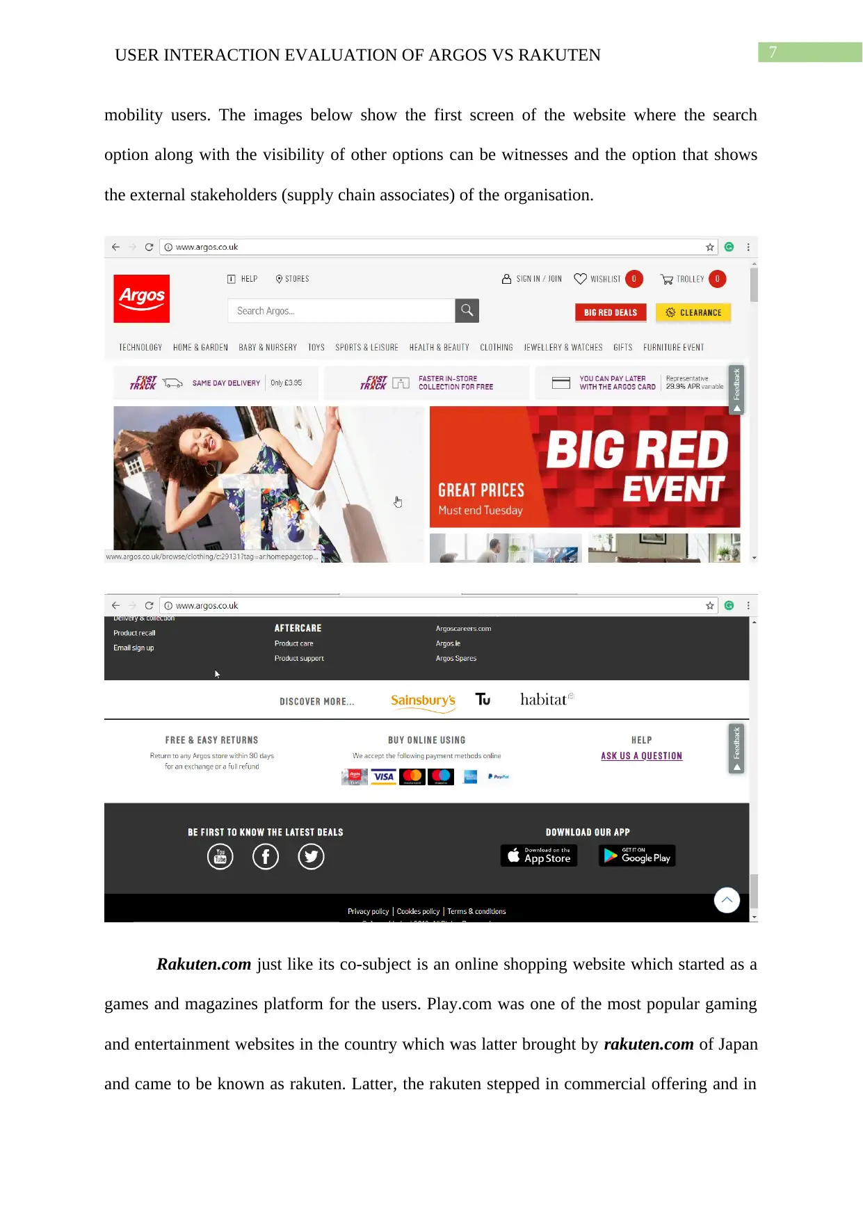
Argos.co.uk is an online shopping website that offers multiple offerings from clothing
to fooding and others. On reviewing the website over different online reviewing cites it was
determined that the discussed website is one of the most preferred choice of shopping for the
online shoppers. Discussing about the design the website is very well-decorated and the
structured. The options available on the site are well placed and are responsive as well.
However, the most vital part of the website as determined by the author is its search option
and algorithm. The search algorithm cites the most suitable results when a keyword is typed.
Additionally, in case the keywords typed is wrong or have some grammatically error then
also, the most similar results for the typed keyword are provided. The usability, visibility and
functionality of the website are also good and one of another notable fact about the website is
that it had options which drifts the user to their supply-chain or sister websites depending on
the selection of the user. The website is even designed to be responsive & dynamic. The
capability of the website to support keyboard makes it even suitable for the blind & low
inexpensiveness and quick evaluation while taking explicit consideration of the user’s work.
The selection of the evaluation method is based on the benefits offered by the methods as
discussed above and on the fact that the discussed method is readily achievable for an
evaluator which even offers reliable results.
Evaluation
Evaluator’s Perception: The first step of the evaluation process is the first perception
of the evaluator after he/she/they visit the website for the first time. The subjects of the paper
are argos.co.uk & rakuten.com and the first perception of the author has been produced in
the following paragraphs.
NOTE: All the images attached in the assignment has been collected from the official
websites of argos and rakuten.
Argos.co.uk is an online shopping website that offers multiple offerings from clothing
to fooding and others. On reviewing the website over different online reviewing cites it was
determined that the discussed website is one of the most preferred choice of shopping for the
online shoppers. Discussing about the design the website is very well-decorated and the
structured. The options available on the site are well placed and are responsive as well.
However, the most vital part of the website as determined by the author is its search option
and algorithm. The search algorithm cites the most suitable results when a keyword is typed.
Additionally, in case the keywords typed is wrong or have some grammatically error then
also, the most similar results for the typed keyword are provided. The usability, visibility and
functionality of the website are also good and one of another notable fact about the website is
that it had options which drifts the user to their supply-chain or sister websites depending on
the selection of the user. The website is even designed to be responsive & dynamic. The
capability of the website to support keyboard makes it even suitable for the blind & low
Paraphrase This Document
Need a fresh take? Get an instant paraphrase of this document with our AI Paraphraser
7USER INTERACTION EVALUATION OF ARGOS VS RAKUTEN
mobility users. The images below show the first screen of the website where the search
option along with the visibility of other options can be witnesses and the option that shows
the external stakeholders (supply chain associates) of the organisation.
Rakuten.com just like its co-subject is an online shopping website which started as a
games and magazines platform for the users. Play.com was one of the most popular gaming
and entertainment websites in the country which was latter brought by rakuten.com of Japan
and came to be known as rakuten. Latter, the rakuten stepped in commercial offering and in
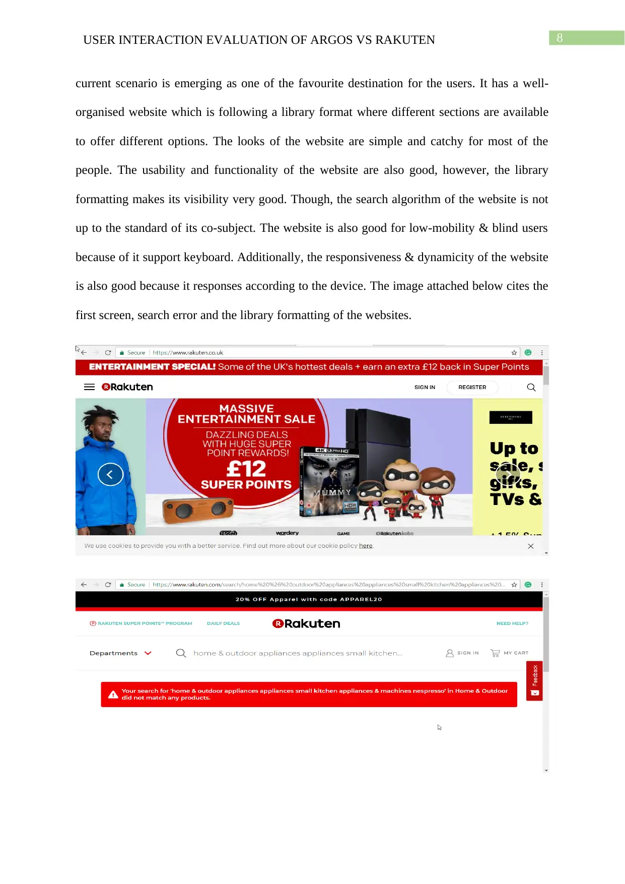
8USER INTERACTION EVALUATION OF ARGOS VS RAKUTEN
current scenario is emerging as one of the favourite destination for the users. It has a well-
organised website which is following a library format where different sections are available
to offer different options. The looks of the website are simple and catchy for most of the
people. The usability and functionality of the website are also good, however, the library
formatting makes its visibility very good. Though, the search algorithm of the website is not
up to the standard of its co-subject. The website is also good for low-mobility & blind users
because of it support keyboard. Additionally, the responsiveness & dynamicity of the website
is also good because it responses according to the device. The image attached below cites the
first screen, search error and the library formatting of the websites.
⊘ This is a preview!⊘
Do you want full access?
Subscribe today to unlock all pages.
Trusted by 1+ million students worldwide
9USER INTERACTION EVALUATION OF ARGOS VS RAKUTEN
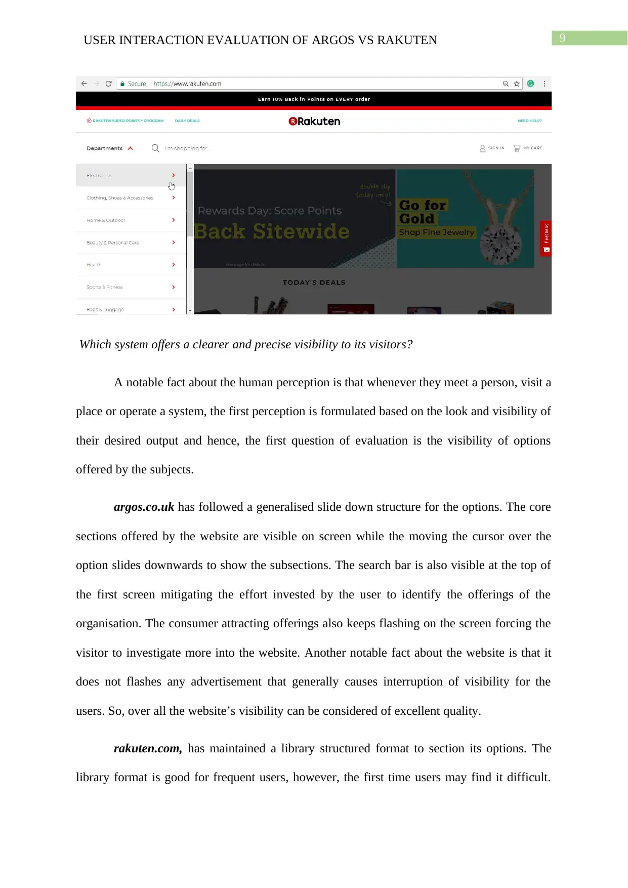
Which system offers a clearer and precise visibility to its visitors?
A notable fact about the human perception is that whenever they meet a person, visit a
place or operate a system, the first perception is formulated based on the look and visibility of
their desired output and hence, the first question of evaluation is the visibility of options
offered by the subjects.
argos.co.uk has followed a generalised slide down structure for the options. The core
sections offered by the website are visible on screen while the moving the cursor over the
option slides downwards to show the subsections. The search bar is also visible at the top of
the first screen mitigating the effort invested by the user to identify the offerings of the
organisation. The consumer attracting offerings also keeps flashing on the screen forcing the
visitor to investigate more into the website. Another notable fact about the website is that it
does not flashes any advertisement that generally causes interruption of visibility for the
users. So, over all the website’s visibility can be considered of excellent quality.
rakuten.com, has maintained a library structured format to section its options. The
library format is good for frequent users, however, the first time users may find it difficult.
Paraphrase This Document
Need a fresh take? Get an instant paraphrase of this document with our AI Paraphraser
10USER INTERACTION EVALUATION OF ARGOS VS RAKUTEN
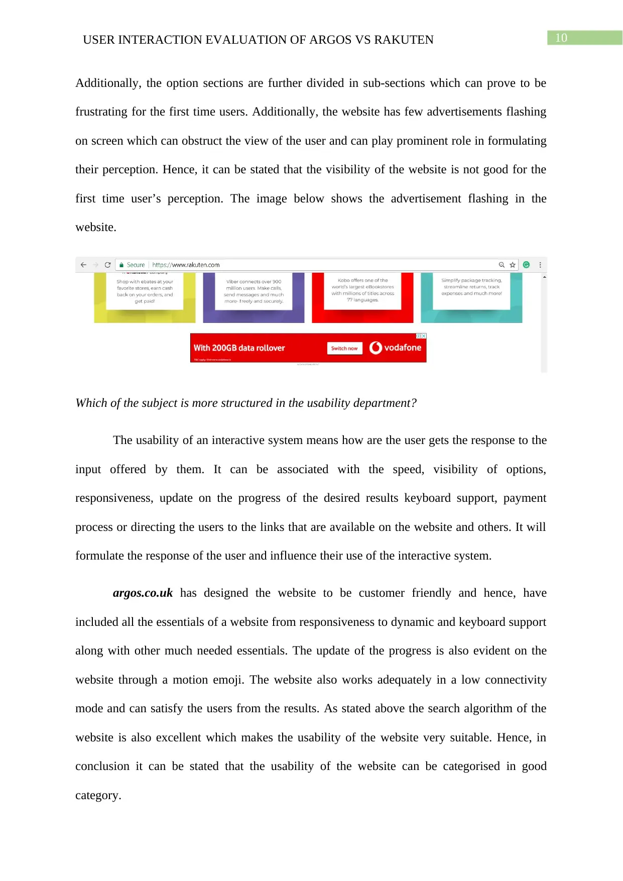
Additionally, the option sections are further divided in sub-sections which can prove to be
frustrating for the first time users. Additionally, the website has few advertisements flashing
on screen which can obstruct the view of the user and can play prominent role in formulating
their perception. Hence, it can be stated that the visibility of the website is not good for the
first time user’s perception. The image below shows the advertisement flashing in the
website.
Which of the subject is more structured in the usability department?
The usability of an interactive system means how are the user gets the response to the
input offered by them. It can be associated with the speed, visibility of options,
responsiveness, update on the progress of the desired results keyboard support, payment
process or directing the users to the links that are available on the website and others. It will
formulate the response of the user and influence their use of the interactive system.
argos.co.uk has designed the website to be customer friendly and hence, have
included all the essentials of a website from responsiveness to dynamic and keyboard support
along with other much needed essentials. The update of the progress is also evident on the
website through a motion emoji. The website also works adequately in a low connectivity
mode and can satisfy the users from the results. As stated above the search algorithm of the
website is also excellent which makes the usability of the website very suitable. Hence, in
conclusion it can be stated that the usability of the website can be categorised in good
category.
11USER INTERACTION EVALUATION OF ARGOS VS RAKUTEN
rakuten.com has its origin rooted to the Japan and took over play.com which was one
of the most appreciated website and hence, the usability of the website is great. It supports all
the essentials of a good interactive website. However, a drawback has been identified and it is
associated with the low connectivity. The website demands high connectivity rate and can
cite error response if the connectivity is not up to the standard of the website. Overall, the
usability of the website is good though, a ‘basic html’ version of the site can be of great
effectiveness.
Which of the two discussed system have a clearer and more precisely defined functionality?
The functionality of the interactive system in the deemed scenario will compare the
response that the user gets and the response they desire, that is it will be evaluated that the
available option avails suitable output to the input.
argos.co.uk did offers suitable response to the input when searched for an item. The
evaluator even attempted to purchase a product and it seemed to be successful. Additionally,
when searched for an item, in the search tab, the outputs were accurate and adequate.
Though, it should be noted that the payment modes available at the bottom of the websites
are attached for no use because when touched they do not offer any details or takes the user to
the checkout step.
rakuten.com on the contrary to its counterpart has limited options available on the
website but has attached only the options that are feasible. The library formatting of the
sections may be time-consuming but offers suitable response to the input. The search options
also offer suitable response to the input though its predictive nature is limited that is in case
the user enters wrong keyword then the system cites no results. The system is capable of
predicting but to a limited capacity.
Which of the two websites offers more enjoyable interface to the users?
⊘ This is a preview!⊘
Do you want full access?
Subscribe today to unlock all pages.
Trusted by 1+ million students worldwide
1 out of 16
Related Documents


Your All-in-One AI-Powered Toolkit for Academic Success.
+13062052269
info@desklib.com
Available 24*7 on WhatsApp / Email
![[object Object]](/_next/static/media/star-bottom.7253800d.svg)
Unlock your academic potential
Copyright © 2020–2026 A2Z Services. All Rights Reserved. Developed and managed by ZUCOL.