De Montfort University: IMAT5209 Usability Evaluation Report
VerifiedAdded on 2023/04/11
|23
|5091
|148
Report
AI Summary
This report presents a usability evaluation of an interactive system, detailing the analysis of usability requirements, the development of use cases, and the selection of appropriate evaluation methodologies. The report begins with an overview of the interactive system, Skullcandy Inc., and its users, followed by the creation of UML use case diagrams to illustrate system functionality. It then outlines key usability requirements, such as navigation simplicity, a linear checkout process, and clear error indications. The evaluation methodology includes the use of questionnaires like SUS, QUIS, CSUQ, and a word-based assessment, administered to a sample of 123 employees. The report concludes with the findings of the evaluation, providing insights into the system's strengths and weaknesses regarding user experience. The report is structured into six parts, covering the system and its users, use cases, usability requirements, evaluation methodology, the evaluation process, and the findings, culminating in a comprehensive analysis of the interactive system's usability.
Running head: USABILITY EVALUATION OF AN INTERACTIVE SYSTEM
Usability Evaluation of an Interactive System
Name of the Student
Name of the University
Author’s note:
Usability Evaluation of an Interactive System
Name of the Student
Name of the University
Author’s note:
Paraphrase This Document
Need a fresh take? Get an instant paraphrase of this document with our AI Paraphraser
1USABILITY EVALUATION OF AN INTERACTIVE SYSTEM
Table of Contents
Part ONE: The interactive system and its users...............................................................................2
Part TWO: The use cases.................................................................................................................3
Part THREE: The usability requirements........................................................................................5
Part FOUR: The evaluation methodology.......................................................................................7
Part FIVE: The evaluation...............................................................................................................9
Part SIX: The findings of the evaluation.......................................................................................14
Conclusion:....................................................................................................................................15
References:....................................................................................................................................17
2USABILITY EVALUATION OF AN INTERACTIVE SYSTEM
Part ONE: The interactive system and its users
Skullcandy Inc. is an American company based in Park City, Utah that markets
headphones, earphones, hands free devices, audio backpacks, MP3 players, and other products.
Skullcandy's products are targeted at the outdoor action sports demographic (snowboarders,
skateboarders, etc.) and general consumer market. Skullcandy products are sold through retailers,
specialty outlets, corporate incentive programs and the company's online store. Skullcandy was
founded by Rick Alden in 2003. The first Skullcandy product, the Skullcandy Portable Link, was
introduced at the 2003 International Consumer Electronics Show (CES) in Las Vegas, Nevada.
The LINK system combines headphones with hands-free cellular technology, allowing users to
listen to music from a portable audio device, while making and receiving calls through their cell
phone. Skullcandy holds a patent for the wireless version of LINK technology.
In 2008, Skullcandy debuted 2XL to the marketplace at all retail stores. In December
2008, Skullcandy products were described as "the world's coolest ear bud," by Fortune magazine.
In April 2011, Skullcandy purchased headphones manufacturer Astro Studios (Astro Gaming)
for an unknown amount of cash. On January 28, 2011, Skullcandy filed for an initial public
offering with the Securities and Exchange Commission. This announcement was met with some
criticism from financial press. On June 24, 2016, Incipio, a maker of phone cases, wireless
speakers, and other accessories announced plans to acquire Skullcandy for $177 million,
however the deal later fell through as Incipio refused to submit a proposed amendment to the
merger agreement and Skullcandy terminated the agreement. Skullcandy considered numerous
other offers, eventually agreeing to be acquired by Mill Road Capital for $196.9 million at $6.35
per share. The deal was finalized and completed on October 3, 2016, and the company became a
private business again.
⊘ This is a preview!⊘
Do you want full access?
Subscribe today to unlock all pages.
Trusted by 1+ million students worldwide
3USABILITY EVALUATION OF AN INTERACTIVE SYSTEM
We currently sell into a broad spectrum of retailers, including those focused on consumer
electronics, such as Best Buy, those focused on sporting goods, such as Dick’s Sporting Goods
and large retailers, such as Wal-Mart, Target and Fred Meyer. We are selective about the
national retail partners that we align with as well as with the product mix we offer to these
retailers in order to reinforce our Skullcandy's brand positioning as the original performance
lifestyle audio brand, Astro Gaming's brand positioning as the premium leader of gaming
headphones that lives at the epicenter of technology, lifestyle and design.
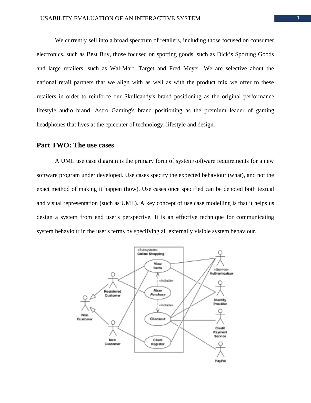
Part TWO: The use cases
A UML use case diagram is the primary form of system/software requirements for a new
software program under developed. Use cases specify the expected behaviour (what), and not the
exact method of making it happen (how). Use cases once specified can be denoted both textual
and visual representation (such as UML). A key concept of use case modelling is that it helps us
design a system from end user's perspective. It is an effective technique for communicating
system behaviour in the user's terms by specifying all externally visible system behaviour.
We currently sell into a broad spectrum of retailers, including those focused on consumer
electronics, such as Best Buy, those focused on sporting goods, such as Dick’s Sporting Goods
and large retailers, such as Wal-Mart, Target and Fred Meyer. We are selective about the
national retail partners that we align with as well as with the product mix we offer to these
retailers in order to reinforce our Skullcandy's brand positioning as the original performance
lifestyle audio brand, Astro Gaming's brand positioning as the premium leader of gaming
headphones that lives at the epicenter of technology, lifestyle and design.
Part TWO: The use cases
A UML use case diagram is the primary form of system/software requirements for a new
software program under developed. Use cases specify the expected behaviour (what), and not the
exact method of making it happen (how). Use cases once specified can be denoted both textual
and visual representation (such as UML). A key concept of use case modelling is that it helps us
design a system from end user's perspective. It is an effective technique for communicating
system behaviour in the user's terms by specifying all externally visible system behaviour.
Paraphrase This Document
Need a fresh take? Get an instant paraphrase of this document with our AI Paraphraser
4USABILITY EVALUATION OF AN INTERACTIVE SYSTEM
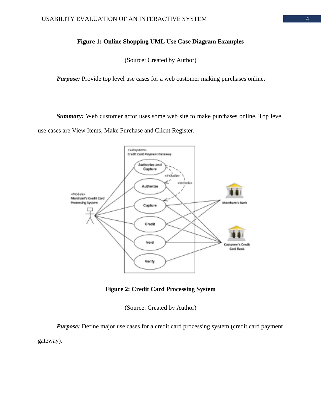
Figure 1: Online Shopping UML Use Case Diagram Examples
(Source: Created by Author)
Purpose: Provide top level use cases for a web customer making purchases online.
Summary: Web customer actor uses some web site to make purchases online. Top level
use cases are View Items, Make Purchase and Client Register.
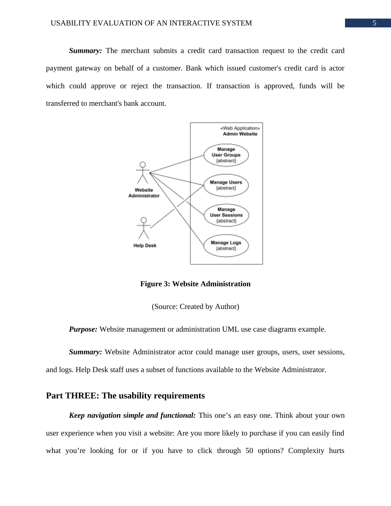
Figure 2: Credit Card Processing System
(Source: Created by Author)
Purpose: Define major use cases for a credit card processing system (credit card payment
gateway).
Figure 1: Online Shopping UML Use Case Diagram Examples
(Source: Created by Author)
Purpose: Provide top level use cases for a web customer making purchases online.
Summary: Web customer actor uses some web site to make purchases online. Top level
use cases are View Items, Make Purchase and Client Register.
Figure 2: Credit Card Processing System
(Source: Created by Author)
Purpose: Define major use cases for a credit card processing system (credit card payment
gateway).
5USABILITY EVALUATION OF AN INTERACTIVE SYSTEM
Summary: The merchant submits a credit card transaction request to the credit card
payment gateway on behalf of a customer. Bank which issued customer's credit card is actor
which could approve or reject the transaction. If transaction is approved, funds will be
transferred to merchant's bank account.
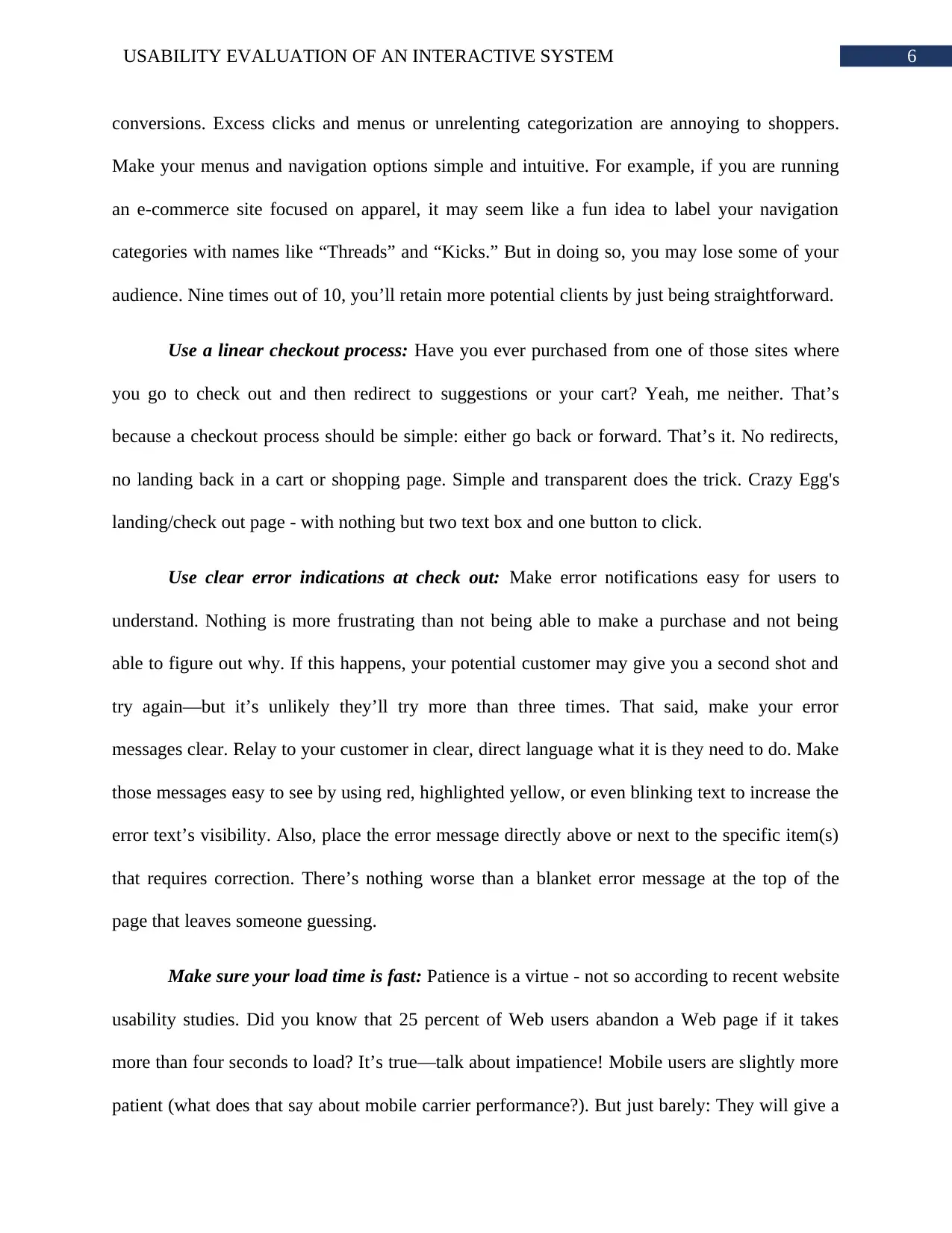
Figure 3: Website Administration
(Source: Created by Author)
Purpose: Website management or administration UML use case diagrams example.
Summary: Website Administrator actor could manage user groups, users, user sessions,
and logs. Help Desk staff uses a subset of functions available to the Website Administrator.
Part THREE: The usability requirements
Keep navigation simple and functional: This one’s an easy one. Think about your own
user experience when you visit a website: Are you more likely to purchase if you can easily find
what you’re looking for or if you have to click through 50 options? Complexity hurts
Summary: The merchant submits a credit card transaction request to the credit card
payment gateway on behalf of a customer. Bank which issued customer's credit card is actor
which could approve or reject the transaction. If transaction is approved, funds will be
transferred to merchant's bank account.
Figure 3: Website Administration
(Source: Created by Author)
Purpose: Website management or administration UML use case diagrams example.
Summary: Website Administrator actor could manage user groups, users, user sessions,
and logs. Help Desk staff uses a subset of functions available to the Website Administrator.
Part THREE: The usability requirements
Keep navigation simple and functional: This one’s an easy one. Think about your own
user experience when you visit a website: Are you more likely to purchase if you can easily find
what you’re looking for or if you have to click through 50 options? Complexity hurts
⊘ This is a preview!⊘
Do you want full access?
Subscribe today to unlock all pages.
Trusted by 1+ million students worldwide
6USABILITY EVALUATION OF AN INTERACTIVE SYSTEM
conversions. Excess clicks and menus or unrelenting categorization are annoying to shoppers.
Make your menus and navigation options simple and intuitive. For example, if you are running
an e-commerce site focused on apparel, it may seem like a fun idea to label your navigation
categories with names like “Threads” and “Kicks.” But in doing so, you may lose some of your
audience. Nine times out of 10, you’ll retain more potential clients by just being straightforward.
Use a linear checkout process: Have you ever purchased from one of those sites where
you go to check out and then redirect to suggestions or your cart? Yeah, me neither. That’s
because a checkout process should be simple: either go back or forward. That’s it. No redirects,
no landing back in a cart or shopping page. Simple and transparent does the trick. Crazy Egg's
landing/check out page - with nothing but two text box and one button to click.
Use clear error indications at check out: Make error notifications easy for users to
understand. Nothing is more frustrating than not being able to make a purchase and not being
able to figure out why. If this happens, your potential customer may give you a second shot and
try again—but it’s unlikely they’ll try more than three times. That said, make your error
messages clear. Relay to your customer in clear, direct language what it is they need to do. Make
those messages easy to see by using red, highlighted yellow, or even blinking text to increase the
error text’s visibility. Also, place the error message directly above or next to the specific item(s)
that requires correction. There’s nothing worse than a blanket error message at the top of the
page that leaves someone guessing.
Make sure your load time is fast: Patience is a virtue - not so according to recent website
usability studies. Did you know that 25 percent of Web users abandon a Web page if it takes
more than four seconds to load? It’s true—talk about impatience! Mobile users are slightly more
patient (what does that say about mobile carrier performance?). But just barely: They will give a
Paraphrase This Document
Need a fresh take? Get an instant paraphrase of this document with our AI Paraphraser
7USABILITY EVALUATION OF AN INTERACTIVE SYSTEM
page up to 10 seconds to load. And there are no second chances: three of five people won’t
return to a site they abandon due to slow load times. Adding further insult to injury, an increase
of just one second in your site’s page load time can cause a nearly seven percent decline in your
conversion rates. Time is money and consumers are not a patient breed. All it takes is mere
seconds to lose a sale. So make sure you’re working with a good, reliable hosting company; your
success depends on their performance.
Automate your search: Finally—and this one should go without saying—make sure to
include a search feature on your site. Some people will come to you knowing exactly what that
they want and, if they can’t find it within seconds, are likely to abandon your site. Upgrade your
search feature to have auto-complete functionality. This is the functionality Google uses, for
example, to finish your sentence before you have typed it. Not only does it make it easier for
visitors to find what they are looking for, but it also gives you horizontal sales potential by
suggesting things within the arena in which they are already searching.
Part FOUR: The evaluation methodology
We decided to limit ourselves to our own questionnaire plus those in the published
literature that we believed could be adapted to evaluating websites. The questionnaires we used
were as follows:
1. SUS (System Usability Scale): This questionnaire, developed at Digital Equipment
Corp., consists of ten questions. It was adapted by replacing the word “system” in every question
with “website”. Each question is a statement and a rating on a fivepoint scale of “Strongly
Disagree” to “Strongly Agree”.
8USABILITY EVALUATION OF AN INTERACTIVE SYSTEM
2. QUIS (Questionnaire for User Interface Satisfaction): The original questionnaire,
developed at the University of Maryland, was composed of 27 questions. We dropped three that
did not seem to be appropriate to websites (e.g., “Remembering names and use of commands”).
The term “system” was replaced by “website”, and the term “screen” was generally replaced by
“web page”. Each question is a rating on a ten-point scale with appropriate anchors at each end
(e.g., “Overall Reaction to the Website: Terrible … Wonderful”).
3. CSUQ (Computer System Usability Questionnaire): This questionnaire, developed at
IBM, is composed of 19 questions. The term “system” or “computer system” was A Comparison
of Questionnaires for Assessing Website Usability UPA 2004 Presentation. Page 2 replaced by
“website”. Each question is a statement and a rating on a seven-point scale of “Strongly
Disagree” to “Strongly Agree”.
4. Words (adapted from Microsoft’s Product Reaction Cards): This questionnaire is based
on the 118 words used by Microsoft on their Product Reaction Cards [1]. (We are grateful to
Joey Benedek and Trish Miner of Microsoft for providing the complete list.) Each word was
presented with a check-box and the user was asked to choose the words that best describe their
interaction with the website. They were free to choose as many or as few words as they wished.
5. Our Questionnaire: This is one that we have been using for several years in usability
tests of websites. It is composed of nine statements (e.g., “This website is visually appealing”) to
which the user responds on a seven-point scale from “Strongly Disagree” to “Strongly Agree”.
The points of the scale are numbered -3, -2, -1, 0, 1, 2, 3. Thus, there is an obvious neutral point
at 0. Note that other tools designed as commercial services for evaluating website usability were
not included in this study. Some of these tools use their own proprietary questionnaires and some
allow for the construction of your own.
⊘ This is a preview!⊘
Do you want full access?
Subscribe today to unlock all pages.
Trusted by 1+ million students worldwide
9USABILITY EVALUATION OF AN INTERACTIVE SYSTEM
The entire study was conducted online via our company’s Intranet. A total of 123 of our
employees participated in the study. Each participant was randomly assigned to one of the five
questionnaire conditions. Each was asked to perform two tasks on each of two wellknown
personal financial information sites: finance.Yahoo.com and Kiplinger.com. (In the rest of this
paper they will simply be referred to as Site 1 and Site 2. No relationship between the site
numbers and site names should be assumed.) The two tasks were as follows:
1. Find the highest price in the past year for a share of. (Note that a different company
was used in each task.)
2. Find the mutual fund with the highest 3-year return. The order of presentation of the
two sites was randomized so that approximately half of the participants received Site 1 first and
half received Site 2 first. After completing (or at least attempting) the two tasks on a site, the user
was presented with the questionnaire for their randomly selected condition. Thus, each user
completed the same questionnaire for the two sites. (Technically, “questionnaires” was a
between-subjects variable and “sites” was a within-subjects variable.)
Part FIVE: The evaluation
Despite the importance of good usability in e-commerce websites, few studies were
found in the literature that evaluated the usability of such sites. Those that were found employed
usability methods that involved either users or evaluators in the process of identifying usability
problems. This section reviews these studies. The usability of e-commerce websites and was
aimed at investigating those factors that affect the usability of such websites. The researchers
asked sixteen users to complete tasks on four e-commerce websites (two of these sites sold
clothing and two sold products) and report what they liked and disliked, as well as what would
Paraphrase This Document
Need a fresh take? Get an instant paraphrase of this document with our AI Paraphraser
10USABILITY EVALUATION OF AN INTERACTIVE SYSTEM
encourage or discourage them from purchasing a product on each site. Major design problems
encountered by users while interacting with the sites were identified and, based on them, the
researchers provided suggestions for improving the usability of e-commerce sites. Importance in
identifying actual users’ interaction with sites and despite the fact that it is the most efficient
technique to evaluate the usability of such sites. However, they employed observation as a user
testing method followed by a post-test questionnaire. The results proved the success of the user
testing method in identifying various usability problems on the three sites based on the
observations and users’ preferences; these results were used to establish guidelines for improving
usability.
Investigate the usability of four electronic supermarkets. The heuristic guidelines that
were used included the ten heuristics developed by Nielsen (mentioned in Section 3.4.1) in
addition to three new heuristics: support for and extending the user’s current skills, pleasurable
and respectful interaction with the user, and protection of personal information. Criteria were
developed for each heuristic to facilitate a detailed evaluation of the sites. A checklist was also
developed from the set of criteria to obtain quantitative results regarding the seriousness of each
interface’s usability problem. The results demonstrated the usefulness of the heuristic evaluation
method regarding its ability to identify a large number of usability problems (weaknesses) and a
large number of good design features (strengths) of the sites.
They developed a comprehensive set of e-commerce design guidelines that were used as
heuristics by web experts to evaluate the usability of e-commerce sites. Several usability
problems were identified by experts and users by means of employing heuristic evaluation and
the user testing method (using post-test questionnaires) on the selected South African e-
commerce sites which proved the success of these methods in identifying a comprehensive set of
11USABILITY EVALUATION OF AN INTERACTIVE SYSTEM
usability problems. Then, significant usability problems were identified by considering the
positive correlation between the problems identified by each method. The authors indicated that
these addressed design issues that should be taken into consideration when designing any
ecommerce site in South Africa.
Evaluation procedure: All user testing sessions followed the same procedure. Data were
gathered using screen capture software (Camtasia) with five questionnaires and observations of
the users working through the tasks. The user session began with the researcher welcoming the
user and reading the test script that explained the objectives of the study, the number of websites
that would be evaluated, number of questionnaires that needed to be filled out, and the user’s
right to withdraw from the session at any time. It was also explained to the user that that he/she
would be observed and his/her screen would be recorded using screen capture software
(Camtasia) during the session. The user was then asked to read and sign the consent form. After
signing the consent form, a pre-test questionnaire was given to the user to fill out in order to
obtain information regarding his/her background and experience. Using a familiarisation task at
the beginning of the usability tests so that the user would get used to the tested site before the
session started. After the exploration, the user was given the tasks for a particular website from
the three tested sites. The time for each task was determined beforehand and checked throughout
the pilot study. As the user worked on each task, the observer noted the sequence of pages, the
time taken to complete each task, and any comments made by the user.
After completing the tasks for the tested website, the user was given the posttest
questionnaire to fill out in order to get his/her feedback. Then the user took a break before
beginning to test the second website. A similar procedure was followed by the user while testing
the second and third sites. After completing the post-test questionnaire for the third website, the
⊘ This is a preview!⊘
Do you want full access?
Subscribe today to unlock all pages.
Trusted by 1+ million students worldwide
1 out of 23
Your All-in-One AI-Powered Toolkit for Academic Success.
+13062052269
info@desklib.com
Available 24*7 on WhatsApp / Email
![[object Object]](/_next/static/media/star-bottom.7253800d.svg)
Unlock your academic potential
Copyright © 2020–2026 A2Z Services. All Rights Reserved. Developed and managed by ZUCOL.