Immunology Report: ELISA Test, Standard Curve and Histogram Analysis
VerifiedAdded on 2020/04/13
|12
|1872
|65
Report
AI Summary
This report delves into the field of immunology, specifically focusing on the Enzyme-Linked Immunosorbent Assay (ELISA) technique. It outlines the principles of ELISA, including its different types and applications in measuring and recognizing proteins. The report details the process of creating a standard curve and a histogram graph using Microsoft Excel, crucial tools for data analysis in ELISA experiments. It explains the steps involved in formatting the axes, adding trendlines, and calculating values from the standard curve equation. Furthermore, the report includes an analysis of sample data, comparing concentration values with those derived from the standard curve, and presents the results of a t-test to assess the significance of the findings. The conclusion summarizes the key aspects of the report, emphasizing the importance of immunology and ELISA in biomedical research.

Immunology
Paraphrase This Document
Need a fresh take? Get an instant paraphrase of this document with our AI Paraphraser
Table of Contents
Introduction.........................................................................................................................................2
ELISA Test...........................................................................................................................................2
Creation of Histogram Graph............................................................................................................6
Analysis of data in Standard Curve...................................................................................................8
Conclusion............................................................................................................................................8
References............................................................................................................................................9
Introduction
Immunology is one of the branches in the biomedical science which deals with the
correspondence of any type of organism for an antigenic challenge and it recognizes what is
self and which is not self. This branch deals with the physical, chemical and biological
properties of any organism. The immune system can be broadly classified into two different
categories known as Innate Immune system and Adaptive Immune system. The term
immunology is responsible for the physiological functions of the immune system in terms of
both the health and disease. It is also used to determine the malfunctions of the immune
system.
ELISA Test
ELISA stands for Enzyme Linked Immunosorbent Assay. ELISA is an immunological
technique which can be used for measuring and recognizing the protein cell from the
supernatant, urine, blood serums and other (Dr Ananya Mandal, 2017). There are different
types of Elisa known as Direct Elisa, Indirect Elisa, Sandwich Elisa and Competitive Elisa.
Direct Elisa is the fundamental and quickest types among all the types of Elisa. The detection
that is expressed by the presence of the fluorescent labels on the antibodies. Indirect Elisa is a
sensitive and consisted enzyme linked antibody. Sandwich Elisa includes two types namely
direct and indirect sandwich Elisa. This type of Elisa has the ability for measuring the antigen
from the sample values. Sandwich Elisa has the specificity and the sensitivity character.
Competitive Elisa is similar to Direct Elisa in which the antigens are directly in binding with
the well (Euromabnet.com, 2017). This type proves that the concetration of the antigen is
inversely proportional with the colour that is being visible on the result. The upcoming
sections are the explanation of the steps that are involved in designing the standard curve and
the histogram graph for the given optical density values and concentration values that are
obtained from the results of the ELISA test (Abcam.com, 2017). This generation of standard
curve and the histogram graph is performed in the MS Excel which reads the data from the
sheet and produces the results in the form of graphical representation (Karem et al., 2002).
The standard curve generation and the formation of histogram in microsoft excel is explained
step by step in the upcoming sections.
Chart Title and Axis Titles
The first step in the generation of the standard curve is the eveluation of the mean of the
optical density values that are generated from the results of the experiment. The optical
density values are expressed in a table. Determine the mean value for the values of the
⊘ This is a preview!⊘
Do you want full access?
Subscribe today to unlock all pages.
Trusted by 1+ million students worldwide
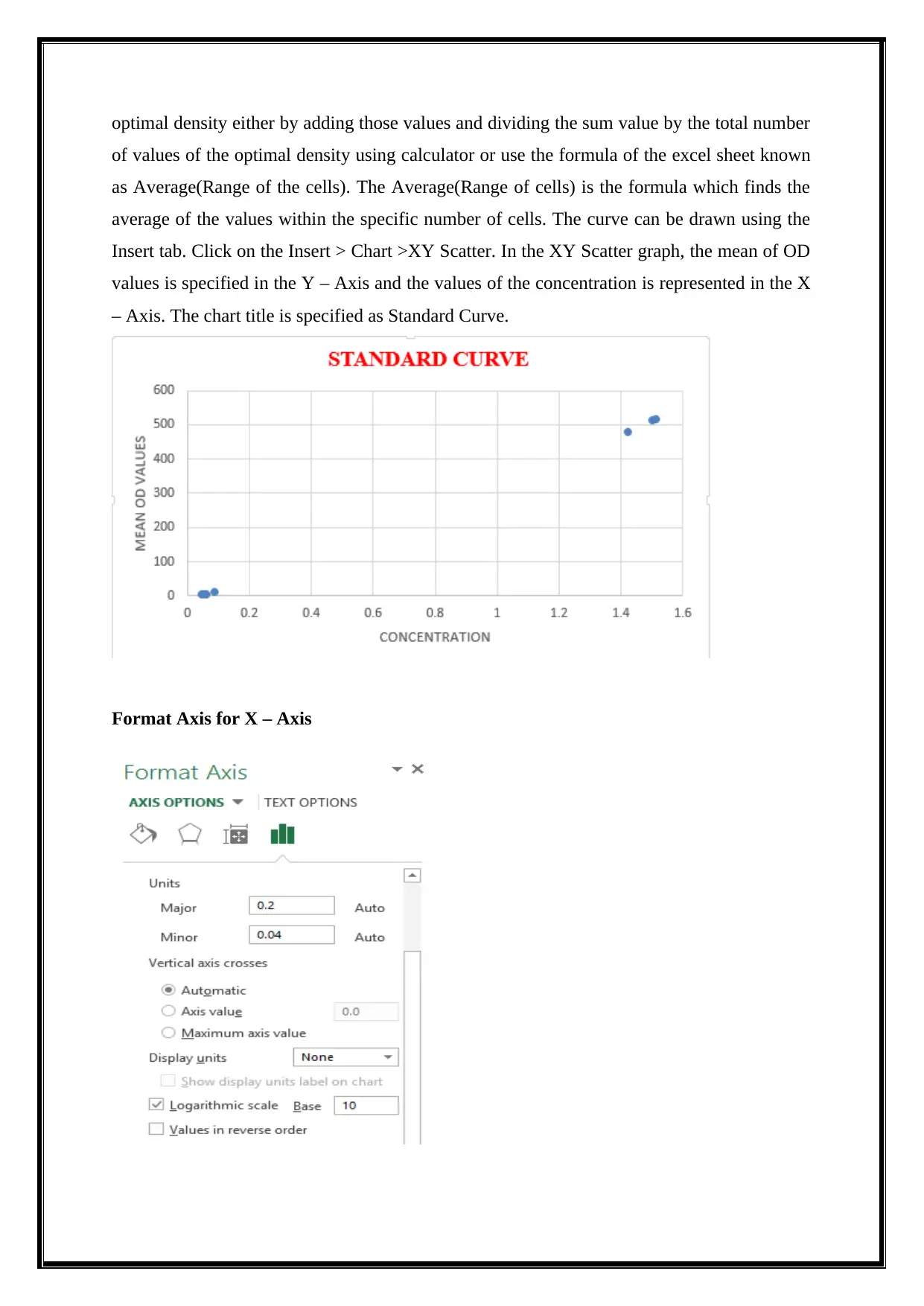
optimal density either by adding those values and dividing the sum value by the total number
of values of the optimal density using calculator or use the formula of the excel sheet known
as Average(Range of the cells). The Average(Range of cells) is the formula which finds the
average of the values within the specific number of cells. The curve can be drawn using the
Insert tab. Click on the Insert > Chart >XY Scatter. In the XY Scatter graph, the mean of OD
values is specified in the Y – Axis and the values of the concentration is represented in the X
– Axis. The chart title is specified as Standard Curve.
Format Axis for X – Axis
Paraphrase This Document
Need a fresh take? Get an instant paraphrase of this document with our AI Paraphraser
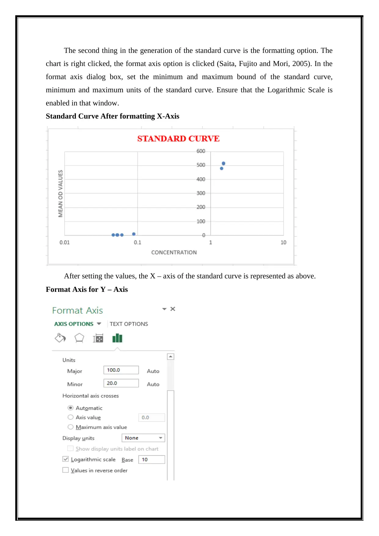
The second thing in the generation of the standard curve is the formatting option. The
chart is right clicked, the format axis option is clicked (Saita, Fujito and Mori, 2005). In the
format axis dialog box, set the minimum and maximum bound of the standard curve,
minimum and maximum units of the standard curve. Ensure that the Logarithmic Scale is
enabled in that window.
Standard Curve After formatting X-Axis
After setting the values, the X – axis of the standard curve is represented as above.
Format Axis for Y – Axis
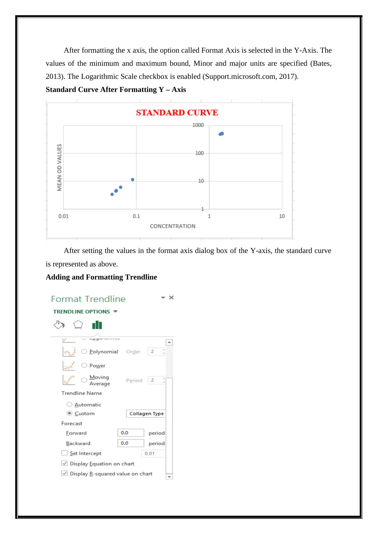
After formatting the x axis, the option called Format Axis is selected in the Y-Axis. The
values of the minimum and maximum bound, Minor and major units are specified (Bates,
2013). The Logarithmic Scale checkbox is enabled (Support.microsoft.com, 2017).
Standard Curve After Formatting Y – Axis
After setting the values in the format axis dialog box of the Y-axis, the standard curve
is represented as above.
Adding and Formatting Trendline
⊘ This is a preview!⊘
Do you want full access?
Subscribe today to unlock all pages.
Trusted by 1+ million students worldwide
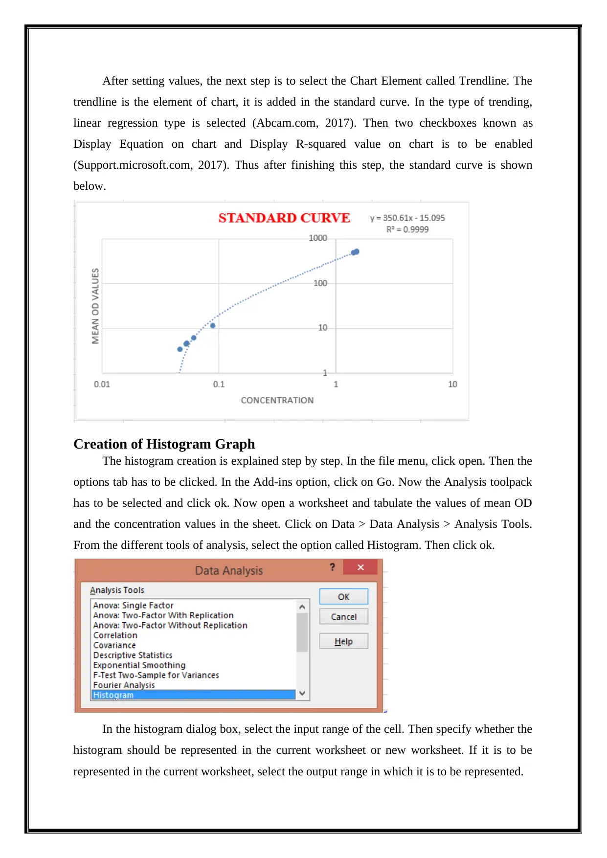
After setting values, the next step is to select the Chart Element called Trendline. The
trendline is the element of chart, it is added in the standard curve. In the type of trending,
linear regression type is selected (Abcam.com, 2017). Then two checkboxes known as
Display Equation on chart and Display R-squared value on chart is to be enabled
(Support.microsoft.com, 2017). Thus after finishing this step, the standard curve is shown
below.
Creation of Histogram Graph
The histogram creation is explained step by step. In the file menu, click open. Then the
options tab has to be clicked. In the Add-ins option, click on Go. Now the Analysis toolpack
has to be selected and click ok. Now open a worksheet and tabulate the values of mean OD
and the concentration values in the sheet. Click on Data > Data Analysis > Analysis Tools.
From the different tools of analysis, select the option called Histogram. Then click ok.
In the histogram dialog box, select the input range of the cell. Then specify whether the
histogram should be represented in the current worksheet or new worksheet. If it is to be
represented in the current worksheet, select the output range in which it is to be represented.
Paraphrase This Document
Need a fresh take? Get an instant paraphrase of this document with our AI Paraphraser
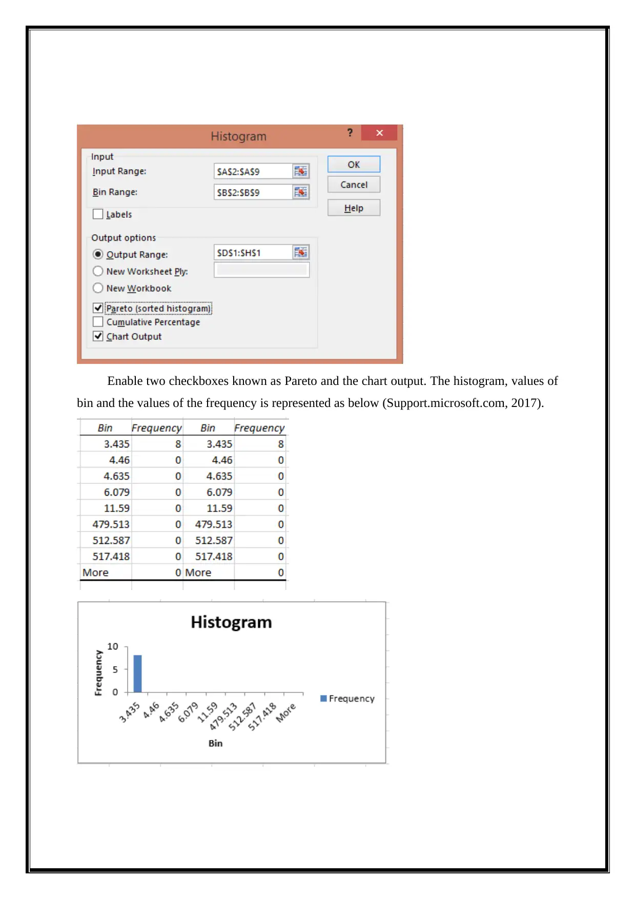
Enable two checkboxes known as Pareto and the chart output. The histogram, values of
bin and the values of the frequency is represented as below (Support.microsoft.com, 2017).
bin and the values of the frequency is represented as below (Support.microsoft.com, 2017).
Analysis of data in Standard Curve
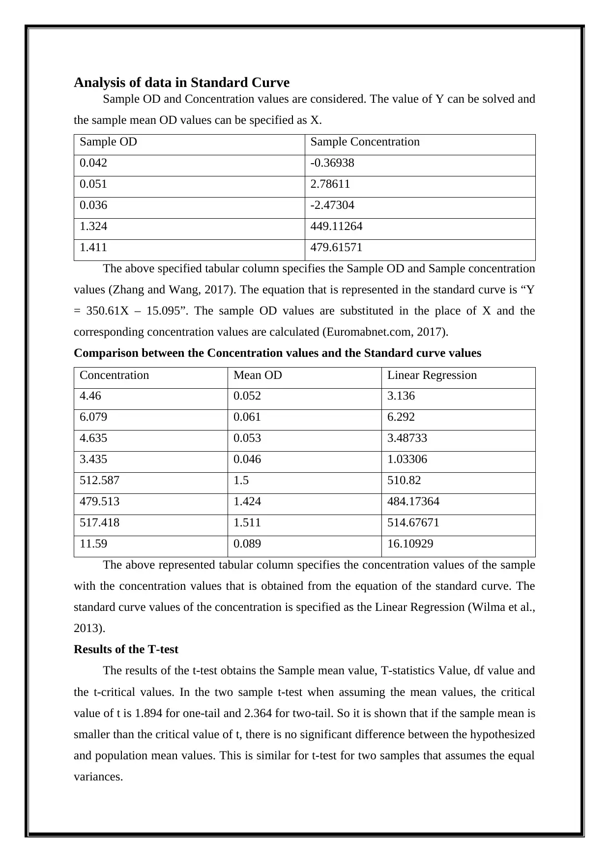
Sample OD and Concentration values are considered. The value of Y can be solved and
the sample mean OD values can be specified as X.
Sample OD Sample Concentration
0.042 -0.36938
0.051 2.78611
0.036 -2.47304
1.324 449.11264
1.411 479.61571
The above specified tabular column specifies the Sample OD and Sample concentration
values (Zhang and Wang, 2017). The equation that is represented in the standard curve is “Y
= 350.61X – 15.095”. The sample OD values are substituted in the place of X and the
corresponding concentration values are calculated (Euromabnet.com, 2017).
Comparison between the Concentration values and the Standard curve values
Concentration Mean OD Linear Regression
4.46 0.052 3.136
6.079 0.061 6.292
4.635 0.053 3.48733
3.435 0.046 1.03306
512.587 1.5 510.82
479.513 1.424 484.17364
517.418 1.511 514.67671
11.59 0.089 16.10929
The above represented tabular column specifies the concentration values of the sample
with the concentration values that is obtained from the equation of the standard curve. The
standard curve values of the concentration is specified as the Linear Regression (Wilma et al.,
2013).
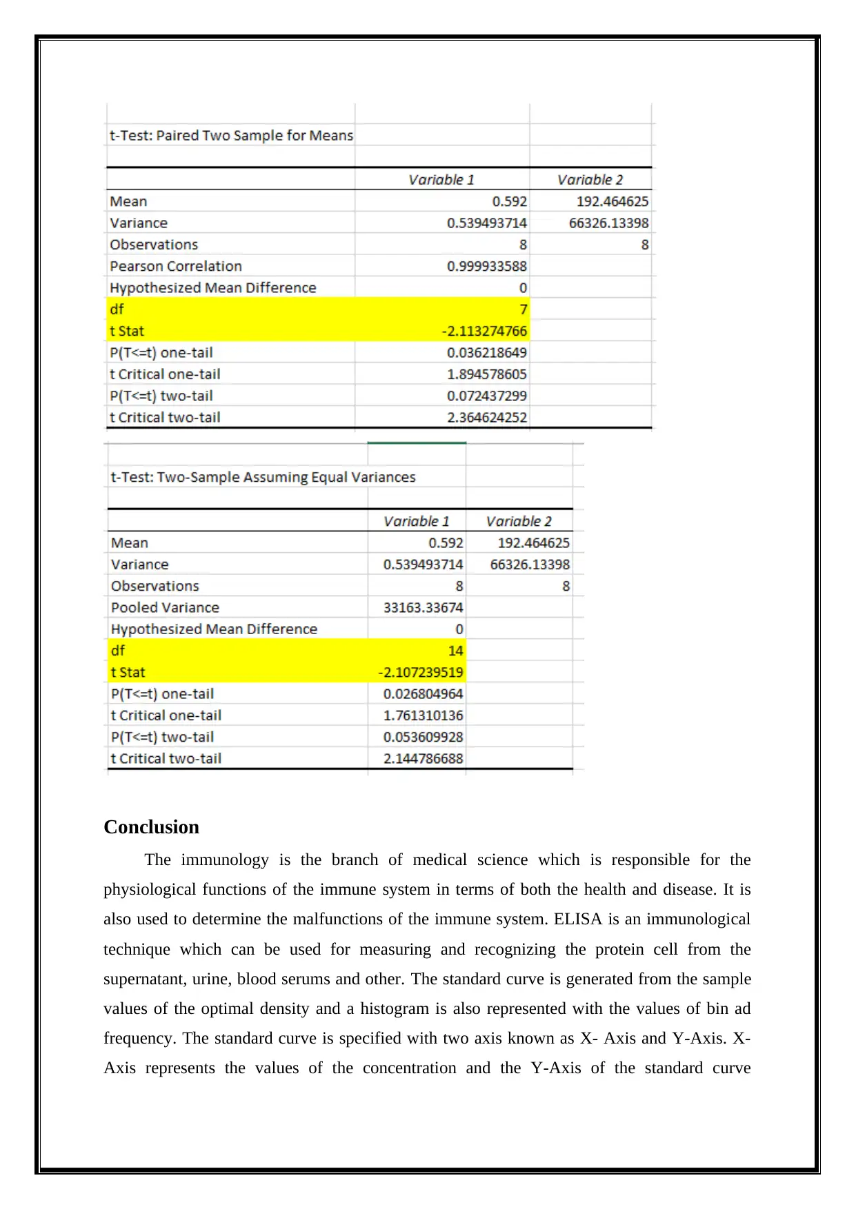
Results of the T-test
The results of the t-test obtains the Sample mean value, T-statistics Value, df value and
the t-critical values. In the two sample t-test when assuming the mean values, the critical
value of t is 1.894 for one-tail and 2.364 for two-tail. So it is shown that if the sample mean is
smaller than the critical value of t, there is no significant difference between the hypothesized
and population mean values. This is similar for t-test for two samples that assumes the equal
variances.
Sample OD and Concentration values are considered. The value of Y can be solved and
the sample mean OD values can be specified as X.
Sample OD Sample Concentration
0.042 -0.36938
0.051 2.78611
0.036 -2.47304
1.324 449.11264
1.411 479.61571
The above specified tabular column specifies the Sample OD and Sample concentration
values (Zhang and Wang, 2017). The equation that is represented in the standard curve is “Y
= 350.61X – 15.095”. The sample OD values are substituted in the place of X and the
corresponding concentration values are calculated (Euromabnet.com, 2017).
Comparison between the Concentration values and the Standard curve values
Concentration Mean OD Linear Regression
4.46 0.052 3.136
6.079 0.061 6.292
4.635 0.053 3.48733
3.435 0.046 1.03306
512.587 1.5 510.82
479.513 1.424 484.17364
517.418 1.511 514.67671
11.59 0.089 16.10929
The above represented tabular column specifies the concentration values of the sample
with the concentration values that is obtained from the equation of the standard curve. The
standard curve values of the concentration is specified as the Linear Regression (Wilma et al.,
2013).
Results of the T-test
The results of the t-test obtains the Sample mean value, T-statistics Value, df value and
the t-critical values. In the two sample t-test when assuming the mean values, the critical
value of t is 1.894 for one-tail and 2.364 for two-tail. So it is shown that if the sample mean is
smaller than the critical value of t, there is no significant difference between the hypothesized
and population mean values. This is similar for t-test for two samples that assumes the equal
variances.
⊘ This is a preview!⊘
Do you want full access?
Subscribe today to unlock all pages.
Trusted by 1+ million students worldwide
Conclusion
The immunology is the branch of medical science which is responsible for the
physiological functions of the immune system in terms of both the health and disease. It is
also used to determine the malfunctions of the immune system. ELISA is an immunological
technique which can be used for measuring and recognizing the protein cell from the
supernatant, urine, blood serums and other. The standard curve is generated from the sample
values of the optimal density and a histogram is also represented with the values of bin ad
frequency. The standard curve is specified with two axis known as X- Axis and Y-Axis. X-
Axis represents the values of the concentration and the Y-Axis of the standard curve
Paraphrase This Document
Need a fresh take? Get an instant paraphrase of this document with our AI Paraphraser
represents the values of the optimal density. The mean value is calculated for the optimal
density. The mean OD is compared with the concentration values using the standard curve.
References
Abcam.com. (2017). Control samples required for ELISA | Abcam. [online] Available at:
http://www.abcam.com/protocols/control-samples-required-for-elisa-protocol#1
[Accessed 6 Dec. 2017].
Abcam.com. (2017). ELISA data: calculating and evaluating | Abcam. [online] Available at:
http://www.abcam.com/protocols/calculating-and-evaluating-elisa-data [Accessed 6 Dec.
2017].
Bates, J. (2013). Learning curve. Nursing Standard, 27(37), pp.26-27.
Dr Ananya Mandal, M. (2017). What is Immunology?. [online] News-Medical.net. Available
at: https://www.news-medical.net/health/What-is-Immunology.aspx [Accessed 6 Dec.
2017].
Euromabnet.com. (2017). Positive and negative controls for antibody validation.
EuroMAbNet. [online] Available at: https://www.euromabnet.com/guidelines/positive-
negative-controls.php [Accessed 6 Dec. 2017].
Karem, K., Poon, A., Bierl, C., Nisenbaum, R. and Unger, E. (2002). Optimization of a
Human Papillomavirus-Specific Enzyme-Linked Immunosorbent Assay. Clinical and
Vaccine Immunology, 9(3), pp.577-582.
Saita, T., Fujito, H. and Mori, M. (2005). A Specific and Sensitive Assay for Gefitinib Using
the Enzyme-Linked Immunosorbent Assay in Human Serum. Biological &
Pharmaceutical Bulletin, 28(10), pp.1833-1837.
Support.microsoft.com. (2017). Microsoft Support. [online] Available at:
https://support.microsoft.com/en-us/help/214269/how-to-use-the-histogram-tool-in-excel
[Accessed 6 Dec. 2017].
Wilma, B., Diogo, S., Maria, A., Mirian, P. and Michelly, T. (2013). Comparative evaluation
of rK39 and soluble antigen ELISA, IFAT and parasitological test for the diagnosis of
Canine Visceral Leishmaniasis. Frontiers in Immunology, 4.
Zhang, Y. and Wang, H. (2017). A Novel Histogram-corrected Quadratic Histogram
Equalization Image Enhancement Method. DEStech Transactions on Social Science,
Education and Human Science, (icsste).
Equalization Image Enhancement Method. DEStech Transactions on Social Science,
Education and Human Science, (icsste).
⊘ This is a preview!⊘
Do you want full access?
Subscribe today to unlock all pages.
Trusted by 1+ million students worldwide
1 out of 12

Your All-in-One AI-Powered Toolkit for Academic Success.
+13062052269
info@desklib.com
Available 24*7 on WhatsApp / Email
![[object Object]](/_next/static/media/star-bottom.7253800d.svg)
Unlock your academic potential
Copyright © 2020–2026 A2Z Services. All Rights Reserved. Developed and managed by ZUCOL.