Usability Evaluation of Interactive System: Ao.com and ee.co.uk
VerifiedAdded on 2021/04/16
|23
|5755
|124
Report
AI Summary
This report presents a usability evaluation of interactive systems, specifically comparing the e-commerce websites Ao.com and ee.co.uk. The study employs the cognitive walkthrough method to assess the user experience, examining aspects such as website navigation, search functionality, and overall user-friendliness. The report begins with a description of interactive systems, highlighting the importance of usability and design in the relationship between users and technology. It then describes the use cases considered, including diagrams of the e-commerce websites. The evaluation procedure, based on the cognitive walkthrough method, is outlined, along with the questions used to assess user interactions. The evaluation section details the author's personal opinions on each website, considering factors like design, navigation, and responsiveness. The report concludes with findings and recommendations for improving the usability of the websites, offering valuable insights for designers and developers aiming to create more user-centered online shopping experiences. The report also considers the importance of user-centered design and the need to satisfy users by improving the quality of work, increasing productivity, reducing costs, and enhancing user satisfaction.
Running head: USABILITY EVALUATION OF AN INTERACTIVE SYSTEM
Usability Evaluation of an Interactive System
Name of student
Name of University
Author’s Note
Usability Evaluation of an Interactive System
Name of student
Name of University
Author’s Note
Paraphrase This Document
Need a fresh take? Get an instant paraphrase of this document with our AI Paraphraser
1USABILITY EVALUATION OF AN INTERACTIVE SYSTEM
Table of Contents
Part 1: Description of interactive system.....................................................................................................2
User Description..........................................................................................................................................2
Part 2: Use Case system considered............................................................................................................4
Descriptions of the use cases.......................................................................................................................5
Part 3: Evaluation Procedure.......................................................................................................................6
Part 4: Evaluation:.......................................................................................................................................8
Part 5: Findings..........................................................................................................................................14
Bibliography..............................................................................................................................................16
2USABILITY EVALUATION OF AN INTERACTIVE SYSTEM
Part 1: Description of interactive system
This paper give the knowledge of an interactive system design by choosing an e-
commerce website and comparing between them. Interactive System is the development and
designs of a system that becomes an important part of our lives (Baumer et. al. 2014). The
usability and design of the systems have some effect on the quality relationship between the
people and the technology. Embedded devices, web applications, games and many more are all
part of the interactive system design. In the interactive system design, every phase depends on
the purpose to serve the design and creation of the product (Segonds et al. 2016). This system of
technology will incorporate with some logical design in an electronic form and complete the task
to achieve the goals. An interactive system designer recognizes the diversity in the process as the
users keeps on changing the process every time (Delamare, Coutrix and Nigay 2015). The
system thus accept the input from the user and provide information as output to the user. There
are many examples of interactive system design. Among which two of the system, Ao.com and
ee.co.uk will be discussed in this paper.
User Description
Based on the principle of user-centered design, it is important to satisfy the users. During
the process of designing a website, the user interaction is considered, and find ways to satisfy the
user to enjoy efficiently and effectively (Bilgihan 2016). In order to understand the requirements
⊘ This is a preview!⊘
Do you want full access?
Subscribe today to unlock all pages.
Trusted by 1+ million students worldwide
3USABILITY EVALUATION OF AN INTERACTIVE SYSTEM
and needs of the users, the quality of the work needs to be enhanced, productivity has to be
increase, the costs of training and support has to be reduce, and improve the satisfaction of the
user.
In the traditional shopping, the user develops an interaction with the physical shop and
determine the users’ impression with the shop. However, in the case of electronic shopping, user
has to make their initial interaction with the Web site for shopping (Bilgihan and Bujisic 2015).
A comprehensive image has been presented with the design of the shop. The electronic shop has
formulated the working environment of the Website which became critical for the users to have a
user-friendly environment and get the desired results (Lammers and Palumbo 2017). Thus, the
web based usability evaluation of the e-commerce website provides a concrete prescriptions
expected to develop a user-centred electronic shops were the sales volume are achieved as per
the need of the users’ (de Lima Salgado, Pereira and Freire 2016). There is some existing
research done on the electronic shopping were usability evaluation were not paid much attention.
Throughout the study the paper will discuss about the users of the “Online Shopping System” for
the interactive system design. This paper will concentrate on the usability problems in the human
interaction with the online website.
Paraphrase This Document
Need a fresh take? Get an instant paraphrase of this document with our AI Paraphraser
4USABILITY EVALUATION OF AN INTERACTIVE SYSTEM
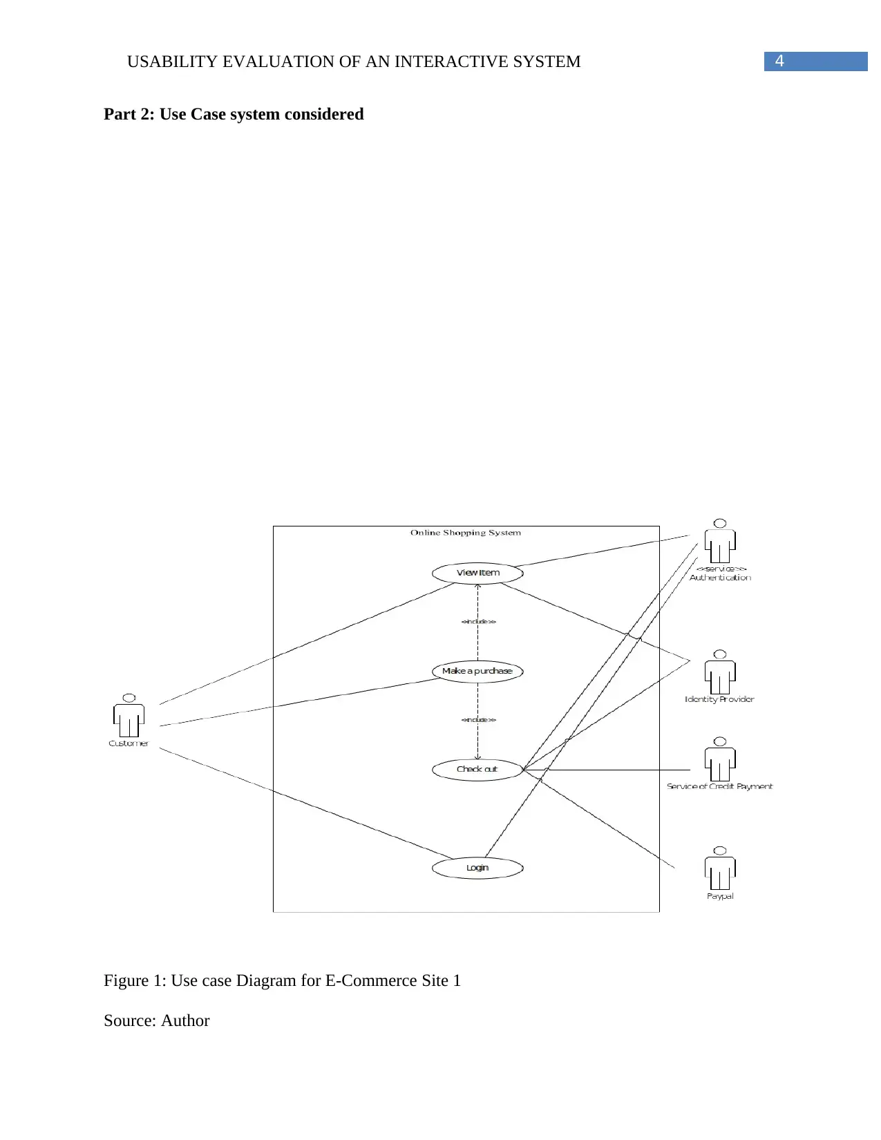
Part 2: Use Case system considered
Figure 1: Use case Diagram for E-Commerce Site 1
Source: Author
Part 2: Use Case system considered
Figure 1: Use case Diagram for E-Commerce Site 1
Source: Author
5USABILITY EVALUATION OF AN INTERACTIVE SYSTEM
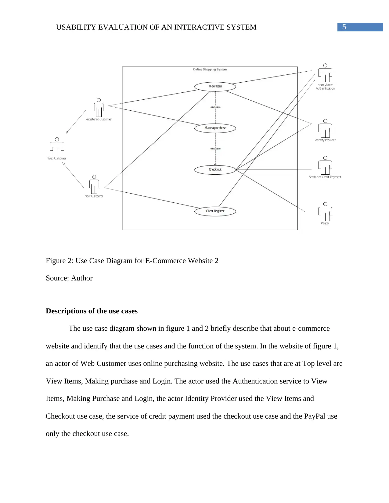
Figure 2: Use Case Diagram for E-Commerce Website 2
Source: Author
Descriptions of the use cases
The use case diagram shown in figure 1 and 2 briefly describe that about e-commerce
website and identify that the use cases and the function of the system. In the website of figure 1,
an actor of Web Customer uses online purchasing website. The use cases that are at Top level are
View Items, Making purchase and Login. The actor used the Authentication service to View
Items, Making Purchase and Login, the actor Identity Provider used the View Items and
Checkout use case, the service of credit payment used the checkout use case and the PayPal use
only the checkout use case.
⊘ This is a preview!⊘
Do you want full access?
Subscribe today to unlock all pages.
Trusted by 1+ million students worldwide
6USABILITY EVALUATION OF AN INTERACTIVE SYSTEM
In the website of figure 2, the actor of Web Customer uses online purchasing website.
The use cases that are at Top level are View Items, Making purchase and Client Register. The
top level use case used by the customer is the View Items were the customer wanted to only see
some items. The use case of Making Purchase is the part of the Use cases. The use case of Client
Register allows web site registry of the customer to get coupon or being invited for private sales.
The use case of Checkout is included use case which is part of Making Purchase.
Part 3: Evaluation Procedure
Inspection of the usability can be done through Cognitive Walkthrough evaluation
where judgement being done by the estimators that are usability specialists or experts for each of
the user interface element
Usability is a system design concept that is use to design a software application for people to use
it in a practical and convenient way (Urh, Vukovic and Jereb 2015). It define the user-friendly
way of the system, service or product. In the formative evaluation, evaluation is being approach
through usability inspections or the reviews of the experts. The major usability inspections
techniques include:
Cognitive Walkthrough: This method of usability evaluation based on the cognitive
theory. During the process of evaluation, it was found that Cognitive Walkthrough is the
method of evaluation that work through a series of one or more evaluators who evaluate the task
and provide a set of question from user perspective for usability testing (Solano et al. 2016). The
tool of Cognitive Walkthrough was design to evaluate the e-commerce website and identify the
best and worst part of the site (Ko, Latoza and Burnett 2015). The user might have little or no
experience about using the website. With this software development tool it would be easier to
understand the experience of the new and the existing users. The method provide access to users
Paraphrase This Document
Need a fresh take? Get an instant paraphrase of this document with our AI Paraphraser
7USABILITY EVALUATION OF AN INTERACTIVE SYSTEM
without first hand. It explicitly takes the user task for usability inspection. It provide suggestions
to improve system learning that can be applied during the development phase. Skills of the
evaluators is limited for Data value (Harb, Sarnikar and El-Gayar 2015). The tool need user
interface, a Persona or profile of the user, a list of task that are needed in the Walkthrough to
specify the task from starting to end.
In this study the Cognitive Walkthrough is conducted in a group that include the
organizer to prepare a walkthrough team that can follow the ground rule (Li and Liew 2015).
Evaluators represents the product team that include business analysts, usability practitioners,
requirement engineers, writers, developers and trainers. There is less chance of any ethical issues
that can be arise during the evaluation process. The fact about the method is deemed for the
evaluator to evaluate the participants’ views and will examine the personal experience of the user
who will be using the website for the first time Best, Manktelow and Taylor 2014). While
evaluating the website both the participant and the author has to keep in mind that the evaluation
would be unbiased. However, the participant will be provide with survey that contains their
review and feedback of using the website and what they have experience. There are some risk to
the evaluation that will be done for both the website. User who generally use online shopping
website may experience more familiar issue than the one who use it for the first time. It is not a
challenge to conduct a cognitive walkthrough if the list of task is prepare well and spend some
time and expense for it to get the appropriate result of the feedback that different customer
provided (GhasemAghaei, Arya and Biddle 2015). Ao.com review has provide excellent service
to the customer and an easy way to place the order. The user fined it pleased to purchase and
think of ordering again. Ee.co.uk has review from user that the site has many problem with
placing and ordering and delivering the services. They found even the customer service
8USABILITY EVALUATION OF AN INTERACTIVE SYSTEM
experience is very poor. User check the list of the items from the website, select and purchase
order by making payment and there is a choice for the user to register and login then follow the
same process of placing the order. The services may be depend on the experience of the
customer when they receive there order. Assistance will be provided to those who need order
related information. It has happen that the user were not able to access the website when the
connectivity is low. This is the significant challenges faced by the users. All this will be
evaluated in the walkthrough method. The walkthrough team have certain systems features that
answer the desired questions. During the evaluation, each action will be assess by the evaluator
with four question related to the user thoughts and actions that needs to be answered.
Test Question:
The evaluation is the first step that will define the questions of things that has to be achieved.
The following question will be evaluate in the whole paper
Q1: The first question evaluate the user similarity level and the responses
Q2: The second question consider the visibility option and evaluate whether they are correctly
noticeable
Q3: The third question asks for associated user to take appropriate action against the expected
outcome
Q4: The forth question check whether the progress is visible to the user when any appropriate
selection being made.
Part 4: Evaluation:
Two of the most well-known online shopping websites in the UK are AO.com and the
ee.co.uk. The paper will consider both of the website to evaluate them individually using
cognitive walkthrough method to identify the most appropriate website of both of them. The
⊘ This is a preview!⊘
Do you want full access?
Subscribe today to unlock all pages.
Trusted by 1+ million students worldwide
9USABILITY EVALUATION OF AN INTERACTIVE SYSTEM
evaluation will consider the four basic questions of the discussed method and will attempt at
finding the results.
The first step in the evaluation is the author’s personal opinion on using the interactive
system for the first time. Hence, the table following describes the user’s perception:
AO.com is an online website that is a fun to use website and does offer some vital
comfort to the user. The dynamic responsive website is a fun to use website for the users, they
enjoy the navigation and usability accuracy. The display of the deemed website is catchy and
attractive because of its colorful. The search option of the website also shows some vital results
which is greatly beneficial who are not familiar with the library formatting of a website. The
discussed website even offers contact option in the home page which is a factor that would
attract the customers. The navigation is also a significant advantage of the talk-about website
while, the on-site content could be improved. The website even offers keyboard support which
can be greatly appreciated by the blind and low mobility users. Additionally, it is also notable
that the website is does not work properly in low connectivity mode which can offer significant
challenges to the users using it from low connectivity zones. Overall, the author’s perception
about the website suggests that the website is good however, with certain improvement it can be
categorized
On the contrary the ee.co.uk is offering a responsive, dynamic website with a more
similar home page which would be greatly effective for the low mobility users. Though the
separation of the contact and compliance sector is not appreciable and could have been kept
together to simplify it for the customers. The search option works fine however; the navigation
option can prove to be a bit of complex for the non-technology friendly people but the average
Paraphrase This Document
Need a fresh take? Get an instant paraphrase of this document with our AI Paraphraser
10USABILITY EVALUATION OF AN INTERACTIVE SYSTEM
people will enjoy it. The deemed website needs to upgrade the sectioning and sub-sectioning of
the website. Like the above discussed website the deemed website also offers keyboard support
and is also more efficient than the former in low connectivity mode. Hence, in conclusion, it can
be suggested that the claimed website is a decent website though, is in dire need of upgradation
in certain specific sections.
The first question that the evaluation will measure is the similarity level among the users’
attempt (what one tried to achieve) and the response that the user receives:
The first question evaluates the responses that the user gets when one attempts at
performing one task and whether or not he/she gets appropriate response to the entered input. In
case of the AO.com the author attempted to enter a search query regarding a product offered by
the discussed website and the results were intuitive. It showed the desired result for the searched
query, additionally, all the available options were visible to the user. Another notable fact about
the discussed website is that it has added a chatting option in the homepage where, the users can
get assistance in case, they are unable to find a specific offering or are confused about the
offering. The sectioning and sub-sectioning are also viable and easy to understand that offers the
desired result to the user and hence, it can be stated that the website does manage the similarity
level among the user’s attempt and the interactive website.
The same method was adopted as the former website was adopted for the ee.co.uk and
the results differed. When the author attempted at searching a product in the search section the
results were evident however, the search was not as much intuitive as the former and can confuse
the users’ with low mobility and technological knowledge. The shoppers who are first-time
shopper or shops rarely may be confused from the results and may even decide to drop the online
11USABILITY EVALUATION OF AN INTERACTIVE SYSTEM
shopping plans. The sectioning and sub-sectioning of the website also needs up-gradation
because they are not on the same level as that of its competitors. The reason for the above-stated
statement lays on the fact that the sectioning is on the homepage but during the navigation, the
advertisements pop up suddenly. Additionally, the sub-sectioning is not within the section but
rather below the sections which makes the user read a lot of option before finding a particular
item. Though it should be noted that in the mobile view, the sections are viewed more
appropriately.
The second question takes account of the visibility of options that is the deemed question
evaluates that are the correct options noticeable for the users?
The designing of the systems especially, the interactive systems should offer a balanced
set of options because little options will frustrate the user from the attempt they make in
identifying the availability of an option or on the contrary, will confuse if too much options are
available. Hidden options should also be avoided because they are not understandable to the
users and they would not appreciate it.
AO.com has taken consideration of the above discussed fact and designed the website
with a balanced sense of options. The sections and options have been divided according to the
most searched offerings of the website. The available options are for TV & entertainment,
computing, laundry, dishwasher and other much needed categories that can simplify the needs of
the users without offering too much of options. The accessories and brands have been
categorized within the specific category to keep it simple for the audience. It can be understood
by the fact that the Sony LCD TV falls under the category TV & entertainment option. Similarly,
the gaming modules such as Xbox and others has also been kept in the same category along with
⊘ This is a preview!⊘
Do you want full access?
Subscribe today to unlock all pages.
Trusted by 1+ million students worldwide
1 out of 23
Related Documents


Your All-in-One AI-Powered Toolkit for Academic Success.
+13062052269
info@desklib.com
Available 24*7 on WhatsApp / Email
![[object Object]](/_next/static/media/star-bottom.7253800d.svg)
Unlock your academic potential
Copyright © 2020–2026 A2Z Services. All Rights Reserved. Developed and managed by ZUCOL.