University of Maryland Libraries: GIS Tutorial with ArcGIS Desktop 10
VerifiedAdded on 2022/07/04
|47
|10985
|94
Practical Assignment
AI Summary
This document is a comprehensive tutorial on Geographic Information Systems (GIS) using ArcGIS Desktop 10, produced by the University of Maryland Libraries. It introduces fundamental GIS operations and the components of ArcGIS Desktop 10, including ArcMap and ArcCatalog. The tutorial covers essential concepts such as data management, file types (shapefiles, geodatabases, and raster data), and ArcGIS terminology. It guides users through opening ArcCatalog, previewing data, and adding data to ArcMap. The document also explains the organization of ArcMap, the use of toolbars, and the process of adding data through both ArcCatalog and ArcMap. Furthermore, it offers insights into metadata management and the differences between vector and raster data. This tutorial serves as a practical guide for those beginning to use GIS software, providing a solid foundation for computerized mapping and spatial analysis, and is suitable for educational purposes.
Introduction to GIS
Using ArcGIS Desktop 10
Last Modified: January 2012
Using ArcGIS Desktop 10
Last Modified: January 2012
Paraphrase This Document
Need a fresh take? Get an instant paraphrase of this document with our AI Paraphraser

This reference and training manual was produced by
the University of Maryland Libraries.
Permission to reproduce this manual or any of its parts for non-commercial, educational purpose
granted. Appropriate citation is appreciated.
University of Maryland Libraries
U.S. Government Information, Maps & GIS Services
McKeldin Library, Room 4118
College Park, MD 20742-7011
www.lib.umd.edu/GOV/
Table of Contents
GIS Facilities at the University of Maryland ...............................................................
Introduction ................................................................................................................
Components of ArcGIS Desktop 10 ............................................................................
ArcCatalog .................................................................................................................
ArcMap ........................................................................................................................
Symbology and Labeling ………………………………………………………………………………
Performing Analysis in the Map Display …………………………………………………………
Queries .......................................................................................................................
Layouts ......................................................................................................................
More Training ............................................................................................................
⊘ This is a preview!⊘
Do you want full access?
Subscribe today to unlock all pages.
Trusted by 1+ million students worldwide
1
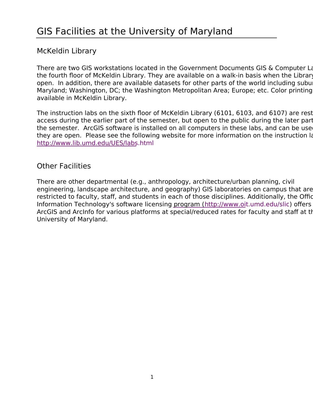
GIS Facilities at the University of Maryland
McKeldin Library
There are two GIS workstations located in the Government Documents GIS & Computer La
the fourth floor of McKeldin Library. They are available on a walk-in basis when the Library
open. In addition, there are available datasets for other parts of the world including subur
Maryland; Washington, DC; the Washington Metropolitan Area; Europe; etc. Color printing
available in McKeldin Library.
The instruction labs on the sixth floor of McKeldin Library (6101, 6103, and 6107) are rest
access during the earlier part of the semester, but open to the public during the later part
the semester. ArcGIS software is installed on all computers in these labs, and can be used
they are open. Please see the following website for more information on the instruction la
http://www.lib.umd.edu/UES/labs.html
Other Facilities
There are other departmental (e.g., anthropology, architecture/urban planning, civil
engineering, landscape architecture, and geography) GIS laboratories on campus that are
restricted to faculty, staff, and students in each of those disciplines. Additionally, the Offic
Information Technology's software licensing program (http://www.oit.umd.edu/slic) offers
ArcGIS and ArcInfo for various platforms at special/reduced rates for faculty and staff at th
University of Maryland.
Paraphrase This Document
Need a fresh take? Get an instant paraphrase of this document with our AI Paraphraser
2
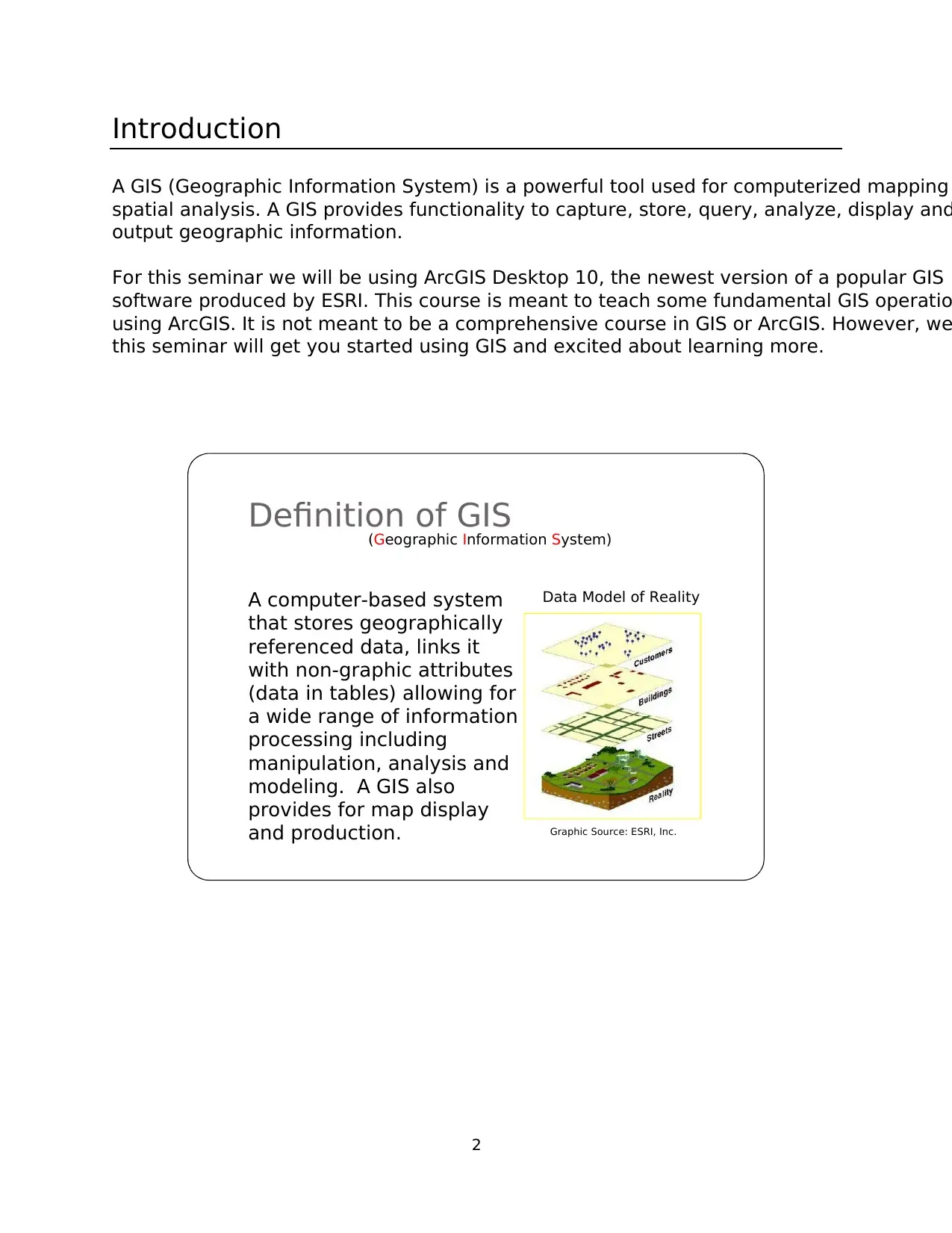
Introduction
A GIS (Geographic Information System) is a powerful tool used for computerized mapping
spatial analysis. A GIS provides functionality to capture, store, query, analyze, display and
output geographic information.
For this seminar we will be using ArcGIS Desktop 10, the newest version of a popular GIS
software produced by ESRI. This course is meant to teach some fundamental GIS operatio
using ArcGIS. It is not meant to be a comprehensive course in GIS or ArcGIS. However, we
this seminar will get you started using GIS and excited about learning more.
Definition of GIS
(Geographic Information System)
A computer-based system
that stores geographically
referenced data, links it
with non-graphic attributes
(data in tables) allowing for
a wide range of information
processing including
manipulation, analysis and
modeling. A GIS also
provides for map display
and production.
Data Model of Reality
Graphic Source: ESRI, Inc.
3
Components of ArcGIS Desktop 10
ArcMap, ArcCatalog, (and ArcToolbox)
ArcGIS Desktop is comprised of a set of integrated applications, which are accessible from
Start menu of your computer: ArcMap and ArcCatalog.
• ArcMap is the main mapping application which allows you to create maps, query
attributes, analyze spatial relationships, and layout final projects.
• ArcCatalog organizes spatial data contained on your computer and various other
locations and allows for you to search, preview, and add data to ArcMap as well as
manage metadata and set up address locator services (geocoding).
• ArcToolbox is the third application of ArcGIS Desktop. Although it is not accessible fr
the Start menu, it is easily accessed and used within ArcMap and ArcCatalog. ArcToo
contains tools for geoprocessing, data conversion, coordinate systems, projections,
more. This workbook will focus on ArcMap and ArcCatalog.
Software Products (Licensing Levels)
ArcMap is made up of three software product levels: ArcView, ArcEditor, and ArcInfo. Thes
products share a common architecture but provide increasing levels of functionality. ArcVi
provides the base mapping and analysis tools. ArcEditor provides all ArcView capability an
includes additional processing and advanced editing. ArcInfo provides all ArcEditor capabi
plus advanced analysis and processing. While these levels are crucial to consider when
purchasing software, it is also important to be aware of the limitations of the level you are
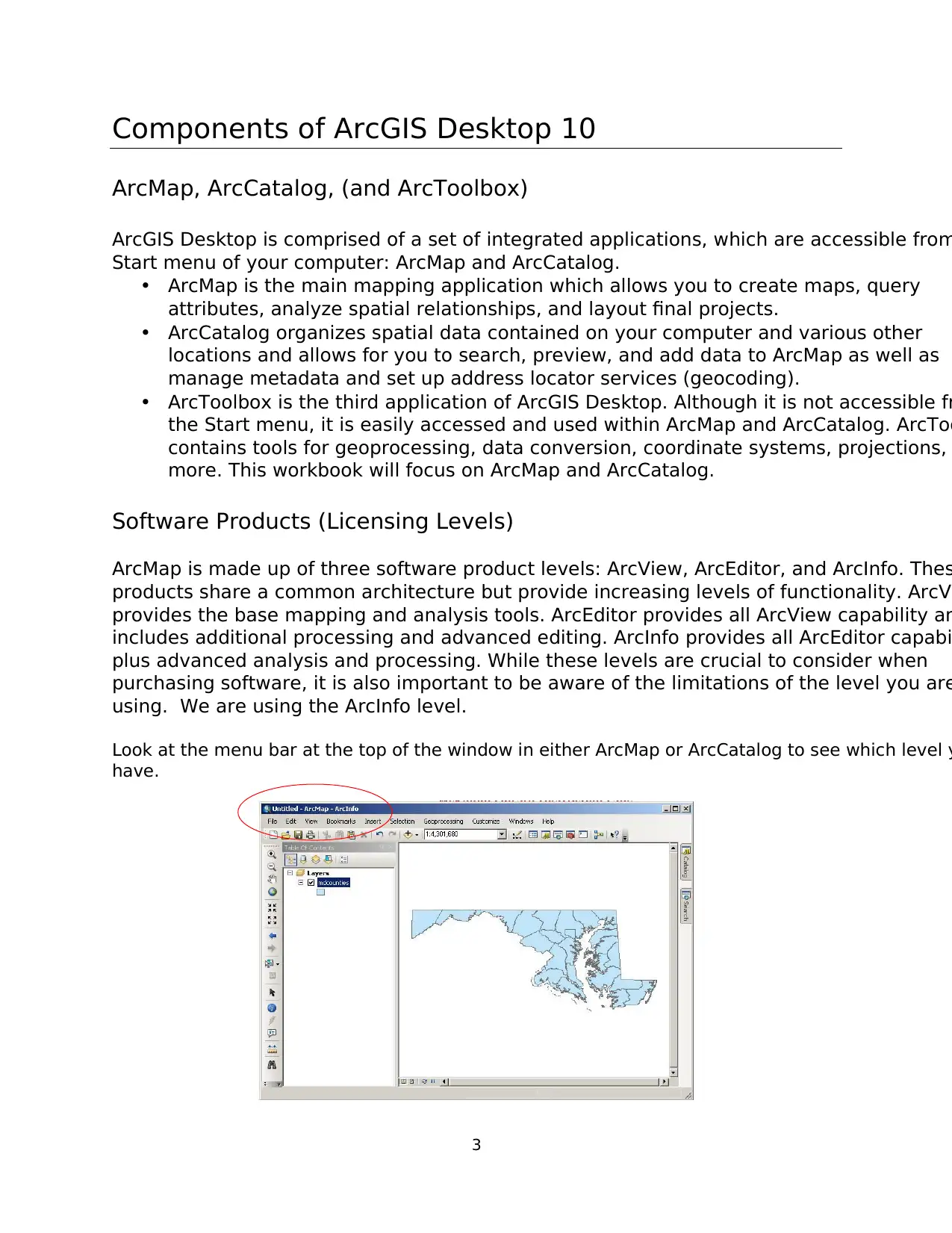
using. We are using the ArcInfo level.
Look at the menu bar at the top of the window in either ArcMap or ArcCatalog to see which level y
have.
Components of ArcGIS Desktop 10
ArcMap, ArcCatalog, (and ArcToolbox)
ArcGIS Desktop is comprised of a set of integrated applications, which are accessible from
Start menu of your computer: ArcMap and ArcCatalog.
• ArcMap is the main mapping application which allows you to create maps, query
attributes, analyze spatial relationships, and layout final projects.
• ArcCatalog organizes spatial data contained on your computer and various other
locations and allows for you to search, preview, and add data to ArcMap as well as
manage metadata and set up address locator services (geocoding).
• ArcToolbox is the third application of ArcGIS Desktop. Although it is not accessible fr
the Start menu, it is easily accessed and used within ArcMap and ArcCatalog. ArcToo
contains tools for geoprocessing, data conversion, coordinate systems, projections,
more. This workbook will focus on ArcMap and ArcCatalog.
Software Products (Licensing Levels)
ArcMap is made up of three software product levels: ArcView, ArcEditor, and ArcInfo. Thes
products share a common architecture but provide increasing levels of functionality. ArcVi
provides the base mapping and analysis tools. ArcEditor provides all ArcView capability an
includes additional processing and advanced editing. ArcInfo provides all ArcEditor capabi
plus advanced analysis and processing. While these levels are crucial to consider when
purchasing software, it is also important to be aware of the limitations of the level you are
using. We are using the ArcInfo level.
Look at the menu bar at the top of the window in either ArcMap or ArcCatalog to see which level y
have.
⊘ This is a preview!⊘
Do you want full access?
Subscribe today to unlock all pages.
Trusted by 1+ million students worldwide
4
Data Management – ArcCatalog
Searching and Content
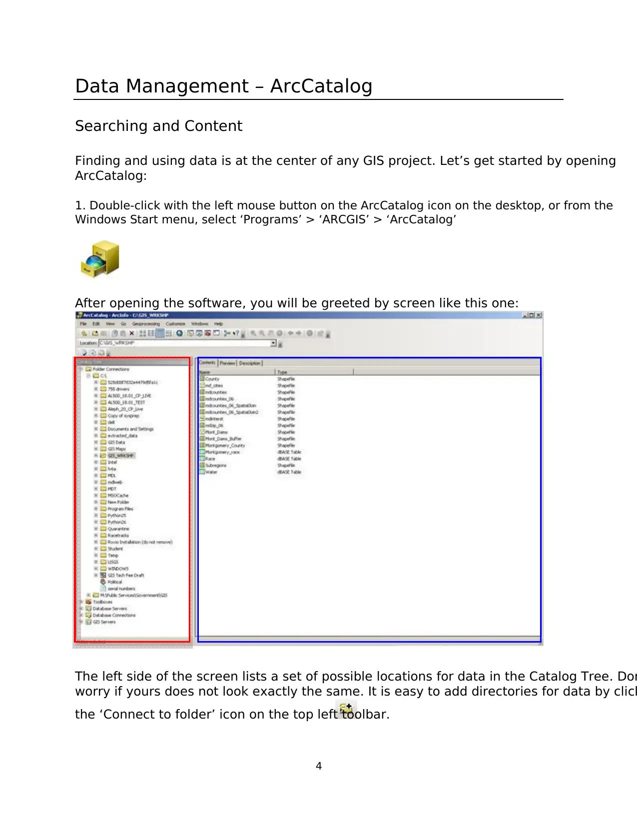
Finding and using data is at the center of any GIS project. Let’s get started by opening
ArcCatalog:
1. Double-click with the left mouse button on the ArcCatalog icon on the desktop, or from the
Windows Start menu, select ‘Programs’ > ‘ARCGIS’ > ‘ArcCatalog’
After opening the software, you will be greeted by screen like this one:
The left side of the screen lists a set of possible locations for data in the Catalog Tree. Don
worry if yours does not look exactly the same. It is easy to add directories for data by click
the ‘Connect to folder’ icon on the top left toolbar.
Data Management – ArcCatalog
Searching and Content
Finding and using data is at the center of any GIS project. Let’s get started by opening
ArcCatalog:
1. Double-click with the left mouse button on the ArcCatalog icon on the desktop, or from the
Windows Start menu, select ‘Programs’ > ‘ARCGIS’ > ‘ArcCatalog’
After opening the software, you will be greeted by screen like this one:
The left side of the screen lists a set of possible locations for data in the Catalog Tree. Don
worry if yours does not look exactly the same. It is easy to add directories for data by click
the ‘Connect to folder’ icon on the top left toolbar.
Paraphrase This Document
Need a fresh take? Get an instant paraphrase of this document with our AI Paraphraser
5
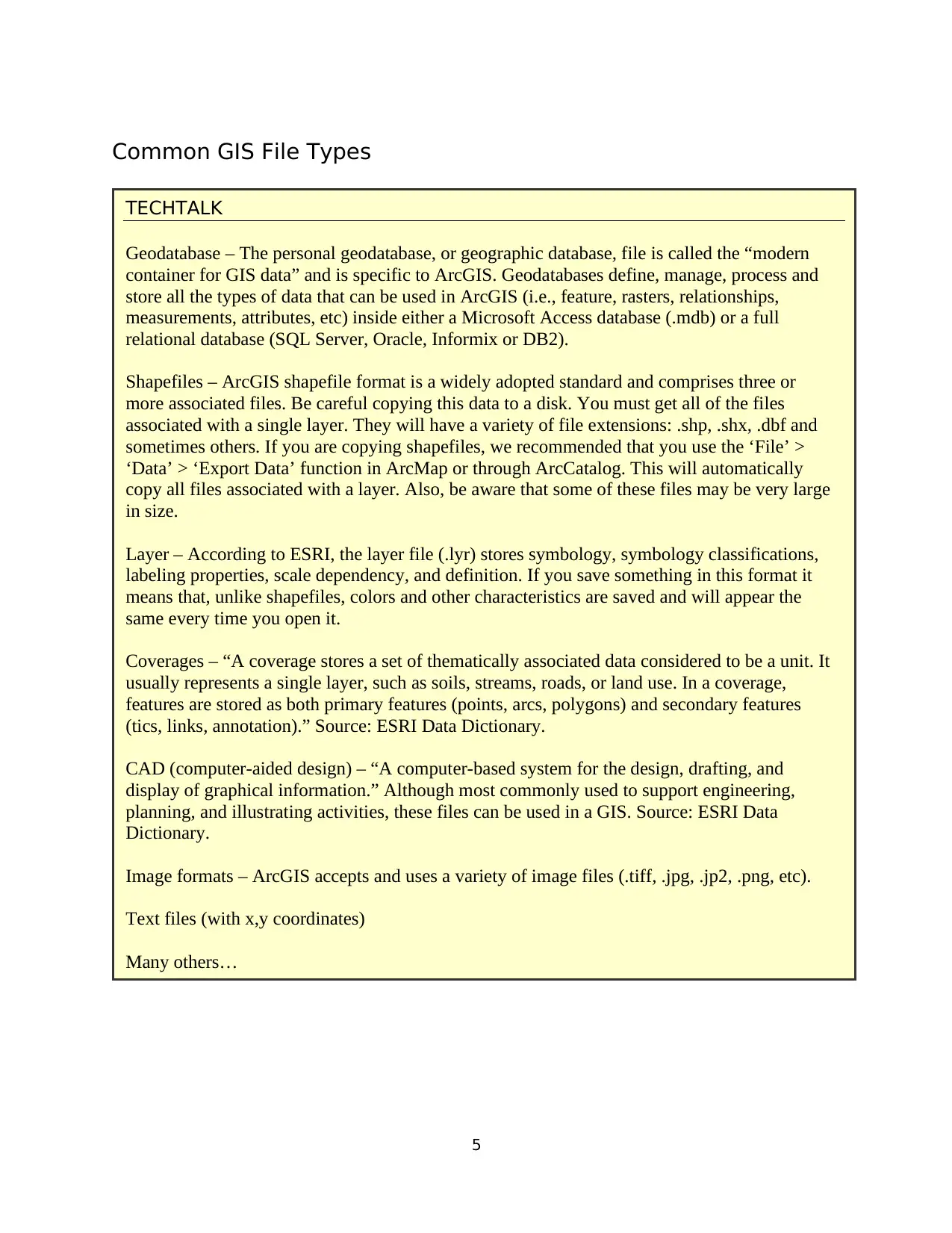
Common GIS File Types
TECHTALK
Geodatabase – The personal geodatabase, or geographic database, file is called the “modern
container for GIS data” and is specific to ArcGIS. Geodatabases define, manage, process and
store all the types of data that can be used in ArcGIS (i.e., feature, rasters, relationships,
measurements, attributes, etc) inside either a Microsoft Access database (.mdb) or a full
relational database (SQL Server, Oracle, Informix or DB2).
Shapefiles – ArcGIS shapefile format is a widely adopted standard and comprises three or
more associated files. Be careful copying this data to a disk. You must get all of the files
associated with a single layer. They will have a variety of file extensions: .shp, .shx, .dbf and
sometimes others. If you are copying shapefiles, we recommended that you use the ‘File’ >
‘Data’ > ‘Export Data’ function in ArcMap or through ArcCatalog. This will automatically
copy all files associated with a layer. Also, be aware that some of these files may be very large
in size.
Layer – According to ESRI, the layer file (.lyr) stores symbology, symbology classifications,
labeling properties, scale dependency, and definition. If you save something in this format it
means that, unlike shapefiles, colors and other characteristics are saved and will appear the
same every time you open it.
Coverages – “A coverage stores a set of thematically associated data considered to be a unit. It
usually represents a single layer, such as soils, streams, roads, or land use. In a coverage,
features are stored as both primary features (points, arcs, polygons) and secondary features
(tics, links, annotation).” Source: ESRI Data Dictionary.
CAD (computer-aided design) – “A computer-based system for the design, drafting, and
display of graphical information.” Although most commonly used to support engineering,
planning, and illustrating activities, these files can be used in a GIS. Source: ESRI Data
Dictionary.
Image formats – ArcGIS accepts and uses a variety of image files (.tiff, .jpg, .jp2, .png, etc).
Text files (with x,y coordinates)
Many others…
6
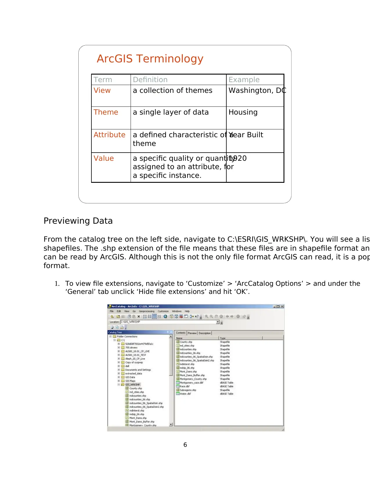
Term Definition Example
View a collection of themes Washington, DC
Theme a single layer of data Housing
Attribute a defined characteristic of a
theme
Year Built
Value a specific quality or quantity
assigned to an attribute, for
a specific instance.
1920
ArcGIS Terminology
Previewing Data
From the catalog tree on the left side, navigate to C:\ESRI\GIS_WRKSHP\. You will see a lis
shapefiles. The .shp extension of the file means that these files are in shapefile format and
can be read by ArcGIS. Although this is not the only file format ArcGIS can read, it is a pop
format.
1. To view file extensions, navigate to ‘Customize’ > ‘ArcCatalog Options’ > and under the
‘General’ tab unclick ‘Hide file extensions’ and hit ‘OK’.
⊘ This is a preview!⊘
Do you want full access?
Subscribe today to unlock all pages.
Trusted by 1+ million students worldwide
7
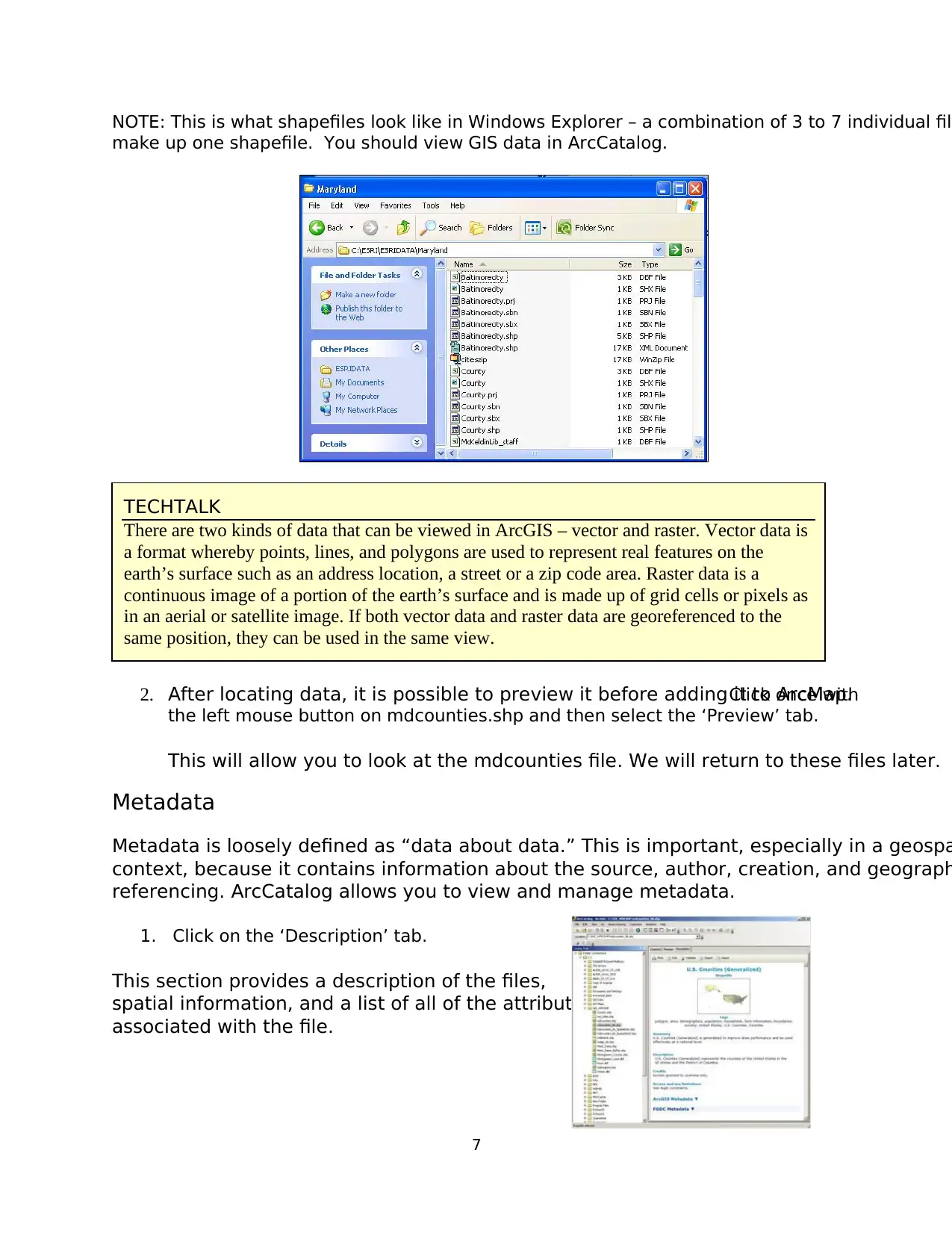
NOTE: This is what shapefiles look like in Windows Explorer – a combination of 3 to 7 individual file
make up one shapefile. You should view GIS data in ArcCatalog.
2. After locating data, it is possible to preview it before adding it to ArcMap.Click once with
the left mouse button on mdcounties.shp and then select the ‘Preview’ tab.
This will allow you to look at the mdcounties file. We will return to these files later.
Metadata
Metadata is loosely defined as “data about data.” This is important, especially in a geospa
context, because it contains information about the source, author, creation, and geograph
referencing. ArcCatalog allows you to view and manage metadata.
1. Click on the ‘Description’ tab.
This section provides a description of the files,
spatial information, and a list of all of the attributes
associated with the file.
TECHTALK
There are two kinds of data that can be viewed in ArcGIS – vector and raster. Vector data is
a format whereby points, lines, and polygons are used to represent real features on the
earth’s surface such as an address location, a street or a zip code area. Raster data is a
continuous image of a portion of the earth’s surface and is made up of grid cells or pixels as
in an aerial or satellite image. If both vector data and raster data are georeferenced to the
same position, they can be used in the same view.
Paraphrase This Document
Need a fresh take? Get an instant paraphrase of this document with our AI Paraphraser
8
Organization of ArcMap
ArcMap can be opened from multiple locations. This time, we will open it from ArcCatalog
can also be opened from the start menu or an icon on the desktop.
Beginning with a Blank Project
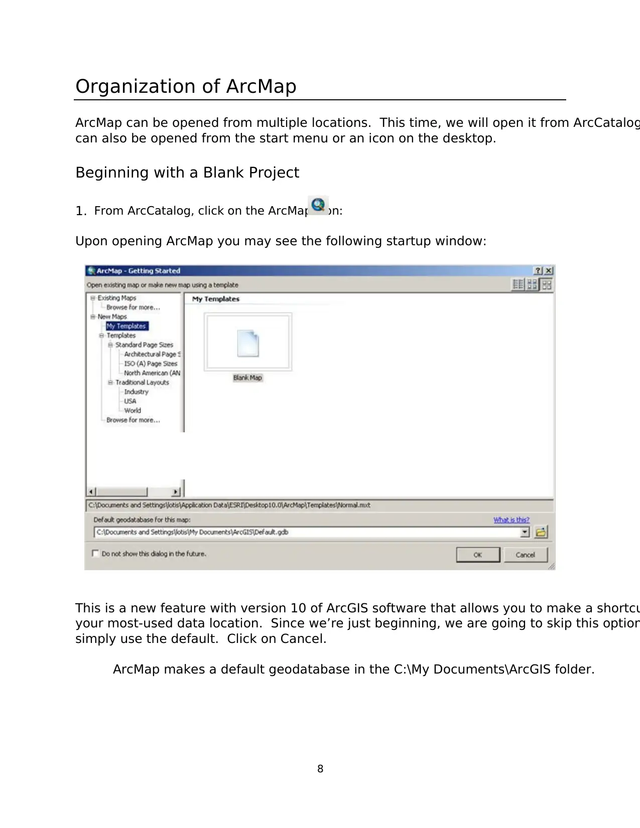
1. From ArcCatalog, click on the ArcMap icon:
Upon opening ArcMap you may see the following startup window:
This is a new feature with version 10 of ArcGIS software that allows you to make a shortcu
your most-used data location. Since we’re just beginning, we are going to skip this option
simply use the default. Click on Cancel.
ArcMap makes a default geodatabase in the C:\My Documents\ArcGIS folder.
Organization of ArcMap
ArcMap can be opened from multiple locations. This time, we will open it from ArcCatalog
can also be opened from the start menu or an icon on the desktop.
Beginning with a Blank Project
1. From ArcCatalog, click on the ArcMap icon:
Upon opening ArcMap you may see the following startup window:
This is a new feature with version 10 of ArcGIS software that allows you to make a shortcu
your most-used data location. Since we’re just beginning, we are going to skip this option
simply use the default. Click on Cancel.
ArcMap makes a default geodatabase in the C:\My Documents\ArcGIS folder.
9
Now you will be in a new, blank document in ArcMap.
This area is known as the Map Display. This display area is where map features are drawn
When you begin, the menu bar changes to show the menu functions available. You can ch
the way the ArcMap looks by moving or hiding toolbars. Docking toolbars in another locati
can be done by clicking on the vertical gray bar at the left edge or top and dragging it to a
location.
To hide or show toolbars, click ‘Customize’ (on the menu bar) > ‘Toolbars’ and check or uncheck t
name.
Any changes made to the interface will be kept and applied every time you use ArcMap. P
note that some toolbars are dependent upon the license level. Some toolbars and extensio
will be visible, but the user will not be able to access the functionality if they do not posse
required license.
At this point, most of the icons of the button bar and tool bar are grayed out because we d
have any data in our view. Let’s add data to see what functions are available to us.
Menu Bar
Basic
Toolbar
Table of Contents
Map Display
⊘ This is a preview!⊘
Do you want full access?
Subscribe today to unlock all pages.
Trusted by 1+ million students worldwide
1 out of 47
Your All-in-One AI-Powered Toolkit for Academic Success.
+13062052269
info@desklib.com
Available 24*7 on WhatsApp / Email
![[object Object]](/_next/static/media/star-bottom.7253800d.svg)
Unlock your academic potential
Copyright © 2020–2026 A2Z Services. All Rights Reserved. Developed and managed by ZUCOL.