ISYS3374 - Business Analytics: Data Analysis and Business Insights

Verified

Added on  2023/03/30

|13
|1710
|92
Homework Assignment
AI Summary
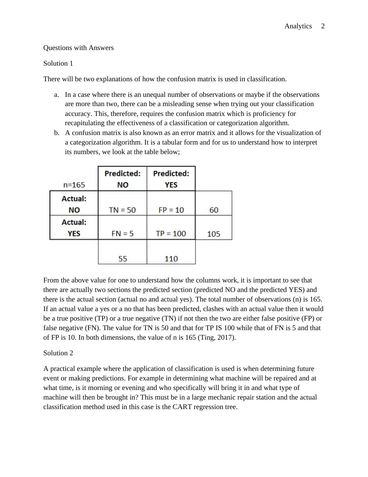
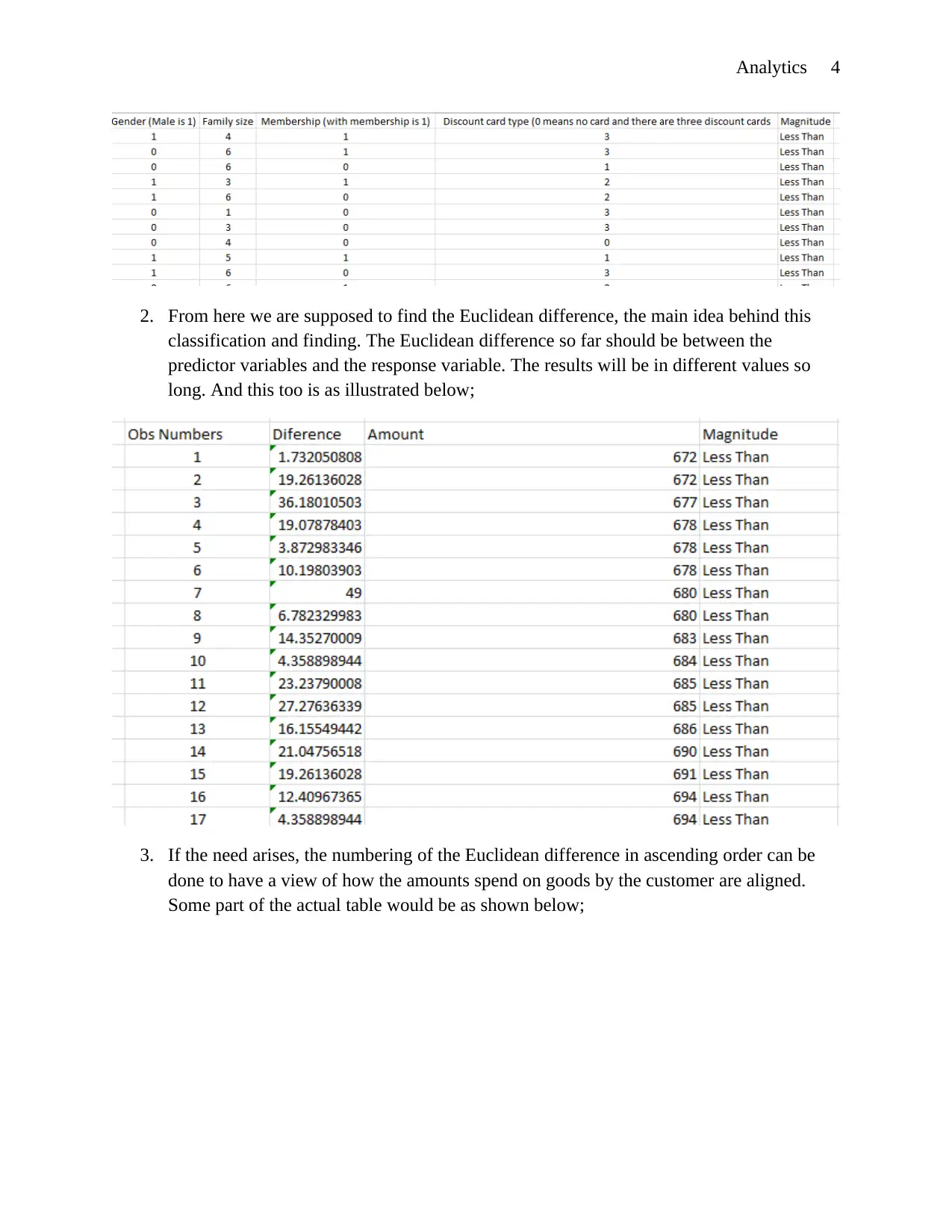
This assignment solution for ISYS3374 Business Analytics covers several key concepts and practical applications. It begins with an explanation of the confusion matrix in classification methods, including examples of its interpretation. The solution then provides practical examples of classification methods in business, such as predicting machine repairs using CART regression trees and classifying student scores using KNN clustering. The document also discusses oversampling techniques to correct for imbalanced datasets, particularly in scenarios like credit card fraud detection. Furthermore, it addresses how explanatory and categorical variables can be represented in logistic regression, using numerical coding. The assignment also involves predicting customer spending using predictor variables like age, gender, and family size, utilizing KNN clustering and Euclidean distance calculations. Finally, the solution includes recommendations for additional variables and analysis methods, such as logistic regression, and addresses data handling techniques in Excel, such as filling missing data points. Desklib provides a platform to explore more solved assignments and study resources.
Document Page
Analytics 1
Business Analytics
Name of Author
Name of Class
Name of Professor
Name of School
State and City of School
Date
tabler-icon-diamond-filled.svg

Secure Best Marks with AI Grader

Need help grading? Try our AI Grader for instant feedback on your assignments.
Document Page
Analytics 2
Questions with Answers
Solution 1
There will be two explanations of how the confusion matrix is used in classification.
a. In a case where there is an unequal number of observations or maybe if the observations
are more than two, there can be a misleading sense when trying out your classification
accuracy. This, therefore, requires the confusion matrix which is proficiency for
recapitulating the effectiveness of a classification or categorization algorithm.
b. A confusion matrix is also known as an error matrix and it allows for the visualization of
a categorization algorithm. It is a tabular form and for us to understand how to interpret
its numbers, we look at the table below;
From the above value for one to understand how the columns work, it is important to see that
there are actually two sections the predicted section (predicted NO and the predicted YES) and
there is the actual section (actual no and actual yes). The total number of observations (n) is 165.
If an actual value a yes or a no that has been predicted, clashes with an actual value then it would
be a true positive (TP) or a true negative (TN) if not then the two are either false positive (FP) or
false negative (FN). The value for TN is 50 and that for TP IS 100 while that of FN is 5 and that
of FP is 10. In both dimensions, the value of n is 165 (Ting, 2017).
Solution 2
A practical example where the application of classification is used is when determining future
event or making predictions. For example in determining what machine will be repaired and at
what time, is it morning or evening and who specifically will bring it in and what type of
machine will then be brought in? This must be in a large mechanic repair station and the actual
classification method used in this case is the CART regression tree.
Document Page
Analytics 3
The next scenario is in the classification of what marks will be scored by what student who is
newly introduced into the class based on a set of predictive entries. The method that is used in
this scenario is KNN clustering.
Solution 3
Oversampling is a method which is applied on a dataset in the sense to correct cases where the
chances of success of a dataset are very low. This happens in an imbalanced dataset. Examples of
areas that we are to discuss here are for example the credit card usage frauds and the next one is
the manufacturing defects where there is a very low percentage of acceptance compared to the
total number of products that are produced. As you have seen there is a very small percentage of
the minority class in such scenarios. This case requires oversampling and in this case, the
percentage of the minority class is to be raised by replication. In this case, there will be no
information loss. The effect that is with this type of creating a balanced dataset is that it is prone
to overfitting as it involves copying and recopying the same data points (Abdi and Hashemi,
2015).
Solution 4
The explanatory variables and the categorical variables can be represented in numbers and this
basically is what logistic regression totally understands and runs easily. Looking at the
explanatory variable there are low, average and high entries and these can be codded with 1, 2
and three respectively whereas the data entries for variable X2 is marked by numbers 4, 5 and 6
respectively. There will be a total of two coefficients whereby one represents the coefficient for
the dependent variable and one is the y-intercept.
Solution 5
Starting from the predictor variables, we have five predictor variables in total. These will be the
variables that will be used in predicting the types of customers that would spend more than
$1000. These variables are; Age, Gender, Family size, Membership, Discount card type. The
Age variable has empty cells that need to be filled in order to help run the accurate analysis. The
method used to fill the cells is the above function in excel.
Steps
1. From the entire dataset, there was a rearrangement and there was a creation of a new data
variable called the magnitude variable. This was sorted to have individuals who spent
more than $1000 on one side (lower rows) and the individuals that spent less than $1000
on the upper rows. An illustration of such is as below;
Document Page
Analytics 4
2. From here we are supposed to find the Euclidean difference, the main idea behind this
classification and finding. The Euclidean difference so far should be between the
predictor variables and the response variable. The results will be in different values so
long. And this too is as illustrated below;
3. If the need arises, the numbering of the Euclidean difference in ascending order can be
done to have a view of how the amounts spend on goods by the customer are aligned.
Some part of the actual table would be as shown below;
tabler-icon-diamond-filled.svg

Secure Best Marks with AI Grader

Need help grading? Try our AI Grader for instant feedback on your assignments.
Document Page
Analytics 5
4. The final bit is the KNN clustering where since there are up to 500 customers there will
be 500 Ks.
5. The final column to be created is the prosperity column. To create the prosperity column,
we divide the respective events columns by the Ks columns and from here we will get
percentages. I had created a 50% to act as the cutoff point and if the prosperity values are
less than 50% then the customers in such areas spent less than $1000 and vice versa
(Imdad et al. 2017).
Document Page
Analytics 6
5b. In this part of the question, predictor variables are given and must be a 28 year old, female,
from a family of 3, a non-member discount card type is 3.
The KNN algorithms steps that are highlighted in the first part of the question must be run step
by step on the entire dataset provided and the customer will be found out to have spent an
amount less than $1000.
6a. the number of months recorded for most of the repair is 4 with an average amount of about 5
when the mean in truncated or 6 when the mean value is rounded off. Most machines are
repaired for an average of 10 hours each.
Document Page
Analytics 7
From the pie chart below, the number of machines that were repaired more than the other was the
electrical machine.
As of the pie chart that will follow, we can see who takes more orders than the other;
tabler-icon-diamond-filled.svg

Paraphrase This Document

Need a fresh take? Get an instant paraphrase of this document with our AI Paraphraser
Document Page
Analytics 8
Bob takes more orders but John follows closely at 44%, 1% lesser than Bob.
From the above pie chart, it is evident to see that more machines were repaired in the morning as
opposed to the afternoon time.
c) Additional variables recommended is the price charged for every repair made and discount
offered for every machine that has been repaired more than three times. The analysis that I would
recommend is the logistic regression analysis that is appropriate based on these two added
variables.
7a. in order to fill missing data points in excel and therefore applied to fill the missing entries in
the blood type column.
Document Page
Analytics 9
The steps that need to be followed are;
1. Click at the find and replace section in excel. It is at the top right corner.
2. Move to the go to special and click.
3. Next is clicking on the blanks box and then OK.
4. There will be a highlight of the empty cells.
5. Putting the case in each box, type an equal sign and the up arrow, tab okay and click
enter. The value that was in the upper cell will automatically fill the following cell. This
can be done for all empty cells (Kupzyk and Cohen, 2015).
7b. as per the percentage graph is drawn, the total blood protein drops and climbs periodically
and it does not entirely drop all the way down. The actual graph is as shown below;
Looking at the graph points are on the negative side of the y-axis at times and other times they
are at the positive side of the x-axis.
7e. the visualization diagrams are
Document Page
Analytics 10
From above there is an illustration of the summary statistics of the variable that is chosen for
visualization.
The pie chart visualizes the actual blood group amounts in the dataset in percentages. With half
taking 13% and the other half 12%.
7(i) age, weight and gender an act as predictor variables that predict an individual's rate of
conducting diabetes and this alone gives us an indication to employ the use of multiple linear
regression since there is more than one predictor variable (Harrell, 2015).
tabler-icon-diamond-filled.svg

Secure Best Marks with AI Grader

Need help grading? Try our AI Grader for instant feedback on your assignments.
Document Page
Analytics 11
7(ii) the regression equation from this level is;
The actual model that we derive the equation above from is a result of multiple linear regression
and is as shown below;
8b. the individual should invest up to 46% of the salary if he wants $1500000 over the thirty year
period.
Document Page
Analytics 12
.
9c. new model is
Maximize 65X1 + 48X2
Constraints
9X1 + 13.6X2 <= 1600
45X1 + 30 X2 <= 10
55X1 + 70X2 <= 14
X1 >= 0, X2>= 0 (Gorgulu et al. 2016).
Document Page
Analytics 13
References
Abdi, L. and Hashemi, S., 2015. To combat multi-class imbalanced problems by means of over-
sampling techniques. IEEE Transactions on Knowledge and Data Engineering, 28(1), pp.238-
251.
Gorgulu, M., Coleman, N. and S Goncu, U.S., 2016. Linear Programming and Excel Solver
Functions for Dairy Ration Calculation. Abstract of Applied Sciences and Engineering, 9, pp.1-
9.
Harrell Jr, F.E., 2015. Regression modelling strategies: with applications to linear models,
logistic and ordinal regression, and survival analysis. Springer.
Imdad, U., Ahmad, W., Asif, M. and Ishtiaq, A., 2017, December. Classification of students
results using KNN and ANN. In 2017 13th International Conference on Emerging Technologies
(ICET) (pp. 1-6). IEEE.
Kupzyk, K.A. and Cohen, M.Z., 2015. Data validation and other strategies for data entry.
Western Journal of nursing research, 37(4), pp.546-556.
Ting, K.M., 2017. Confusion matrix. Encyclopedia of Machine Learning and Data Mining,
pp.260-260.
chevron_up_icon
1 out of 13
circle_padding
hide_on_mobile
zoom_out_icon
[object Object]