ITC 504: Interface Usability Report - Hibyk App Design Alternatives
VerifiedAdded on 2024/07/01
|37
|1766
|181
Report
AI Summary
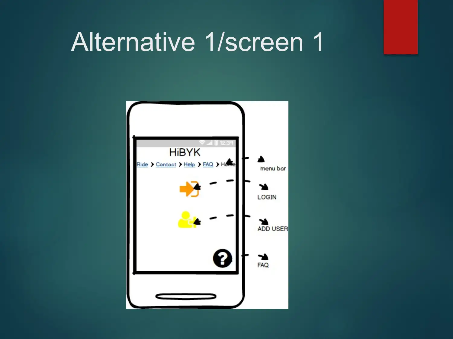
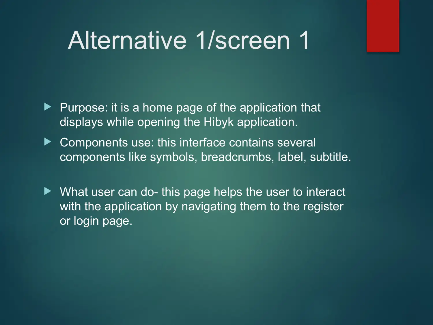
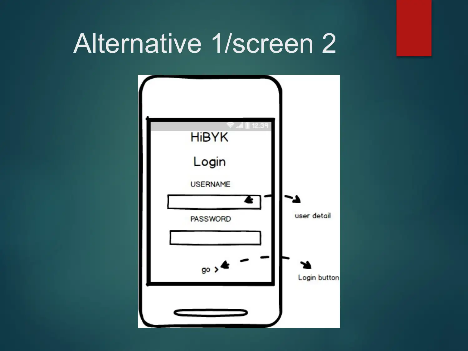
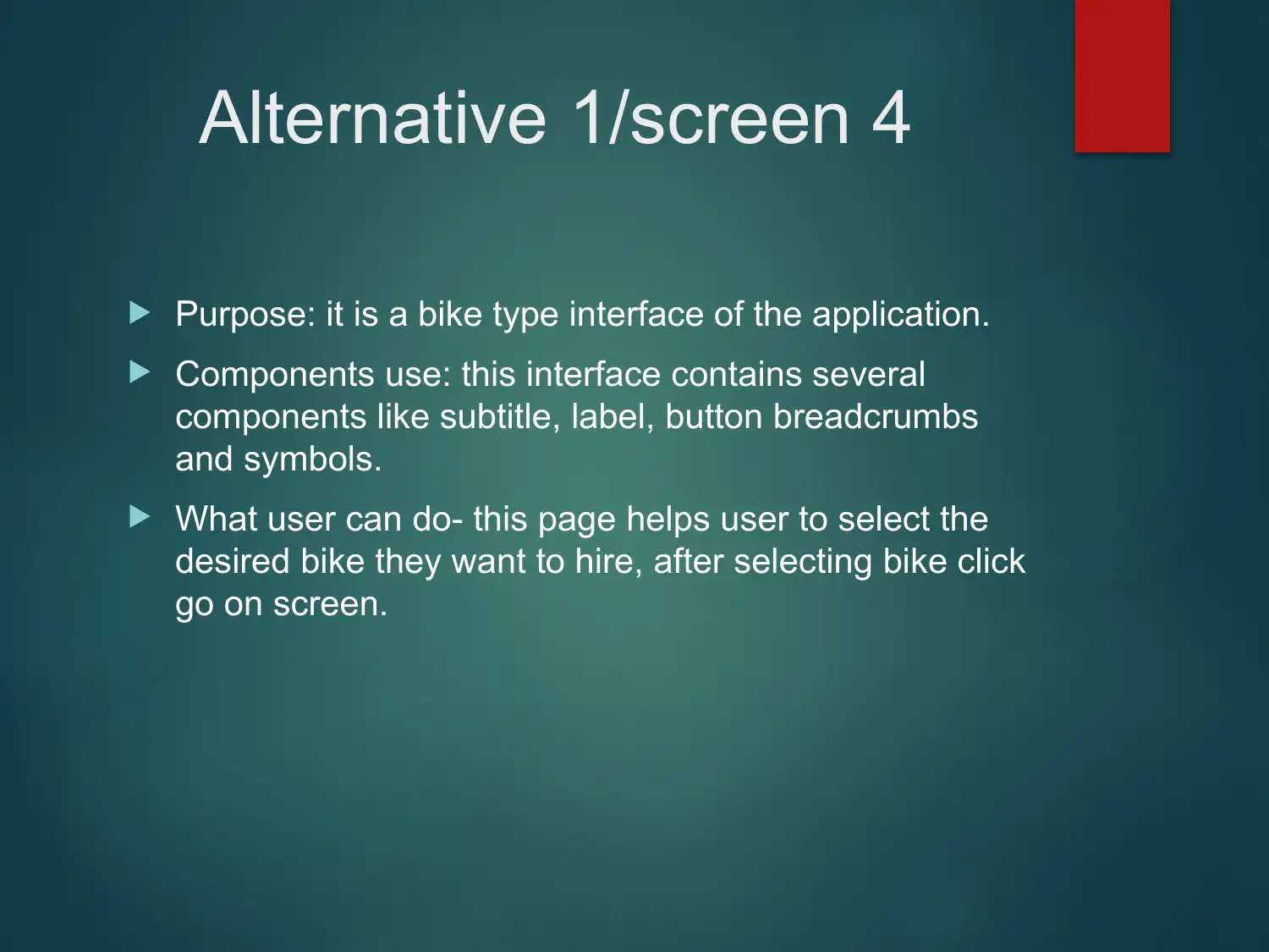
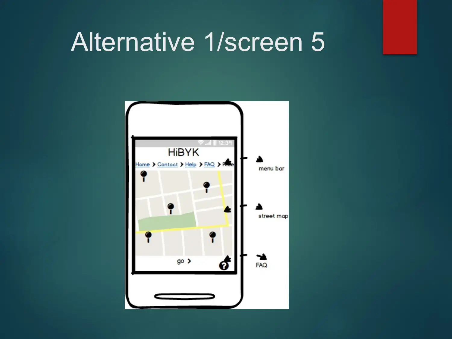
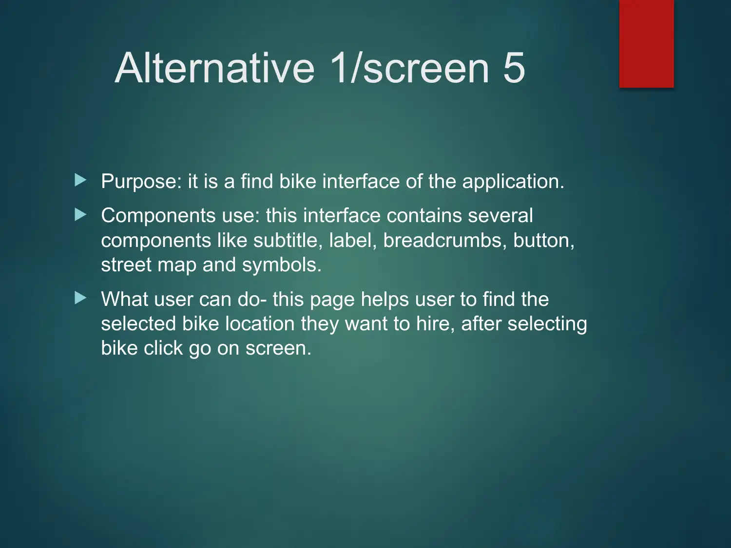
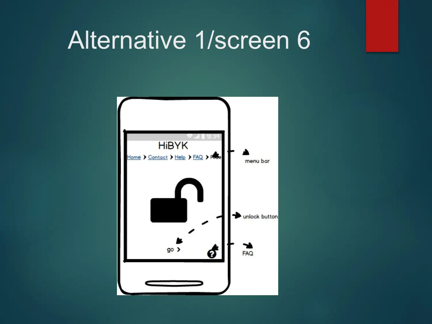
This report presents an analysis of the interface usability of the Hibyk app, exploring two design alternatives. Alternative 1 focuses on a minimalistic design with essential features for bike hiring services, emphasizing security, smooth navigation, and flexibility. Alternative 2 builds upon the first, incorporating more functionalities like back and sign-out buttons, adhering to heuristic principles such as real-world matching, flexibility, and user freedom. The report recommends Alternative 2 due to its improved navigation, enhanced user freedom, appealing design, and consistent component alignment across screens. References to usability heuristics and interface design principles support the analysis and recommendations. Desklib offers similar solved assignments and past papers for students.
1 out of 37
Related Documents


Your All-in-One AI-Powered Toolkit for Academic Success.
+13062052269
info@desklib.com
Available 24*7 on WhatsApp / Email
![[object Object]](/_next/static/media/star-bottom.7253800d.svg)
Copyright © 2020–2026 A2Z Services. All Rights Reserved. Developed and managed by ZUCOL.