ITECH1103 Big Data and Analytics Report: Data Visualization Analysis

Verified

Added on  2022/08/22

|20
|2164
|14
Report
AI Summary
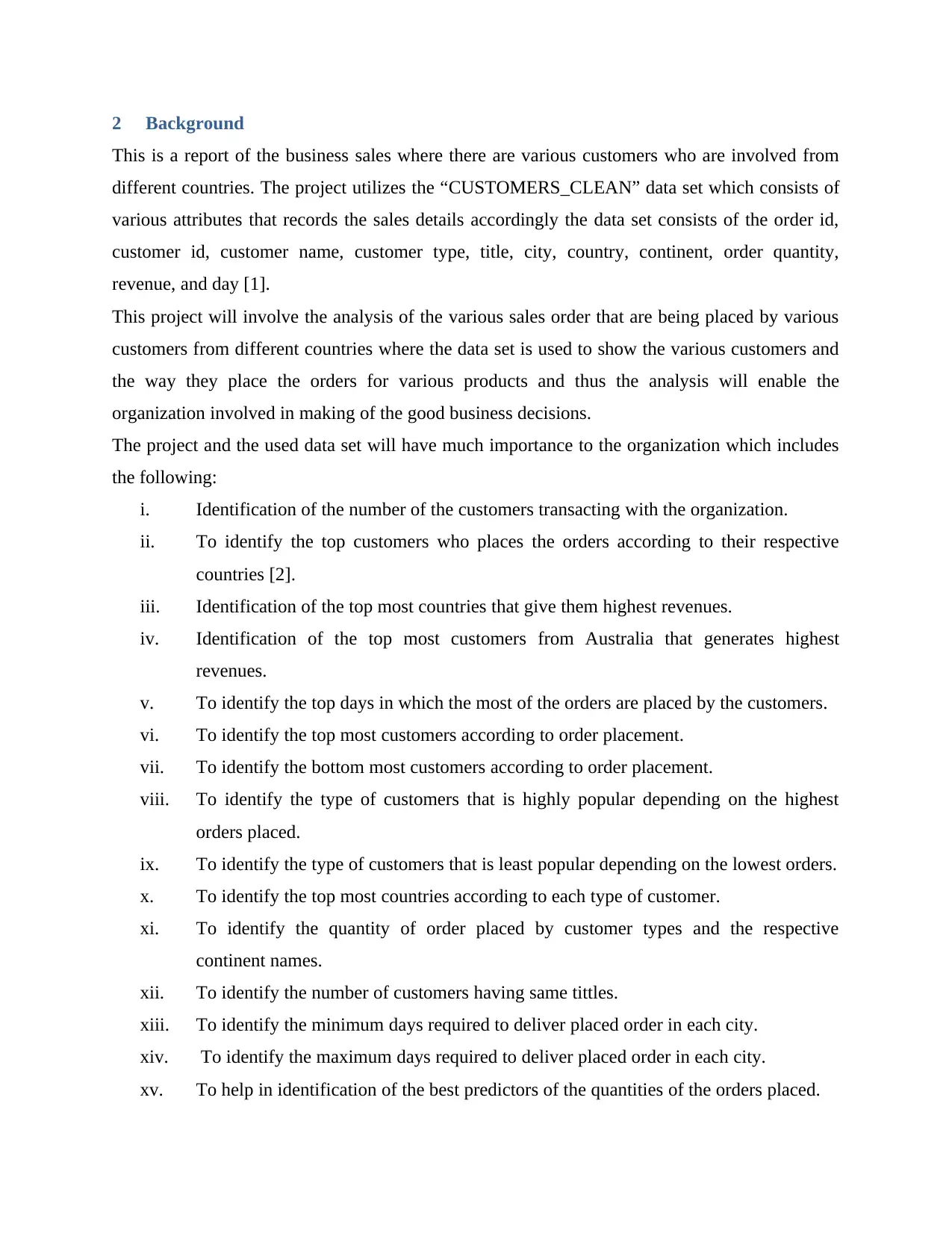
This report presents a comprehensive analysis of business sales data using SAS Visual Analytics. The project focuses on visualizing sales orders from various customers across different continents to facilitate informed business decision-making. The report includes background information on the dataset, details on the dashboards and reports created, additional visualizations such as bar charts, line charts, and scatter plots, justifications for the chosen visualization tools, a discussion of the findings, and a conclusion summarizing the key insights. The analysis covers aspects such as customer identification, top customers by country, revenue generation, order patterns, and customer types. Various visualizations are employed to compare data, identify trends, and highlight relationships between variables, ultimately aiming to provide valuable insights for strategic business decisions. The report also includes a data dictionary, sample reports, and appendices with visual representations of the data analysis.
Document Page
ITECH1103- BIG DATA AND ANALYTICS
[Student name]
[Student ID]
[University name]
[Professor Name]
[Date]
tabler-icon-diamond-filled.svg

Secure Best Marks with AI Grader

Need help grading? Try our AI Grader for instant feedback on your assignments.
Document Page
Table of Contents
1 Executive Summary.......................................................................................................2
2 Background...................................................................................................................3
3 Reporting / Dashboards..................................................................................................5
4 Additional Visualizations...............................................................................................6
5 Justification...................................................................................................................9
6 Discussion of findings..................................................................................................11
7 Conclusion..................................................................................................................14
8 References..................................................................................................................15
9 Appendices.................................................................................................................16
Document Page
1 Executive Summary
This is a project about the data visualization for the business sales orders that are placed by
various customers in various continents moreover this visualization is done in order to offer good
business decision making for the organization. However in this report various aspects are put
into consideration which includes the background information, preparation of the dashboards and
reports, additional visualizations, justifications , finding and the conclusions which will be
presented to the organization management to be used for various decision making.
Document Page
2 Background
This is a report of the business sales where there are various customers who are involved from
different countries. The project utilizes the “CUSTOMERS_CLEAN” data set which consists of
various attributes that records the sales details accordingly the data set consists of the order id,
customer id, customer name, customer type, title, city, country, continent, order quantity,
revenue, and day [1].
This project will involve the analysis of the various sales order that are being placed by various
customers from different countries where the data set is used to show the various customers and
the way they place the orders for various products and thus the analysis will enable the
organization involved in making of the good business decisions.
The project and the used data set will have much importance to the organization which includes
the following:
i. Identification of the number of the customers transacting with the organization.
ii. To identify the top customers who places the orders according to their respective
countries [2].
iii. Identification of the top most countries that give them highest revenues.
iv. Identification of the top most customers from Australia that generates highest
revenues.
v. To identify the top days in which the most of the orders are placed by the customers.
vi. To identify the top most customers according to order placement.
vii. To identify the bottom most customers according to order placement.
viii. To identify the type of customers that is highly popular depending on the highest
orders placed.
ix. To identify the type of customers that is least popular depending on the lowest orders.
x. To identify the top most countries according to each type of customer.
xi. To identify the quantity of order placed by customer types and the respective
continent names.
xii. To identify the number of customers having same tittles.
xiii. To identify the minimum days required to deliver placed order in each city.
xiv. To identify the maximum days required to deliver placed order in each city.
xv. To help in identification of the best predictors of the quantities of the orders placed.
tabler-icon-diamond-filled.svg

Secure Best Marks with AI Grader

Need help grading? Try our AI Grader for instant feedback on your assignments.
Document Page
xvi. To enable creation of the geo maps of the various countries of the customers.
xvii. To enable the creation of the cluster analysis of the customers types.
xviii. To identify the appropriate days to deliver each customer customers in each
continent.
xix. To identify the top most type of customers according to the days to deliver.
xx. To enable plotting of the bubble plot indicating number of orders according to days to
deliver orders.
xxi. To identify the correlations between the quantities of placed orders, the unit costs and
the discount in percentage.
xxii. To identify the quantities that is ordered according to type of customer and unit costs.
The visual analytics is application software that is used in the data analysis where it improves the
explorations of data, minimizing the overall costs and improvement of data analysis
[3]. .However it is used since it is able makes easier the bulk of complex information for better
decisions making. Below are the major benefits of using the visual analytics for the organization
business analysis:
Improvement of the data explorations, minimizing of overall costs, and improvement of
data analysis.
To make easy the bulk complex information for better decision making.
To enable the organization to have better understanding of data quickly and allow faster
decision making.
It improves the computing and data storage and thus helping the organization business in
solving of some issues.
It enables solving complex and large issues and hence giving results with high accuracy
for more profitable businesses decisions.
It gives variety of trend of visualizations and thus giving data presentation modes that are
easy to understand.
Document Page
3 Reporting / Dashboards
In this project there are various visualizations that I will use in order to analyze the data and also
use top answer the questions, these visualizations will be used as they will have a range of use as
discussed below.
i. Bar Chart
The bar chart is one of the visualization tool that will be used and they are made of bars , these
are used as the users will be able to scan information quickly in them, the bar charts organizes
the data in rectangular bars which make it easy while comparing related data [4].
The bar chart visualization is mainly used in the following reasons:
While one wants to compare two or more values in similar categories.
While one wants to compare part of whole data.
While one have fewer groups below 10.
When one want to compare how multiple similar data sets are relating to each other.
ii. Tables
The table is the other visualization tool that I used analysis, the table is preferable as it is able to
display every detail in table form within rows and columns and thus enabling one to make
appropriate decision making. It is able to display the data points and graphs, the bullet chart,
icon, and sparkline and above is an example of the table.
The following are the main reasons of using tables:
Document Page
When one want to display two dimension data set which is organized categorically
Since one can break large data sets into small required data.
4 Additional Visualizations
The below are the additional visualization used.
i. Line Chart
This visualization tool will be used as it will assist in the visualization of the data in a more
compacted and precise formats that make it easy to do rapid scanning so that to get better
understanding of the trends.
ii. Scatter plot
This visualization tool will be used to do the analysis and it is mainly used in case there are
various data points and it helps to highlighting the data sets similarities and this tool also is
appropriate while one is looking for the outliers and identifying the data distribution.
iii. Pie Chart
tabler-icon-diamond-filled.svg

Paraphrase This Document

Need a fresh take? Get an instant paraphrase of this document with our AI Paraphraser
Document Page
This visualization tool will be used to analyze the data, it is used since it is easy to read and
understand as the relationship of the data is very clear and obvious.
iv. Bar chart
Mon
Tue
Thur
Frid
Wed
0 2 4 6 8 10 12
orders
This visualization tool will be used to show how the data is distributed over a continuous or
within a certain period of time and it consists of the vertical bar charts and line charts.
v. Area Chart
This visualization tool will be used to do the analysis that mainly highlights the relative
difference between the data items ,this is used while one want to see how various items stacks up
or contributes to entire data.
vi. Box Plot
Document Page
This visualization tool will be used to display the distributions of the data across the groups
which are based on five numbers summary which includes the minimum, first quartile, median,
third quartile and maximum [5].
5 Justification
In this report I used various visualization tools due to the various reasons as discussed here
below:
i. To enable comparison of the many valuables in same category.
ii. To enable comparison of part of entire data.
iii. To enable easy understanding of similar of similar data sets.
Document Page
iv. To enable displaying of two dimension data sets.
v. To enable user to have easy understanding of the trend, pattern and data fluctuations.
vi. To indicate the relationship between two variables.
vii. To enable easy compacting of the data visualization.
viii. To enable easy comparison of the relative values.
Below are some assumptions made while selecting visualization tool.
i. All the customer details are captured correctly.
ii. The various customers are matched with their respective countries.
iii. The various orders placed are correctly matched with the respective customers.
iv. The revenue is associated correctly with customer and the countries.
Below are some of the visual sample reports.
i. Top 10 Customers with respect to all countries
INDIA
AUSTRARIA
US.A
TURKEY
US.A
ISRAEL
US.A
ITALY
NETHELANDS
DOMINI
C ANN MARK JULIET PAUL PETER JAMES EZRA ISAAC
0
4
8
12
TOP 10 CUSTOMERS RESPCT TO ALL
COUNTRIES
ORDER PLACED
ii. Top 10 Countries with respect to Total Revenue.
tabler-icon-diamond-filled.svg

Secure Best Marks with AI Grader

Need help grading? Try our AI Grader for instant feedback on your assignments.
Document Page
18%
14%
13%
11%
11%
11%
8%
8%
6%
TOP 10 COUNTRIES WITH RESPECT
TO TOTAL REVENUE INDIA
AUSTRARIA
US.A
TURKEY
US.A
ISRAEL
US.A
ITALY
NETHELANDS
iii. Top 10 Customers from Australia in terms of Total Revenue
AUSTRARIA
AUSTRARIA
AUSTRARIA
AUSTRARIA
AUSTRARIA
AUSTRARIA
AUSTRARIA
AUSTRARIA
AUSTRARIA
DOMINI
C ANN MARK JULIET PAUL PETER JAMES EZRA ISAAC
0
40000
80000
120000
Top 10 Australia CustomersTotal Revenue
revenue
iv. Top 5 days with most numbers of orders placed by customers.
Mon
Tue
Thur
Frid
Wed
0 2 4 6 8 10 12
Top 5 days with most numbers of
orders placed by customers
orders
Document Page
6 Discussion of findings
In this project there are various visualizations that had been used and they had been used to show
various results as listed here below.
i. Bar Chart
INDIA
AUSTRARIA
US.A
TURKEY
US.A
ISRAEL
US.A
ITALY
NETHELANDS
DOMINIC ANN MARK JULIET PAUL PETER JAMES EZRA ISAAC
0
2
4
6
8
10
12
TOP 10 CUSTOMERS RESPCT TO ALL COUNTRIES
ORDER PLACED
a. The highest three customer types according to the days of delivery.
b. The number of days taken in delivering for each type of customer in every continent
c. The minimum and maximum days taken to do delivery in each of city.
d. The best ten Customers according to all the countries
ii. Tables
a. The data dictionary prepared by group.
b. The numbers of customer in database system.
iii. Line Chart
AUSTRARIA
AUSTRARIA
AUSTRARIA
AUSTRARIA
AUSTRARIA
AUSTRARIA
AUSTRARIA
AUSTRARIA
AUSTRARIA
DOMINI
C ANN MARK JULIET PAUL PETER JAMES EZRA ISAAC
0
60000
120000
Top 10 Australia CustomersTotal Revenue
revenue
Document Page
The above visualization shows the following:
a. The best five days according to the most of numbers of orders that had been placed by the
customers.
iv. Scatter plot
0 1 2 3 4 5 6 7 8 9 10
0
5
10
15
10 8 7 5 3 3 2 2 1
Top 3 and bottom 3 customers in terms of quantity ordered
orders
The above visualization shows the following:
a. The various types of customer’s related data
b. The Geo-maps of the customer’s in the countries.
c. Top 3 and bottom 3 customers in terms of quantity ordered.
v. Pie Chart
1
8
%
1
4
%
1
3
%
1
1
%
1
1
%
1
1
%
8
%
8
%6
%
TOP 10 COUNTRIES WITH RESPECT
TO TOTAL REVENUEINDIA AUSTRARIA US.A
TURKEY US.A ISRAEL
US.A ITALY NETHELANDS
The above visualization shows the following:
a. The best ten Customers from Australia according to the Total Revenue.
b. The best ten Countries according to the Total Revenue
vi. Bar chart
Mon
Thur
Wed
0 2 4 6 8 10 12
Top 5 days with most
numbers of orders placed by
customers
orders
tabler-icon-diamond-filled.svg

Paraphrase This Document

Need a fresh take? Get an instant paraphrase of this document with our AI Paraphraser
Document Page
The above visualization shows the following:
a. The best five countries according to the customer’s types.
b. The customer’s types with highest and lowest according to quantities ordered
vii. Area Chart
The above visualization shows the following:
a. The numbers of customers who had similar titles.
b. The quantities that are ordered by customer’s types and continents names.
viii. Box Plot
The above visualization shows the following:
a. The minimum and maximum days taken for delivering in every city
b. The Correlations between the quantity that was ordered, unit costs and discounts in
percentage.
c. The bubbles plot for showing the numbers of the orders according to days to deliveries.
Document Page
7 Conclusion
During the implementation of this project I faced various challenges in the data analysis which
includes the identification of the various appropriate attributes to use, the development of the
data dictionary, and also plotting some visual graphs. However I was able to learn various issues
like the creating the data dictionary, and plotting of various visual tools. During the entire project
I contributed to various areas which include answering of the guided questions, preparation of
the data dictionary and also identification of the various visual tools to use. Therefore the
implementation of the entire project is important and it will help in organization making some
important business decisions.
Document Page
8 References
[1] Dick,B. IT Project Management Essentials: Information Systems Project Methodology
Kindle Edition. New York:Amazon Digital Services LLC,2018.
[2] Elmasri,E. Database Systems: Models, Languages, Design and Application
Programming.India: PEARSON EDUCATION,2014.
[3] Ramez,E. Database Systems: Models, Languages, Design and Application Programming-
International Edition Paperback. India:PEARSON EDUCATION,2015.
[4] Shamkant, B. Fundamentals of Database Systems (7th Edition).India:pearson,2015.
[5] Thomas,C. Database Systems: A Practical Approach to Design, Implementation and
Management: WITH Success in Your Project. USA:Addison Wesley,2014.
tabler-icon-diamond-filled.svg

Secure Best Marks with AI Grader

Need help grading? Try our AI Grader for instant feedback on your assignments.
Document Page
9 Appendices
Below are some of the visual sample reports.
i. Data dictionary
customer
s
countries Day orders revenue
ii. Number of Customers in the database
iii. Top 10 Customers with respect to all countries
Document Page
INDIA
AUSTRARIA
US.A
TURKEY
US.A
ISRAEL
US.A
ITALY
NETHELANDS
DOMINIC ANN MARK JULIET PAUL PETER JAMES EZRA ISAAC
0
2
4
6
8
10
12
TOP 10 CUSTOMERS RESPCT TO ALL COUNTRIES
ORDER PLACED
iv. Top 10 Countries with respect to Total Revenue.
18%
14%
13%
11%
11%
11%
8%
8%
6%
TOP 10 COUNTRIES WITH RESPECT
TO TOTAL REVENUE INDIA
AUSTRARIA
US.A
TURKEY
US.A
ISRAEL
US.A
ITALY
NETHELANDS
v. Top 10 Customers from Australia in terms of Total Revenue
Document Page
AUSTRARIA
AUSTRARIA
AUSTRARIA
AUSTRARIA
AUSTRARIA
AUSTRARIA
AUSTRARIA
AUSTRARIA
AUSTRARIA
DOMINI
C ANN MARK JULIET PAUL PETER JAMES EZRA ISAAC
0
20000
40000
60000
80000
100000
120000
Top 10 Australia CustomersTotal Revenue
revenue
vi. Top 5 days with most numbers of orders placed by customers.
Mon
Tue
Thur
Frid
Wed
0 2 4 6 8 10 12
Top 5 days with most numbers of
orders placed by customers
orders
vii. Top 3 and bottom 3 customers in terms of quantity ordered.
tabler-icon-diamond-filled.svg

Paraphrase This Document

Need a fresh take? Get an instant paraphrase of this document with our AI Paraphraser
Document Page
0 1 2 3 4 5 6 7 8 9 10
0
2
4
6
8
10
12
10
8
7
5
3 3
2 2
1
Top 3 and bottom 3 customers in
terms of quantity ordered
orders
chevron_up_icon
1 out of 20
circle_padding
hide_on_mobile
zoom_out_icon
logo.png

Your All-in-One AI-Powered Toolkit for Academic Success.

Available 24*7 on WhatsApp / Email

[object Object]