ITECH1103: Big Data and Analytics - SAS Visual Analytics Report

Verified

Added on  2022/08/19

|9
|565
|17
Report
AI Summary
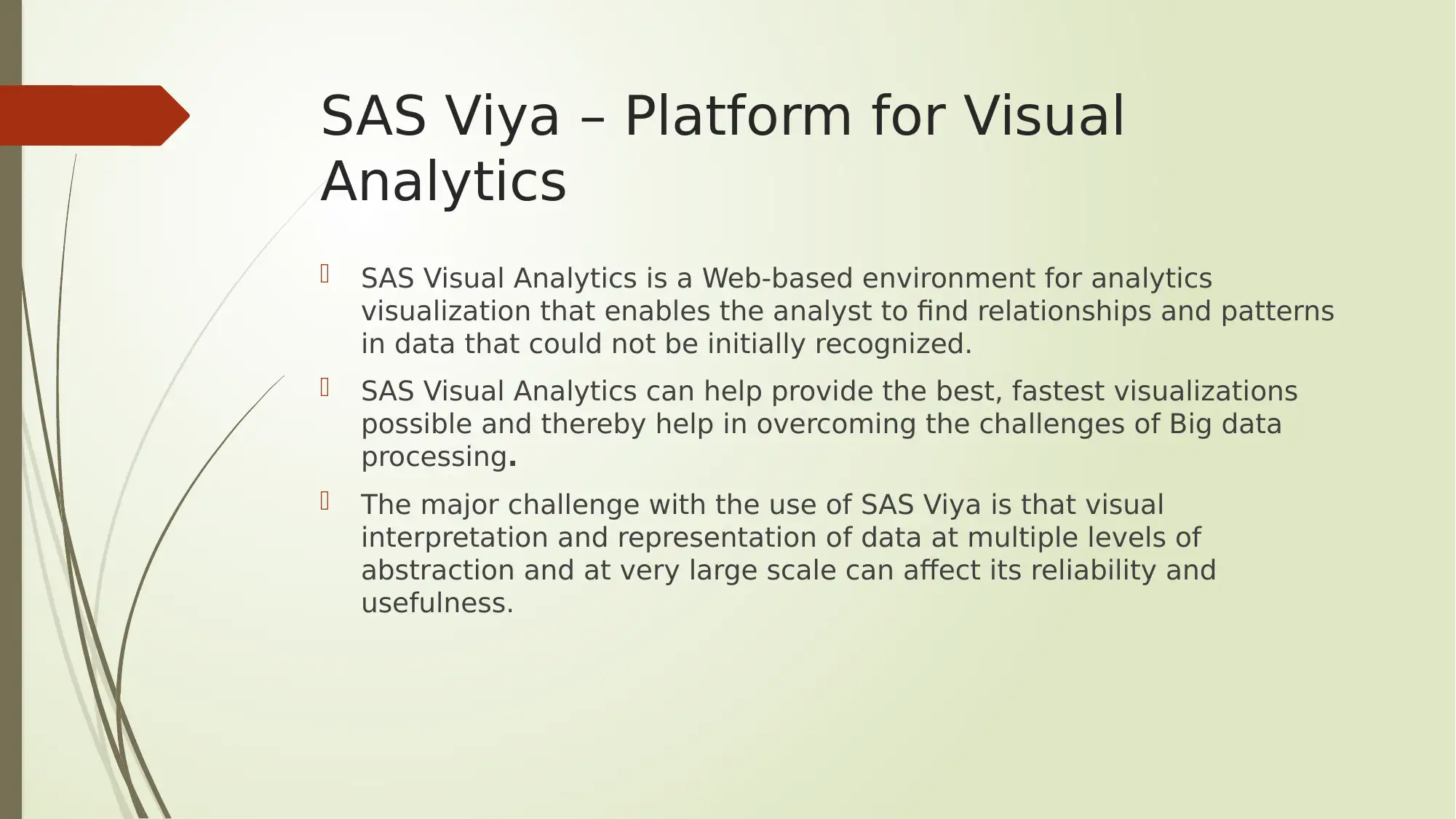
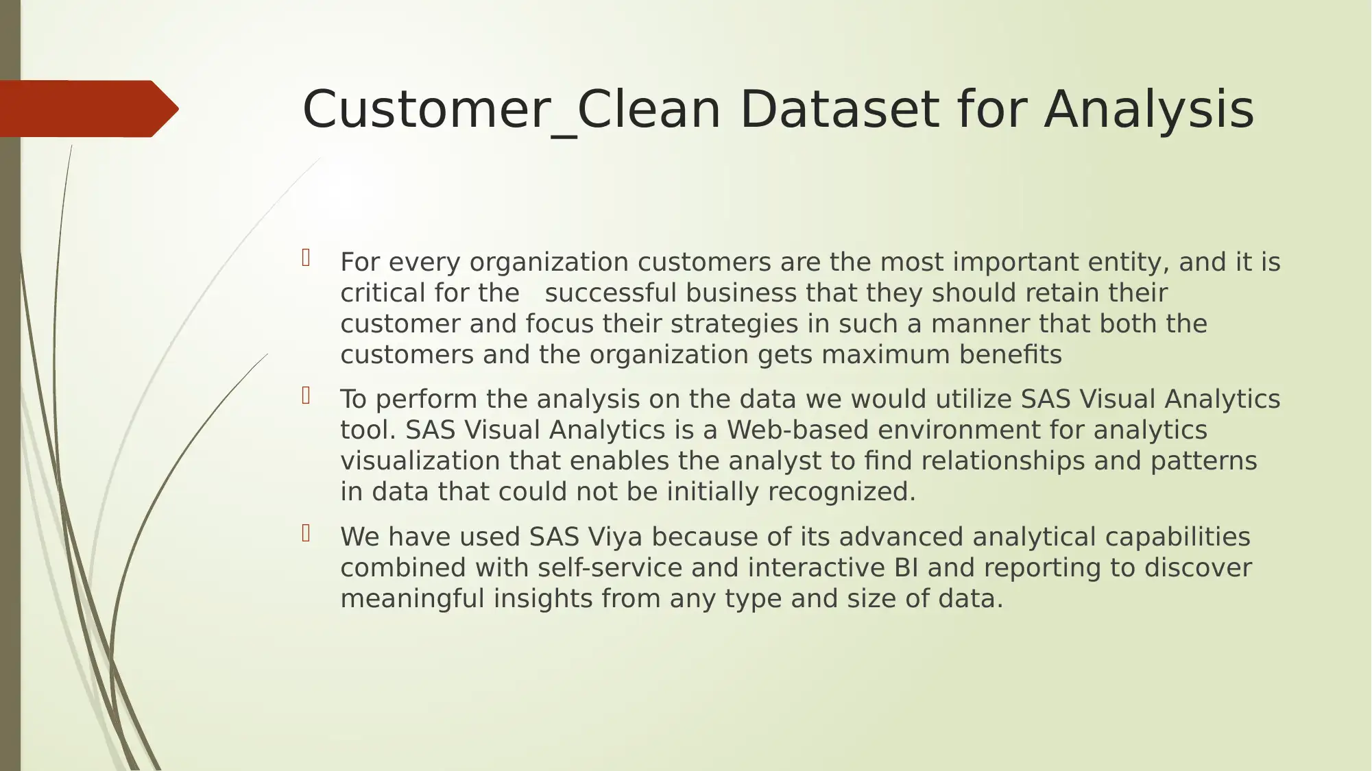
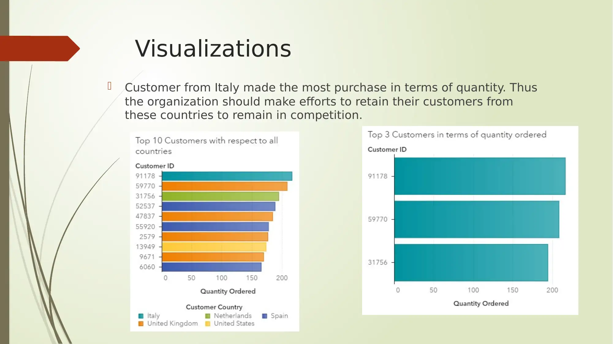
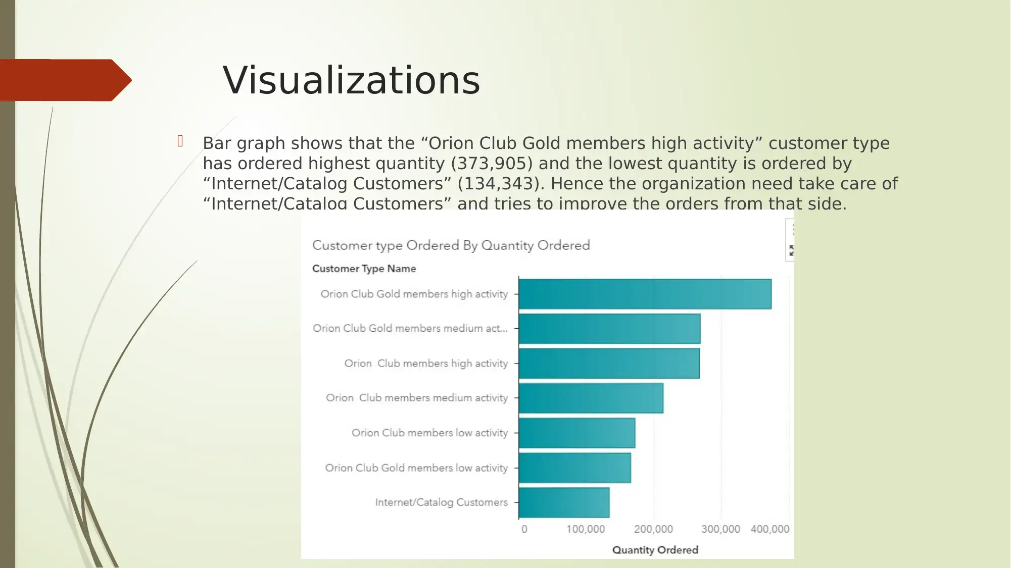
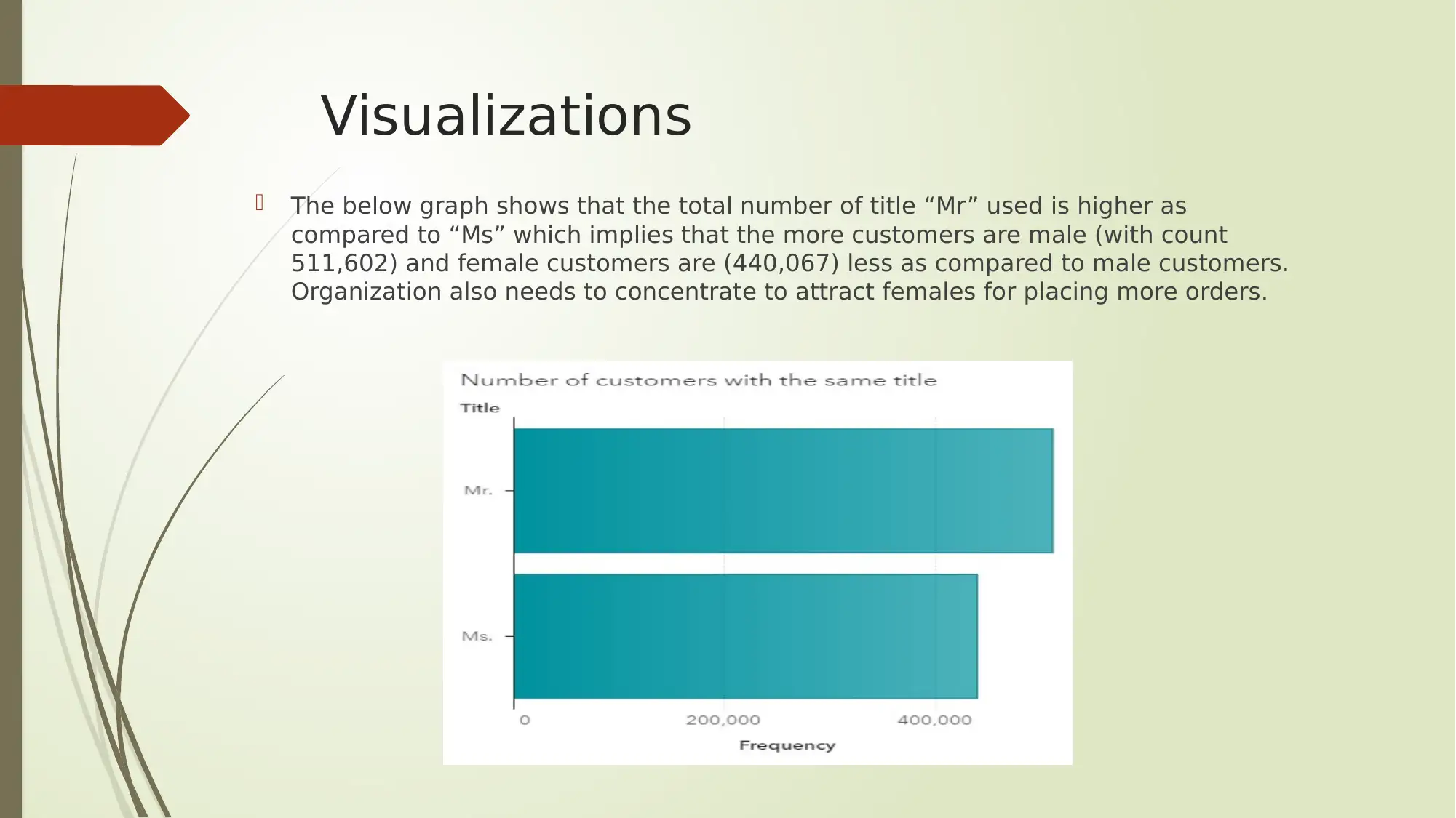
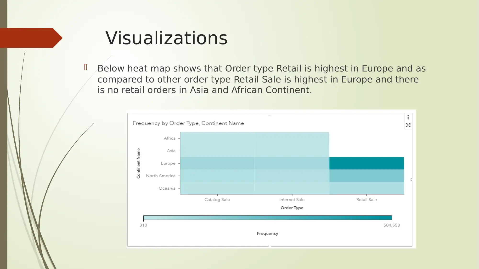
This report, created using SAS Visual Analytics, analyzes a customer dataset to identify patterns, trends, and insights. The analysis includes various visualizations, such as bar graphs and heatmaps, to understand customer behavior, purchase quantities, and order types across different regions and customer segments. Key findings include the identification of the most valuable customer groups, the significance of specific customer types, and regional variations in order preferences. The report emphasizes the importance of selecting appropriate visualizations to effectively communicate data-driven insights and highlights the challenges and opportunities in leveraging big data for business decision-making. The analysis provides actionable recommendations for customer retention and targeted marketing strategies, contributing to a deeper understanding of the customer base and enhancing business performance.
tabler-icon-diamond-filled.svg

Contribute Materials

Your contribution can guide someone’s learning journey. Share your documents today.
Document Page
ITECH1103- Big Data and
Analytics
tabler-icon-diamond-filled.svg

Secure Best Marks with AI Grader

Need help grading? Try our AI Grader for instant feedback on your assignments.
Document Page
SAS Viya – Platform for Visual
Analytics
SAS Visual Analytics is a Web-based environment for analytics
visualization that enables the analyst to find relationships and patterns
in data that could not be initially recognized.
SAS Visual Analytics can help provide the best, fastest visualizations
possible and thereby help in overcoming the challenges of Big data
processing.
The major challenge with the use of SAS Viya is that visual
interpretation and representation of data at multiple levels of
abstraction and at very large scale can affect its reliability and
usefulness.
Document Page
Customer_Clean Dataset for Analysis
For every organization customers are the most important entity, and it is
critical for the successful business that they should retain their
customer and focus their strategies in such a manner that both the
customers and the organization gets maximum benefits
To perform the analysis on the data we would utilize SAS Visual Analytics
tool. SAS Visual Analytics is a Web-based environment for analytics
visualization that enables the analyst to find relationships and patterns
in data that could not be initially recognized.
We have used SAS Viya because of its advanced analytical capabilities
combined with self-service and interactive BI and reporting to discover
meaningful insights from any type and size of data.
Document Page
Visualizations
Customer from Italy made the most purchase in terms of quantity. Thus
the organization should make efforts to retain their customers from
these countries to remain in competition.
tabler-icon-diamond-filled.svg

Secure Best Marks with AI Grader

Need help grading? Try our AI Grader for instant feedback on your assignments.
Document Page
Visualizations
Bar graph shows that the “Orion Club Gold members high activity” customer type
has ordered highest quantity (373,905) and the lowest quantity is ordered by
“Internet/Catalog Customers” (134,343). Hence the organization need take care of
“Internet/Catalog Customers” and tries to improve the orders from that side.
Document Page
Visualizations
The below graph shows that the total number of title “Mr” used is higher as
compared to “Ms” which implies that the more customers are male (with count
511,602) and female customers are (440,067) less as compared to male customers.
Organization also needs to concentrate to attract females for placing more orders.
Document Page
Visualizations
Below heat map shows that Order type Retail is highest in Europe and as
compared to other order type Retail Sale is highest in Europe and there
is no retail orders in Asia and African Continent.
tabler-icon-diamond-filled.svg

Paraphrase This Document

Need a fresh take? Get an instant paraphrase of this document with our AI Paraphraser
Document Page
Conclusion
From this tasks we can understand that visualization of the data can be
both fun as well as challenging. In this era of big data, visualization has
emerged as a critical component of analytics.
From visual analytics organizations can transform raw data into meaningful
information. However, it is also evident that selection of correct
visualization is important as well as challenging for the analyst as it can
result in wrong visualization to present the information.
The analysis performed on the data shows important visuals of the
interpreted information such as countries where customers purchase in
high quantity, customers that has aided in most revenue generation,
highest and lowest number of orders placed by the customers and so on By
understanding the features of data, and the information that is to be
conveyed, the visualization strategy can turn into a great opportunity.
Document Page
Thanks You
chevron_up_icon
1 out of 9
circle_padding
hide_on_mobile
zoom_out_icon
logo.png

Your All-in-One AI-Powered Toolkit for Academic Success.

Available 24*7 on WhatsApp / Email

[object Object]