University Assignment: Responsive Web Design Analysis of Makezine.com
VerifiedAdded on 2020/02/18
|14
|3272
|359
Report
AI Summary
This report provides a comprehensive evaluation of makezine.com from a responsive web design (RWD) perspective. It begins with an executive summary and table of contents, followed by an introduction emphasizing the importance of RWD in today's mobile-centric world. The report then delves into an overview and description of makezine.com, identifying its key features and assessing both its positive aspects, such as the use of media-specific CSS and efficient web page titles, and negative aspects, including the lack of height and width HTML tags and missing description meta tags. Screenshots are included to illustrate the website's appearance on different devices. The report also incorporates reviews and comments from two participants, offering diverse perspectives on the site's usability. Recommendations for improvement are provided, focusing on the inclusion of meta data, proper use of headings, and correct heading definitions. Furthermore, the report explores the relevance of the website's design to RWD principles, outlining nine key principles such as content flow, use of relative units, and mobile-first approach. The report also discusses the simulation tools used for the review, along with their advantages and disadvantages, and mentions similar tools available for testing. Finally, the report concludes with a summary of the findings and recommendations, and includes references to support the analysis.
Running head: RESPONSIVE WEB DESIGN
Responsive Web design
Name of the Student
Name of the University
Authors note
Responsive Web design
Name of the Student
Name of the University
Authors note
Paraphrase This Document
Need a fresh take? Get an instant paraphrase of this document with our AI Paraphraser
1RESPONSIVE WEB DESIGN
Executive Summary
The following report consist about the testing of the Site makezine.com from the perspective
of the responsive web designing principle. In addition to that, evaluation of the site, the
positive and negative aspects relevance with the different RWD principles are also discussed
in the different sections of this report.
2RESPONSIVE WEB DESIGN
Table of Contents
Introduction................................................................................................................................3
Review and Evaluation..............................................................................................................3
Overview and description..........................................................................................3
Identification of the main features of the Site............................................................3
Positive aspects..........................................................................................................3
Negative aspects.........................................................................................................3
Screenshots.................................................................................................................................4
Reviews and comments from two other participants.................................................7
Recommendation to be made to the site....................................................................7
Relevance to principles of RWD................................................................................................8
RWD principles..........................................................................................................8
Relevance with the principles....................................................................................9
Simulation tools used for the review..........................................................................................9
Advantages and disadvantages of simulation tool used.............................................9
Advantages.............................................................................................................9
Disadvantages........................................................................................................9
Similar tools available for testing............................................................................10
Conclusion................................................................................................................................11
References................................................................................................................................12
⊘ This is a preview!⊘
Do you want full access?
Subscribe today to unlock all pages.
Trusted by 1+ million students worldwide
3RESPONSIVE WEB DESIGN
Introduction
With the increasing number of mobile devices with variable screen sizes are used and
adopted by the users throughout the world, the need for the responsive web design is also
becomes more important for the designers. This becomes more important as without the
responsive design the websites does not provide a consistent view on the different devices the
users are trying to open it. Presently the sites are developed with the responsive layout by
keeping in mind the small resolution of 320 pixels to the larger resolutions like, devices with
120 pixels.
The following report contributes to the review and explanations about the different
features of a given site makezine.com, positive and negative aspects of the provided site from
the perspective of the users and numerous recommendations that can help in improving the
experience of the users when they interact with the given site. In addition to that the tools
used for the testing are also discussed in the different sections of the report along with the
advantages and disadvantages of the tool. Moreover, other available tools to test websites are
also discussed in this report.
Review and Evaluation
Overview and description
The makezine.com is a digital magazine that publishes articles on DIY or DIWO
project related to the computer, woodcraft, metal works as well as electronics and robotics.
The pages of the site are using the responsive web designing methodology. This
helps the user to see the site in a consistent layout on the different devices with varying
screen size.
Identification of the main features of the Site
The given website is served with GZIP encoding to the users that helps in the
reduction in the loading time for the webpages of the website.
In addition to that, all the pages are also optimised for mobile viewing as majority of
the users are using mobile or smart phone devices in order to access the site. For this
optimization the pages are developed using the media specific CSS.
The use of the media specific CSS enables the browsers on the smartphones or other
similar devices to detect the screen size and optimize the pages as per the size as well as in
efficiently rendering the navigation controls, images and texts.
This site also follows the standard practice of using a permanent URL HTTP 301
redirecting process in the different URLs of the different pages that are with/without trailing
slashes.
Positive aspects
Use of the Media Specific CSS: All the pages in the sites are developed and
delivered to the users with the media specific CSS for consistent view regardless of the
screen size of the screen of the devices (Voutilainen, Salonen and Mikkonen 2015). Thus
leads to the better users experience whether the access the site through a work station or a
smart phone device.
Efficient use of the Web page Titles: All the web pages of the given site efficiently
uses page titles. These page titles appears on the top of the search results for a search engine
Paraphrase This Document
Need a fresh take? Get an instant paraphrase of this document with our AI Paraphraser
4RESPONSIVE WEB DESIGN
results as well as at the top of the user’s browser windows. Use of appropriate page titles can
help in search engine ranking optimization to be in the top results in the search results.
Negative aspects
Lack of height and Width HTML tag: While evaluating the given website
“makezine.com”, we found that the most of the images on the different pages of the site
almost 98.0% images does not have any defined size by utilizing the height and width HTML
attributes on the pages (Voutilainen, Salonen and Mikkonen 2015). Even though these
HTML attributes are considered as optional by the web page designers but are strongly
recommended as this attributes help the web browser load the web pages faster as the
browser can render the total page while keeping the space for the image on the page.
The Web browsers download the page data in a parallel way as well as they try to
render the webpage as soon as possible with the downloaded data (Baturay and Birtane
2013). If the image height and width of the source images is not specified, the browser
would not have any idea about the dimension of the image and the space it is going to take on
the web page until the image is fully downloaded by the browser. This delay in the download
of the image and rendering process forces the web browser to frequently reflow or repaint the
layout of the page. This consequently leads to the overall delay in the complete load time.
With the more number of images with the same issue the more time browser will take to load
the web page (Voutilainen, Salonen and Mikkonen 2015). If the height and width of the
images are specified either in supporting CSS or in the main HTML code then the web
browser can easily avoid the frequent repaints of the layout of the page as per the downloaded
content.
Lack of Description Meta tags: In our observation all the pages of the site include
some metadata. On the other hand only 40.0% of the web pages in the site consist of a
description Meta tag. The description Meta data on every page is considered as important
because it is used by the search engines whenever a user searches for some site that matches
with the similar Meta tags and with better Meta tags it can improve the ranking on the search
result pages.
Empty headings: In our observations we found that some of the headings on the
different pages are empty or are incorrectly defined (Baturay and Birtane 2013). These empty
headings can irritate the users as are of no value to impact the search engine results. At the
end it makes a website less accessible and are avoided by the users.
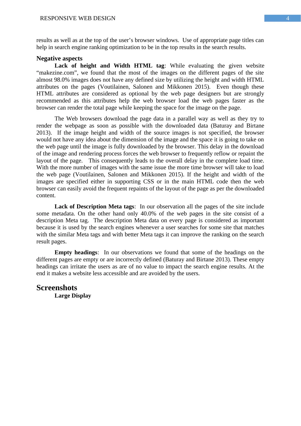
Screenshots
Large Display
results as well as at the top of the user’s browser windows. Use of appropriate page titles can
help in search engine ranking optimization to be in the top results in the search results.
Negative aspects
Lack of height and Width HTML tag: While evaluating the given website
“makezine.com”, we found that the most of the images on the different pages of the site
almost 98.0% images does not have any defined size by utilizing the height and width HTML
attributes on the pages (Voutilainen, Salonen and Mikkonen 2015). Even though these
HTML attributes are considered as optional by the web page designers but are strongly
recommended as this attributes help the web browser load the web pages faster as the
browser can render the total page while keeping the space for the image on the page.
The Web browsers download the page data in a parallel way as well as they try to
render the webpage as soon as possible with the downloaded data (Baturay and Birtane
2013). If the image height and width of the source images is not specified, the browser
would not have any idea about the dimension of the image and the space it is going to take on
the web page until the image is fully downloaded by the browser. This delay in the download
of the image and rendering process forces the web browser to frequently reflow or repaint the
layout of the page. This consequently leads to the overall delay in the complete load time.
With the more number of images with the same issue the more time browser will take to load
the web page (Voutilainen, Salonen and Mikkonen 2015). If the height and width of the
images are specified either in supporting CSS or in the main HTML code then the web
browser can easily avoid the frequent repaints of the layout of the page as per the downloaded
content.
Lack of Description Meta tags: In our observation all the pages of the site include
some metadata. On the other hand only 40.0% of the web pages in the site consist of a
description Meta tag. The description Meta data on every page is considered as important
because it is used by the search engines whenever a user searches for some site that matches
with the similar Meta tags and with better Meta tags it can improve the ranking on the search
result pages.
Empty headings: In our observations we found that some of the headings on the
different pages are empty or are incorrectly defined (Baturay and Birtane 2013). These empty
headings can irritate the users as are of no value to impact the search engine results. At the
end it makes a website less accessible and are avoided by the users.
Screenshots
Large Display
5RESPONSIVE WEB DESIGN
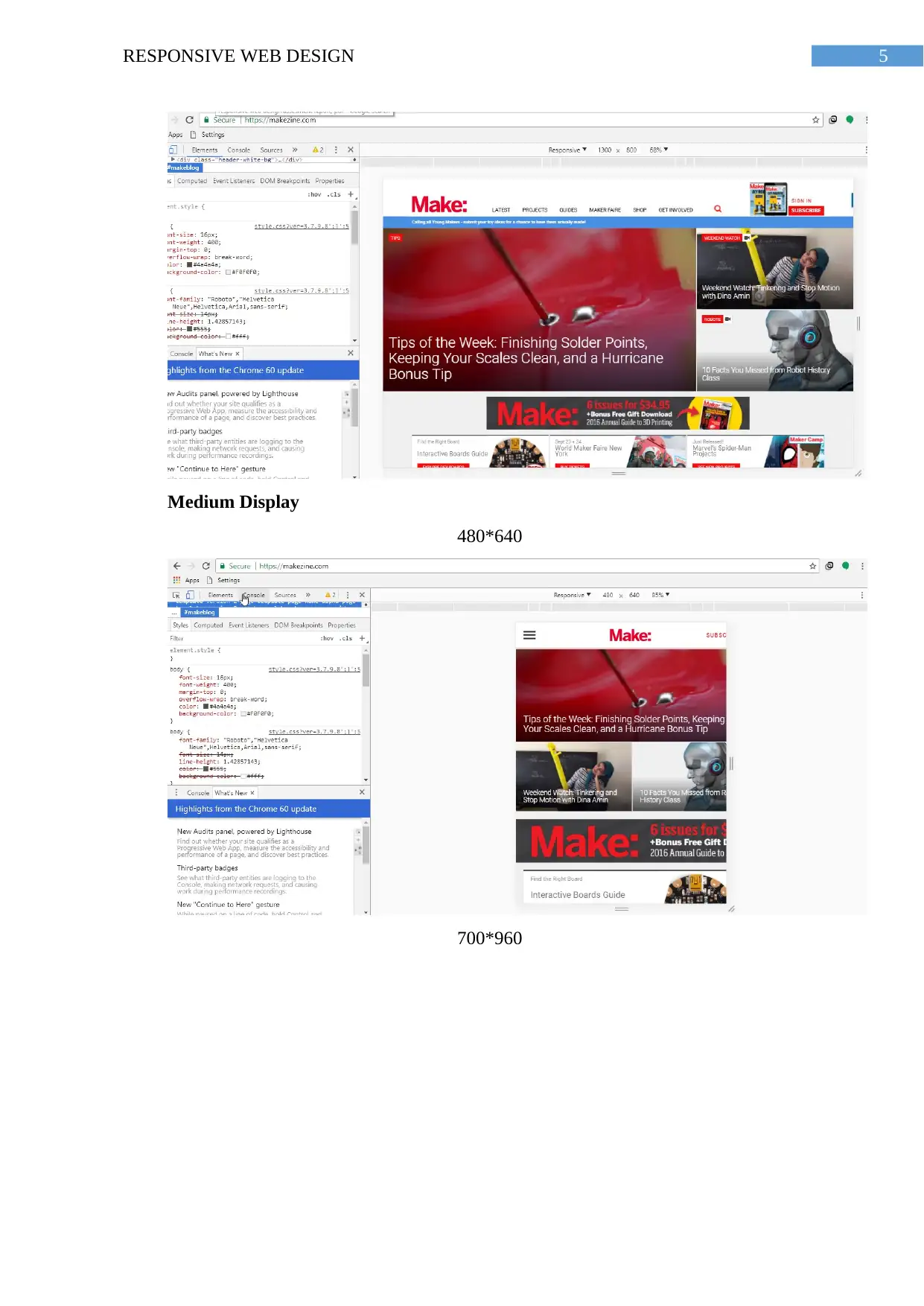
Medium Display
480*640
700*960
Medium Display
480*640
700*960
⊘ This is a preview!⊘
Do you want full access?
Subscribe today to unlock all pages.
Trusted by 1+ million students worldwide
6RESPONSIVE WEB DESIGN
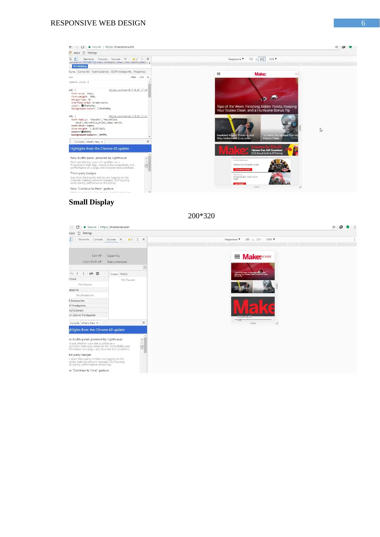
Small Display
200*320
Small Display
200*320
Paraphrase This Document
Need a fresh take? Get an instant paraphrase of this document with our AI Paraphraser
7RESPONSIVE WEB DESIGN
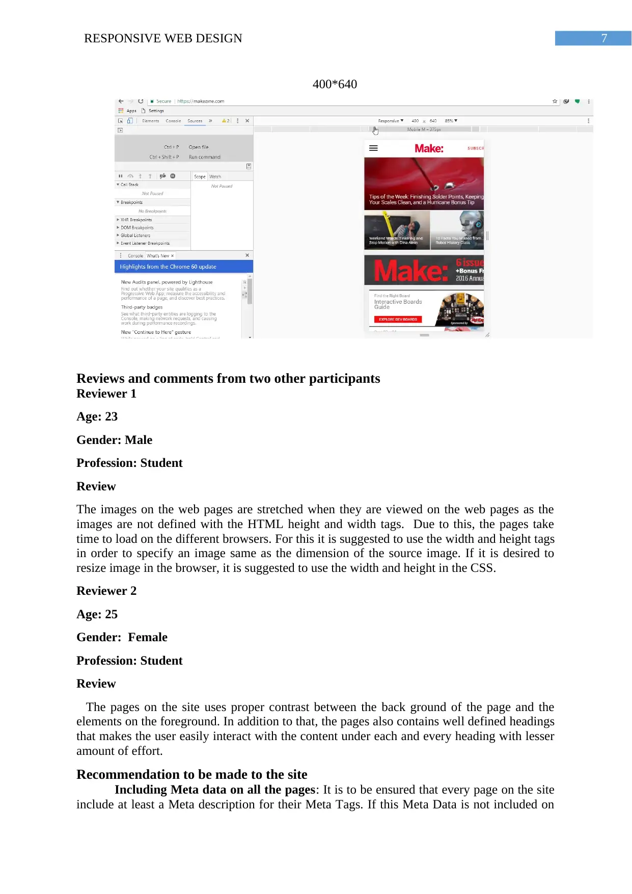
400*640
Reviews and comments from two other participants
Reviewer 1
Age: 23
Gender: Male
Profession: Student
Review
The images on the web pages are stretched when they are viewed on the web pages as the
images are not defined with the HTML height and width tags. Due to this, the pages take
time to load on the different browsers. For this it is suggested to use the width and height tags
in order to specify an image same as the dimension of the source image. If it is desired to
resize image in the browser, it is suggested to use the width and height in the CSS.
Reviewer 2
Age: 25
Gender: Female
Profession: Student
Review
The pages on the site uses proper contrast between the back ground of the page and the
elements on the foreground. In addition to that, the pages also contains well defined headings
that makes the user easily interact with the content under each and every heading with lesser
amount of effort.
Recommendation to be made to the site
Including Meta data on all the pages: It is to be ensured that every page on the site
include at least a Meta description for their Meta Tags. If this Meta Data is not included on
8RESPONSIVE WEB DESIGN
the pages then search engines will arbitrarily choose some sample text from webpages in
order to determine the appearance in the results list. Inclusion of Meta description can
improve the appearance of the site in the search engine results.
Proper use of the headings and content under them: It needs to be made sure that
all the headings on the different pages have at least some content relevant to the heading on
the pages.
Incorrect use of the headers on the pages: Some of the web pages of the site
contains headings that are not defined correctly. As per the standard convention, the H1 tag
must be used for top-level headings on the pages, H2 needs to be used for sub-headings
under the main headings,H3, H4 for sub-headings that comes after and so-on. Not using this
convention results in confusion in the visitors to the site.
Relevance to principles of RWD
RWD principles
RWD or the Responsive web design is considered as an approach in the field of web
design that delivers an optimal interaction and viewing experience through the wide range of
users devices with varying screen sizes such as desktop computer monitors, hand held smart
phones.
There are mainly 9 principles that are to be maintained and adopted while designing a
responsive web design. The principles are briefly described below.
Flow of the Content: With the smaller screen sizes of the devices the content on the
page takes up more and more vertical space, thus the next part in the content is pushed down
so that it would not interrupt the users view. Pushing down the content of the webpages for
better viewing is called flow.
Use of relative Units: The viewing screen can be a smart phone screen, desktop, or
other devices. Pixel density on the different devices also varies, therefore in the designing the
web pages some units requires that are flexible to work with. In this scenario, relative units
like percent of the screen size is helpful. Therefore making something 40% wide on the
screen, will imply that the element will always 40% of the screen. For this viewport can be
used that is total size of web browser window.
Use of the Vectors instead of image files: In case the used images on the web pages
does not contain some specific effects, it is suggested to use the Vectors. As the Vectors can
provide consistent view of all the images even though they are zoomed out.
Use of Web fonts: In the responsive web designs the use of the web fonts is
encouraged so that the view of the pages can be made attractive. At the same time it is also
important to keep in mind that, the increased number of used web font’s increases the loading
time of the web pages as the page loads only after all the packages are downloaded.
Mobile first approach: As the number of smart phone devices and their users
increasing day by day (Voutilainen, Salonen and Mikkonen 2015). A large number of users
access the site through the smart phones thus it is suggested to develop the website with
mobile first approach.
Use of Max and Min values for different elements: Use of the Max and Min values
in order to restrict the stretching of the content of the site throughout the page or screen. As
an example for the content or an element having width 100% will result in the stretching of
⊘ This is a preview!⊘
Do you want full access?
Subscribe today to unlock all pages.
Trusted by 1+ million students worldwide
9RESPONSIVE WEB DESIGN
the total content or element all over the screen. On the other hand the fixing the max width
100px would restrict the content from filling the overall screen, but go over 100px.
Use of the Nested objects in the design: In the web pages that consist of lot of
elements that depends on each other for their position on the screen. In this scenario it would
be difficult to control the positions and appearance on the screens. In order to avoid this
issues, it is important to wrap elements in a container in HTML code (Baturay and Birtane
2013). This makes the elements more clean, understandable as well as tidy on the screen. In
this scenario the static units for the screen sizes such as pixels can help to position the
elements.
Relevance with the principles
According to our tests the pages of the site is developed depending on the nine RWD
principles discussed above. Such as the
Simulation tools used for the review
For reviewing the given site we have used the Chrome device simulator of the chrome
browser.
Advantages and disadvantages of simulation tool used
Advantages
The chrome device simulator is helpful in the following ways,
Helps the developers to find unexpected behaviour of the responsive sites on different
viewports.
It is free and open source
The emulator can be connected with IDE’s so that early testing during the
development of the pages can be done.
It is an inexpensive solution for the testing of the sites.
Disadvantages
For any device and its browser, there are mainly three components that are important
for rendering the sites which are,
Screen size of the device: It is the size of the viewport of the device to render the
webpage.
User Agent: It is the component of the browser that informs the website about itself
and its attributes to retrieve the appropriate HTML.
Rendering Engine of the browser: It is the code of browser which is used to
interpret the HTML/CSS on the page. After that it renders and create what the users see in the
browser.
The chrome device simulator can accommodate the requirement one and two in the
above list. On the other hand, in case of the Rendering engine the Chrome device simulator
cannot emulate the behaviour of a real one leading to the inefficient testing and results
(Baturay and Birtane 2013).
Paraphrase This Document
Need a fresh take? Get an instant paraphrase of this document with our AI Paraphraser
10RESPONSIVE WEB DESIGN
Unable to emulate Device hardware: CPU and GPU behaviour are not emulated in
this simulation tool.
Browser User Interface: The emulator is unable to emulate the address bar and other
system UI elements. In addition to that, native displays, such as <select> elements, are not
emulated as list.
Some enrichments, like number inputs, keypad mode, varies from actual mobile
device behaviour. Other browser functionalities like, the iOS orientation zoom is not
emulated in the chrome device emulator. In addition to that, line-height CSS property
operates in the emulator, but is not supported in the browsers like Opera Mini.
Similar tools available for testing
Responsivedesignchecker.com:
Responsinator.com: Responsinator is an online tool that helps website designers
quickly get an overview about their responsive website. Changing the device settings on the
site they can test their sites on the most popular devices starting from the desktops to the
smart. The site does not exactly replicate how it will look and act on the devices thus the site
suggest use of the real devices for accurate testing result.
MobileTest.me: The Site helps the developers to select from a wide range of mobile
devices with different screen sizes so that they can observe the appearance on the viewports
of those devices.
11RESPONSIVE WEB DESIGN
Conclusion
In developing the responsive web design, it can help in the decreasing the
development cost for different platforms as it uses single and common code Base. Responsive
websites utilize one code base for all devices with varying screen sizes, which implies that
only one site needs to be maintained, which can mean less cost after some time. Responsive
website designs enables applications for adjusting powerfully to different screen sizes,
extents, and introductions. RWD is a way to deal with the issue of outlining for the colossal
number of gadgets running from little cell phones to extensive desktop screens. The most
important technical issue for developers taking a shot at responsive destinations is
progressively resizing pictures. Utilizing CSS2 to code for pictures in adaptable design that
resize for various measured viewport is simple. The issue is that smartphones need to
download the full-estimate picture before measuring it to fit the show. At the end the,
development costs for responsive plans add expenses to the advancement stage. As opposed
to planning one interface, designers now need to code to support more than one devices and
test them all.
⊘ This is a preview!⊘
Do you want full access?
Subscribe today to unlock all pages.
Trusted by 1+ million students worldwide
1 out of 14
Related Documents


Your All-in-One AI-Powered Toolkit for Academic Success.
+13062052269
info@desklib.com
Available 24*7 on WhatsApp / Email
![[object Object]](/_next/static/media/star-bottom.7253800d.svg)
Unlock your academic potential
Copyright © 2020–2026 A2Z Services. All Rights Reserved. Developed and managed by ZUCOL.