Analysis of Makezine Website: Responsive Web Design Techniques
VerifiedAdded on 2020/03/23
|16
|3582
|239
Report
AI Summary
This report presents a comprehensive analysis of the Makezine website's responsive web design (RWD). It begins with an introduction to RWD principles and then identifies and describes the Makezine website, a platform for DIY projects. The report explores the website's features, including responsive navigation, and evaluates both its positive and negative aspects, such as the use of a top navigation bar and potential issues with font support and content display on smaller screens. The analysis incorporates reviews from participants and utilizes the Google Chrome Device Simulator to assess the website's responsiveness across various screen resolutions. The report concludes with recommendations based on the findings and provides a bibliography of cited sources.
Running head: RESPONSIVE WEB DESIGNING
RWD Analysis: A Case Study of Makezine Website and
Google Chrome Simulator
Name of the Student
Name of the University
RWD Analysis: A Case Study of Makezine Website and
Google Chrome Simulator
Name of the Student
Name of the University
Paraphrase This Document
Need a fresh take? Get an instant paraphrase of this document with our AI Paraphraser
1RESPONSIVE WEB DESIGNING
Table of Contents
Introduction:....................................................................................................................................2
1. Identification and Description of Makezine:...............................................................................2
2. Features of Makezine:..................................................................................................................4
2.1 Main Feature: Responsive Navigation...................................................................................4
2.2 Other Features:.......................................................................................................................4
3. Positive and Negative Aspects of Website:.................................................................................5
3.1 Positive Aspects:....................................................................................................................5
3.2 Negative Aspects:..................................................................................................................5
4. Review of the Website:................................................................................................................6
4.1 RWD Analysis through Google Chrome Device Simulator:.................................................6
4.2 Participant Review...............................................................................................................10
4.3 Similarity and Dissimilarity in the Reviews:.......................................................................10
4.4 Review of Google Chrome Simulator:................................................................................11
4.5 Other Mobile Device Emulators:.........................................................................................11
5. Recommendations:....................................................................................................................13
Conclusion:....................................................................................................................................13
Bibliography:.................................................................................................................................14
2RESPONSIVE WEB DESIGNING
Introduction:
The responsive web design is the strategy of making the site responsive in terms of user’s
screen size environment, orientation and platform. This makes the looks of the website good
regarding ay device (Jensen, 2013). These sites are developed using the HTML and CSS or
cascading style sheet. Considering the responsive web design as a technology like JavaScript or
PHP or any other will be inadequate.
Within the study, the Makezine website will be analyzed in the contest of responsive web
design. Through the identification and overview of the site, the study will be initiated. The study
holds a number of reviews of the Makezine website. The gathered information has been critically
evaluated and on the basis of that evaluation, few recommendations has been provided.
1. Identification and Description of Makezine:
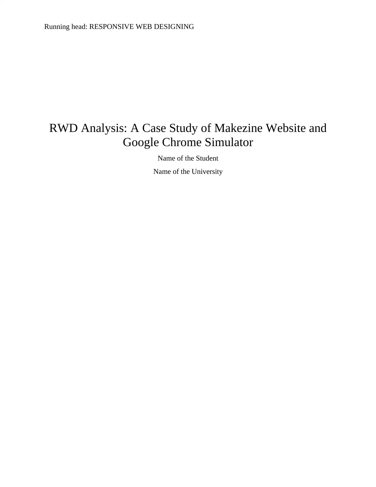
Identification of Makezine: The Makezine website is based on DIY projects. The
website provides project ideas and description to the users so that they can create their DIY
projects too. The home page of the website is full of projects and ideas.
Figure 1: Home Page of Makezine
(Source: Known Lock et al. 2017)
The website is based on the mission of empowering the makers and creators all around
the world. The website initiated the maker movement that embraces learning, creativity and
innovation. The website attracts various persons of different ages and professions to participate
in this event. The attractive ness and simplicity of the website makes the user to stay in website
for more times. The website is included with the social media integration.
Overview of the Website: The Makezine website is based on RWD principles that allows
the users to access the site properly from the mobile devices. The site registers the users and the
registered users can login to the system through the predefined ID and password. The website
also allows the users to subscribe magazine at the cost of $24.99, $34.99 and $39.99. The
website is consisting if header and footer. The menu and logo of the site has been provided in the
footer as it can be seen in the figure 1.
Introduction:
The responsive web design is the strategy of making the site responsive in terms of user’s
screen size environment, orientation and platform. This makes the looks of the website good
regarding ay device (Jensen, 2013). These sites are developed using the HTML and CSS or
cascading style sheet. Considering the responsive web design as a technology like JavaScript or
PHP or any other will be inadequate.
Within the study, the Makezine website will be analyzed in the contest of responsive web
design. Through the identification and overview of the site, the study will be initiated. The study
holds a number of reviews of the Makezine website. The gathered information has been critically
evaluated and on the basis of that evaluation, few recommendations has been provided.
1. Identification and Description of Makezine:
Identification of Makezine: The Makezine website is based on DIY projects. The
website provides project ideas and description to the users so that they can create their DIY
projects too. The home page of the website is full of projects and ideas.
Figure 1: Home Page of Makezine
(Source: Known Lock et al. 2017)
The website is based on the mission of empowering the makers and creators all around
the world. The website initiated the maker movement that embraces learning, creativity and
innovation. The website attracts various persons of different ages and professions to participate
in this event. The attractive ness and simplicity of the website makes the user to stay in website
for more times. The website is included with the social media integration.
Overview of the Website: The Makezine website is based on RWD principles that allows
the users to access the site properly from the mobile devices. The site registers the users and the
registered users can login to the system through the predefined ID and password. The website
also allows the users to subscribe magazine at the cost of $24.99, $34.99 and $39.99. The
website is consisting if header and footer. The menu and logo of the site has been provided in the
footer as it can be seen in the figure 1.
⊘ This is a preview!⊘
Do you want full access?
Subscribe today to unlock all pages.
Trusted by 1+ million students worldwide
3RESPONSIVE WEB DESIGNING
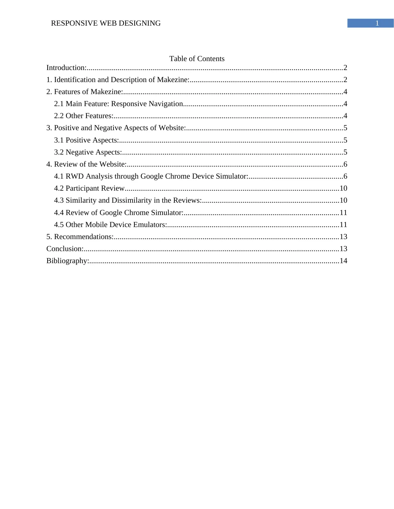
Figure 2: Footer of Makezine Website
(Source: Known Lock et al. 2017)
The footer of the site is consisting of crucial topic like explore making, our company and
follow us. These topics can be further categorized in different links. The Social media integration
can be seen in the follow us section of footer. Six main links has been provided in the menu of
the site, which expands into many more links to different pages. The webpage of articles as well
as videos on the DIY projects and ideas.
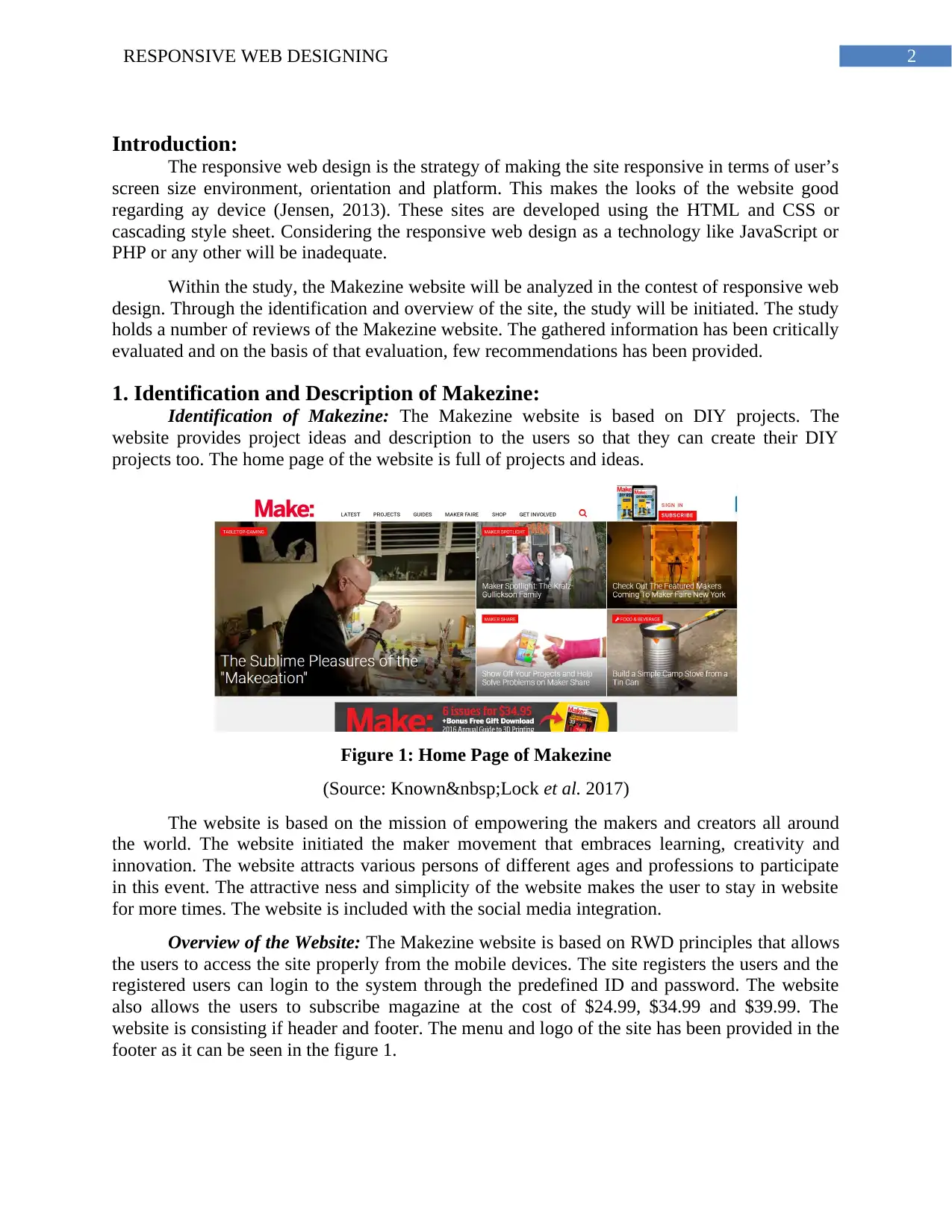
Figure 3: Get Involved Menu of Makezine Website
(Source: Known Lock et al. 2017)
The website allows the users to interact with the site extensively through the Get
Involved menu as shown in the figure 3. The users can take part in the maker camp, a well-
known activity of the site as mentioned above. The users can generate their individual portfolios
Figure 2: Footer of Makezine Website
(Source: Known Lock et al. 2017)
The footer of the site is consisting of crucial topic like explore making, our company and
follow us. These topics can be further categorized in different links. The Social media integration
can be seen in the follow us section of footer. Six main links has been provided in the menu of
the site, which expands into many more links to different pages. The webpage of articles as well
as videos on the DIY projects and ideas.
Figure 3: Get Involved Menu of Makezine Website
(Source: Known Lock et al. 2017)
The website allows the users to interact with the site extensively through the Get
Involved menu as shown in the figure 3. The users can take part in the maker camp, a well-
known activity of the site as mentioned above. The users can generate their individual portfolios
Paraphrase This Document
Need a fresh take? Get an instant paraphrase of this document with our AI Paraphraser
4RESPONSIVE WEB DESIGNING
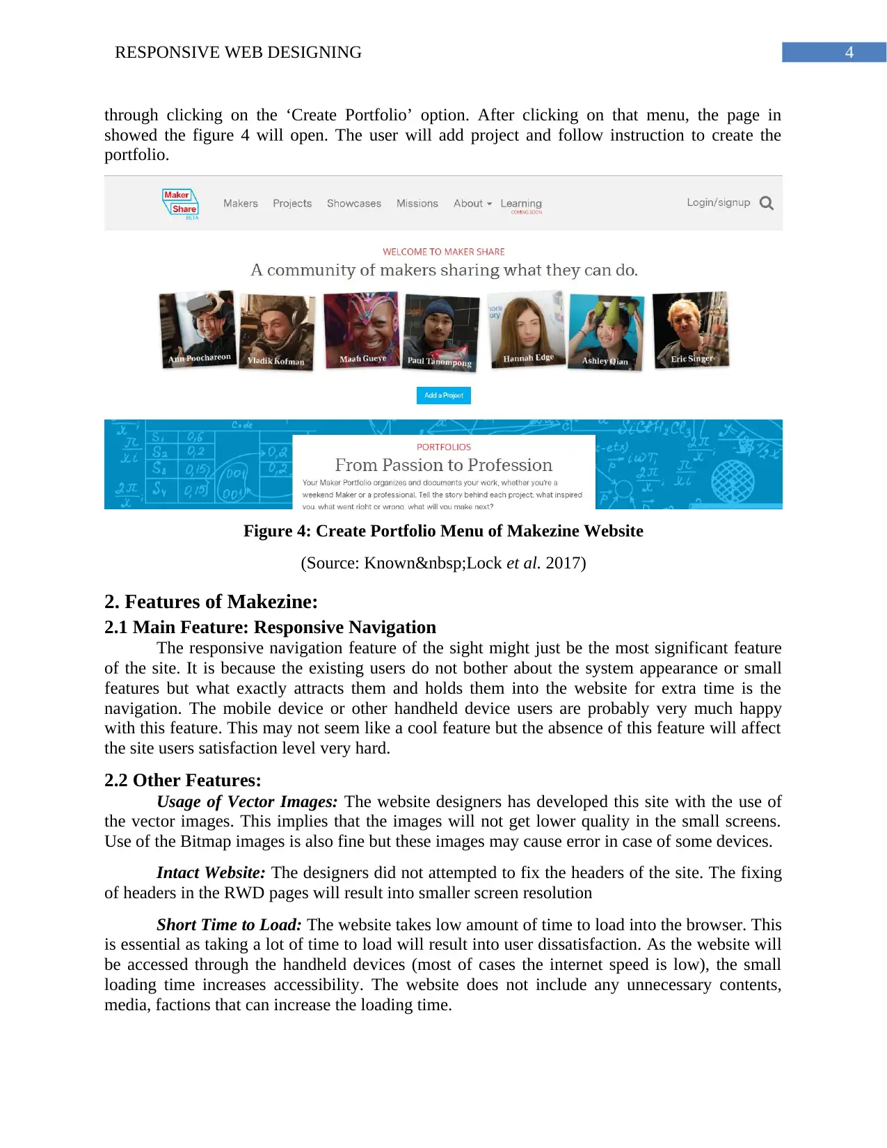
through clicking on the ‘Create Portfolio’ option. After clicking on that menu, the page in
showed the figure 4 will open. The user will add project and follow instruction to create the
portfolio.
Figure 4: Create Portfolio Menu of Makezine Website
(Source: Known Lock et al. 2017)
2. Features of Makezine:
2.1 Main Feature: Responsive Navigation
The responsive navigation feature of the sight might just be the most significant feature
of the site. It is because the existing users do not bother about the system appearance or small
features but what exactly attracts them and holds them into the website for extra time is the
navigation. The mobile device or other handheld device users are probably very much happy
with this feature. This may not seem like a cool feature but the absence of this feature will affect
the site users satisfaction level very hard.
2.2 Other Features:
Usage of Vector Images: The website designers has developed this site with the use of
the vector images. This implies that the images will not get lower quality in the small screens.
Use of the Bitmap images is also fine but these images may cause error in case of some devices.
Intact Website: The designers did not attempted to fix the headers of the site. The fixing
of headers in the RWD pages will result into smaller screen resolution
Short Time to Load: The website takes low amount of time to load into the browser. This
is essential as taking a lot of time to load will result into user dissatisfaction. As the website will
be accessed through the handheld devices (most of cases the internet speed is low), the small
loading time increases accessibility. The website does not include any unnecessary contents,
media, factions that can increase the loading time.
5RESPONSIVE WEB DESIGNING
Proper Space between Contents: The website does not have any inadequate spaces
between the contents. This allows the reader to interact with the website properly and makes the
appearance much better.
3. Positive and Negative Aspects of Website:
3.1 Positive Aspects:
1) Use of Top Navigation Bar: The website has a top navigation bar that can be
accessed from anywhere in the page. The menu bar will always be visible to the
user. This will reduce the effort and time of users as they will not have to scroll to
the top of the page to just access the menu.
2) Proper Navigation Menu: The headings of the menu has been properly named.
Each of the menu signifies which content or functions they possess. The user does
not have to roam around pages to find out the purpose of each page.
3) Three Click Convention: the website allows the user to access the intended
content within three clicks.
4) Proper Color Selection: The colors that has been used within the site is very
decent and light. The colors does not distract the users from the contents. The
light colors also attracts the new users. The existing users also like light color
pages.
5) Proper Division of Page: The page header, body and footer has been divided
properly. The division of page allows the user to access the page easily.
6) The Usage of Links: The pages uses links that will redirect the user to the
important sections of the website. The links has been used in the proper positions
so that use of inadequate content can be prevented.
7) Use of Images: The images has been used within the site so that users can
understand the project properly. The use of images also improves the interface of
the site.
3.2 Negative Aspects:
1) Improper Fonts: The fonts of the pages does not support all the systems. It seems
that fonts that has been used within the site is system generated fonts. All the
fonts of the system generated fonts does not support all the operating system
based browsers.
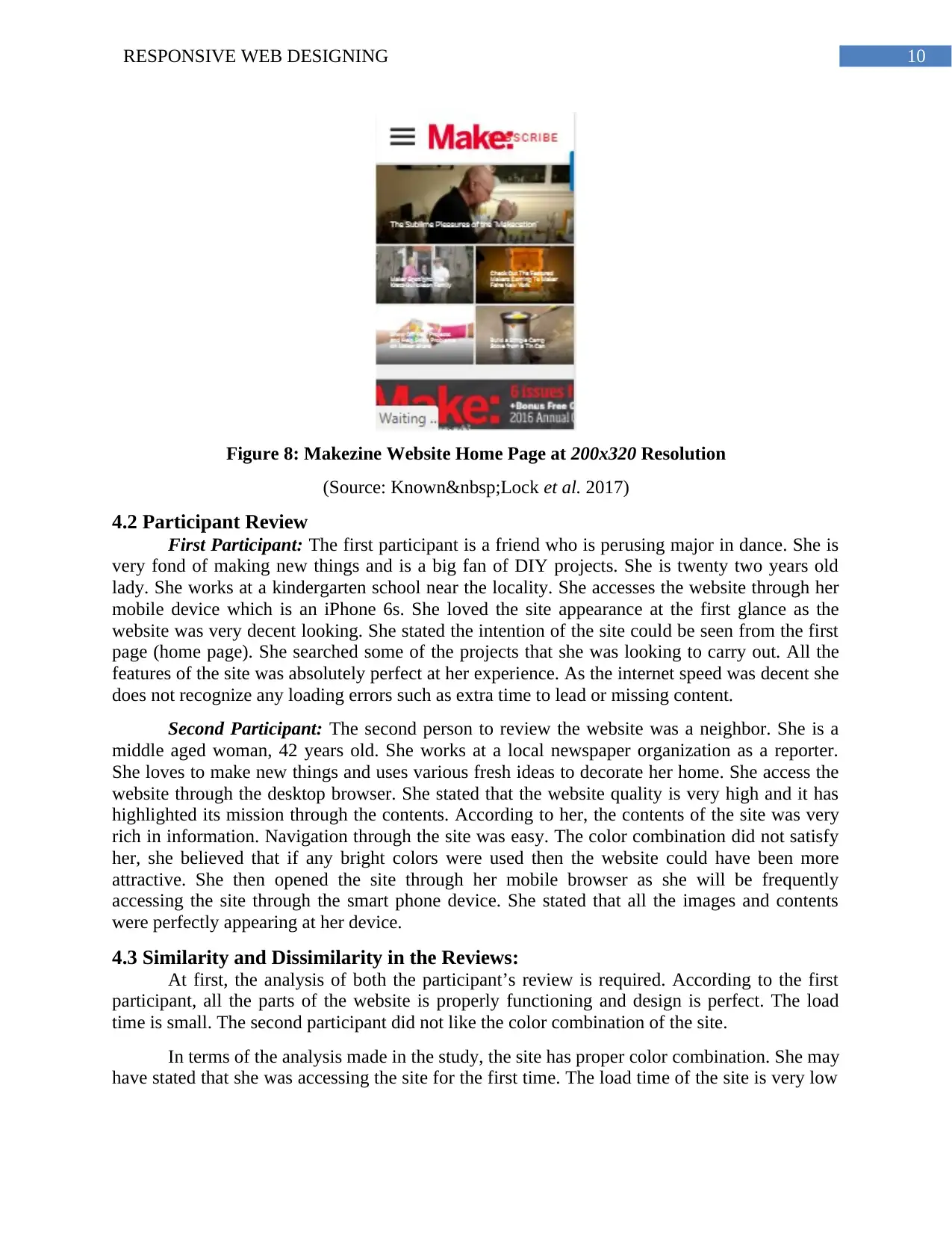
2) Error in Contents in Very Low Screen Size: Few of the contents does not fit into
the website properly when the screen is reduced to 200*320 resolution (can be
seen in the figure 8). As we all know, this kind of small screen size is not a major
issues. However, as the study is based on critical analysis, it is required to
highlight each issue.
3) Responsiveness for Mobile Devices Only: The website is only responsive to the
mobile sites only. In case of some old handheld devices and few less popular
products, the website does not fit properly. It may be because of the website
technology is not supported by the device browser.
4) Not Adequate for All Browser: The website may not be supported by all the
browsers. It has been seen, that the website is not properly functional (in terms of
interface and RWD only) in the internet explorer.
Proper Space between Contents: The website does not have any inadequate spaces
between the contents. This allows the reader to interact with the website properly and makes the
appearance much better.
3. Positive and Negative Aspects of Website:
3.1 Positive Aspects:
1) Use of Top Navigation Bar: The website has a top navigation bar that can be
accessed from anywhere in the page. The menu bar will always be visible to the
user. This will reduce the effort and time of users as they will not have to scroll to
the top of the page to just access the menu.
2) Proper Navigation Menu: The headings of the menu has been properly named.
Each of the menu signifies which content or functions they possess. The user does
not have to roam around pages to find out the purpose of each page.
3) Three Click Convention: the website allows the user to access the intended
content within three clicks.
4) Proper Color Selection: The colors that has been used within the site is very
decent and light. The colors does not distract the users from the contents. The
light colors also attracts the new users. The existing users also like light color
pages.
5) Proper Division of Page: The page header, body and footer has been divided
properly. The division of page allows the user to access the page easily.
6) The Usage of Links: The pages uses links that will redirect the user to the
important sections of the website. The links has been used in the proper positions
so that use of inadequate content can be prevented.
7) Use of Images: The images has been used within the site so that users can
understand the project properly. The use of images also improves the interface of
the site.
3.2 Negative Aspects:
1) Improper Fonts: The fonts of the pages does not support all the systems. It seems
that fonts that has been used within the site is system generated fonts. All the
fonts of the system generated fonts does not support all the operating system
based browsers.
2) Error in Contents in Very Low Screen Size: Few of the contents does not fit into
the website properly when the screen is reduced to 200*320 resolution (can be
seen in the figure 8). As we all know, this kind of small screen size is not a major
issues. However, as the study is based on critical analysis, it is required to
highlight each issue.
3) Responsiveness for Mobile Devices Only: The website is only responsive to the
mobile sites only. In case of some old handheld devices and few less popular
products, the website does not fit properly. It may be because of the website
technology is not supported by the device browser.
4) Not Adequate for All Browser: The website may not be supported by all the
browsers. It has been seen, that the website is not properly functional (in terms of
interface and RWD only) in the internet explorer.
⊘ This is a preview!⊘
Do you want full access?
Subscribe today to unlock all pages.
Trusted by 1+ million students worldwide
6RESPONSIVE WEB DESIGNING
4. Review of the Website:
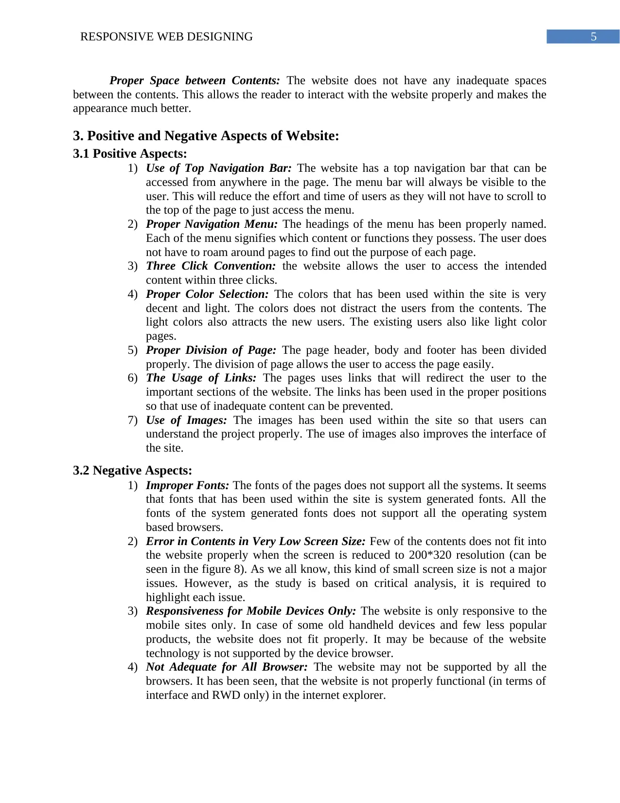
4.1 RWD Analysis through Google Chrome Device Simulator:
1280x768: The analysis of the makezine site has been done through the 1280x768 screen
resolution
Figure 4: Makezine Website Home Page at 1280x768 Resolution
(Source: Known Lock et al. 2017)
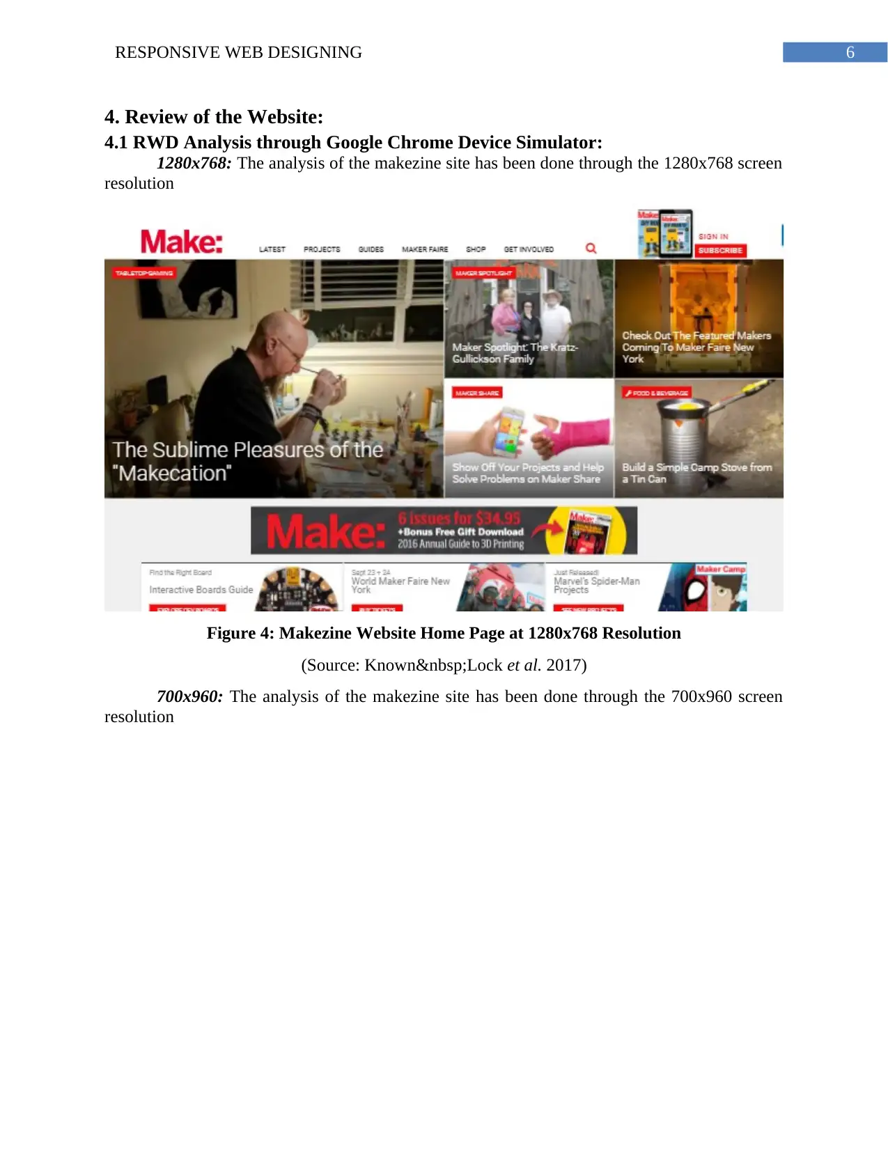
700x960: The analysis of the makezine site has been done through the 700x960 screen
resolution
4. Review of the Website:
4.1 RWD Analysis through Google Chrome Device Simulator:
1280x768: The analysis of the makezine site has been done through the 1280x768 screen
resolution
Figure 4: Makezine Website Home Page at 1280x768 Resolution
(Source: Known Lock et al. 2017)
700x960: The analysis of the makezine site has been done through the 700x960 screen
resolution
Paraphrase This Document
Need a fresh take? Get an instant paraphrase of this document with our AI Paraphraser
7RESPONSIVE WEB DESIGNING
Figure 5: Makezine Website Home Page at 700x960 Resolution
(Source; Known Lock et al. 2017)
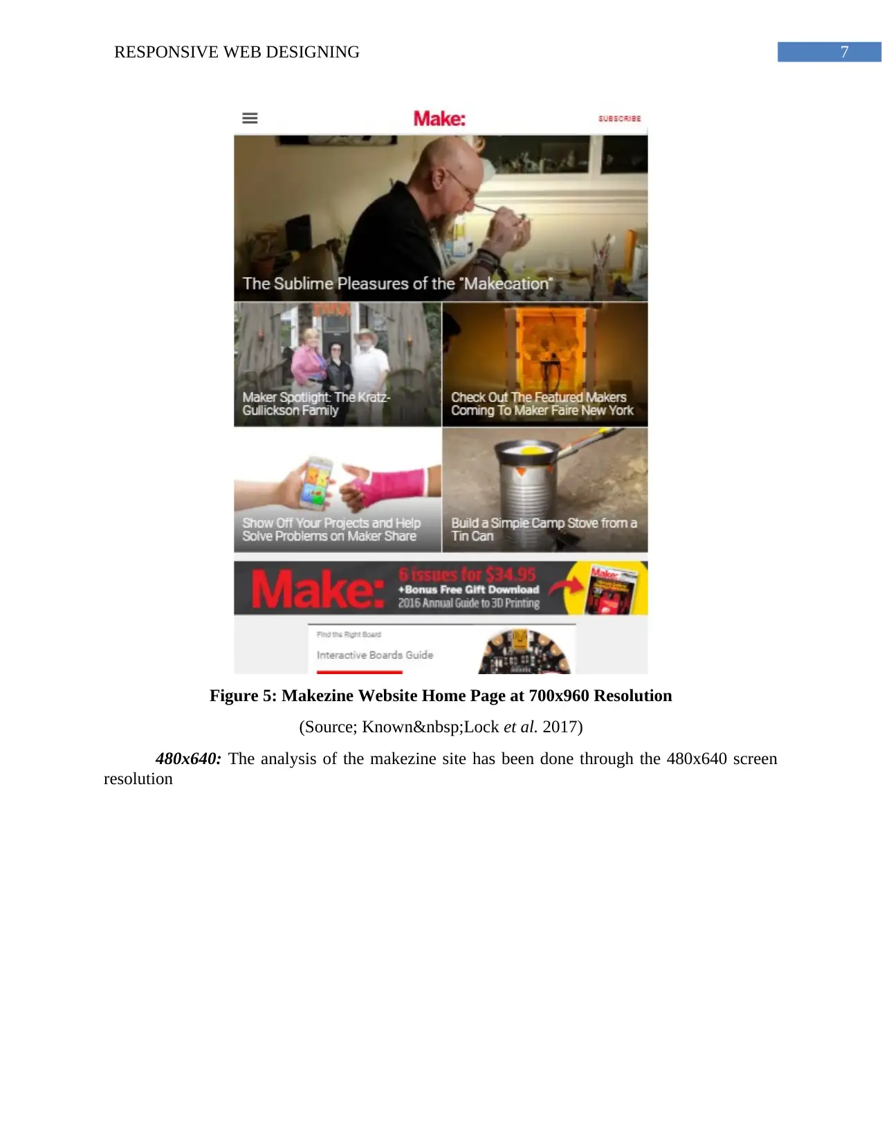
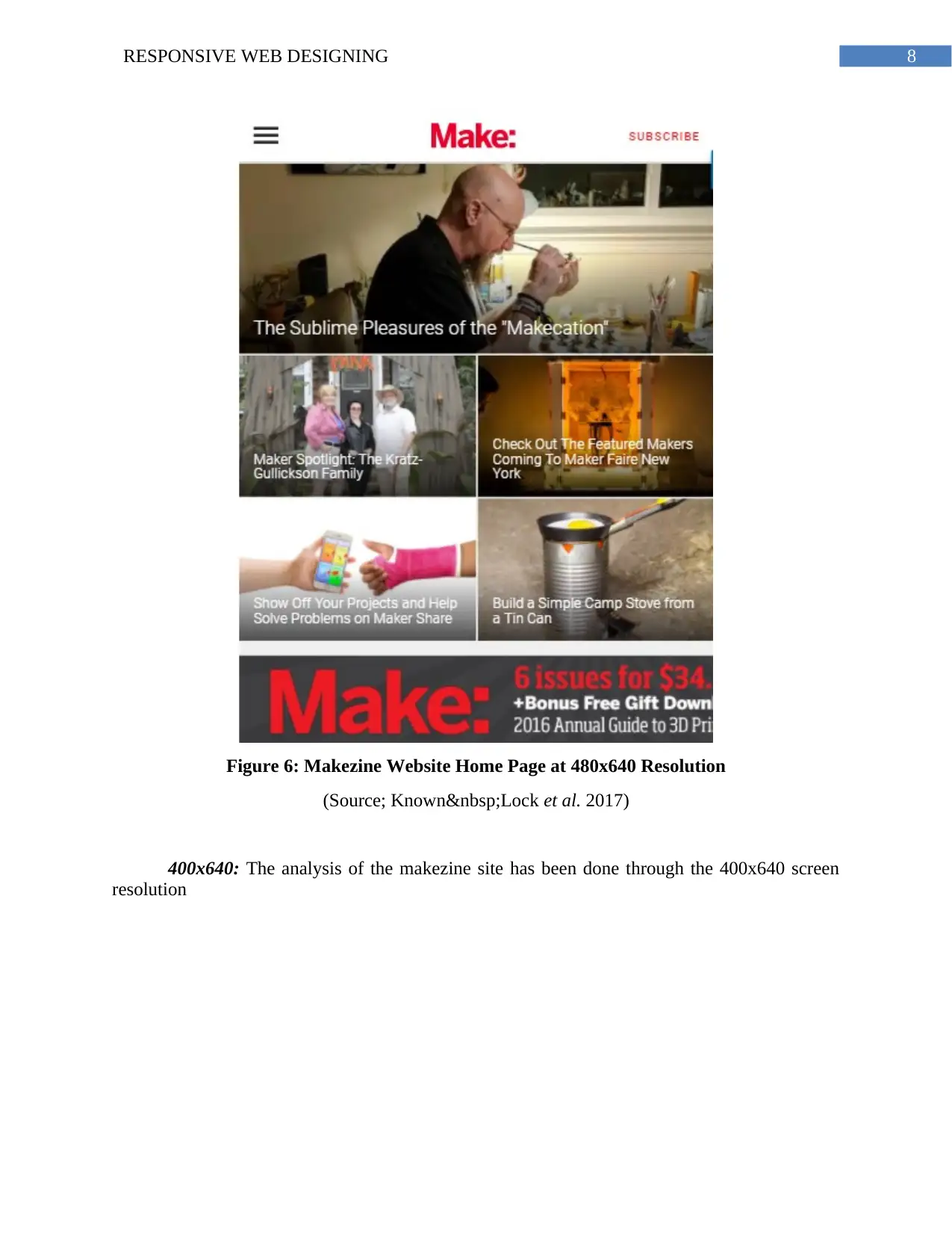
480x640: The analysis of the makezine site has been done through the 480x640 screen
resolution
Figure 5: Makezine Website Home Page at 700x960 Resolution
(Source; Known Lock et al. 2017)
480x640: The analysis of the makezine site has been done through the 480x640 screen
resolution
8RESPONSIVE WEB DESIGNING
Figure 6: Makezine Website Home Page at 480x640 Resolution
(Source; Known Lock et al. 2017)
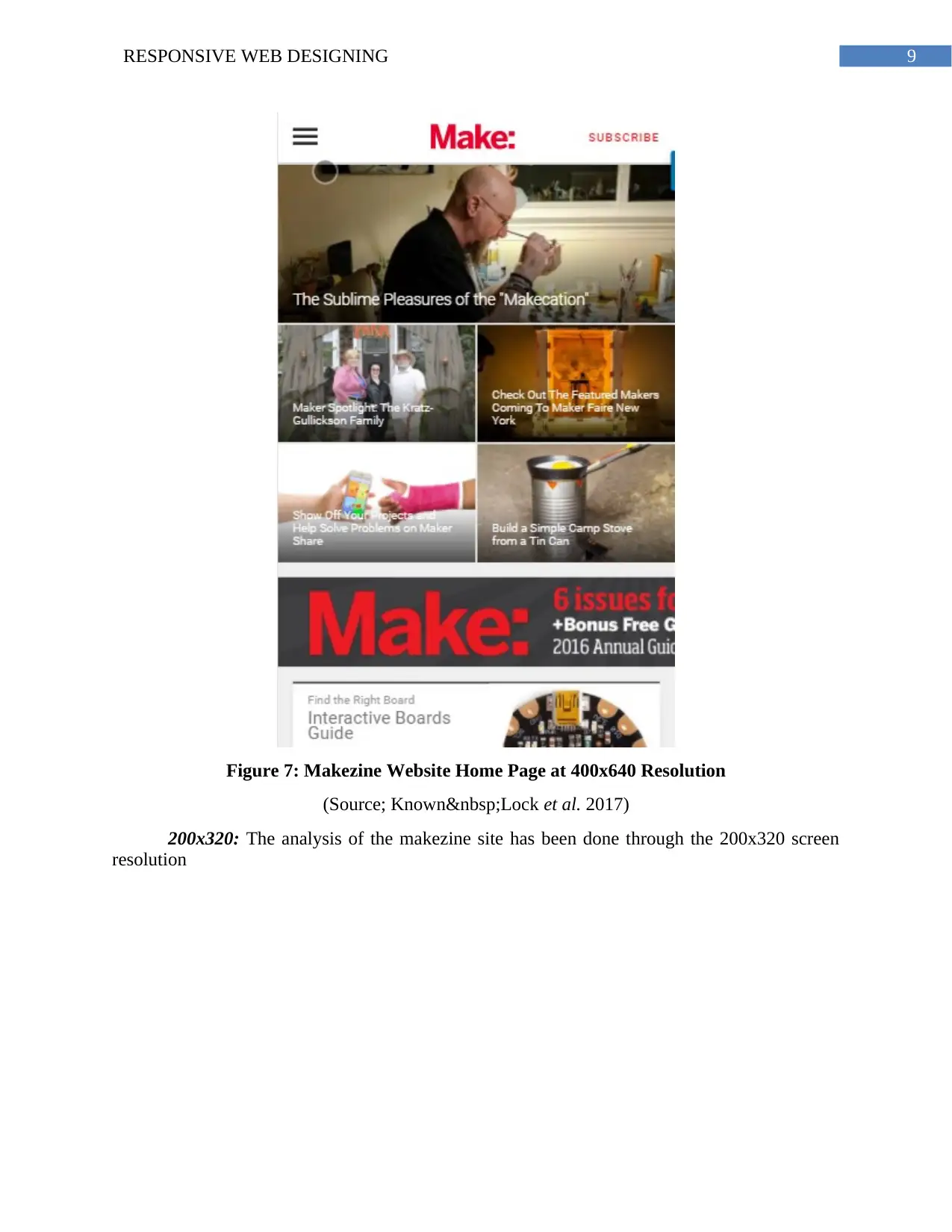
400x640: The analysis of the makezine site has been done through the 400x640 screen
resolution
Figure 6: Makezine Website Home Page at 480x640 Resolution
(Source; Known Lock et al. 2017)
400x640: The analysis of the makezine site has been done through the 400x640 screen
resolution
⊘ This is a preview!⊘
Do you want full access?
Subscribe today to unlock all pages.
Trusted by 1+ million students worldwide
9RESPONSIVE WEB DESIGNING
Figure 7: Makezine Website Home Page at 400x640 Resolution
(Source; Known Lock et al. 2017)
200x320: The analysis of the makezine site has been done through the 200x320 screen
resolution
Figure 7: Makezine Website Home Page at 400x640 Resolution
(Source; Known Lock et al. 2017)
200x320: The analysis of the makezine site has been done through the 200x320 screen
resolution
Paraphrase This Document
Need a fresh take? Get an instant paraphrase of this document with our AI Paraphraser
10RESPONSIVE WEB DESIGNING
Figure 8: Makezine Website Home Page at 200x320 Resolution
(Source: Known Lock et al. 2017)
4.2 Participant Review
First Participant: The first participant is a friend who is perusing major in dance. She is
very fond of making new things and is a big fan of DIY projects. She is twenty two years old
lady. She works at a kindergarten school near the locality. She accesses the website through her
mobile device which is an iPhone 6s. She loved the site appearance at the first glance as the
website was very decent looking. She stated the intention of the site could be seen from the first
page (home page). She searched some of the projects that she was looking to carry out. All the
features of the site was absolutely perfect at her experience. As the internet speed was decent she
does not recognize any loading errors such as extra time to lead or missing content.
Second Participant: The second person to review the website was a neighbor. She is a
middle aged woman, 42 years old. She works at a local newspaper organization as a reporter.
She loves to make new things and uses various fresh ideas to decorate her home. She access the
website through the desktop browser. She stated that the website quality is very high and it has
highlighted its mission through the contents. According to her, the contents of the site was very
rich in information. Navigation through the site was easy. The color combination did not satisfy
her, she believed that if any bright colors were used then the website could have been more
attractive. She then opened the site through her mobile browser as she will be frequently
accessing the site through the smart phone device. She stated that all the images and contents
were perfectly appearing at her device.
4.3 Similarity and Dissimilarity in the Reviews:
At first, the analysis of both the participant’s review is required. According to the first
participant, all the parts of the website is properly functioning and design is perfect. The load
time is small. The second participant did not like the color combination of the site.
In terms of the analysis made in the study, the site has proper color combination. She may
have stated that she was accessing the site for the first time. The load time of the site is very low
11RESPONSIVE WEB DESIGNING
which matches with the review of first participant. The analysis made in the study matches
completely with the review of both the participants except the color selection.
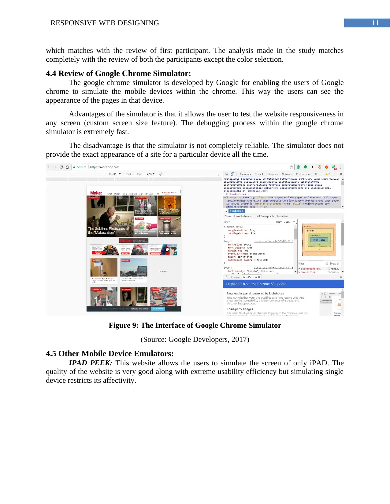
4.4 Review of Google Chrome Simulator:
The google chrome simulator is developed by Google for enabling the users of Google
chrome to simulate the mobile devices within the chrome. This way the users can see the
appearance of the pages in that device.
Advantages of the simulator is that it allows the user to test the website responsiveness in
any screen (custom screen size feature). The debugging process within the google chrome
simulator is extremely fast.
The disadvantage is that the simulator is not completely reliable. The simulator does not
provide the exact appearance of a site for a particular device all the time.
Figure 9: The Interface of Google Chrome Simulator
(Source: Google Developers, 2017)
4.5 Other Mobile Device Emulators:
IPAD PEEK: This website allows the users to simulate the screen of only iPAD. The
quality of the website is very good along with extreme usability efficiency but simulating single
device restricts its affectivity.
which matches with the review of first participant. The analysis made in the study matches
completely with the review of both the participants except the color selection.
4.4 Review of Google Chrome Simulator:
The google chrome simulator is developed by Google for enabling the users of Google
chrome to simulate the mobile devices within the chrome. This way the users can see the
appearance of the pages in that device.
Advantages of the simulator is that it allows the user to test the website responsiveness in
any screen (custom screen size feature). The debugging process within the google chrome
simulator is extremely fast.
The disadvantage is that the simulator is not completely reliable. The simulator does not
provide the exact appearance of a site for a particular device all the time.
Figure 9: The Interface of Google Chrome Simulator
(Source: Google Developers, 2017)
4.5 Other Mobile Device Emulators:
IPAD PEEK: This website allows the users to simulate the screen of only iPAD. The
quality of the website is very good along with extreme usability efficiency but simulating single
device restricts its affectivity.
⊘ This is a preview!⊘
Do you want full access?
Subscribe today to unlock all pages.
Trusted by 1+ million students worldwide
1 out of 16
Related Documents


Your All-in-One AI-Powered Toolkit for Academic Success.
+13062052269
info@desklib.com
Available 24*7 on WhatsApp / Email
![[object Object]](/_next/static/media/star-bottom.7253800d.svg)
Unlock your academic potential
Copyright © 2020–2026 A2Z Services. All Rights Reserved. Developed and managed by ZUCOL.