COIT20268: MCA Website Evaluation Report - Term 2 2019
VerifiedAdded on 2022/10/19
|16
|3662
|253
Report
AI Summary
This report provides a comprehensive evaluation of the Museum of Contemporary Art (MCA) Australia website, focusing on its responsive web design. The report begins with an introduction to web applications and websites, emphasizing their importance for businesses. It then provides an overview of the MCA website, detailing its purpose, features, and the museum's mission. The main body of the report includes a site analysis, evaluating the website's design on both desktop and mobile versions, highlighting positive aspects such as the non-static logo, the use of white space, and the consistent design principles. However, the report also identifies several negative aspects, including the non-static logo, design inconsistencies, menu click issues, feature repetition, missing breadcrumbs, and the absence of a separate contact page. The evaluation is supported by user interviews and concludes with recommendations for improving the website's usability and responsiveness. The evaluation was carried out using Google Chrome's device simulator, and the report adheres to responsive web design principles.
19
Website Evaluation
MCA
Website Evaluation
MCA
Paraphrase This Document
Need a fresh take? Get an instant paraphrase of this document with our AI Paraphraser
Website Evaluation
Table of Contents
Introduction.......................................................................................................................2
Overview of the Website.....................................................................................................2
Main features.....................................................................................................................3
Site analysis.......................................................................................................................5
Positives.......................................................................................................................................7
Negatives...................................................................................................................................10
User interview..................................................................................................................11
Recommendations............................................................................................................12
Tool used for review.........................................................................................................13
Conclusion.......................................................................................................................14
References.......................................................................................................................15
1
Website Evaluation
Introduction
Web applications have become an integral part of the everyday lives of the users. These
applications are being used for the personal activities, such as communication, entertainment,
leisure, etc. Also, the conduction of the business processes and operations is also based on
these applications. The web applications come in different forms and the most common out
of all are the websites. The websites are accessed by the users on the desktop as well as on
the mobile devices. The presence of a website for a business firm irrespective of its nature of
business has become crucial in the present days. The customers check the website of a
business organization and determine their association with the firm accordingly. It is,
therefore, extremely crucial for the organizations to pay special attention on the design and
utility of the website. The website that is developed for a specific firm shall fill its purpose
and it shall be ensured that the users get to connect with the site. The report comprises of the
evaluation of one such site which has been developed for the Museum of Contemporary Art,
Australia. The primary features of the site along with the positive and negative aspects are
explored in the evaluation and there are recommendations provided at the end.
Overview of the Website
Museum of Contemporary Arts, Australia is the leading museum in the country and it is
dedicated to exhibiting the talent of the present day artists. The museum experiences over a
million visits in one year and it is because of the exception collection of the international and
Australian art that is present in the museum. There are also a number of events that are
organized by the museum on a regular basis so that the work of the artists is recognized and
they get a platform to showcase their talent.
The primary aim of MCA is to make the Australian art accessible to all the people and make
sure that the work of the artists gets noticed. The MCA website has been developed to fulfill
the aim and it is a portal that provides all of the details associated with MCA (Mca, 2019).
The web and social media have become the primary medium to reach out to the people and
the purpose behind the development of the MCA website is the same. It comprises of all the
relevant details about the museum along with the information on the events and programs to
make sure that the people and the artists get to know about the same. The collection that has
been put up inside the museum is being collected since the year 1989. There are over 4000 art
pieces that are present in the museum and these belong to a variety of different artists.
2
⊘ This is a preview!⊘
Do you want full access?
Subscribe today to unlock all pages.
Trusted by 1+ million students worldwide
Website Evaluation
The website provides such factual details about the museum and the Australian art and also
provides the basic information, such as opening & closing hours of the museum, details of the
events, information on the artists, and likewise. This provides the ability to connect with the
people and share information about the museum and the latest developments associated with
it.
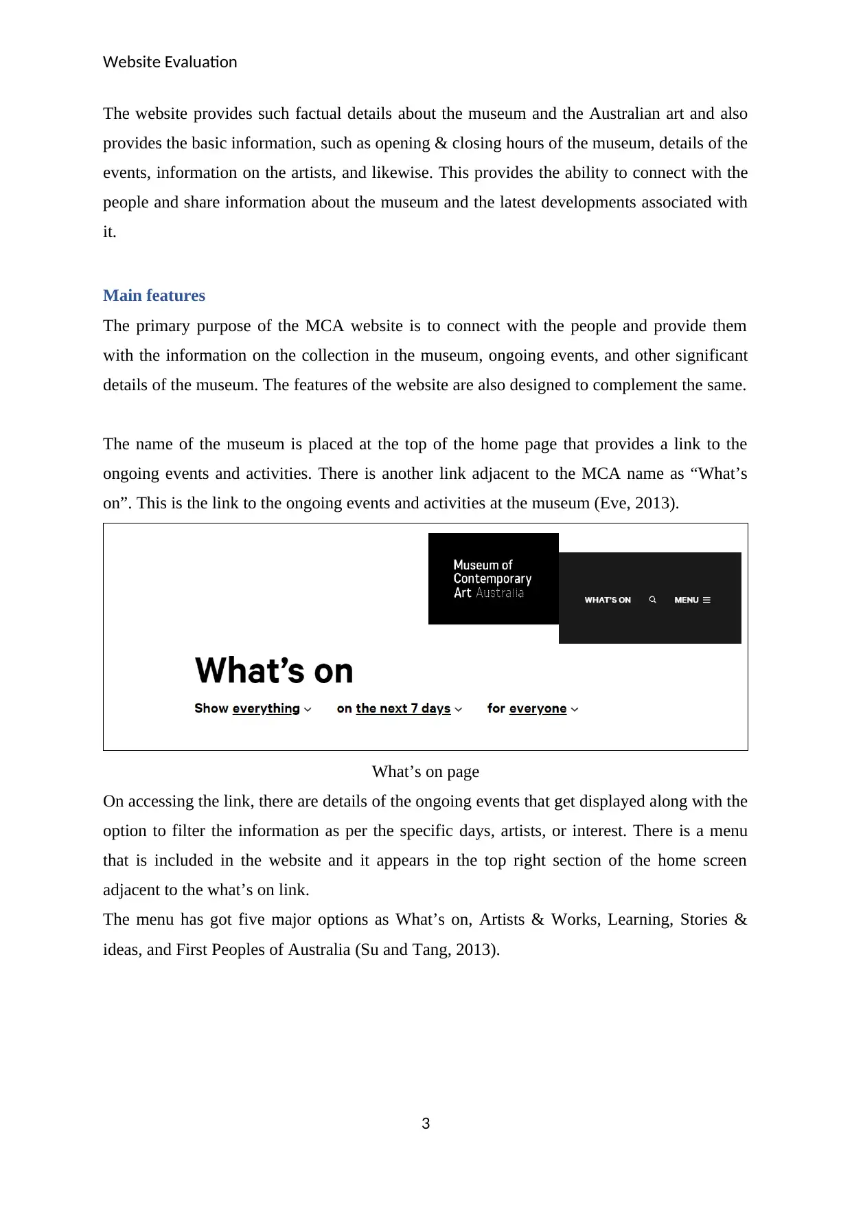
Main features
The primary purpose of the MCA website is to connect with the people and provide them
with the information on the collection in the museum, ongoing events, and other significant
details of the museum. The features of the website are also designed to complement the same.
The name of the museum is placed at the top of the home page that provides a link to the
ongoing events and activities. There is another link adjacent to the MCA name as “What’s
on”. This is the link to the ongoing events and activities at the museum (Eve, 2013).
What’s on page
On accessing the link, there are details of the ongoing events that get displayed along with the
option to filter the information as per the specific days, artists, or interest. There is a menu
that is included in the website and it appears in the top right section of the home screen
adjacent to the what’s on link.
The menu has got five major options as What’s on, Artists & Works, Learning, Stories &
ideas, and First Peoples of Australia (Su and Tang, 2013).
3
The website provides such factual details about the museum and the Australian art and also
provides the basic information, such as opening & closing hours of the museum, details of the
events, information on the artists, and likewise. This provides the ability to connect with the
people and share information about the museum and the latest developments associated with
it.
Main features
The primary purpose of the MCA website is to connect with the people and provide them
with the information on the collection in the museum, ongoing events, and other significant
details of the museum. The features of the website are also designed to complement the same.
The name of the museum is placed at the top of the home page that provides a link to the
ongoing events and activities. There is another link adjacent to the MCA name as “What’s
on”. This is the link to the ongoing events and activities at the museum (Eve, 2013).
What’s on page
On accessing the link, there are details of the ongoing events that get displayed along with the
option to filter the information as per the specific days, artists, or interest. There is a menu
that is included in the website and it appears in the top right section of the home screen
adjacent to the what’s on link.
The menu has got five major options as What’s on, Artists & Works, Learning, Stories &
ideas, and First Peoples of Australia (Su and Tang, 2013).
3
Paraphrase This Document
Need a fresh take? Get an instant paraphrase of this document with our AI Paraphraser
Website Evaluation
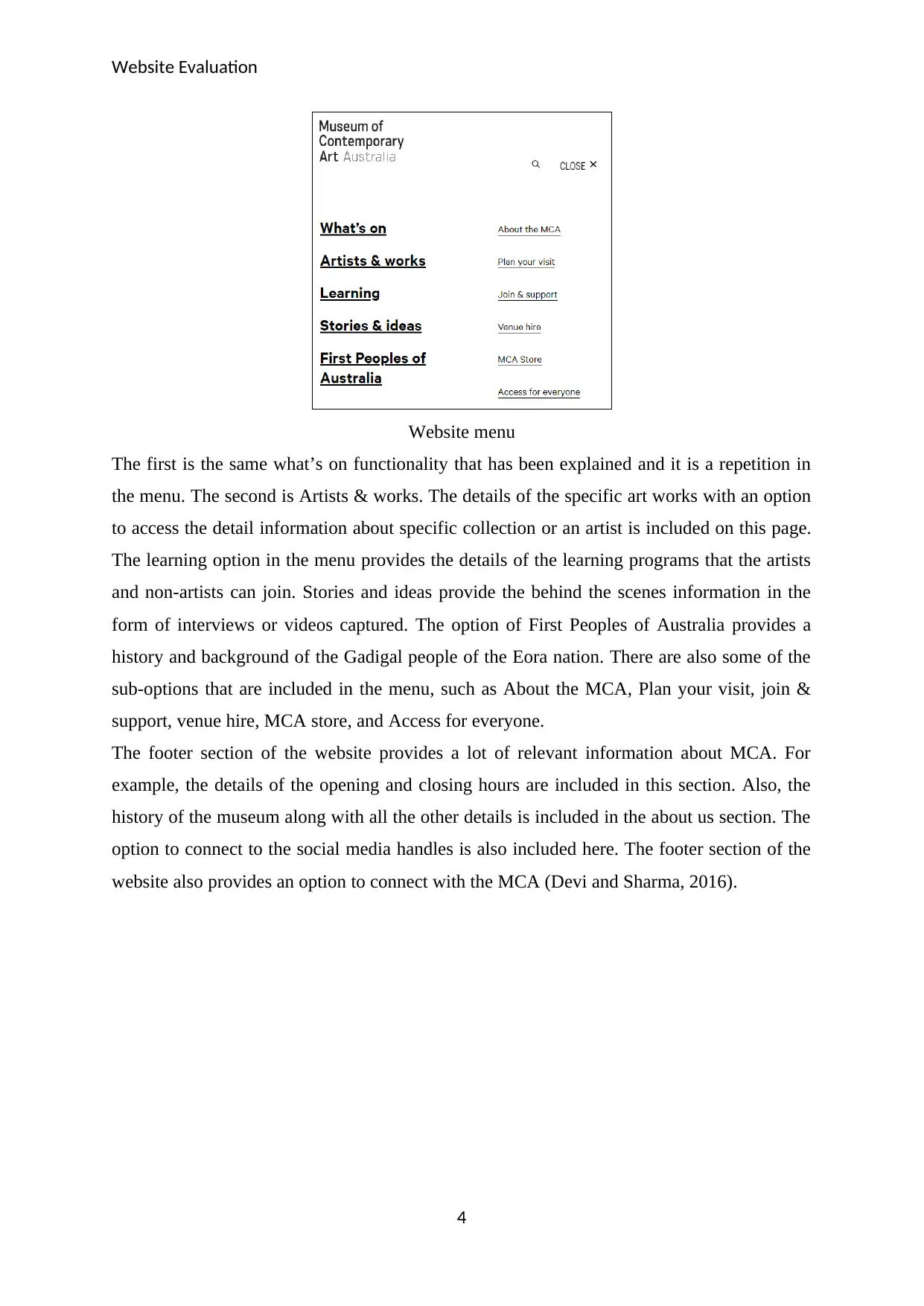
Website menu
The first is the same what’s on functionality that has been explained and it is a repetition in
the menu. The second is Artists & works. The details of the specific art works with an option
to access the detail information about specific collection or an artist is included on this page.
The learning option in the menu provides the details of the learning programs that the artists
and non-artists can join. Stories and ideas provide the behind the scenes information in the
form of interviews or videos captured. The option of First Peoples of Australia provides a
history and background of the Gadigal people of the Eora nation. There are also some of the
sub-options that are included in the menu, such as About the MCA, Plan your visit, join &
support, venue hire, MCA store, and Access for everyone.
The footer section of the website provides a lot of relevant information about MCA. For
example, the details of the opening and closing hours are included in this section. Also, the
history of the museum along with all the other details is included in the about us section. The
option to connect to the social media handles is also included here. The footer section of the
website also provides an option to connect with the MCA (Devi and Sharma, 2016).
4
Website Evaluation
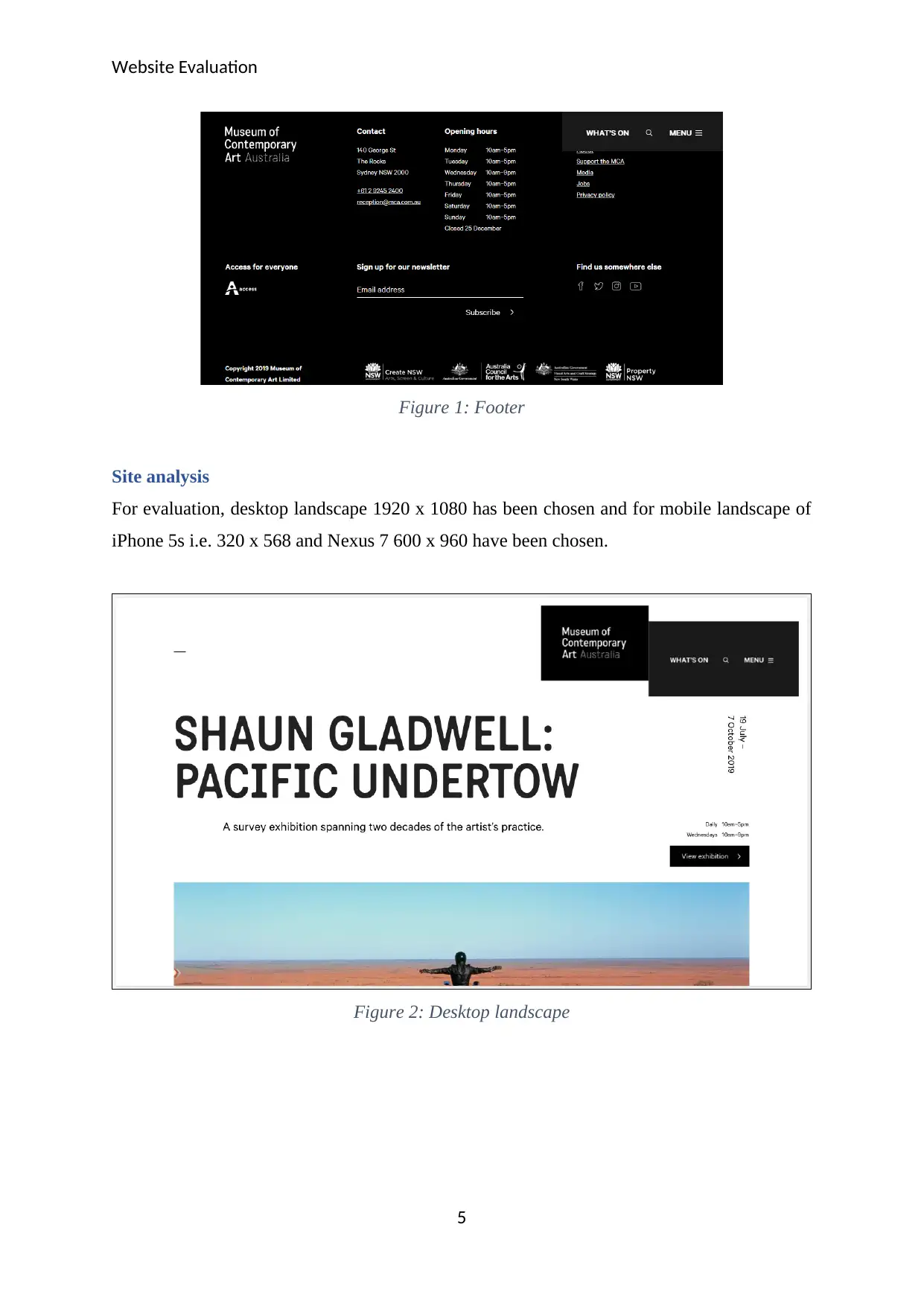
Figure 1: Footer
Site analysis
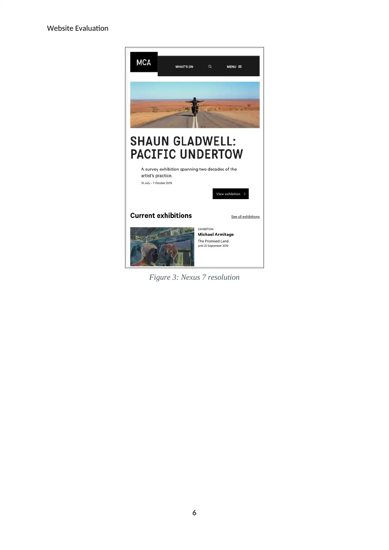
For evaluation, desktop landscape 1920 x 1080 has been chosen and for mobile landscape of
iPhone 5s i.e. 320 x 568 and Nexus 7 600 x 960 have been chosen.
Figure 2: Desktop landscape
5
Figure 1: Footer
Site analysis
For evaluation, desktop landscape 1920 x 1080 has been chosen and for mobile landscape of
iPhone 5s i.e. 320 x 568 and Nexus 7 600 x 960 have been chosen.
Figure 2: Desktop landscape
5
⊘ This is a preview!⊘
Do you want full access?
Subscribe today to unlock all pages.
Trusted by 1+ million students worldwide
Website Evaluation
Figure 3: Nexus 7 resolution
6
Figure 3: Nexus 7 resolution
6
Paraphrase This Document
Need a fresh take? Get an instant paraphrase of this document with our AI Paraphraser
Website Evaluation
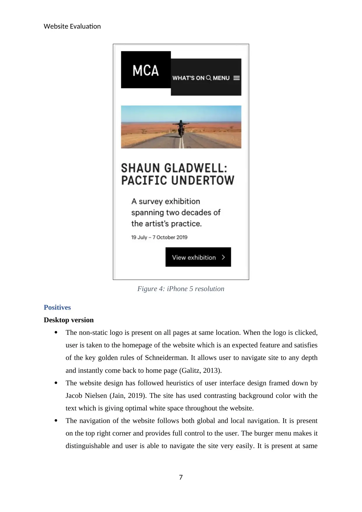
Figure 4: iPhone 5 resolution
Positives
Desktop version
The non-static logo is present on all pages at same location. When the logo is clicked,
user is taken to the homepage of the website which is an expected feature and satisfies
of the key golden rules of Schneiderman. It allows user to navigate site to any depth
and instantly come back to home page (Galitz, 2013).
The website design has followed heuristics of user interface design framed down by
Jacob Nielsen (Jain, 2019). The site has used contrasting background color with the
text which is giving optimal white space throughout the website.
The navigation of the website follows both global and local navigation. It is present
on the top right corner and provides full control to the user. The burger menu makes it
distinguishable and user is able to navigate the site very easily. It is present at same
7
Website Evaluation
location on all the pages which follows the consistent design principle of Nielsen’s
golden rule.
The website is following the standard layout with a clear footer area which shows
critical information such as contact details, visiting hours and company’s background.
Almost all pages have same layout with logo, slider like image and main body
content. This is another example of consistent design.
The website presents the content with lots of image though of same size but it
complements the theme of the website i.e. the cultural aspect.
The home page shows lots of information which grasps the user and motivates one to
browse through more pages of the website (Kahn and Lenk, 2013).
Search option is placed as per the design principle and can immediately grabs the
user’s attention.
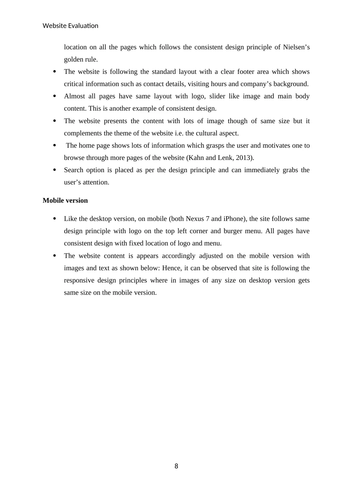
Mobile version
Like the desktop version, on mobile (both Nexus 7 and iPhone), the site follows same
design principle with logo on the top left corner and burger menu. All pages have
consistent design with fixed location of logo and menu.
The website content is appears accordingly adjusted on the mobile version with
images and text as shown below: Hence, it can be observed that site is following the
responsive design principles where in images of any size on desktop version gets
same size on the mobile version.
8
location on all the pages which follows the consistent design principle of Nielsen’s
golden rule.
The website is following the standard layout with a clear footer area which shows
critical information such as contact details, visiting hours and company’s background.
Almost all pages have same layout with logo, slider like image and main body
content. This is another example of consistent design.
The website presents the content with lots of image though of same size but it
complements the theme of the website i.e. the cultural aspect.
The home page shows lots of information which grasps the user and motivates one to
browse through more pages of the website (Kahn and Lenk, 2013).
Search option is placed as per the design principle and can immediately grabs the
user’s attention.
Mobile version
Like the desktop version, on mobile (both Nexus 7 and iPhone), the site follows same
design principle with logo on the top left corner and burger menu. All pages have
consistent design with fixed location of logo and menu.
The website content is appears accordingly adjusted on the mobile version with
images and text as shown below: Hence, it can be observed that site is following the
responsive design principles where in images of any size on desktop version gets
same size on the mobile version.
8
⊘ This is a preview!⊘
Do you want full access?
Subscribe today to unlock all pages.
Trusted by 1+ million students worldwide
Website Evaluation
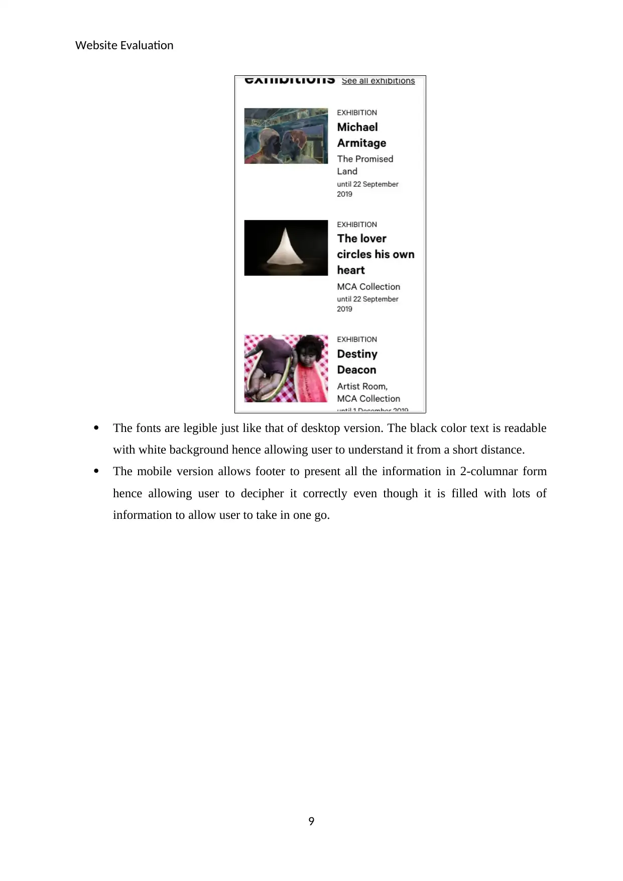
The fonts are legible just like that of desktop version. The black color text is readable
with white background hence allowing user to understand it from a short distance.
The mobile version allows footer to present all the information in 2-columnar form
hence allowing user to decipher it correctly even though it is filled with lots of
information to allow user to take in one go.
9
Paraphrase This Document
Need a fresh take? Get an instant paraphrase of this document with our AI Paraphraser
Website Evaluation
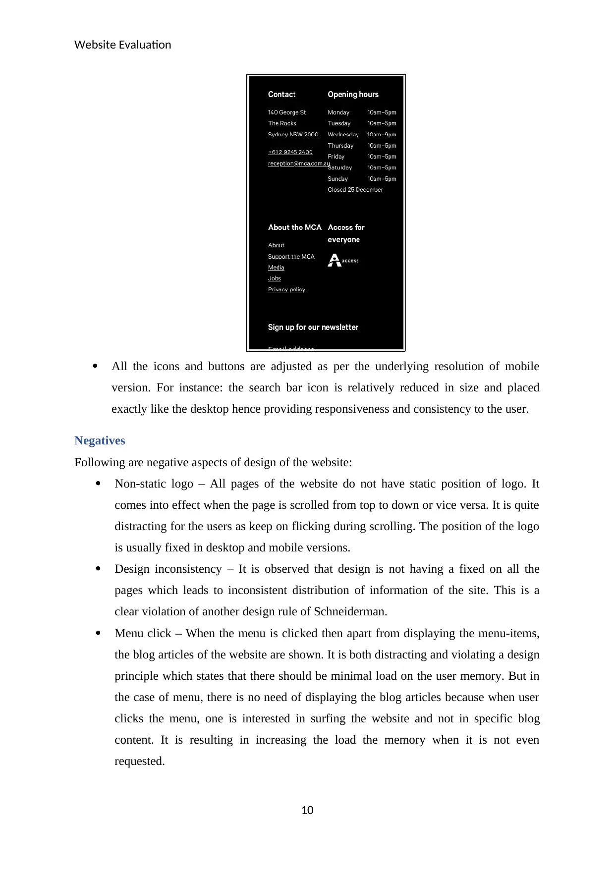
All the icons and buttons are adjusted as per the underlying resolution of mobile
version. For instance: the search bar icon is relatively reduced in size and placed
exactly like the desktop hence providing responsiveness and consistency to the user.
Negatives
Following are negative aspects of design of the website:
Non-static logo – All pages of the website do not have static position of logo. It
comes into effect when the page is scrolled from top to down or vice versa. It is quite
distracting for the users as keep on flicking during scrolling. The position of the logo
is usually fixed in desktop and mobile versions.
Design inconsistency – It is observed that design is not having a fixed on all the
pages which leads to inconsistent distribution of information of the site. This is a
clear violation of another design rule of Schneiderman.
Menu click – When the menu is clicked then apart from displaying the menu-items,
the blog articles of the website are shown. It is both distracting and violating a design
principle which states that there should be minimal load on the user memory. But in
the case of menu, there is no need of displaying the blog articles because when user
clicks the menu, one is interested in surfing the website and not in specific blog
content. It is resulting in increasing the load the memory when it is not even
requested.
10
Website Evaluation
Feature repetition – There should not be any repetition of any feature on the page. In
MCA site, search option is placed twice – one at the top and one at the bottom.
Similarly, subscribe button is present in footer as well as in the middle of the page.
The repetition distorts the user’s experience and gives a confusing platform.
The location of subscribe button is inappropriate in the home page which distracts
user from surfing the website. Any distraction in user’s site experience is a clear
violation of Schneiderman golden rules.
Another important which is missing from the website’s design is the breadcrumbs. It
is very important for the user to know its location i.e. from which page one has
landed on which page. For instance: Home > MCA store breadcrumb depicts that
user is on MCA page and one has come on it through Home page. In the absence of
them, user may get lost in the site hence it violates another golden rule of
Schneiderman.
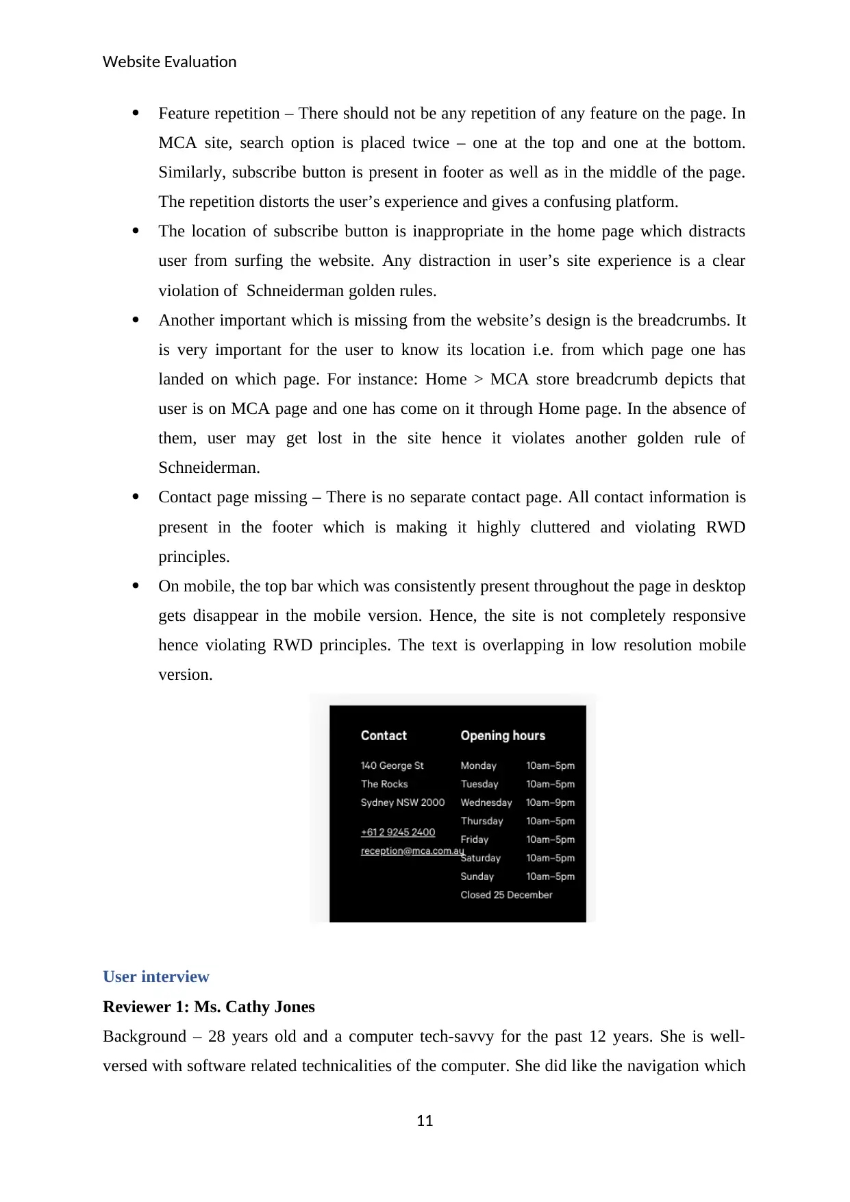
Contact page missing – There is no separate contact page. All contact information is
present in the footer which is making it highly cluttered and violating RWD
principles.
On mobile, the top bar which was consistently present throughout the page in desktop
gets disappear in the mobile version. Hence, the site is not completely responsive
hence violating RWD principles. The text is overlapping in low resolution mobile
version.
User interview
Reviewer 1: Ms. Cathy Jones
Background – 28 years old and a computer tech-savvy for the past 12 years. She is well-
versed with software related technicalities of the computer. She did like the navigation which
11
Feature repetition – There should not be any repetition of any feature on the page. In
MCA site, search option is placed twice – one at the top and one at the bottom.
Similarly, subscribe button is present in footer as well as in the middle of the page.
The repetition distorts the user’s experience and gives a confusing platform.
The location of subscribe button is inappropriate in the home page which distracts
user from surfing the website. Any distraction in user’s site experience is a clear
violation of Schneiderman golden rules.
Another important which is missing from the website’s design is the breadcrumbs. It
is very important for the user to know its location i.e. from which page one has
landed on which page. For instance: Home > MCA store breadcrumb depicts that
user is on MCA page and one has come on it through Home page. In the absence of
them, user may get lost in the site hence it violates another golden rule of
Schneiderman.
Contact page missing – There is no separate contact page. All contact information is
present in the footer which is making it highly cluttered and violating RWD
principles.
On mobile, the top bar which was consistently present throughout the page in desktop
gets disappear in the mobile version. Hence, the site is not completely responsive
hence violating RWD principles. The text is overlapping in low resolution mobile
version.
User interview
Reviewer 1: Ms. Cathy Jones
Background – 28 years old and a computer tech-savvy for the past 12 years. She is well-
versed with software related technicalities of the computer. She did like the navigation which
11
⊘ This is a preview!⊘
Do you want full access?
Subscribe today to unlock all pages.
Trusted by 1+ million students worldwide
1 out of 16
Related Documents


Your All-in-One AI-Powered Toolkit for Academic Success.
+13062052269
info@desklib.com
Available 24*7 on WhatsApp / Email
![[object Object]](/_next/static/media/star-bottom.7253800d.svg)
Unlock your academic potential
Copyright © 2020–2026 A2Z Services. All Rights Reserved. Developed and managed by ZUCOL.