Mobile Systems Report: Website Responsiveness and Mobile Web Coding
VerifiedAdded on 2023/06/04
|17
|1392
|407
Report
AI Summary
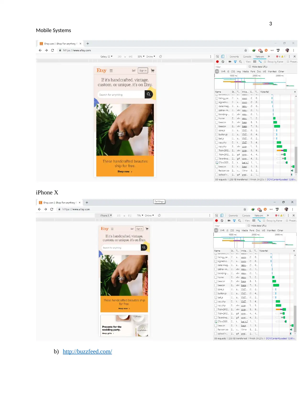
This report provides a comprehensive analysis of mobile systems, focusing on website testing and mobile web coding techniques. The report begins by evaluating the mobile friendliness and responsiveness of various websites, including both mobile-friendly and mobile-unfriendly examples. Testing methods include browser-based tools, automated testing, and user testing on actual devices. Detailed test results are presented with screenshots and explanations. The report then delves into mobile web coding, comparing a desktop-optimized tip calculator web application with a mobile-optimized version. It highlights the differences in source code, such as the use of viewport meta tags, apple-specific meta tags, CSS styling, and input types, and explains how these elements improve the mobile view and user experience. The conclusion emphasizes the importance of website testing in ensuring a quality final product and highlights the various methods that can be used to achieve accurate results. The report is a valuable resource for understanding mobile web development principles and best practices.

Running head: MOBILE SYSYEMS
Mobile Systems
Name of the student
Name of the University
Author’s note
Mobile Systems
Name of the student
Name of the University
Author’s note
Paraphrase This Document
Need a fresh take? Get an instant paraphrase of this document with our AI Paraphraser

1
Mobile Systems
Table of Contents
Table of Contents.........................................................................................................................................1
Introduction.................................................................................................................................................2
1. Test a website’s mobile friendliness/responsiveness.................................................................................2
2. Mobile web coding for mobile friendliness..........................................................................................12
a) Simple Tip Calculator web application (Desktop Optimized Version).............................................12
b) Simple Tip Calculator web application (Mobile Optimized Version)...............................................13
c) Differences in Source Code and how they Improve the Mobile view.................................................13
Conclusion..................................................................................................................................................15
References..................................................................................................................................................16

2
Mobile Systems
Introduction
These report is aimed at providing analysis and report on different test results of websites that are
Mobile friendly and Mobile unfriendly. The report also outlines the test for websites
responsiveness using various tools including Website based tools, automated testing tools,
Browser tools and User testing on actual device.
Below are different results and solutions after every test.
1. Test a website’s mobile friendliness/responsiveness
Mobile Friendly Websites
https://www.etsy.com/
http://buzzfeed.com/
Mobile Unfriendly Websites
http://www.milehighcomics.com/
http://www.roverp6cars.com/
Simple Test Report
1. Chrome Browser tool test Results
a) https://www.etsy.com/
Etsy is an ecommerce website where people can buy and sell vintage or handmade items.
Results:
The page is friendly in mobile, For Galaxy S5 viewport, the width is large and The content of the
page fits well in the screen. Text on the page is also readable
In Iphone X, The Results is the same with small screen content compared to Galaxy S5. Links can
be clicked and it is touch friendly.
The site is very adaptive to the change in the screen width.
You're viewing a preview
Unlock full access by subscribing today!

3
Mobile Systems
iPhone X
b) http://buzzfeed.com/
Mobile Systems
iPhone X
b) http://buzzfeed.com/
Paraphrase This Document
Need a fresh take? Get an instant paraphrase of this document with our AI Paraphraser

4
Mobile Systems
The Website is easy to use on the Mobile device as it is simulated in the Chrome different
viewport.
Simulating with iPad pro, the all contents of the Website include the sidebar information fit in the
screen. The text can be read clearly and pictures are visible.
With viewport adjusted to Pixel 2 XL, the content is more readable and the content on the page is
too long since the user keeps on scroll till the end. The page is mobile friendly.
iPad Pro

5
Mobile Systems
Pixel 2XL
c) http://www.milehighcomics.com/
On iPhone X, the text on the page is too small to read. The links and tap targets are too close or
rather small.
On iPhone 6/7/8 plus, the content can be read clearly with pictures being shown. The search
textboxes are still small and some sidebar contents are not clearly shown.
Iphone 6/7/8plus
You're viewing a preview
Unlock full access by subscribing today!

6
Mobile Systems
iPhone X
Mobile Systems
iPhone X
Paraphrase This Document
Need a fresh take? Get an instant paraphrase of this document with our AI Paraphraser

7
Mobile Systems
d) http://www.roverp6cars.com
On galaxy S5, the content of the website is not visible. The text is too small and some contents are
hidden.
On iPhone X, the content of the website is total unreadable and only images are able to be seen
not clearly seen clearly. The website is not responsive and adaptive.
Galaxy S5

8
Mobile Systems
iPhoneX
2. Google Mobile Automated Test Results
1. https://www.etsy.com/
The page is responsive and mobile friendly. Text is readable
Mobile Systems
iPhoneX
2. Google Mobile Automated Test Results
1. https://www.etsy.com/
The page is responsive and mobile friendly. Text is readable
You're viewing a preview
Unlock full access by subscribing today!

9
Mobile Systems
2. http://buzzfeed.com/
The page is responsible, the text is readable and the page is adaptive.
3. http://www.milehighcomics.com/
Text is too small and page is mobile unfriendly
Mobile Systems
2. http://buzzfeed.com/
The page is responsible, the text is readable and the page is adaptive.
3. http://www.milehighcomics.com/
Text is too small and page is mobile unfriendly
Paraphrase This Document
Need a fresh take? Get an instant paraphrase of this document with our AI Paraphraser

10
Mobile Systems
4. http://www.roverp6cars.com
Page is not mobile friendly and font is too small to be read.
Mobile Systems
4. http://www.roverp6cars.com
Page is not mobile friendly and font is too small to be read.

11
Mobile Systems
Mobile Systems
You're viewing a preview
Unlock full access by subscribing today!

12
Mobile Systems
2. Mobile web coding for mobile friendliness
a) Simple Tip Calculator web application (Desktop Optimized Version)
Below are the Major User Experience Issues Identified;
Inconsistent Design. The Web Application Design is Poor as it does not make full use of the
Screen width leaving some spaces empty.
Font Size is too small. The font size used in the Desktop version of the web application is small.
This forces to user to Stare long or Zoom in order to read the content.
Paraphrase This Document
Need a fresh take? Get an instant paraphrase of this document with our AI Paraphraser

13
Mobile Systems
b) Simple Tip Calculator web application (Mobile Optimized Version)
Nice Design. The Web application content covers the screen width including the elements
The amount input textbox allows only Numbers restricting non-numeric values.
Text on the page is readable.
Tip rates results in zero when Calculating an empty
c) Differences in Source Code and how they Improve the Mobile view
1. Viewport Meta tag.
In Mobile optimized version, Viewport Meta tag is included which refers to a visible area of a
webpage on a display device that helps in rendering device specific coordinates like pixels for

14
Mobile Systems
screen coordinates. Without Viewport meta tag, mobile devices will render pages with Desktop
default screen widths, and then they scale the pages to the mobile device screens. They help in
making a webpage respond to different screens.
2. Apple-Specific Meta Tag
“apple-mobile-web-app-capable” meta tag name in included in mobile optimized version defines
whether the web application webpage will run in full scree mode or not. If the content property is
yes, this set the application webpage to run in full-screen mode.
3. Cascading Style Sheet(CSS) Styling
The code in mobile optimized version is included with style that for the body and the input that
allows separation of document content written in HTML from Document presentation. They
Include width that defines a full width for all inputs elements. Style helps in detailing the
presentation of a webpage content such as colors, fonts and general layout. It also improves the
design of the web application consistent.
4. Input Type
The type of the input element in the mobile optimized version is set to number as opposed to the
one for Desktop version. The type “number” has inbuilt validation that rejects non-numerical
entries. It is used to let the user to enter number values only.
You're viewing a preview
Unlock full access by subscribing today!

15
Mobile Systems
Conclusion
Website Testing is a very wide phase of website development and ensures that the final product
offered to the client meets all the requirements and covers everything. It is a broad topic or rather
phase that requires keen looking on it. When developers want to test website, they need to come
up with techniques and method that will ensure accurate results. With the testing done above, It
clearly shows that different methods can be used to provide Website Quality and Assurance.
Therefore, Testing should not be ignored in any process of development.
Paraphrase This Document
Need a fresh take? Get an instant paraphrase of this document with our AI Paraphraser

16
Mobile Systems
References
Chopra, R. (2015). Challenges of Website Testing. IJIACS, no, 4.
Maguire, M., & Isherwood, P. (2018, July). A Comparison of User Testing and Heuristic
Evaluation Methods for Identifying Website Usability Problems. In International Conference of
Design, User Experience, and Usability (pp. 429-438). Springer, Cham.
Dishman, M. (2015). Website Usability Testing Software-Improving User Experience and
Satisfaction with Community College Websites. The Community College Enterprise, 21(1), 84.
Raman, J., Umapathy, K., & Huang, H. (2018). SECURITY AND USER EXPERIENCE: A
HOLISTIC MODEL FOR CAPTCHA USABILITY ISSUES.
Al-Qeisi, K., Dennis, C., Alamanos, E., & Jayawardhena, C. (2014). Website design quality and
usage behavior: Unified Theory of Acceptance and Use of Technology. Journal of Business
Research, 67(11), 2282-2290.
Gorny, T., Conrad, T., Lovell, S., & Feather, N. E. (2018). U.S. Patent No. 9,900,337.
Washington, DC: U.S. Patent and Trademark Office.
1 out of 17

Your All-in-One AI-Powered Toolkit for Academic Success.
+13062052269
info@desklib.com
Available 24*7 on WhatsApp / Email
Unlock your academic potential
© 2024 | Zucol Services PVT LTD | All rights reserved.