Moving Moose: Brand Analysis, Marketing Plan, and Store Design Project

Verified

Added on  2020/07/22

|32
|2631
|80
Project
AI Summary
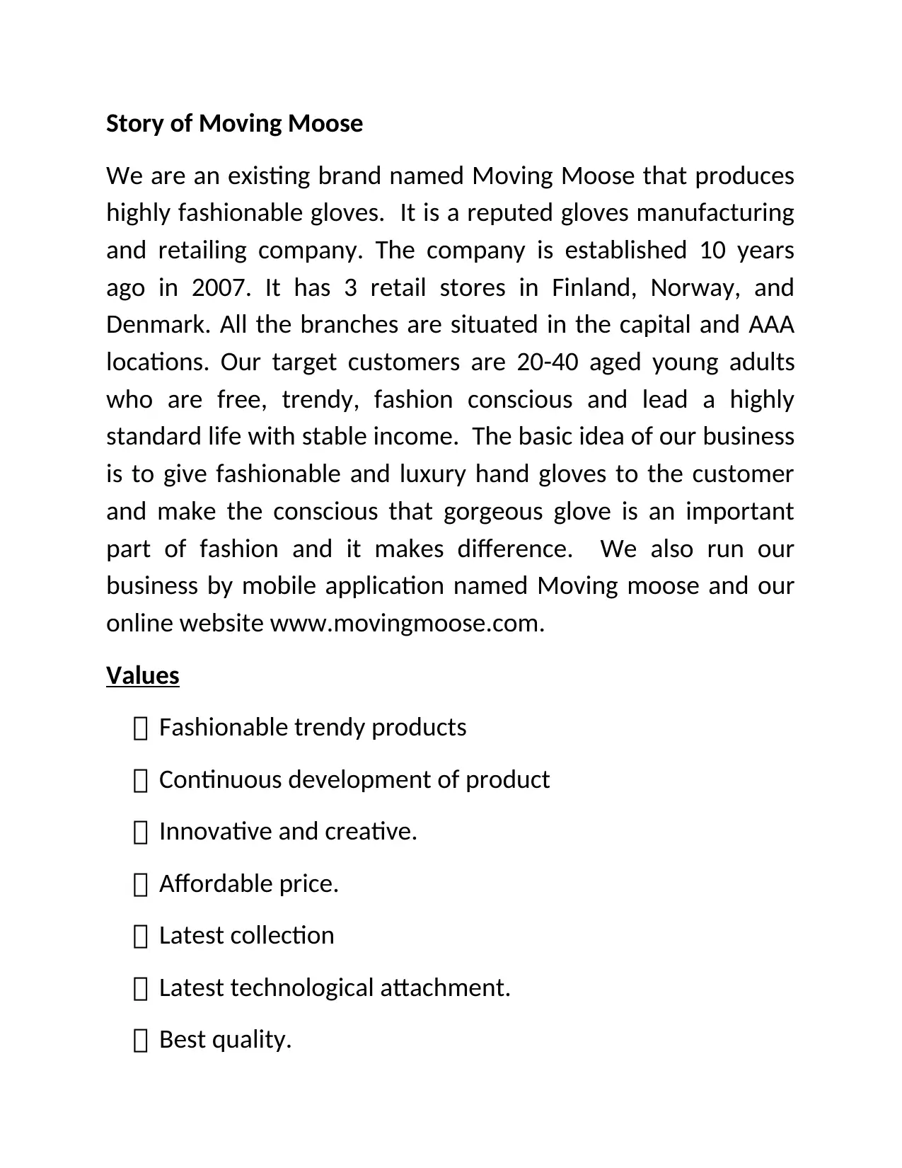
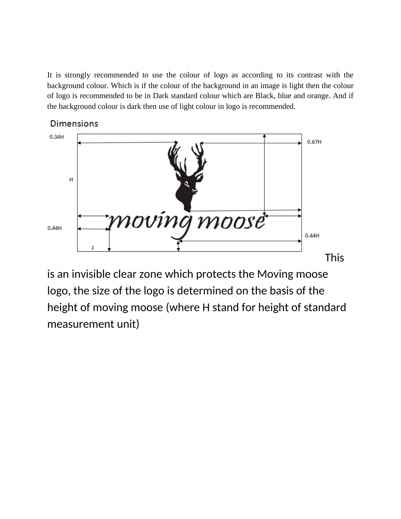
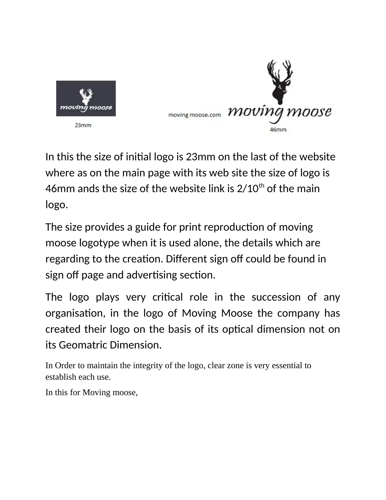
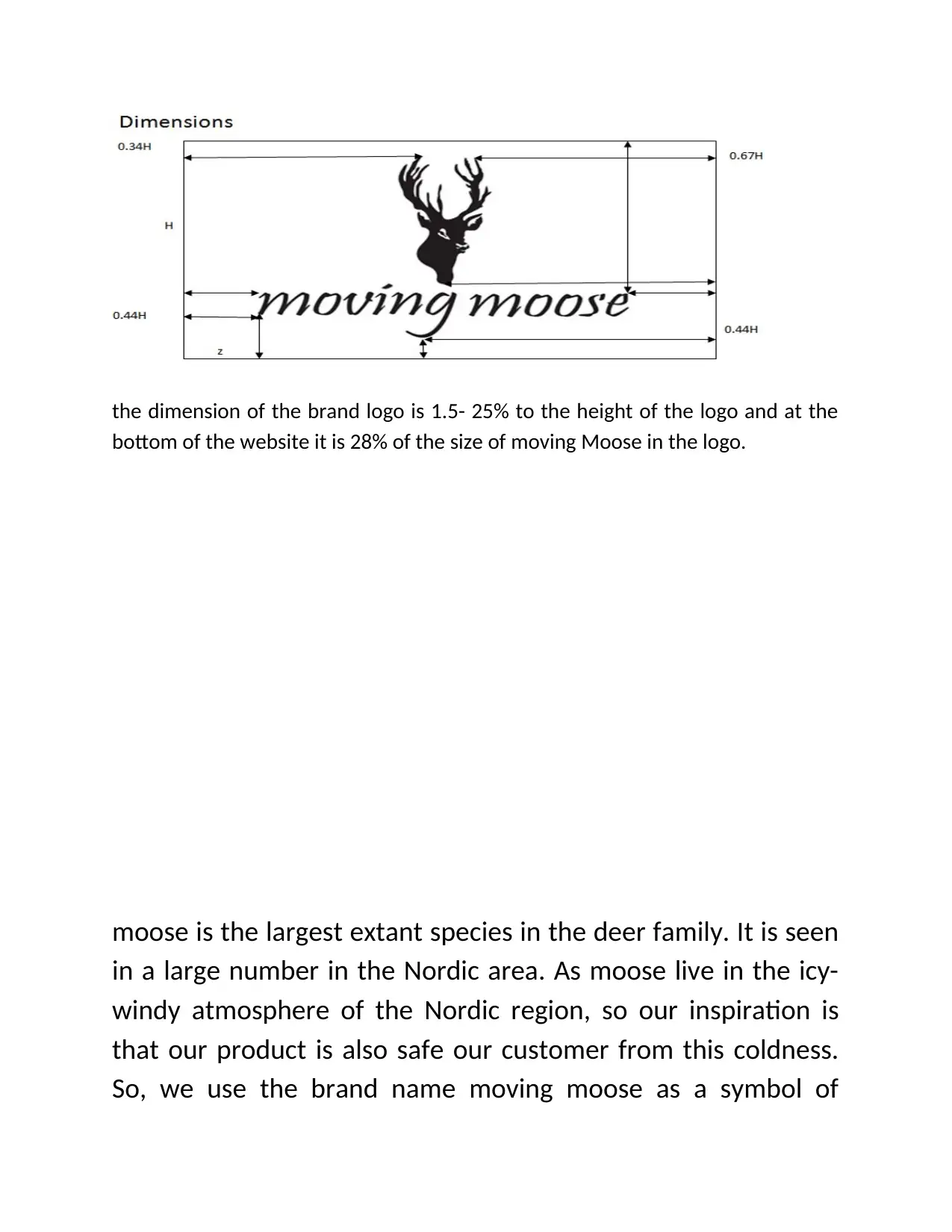
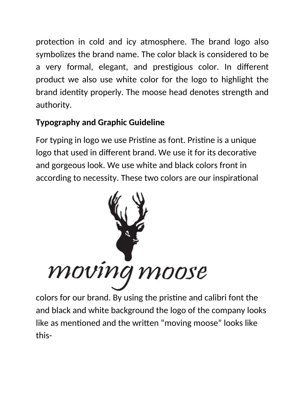
This project provides a comprehensive analysis of the Moving Moose brand, a fashionable glove manufacturer and retailer. It details the company's history, values (fashionable, trendy, innovative, customer-oriented), and vision. The project includes a mood board with color concepts (white, black, red, and orange), logo description (script style, optical center, clear zone, and size specifications), and typography guidelines (Pristine and Calibri fonts). It outlines promotional posters and provides a detailed product description, including various glove types (smart, biking, wedding, gym, cycling, and women's stylish gloves), sizes, colors, materials, and price points. The target customer profile (20-40 year old, fashion-conscious adults) and store location (Mood Stockholm) are also presented, along with store layout details, interior design (white and black color scheme, wooden floors, marble cash counter), material specifications, and store guidance. Additionally, the project covers store security, staff, packaging (sustainable jute bags), customization services (self-size measurement, hand scanners), omni-channel integration, RFID implementation, payment and return policies, and concludes with an overall analysis of the brand's strengths and strategies.
Document Page
tabler-icon-diamond-filled.svg

Paraphrase This Document

Need a fresh take? Get an instant paraphrase of this document with our AI Paraphraser
Document Page
CONTENT
STORY OF MOVING MOOSE
VALUES
VISION
MOOD BOARD
COLOR CONCEPT
LOGO DESCRIPTION
TYPROGRAPHY
PROMOTIONAL POSTER
PRODUCT DESCRIPTION
PRODUCT DETAILS
TARGET CUSTOMER
STORE LOCATION
STORE LAYOUT
STORE GUIDELINE
INTERIOR MATERIAL
STORE INTERIOR
STORE GUIDEANCE
CUSTOMIZATION
OMNI CHANEL INDEX
RFID
PAYMENT AND RETURN POLICY
ANALYSIS
Document Page
Story of Moving Moose
We are an existing brand named Moving Moose that produces
highly fashionable gloves. It is a reputed gloves manufacturing
and retailing company. The company is established 10 years
ago in 2007. It has 3 retail stores in Finland, Norway, and
Denmark. All the branches are situated in the capital and AAA
locations. Our target customers are 20-40 aged young adults
who are free, trendy, fashion conscious and lead a highly
standard life with stable income. The basic idea of our business
is to give fashionable and luxury hand gloves to the customer
and make the conscious that gorgeous glove is an important
part of fashion and it makes difference. We also run our
business by mobile application named Moving moose and our
online website www.movingmoose.com.
Values
Fashionable trendy products
Continuous development of product
Innovative and creative.
Affordable price.
Latest collection
Latest technological attachment.
Best quality.
Document Page
Customer oriented.
Vision
Our vision is to provide our customer trendy, fashionable and
durable product in affordable price. We also want to increase
our branches with rapid customization and quality service
Mood Board
tabler-icon-diamond-filled.svg

Paraphrase This Document

Need a fresh take? Get an instant paraphrase of this document with our AI Paraphraser
Document Page
Color Concept
COLOR CONCEPT
For graphic guideline we used three basic colors. This are-
white, black, and red. White is the mother of color. Anything
perfectly match with white while black is the color of elegance.
These two colors are used to show the brand identity. In some
cases the mixture of these two colors are used. These two
colors and grades are used in the store also. The red color is
used in the brand web page for text and highlights the headings
of the things. The true Wight and brown color is properly
increasing the beauty of packaging. The sustainable handbag is
decorated by blue color. Majorly the interior of the store is
colored in Rich white which implies the beauty and develop a
sense of brand satisfaction to the customers. A perfect of color
plate is obviously needed for building brand image. Also,
clothes color of the interior is majorly orange and black which
totally contrast with white and developing the image of brand.
Document Page
The orange color which
is used by the brand is #FF4500 hex code and the light blue color is having #ADD8E6 Hex code.
Logo Description
Document Page
tabler-icon-diamond-filled.svg

Paraphrase This Document

Need a fresh take? Get an instant paraphrase of this document with our AI Paraphraser
Document Page
The script style of Moving moose is having its own idiosyncrasies and symmetry, the
logo can be effectively centred by using optical centre rather than using Geomatrical
measurements.
While using different background colours it is highly
recomondend to Moving moose for the use of logo colour as
accordingly making contrast with the background colour.
Document Page
It is strongly recommended to use the colour of logo as according to its contrast with the
background colour. Which is if the colour of the background in an image is light then the colour
of logo is recommended to be in Dark standard colour which are Black, blue and orange. And if
the background colour is dark then use of light colour in logo is recommended.
This
is an invisible clear zone which protects the Moving moose
logo, the size of the logo is determined on the basis of the
height of moving moose (where H stand for height of standard
measurement unit)
Document Page
In this the size of initial logo is 23mm on the last of the website
where as on the main page with its web site the size of logo is
46mm ands the size of the website link is 2/10th of the main
logo.
The size provides a guide for print reproduction of moving
moose logotype when it is used alone, the details which are
regarding to the creation. Different sign off could be found in
sign off page and advertising section.
The logo plays very critical role in the succession of any
organisation, in the logo of Moving Moose the company has
created their logo on the basis of its optical dimension not on
its Geomatric Dimension.
In Order to maintain the integrity of the logo, clear zone is very essential to
establish each use.
In this for Moving moose,
tabler-icon-diamond-filled.svg

Paraphrase This Document

Need a fresh take? Get an instant paraphrase of this document with our AI Paraphraser
Document Page
the dimension of the brand logo is 1.5- 25% to the height of the logo and at the
bottom of the website it is 28% of the size of moving Moose in the logo.
moose is the largest extant species in the deer family. It is seen
in a large number in the Nordic area. As moose live in the icy-
windy atmosphere of the Nordic region, so our inspiration is
that our product is also safe our customer from this coldness.
So, we use the brand name moving moose as a symbol of
Document Page
protection in cold and icy atmosphere. The brand logo also
symbolizes the brand name. The color black is considered to be
a very formal, elegant, and prestigious color. In different
product we also use white color for the logo to highlight the
brand identity properly. The moose head denotes strength and
authority.
Typography and Graphic Guideline
For typing in logo we use Pristine as font. Pristine is a unique
logo that used in different brand. We use it for its decorative
and gorgeous look. We use white and black colors front in
according to necessity. These two colors are our inspirational
colors for our brand. By using the pristine and calibri font the
and black and white background the logo of the company looks
like as mentioned and the written “moving moose” looks like
this-
chevron_up_icon
1 out of 32
circle_padding
hide_on_mobile
zoom_out_icon
[object Object]