COIT20268 Responsive Web Design: National Geographic Website
VerifiedAdded on 2024/05/30
|18
|3640
|127
Report
AI Summary
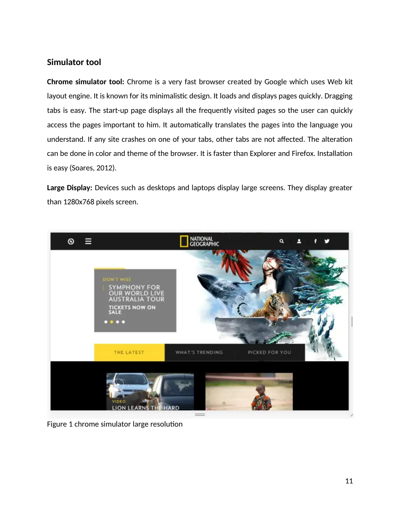
This report provides a detailed review of the National Geographic website, focusing on its responsive web design (RWD) implementation. It begins with an introduction to the importance of responsive design in today's multi-device environment, followed by an overview of the website's purpose and content. The report highlights key features such as the exploration of topics like science, space, and wildlife, TV shows, games, newsletters, ebook purchases, user-generated content, and a rich gallery. Positive aspects of the website include its user-friendliness, well-researched content, appropriate font usage, smooth navigation, and vibrant imagery, while negative aspects include inconsistent animation, limited content on other pages, accessibility issues, and the absence of a search box. User reviews and feedback are analyzed to understand user perceptions. The report also delves into the principles of responsive web design, such as responsive vs adaptive design, flow, relative units, breakpoints, and minimum/maximum values, and examines the use of Chrome's simulator tool to test responsiveness. It concludes with recommendations for improvement and emphasizes the importance of responsive design for optimal user experience. Desklib offers similar assignments and resources for students.
1 out of 18
Related Documents


Your All-in-One AI-Powered Toolkit for Academic Success.
+13062052269
info@desklib.com
Available 24*7 on WhatsApp / Email
![[object Object]](/_next/static/media/star-bottom.7253800d.svg)
Copyright © 2020–2026 A2Z Services. All Rights Reserved. Developed and managed by ZUCOL.