Detailed Report: National Geographic Website Analysis using RWD
VerifiedAdded on 2024/05/30
|30
|3599
|133
Report
AI Summary
This report provides an in-depth analysis of the National Geographic website, focusing on its features, positive and negative aspects, user reviews, and adherence to responsive web design (RWD) principles. The analysis involves examining the website's responsiveness across different screen sizes using Google Chrome's device simulator and assessing its implementation of nine key RWD principles, including the flow of content, relative units, breakpoints, and the use of web fonts. User reviews from individuals with different backgrounds are incorporated to provide insights into the website's usability and overall user experience. Recommendations for improvement are also provided to enhance the website's design and functionality.
Table of Contents
List of figures...................................................................................................................................2
1. Introduction..............................................................................................................................3
2. Overview..................................................................................................................................4
2.1 Main features of the website..................................................................................................4
2.2 Positive and negative aspects of website...............................................................................5
2.3 User reviews and feedbacks...................................................................................................6
2.4 Responsive web design..........................................................................................................8
2.4.1 Responsive vs adaptive web design................................................................................8
2.4.2 The flow........................................................................................................................10
2.4.3 Relative units................................................................................................................13
2.4.4 Breakpoints...................................................................................................................15
2.4.5 Minimum and maximum values...................................................................................17
2.4.6 Nested Objects..............................................................................................................19
2.4.7 Desktop or mobile first.................................................................................................21
2.4.8 Web fonts and system fonts..........................................................................................22
2.4.9 Bitmap or images or vector...........................................................................................24
3. Recommendations..................................................................................................................28
4. Conclusion.............................................................................................................................29
5. References..............................................................................................................................30
Paraphrase This Document
Need a fresh take? Get an instant paraphrase of this document with our AI Paraphraser
List of figures
Figure 1 Large display screen 1.......................................................................................................7
Figure 2 Medium display screen 1...................................................................................................8
Figure 3 Tiny display screen 1.........................................................................................................9
Figure 4 High-resolution screen 2.................................................................................................10
Figure 5 Medium resolution screen 2............................................................................................11
Figure 6 Low-resolution screen 2..................................................................................................11
Figure 7 High resolution screen 3..................................................................................................12
Figure 8 Medium resolution screen 3............................................................................................13
Figure 9 Low resolution screen 3..................................................................................................13
Figure 10 High resolution screen 4................................................................................................14
Figure 11 Medium resolution screen 4..........................................................................................15
Figure 12 Low resolution screen 4................................................................................................15
Figure 13 High resolution screen 5................................................................................................16
Figure 14 Medium resolution screen 5..........................................................................................17
Figure 15 Low resolution screen 5................................................................................................18
Figure 16 High resolution screen 6................................................................................................19
Figure 17 Medium resolution screen 6..........................................................................................19
Figure 18 Low resolution screen 6................................................................................................20
Figure 19 High resolution screen 7................................................................................................20
Figure 20 Medium resolution screen 7..........................................................................................21
Figure 21 Low resolution screen 7................................................................................................21
Figure 22 High resolution screen 8................................................................................................22
Figure 23 Medium resolution screen 8..........................................................................................22
Figure 24 Low resolution screen 8................................................................................................23
Figure 25 High resolution screen 9................................................................................................23
Figure 26 Medium resolution screen 9..........................................................................................24
Figure 27 low resolution screen 9..................................................................................................25
1. Introduction
This assignment is based on the analysis of the National Geographic website. The
analysis of the website will be done with help of Google chrome device simulator. The
website analysis will be done with the help of nine response web design (RWD)
principles. In first section of report the overview and description of website will be
discussed. In the next section of report the features of the website National Geographic
will be discussed. After discussing the features of website, the positive and negative
aspects of the website will be discussed. In the next section of report the website is
compared according to of nine response web design (RWD) principles. After comparing
of website, the user review will be collected from two different users with different
background. And in the last section of report the recommendations will be proposed for
the website National Geographic.
⊘ This is a preview!⊘
Do you want full access?
Subscribe today to unlock all pages.
Trusted by 1+ million students worldwide
2. Overview
The national geographic website is a type of website which provides the information of
whole planet. It includes various different sectors like science, geographic, plants,
animals. The national geographic website is a global leader to provide information about
new researches, projects. The information is provided by world best people like
scientists, photographers, filmmakers and journalists. The national geographic
community engages with people through different means of communication like
magazines, website, books, travel expeditions, social and digital media platform. The aim
of website is to provide the numerous information to people so that they can know the
amazing facts about their planet (Nationalgeographic, 2018).
Description
The primary focus of the national geographic education is to provide information about
world events, history and science. The website includes vast amount of the multimedia
content which includes photos, games, videos. The website also includes the coverage of
the sensitive topics. The national geographic website is a huge database of good quality
educational material. The website provides number of offline and online activities.
Website provides the option for users to access the articles, photos, project ideas and
maps. The subjects covered by the website are science and social studies. The science
subject includes biology, engineering, animals, geology, ecosystem and weather. The
social science subject includes culture, citizenship, events, geography, exploration,
history and global awareness. The website has different topics from which user can select
any topic which he wants to explore. The website also provides online books which user
can purchase from website. The website also has an option of online TV which provides
various episodes. The user can also have placed ads on the website for which they have to
give some amount to the national geographic society (Gaul, 2014).
2.1 Main features of the website
There are numerous features of national geographic website. The website has various
sections.
a. There are numerous options on the national geographic website like videos, explore,
TV, shop, travel.
b. There is an option of Your Shot in the National Geographic website. In this feature
user can upload the photos and shots and can also share the experience on the
website. The user can also view the shots uploaded before. There is various category
of pictures on the website and user can select the category according to needs.
c. There is another option of travel in which user gets the information of different
tourist place. The user also gets facility to explore different country travel guide like
America, Africa, Antarctica, North America.
Paraphrase This Document
Need a fresh take? Get an instant paraphrase of this document with our AI Paraphraser
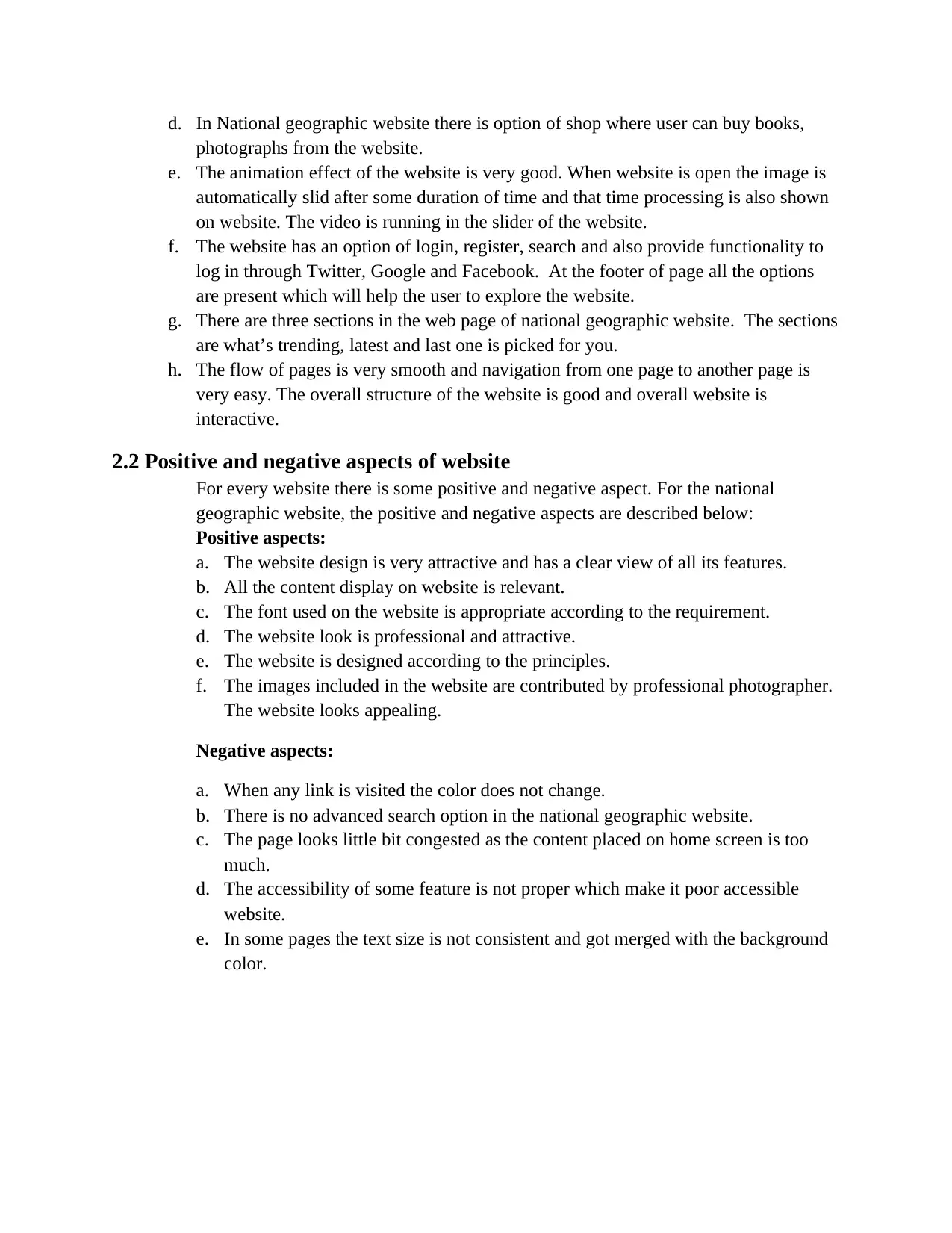
d. In National geographic website there is option of shop where user can buy books,
photographs from the website.
e. The animation effect of the website is very good. When website is open the image is
automatically slid after some duration of time and that time processing is also shown
on website. The video is running in the slider of the website.
f. The website has an option of login, register, search and also provide functionality to
log in through Twitter, Google and Facebook. At the footer of page all the options
are present which will help the user to explore the website.
g. There are three sections in the web page of national geographic website. The sections
are what’s trending, latest and last one is picked for you.
h. The flow of pages is very smooth and navigation from one page to another page is
very easy. The overall structure of the website is good and overall website is
interactive.
2.2 Positive and negative aspects of website
For every website there is some positive and negative aspect. For the national
geographic website, the positive and negative aspects are described below:
Positive aspects:
a. The website design is very attractive and has a clear view of all its features.
b. All the content display on website is relevant.
c. The font used on the website is appropriate according to the requirement.
d. The website look is professional and attractive.
e. The website is designed according to the principles.
f. The images included in the website are contributed by professional photographer.
The website looks appealing.
Negative aspects:
a. When any link is visited the color does not change.
b. There is no advanced search option in the national geographic website.
c. The page looks little bit congested as the content placed on home screen is too
much.
d. The accessibility of some feature is not proper which make it poor accessible
website.
e. In some pages the text size is not consistent and got merged with the background
color.
2.3 User reviews and feedbacks
Below develops the questionnaire for the user as a review of the website:
For feedback of website the user review is collected of two users. The background of
both users is different (Uhacz, 2017). In the below section the user review of both
users is collected:
User-1 Name: Michael, Age: 35, Gender: Male, Profession:
Photographer
SR.no Questions Rate out of 10
1 Is website being easy for users? 8
2 The functions of website are complex to use? 7
3 Provides appropriate information of relevant topic? 9
4 Is there any need for technical support for use of
website?
6
5 Comment on navigation in website. 6
6 Is there any special requirement needed for use of
website?
5
7 Comment on fonts and content of website 8
8 How fast website is loaded 9
9 Are all functions working properly and serve proper
desire output?
10
10 Additional hardware configuration is needed to load
website?
4
User 1
Name: Michael
Age: 35
Gender: Male
Profession: Photographer
Review:
When the website is open it looks very attractive. The view of website is nice. After using the
website. I have observed that the navigation from one page to other screen is easy. The
alignment of all images and content on the website is appropriate. The font used on the
website makes it look good. The website properly provides the relevant information and easy
to use. Overall experience of using website is satisfactory and good.
⊘ This is a preview!⊘
Do you want full access?
Subscribe today to unlock all pages.
Trusted by 1+ million students worldwide
User-2 Name: Olive, Age: 20, Gender: Female, Profession:
Student
SR.no Questions Rate out of 10
1 Is website being easy for users? 6
2 The functions of website are complex to use? 9
3 Provides appropriate information of relevant topic? 8
4 Is there any need for technical support for use of
website?
7
5 Comment on navigation in website. 8
6 Is there any special requirement needed for use of
website?
6
7 Comment on fonts and content of website 7
8 How fast website is loaded 10
9 Are all functions working properly and serve proper
desire output?
9
10 Additional hardware configuration is needed to load
website?
5
User 1
Name: Olive
Age: 20
Gender: Female
Profession: Student
Review:
The National Geographic website provides the complete information on all topics like an
animal, plants, science, geography. The website loads very fast and serves the results very
quickly. The videos present on website has very good quality. The images use is also very
good and make website more attractive. The theme used by the website is very appealing. The
additional features like pictures can be posted on website, products can be bought from using
the website make it unique.
Both the users are using the same desktop view for reviewing the National Geographic website.
After looking the reviews from both the users it can be concluded that overall website is good
and have a positive feedback. And it can be further improved with the help of feedback which
can make the website more user-friendly and perform better functions (Vrabie, 2010).
Paraphrase This Document
Need a fresh take? Get an instant paraphrase of this document with our AI Paraphraser
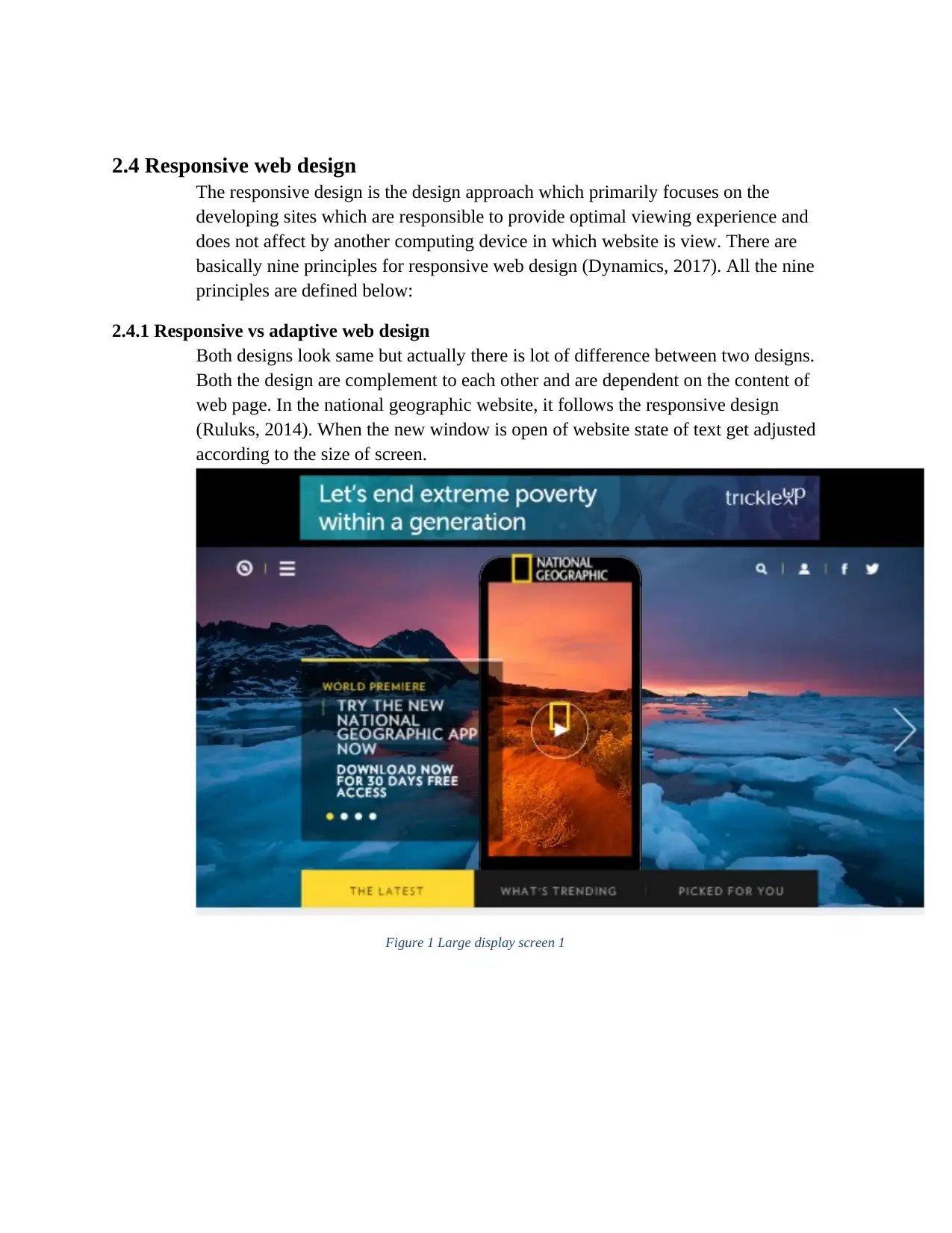
2.4 Responsive web design
The responsive design is the design approach which primarily focuses on the
developing sites which are responsible to provide optimal viewing experience and
does not affect by another computing device in which website is view. There are
basically nine principles for responsive web design (Dynamics, 2017). All the nine
principles are defined below:
2.4.1 Responsive vs adaptive web design
Both designs look same but actually there is lot of difference between two designs.
Both the design are complement to each other and are dependent on the content of
web page. In the national geographic website, it follows the responsive design
(Ruluks, 2014). When the new window is open of website state of text get adjusted
according to the size of screen.
Figure 1 Large display screen 1
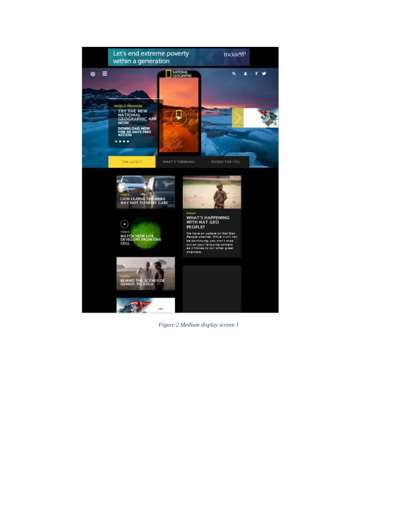
Figure 2 Medium display screen 1
⊘ This is a preview!⊘
Do you want full access?
Subscribe today to unlock all pages.
Trusted by 1+ million students worldwide
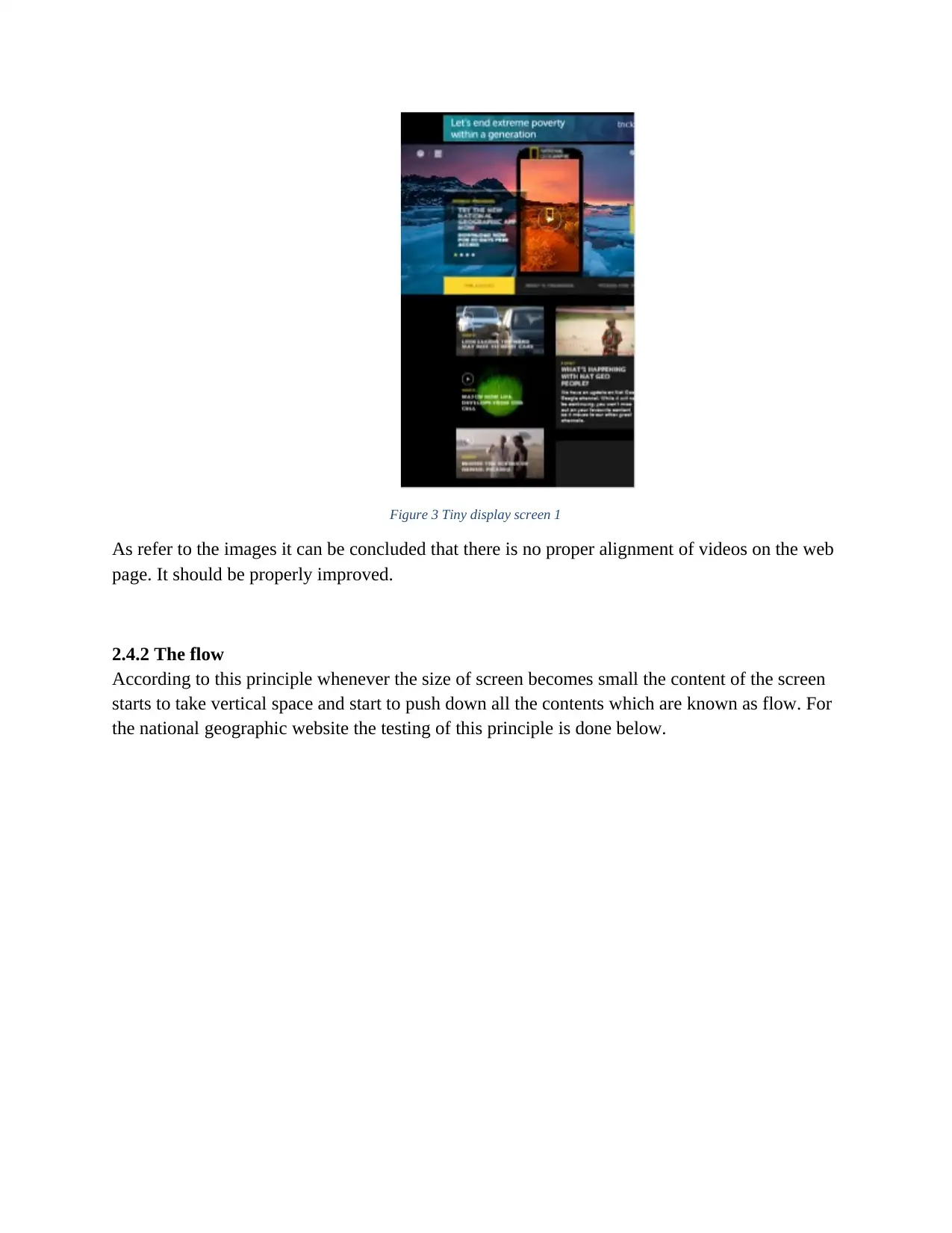
Figure 3 Tiny display screen 1
As refer to the images it can be concluded that there is no proper alignment of videos on the web
page. It should be properly improved.
2.4.2 The flow
According to this principle whenever the size of screen becomes small the content of the screen
starts to take vertical space and start to push down all the contents which are known as flow. For
the national geographic website the testing of this principle is done below.
Paraphrase This Document
Need a fresh take? Get an instant paraphrase of this document with our AI Paraphraser
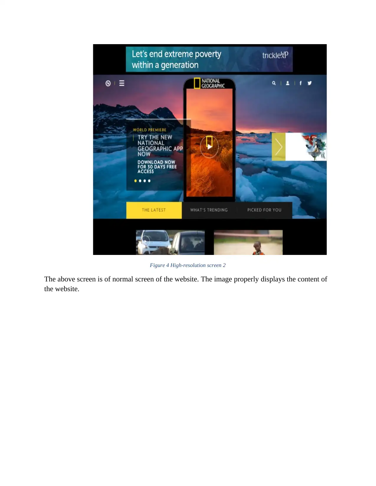
Figure 4 High-resolution screen 2
The above screen is of normal screen of the website. The image properly displays the content of
the website.
The above screen is of normal screen of the website. The image properly displays the content of
the website.
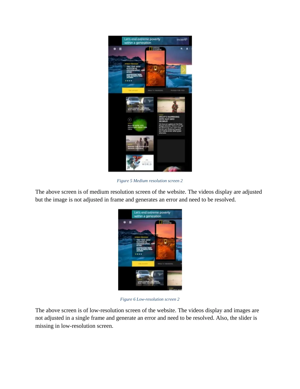
Figure 5 Medium resolution screen 2
The above screen is of medium resolution screen of the website. The videos display are adjusted
but the image is not adjusted in frame and generates an error and need to be resolved.
Figure 6 Low-resolution screen 2
The above screen is of low-resolution screen of the website. The videos display and images are
not adjusted in a single frame and generate an error and need to be resolved. Also, the slider is
missing in low-resolution screen.
⊘ This is a preview!⊘
Do you want full access?
Subscribe today to unlock all pages.
Trusted by 1+ million students worldwide
1 out of 30
Related Documents


Your All-in-One AI-Powered Toolkit for Academic Success.
+13062052269
info@desklib.com
Available 24*7 on WhatsApp / Email
![[object Object]](/_next/static/media/star-bottom.7253800d.svg)
Unlock your academic potential
Copyright © 2020–2026 A2Z Services. All Rights Reserved. Developed and managed by ZUCOL.