COIT 20268: Responsive Web Design Portfolio Project - Paper Kraft

Verified

Added on  2023/06/03

|16
|1797
|454
Project
AI Summary
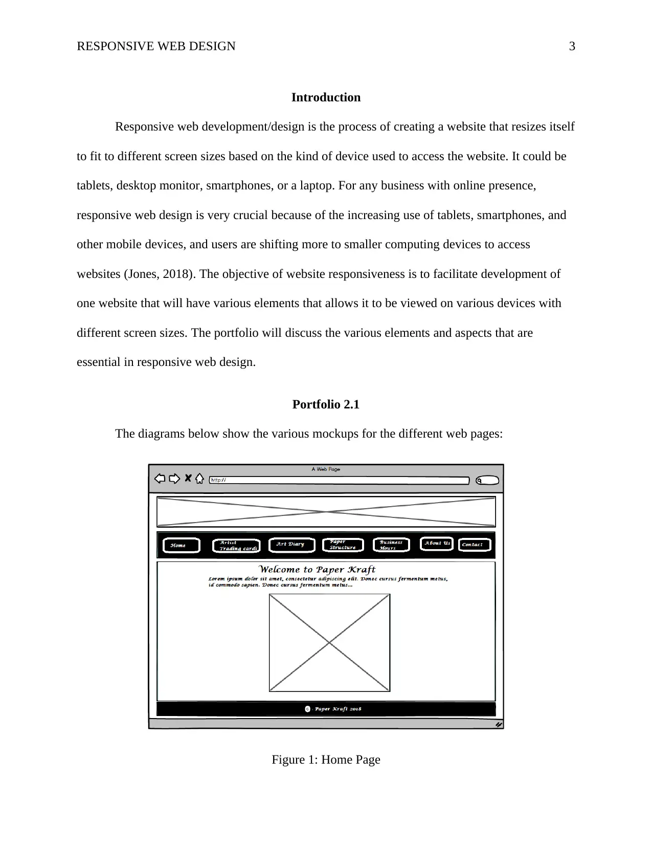
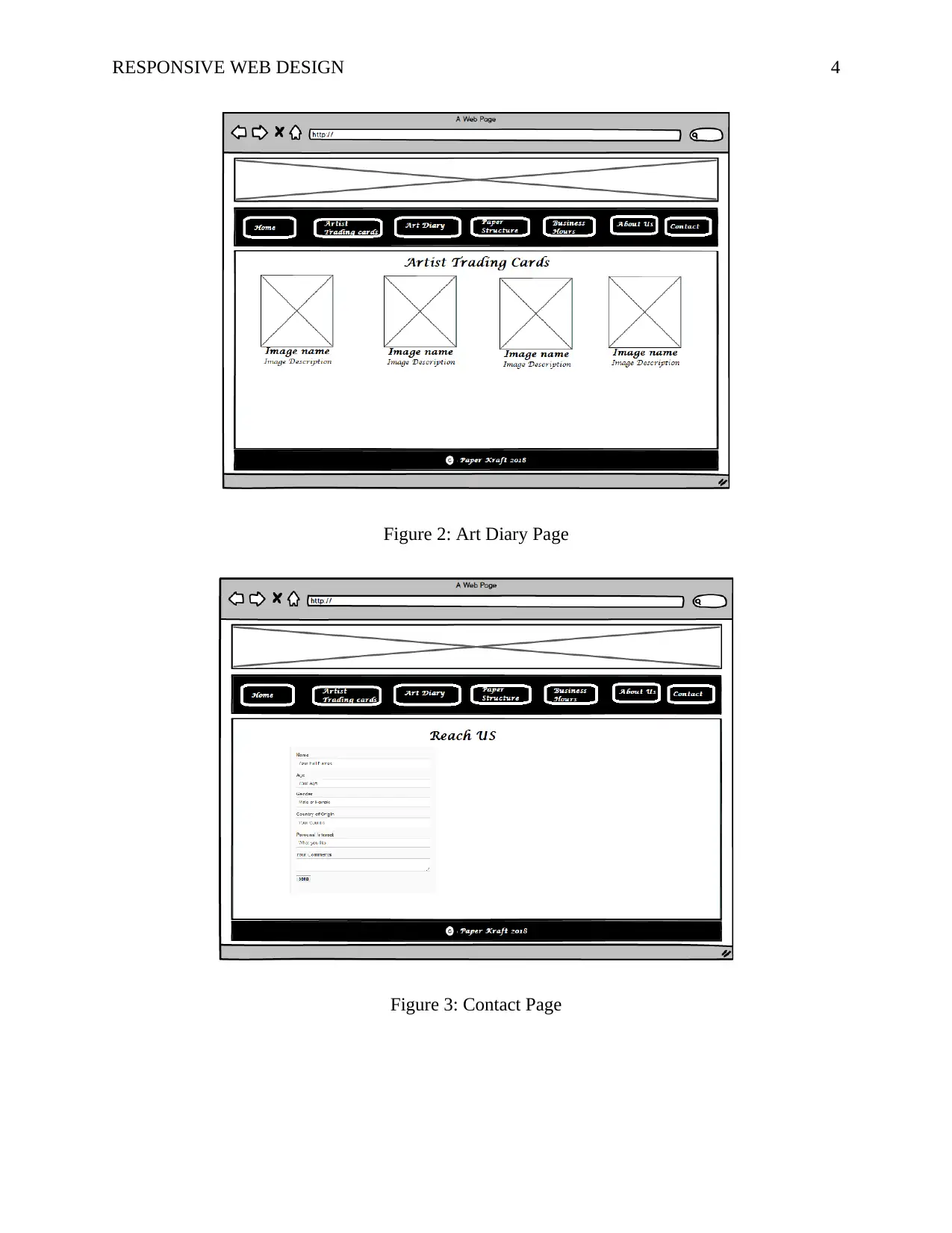
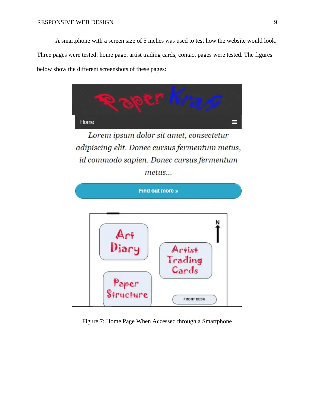
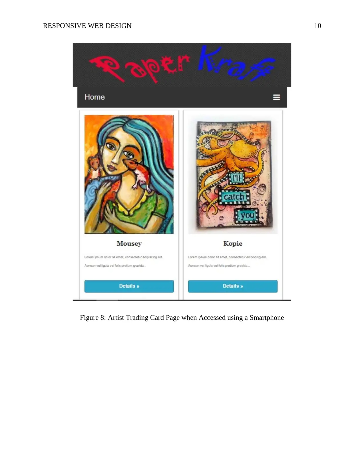
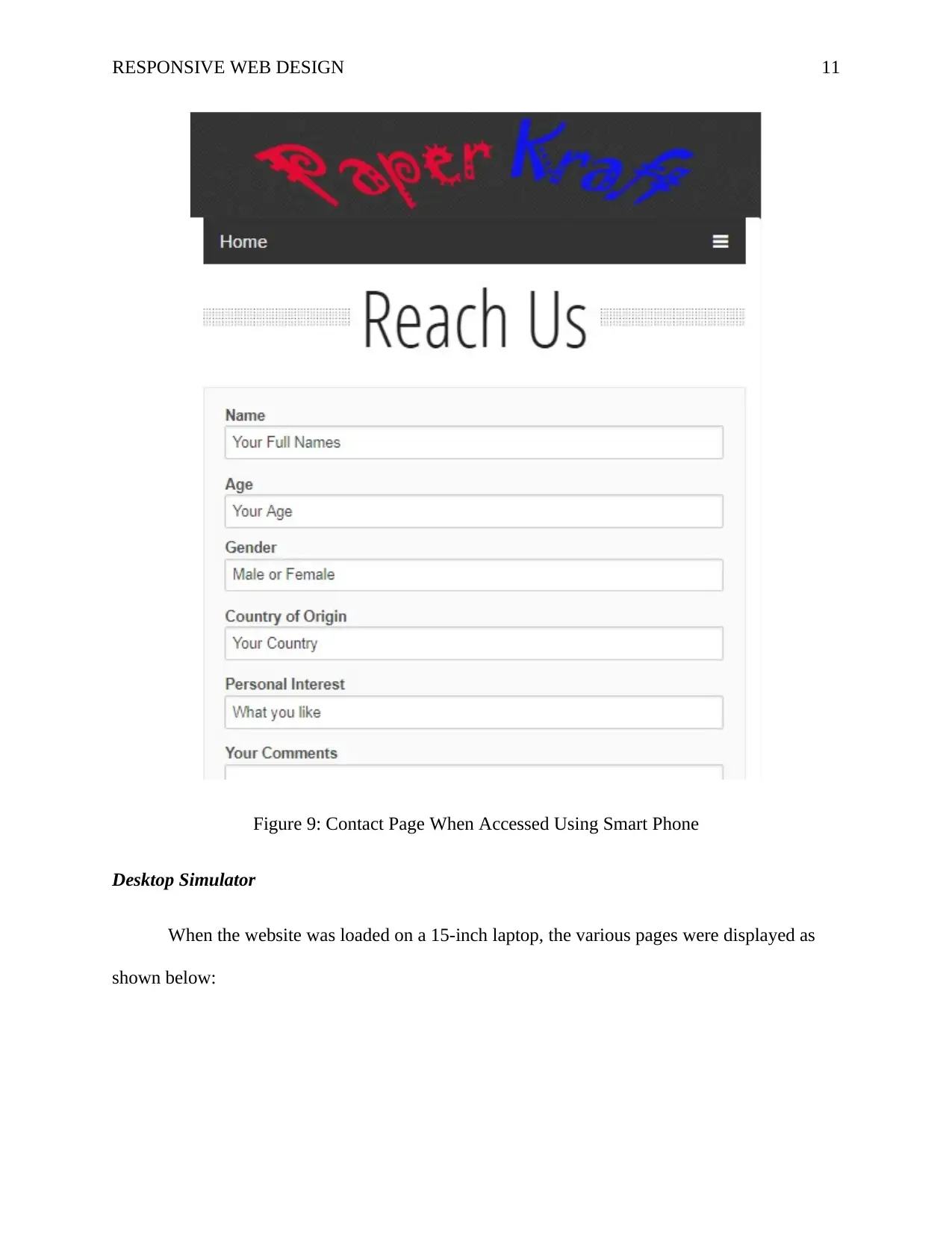
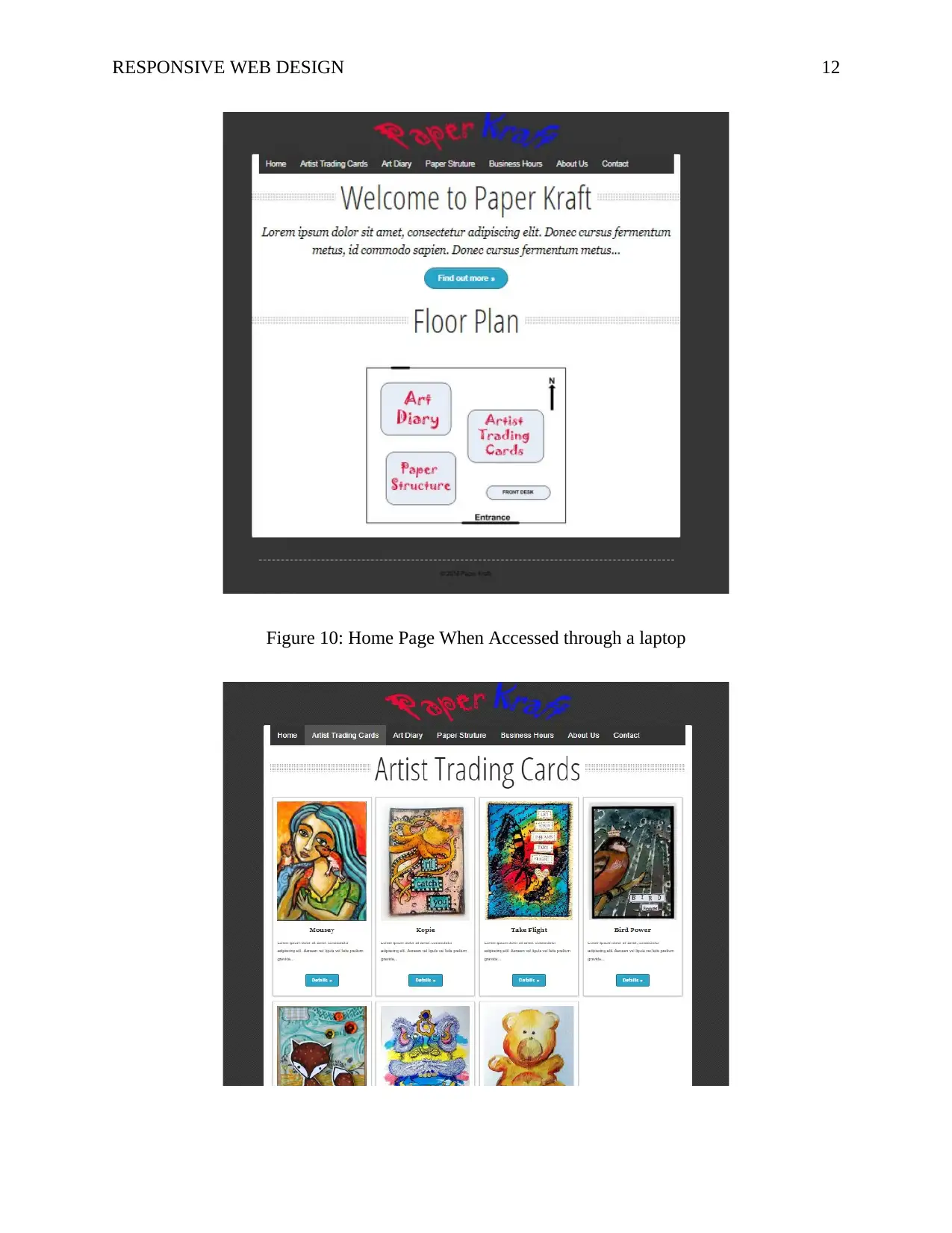
This portfolio showcases the development of a responsive website for Paper Kraft, a shop aiming to provide information to its customers. The project details the design and implementation of a website that adapts to various screen sizes, including smartphones and laptops. It covers crucial aspects such as color theory, text alignment, and the use of CSS3 and media queries for responsive behavior. The portfolio includes mockups of different web pages (home, art diary, contact), navigation flowcharts, and screenshots demonstrating the website's responsiveness on different devices. User feedback obtained through website testing is also discussed, with the aim of improving the design and usability. The assignment demonstrates understanding of the principles of responsive web design and its importance for businesses with an online presence. This project provides a practical application of responsive web design, including design choices, user testing, and the overall development process.
Document Page
Running head: RESPONSIVE WEB DESIGN 1
Responsive Web Design
Student Name
Institutional Affiliation
tabler-icon-diamond-filled.svg

Secure Best Marks with AI Grader

Need help grading? Try our AI Grader for instant feedback on your assignments.
Document Page
RESPONSIVE WEB DESIGN 2
Table of Contents
Introduction......................................................................................................................................3
Portfolio 2.1.....................................................................................................................................3
Portfolio 2.2.....................................................................................................................................6
Portfolio 2.3.....................................................................................................................................7
Portfolio 2.4.....................................................................................................................................7
Portfolio 2.5.....................................................................................................................................8
Portfolio 2.6.....................................................................................................................................9
Portfolio 2 Summary and Conclusion............................................................................................15
References......................................................................................................................................17
Document Page
RESPONSIVE WEB DESIGN 3
Introduction
Responsive web development/design is the process of creating a website that resizes itself
to fit to different screen sizes based on the kind of device used to access the website. It could be
tablets, desktop monitor, smartphones, or a laptop. For any business with online presence,
responsive web design is very crucial because of the increasing use of tablets, smartphones, and
other mobile devices, and users are shifting more to smaller computing devices to access
websites (Jones, 2018). The objective of website responsiveness is to facilitate development of
one website that will have various elements that allows it to be viewed on various devices with
different screen sizes. The portfolio will discuss the various elements and aspects that are
essential in responsive web design.
Portfolio 2.1
The diagrams below show the various mockups for the different web pages:
Figure 1: Home Page
Document Page
RESPONSIVE WEB DESIGN 4
Figure 2: Art Diary Page
Figure 3: Contact Page
tabler-icon-diamond-filled.svg

Secure Best Marks with AI Grader

Need help grading? Try our AI Grader for instant feedback on your assignments.
Document Page
RESPONSIVE WEB DESIGN 5
Portfolio 2.2
Having a successful website requires using the right combination of colors using color
theory which is very essential. It is very crucial to have the right color scheme when creating a
website whether it has been created by an individual or a professional web development firm.
Viewer and visitors easily get attracted to high quality websites and if it is not appealing there is
a high chance that they will not spend longer time interacting or viewing the content on the
website and in extreme cases they exit even before reading anything.
When developing a website, it is necessary to have knowledge on theory behind color
schemes. It begins by analyzing the color wheel and grouping the colors into three categories:
primary, secondary, and tertiary colors (Jones, 2017). Color theory describes color combination
strategies to enhance allure and optimize use. Choosing website colors requires selecting
combination of colors that are harmonious and sober to the eye of the viewer.
Color schemes and theories were considered in developing the Paper Kraft website. Some
of the color aspect considered include:
Background color: white and black colors were used as background colors for the website
because website concentration is maintained and the web pages are punched forward. The
background is the same across all the pages to maintain uniformity. For the menu, the
background color used was black so as to rhyme with the overall background color of the
website.
Text color: for the text content in the website, white and black colors have been used
because they are more readable and clearer. Since the menu have a black background color, text
Document Page
RESPONSIVE WEB DESIGN 6
color used is white to enhance clarity. Mixing text colors will negatively affect the overall look
of the website and is thus discouraged to use more that 4 colors in a website.
Image properties: standard image properties and tags have been used in all the images
used in the website. The code below shows the general image properties used in the tag:
<div class='box photo col2'> <a href="#"><img src="URL" alt="name"></a>
Links: menu has a hover functions such the when a mouse is moved over a menu item the
background color changes to grey. All visited links will turn blue.
Portfolio 2.3
The figure below shows an improvement of the navigation flowchart:
Figure 4: Navigation Flowchart
Portfolio 2.4
Text alignment is crucial integral part in the development of websites and many web
designers tend to overlook at this aspect. As such, it is important that a website has predesigned
layout to act as master grid for supporting the navigation, sections, footers, headers, look and
feel, sides, and sidebars (Boudreaux, 2012). Alignment enables the designers to effectively and
Document Page
RESPONSIVE WEB DESIGN 7
efficiently make careful decisions concerning the layout of elements of the website. If alignment
strategies are not used then the elements would be scattered arbitrarily with no or little
connection to other elements. The diagram below shows how text is aligned on the business hour
page:
Figure 5: Text Alignment
Portfolio 2.5
Contact form play a vital role because it is the primary channel that website visitors use
to connect and communicate with the business. It enables them to give their opinions, feedback,
seek clarifications, and make complements. It also offers a way for the business to continuously
engage with the customers. Paper Kraft website contact web page is shown below:
tabler-icon-diamond-filled.svg

Paraphrase This Document

Need a fresh take? Get an instant paraphrase of this document with our AI Paraphraser
Document Page
RESPONSIVE WEB DESIGN 8
Figure 6: Contact Form
Portfolio 2.6
It is important to ensure that the website automatically responds to fit different screen
sizes while maintain the look and feel and keeping the simplicity of interacting with the website.
CSS3 and media queries and html5 functions enables the website to respond dynamically to
different device screens such as tablet, smartphones, laptops, and desktop monitors (Pilon, 2018).
Testing the website using different Simulators
Mobile and desktop simulators were used to test the website for responsiveness and
overall look and feel.
Mobile simulator
Document Page
RESPONSIVE WEB DESIGN 9
A smartphone with a screen size of 5 inches was used to test how the website would look.
Three pages were tested: home page, artist trading cards, contact pages were tested. The figures
below show the different screenshots of these pages:
Figure 7: Home Page When Accessed through a Smartphone
Document Page
RESPONSIVE WEB DESIGN 10
Figure 8: Artist Trading Card Page when Accessed using a Smartphone
tabler-icon-diamond-filled.svg

Secure Best Marks with AI Grader

Need help grading? Try our AI Grader for instant feedback on your assignments.
Document Page
RESPONSIVE WEB DESIGN 11
Figure 9: Contact Page When Accessed Using Smart Phone
Desktop Simulator
When the website was loaded on a 15-inch laptop, the various pages were displayed as
shown below:
Document Page
RESPONSIVE WEB DESIGN 12
Figure 10: Home Page When Accessed through a laptop
Document Page
RESPONSIVE WEB DESIGN 13
Figure 11: Artist Trading Card Page when Accessed using a laptop
Figure 12: Contact Page When Accessed Using laptop
Website Review
To check if the website meets all the usability requirements, four people were asked to
interact with the website. They were asked to interact with the website using any device either
tablet, smartphone, or PC.
The first person said that he was impressed with the color combinations used and the fact
that the website did not contain many colors. He further stated that all the contents were clear
and that they were clear. When he was asked to rate the website on a scale of 1 to 10, 10 being
the best he rated the website at 9/10.
The second person was satisfied on how the images have been aligned on the website. He
said that the images were clear indicating that the original image properties have been
tabler-icon-diamond-filled.svg

Paraphrase This Document

Need a fresh take? Get an instant paraphrase of this document with our AI Paraphraser
Document Page
RESPONSIVE WEB DESIGN 14
maintained. She suggested that it would have been better to use two or three columns for the
images rather than using four columns. She rated the website at 9/10.
The third person said the color combinations used were more traditional and she
suggested that more brighter colors would have been used. she further recommended the colors
green, blue, and white would best fit the website. However, the colors recommended by the third
person are not appealing to as argued by the first, second, and forth person. She rated the website
7/10.
The fourth person said that he was satisfied with the overall design of the website and he
did not give any suggestions for improvements. However, he rated the website 9/10.
The feedback collected from the four people suggested that the website was good and
appealing to the visitors. Additionally, the colors chosen gave the website a better look and were
not shouting. Using shouting colors could may affect some users who are allergic to bright
colors.
Assumptions
The assumptions made include: the users are not disabled and were using mouse,
keyboard, and touch screen to interact with the website. They are also connected to high speed
internet.
Portfolio 2 Summary and Conclusion
For any business with online presence, responsive web design is very crucial because of
the increasing use of tablets, smartphones, and other mobile devices, and users are shifting more
to smaller computing devices to access websites. The objective of website responsiveness is to
Document Page
RESPONSIVE WEB DESIGN 15
facilitate development of one website that will have various elements that allows it to be viewed
on various devices with different screen sizes.
When developing a website, it is necessary to have knowledge on theory behind color
schemes. It begins by analyzing the color wheel and grouping the colors into three categories:
primary, secondary, and tertiary colors. Color theory describes color combination strategies to
enhance allure and optimize use. Choosing website colors requires selecting combination of
colors that are harmonious and sober to the eye of the viewer.
Alignment enables the designers to effectively and efficiently make careful decisions
concerning the layout of elements of the website. If alignment strategies are not used then the
elements would be scattered arbitrarily with no or little connection to other elements.
Document Page
RESPONSIVE WEB DESIGN 16
References
Boudreaux, R. (2012). Effective design principles for web designers: Alignment. Retrieved from
https://www.techrepublic.com/blog/web-designer/effective-design-principles-for-web-
designers-alignment/
Jones, B. (2017). Color Theory: The Importance of Color in Web Design. Retrieved from
https://www.designandpromote.com/color-theory-the-importance-of-color-in-web-design/
Jones, J. (2018). The Importance Of Responsive Web Design | Digital Next. Retrieved from
https://digitalnext.co.uk/dn-hub/blog/importance-of-responsive-web-design/
Pilon, A. (2018). What is Responsive Web Design? - Small Business Trends. Retrieved from
https://smallbiztrends.com/2013/05/what-is-responsive-web-design.html
chevron_up_icon
1 out of 16
circle_padding
hide_on_mobile
zoom_out_icon
logo.png

Your All-in-One AI-Powered Toolkit for Academic Success.

Available 24*7 on WhatsApp / Email

[object Object]