Poster Design Research Report - Foundation Studies, Semester 1

Verified

Added on  2023/05/30

|6
|654
|255
Report
AI Summary
This report provides a detailed analysis of poster design within the music industry. It begins with an introduction to poster design as a form of advertising and visual communication. The body of the report examines three distinct poster designs, including a Metallica poster, a Mike Shinoda concert poster, and a Linkin Park poster. Each poster is analyzed for its design elements, such as color, typography, and layout, and how these elements contribute to the overall message and effectiveness of the poster. The report highlights the use of diagonal bars, typographic images, and color to convey messages and attract viewers. The conclusion summarizes the key takeaways from the research, emphasizing the lessons learned from each poster design. The report uses Harvard referencing to cite sources.
Document Page
Running head: POSTER DESIGN RESEARCH
Poster Design Research
Name of the Student:
Name of the University:
Author note:
tabler-icon-diamond-filled.svg

Paraphrase This Document

Need a fresh take? Get an instant paraphrase of this document with our AI Paraphraser
Document Page
2
POSTER DESIGN RESEARCH
Introduction
Poster design is considered to be one of the earliest forms of advertising medium.
Apart from setting up a brand image before the entire mass, purpose of a poster is to attract
and captivate the viewer. An effective poster is noticeable from a distance and communicates
its message immediately. Here, three distinct sets of posters will be reviewed and drawn
inspiration from in order to create a poster for a similar domain of industry.
Research Analysis
Poster 1
This is just a mock-up poster available on the internet. This has been designed and
published by AliExpress.com. This poster was primarily released to serve the purpose of a
retro Metallica poster.
The design elements used in this poster are indeed awe-inspiring. The use of dark and
flat colours depicts the fame, strength and gravity of the entertainer. What draws major
attention is the use of the diagonal bar. It uses up a major space of the poster and seems to
hold the entire image in place. The typography used, is also fairly constant and alluring.
https://www.aliexpress.com/item/Metallica-Alice-in-Chains-Music-Poster-Classic-Retro-Vintage-Kraft-Decorative-DIY-Wall-
Canvas-Sticker-Home/32838720654.html
Document Page
3
POSTER DESIGN RESEARCH
Poster 2
This poster has been designed to suffice a concert of Mike Sinhoda, one of the main
pillars of the Linkin Park band, in his tour of China.
The poster gracefully highlights the main attraction of the event. Once again, the use
of a contrasting set of dark mat colours can be seen, which resembles the rock genre. The
typographic image of Mike covers the main part of the poster and draws the viewer’s
attention to the core. Typographic images put up a strong face of the concerned character, it
highlights a message that the image or the character can send out to the society. Other
necessary information about the event has also been gracefully laid out clearly at the lower
end of the poster.
https://chengdu-expat.com/events/festivals-music/mike-shinoda-of-linkin-park-in-chengdu/
Document Page
4
POSTER DESIGN RESEARCH
Poster 2
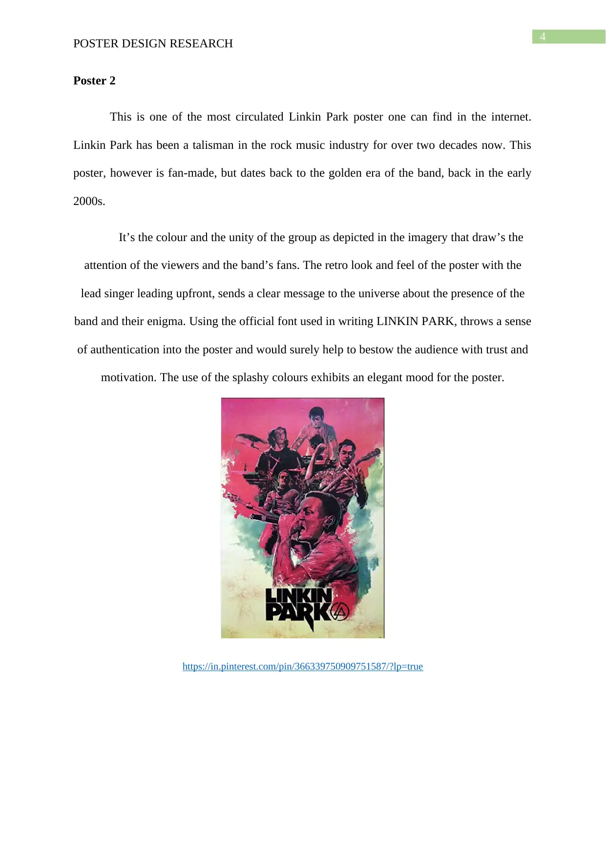
This is one of the most circulated Linkin Park poster one can find in the internet.
Linkin Park has been a talisman in the rock music industry for over two decades now. This
poster, however is fan-made, but dates back to the golden era of the band, back in the early
2000s.
It’s the colour and the unity of the group as depicted in the imagery that draw’s the
attention of the viewers and the band’s fans. The retro look and feel of the poster with the
lead singer leading upfront, sends a clear message to the universe about the presence of the
band and their enigma. Using the official font used in writing LINKIN PARK, throws a sense
of authentication into the poster and would surely help to bestow the audience with trust and
motivation. The use of the splashy colours exhibits an elegant mood for the poster.
https://in.pinterest.com/pin/366339750909751587/?lp=true
tabler-icon-diamond-filled.svg

Paraphrase This Document

Need a fresh take? Get an instant paraphrase of this document with our AI Paraphraser
Document Page
5
POSTER DESIGN RESEARCH
Conclusion
The posters that have been researched, each has a special lesson to convey on the
various concepts of graphic designing. While the first Metallica poster outlines the use of a
diagonal bar that hold the entire image into place, the Mike Sinhoda poster describes the
uniqueness of the use of typography and the proper placement of event information. The final
LP poster also depicts the beautiful use of colours to convey a message and the factual use of
font styles to authenticate the design.
Document Page
6
POSTER DESIGN RESEARCH
References
https://www.aliexpress.com/item/Metallica-Alice-in-Chains-Music-Poster-Classic-Retro-
Vintage-Kraft-Decorative-DIY-Wall-Canvas-Sticker-Home/32838720654.html
https://chengdu-expat.com/events/festivals-music/mike-shinoda-of-linkin-park-in-chengdu/
https://in.pinterest.com/pin/366339750909751587/?lp=true
chevron_up_icon
1 out of 6
circle_padding
hide_on_mobile
zoom_out_icon