PROJ 1201 Winter 2020: Project Quality Management Team Project
VerifiedAdded on 2022/07/28
|12
|1847
|28
Project
AI Summary
This project quality management assignment from focuses on data analysis and visualization techniques. The report includes an executive summary outlining the importance of data visualization in presenting and analyzing results, utilizing various charts like bar charts, circle charts, and control charts. The deliverables involve creating check sheets, graphs (line, bar, circle, histogram, Pareto, scatter), flow charts, run charts, control charts, pillar diagrams, and cause-and-effect diagrams. The assignment also explores problem-solving methods, such as brainstorming, to address identified issues. Furthermore, the student reflects on the quality plan, including leadership, teamwork, and the overall process, emphasizing the importance of team effort and the impact of data visualization on audience engagement. The report highlights the use of descriptive statistics, data collection methods, and the application of statistical tools to analyze customer feedback and improve service quality. The student also provides a critical evaluation of the entire process, discussing strengths, weaknesses, and areas for improvement in data presentation and statistical analysis.

Running head: PROJECT QUALITY MANAGEMENT 1
Project quality management
<Name>
<University Name>
Project quality management
<Name>
<University Name>
Paraphrase This Document
Need a fresh take? Get an instant paraphrase of this document with our AI Paraphraser
ROJECT QUALITY MANAGEMENT 2
Project quality management
1. Executive summary
In summary, data visualization play an important role when it comes to data presentation
and analysis. Different visuals including bar chart, circle charts, histogram, scatterplots, control
charts and pillar diagrams were used to visualize the results in the report. In addition, quality of
work depends on the team effort and level of commitment while doing the task. For instance,
deeper analysis including charts designs makes the viewers to like the report and all these factors
were given consideration in the current report.
ROJECT QUALITY MANAGEMENT 3
Table of Contents
1. Executive summary................................................................................................................2
2. Deliverables.............................................................................................................................3
1.1 Data gathering, representation and analysis......................................................................3
1.1.1 Create a check sheet for collecting data points about your project................................3
1.1.2 Prepare a line graph, bar graph, and circle graph using simple data that is available to
you from your Check Sheet.....................................................................................................3
1.1.3 Prepare a histogram with data that is readily available to you from your check sheet...5
1.1.4 Prepare a Pareto chart with data that is available to you from your project...................5
1.1.5 Prepare a scatter diagram using data available to you from your project.......................6
1.2 Understanding Processes...................................................................................................7
1.2.1 A flow chart for a common process for the highest complaint to lowest.......................7
1.2.2 Prepare a run chart for the temperature for 10 days.......................................................7
1.2.3 Prepare a control chart....................................................................................................8
1.2.6 Develop a degree of influence Pillar Diagram using the top five results from the error
check sheet developed in part 1.1.1 of this assignment...............................................................8
1.2.7 Based on the highest influence error cause from part 1.2.6 of this assignment
determine the causes of the cause by using a cause-and-effect diagram.................................9
1.3 Problem Solving................................................................................................................9
1.3.1 Consider the causes from your Ishikawa (part 1.2.7). Use any of the problem solving
and brainstorming method (s) to document your teams process for developing solution (s)
for one of your stated causes from part 1.2.7 of this assignment............................................9
1.4 Now as a consultant you are asked to evaluate your quality plan from the following
prospective:..................................................................................................................................9
⊘ This is a preview!⊘
Do you want full access?
Subscribe today to unlock all pages.
Trusted by 1+ million students worldwide
ROJECT QUALITY MANAGEMENT 4
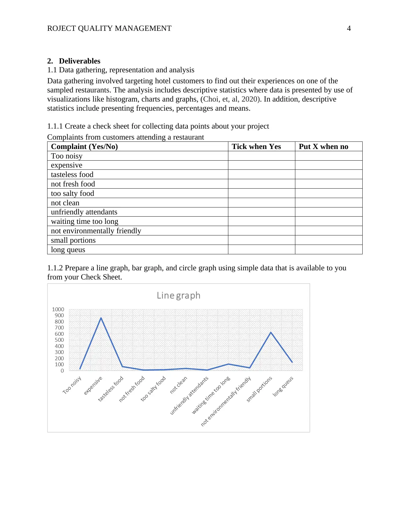
2. Deliverables
1.1 Data gathering, representation and analysis
Data gathering involved targeting hotel customers to find out their experiences on one of the
sampled restaurants. The analysis includes descriptive statistics where data is presented by use of
visualizations like histogram, charts and graphs, (Choi, et, al, 2020). In addition, descriptive
statistics include presenting frequencies, percentages and means.
1.1.1 Create a check sheet for collecting data points about your project
Complaints from customers attending a restaurant
Complaint (Yes/No) Tick when Yes Put X when no
Too noisy
expensive
tasteless food
not fresh food
too salty food
not clean
unfriendly attendants
waiting time too long
not environmentally friendly
small portions
long queus
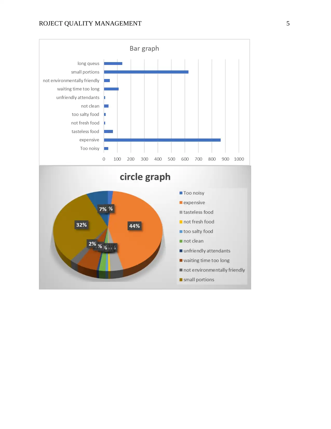
1.1.2 Prepare a line graph, bar graph, and circle graph using simple data that is available to you
from your Check Sheet.
2. Deliverables
1.1 Data gathering, representation and analysis
Data gathering involved targeting hotel customers to find out their experiences on one of the
sampled restaurants. The analysis includes descriptive statistics where data is presented by use of
visualizations like histogram, charts and graphs, (Choi, et, al, 2020). In addition, descriptive
statistics include presenting frequencies, percentages and means.
1.1.1 Create a check sheet for collecting data points about your project
Complaints from customers attending a restaurant
Complaint (Yes/No) Tick when Yes Put X when no
Too noisy
expensive
tasteless food
not fresh food
too salty food
not clean
unfriendly attendants
waiting time too long
not environmentally friendly
small portions
long queus
1.1.2 Prepare a line graph, bar graph, and circle graph using simple data that is available to you
from your Check Sheet.
Paraphrase This Document
Need a fresh take? Get an instant paraphrase of this document with our AI Paraphraser
ROJECT QUALITY MANAGEMENT 5
ROJECT QUALITY MANAGEMENT 6
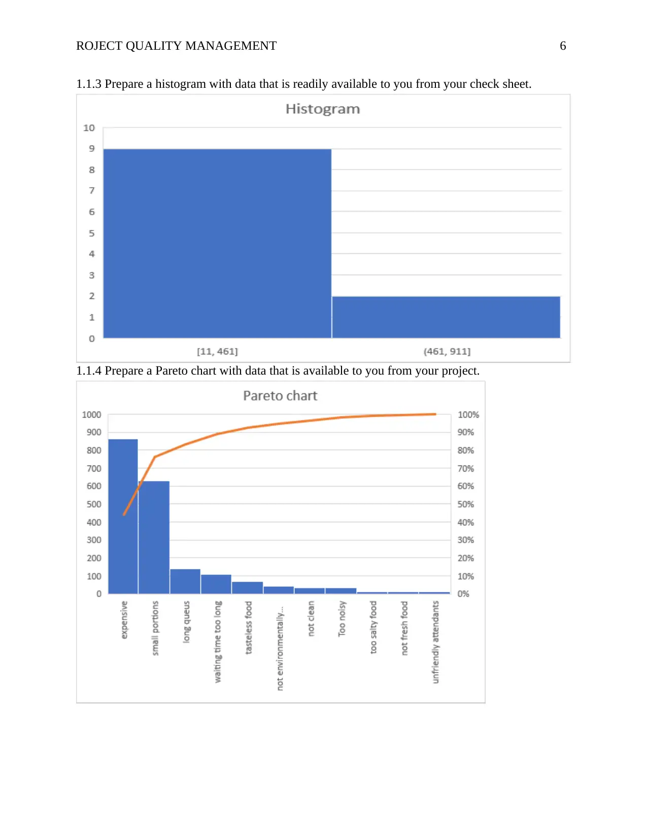
1.1.3 Prepare a histogram with data that is readily available to you from your check sheet.
1.1.4 Prepare a Pareto chart with data that is available to you from your project.
1.1.3 Prepare a histogram with data that is readily available to you from your check sheet.
1.1.4 Prepare a Pareto chart with data that is available to you from your project.
⊘ This is a preview!⊘
Do you want full access?
Subscribe today to unlock all pages.
Trusted by 1+ million students worldwide
ROJECT QUALITY MANAGEMENT 7
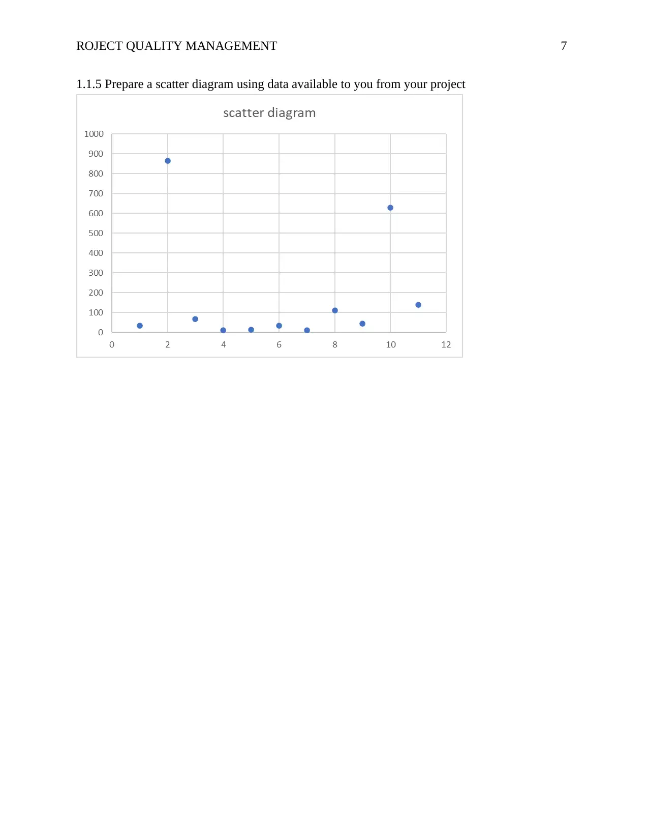
1.1.5 Prepare a scatter diagram using data available to you from your project
1.1.5 Prepare a scatter diagram using data available to you from your project
Paraphrase This Document
Need a fresh take? Get an instant paraphrase of this document with our AI Paraphraser
ROJECT QUALITY MANAGEMENT 8
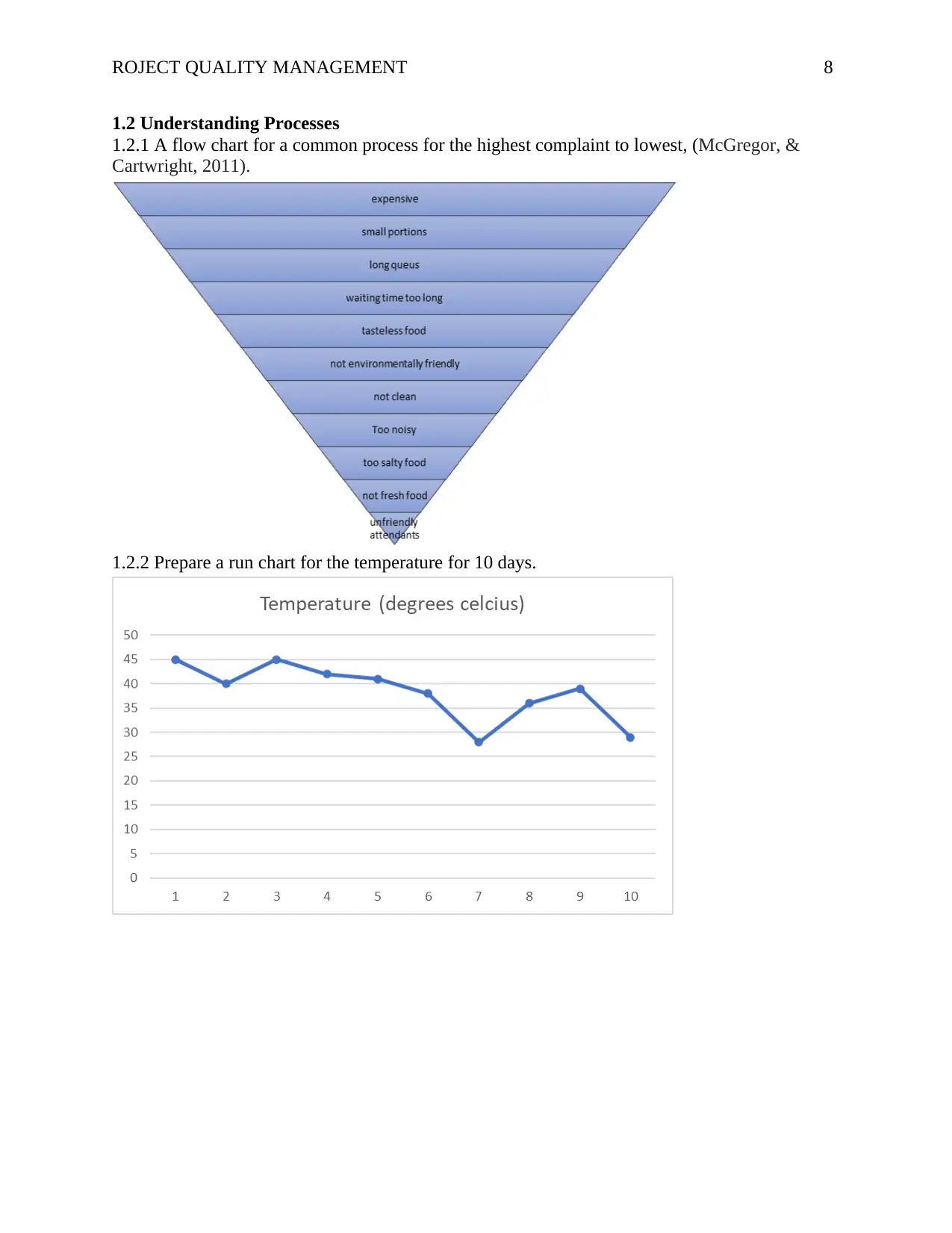
1.2 Understanding Processes
1.2.1 A flow chart for a common process for the highest complaint to lowest, (McGregor, &
Cartwright, 2011).
1.2.2 Prepare a run chart for the temperature for 10 days.
1.2 Understanding Processes
1.2.1 A flow chart for a common process for the highest complaint to lowest, (McGregor, &
Cartwright, 2011).
1.2.2 Prepare a run chart for the temperature for 10 days.
ROJECT QUALITY MANAGEMENT 9
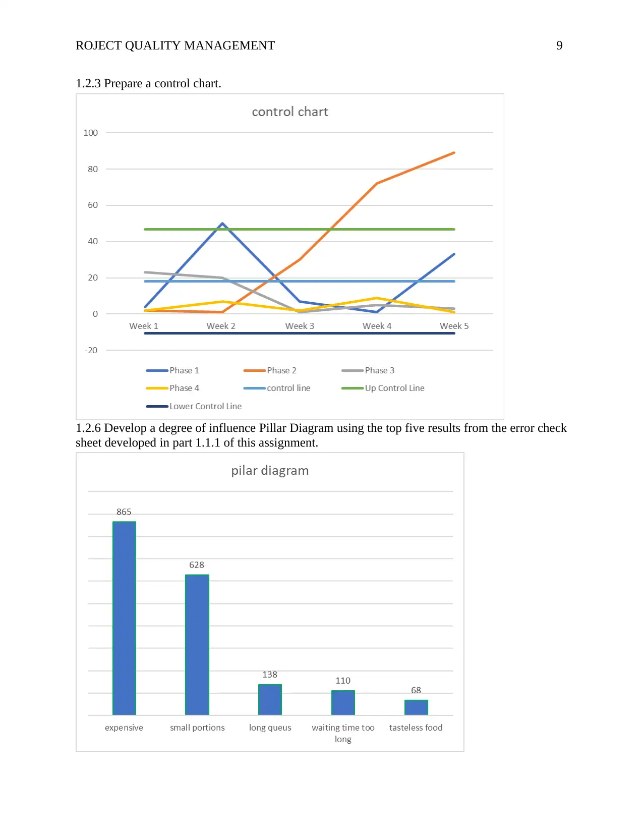
1.2.3 Prepare a control chart.
1.2.6 Develop a degree of influence Pillar Diagram using the top five results from the error check
sheet developed in part 1.1.1 of this assignment.
1.2.3 Prepare a control chart.
1.2.6 Develop a degree of influence Pillar Diagram using the top five results from the error check
sheet developed in part 1.1.1 of this assignment.
⊘ This is a preview!⊘
Do you want full access?
Subscribe today to unlock all pages.
Trusted by 1+ million students worldwide
ROJECT QUALITY MANAGEMENT 10
1.2.7 Based on the highest influence error cause from part 1.2.6 of this assignment determine the
causes of the cause by using a cause-and-effect diagram.
Done in excel
1.3 Problem Solving
1.3.1 Consider the causes from your Ishikawa (part 1.2.7). Use any of the problem solving and
brainstorming method (s) to document your teams process for developing solution (s) for one of
your stated causes from part 1.2.7 of this assignment.
In order to reduce complaints on the cost of the services and food offered at the hotel, there is
need for the management to revise costs and even do a benchmark with nearby hotels to offer
nearly similar charges for the same quantity of foods, (Boella, & Goss-Turner, 2019).
1.4 Now as a consultant you are asked to evaluate your quality plan from the following
prospective:
1. Leadership and teamwork
2. Quality plan and approaches
3. Reflection on the entire process of creating the/this report
Generally, most students prefer group discussions in their task, (Arja, et, al, 2020). On the other
hand, this approach has not obtained enough support from learners even though it is the best
method when studying relevant courses in schools. Having completed the task, I am confident
that my group did equally good work to complete the statistical requirements in the report. Each
person had an opportunity to handle a specific task like drawing bar chat, pareto chart etc.
Again, members in a team had an opportunity to carry out a research on the best way of drawing
diagrams in excel thus leading to quality statistical analysis conducted on our collected datasets,
(Dittmann, Stephens, & Townsend, 2020). With the results, persuading listeners to believe on the
results of excel presentations as true findings that can be generalized to other settings is not
difficult indicating the quality work conducted.
Well, not all people enjoy statistics but with the visualizations, I believe that every lister’s
attention will be captured thus enjoying the completed task. Even though, several other statistical
presentations were applicable but were not considered in the presentation, (Cronin, & McCabe,
2017). For instance, an independent sample t test would have been conducted to find out whether
there is gender difference when it comes to restaurant’s complaints from the customers.
With the fact that human beings are prone to error, in some circumstances, the group had some
statistical errors in the presentation, (Strauch, 2017). For instance, the use of boxplots to present
statistical significance difference customer’s complaints and later dropping the presentation
because it was not part of the report.
In addition, having learnt to always respond to any task by giving relevant information as per our
arguments make me have extreme confidence in a great job done, (Klein, 2017). Just to ensure
that the team avoided rambling, we only presented a few visualizations with labels that were
relevant and avoided presentations on other matters that were not necessary. To have produced
the great presentations, every group member is highly encouraged to put great effort while
working on the presentation. Again, to avoid time wastage, for a success to be seen,
Paraphrase This Document
Need a fresh take? Get an instant paraphrase of this document with our AI Paraphraser
ROJECT QUALITY MANAGEMENT 11
brainstorming on the data visualizations is key and this was given priority by every group
member.
Through the collaboration efforts, the project managed to get adequate information to make our
presentation better. Through this exercise, we learned that every individual has different
strengths that can be tapped to make a good presentation. For instance, the visualization was
delegated to the group member with computer skills and able to edit nice charts.
With the absence of inferential statistics which are very key in statistical presentation, in one way
or the other, it is likely to affect the flow and attention of the listeners who may want to compare
charts with the descriptive results hence doubting the presentation, (Bone, 2016). As much as the
work is fulfilling all the requirements, I strongly believed that more of the listeners would have
desired to understand how the visualizations like control chart are reproduced thus need for
presentation guide.
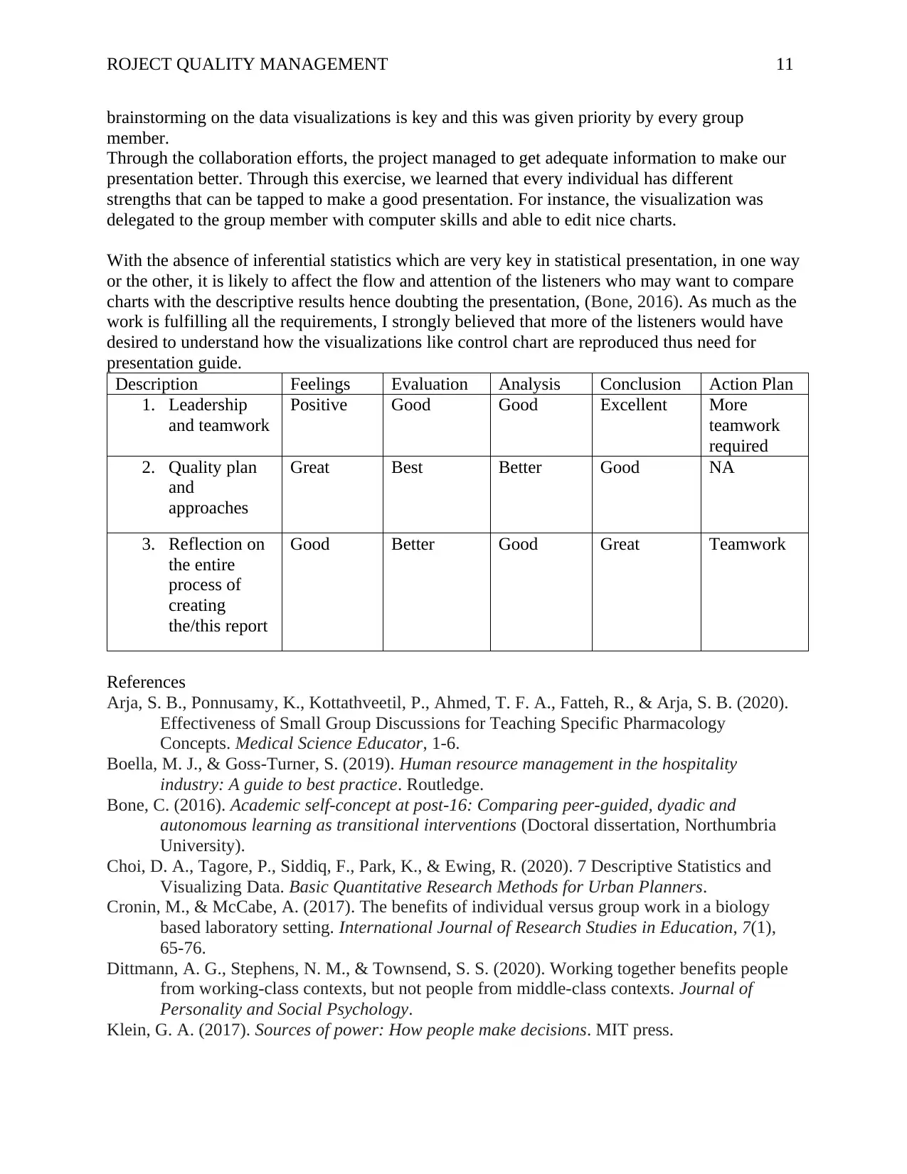
Description Feelings Evaluation Analysis Conclusion Action Plan
1. Leadership
and teamwork
Positive Good Good Excellent More
teamwork
required
2. Quality plan
and
approaches
Great Best Better Good NA
3. Reflection on
the entire
process of
creating
the/this report
Good Better Good Great Teamwork
References
Arja, S. B., Ponnusamy, K., Kottathveetil, P., Ahmed, T. F. A., Fatteh, R., & Arja, S. B. (2020).
Effectiveness of Small Group Discussions for Teaching Specific Pharmacology
Concepts. Medical Science Educator, 1-6.
Boella, M. J., & Goss-Turner, S. (2019). Human resource management in the hospitality
industry: A guide to best practice. Routledge.
Bone, C. (2016). Academic self-concept at post-16: Comparing peer-guided, dyadic and
autonomous learning as transitional interventions (Doctoral dissertation, Northumbria
University).
Choi, D. A., Tagore, P., Siddiq, F., Park, K., & Ewing, R. (2020). 7 Descriptive Statistics and
Visualizing Data. Basic Quantitative Research Methods for Urban Planners.
Cronin, M., & McCabe, A. (2017). The benefits of individual versus group work in a biology
based laboratory setting. International Journal of Research Studies in Education, 7(1),
65-76.
Dittmann, A. G., Stephens, N. M., & Townsend, S. S. (2020). Working together benefits people
from working-class contexts, but not people from middle-class contexts. Journal of
Personality and Social Psychology.
Klein, G. A. (2017). Sources of power: How people make decisions. MIT press.
brainstorming on the data visualizations is key and this was given priority by every group
member.
Through the collaboration efforts, the project managed to get adequate information to make our
presentation better. Through this exercise, we learned that every individual has different
strengths that can be tapped to make a good presentation. For instance, the visualization was
delegated to the group member with computer skills and able to edit nice charts.
With the absence of inferential statistics which are very key in statistical presentation, in one way
or the other, it is likely to affect the flow and attention of the listeners who may want to compare
charts with the descriptive results hence doubting the presentation, (Bone, 2016). As much as the
work is fulfilling all the requirements, I strongly believed that more of the listeners would have
desired to understand how the visualizations like control chart are reproduced thus need for
presentation guide.
Description Feelings Evaluation Analysis Conclusion Action Plan
1. Leadership
and teamwork
Positive Good Good Excellent More
teamwork
required
2. Quality plan
and
approaches
Great Best Better Good NA
3. Reflection on
the entire
process of
creating
the/this report
Good Better Good Great Teamwork
References
Arja, S. B., Ponnusamy, K., Kottathveetil, P., Ahmed, T. F. A., Fatteh, R., & Arja, S. B. (2020).
Effectiveness of Small Group Discussions for Teaching Specific Pharmacology
Concepts. Medical Science Educator, 1-6.
Boella, M. J., & Goss-Turner, S. (2019). Human resource management in the hospitality
industry: A guide to best practice. Routledge.
Bone, C. (2016). Academic self-concept at post-16: Comparing peer-guided, dyadic and
autonomous learning as transitional interventions (Doctoral dissertation, Northumbria
University).
Choi, D. A., Tagore, P., Siddiq, F., Park, K., & Ewing, R. (2020). 7 Descriptive Statistics and
Visualizing Data. Basic Quantitative Research Methods for Urban Planners.
Cronin, M., & McCabe, A. (2017). The benefits of individual versus group work in a biology
based laboratory setting. International Journal of Research Studies in Education, 7(1),
65-76.
Dittmann, A. G., Stephens, N. M., & Townsend, S. S. (2020). Working together benefits people
from working-class contexts, but not people from middle-class contexts. Journal of
Personality and Social Psychology.
Klein, G. A. (2017). Sources of power: How people make decisions. MIT press.
ROJECT QUALITY MANAGEMENT 12
McGregor, D., & Cartwright, L. (2011). Developing Reflective Practice: A Guide For Beginning
Teachers: A Guide for Beginning Teachers. McGraw-Hill Education (UK).
McGregor, D., & Cartwright, L. (2011). Developing Reflective Practice: A Guide For Beginning
Teachers: A Guide for Beginning Teachers. McGraw-Hill Education (UK).
⊘ This is a preview!⊘
Do you want full access?
Subscribe today to unlock all pages.
Trusted by 1+ million students worldwide
1 out of 12

Your All-in-One AI-Powered Toolkit for Academic Success.
+13062052269
info@desklib.com
Available 24*7 on WhatsApp / Email
![[object Object]](/_next/static/media/star-bottom.7253800d.svg)
Unlock your academic potential
Copyright © 2020–2026 A2Z Services. All Rights Reserved. Developed and managed by ZUCOL.