Quantitative Analysis of Sales, Fresh Foods, and Specials: ECON10005
VerifiedAdded on 2023/01/19
|12
|2069
|27
Homework Assignment
AI Summary
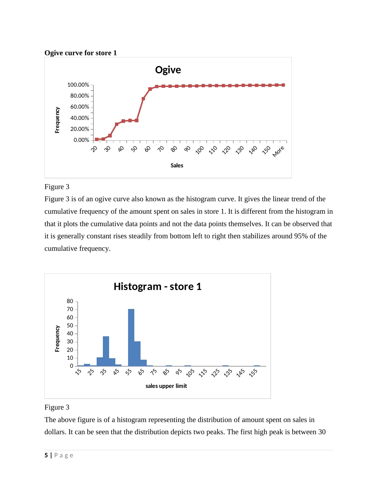
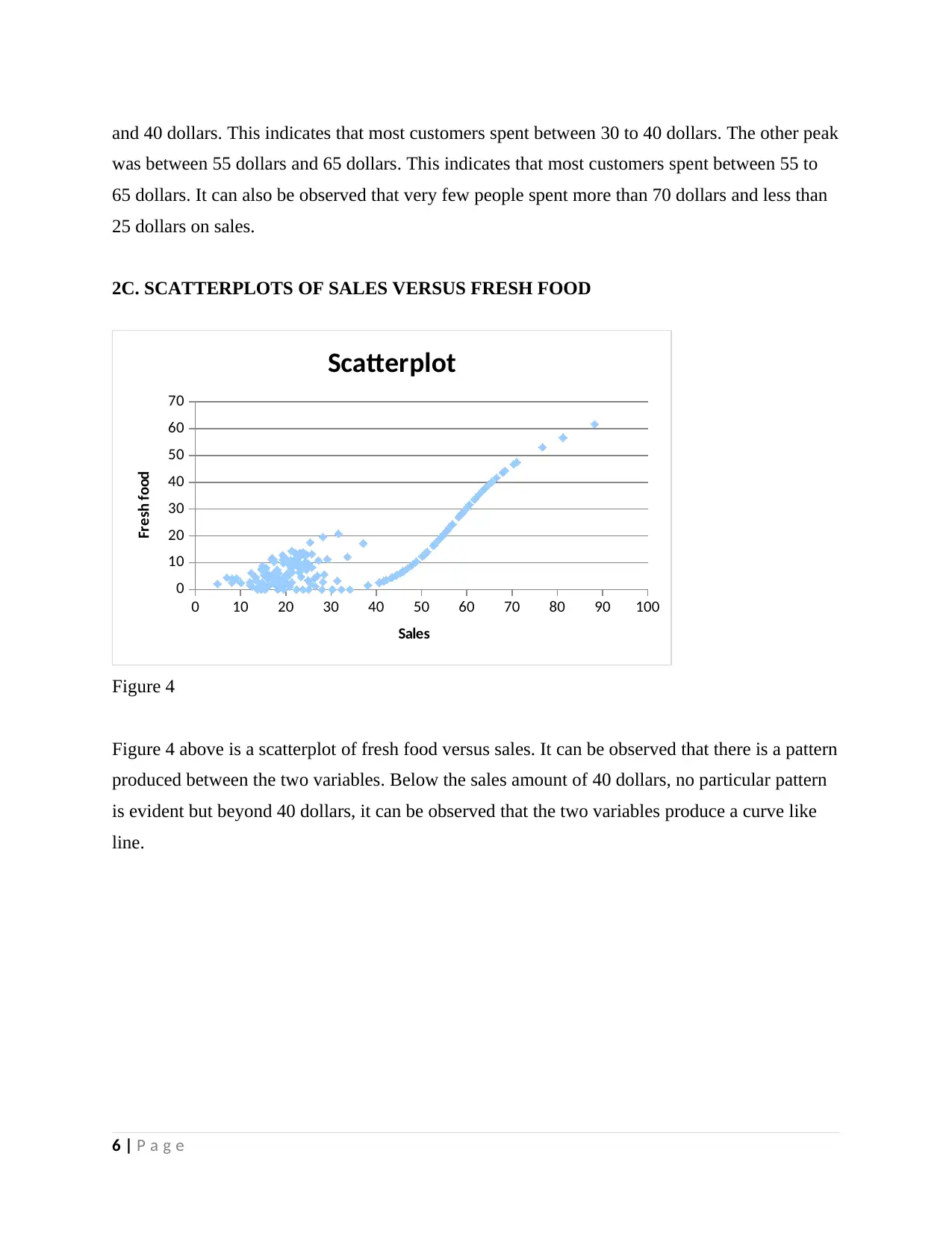
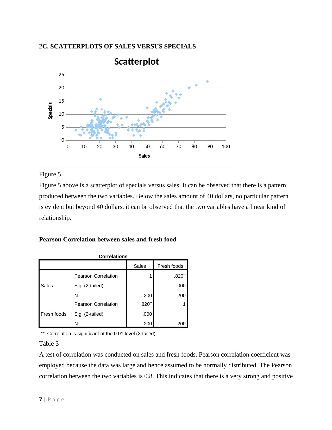
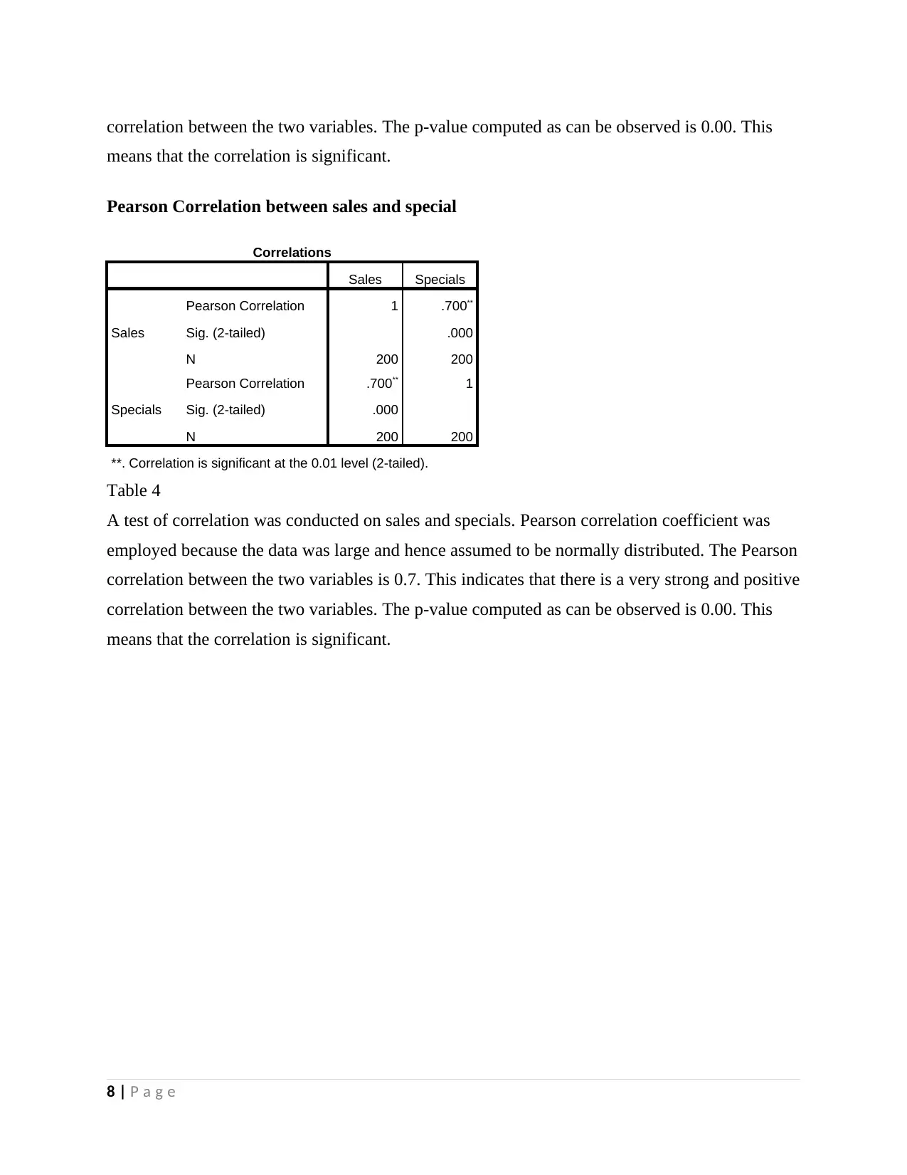
This assignment solution presents a comprehensive quantitative analysis of sales data, encompassing descriptive statistics, histograms, ogive curves, scatterplots, correlation analysis, contingency tables, and probability trees. The analysis includes data from two stores, examining the relationships between sales, fresh foods, and specials. The solution provides a detailed breakdown of the mean, median, standard deviation, and other statistical measures for each variable. Visual representations, such as histograms and ogive curves, are used to illustrate the distribution of sales data. Scatterplots are employed to explore the relationships between sales and fresh foods, and sales and specials. Pearson correlation coefficients and covariance are calculated to quantify the strength and direction of these relationships. Furthermore, the solution includes the creation of a contingency table, relative frequency/joint probabilities, and conditional probability tables to assess the independence of the variables. A probability tree is also included for visual representation. The student demonstrates a strong understanding of statistical concepts and their application to real-world data analysis.

Quantitative analysis
Student name:
Instructor:
1 | P a g e
Student name:
Instructor:
1 | P a g e
Paraphrase This Document
Need a fresh take? Get an instant paraphrase of this document with our AI Paraphraser

NUMBER TWO
2a. Descriptive statistics
Statistics
Sales Freshfoods Special
s
N Valid 200 200 200
Missing 0 0 0
Mean 33.3778 12.4468 7.5546
Std. Error of Mean 1.31213 .87324 .29951
Median 24.5600 9.0400 6.6300
Mode 23.01a .00 6.00
Std. Deviation 18.5562
6
12.34947 4.23570
Variance 344.335 152.509 17.941
Skewness .693 1.597 .981
Std. Error of Skewness .172 .172 .172
Kurtosis -.747 2.308 .917
Std. Error of Kurtosis .342 .342 .342
Range 83.39 61.77 21.64
Minimum 4.88 .00 1.00
Maximum 88.27 61.77 22.64
Percentile
s
25 19.1300 3.9200 4.7300
50 24.5600 9.0400 6.6300
75 50.7550 16.5825 9.8675
a. Multiple modes exist. The smallest value is shown
Table 1
Table 1 represents the summary statistics of three variables which are in monetary value. The
first variable is sales. This represents the amount that was spent by each of the customers in
dollars. The other variable is fresh foods. This represents the amount spent on fresh food in terms
of dollars. The last one is specials. This represents the amount of money spent on products which
were given 50% discount. As can be observed from the statistics, the mean amount spent on sales
is 33.78 dollars. The mean amount spent on fresh foods is 12.44 dollars. Lastly, the mean amount
of money spent on specials was 7.55 dollars. The median amount spent on sales is 24.56 dollars.
The mean amount spent on fresh foods is 12.44 dollars. Lastly, the mean amount of money spent
on specials was 7.55 dollars.
2 | P a g e

2b. Histogram and ogive curve
0-5
10-15
20-25
30-35
40-45
50-55
60-65
70-75
80-85
90-95
100-105
110-115
0
5
10
15
20
25
30
35
40
45
50
Histogram - store 2
Sales intervals
Frequency
Figure 1
The above figure is of a histogram representing the distribution of amount spent on sales in
dollars. It can be seen that the distribution depicts two peaks. The first high peak is between 10
and 25 dollars. This indicates that most customers spent between 10 to 25 dollars. The other peak
was between 50 dollars and 65 dollars. This indicates that most customers spent between 50 to
65 dollars. It can also be observed that very few people spent more than 65 dollars and less than
10 dollars on sales.
5
15
25
35
45
55
65
75
85
95
105
115
0.00%
10.00%
20.00%
30.00%
40.00%
50.00%
60.00%
70.00%
80.00%
90.00%
100.00%
Ogive curve-store 2
upper limits
Cummulative frequency
Figure 2
3 | P a g e
⊘ This is a preview!⊘
Do you want full access?
Subscribe today to unlock all pages.

Trusted by 1+ million students worldwide

Figure 2 is of an ogive curve also known as the histogram curve. It gives the linear trend of the
cumulative frequency of the amount spent on sales. It is different from the histogram in that it
plots the cumulative data points and not the data points themselves. It can be observed that it
rises steadily from bottom left to right then stabilizes around 90% of the cumulative frequency.
Descriptive statistics for amount spent in store 1
STORE 1
Descriptive statistics
Sales Fresh foods Specials
Mean 47.86 19.48 11.62
Standard Error 1.22 0.36 0.19
Median 52.97 20.11 11.44
Mode 51.94 20.10 11.40
Standard Deviation 16.40 4.89 2.51
Sample Variance 268.98 23.95 6.29
Kurtosis 11.56 0.97 1.37
Skewness 1.95 0.03 0.94
Range 140.26 35.56 13.46
Minimum 13.72 0.00 8.24
Maximum 153.98 35.56 21.70
Sum 8614.20 3506.29 2092.16
Count 180 180 180
Table 2
Table 2 represents the summary statistics of three variables which are in monetary value. The
first variable is sales. This represents the amount that was spent by each of the customers in
dollars. The other variable is fresh foods. This represents the amount spent on fresh food in terms
of dollars. The last one is specials. This represents the amount of money spent on products which
were given 50% discount. As can be observed from the statistics, the mean amount spent on sales
is 47.86 dollars. The mean amount spent on fresh foods is 19.48 dollars. Lastly, the mean amount
of money spent on specials was 11.62 dollars. The median amount spent on sales is 52.97
dollars. The mean amount spent on fresh foods is 20.11 dollars. Lastly, the mean amount of
money spent on specials was 11.44 dollars. It can be concluded that the amounts spent on the
variables in store 1 were higher than the amounts spent on the variables in store 2.
4 | P a g e
Paraphrase This Document
Need a fresh take? Get an instant paraphrase of this document with our AI Paraphraser

Ogive curve for store 1
20
30
40
50
60
70
80
90
100
110
120
130
140
150
More
0.00%
20.00%
40.00%
60.00%
80.00%
100.00%
Ogive
Sales
Frequency
Figure 3
Figure 3 is of an ogive curve also known as the histogram curve. It gives the linear trend of the
cumulative frequency of the amount spent on sales in store 1. It is different from the histogram in
that it plots the cumulative data points and not the data points themselves. It can be observed that
it is generally constant rises steadily from bottom left to right then stabilizes around 95% of the
cumulative frequency.
15
25
35
45
55
65
75
85
95
105
115
125
135
145
155
0
10
20
30
40
50
60
70
80
Histogram - store 1
sales upper limit
Frequency
Figure 3
The above figure is of a histogram representing the distribution of amount spent on sales in
dollars. It can be seen that the distribution depicts two peaks. The first high peak is between 30
5 | P a g e
20
30
40
50
60
70
80
90
100
110
120
130
140
150
More
0.00%
20.00%
40.00%
60.00%
80.00%
100.00%
Ogive
Sales
Frequency
Figure 3
Figure 3 is of an ogive curve also known as the histogram curve. It gives the linear trend of the
cumulative frequency of the amount spent on sales in store 1. It is different from the histogram in
that it plots the cumulative data points and not the data points themselves. It can be observed that
it is generally constant rises steadily from bottom left to right then stabilizes around 95% of the
cumulative frequency.
15
25
35
45
55
65
75
85
95
105
115
125
135
145
155
0
10
20
30
40
50
60
70
80
Histogram - store 1
sales upper limit
Frequency
Figure 3
The above figure is of a histogram representing the distribution of amount spent on sales in
dollars. It can be seen that the distribution depicts two peaks. The first high peak is between 30
5 | P a g e

and 40 dollars. This indicates that most customers spent between 30 to 40 dollars. The other peak
was between 55 dollars and 65 dollars. This indicates that most customers spent between 55 to
65 dollars. It can also be observed that very few people spent more than 70 dollars and less than
25 dollars on sales.
2C. SCATTERPLOTS OF SALES VERSUS FRESH FOOD
0 10 20 30 40 50 60 70 80 90 100
0
10
20
30
40
50
60
70
Scatterplot
Sales
Fresh food
Figure 4
Figure 4 above is a scatterplot of fresh food versus sales. It can be observed that there is a pattern
produced between the two variables. Below the sales amount of 40 dollars, no particular pattern
is evident but beyond 40 dollars, it can be observed that the two variables produce a curve like
line.
6 | P a g e
⊘ This is a preview!⊘
Do you want full access?
Subscribe today to unlock all pages.

Trusted by 1+ million students worldwide

2C. SCATTERPLOTS OF SALES VERSUS SPECIALS
0 10 20 30 40 50 60 70 80 90 100
0
5
10
15
20
25
Scatterplot
Sales
Specials
Figure 5
Figure 5 above is a scatterplot of specials versus sales. It can be observed that there is a pattern
produced between the two variables. Below the sales amount of 40 dollars, no particular pattern
is evident but beyond 40 dollars, it can be observed that the two variables have a linear kind of
relationship.
Pearson Correlation between sales and fresh food
Correlations
Sales Fresh foods
Sales
Pearson Correlation 1 .820**
Sig. (2-tailed) .000
N 200 200
Fresh foods
Pearson Correlation .820** 1
Sig. (2-tailed) .000
N 200 200
**. Correlation is significant at the 0.01 level (2-tailed).
Table 3
A test of correlation was conducted on sales and fresh foods. Pearson correlation coefficient was
employed because the data was large and hence assumed to be normally distributed. The Pearson
correlation between the two variables is 0.8. This indicates that there is a very strong and positive
7 | P a g e
Paraphrase This Document
Need a fresh take? Get an instant paraphrase of this document with our AI Paraphraser

correlation between the two variables. The p-value computed as can be observed is 0.00. This
means that the correlation is significant.
Pearson Correlation between sales and special
Correlations
Sales Specials
Sales
Pearson Correlation 1 .700**
Sig. (2-tailed) .000
N 200 200
Specials
Pearson Correlation .700** 1
Sig. (2-tailed) .000
N 200 200
**. Correlation is significant at the 0.01 level (2-tailed).
Table 4
A test of correlation was conducted on sales and specials. Pearson correlation coefficient was
employed because the data was large and hence assumed to be normally distributed. The Pearson
correlation between the two variables is 0.7. This indicates that there is a very strong and positive
correlation between the two variables. The p-value computed as can be observed is 0.00. This
means that the correlation is significant.
8 | P a g e
means that the correlation is significant.
Pearson Correlation between sales and special
Correlations
Sales Specials
Sales
Pearson Correlation 1 .700**
Sig. (2-tailed) .000
N 200 200
Specials
Pearson Correlation .700** 1
Sig. (2-tailed) .000
N 200 200
**. Correlation is significant at the 0.01 level (2-tailed).
Table 4
A test of correlation was conducted on sales and specials. Pearson correlation coefficient was
employed because the data was large and hence assumed to be normally distributed. The Pearson
correlation between the two variables is 0.7. This indicates that there is a very strong and positive
correlation between the two variables. The p-value computed as can be observed is 0.00. This
means that the correlation is significant.
8 | P a g e

Covariance between the three variables
Correlations
Sales Specials Fresh
foods
Sales Pearson Correlation 1 .700** .820**
Sig. (2-tailed) .000 .000
Sum of Squares and
Cross-products
68522.59
4
10948.03
5
37394.116
Covariance 344.335 55.015 187.910
N 200 200 200
Specials Pearson Correlation .700** 1 .871**
Sig. (2-tailed) .000 .000
Sum of Squares and
Cross-products
10948.03
5
3570.286 9069.047
Covariance 55.015 17.941 45.573
N 200 200 200
Fresh
foods
Pearson Correlation .820** .871** 1
Sig. (2-tailed) .000 .000
Sum of Squares and
Cross-products
37394.11
6
9069.047 30349.377
Covariance 187.910 45.573 152.509
N 200 200 200
**. Correlation is significant at the 0.01 level (2-tailed).
Table 5
Table 5 above gives the results of covariance between the three variables. The covariance
between sales and specials is 55.02. The covariance between sales and fresh foods is 187.91. To
add on, the covariance between specials and fresh foods is 45.57.
QUESTION THREE
3A. Contingency table
SALES
High value
sales
Medium value
sales
Low value
sales TOTAL
SPECIAL
S
High value
specials 306 296 257 859
Low value specials 200 190 151 541
TOTAL 506 486 408 1400
9 | P a g e
⊘ This is a preview!⊘
Do you want full access?
Subscribe today to unlock all pages.

Trusted by 1+ million students worldwide

Table 6
The contingency table above is of sales versus specials. The sales were categorized into high
value sales, medium value sales and low value sales. On the other hand, the specials were
categorized into high value specials and low value specials.
3B. Relative frequency/joint probabilities
RELATIVE FREQUENCY/JOINT PROBABILITY
SALES
High value sales Medium value sales Low value sales
TOTA
L
SPECIAL
S
High value
specials 0.219 0.211 0.184 0.614
Low value specials 0.143 0.136 0.108 0.386
TOTAL 0.361 0.347 0.291 1.000
Table 7
3C. Conditional probability table
CONDITIONAL PROBABILITY TABLE
SALES
High value
sales
Medium value
sales
Low value
sales TOTAL
SPECIAL
S
High value
specials 0.356 0.345 0.299 1.000
Low value specials 0.370 0.351 0.279 1.000
Table 8
The two variables are independent. This is because the joint probabilities are equal to their
corresponding conditional probabilities.
For example
P ( high value sales ) =0.36
But the P ( high value sales∨value specials )=0.36
The last row of table 7 can be compared with the values in table 8 to confirm the independence
of the two variables.
10 | P a g e
Paraphrase This Document
Need a fresh take? Get an instant paraphrase of this document with our AI Paraphraser

3D Probability tree
Figure 6
RELATIVE FREQUENCY/JOINT PROBABILITY
SALES
High value sales Medium value sales Low value sales
TOTA
L
SPECIAL
S
High value
specials 0.219 0.211 0.184 0.614
Low value specials 0.143 0.136 0.108 0.386
TOTAL 0.361 0.347 0.291 1.000
Table 9
From the table above, it can be said that there is no difference in joint probabilities from the
probability tree and relative frequencies as given above. This can be confirmed from the
following.
P ( medium value sales ) =0.35
11 | P a g e

But the P ( medium value sales∨value specials )=0.35
The last row of table 7 can be compared with the values in table 8 to confirm the independence
of the two variables.
12 | P a g e
The last row of table 7 can be compared with the values in table 8 to confirm the independence
of the two variables.
12 | P a g e
⊘ This is a preview!⊘
Do you want full access?
Subscribe today to unlock all pages.

Trusted by 1+ million students worldwide
1 out of 12
Related Documents

Your All-in-One AI-Powered Toolkit for Academic Success.
+13062052269
info@desklib.com
Available 24*7 on WhatsApp / Email
Unlock your academic potential
Copyright © 2020–2025 A2Z Services. All Rights Reserved. Developed and managed by ZUCOL.