Report on Descriptive Statistics: Final Year Student Data Analysis
VerifiedAdded on 2021/09/23
|13
|2200
|104
Report
AI Summary
This report presents an analysis of student data using descriptive statistical techniques. The study focuses on a sample of 30 final-year students from SEGI University, utilizing survey data on GPA, study time, program, age, and gender. The report details the calculation of central tendency measures (mean, median, and mode) for grouped GPA data. It includes frequency distribution tables, and visual representations of the data through charts and histograms for variables like age, gender, program, and self-study time. The analysis also explores the correlation between GPA and self-study time, revealing a weak positive correlation. The report concludes with a summary of findings, highlighting the asymmetric GPA distribution and the implications of the correlation analysis. The report also references several statistical methods and techniques.
QUANTITATIVE AND STATISTICAL METHODS
STUDENT ID:
[Pick the date]
STUDENT ID:
[Pick the date]
Paraphrase This Document
Need a fresh take? Get an instant paraphrase of this document with our AI Paraphraser
Executive Summary
The objective of the given report is to highlight the use of various descriptive statistics
technique aimed at summarising the sample data. The underlying sample data for the purpose
of the given task is the primary data selected using the survey amongst the final year students
at the SEGI University so as to consider a sample of 30 students. The survey used for
collecting the data has been given. One of the variables present in the sample data is student
GPA which has been represented in the form of grouped data using four class intervals. The
various measures of central tendency (mean, median and mode) of this grouped data have
been estimated manually. Then using Excel as the enabling tool, suitable charts of age,
gender, time spent on self-study and program name have been obtained and suitable
discussed. Finally, the histogram of GPA is drawn based on which it becomes evident that
shape is asymmetric and also negative skew is present. Also, weak positive correlation is
present between GPA and self-study time spent daily. This is on expected lines as there are a
plethora of other significant variables which ought to be considered.
1
Table of Contents
Executive Summary...................................................................................................................1
Introduction................................................................................................................................3
Analysis......................................................................................................................................3
Survey for data collection.......................................................................................................3
Frequency Distribution Table.................................................................................................3
Central Tendency Statistics....................................................................................................4
Suitable Chart.........................................................................................................................7
Histogram of GPA..................................................................................................................9
Correlation between GPA and Time –Spent........................................................................10
Conclusion................................................................................................................................10
References................................................................................................................................12
2
⊘ This is a preview!⊘
Do you want full access?
Subscribe today to unlock all pages.
Trusted by 1+ million students worldwide
Introduction
The objective of the given task is to demonstrate the use of various techniques of descriptive
statistics. Unlike inferential statistics which aims at estimating the characteristics of the
population based on sample statistics, the descriptive statistics aim to outline the summary of
the sample data. Also, descriptive statistics can be used to outline the linear relationship
between different variables through the use of tools such as correlation. For the purpose of
this report, a primary data of 30 students has been randomly selected through the use of a
survey which aims to collect information related to GPA, study time, course and relevant
demographic details such as age and sex. It is imperative to note that for the purpose of data
collection only the final year students were considered. The data has been analysed in line
with the objectives of the study using appropriate of descriptive statistics.
Analysis
The given section presents the various tasks which need to be implemented with regards to
the given task and the collected data.
Survey for data collection
The following survey has been used for the collection of data from the students.
Q. What is your present age (in nearest whole number)? Answer.
Q. Tick the correct gender that is applicable for you. Male/Female
Q. What is the name of the program that you are currently enrolled in SEGI University?
Q. What is your present GPA (correct to two decimal places) ?
Q. What is the approximate time spent on an average daily for the purposes of self-study
(answer may be in decimals but upto one decimal place only)?
The data that is being used for the given task has been obtained using the above mentioned
survey which was distributed online and responses were solicited online only. Further, no
personal details have been recorded as part of this survey so as to keep the anonymity of the
respondents.
Frequency Distribution Table
It is required to draw a frequency distribution table to summary the GPA of the sample
information. In order to obtain the same, the various classes need to be defined which have
3
Paraphrase This Document
Need a fresh take? Get an instant paraphrase of this document with our AI Paraphraser
been defined in line with the guideline provided in the question. Considering that the
maximum possible GPA at the university is 4 with minimum of 0, the four classes are defined
as follows.
1) 0.01 to 1.00
2) 1.01 to 2.00
3) 2.01 to 3.00
4) 3.01 to 4.00
It is noteworthy that class boundaries are also included in the respective classes that have
been outlined above. For instance, a GPA value of 2.01 would fall in the 2.01 to 3.00 interval
while a value of 2.00 would fall in the 1.01 to 2.00 interval. Taking into consideration the raw
data collected, the respective frequency of each of the classes is distributed. The formula for
cumulative frequency is indicated below and also it is noteworthy that for the first class
interval, the cumulative frequency is equal to the respective frequency of the first class
interval (Fehr & Grossman, 2014).
Cumulative frequency of a particular class = Cumulative frequency of previous class +
Respective frequency of the given class
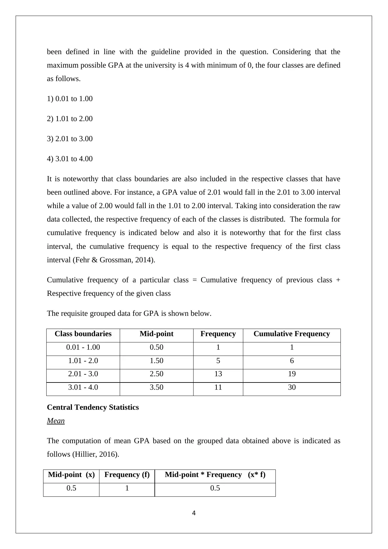
The requisite grouped data for GPA is shown below.
Class boundaries Mid-point Frequency Cumulative Frequency
0.01 - 1.00 0.50 1 1
1.01 - 2.0 1.50 5 6
2.01 - 3.0 2.50 13 19
3.01 - 4.0 3.50 11 30
Central Tendency Statistics
Mean
The computation of mean GPA based on the grouped data obtained above is indicated as
follows (Hillier, 2016).
Mid-point (x) Frequency (f) Mid-point * Frequency (x* f)
0.5 1 0.5
4
maximum possible GPA at the university is 4 with minimum of 0, the four classes are defined
as follows.
1) 0.01 to 1.00
2) 1.01 to 2.00
3) 2.01 to 3.00
4) 3.01 to 4.00
It is noteworthy that class boundaries are also included in the respective classes that have
been outlined above. For instance, a GPA value of 2.01 would fall in the 2.01 to 3.00 interval
while a value of 2.00 would fall in the 1.01 to 2.00 interval. Taking into consideration the raw
data collected, the respective frequency of each of the classes is distributed. The formula for
cumulative frequency is indicated below and also it is noteworthy that for the first class
interval, the cumulative frequency is equal to the respective frequency of the first class
interval (Fehr & Grossman, 2014).
Cumulative frequency of a particular class = Cumulative frequency of previous class +
Respective frequency of the given class
The requisite grouped data for GPA is shown below.
Class boundaries Mid-point Frequency Cumulative Frequency
0.01 - 1.00 0.50 1 1
1.01 - 2.0 1.50 5 6
2.01 - 3.0 2.50 13 19
3.01 - 4.0 3.50 11 30
Central Tendency Statistics
Mean
The computation of mean GPA based on the grouped data obtained above is indicated as
follows (Hillier, 2016).
Mid-point (x) Frequency (f) Mid-point * Frequency (x* f)
0.5 1 0.5
4
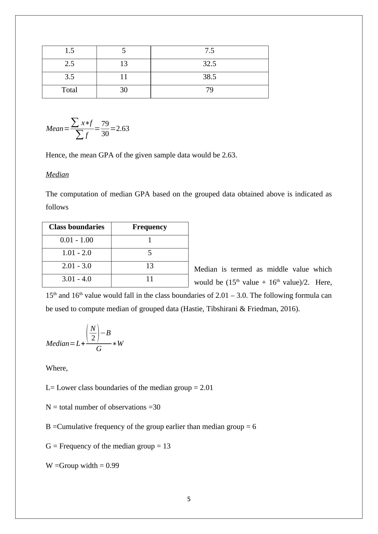
1.5 5 7.5
2.5 13 32.5
3.5 11 38.5
Total 30 79
Mean=∑ x∗f
∑ f = 79
30 =2.63
Hence, the mean GPA of the given sample data would be 2.63.
Median
The computation of median GPA based on the grouped data obtained above is indicated as
follows
Median is termed as middle value which
would be (15th value + 16th value)/2. Here,
15th and 16th value would fall in the class boundaries of 2.01 – 3.0. The following formula can
be used to compute median of grouped data (Hastie, Tibshirani & Friedman, 2016).
Median=L+ ( N
2 )−B
G ∗W
Where,
L= Lower class boundaries of the median group = 2.01
N = total number of observations =30
B =Cumulative frequency of the group earlier than median group = 6
G = Frequency of the median group = 13
W =Group width = 0.99
5
Class boundaries Frequency
0.01 - 1.00 1
1.01 - 2.0 5
2.01 - 3.0 13
3.01 - 4.0 11
⊘ This is a preview!⊘
Do you want full access?
Subscribe today to unlock all pages.
Trusted by 1+ million students worldwide
Now,
Median=L+ ( N
2 ) −B
G ∗W =2.01+ { ( 30
2 )−6
13 }∗0.99=2.70
Hence, the median GPA of the given sample data is 2.70.
Mode
The computation of modal GPA based on the grouped data obtained above is indicated as
follows.
Maximum frequency falls in the range of 2.01 -3 and hence, it would be termed as modal
group. The relevant formula for mode computation in grouped data is indicated below (Hair,
Wolfinbarger, Money, Samouel & Page, 2015).
Mode=L+ f m−f m−1
( f m−f m−1 ) +¿ ¿ ¿
Where,
L= Lower class boundaries of the median group = 2.01
f m−1=Frequency of the group earlier the modal group=5
f m=Frequency of the modal group=13
f m+1=Frequency of the group after the modal group=11
W =Group width = 0.99
Mode=2.01+ 13−5
( 13−5 ) +(13−11)∗0.99=2.80
6
Class boundaries Frequency
0.01 - 1.00 1
1.01 - 2.0 5
2.01 - 3.0 13
3.01 - 4.0 11
Paraphrase This Document
Need a fresh take? Get an instant paraphrase of this document with our AI Paraphraser
Hence, the mode of the sample GPA would be 2.80.
Suitable Chart
The suitable chart summarising the information indicated in each of the given variables is as
exhibited below.
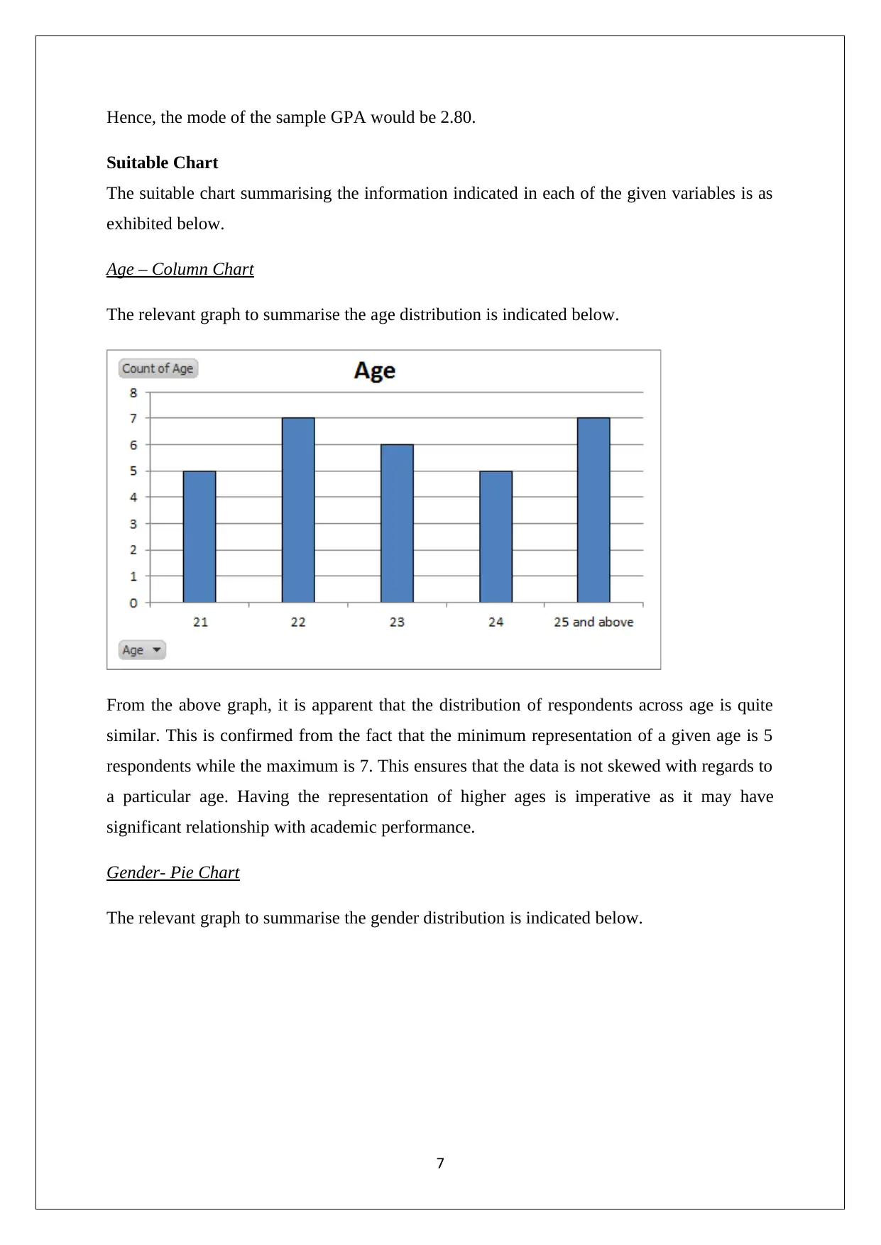
Age – Column Chart
The relevant graph to summarise the age distribution is indicated below.
From the above graph, it is apparent that the distribution of respondents across age is quite
similar. This is confirmed from the fact that the minimum representation of a given age is 5
respondents while the maximum is 7. This ensures that the data is not skewed with regards to
a particular age. Having the representation of higher ages is imperative as it may have
significant relationship with academic performance.
Gender- Pie Chart
The relevant graph to summarise the gender distribution is indicated below.
7
Suitable Chart
The suitable chart summarising the information indicated in each of the given variables is as
exhibited below.
Age – Column Chart
The relevant graph to summarise the age distribution is indicated below.
From the above graph, it is apparent that the distribution of respondents across age is quite
similar. This is confirmed from the fact that the minimum representation of a given age is 5
respondents while the maximum is 7. This ensures that the data is not skewed with regards to
a particular age. Having the representation of higher ages is imperative as it may have
significant relationship with academic performance.
Gender- Pie Chart
The relevant graph to summarise the gender distribution is indicated below.
7
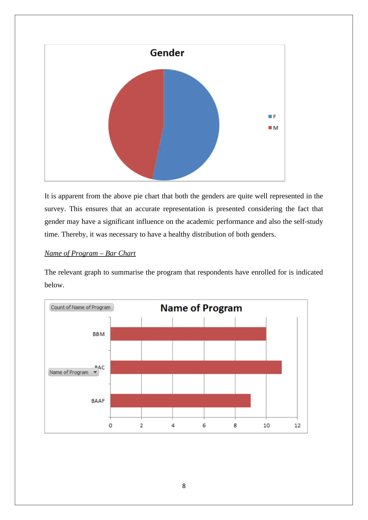
It is apparent from the above pie chart that both the genders are quite well represented in the
survey. This ensures that an accurate representation is presented considering the fact that
gender may have a significant influence on the academic performance and also the self-study
time. Thereby, it was necessary to have a healthy distribution of both genders.
Name of Program – Bar Chart
The relevant graph to summarise the program that respondents have enrolled for is indicated
below.
8
⊘ This is a preview!⊘
Do you want full access?
Subscribe today to unlock all pages.
Trusted by 1+ million students worldwide
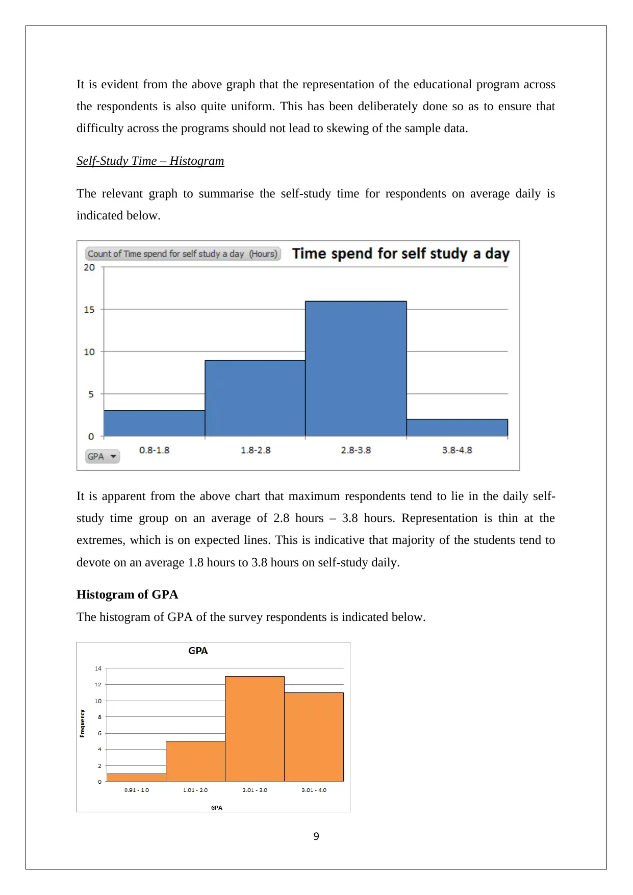
It is evident from the above graph that the representation of the educational program across
the respondents is also quite uniform. This has been deliberately done so as to ensure that
difficulty across the programs should not lead to skewing of the sample data.
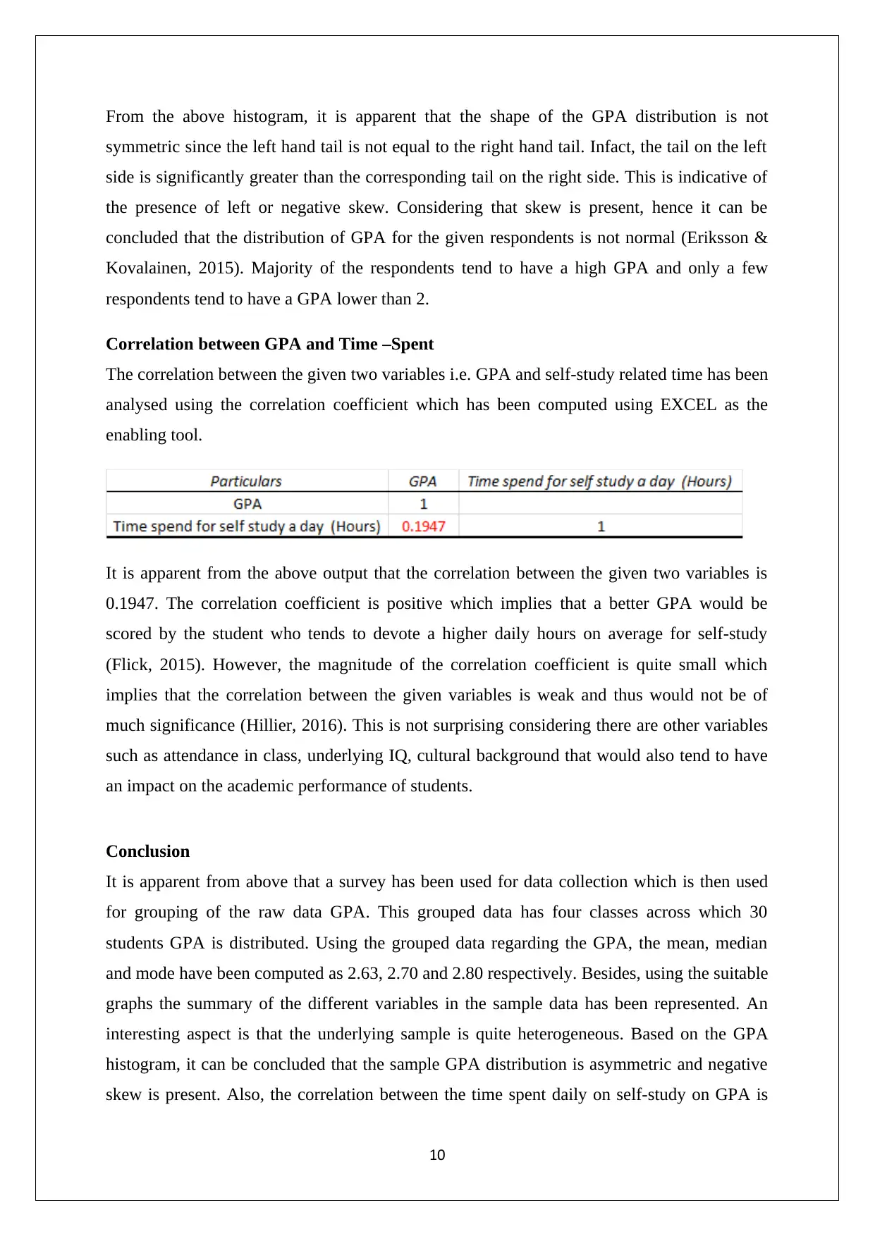
Self-Study Time – Histogram
The relevant graph to summarise the self-study time for respondents on average daily is
indicated below.
It is apparent from the above chart that maximum respondents tend to lie in the daily self-
study time group on an average of 2.8 hours – 3.8 hours. Representation is thin at the
extremes, which is on expected lines. This is indicative that majority of the students tend to
devote on an average 1.8 hours to 3.8 hours on self-study daily.
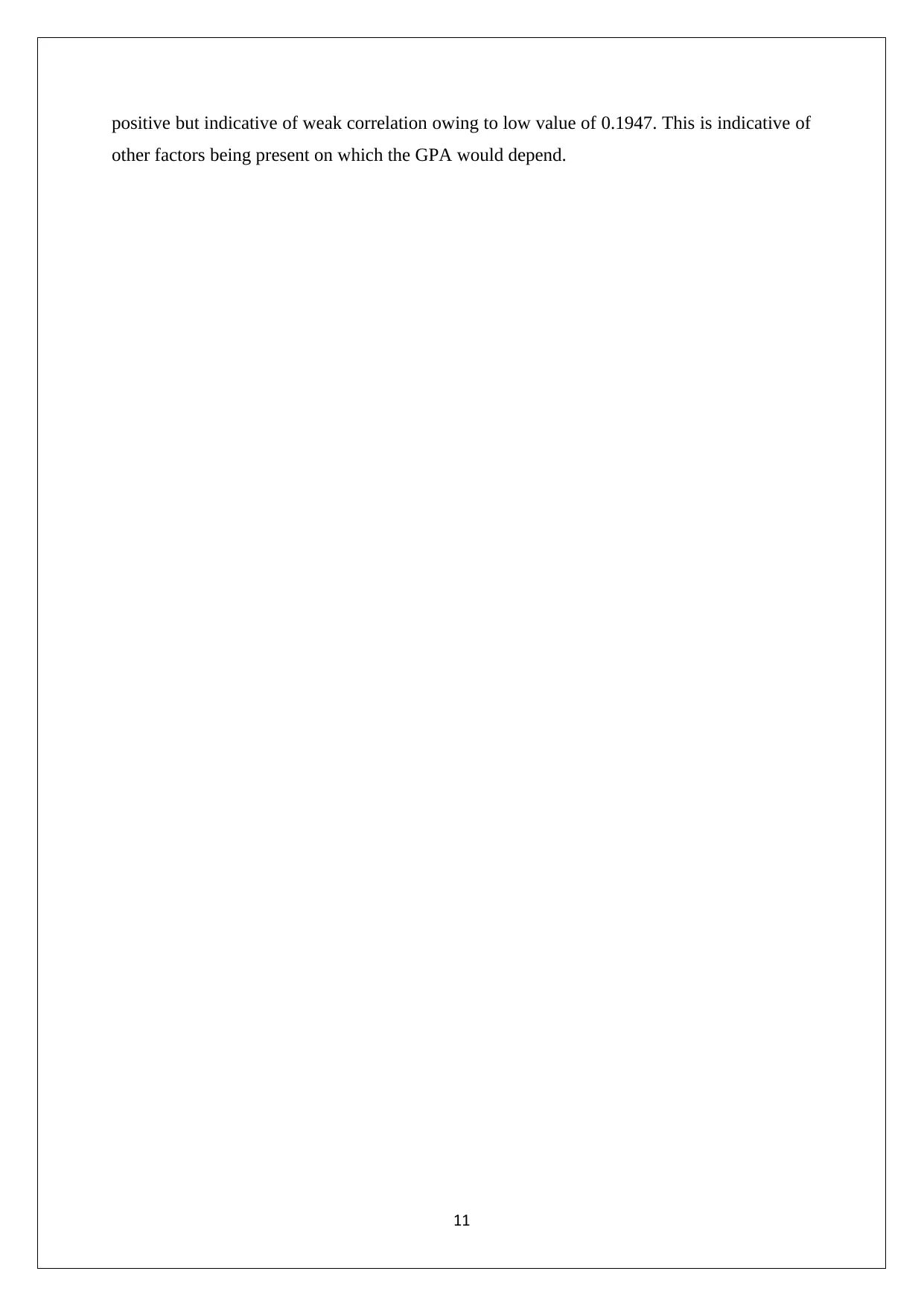
Histogram of GPA
The histogram of GPA of the survey respondents is indicated below.
9
the respondents is also quite uniform. This has been deliberately done so as to ensure that
difficulty across the programs should not lead to skewing of the sample data.
Self-Study Time – Histogram
The relevant graph to summarise the self-study time for respondents on average daily is
indicated below.
It is apparent from the above chart that maximum respondents tend to lie in the daily self-
study time group on an average of 2.8 hours – 3.8 hours. Representation is thin at the
extremes, which is on expected lines. This is indicative that majority of the students tend to
devote on an average 1.8 hours to 3.8 hours on self-study daily.
Histogram of GPA
The histogram of GPA of the survey respondents is indicated below.
9
Paraphrase This Document
Need a fresh take? Get an instant paraphrase of this document with our AI Paraphraser
From the above histogram, it is apparent that the shape of the GPA distribution is not
symmetric since the left hand tail is not equal to the right hand tail. Infact, the tail on the left
side is significantly greater than the corresponding tail on the right side. This is indicative of
the presence of left or negative skew. Considering that skew is present, hence it can be
concluded that the distribution of GPA for the given respondents is not normal (Eriksson &
Kovalainen, 2015). Majority of the respondents tend to have a high GPA and only a few
respondents tend to have a GPA lower than 2.
Correlation between GPA and Time –Spent
The correlation between the given two variables i.e. GPA and self-study related time has been
analysed using the correlation coefficient which has been computed using EXCEL as the
enabling tool.
It is apparent from the above output that the correlation between the given two variables is
0.1947. The correlation coefficient is positive which implies that a better GPA would be
scored by the student who tends to devote a higher daily hours on average for self-study
(Flick, 2015). However, the magnitude of the correlation coefficient is quite small which
implies that the correlation between the given variables is weak and thus would not be of
much significance (Hillier, 2016). This is not surprising considering there are other variables
such as attendance in class, underlying IQ, cultural background that would also tend to have
an impact on the academic performance of students.
Conclusion
It is apparent from above that a survey has been used for data collection which is then used
for grouping of the raw data GPA. This grouped data has four classes across which 30
students GPA is distributed. Using the grouped data regarding the GPA, the mean, median
and mode have been computed as 2.63, 2.70 and 2.80 respectively. Besides, using the suitable
graphs the summary of the different variables in the sample data has been represented. An
interesting aspect is that the underlying sample is quite heterogeneous. Based on the GPA
histogram, it can be concluded that the sample GPA distribution is asymmetric and negative
skew is present. Also, the correlation between the time spent daily on self-study on GPA is
10
positive but indicative of weak correlation owing to low value of 0.1947. This is indicative of
other factors being present on which the GPA would depend.
11
other factors being present on which the GPA would depend.
11
⊘ This is a preview!⊘
Do you want full access?
Subscribe today to unlock all pages.
Trusted by 1+ million students worldwide
1 out of 13
Related Documents


Your All-in-One AI-Powered Toolkit for Academic Success.
+13062052269
info@desklib.com
Available 24*7 on WhatsApp / Email
![[object Object]](/_next/static/media/star-bottom.7253800d.svg)
Unlock your academic potential
Copyright © 2020–2026 A2Z Services. All Rights Reserved. Developed and managed by ZUCOL.