SBLC4002 - Quantitative Techniques in Business: Data Presentation
VerifiedAdded on 2023/06/15
|19
|3540
|334
Report
AI Summary
This report explores various quantitative techniques used in business for data presentation. It discusses three primary methods: textual, tabulation, and diagrammatic presentation, highlighting their respective advantages and disadvantages. Textual presentation involves using paragraphs of text to describe data, suitable for official reports but cumbersome for large datasets. Tabulation offers a compact form of data presentation using tables with rows and columns, enabling easy comparison and statistical analysis. Diagrammatic presentation utilizes charts, maps, and pictures to visually represent data, emphasizing relative positions and capturing data features effectively. The report provides a comparative analysis of these techniques, emphasizing that the choice of method depends on the nature and size of the data. Desklib provides access to similar solved assignments and resources for students.

Running Head: QUANTITATIVE TECHNIQUES IN BUSINESS
Quantitative Techniques in Business
Name of the Student
Name of the University
Author note
Quantitative Techniques in Business
Name of the Student
Name of the University
Author note
Paraphrase This Document
Need a fresh take? Get an instant paraphrase of this document with our AI Paraphraser
1QUANTITATIVE TECHNIQUES IN BUSINESS
Table of Contents
Introduction................................................................................................................................2
Evidence from literature.............................................................................................................2
Different methods of data presentation......................................................................................3
Textual Presentation of data...................................................................................................3
Tabulation..............................................................................................................................3
Diagrammatic presentation....................................................................................................4
Comparative analysis among different data presentation techniques........................................7
Practical application of different form of data presentation.....................................................15
Conclusion................................................................................................................................16
Reference list............................................................................................................................17
2QUANTITATIVE TECHNIQUES IN BUSINESS
Introduction
In today’s world collection of data and its application has become a major part of any
organization. Depending on methods of collection data are classified in two groups- primary
data (collected from direct source) and secondary data (collected from indirect source).
Reliable data source is one primary aspect of data collection. An equally important thing is
presentation of data. The paper considers different data presentation techniques and their
application in real world. The three types of data presentation methods discussed are textual,
tabulation and graphical. All the three forms have their respective merits and demerits.
Despite some demerits, appropriate data presentation technique is chosen after scrutinizing
the statistical data.
Evidence from literature
Data and information play an important role in all part of academic studies,
commercial, business and marketing activities. After collection and classification of data, the
next important step is to present the collected data in an appropriate form. The raw data
collected should be processed and presented in suitable format to make further use of the
data. After collection of data, it should be classified in different groups to make data
presentation easy. The four major types of classification include classification on qualitative
basis, on quantitative basis, on time basis and on geographical basis (Weissgerber et al.
2015). Qualitative classification refers to classification of total population according to
attributes like religion, sex and occupation. Classification of population based on age,
industry classification according to number of person employed are examples of quantitative
classification. When data are arranged according to time then it is known as time series data.
Classification can also be done using geographic characteristics. Quantitative data can further
be classified into frequency and non-frequency group. These different forms of data need
⊘ This is a preview!⊘
Do you want full access?
Subscribe today to unlock all pages.
Trusted by 1+ million students worldwide
3QUANTITATIVE TECHNIQUES IN BUSINESS
proper means of presentation (Chambers 2018). It can be presented in textual format or using
tables or using graphs. Which particular form is to be used that depend on nature and size of
data. For a very small data, a textual format can be the most appropriate form of data while
for large data tabulation or graphs are the most suitable means of data presentation (Anderson
et al. 2016). The next two sections discuss standard methods of data presentation with
practical application of these techniques.
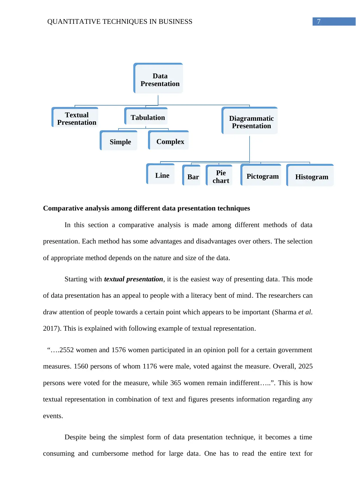
Different methods of data presentation
Presentation of data is broadly classified into three major categories
Textual Presentation
Tabulation
Diagrammatic presentation
Textual Presentation of data
It is a very common method of presenting statistical data. The textual presentation
refers to presenting data using paragraphs of text. This technique is employed in preparing
official report where plans, activities or programs are described in words. In such reports
relevant numerical figures are inserted in between the texts (Ross 2017). This is the simplest
technique of data presentation. There is no hard and fast rule for presenting data in textual
format. One thing that should be taken care of is the logical sequence of the data and clarity
of the presentation. The data should be presented using precise and brief text.
Tabulation
Tabulation is a compact form of data presentation. This involves a systematic
presentation of data in the form of a table structure comprising relevant rows and columns.
There are two common form of tabulation
proper means of presentation (Chambers 2018). It can be presented in textual format or using
tables or using graphs. Which particular form is to be used that depend on nature and size of
data. For a very small data, a textual format can be the most appropriate form of data while
for large data tabulation or graphs are the most suitable means of data presentation (Anderson
et al. 2016). The next two sections discuss standard methods of data presentation with
practical application of these techniques.
Different methods of data presentation
Presentation of data is broadly classified into three major categories
Textual Presentation
Tabulation
Diagrammatic presentation
Textual Presentation of data
It is a very common method of presenting statistical data. The textual presentation
refers to presenting data using paragraphs of text. This technique is employed in preparing
official report where plans, activities or programs are described in words. In such reports
relevant numerical figures are inserted in between the texts (Ross 2017). This is the simplest
technique of data presentation. There is no hard and fast rule for presenting data in textual
format. One thing that should be taken care of is the logical sequence of the data and clarity
of the presentation. The data should be presented using precise and brief text.
Tabulation
Tabulation is a compact form of data presentation. This involves a systematic
presentation of data in the form of a table structure comprising relevant rows and columns.
There are two common form of tabulation
Paraphrase This Document
Need a fresh take? Get an instant paraphrase of this document with our AI Paraphraser
4QUANTITATIVE TECHNIQUES IN BUSINESS
i)Simple Tabulation: In a simple table only one characteristic of data can be presented. In the
simple tabulation other characteristics of data are left out.
ii)Complex Tabulation: With complex table one can present different dimension of data in a
composite form.
There may be single, double, treble or manifold tabulation. The single tabulation
answers one or more independent questions (Najafabadi et al. 2015). Whereas in double,
treble or manifold tabulation contains two, three or more subdivisions according to
characteristics of presented data and can address independent as well as mutually dependent
questions.
Diagrammatic presentation
Different forms of charts, maps, pictures, are effective and attractive means of
statistical data presentation. The use of diagrams in presenting data has the advantage of
readily capturing some feature of the exhibited data. The primary objective of using diagrams
is to emphasize relative position of different subdivision (Copland and Creese 2015). There
are different types of diagrams that can be used for present data depending on the nature of
statistical data. The commonly used diagrams are the followings
Line diagram or graph
Bar Diagram
Pie diagram
Pictogram
Histogram
5QUANTITATIVE TECHNIQUES IN BUSINESS
Line diagram
The easiest and common form of diagram is line diagram. Line diagram is particularly
applied in field of commerce and business where data are presented with respect to time. The
line diagram depicts relationship between two variables. A straight line implies linear
relationship while quadratic or polynomial relationship is shown by means of a curve. For
construction of line diagram, two co-ordinates are taken (Bendig,et al. 2017). The horizontal
axis measures time while the vertical axis represents the corresponding variables. After
selecting the co-ordinates suitable measures of scale are chosen to plot the data points. The
data of the chosen variable is then plotted against time to obtain co-ordinates of points. The
points thus obtain are then joined and the smooth curve obtained is called line diagram.
Bar Diagram
In this form of diagrammatic presentation there are number of equidistant rectangles
termed as bars, each corresponds to some specific category of available data. The bars have a
common width and are drawn on the base line. The base line represents various categories.
The height or length of bars shows value corresponding to each category. Bar diagrams are of
two types- vertical bar diagram and horizontal bar diagram. The vertical bar diagram is
applicable to time series data or for the data classified according to values of the variable.
Horizontal bars are used to present data that contains attributes. For each of these bar diagram
there are again grouped bar diagram, paired bar diagram and subdivided bar diagram. In order
to show comparison from two or more statistical group of data grouped bar diagram is used
(Matthews, Harel and Aseltine Jr 2017). The subdivided or component bar diagram shows
comparison among different components of the bars and show relation between different part
and as a whole. In the paired bar diagram there are several pairs of horizontal bars extending
in opposite direction.
⊘ This is a preview!⊘
Do you want full access?
Subscribe today to unlock all pages.
Trusted by 1+ million students worldwide
6QUANTITATIVE TECHNIQUES IN BUSINESS
Pie diagram
Pie diagram is an appropriate form of diagrammatic representation for presenting data
exhibiting relative sizes of different parts as a whole. In pie diagram, a circle is partitioned to
present different parts of the data. The relative values of each part is first converted to
percentage form of the whole and then converted to respective angles. Each sector of the pie
diagram represents concerned percentage of the part as a whole (Nadeem, Zafar and Zahid
2015). The area enclosed by the circle is regarded as 100. As circle represents angles
measures 3600, each part is multiplied by 3.6 to find out corresponding angles. Pie diagram is
very useful when data are subdivided in a number of categories and the researcher is
interested in comparing various categories or between different parts or as a whole.
Pictogram
Pictogram comprises rows of picture symbols, all having equal size. Each symbol is
representative of a definite numerical value. In case there is a fraction of value, then
appropriate proportion of the symbol is shown. Pictogram is used to present time series data
(Peck, Olsen and Devore 2015). For each time period, there is a row of pictures. Pictograms
are also very useful in presenting statistical data containing attributes.
Histogram
Histograms are used to present data containing grouped frequency distribution. It
comprises of several adjoining rectangles drawn on the base line having areas proportional to
respective class frequencies (Jin,et al., 2016).
Paraphrase This Document
Need a fresh take? Get an instant paraphrase of this document with our AI Paraphraser
7QUANTITATIVE TECHNIQUES IN BUSINESS
Comparative analysis among different data presentation techniques
In this section a comparative analysis is made among different methods of data
presentation. Each method has some advantages and disadvantages over others. The selection
of appropriate method depends on the nature and size of the data.
Starting with textual presentation, it is the easiest way of presenting data. This mode
of data presentation has an appeal to people with a literacy bent of mind. The researchers can
draw attention of people towards a certain point which appears to be important (Sharma et al.
2017). This is explained with following example of textual representation.
“….2552 women and 1576 women participated in an opinion poll for a certain government
measures. 1560 persons of whom 1176 were male, voted against the measure. Overall, 2025
persons were voted for the measure, while 365 women remain indifferent…..”. This is how
textual representation in combination of text and figures presents information regarding any
events.
Despite being the simplest form of data presentation technique, it becomes a time
consuming and cumbersome method for large data. One has to read the entire text for
Data
Presentation
Textual
Presentation Tabulation
Simple Complex
Diagrammatic
Presentation
Line Bar Pie
chart Pictogram Histogram
8QUANTITATIVE TECHNIQUES IN BUSINESS
understanding the data. This method is not suitable for presenting a large mass of data. It is
difficult to draw comparison among data point from textual presentation. Visually the textual
presentation seems boring and monotonous. One primary purpose of data collection is to
analyze the data. However, with textual presentation the data are not ready for statistical
analysis.
A comparatively better form of data presentation technique is tabulation. A good
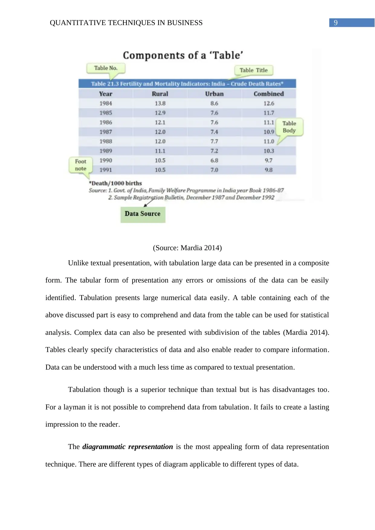
table should comprise of following parts
Title: The title contains brief description of the table and is shown at the top of the table.
Stub: The extreme left part of the table is called Stub. This part contains description of rows.
Caption or box head: This is the upper part of the table showing description of columns and
sub columns. The whole upper part including caption, measurement units and column number
is known as box head.
Body: This contains the data points or figures.
Footnote: This is below the body containing source of data or any important information
regarding the data.
understanding the data. This method is not suitable for presenting a large mass of data. It is
difficult to draw comparison among data point from textual presentation. Visually the textual
presentation seems boring and monotonous. One primary purpose of data collection is to
analyze the data. However, with textual presentation the data are not ready for statistical
analysis.
A comparatively better form of data presentation technique is tabulation. A good
table should comprise of following parts
Title: The title contains brief description of the table and is shown at the top of the table.
Stub: The extreme left part of the table is called Stub. This part contains description of rows.
Caption or box head: This is the upper part of the table showing description of columns and
sub columns. The whole upper part including caption, measurement units and column number
is known as box head.
Body: This contains the data points or figures.
Footnote: This is below the body containing source of data or any important information
regarding the data.
⊘ This is a preview!⊘
Do you want full access?
Subscribe today to unlock all pages.
Trusted by 1+ million students worldwide
9QUANTITATIVE TECHNIQUES IN BUSINESS
(Source: Mardia 2014)
Unlike textual presentation, with tabulation large data can be presented in a composite
form. The tabular form of presentation any errors or omissions of the data can be easily
identified. Tabulation presents large numerical data easily. A table containing each of the
above discussed part is easy to comprehend and data from the table can be used for statistical
analysis. Complex data can also be presented with subdivision of the tables (Mardia 2014).
Tables clearly specify characteristics of data and also enable reader to compare information.
Data can be understood with a much less time as compared to textual presentation.
Tabulation though is a superior technique than textual but is has disadvantages too.
For a layman it is not possible to comprehend data from tabulation. It fails to create a lasting
impression to the reader.
The diagrammatic representation is the most appealing form of data representation
technique. There are different types of diagram applicable to different types of data.
Paraphrase This Document
Need a fresh take? Get an instant paraphrase of this document with our AI Paraphraser
10QUANTITATIVE TECHNIQUES IN BUSINESS
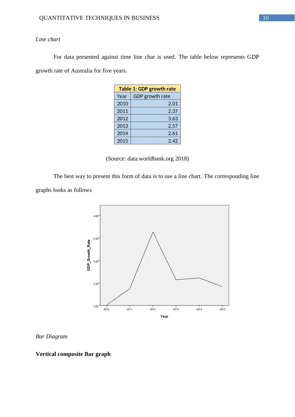
Line chart
For data presented against time line char is used. The table below represents GDP
growth rate of Australia for five years.
Table 1: GDP growth rate
Year GDP growth rate
2010 2.01
2011 2.37
2012 3.63
2013 2.57
2014 2.61
2015 2.42
(Source: data.worldbank.org 2018)
The best way to present this form of data is to use a line chart. The corresponding line
graphs looks as follows
Bar Diagram
Vertical composite Bar graph
11QUANTITATIVE TECHNIQUES IN BUSINESS
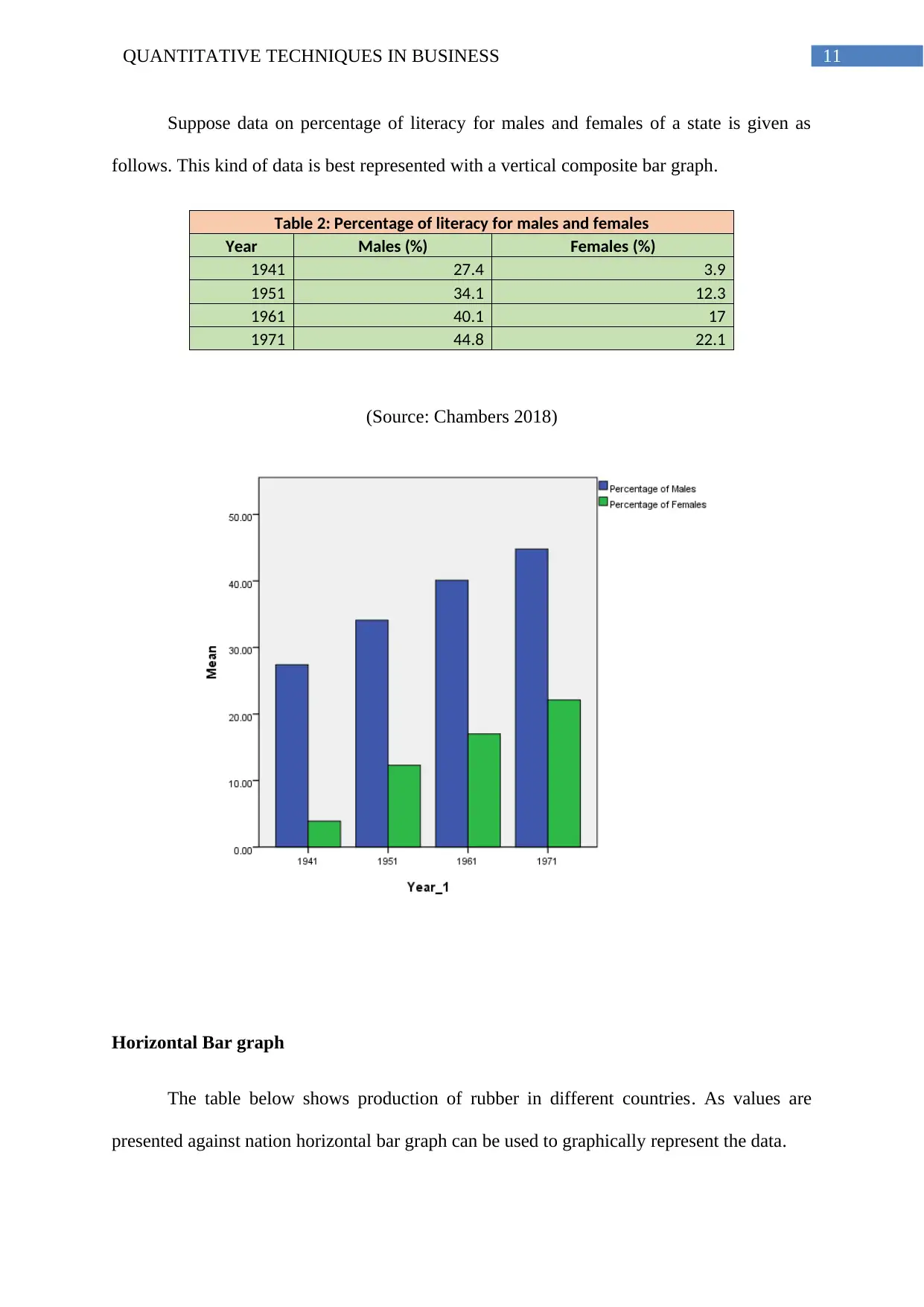
Suppose data on percentage of literacy for males and females of a state is given as
follows. This kind of data is best represented with a vertical composite bar graph.
Table 2: Percentage of literacy for males and females
Year Males (%) Females (%)
1941 27.4 3.9
1951 34.1 12.3
1961 40.1 17
1971 44.8 22.1
(Source: Chambers 2018)
Horizontal Bar graph
The table below shows production of rubber in different countries. As values are
presented against nation horizontal bar graph can be used to graphically represent the data.
⊘ This is a preview!⊘
Do you want full access?
Subscribe today to unlock all pages.
Trusted by 1+ million students worldwide
1 out of 19
Related Documents


Your All-in-One AI-Powered Toolkit for Academic Success.
+13062052269
info@desklib.com
Available 24*7 on WhatsApp / Email
![[object Object]](/_next/static/media/star-bottom.7253800d.svg)
Unlock your academic potential
Copyright © 2020–2026 A2Z Services. All Rights Reserved. Developed and managed by ZUCOL.