University Web Dev Project: Scientific Calculator App

Verified

Added on  2021/04/17

|21
|2673
|54
Project
AI Summary
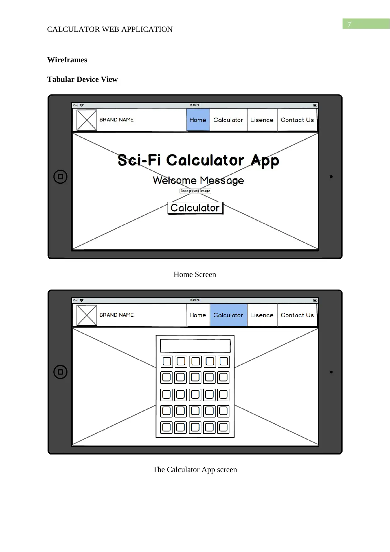
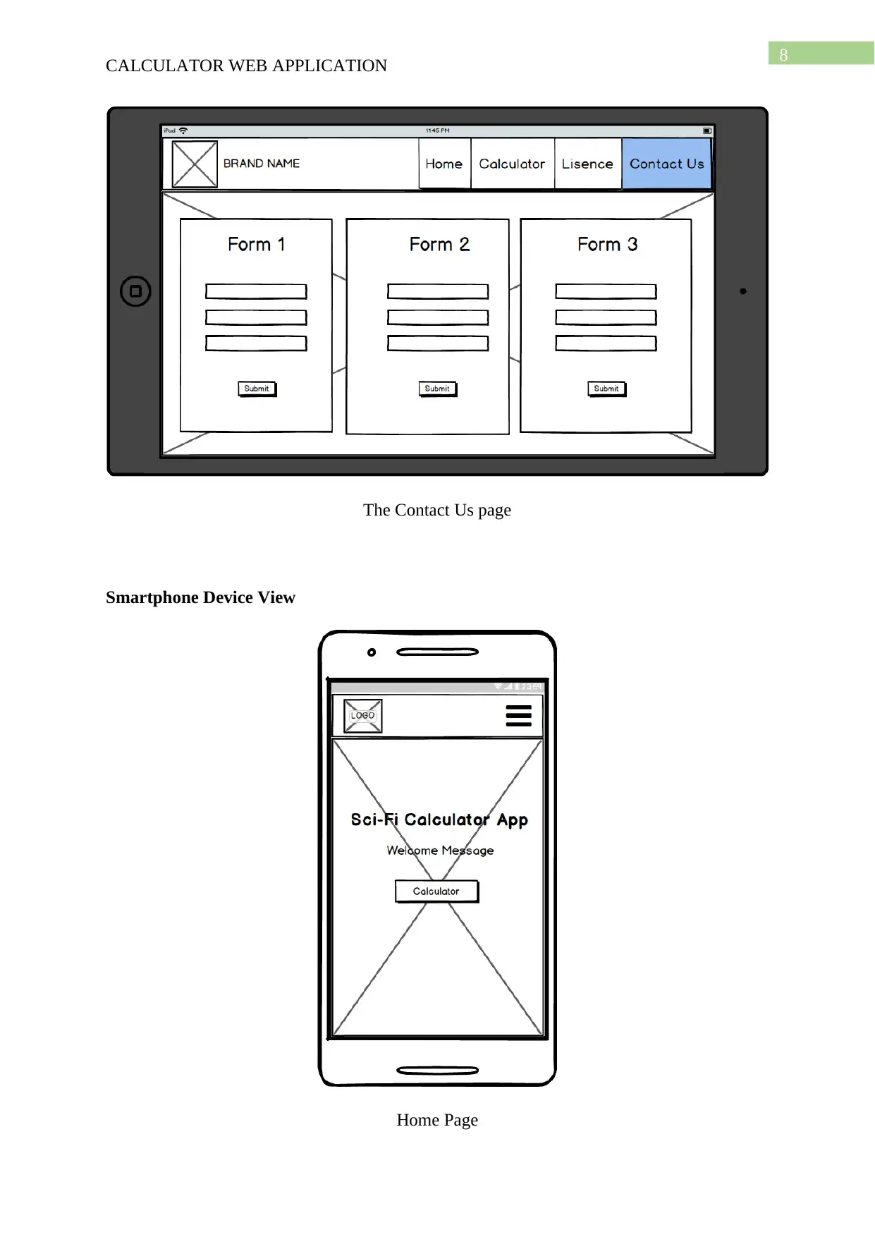
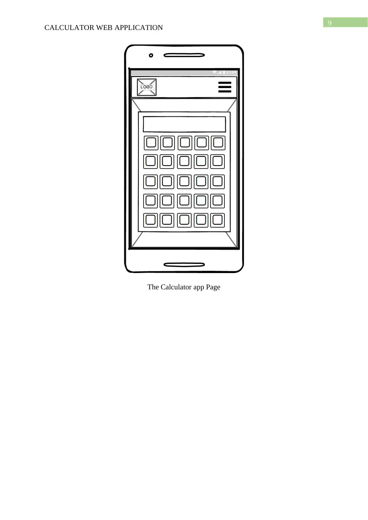
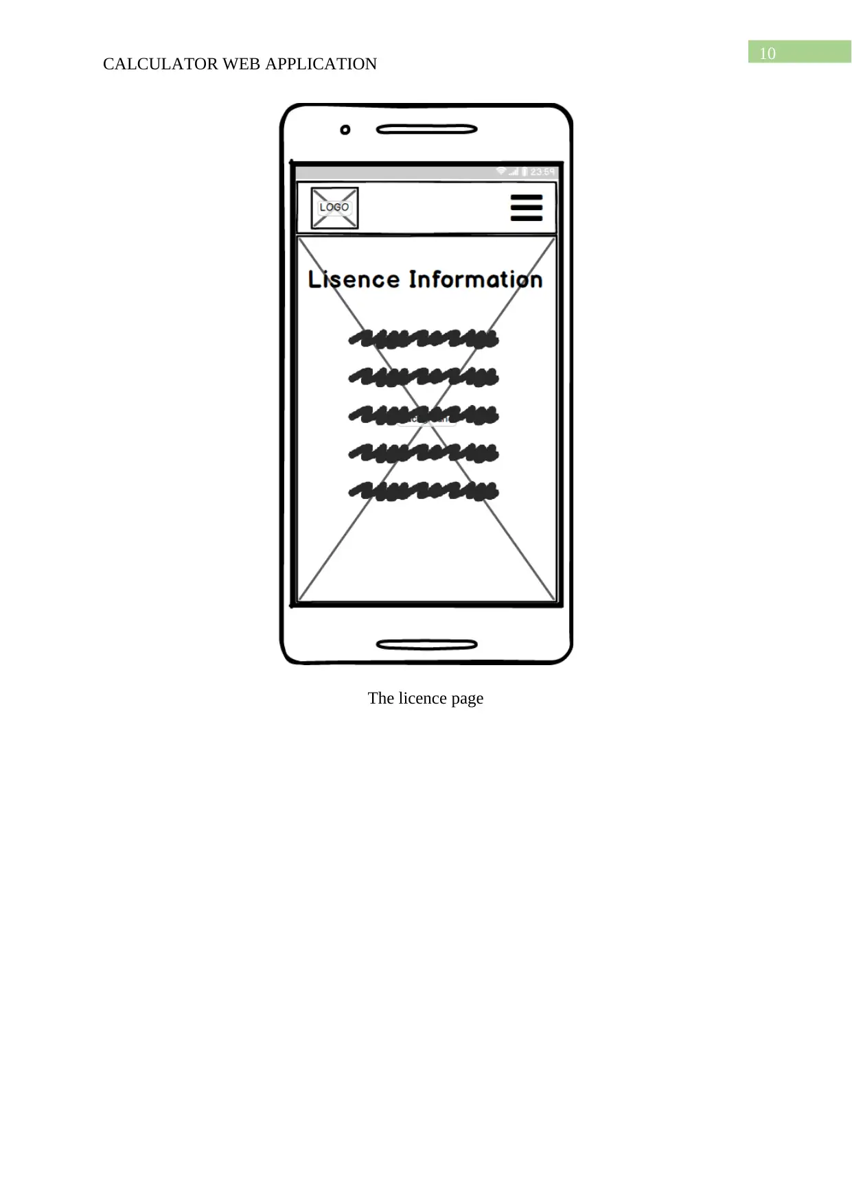
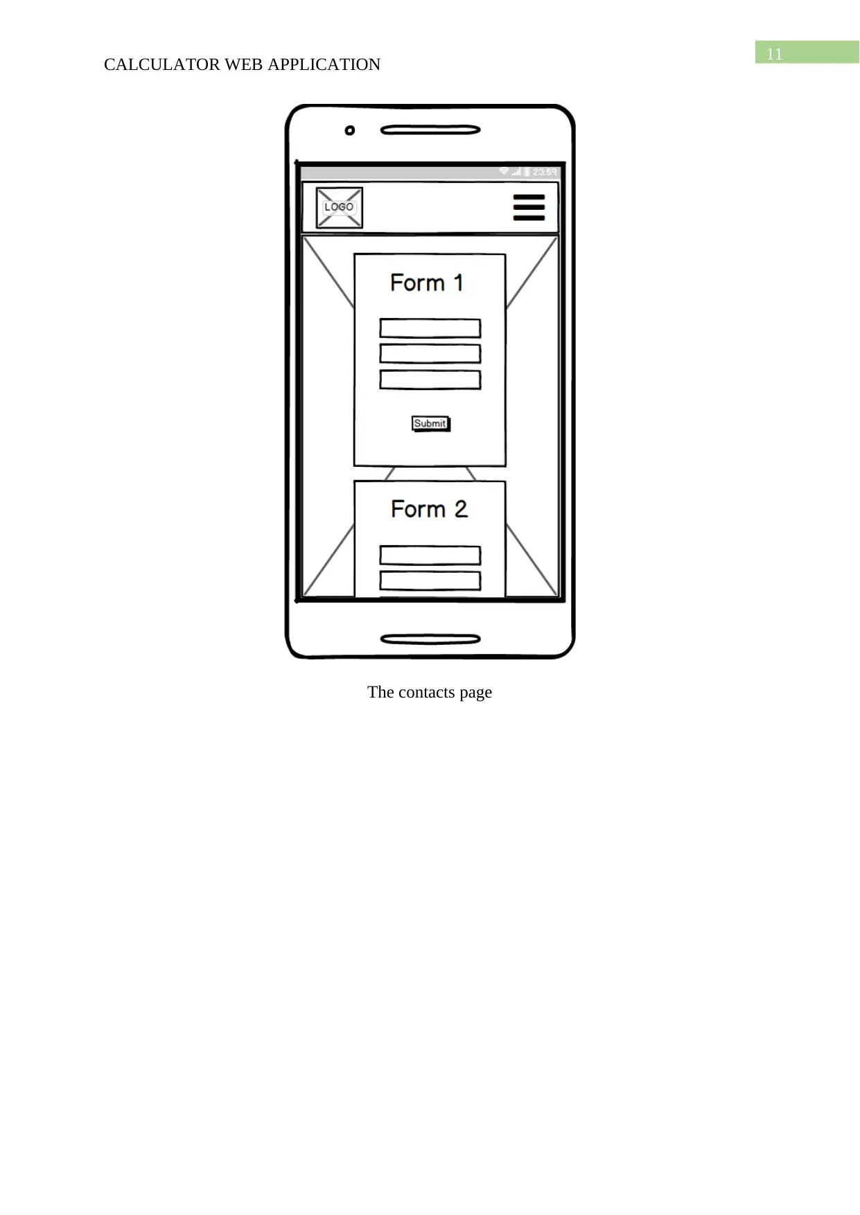
This project details the development of a scientific calculator web application, emphasizing responsive design principles and usability. The application utilizes native HTML5 and CSS3 for a fluid user interface, enhanced by the Bootstrap framework for responsiveness across various devices. JavaScript is employed for handling the calculator's logical operations, leveraging its library functions for efficient computation. The project includes wireframes illustrating the application's layout in both tabular and mobile views, highlighting key usability features like a navigation bar and responsive grid system. The commentary section reflects on the development process, including challenges faced, such as linking JavaScript files and graphic design limitations, while also acknowledging the application's core functionalities and responsiveness. The project's testing phase and screenshots are included to showcase the user interface. The student has created a scientific calculator with a responsive design, using HTML, CSS, JavaScript and Bootstrap to deliver a functional web application, and the project includes an analysis of the development stages, usability features, and testing results.
Document Page
Running head: CALCULATOR WEB APPLICATION
Calculator Web App
Name of the Student:
Name of the University:
Author note:
tabler-icon-diamond-filled.svg

Paraphrase This Document

Need a fresh take? Get an instant paraphrase of this document with our AI Paraphraser
Document Page
1
CALCULATOR WEB APPLICATION
Table of Contents
The native HTML5 and CSS3 web framework………………………………………….……2
The Bootstrap Framework………………………………………………………………….…3
Features…………………………………………………………………………..……3
The Grid System………………………………………………………………….……4
Stylesheets………………………………………………………………………..……4
Re-usable components…………………………………………………………………5
The use of Javascript libraries…………………………………………………………………6
Wireframes…………………………………………………………………………….………7
Tabular View……………………………………………………………………..……7
Mobile View………………………………………………………………….…..……8
Usability Features of the Calculator Application……………………………………….……12
Application Commentary………………………………………………………….…………13
Testing…………………………………………………………………………………..……15
Document Page
2
CALCULATOR WEB APPLICATION
The native HTML5 and CSS3 web framework
The web application that is being developed here is a Scientific Calculator. It needs
not any complex web technology to be developed, therefore, certain clusters of native web
technologies have been used in order to deliver a fluid performance. It was necessary to
enhance the User Interface and the look and feel of the application. The use of native HTML
and CSS components and classes helped to keep the development phase simple (Fielding
2014). Furthermore, in order to elaborate on the design aspects of the website of the
application, Bootstrap has been chosen to bring the responsive web design concept. Finally,
the Calculator application’s logical operations have been carried out using the JavaScript
framework and its library methods or functions (Shenoy and Sossou 2014).
Document Page
3
CALCULATOR WEB APPLICATION
The Bootstrap Framework
The application is developed and designed with the motive to serve both the
smartphone/tablet and the computer internet users. It was therefore necessary to choose a
proper web framework that can handle the changing platforms for this application or website
as one may opt to name it. For this purpose, a thorough search was necessary. It revealed
quite a handsome number of options that can assist to build a responsive website. A
responsive website is one that fixes the positions and sizes of its elements according to the
screen sizes that it is being used in. Nene (2015), says the in a responsive website, the
webpages can easily align themselves on a variety of devices with varying screen resolutions.
This enhances the usability features of any application or website (Bryant and Jones 2012). A
website designed with responsive web design adapts its layout according to the viewing
environment by the means of fluid, proportion-based grids, CSS3 media-queries and flexible
images. With the increase in mobile traffic on the internet, every web designer’s urgent
requirement is to design for their client, the best possible responsive layout. JQuery Mobile
and Bootstrap are two of the most common frameworks that offers the web developers and
designers the scope to design hassle-free responsive layouts. Below, the Bootstrap framework
will be critically attributed along with explanations about why it was chosen to design the
Scientific Calculator application here.
Bootstrap is an open-source frond-end library that is used for the designing of
websites and web-applications, developed by Twitter (Cochran 2012). It consists of CSS and
HTML based templates for forms, buttons, tables, typography, navigation and many more.
While JQuery Mobile is mostly a script based framework, bootstrap mostly concentrates on
the front-end development only.
Features of Bootstrap
tabler-icon-diamond-filled.svg

Paraphrase This Document

Need a fresh take? Get an instant paraphrase of this document with our AI Paraphraser
Document Page
4
CALCULATOR WEB APPLICATION
Bootstrap 4 has been developed with the motif to support all the commonly used web
browsers like Firefox, Safari, Google Chrome, Internet Explorer and so on. Surprisingly, it is
a framework that is supported by the IE8 versions as well. Bootstrap 3.0 adopted the mobile-
first design philosophy that by default emphasises on responsive web design (Shenoy and
Sossou 2014).
Bootstrap is a modular framework, consisting of series of Less stylesheets. These
implement the various individual components of the toolkit. These stylesheets are commonly
kept compiled within a bundle. These are included in the various webpages, with the
programmer having the opportunity to choose which of the features that he wishes to keep
and which not. Bootstrap provides various features to enhance the look and feel of a web
design through the margin, padding and colour components. Every Bootstrap component
contains of HTML structure, CSS declarations, and also accompanying JavaScript code, in
some cases (Spurlock 2013).
Grid System
The grid system is one of the most attractive features of the Bootstrap framework. The
grid system and the bootstrap responsive design comes with a standard 1170 pixel grid
layout. Alternatively, the developer can also opt to use a variable-width layout. However, in
both the above said cases, the toolkit has four variations to make use of different resolutions
and types of devices: mobile phones, portrait and landscape, tablets and PCs with low and
high resolution. Each variation adjusts the width of the columns according to the device
display resolutions.
Stylesheets
Document Page
5
CALCULATOR WEB APPLICATION
Bootstrap provides a set of stylesheets that provide basic style definitions for all
necessary HTML components. These ranges from headings, buttons, other input elements to
tables, divs and navigation bars. These provide a uniform, modern appearance for formatting
all these images, texts and or form elements.
Re-usable components
Apart from the above said regular HTML tags and elements, Bootstrap consists of
other commonly used interface elements which are necessary to be implemented in order to
design a responsive web design. These components are implemented as CSS classes, which
must be applied to the required HTML elements in the webpages. These CSS classes are pre-
compiled and stored in the open-source project that is available for free on the official
website of Bootstrap (Mammen 2012). This makes it stand out from the rest. One can just
mention this classes within their tag elements inside their HTML codes and can eventually
view the changes in the web design. Hence, this allows the designers to re-use the CSS codes
that are stored online and hence helps to save up on a lot of web designing time.
Document Page
6
CALCULATOR WEB APPLICATION
The use of JavaScript Libraries
In order to perform the operations of the application, Javascript has been used. It
allows the developers to dive deep into its library functions and use all necessary pre-written
and compiled snippets of code. Javascript is a programming language or scripting language as
many favours to call it. Since, the application here did not require any server end operations,
there was not any urgent need to apply the extended JS frameworks like Ajax and so on.
However, the javascript libraries will prove to be a great zeal designing and developing such
logic based applications. Especially for this application, the Math library class of javaScript
can provide most of the necessary methods like the trigonometric methods, the exponential
methods and so on. It must also be noted that Bootstrap itself extends many of the native
Javascript methods in order to provide the responsive features to the designers (Johansen,
Britto and Cusin 2013).
tabler-icon-diamond-filled.svg

Paraphrase This Document

Need a fresh take? Get an instant paraphrase of this document with our AI Paraphraser
Document Page
7
CALCULATOR WEB APPLICATION
Wireframes
Tabular Device View
Home Screen
The Calculator App screen
Document Page
8
CALCULATOR WEB APPLICATION
The Contact Us page
Smartphone Device View
Home Page
Document Page
9
CALCULATOR WEB APPLICATION
The Calculator app Page
tabler-icon-diamond-filled.svg

Paraphrase This Document

Need a fresh take? Get an instant paraphrase of this document with our AI Paraphraser
Document Page
10
CALCULATOR WEB APPLICATION
The licence page
Document Page
11
CALCULATOR WEB APPLICATION
The contacts page
chevron_up_icon
1 out of 21
circle_padding
hide_on_mobile
zoom_out_icon
[object Object]