COIT20268: In-Depth Responsive Web Design Analysis of awm.gov.au
VerifiedAdded on 2023/03/23
|20
|3243
|79
Report
AI Summary
This report presents a comprehensive analysis of the Australian War Memorial website (awm.gov.au) from a responsive web design (RWD) perspective. The analysis covers various aspects of the website, including its mobile compatibility, information architecture, content formatting, loading times, and browser consistency. The report identifies both positive and negative aspects of the website's design, such as the use of web fonts and light design versus unstructured menus and the use of bitmaps. The website's responsiveness is tested across different screen sizes using Google Chrome's device simulator, and feedback from multiple participants is incorporated to provide a well-rounded evaluation. The report concludes with recommendations for improving the website's responsiveness and overall user experience.
Running head: RESPONSIVE WEB DESIGN ANALYSIS
Responsive Web Design Analysis
Name of the Student
Name of the University
Author’s Name:
Responsive Web Design Analysis
Name of the Student
Name of the University
Author’s Name:
Paraphrase This Document
Need a fresh take? Get an instant paraphrase of this document with our AI Paraphraser
1RESPONSIVE WEB DESIGN ANALYSIS
Table of Contents
Introduction:....................................................................................................................................2
Identification of Nominated Website:.............................................................................................2
Main Features of the Website:.........................................................................................................3
Positive and Negative Aspect of the Website:.................................................................................5
Positive Aspect of Website:.........................................................................................................5
Negative Aspect of Website:.......................................................................................................6
Website Review:..............................................................................................................................7
Comment of Tool:..........................................................................................................................15
Recommendation:..........................................................................................................................16
Conclusion:....................................................................................................................................17
Bibliography:.................................................................................................................................18
2RESPONSIVE WEB DESIGN ANALYSIS
Introduction:
The responsive web development is the approach for designing a website which can
make the pages of the website rendered on various devices like desktop browser, mobile web
browser and tablet web browser. In simple words, the responsiveness of the website illustrates
that a website can be accessed from various devices with different screen sizes. There are various
principles based on which a responsive website must be built.
The report is crated based on the website named Australian War Memorial. The analysis
is done on the basis of validating the responsiveness of the website. The website will be checked
in three mobile device screens such as notebook desktop (screen size 1280x768 pixels), a mobile
device with screen size between 480x640 and 700x960 and another mobile device with screen
size between 200x320 and 400x640.
Identification of Nominated Website:
The website selected for evaluation is Australian War Memorial. The URL of the website
is www.awm.gov.au. First of all, the Australian War Memorial is consisted of shrine, an
extensive archive, and a world-class museum. The memorial was built for commemorating the
Australians who died in the war or on operational service. It is also for respecting those who
served Australia in times of conflict.
The website provides a good overview of the Australian War Memorial. It shows the
collection of the Australian War Memorial. The website allows the users to search for a person
by entering the name, service number and unit name. It also sells various products online.
Moreover, the website provides the information which can assist the people to visit Australian
War Memorial. From the opening times, location to the different kind of transportation medium
⊘ This is a preview!⊘
Do you want full access?
Subscribe today to unlock all pages.
Trusted by 1+ million students worldwide
3RESPONSIVE WEB DESIGN ANALYSIS
is properly described in the website. It has a side panel as sub-menu which shows the pages
available under the main menu option. The website has links for donations and corporate
partnership. The users can register for e-memorial newsletter using the website.
The website allows the users to login. However, in order to login to the website, the users
have to register first. In order to register, the users have to provide name, email address and
password. The website allows resetting the password. Registered email is essential for password
reset.
The color combination of the website is very good. It has white color background and
black colored tests. The whole website follows the same black and white pattern. In menu, the
background is black and text colors are white. A search page is available in the website that
allows searching different information such as military events, units, library and more. The
website share the private records, photographs and arts that are available physically in Australian
War Memorial. The website also provides the information on exhibition and events that are
scheduled in the Australian War Memorial. The user can ‘Plan a Visit’ at Australian War
Memorial through the website.
Main Features of the Website:
The primary features of the website are as following.
Mobile Compatibility: The mobile phones are most used devices to access a website. The
popularity of mobile browser supported website have grown very fast in last few years. Almost
all the organizations implement a responsive website that can be accessed from a mobile device.
The selected website can be accessed from mobile devices.
Paraphrase This Document
Need a fresh take? Get an instant paraphrase of this document with our AI Paraphraser
4RESPONSIVE WEB DESIGN ANALYSIS
Accessible to All Users: The website can be accessed by all kind of users such as
disabled, elderly and blind. The website can be accessed from the screen readers to be accessed
over the internet. The website design is simple and the fonts are large enough to be read by every
type of person.
Well Planned Information Architecture: A good usability of a website is represented
through the well-structured and presented contents. The website has properly concentrated on the
presentation of the contents and media. It has wide range of information about the Australian
War Memorial. It shows the collection of the Australian War Memorial. The website allows the
users to search for a person by entering the name, service number and unit name. It also sells
various products online. The website share the private records, photographs and arts that are
available physically in Australian War Memorial. The website also provides the information on
exhibition and events that are scheduled in the Australian War Memorial.
Well-Formatted Content That Is Easy to Scan: The allows the average internet users to
skim through the web page content rather than just reading all the available contents in the web
page from the top to the bottom. The users can look for the particular parts that they want to
access irrelevant of the device they are using. Each content in mobile or desktop web browser is
very well published and presented. The website has used heading and subheading for
categorizing the contents. The use of media also allows to understand the purpose of the
information easily.
Fast Load Times: The website loading time is low. The users do not have to be annoyed
for high loading time of the website. It is important as mobile devices use low bandwidth internet
connection than broadband connection at desktop. Low loading time allows the mobile users to
access the website easily.
5RESPONSIVE WEB DESIGN ANALYSIS
Browser Consistency: The website has not overlooked the browser compatibility. Often
big organizations neglect this feature. The website has high usability in the mobile devices and
desktop devices as browser compatibility has been maintained properly. There are surely some
differences on how different browsers will interpret the Australian War Memorial website. The
website has high usability for each browser.
Effective Navigation: The responsiveness of the website is best seen in the navigation.
The navigation is extremely easy in small device screen sizes. There is an option for navigating
within the sub-menus of the main menu.
Positive and Negative Aspect of the Website:
Positive Aspect of Website:
Use of Web fonts Rather Than System Fonts: The mobile users cannot access the
system fonts. That is why the systems fonts are only limited to the PC system. The selected
website does not use the systems fonts, instead it uses web fonts so that mobile users will have
same expire as PC users. This is a very good practice for implementing responsive websites. The
web fonts are universal and is accessible by every device perfectly.
No Item of the Website Is Fixed: As the mobile devices are mostly used for accessing
the website, fixing the header or other sections of the website can be resulting in the screen size
smaller. Therefore, in terms of responsive website design which does not make any item fix at
all.
Light Website Design: Light websites load faster than complex websites. The loading
time has very high priority in responsive website design. The website loading time is low. The
⊘ This is a preview!⊘
Do you want full access?
Subscribe today to unlock all pages.
Trusted by 1+ million students worldwide
6RESPONSIVE WEB DESIGN ANALYSIS
users do not have to be annoyed for high loading time of the website. It is important as mobile
devices use low bandwidth internet connection than broadband connection at desktop. Low
loading time allows the mobile users to access the website easily.
Responsiveness: The website can be accessed from various mobile devices. The mobile
phones are most used devices to access a website. The popularity of mobile browser supported
website have grown very fast in last few years. Almost all the organizations implement a
responsive website that can be accessed from a mobile device. The selected website can be
accessed from mobile devices.
Responsive Navigation: The navigation of the website adjusts based on the device used
for accessing the website. The navigation is simple and effective for both the pc and mobile
users. Each navigation content is available for every kind of device users.
Responsive Navigation: The website may be accessed by the users who has tablets,
gaming pads and console. That is why implementing a website that can be accessed from devices
other mobile is also very important.
Consistency: The website has maintained consistency of style in every page. The style is
also followed in the mobile devices. This allows a user who uses the website in desktop to use
the website in mobile with equal efficiency.
Negative Aspect of Website:
Unstructured Menu in Desktop Version: The menu in the desktop version does not have
structured menu. The list of the menu is not available in page for few main menu options. If the
user tries to scroll down, the menu often closes.
Paraphrase This Document
Need a fresh take? Get an instant paraphrase of this document with our AI Paraphraser
7RESPONSIVE WEB DESIGN ANALYSIS
Use of bitmaps: Unless the website uses vector images, the website not completely
responsive. The use of bitmaps has limited the responsiveness of Australian War Memorial
website. The vector images does not loose quality while rescaled.
Use of PX: The website may be using px instead of percentage. The px does not work
properly in every situation. The use of percentage should have been used in every css code.
Extra Space between Contents: The website has large spaces between contents. This
makes the users assume that website does not have much information.
Website Review:
The selected screen sizes for the testing the responsiveness are 1280x768 pixels, 480x640
pixels and 200x320 pixels.
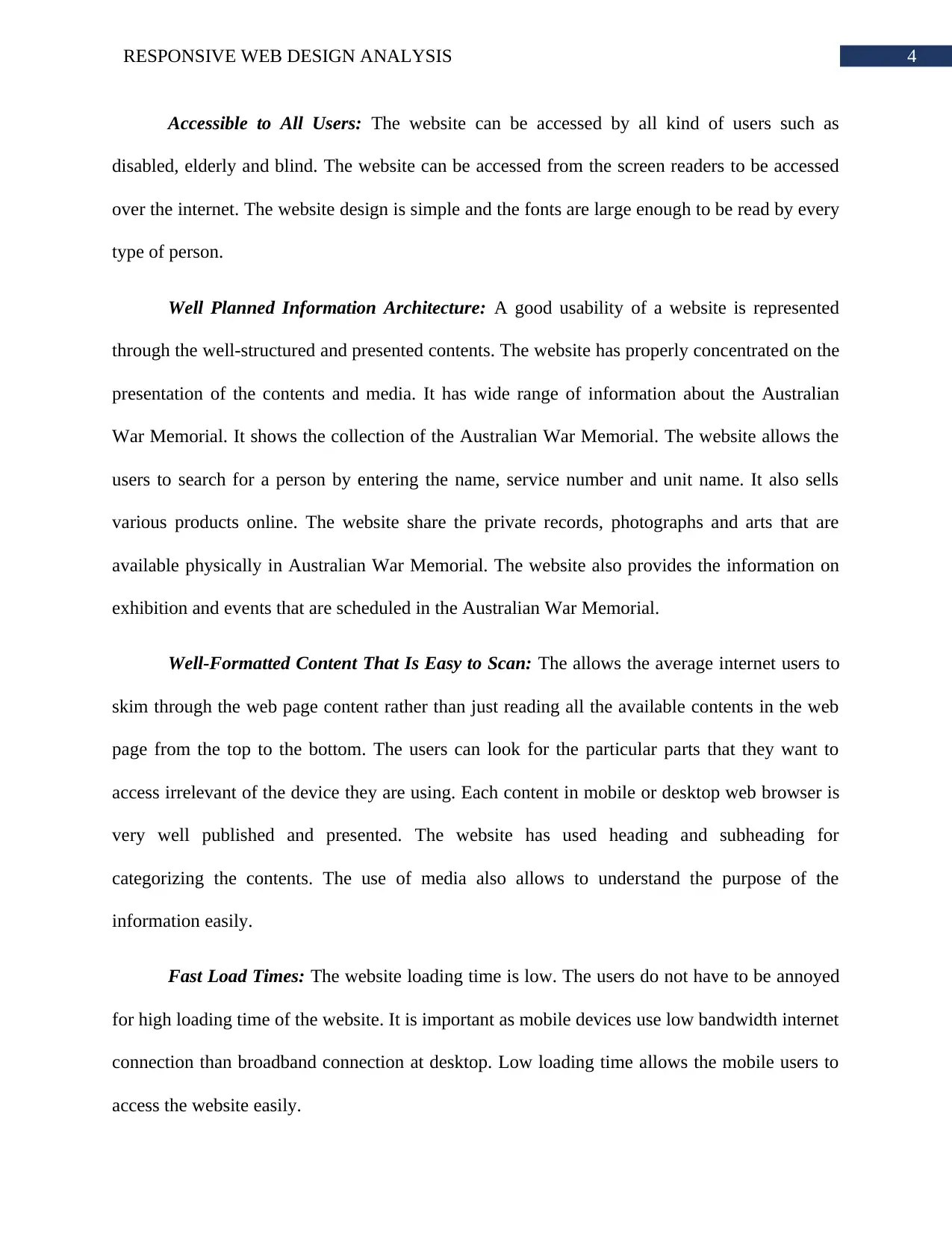
First Participant: The first participant is the author of this report. The website does not
show the submenus when clicked on the menu.
Use of bitmaps: Unless the website uses vector images, the website not completely
responsive. The use of bitmaps has limited the responsiveness of Australian War Memorial
website. The vector images does not loose quality while rescaled.
Use of PX: The website may be using px instead of percentage. The px does not work
properly in every situation. The use of percentage should have been used in every css code.
Extra Space between Contents: The website has large spaces between contents. This
makes the users assume that website does not have much information.
Website Review:
The selected screen sizes for the testing the responsiveness are 1280x768 pixels, 480x640
pixels and 200x320 pixels.
First Participant: The first participant is the author of this report. The website does not
show the submenus when clicked on the menu.
8RESPONSIVE WEB DESIGN ANALYSIS
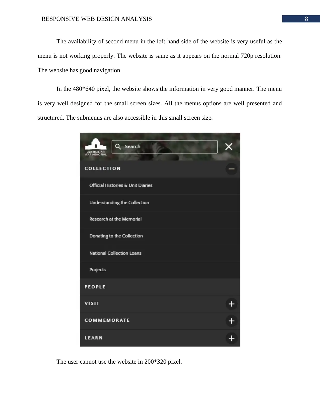
The availability of second menu in the left hand side of the website is very useful as the
menu is not working properly. The website is same as it appears on the normal 720p resolution.
The website has good navigation.
In the 480*640 pixel, the website shows the information in very good manner. The menu
is very well designed for the small screen sizes. All the menus options are well presented and
structured. The submenus are also accessible in this small screen size.
The user cannot use the website in 200*320 pixel.
⊘ This is a preview!⊘
Do you want full access?
Subscribe today to unlock all pages.
Trusted by 1+ million students worldwide
9RESPONSIVE WEB DESIGN ANALYSIS
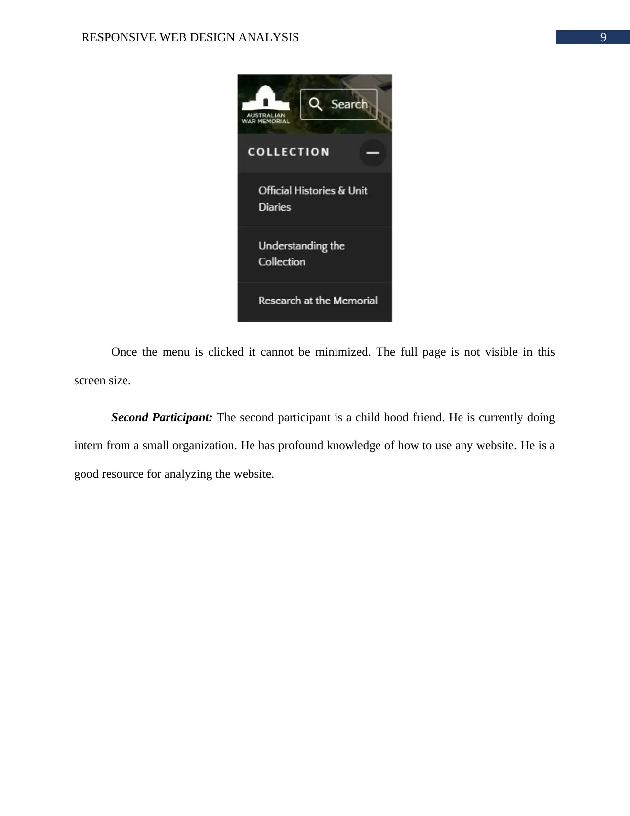
Once the menu is clicked it cannot be minimized. The full page is not visible in this
screen size.
Second Participant: The second participant is a child hood friend. He is currently doing
intern from a small organization. He has profound knowledge of how to use any website. He is a
good resource for analyzing the website.
Paraphrase This Document
Need a fresh take? Get an instant paraphrase of this document with our AI Paraphraser
10RESPONSIVE WEB DESIGN ANALYSIS
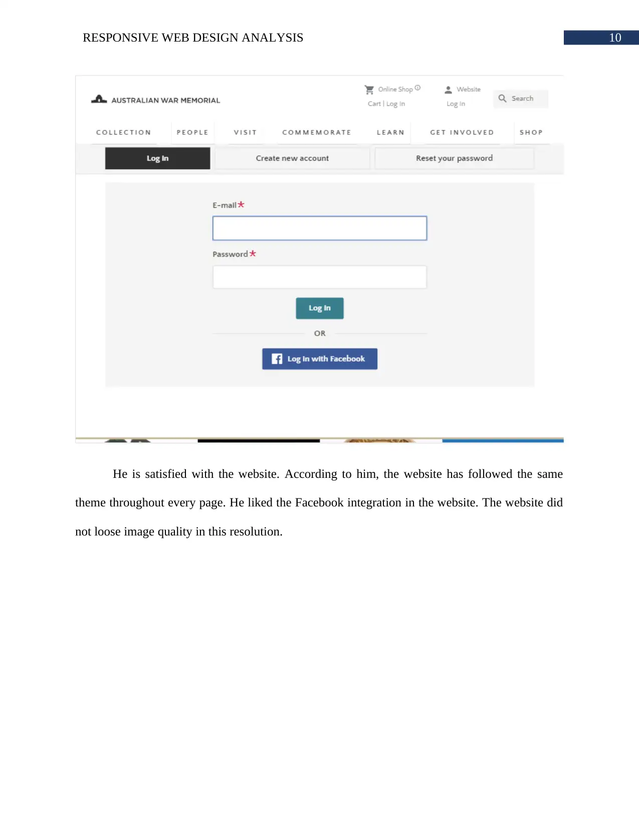
He is satisfied with the website. According to him, the website has followed the same
theme throughout every page. He liked the Facebook integration in the website. The website did
not loose image quality in this resolution.
He is satisfied with the website. According to him, the website has followed the same
theme throughout every page. He liked the Facebook integration in the website. The website did
not loose image quality in this resolution.
11RESPONSIVE WEB DESIGN ANALYSIS
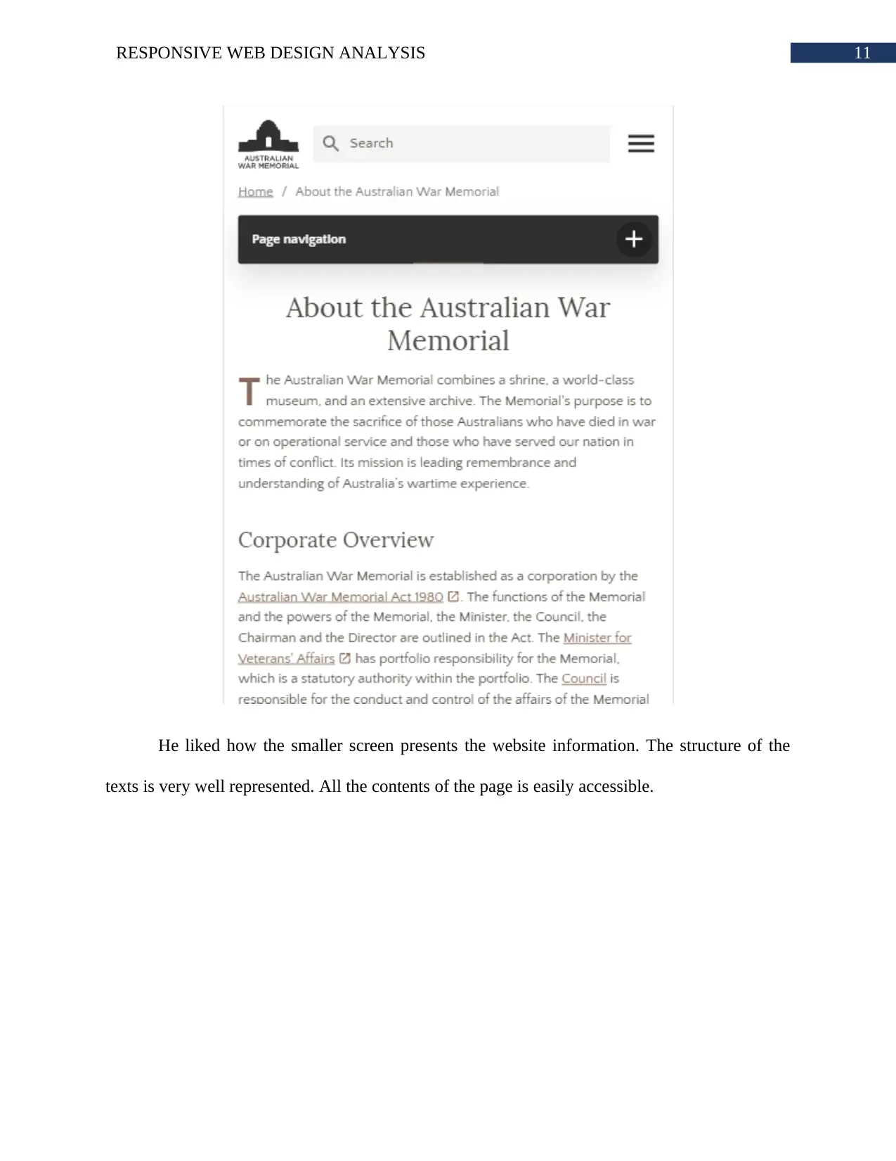
He liked how the smaller screen presents the website information. The structure of the
texts is very well represented. All the contents of the page is easily accessible.
He liked how the smaller screen presents the website information. The structure of the
texts is very well represented. All the contents of the page is easily accessible.
⊘ This is a preview!⊘
Do you want full access?
Subscribe today to unlock all pages.
Trusted by 1+ million students worldwide
1 out of 20
Related Documents


Your All-in-One AI-Powered Toolkit for Academic Success.
+13062052269
info@desklib.com
Available 24*7 on WhatsApp / Email
![[object Object]](/_next/static/media/star-bottom.7253800d.svg)
Unlock your academic potential
Copyright © 2020–2026 A2Z Services. All Rights Reserved. Developed and managed by ZUCOL.