Responsive Web Design Analysis
VerifiedAdded on 2020/04/01
|13
|3591
|86
Report
AI Summary
This report delves into the principles and practices of responsive web design (RWD), highlighting its importance in creating user-friendly websites that adapt to various devices. It discusses the advantages and disadvantages of RWD, including improved user experience, SEO benefits, and cost-effectiveness. The report also outlines recommendations for effective RWD implementation and evaluates various simulation tools that aid in testing and optimizing web designs. Overall, it emphasizes the necessity of responsive design in today's digital landscape.
Running Head: Responsive Web Design
Responsive Web Design
Responsive Web Design
Paraphrase This Document
Need a fresh take? Get an instant paraphrase of this document with our AI Paraphraser
1
Responsive Web Design
Table of Contents
INTRODUCTION.................................................................................................................................2
DISCUSSION.......................................................................................................................................2
RECOMMENDATIONS.......................................................................................................................6
CONCLUSION...................................................................................................................................11
References...........................................................................................................................................12
Table of Figures
Figure 1 Responsive Web Design Approach..........................................................................................3
Figure 2 Principles of RWD....................................................................................................................8
2
Responsive Web Design
INTRODUCTION
Responsive Web Design can be well-defined as the approach that suggests that design and
expansion should response to the user’s performance and the environment is based on the size
of the screen, its platform and the orientation. The design of the website generally consist of a
mix flexible grids and layouts, and the images and graphics been used and an intelligent use
of CSS media queries. Responses Web Design aims to make your web page look attractive
and good in all the devices. It is designed in HTML and CSS. It is generally not a JavaScript
or a program. Generally the responsive web design when designed in HTML and CSS is used
to resize, fleece and shrink, expand or transfer the content to make it look good on any
screen. It basically allows the website to familiarize on the device your users are viewing it
on. It initially aims to responds to the users need. The makers’ movement holds in invention,
imagination and knowledge to improve the upcoming scenario and to make them learn for the
better future (Firdaus, 2013). This site basically tends to develop and design in the field of art
and science and it is been created by the educators, parents and professionals. They design
and develop the projects of the different fields and to innovate the new ideas to implement in
making and designing the new projects. They acquire to help the people who are keen to
learn and participate with them to become the expertise using various tools and techniques to
implement their ideas into the reality. It is a wide range of people of all the age groups who
are involving and developing their talents and discovering the new ways of solving the
⊘ This is a preview!⊘
Do you want full access?
Subscribe today to unlock all pages.
Trusted by 1+ million students worldwide
3
Responsive Web Design
problems by working in a groups and making an appropriate solutions. It builds a community
and brings the people together to collaborate and inspire them in the field of innovation.
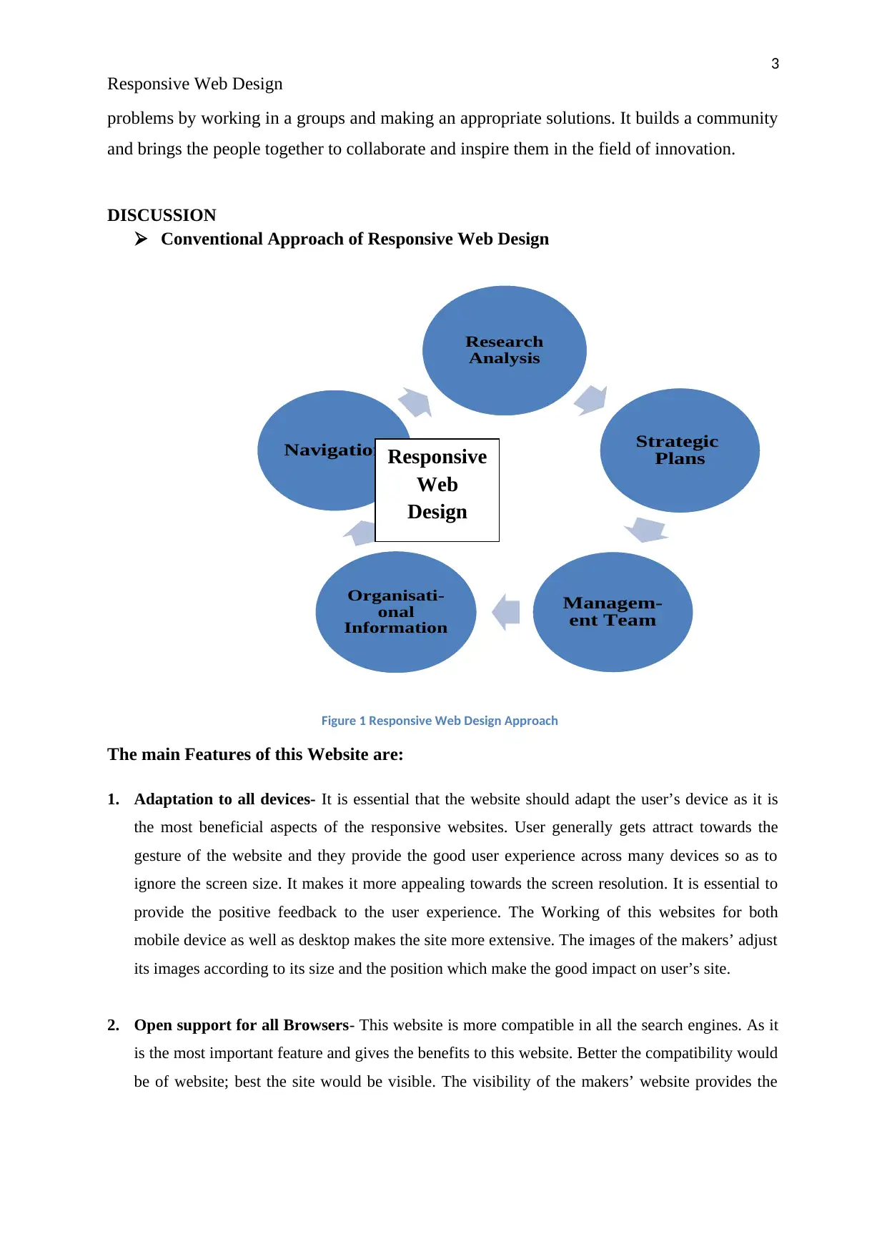
DISCUSSION
Conventional Approach of Responsive Web Design
Figure 1 Responsive Web Design Approach
The main Features of this Website are:
1. Adaptation to all devices- It is essential that the website should adapt the user’s device as it is
the most beneficial aspects of the responsive websites. User generally gets attract towards the
gesture of the website and they provide the good user experience across many devices so as to
ignore the screen size. It makes it more appealing towards the screen resolution. It is essential to
provide the positive feedback to the user experience. The Working of this websites for both
mobile device as well as desktop makes the site more extensive. The images of the makers’ adjust
its images according to its size and the position which make the good impact on user’s site.
2. Open support for all Browsers- This website is more compatible in all the search engines. As it
is the most important feature and gives the benefits to this website. Better the compatibility would
be of website; best the site would be visible. The visibility of the makers’ website provides the
Research
Analysis
Strategic
Plans
Managem-
ent Team
Organisati-
onal
Information
Navigation Responsive
Web
Design
Responsive Web Design
problems by working in a groups and making an appropriate solutions. It builds a community
and brings the people together to collaborate and inspire them in the field of innovation.
DISCUSSION
Conventional Approach of Responsive Web Design
Figure 1 Responsive Web Design Approach
The main Features of this Website are:
1. Adaptation to all devices- It is essential that the website should adapt the user’s device as it is
the most beneficial aspects of the responsive websites. User generally gets attract towards the
gesture of the website and they provide the good user experience across many devices so as to
ignore the screen size. It makes it more appealing towards the screen resolution. It is essential to
provide the positive feedback to the user experience. The Working of this websites for both
mobile device as well as desktop makes the site more extensive. The images of the makers’ adjust
its images according to its size and the position which make the good impact on user’s site.
2. Open support for all Browsers- This website is more compatible in all the search engines. As it
is the most important feature and gives the benefits to this website. Better the compatibility would
be of website; best the site would be visible. The visibility of the makers’ website provides the
Research
Analysis
Strategic
Plans
Managem-
ent Team
Organisati-
onal
Information
Navigation Responsive
Web
Design
Paraphrase This Document
Need a fresh take? Get an instant paraphrase of this document with our AI Paraphraser
4
Responsive Web Design
ease of accessibly website on the devices. This visibility will gain the attraction of the users and
will increase the income graph.
3. Perfection in your SEO- The websites which don’t have the responsive design are
generally not compatible for smart phones or other devices. For this other companies
design their separate mobile sites. But these things increase the challenge towards the
SEO. This website gives the consistency in the URL structure again all the optimizations.
This increases the higher outcome to the performance rate and the popularity to this site.
4. Low cost and higher maintenance- It is the main feature to the makers’ website as it
allows the website to access to the makes magazines and to the games designed by their
community. This single site is compatible to all devices according to responsive features.
5. More sale and higher Conversation- A huge amount of people visit on this website
globally to interact with the makers’ community through smart phones, tablets, etc. The
main benefit of this website is that makers provide the facility for educating and provides
the best services to the people around globally, for their user friendly behaviour of the
leads to the higher conversation growth (Hussain & Mkpojiogu, 2015).
The Positive and the Negative Aspects of the Website are:
Positive Aspects:
1. Smooth Management of Mobile Traffic- The traffic on this website is more as the
people easily get attracted towards those websites which help them to develop their skills
and provide the knowledge for innovating new ideas of designing and implementation. It
is necessary for the makers to provide the proper accessibility to the users so that the
users don’t encounter any distorted experience regarding the website.
2. Faster Mobile Development at Lower Costs- Availability to the faster access of the
maker website considerably take less time in making a user to provide the stand alone
mobile application in addition to a standard desktop website. Since It is the scenario
where money have become the important priority, responsive design generally cost less
than the options.
5
Responsive Web Design
3. Minimum Need of Maintenance- It is essential to maintain the brand name of the maker
website so as to attract the users and gain the attention on the mobile site. Protection of
the separate mobile site requires the extra testing and support from the makers’ team. The
makers’ website used the standardized methodologies for certifying the optimal use of a
maker magazine on the screen.
4. Quick access to Webpages- It has the fast accessibility over the browser or in standalone
application as it provides the quick access whether it is makers’ magazines, conversation
or reading the testimonials from the makers’ magazines. Users particularly have the
shorter attention spans and studies about the ideas been implemented and the work
progress going on innovation of new techniques. If a site does not optimize properly it
will take more time for the navigation and the user stop accessing to the webpage.
5. Minimum Fluctuation in Rates- It provides the greatest experience to the users to have
the ideas of implementing the new techniques and get an opportunity to work with the
makers’ community. A responsive and optimized mobile site provides a greater
experience to the customer for visiting and accessing on their webpage. It is more likely
to have best ideas that will switch around for a longer time to explore all the new fields
and new technologies of innovation. If the site doesn’t response properly it is difficult to
engage the user for the longer period.
6. Higher Conversion Rates- Generating a consistent user experience to all the other
devices is the essential key for converting the new users. It depends on the user whether
the user is satisfied and has achieved the basic criteria and satisfaction working with the
makers’ team and learning to the new technologies makes the user decide whether to
subscribe or not to the service provided by the team. Generally users don’t prefer to
redirect to the specific devices for the websites because sometimes the process may take
longer time for accessing.
7. Convenient Analytical Reporting- It is essential to know which area has the maximum
usability and from where the traffic is coming. It is fully dependable on how the users
interact with the website. It is necessary for the makers’ to manage the multiple version of
⊘ This is a preview!⊘
Do you want full access?
Subscribe today to unlock all pages.
Trusted by 1+ million students worldwide
6
Responsive Web Design
their website which helps the developers to track the user’s location. For a single
responsive web design it basically simplifies the great monitoring process.
8. Enhanced SEO- It has become a vital role for enhancing the search engine optimization
for the quality content. Stronger the look of the website would be more the users would
access to the webpage for having the stronger links and better bounce rates will transfer to
the great rankings but the makers provide extra benefits for the mobile applications SEO.
9. Upgraded Online Browsing- The makers’ attract the users from the very first time the
users access to the website and it is obvious that the first impression is everything. It is
necessary that whether the user is accessing a website from the smart phone or to desktop
the user should have the great experience and positive feedback for the website (Peterson,
2014).
Negative Aspects:
1. Time taken during Loading- Due to redundant codes downloads in a mobile device,
heaping time is usually higher. Sometimes many users are communicating with the
team so it creates kiosks during the website being loaded.
2. Responsive Design Development- Sometimes the initial development in the design
and the implementation takes time during designing period so it is much easier to
access to the mobile site rather than the desktop site.
3. Problems faced during Implementation- During the implementation time the
responsive web design takes much time than the expected time being mentioned by the
team. When the implementation is made on the new technique many things are
unfamiliar and some problems generally arise which is hard to fix.
4. Resources are Limited- As the makers keep on bringing to the new ideas and
innovations so resources used are always less according to the concept designing and
for that the proper designing is not made.
Paraphrase This Document
Need a fresh take? Get an instant paraphrase of this document with our AI Paraphraser
7
Responsive Web Design
5. Design- It is essential to design the different webpages for the different fields so it can
become easy way for the user to access to the desired field, for this several layouts
should be designed for accessing into mobiles and desktop (Schade, 2014.).
RECOMMENDATIONS
Recommendations for the robust features of Responsive Web Design
The recommendations to the robust features for designing to a website before launching the new
technologies and implementing the new techniques should test on the responsive test tools. These
tools create more effective and efficient way to look the website better. These Tools are not same as
the actual device testing. This is a replacement of actual device testing simply used for recommending
to the new ideologies and features for testing for the responsive site.
1. It must prioritize Extreme Viewport dimensions- It is essential to follow the
technical constraints for the smallest and the largest devices for the effective strategy
so as to make the website presentable in all sizes according to the user availability
devices. It mainly targets to all the sizes and focus on the overall designing part.
2. It must Model out the instances occurring between the breakpoints- User can keep
the accessibility according to his needs that how the application would look like in his
device.
3. It must readily the feedbacks- while designing and implementation the developers
and the technical team focus and are very protective to their work for seeking to the
good opportunities and positive feedback from the customer to always have a better
service. Team members generally have the knowledge in all the fields and have the
experience to share in different fields.
4. It must promote higher sale- It is essential that the team should promote their
products and services to the users for the better profit by promoting and providing the
packages to the customers.
5. Supports maximum conversation- The team is always ready to provide the
innovative idea and keep on providing the new technologies for implementing the
designs and keep the conversation as friendly behaviour (Wiener, 2017).
Evaluation of Responsive Web Design
It is essential for the web page to be responsive and have the proper conversation when
user is accessed to an application in the device. It generally happens because of the
developing and implementing of an idea for the usability of Smartphones and tablets,
8
Responsive Web Design
there is an increase in demand for responsive web designs is expected to satisfy the users
need and provide the new ideologies and tools for the innovations. As the usability of the
makers’ is increasing more the number of users are spending the time on mobile devices
to access on the Internet, many of the website owners are implementing and designing the
responsive outlines to reach to the users globally from where the accessibility is made.
A responsive web design also known as RWD is produced using various principles and
simulation tools. Furthermore, it is been designed using CSS media queries. A responsive
website directly approach and responds to user’s expectation so that user feel free to use
and access the webpage faster and the screen of a website should be appropriate to the
mobile user. In the current scenario more modern browsers are been accessed and devices
are being developed, it becomes indispensable to the test makers’ website approachability
for all the browsers and device groupings (Peterson, 2014).
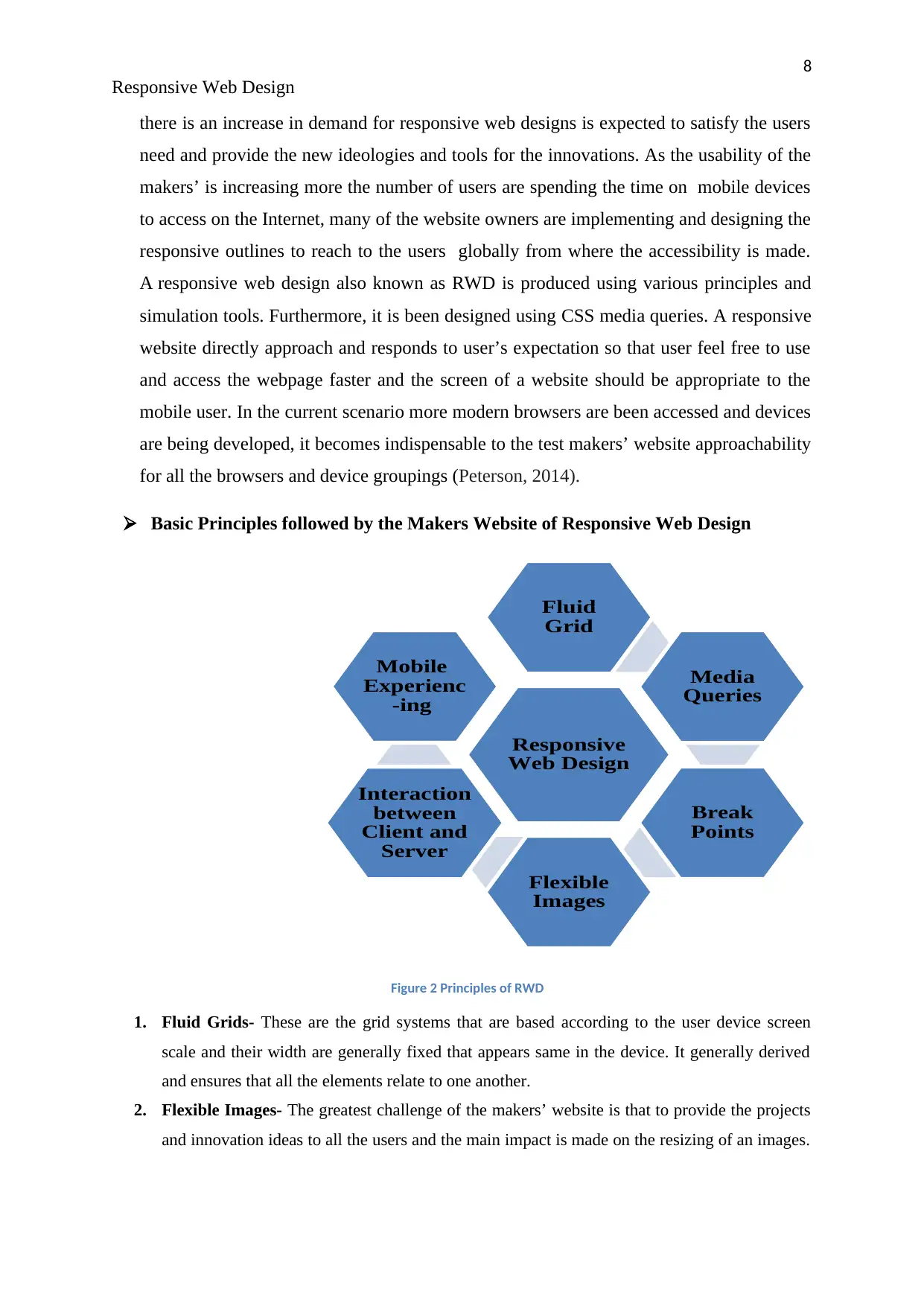
Basic Principles followed by the Makers Website of Responsive Web Design
Figure 2 Principles of RWD
1. Fluid Grids- These are the grid systems that are based according to the user device screen
scale and their width are generally fixed that appears same in the device. It generally derived
and ensures that all the elements relate to one another.
2. Flexible Images- The greatest challenge of the makers’ website is that to provide the projects
and innovation ideas to all the users and the main impact is made on the resizing of an images.
Responsive
Web Design
Fluid
Grid
Media
Queries
Break
Points
Flexible
Images
Interaction
between
Client and
Server
Mobile
Experienc
-ing
Responsive Web Design
there is an increase in demand for responsive web designs is expected to satisfy the users
need and provide the new ideologies and tools for the innovations. As the usability of the
makers’ is increasing more the number of users are spending the time on mobile devices
to access on the Internet, many of the website owners are implementing and designing the
responsive outlines to reach to the users globally from where the accessibility is made.
A responsive web design also known as RWD is produced using various principles and
simulation tools. Furthermore, it is been designed using CSS media queries. A responsive
website directly approach and responds to user’s expectation so that user feel free to use
and access the webpage faster and the screen of a website should be appropriate to the
mobile user. In the current scenario more modern browsers are been accessed and devices
are being developed, it becomes indispensable to the test makers’ website approachability
for all the browsers and device groupings (Peterson, 2014).
Basic Principles followed by the Makers Website of Responsive Web Design
Figure 2 Principles of RWD
1. Fluid Grids- These are the grid systems that are based according to the user device screen
scale and their width are generally fixed that appears same in the device. It generally derived
and ensures that all the elements relate to one another.
2. Flexible Images- The greatest challenge of the makers’ website is that to provide the projects
and innovation ideas to all the users and the main impact is made on the resizing of an images.
Responsive
Web Design
Fluid
Grid
Media
Queries
Break
Points
Flexible
Images
Interaction
between
Client and
Server
Mobile
Experienc
-ing
⊘ This is a preview!⊘
Do you want full access?
Subscribe today to unlock all pages.
Trusted by 1+ million students worldwide
9
Responsive Web Design
The images are loaded very fast for the learning purpose. They generally provide the original
size of a viewport for accessing on the mobile device.
3. Media Queries- According to the accessibility on the browsers, it has become narrow because
of the new challenges have arisen which makes it essential to query from the browsers. This
website enables to collect the data and innovate the ideas for implementing the task for this the
data is collected separately from the desired field.
4. Interaction between Client and Server-It is necessary to build the communication between
the client and the server and the Makers’ aim to build the healthy communication and provide
the proper and desired services to the user.
5. Mobile Experiencing- Makers’ have their own mobile application for those users who access
and browse the applications in mobile for the better experiencing and easy accessibility.
6. Break Points- It depends on the user desires that how the application should look like on their
screen. Designers generally think on the break points for the sizing down the layouts of their
screen according to their needs (Sheng, 2017).
Simulation Software tools of some best Responsive Web Design tools.
1. Responsivepx- This tool is used for the web based applications that let you to upload
your own URL to the website at a specific height and width, so as to help you to
estimate how your website assemble at different resolutions.
2. Responsive Web Design Tool- This is basically a testing tool that allows you to view
your website in different formats on the screen simultaneously. For using the web
application, it is essential to enter your website URL, and all the web pages will be visible
in different device sizes in all the other devices.
3. MobiReady- This tool provides the free facility for testing, which helps in designing
and implementing, to calculate the performance of their network designs on mobile
devices. This tools is been used in the web industry as it is the best tool for testing and
generally performs and ideals to the test if a site is mobile-ready or not. It operates a
scoring scheme to determine how proficient your website performance would be, when
accessed in different devices.
4. Edge Inspect- This tool is of Adobe- Edge Inspect, It is an excessive assessment tool
which helps in designing to help web designers and creators to view the performance of
the pages of their site across multiple devices. Using this tool, user needs to install
software’s for functioning of tools in the system, and Google Chrome browser extension.
Paraphrase This Document
Need a fresh take? Get an instant paraphrase of this document with our AI Paraphraser
10
Responsive Web Design
5. Screenfly- This tool is immediately used to check how the website will look like on all
types of device screens and its resolutions, Screenfly checks the suitability that the user is
satisfied and attracted towards the easier way of accessing.
6. Responsive.Is- This tool is the appropriate for the designing and implementation
of the, who want to check how their website will look after the website is been accessed
across different device screens.
7. Responsive Design Bookmarklet- This tool is used as a simplest way of web testing
tool that generally lets the user preview the makers website's and the view of the current
page in four different screen widths of Smartphones, desktop and tablet. Responsive
Design Bookmarklet tool, is used simply for the drag and drop purpose. (Ekholm &
Haller, 2017).
Advantages of the Simulation Software Tools Used:
It makes easier way to the users for sharing and linking to the contents with a single
URL.
Generally it requires less manufacturing time to build multiple pages for the same
content.
It reduces the copied data and the content on which generally the mistakes are been
affected and shown on the mobile sites.
Generally it requires no functioning for the users to have an optimization of a devices
to view the web page, which decreases the loading time.
Dis-advantages of the Simulation Software Tools:
Some simulation tools are not readily available after an event has occurred and they
take long time for processing in the stimulating environment.
Some simulators are basically restricted by the limited hardware platforms.
Sometimes it becomes difficult to imply the hierarchical approach to design and it
itself create its own problem of simulation.
11
Responsive Web Design
CONCLUSION
In today’s scenario everyone is aware of using smart phones, tablets etc. With the
development in the new technologies and tools are designed and implementing in
everyday basis by the makers’ team for the upcoming future for better knowledge and
advancement in the technologies. Responsive web design is becoming a critical pillar of
overall mobile strategy. Device manufacturers are continuing to develop web-enabled
devices in expanding resolutions and capabilities. Companies including Google, Apple,
Samsung, and others are looking for the “next big thing,” and many suggest wearable
technology may be the next shake-up in the computing landscape. As the new
technologies is been arrived in the scenario our team start working on the tools and
technologies being implemented for the better results. By adapting the technical
enhancement in IT field, it has become essential that the user should be aware with the
technologies and the tools for the responsive web designs for the better visualise
experience in the near future. As a result, it is critical to ensure that the data and content
that power our websites and applications are available so they can be consumed in many
different ways and will improve the SEO burden for the higher performance in low cost
and an affordable time (Peterson, 2014).
⊘ This is a preview!⊘
Do you want full access?
Subscribe today to unlock all pages.
Trusted by 1+ million students worldwide
1 out of 13
Related Documents


Your All-in-One AI-Powered Toolkit for Academic Success.
+13062052269
info@desklib.com
Available 24*7 on WhatsApp / Email
![[object Object]](/_next/static/media/star-bottom.7253800d.svg)
Unlock your academic potential
Copyright © 2020–2026 A2Z Services. All Rights Reserved. Developed and managed by ZUCOL.