University Website Analysis Report: RWD and Design Principles
VerifiedAdded on 2022/08/24
|17
|4013
|16
Report
AI Summary
This report provides a comprehensive analysis of the Australian War Memorial website, evaluating its design and responsiveness within the context of responsive web design (RWD) principles. The report begins with an overview of the website's features, including its responsiveness, goals, and user interface. It identifies both positive aspects, such as its lightweight design and vector image utilization, and negative aspects, such as slow initial loading times and the use of bitmap images. The analysis includes reviews from two participants who tested the website using the Chrome device simulator on different screen sizes. The report also highlights current issues with the website, such as display problems and a security vulnerability in the newsletter signup. Finally, it offers recommendations for improvement, emphasizing the need for enhanced responsiveness and addressing the identified drawbacks. The report also incorporates RWD principles and the use of the Chrome device simulator for testing.
Website Analysis
Name of the Student
Name of the University
Author Note
Name of the Student
Name of the University
Author Note
Paraphrase This Document
Need a fresh take? Get an instant paraphrase of this document with our AI Paraphraser
1
Table of Contents
Introduction.................................................................................................................................2
Discussion...................................................................................................................................2
Identification of various features of the website ‘Australian War Memorial’........................2
Overview.............................................................................................................................2
Website Features.................................................................................................................2
Positive and Negative aspect Identification............................................................................3
Positive Aspects..................................................................................................................3
Negative Aspects................................................................................................................3
Website Review from the Two Participants...........................................................................3
Website Current Condition.....................................................................................................4
Recommendation for Website Improvement..........................................................................6
RWD (Responsive Web Design) Principles...........................................................................7
Chrome Device Simulator Advantage and Disadvantage.......................................................8
Advantage...........................................................................................................................8
Disadvantage.......................................................................................................................8
Similar Tools Available for Testing RWD.............................................................................9
Examining Australian War Model using Chrome Device simulator....................................11
Conclusion................................................................................................................................15
Bibliography.............................................................................................................................15
2
Introduction
In this report we will evaluate the nominated website “https://www.awm.gov.au/”
(Australian War Memorial) in a detailed way. The analysis will be done on every page of the
website and a generalised overview of the whole site will be given; in other ways the report
will contain about the features of the website, its positive along with the negative sides (if
any), interaction and usability features and characteristics, review from two different people
apart from myself, point on how the website is in the time of analysis, suggestion for future
update of the website (if found any), a detailed description on RWD features added in the
nominated website like whether the site is responsive or adaptive, detail about what type of
relative units have been taken, inclusion of breakpoints and many more. There will also be a
section containing a detailed comment on the tool used (chrome device simulator) while
testing the website with a few advantage and disadvantage listings of using the same with
some screenshots of different types of display used.
Discussion
Identification of various features of the website ‘Australian War Memorial’
Overview
The website is about the Australian War Memorial, it syndicates a sanctuary, an
extensive documentation of the same and an outstanding arts gallery. The purpose of the
memorial is to honour the sacrifices of all the Australians who got deceased in their
operational service or during the war along with the names of the personals who have served
Australia in the time of war.
When a user enter the website for the first time, a disclaimer window pops up about
the contents of the website. Upon closing it, the website gets visible for the viewers. The
Header section of the website consists of a link (named as ‘AUSTRALIAN WAR MODEL’)
to the homepage. Towards the right side, there is a button named as search, it redirects the
user to the ‘Advanced search page’. The right side also includes, LogIn and Cart buttons.
Under the header, there lies the Navigation bar; it consists of navigation menus like ‘People,
‘Collection’, ‘Commemorate’, ‘Visit’, ‘Get Involved’, ‘Learn’ and ‘Shop’. Each menus
contain sub-menus and they redirect the viewer to different pages. Under the Navigation Bar
there is a slider containing links on every slides to redirect the viewer to specific page; below
the slider division, there is a search bar; people can search for war related people, place or
things in there and they will be redirected accordingly. The body section of the webpage has
specific breakpoints mentioned as a result it is gets adjusted with different screen sizes and
works properly in different screens. The footer section consists of different containers for
specific group details (text based group, Link based group, image based link, social media
redirection, etc.).
Website Features
Features of the website are as follows:
Responsiveness of the website – The design of the website is highly responsive and
most of the viewers can view the website with just an internet connection in a device.
Website users/viewers can also view the site from small screen devices.
Goal of the Website – The website successfully described about its objectives and
goals in the ‘About’ section.
Getting the correct thoughts to the spectators – The content presentation format
reached the viewers. It is so because of the smooth and attractive design of the
website.
⊘ This is a preview!⊘
Do you want full access?
Subscribe today to unlock all pages.
Trusted by 1+ million students worldwide
3
Fast loading of the website – Initial loading of the website is a bit slow, after
completion of the first load, the website loads smoothly on any device without
consuming any additional time.
Clear logo icon – The logo design of the website is clear and is easily understandable
by the viewers of the site.
Positive and Negative aspect Identification
Positive Aspects
Light-weight design – Throughout the whole design, the light weightiness of the
website is considered as the main feature. It is so because the lightness of the website
lets the website load fast and smooth loading experience to the spectators of the site.
Vector Image Utilization – The designer of the website, while designing the site, have
make use of vector images in some parts of the website. In those parts, the website
displays same quality of image irrespective of the type of screens a viewer may open
the site.
Rich with vibrant display – User Interface (UI) of the website is very clear. It is one of
the important elements for designing a website. The main purpose of the UI design is
to let people interact with the website via proper communicating functions. The UI of
the website ‘Australian War Memorial’ is easy to understand by the user and is clear
as to how the site works and how to go in a particular section of the website.
Conciseness – The website content is to-the-point and clear. All the details provided in
the website are neither too less nor too big. It results the user to take less time while
observing the site and get a detailed information on the selected topic.
Consistency – The given links, buttons, menus and submenus are consistent.
Negative Aspects
Late response while initial loading – Loading time of the first time someone opens the
website is relatively longer. Depending on the network connection speed, first loading
time may take some while for the observers.
Utilization of bitmap images – Some parts of the website use bitmap images, as for
when those images are maximized, it gets pixelated out.
Website Review from the Two Participants
In order to conduct a critical review on the chosen normalized website, two
participants have been invited. They have provided their review about the selected website
‘Australian War Memorial’ using the chrome device simulator. Both of them will simulate the
site on two types of screens iPadPro with a resolution of 1024 x 1366 and Nexus 7 with
resolution 600 x 960. Two of the persons are my neighbours Tom and Harry. Harry is 23
years old pursuing MCA and Tom is a software engineer aging 33 years. Their review of the
nominated website are as follows:
Harry
After reviewing the whole website, he said that he started opening every characteristic
feature of the website and went through every page of the website using the chrome simulator
in order to test the responsiveness of all the webpages for both the screen size simulations. In
the end, Harry said the website is supported with both the screen sizes and it is well
responsive. Harry continued that the website design and compatibility is all good; but during
the first loading time of the website, it was slow and to some extent a bit lag was found, he
had to wait for a few seconds in order to access the contents of the website.
Paraphrase This Document
Need a fresh take? Get an instant paraphrase of this document with our AI Paraphraser
4
Tom
After reviewing the whole website, in both the iPadPro and Nexus 7 simulations, he
said that he reviewed all the parts of the website it includes all the pages, links and buttons
present in the website. He specifically checked the different pages for their responsiveness in
both the screen sizes using the chrome device simulator. In the end, he said that the website is
both compatible and responsive for both the screen types; but he found that the webpage stop
loading correctly when he uses any screen types other than the large screen display. The
rendering problem also comes when responsive simulation is enabled. He also mentioned that
the website is suited for both the landscape and portrait views and because of the use of vector
image, the images used images in the website does not become pixelated with exception of a
few.
As for my reviews, they are similar to that of the two participants Tom and Harry.
Website Current Condition
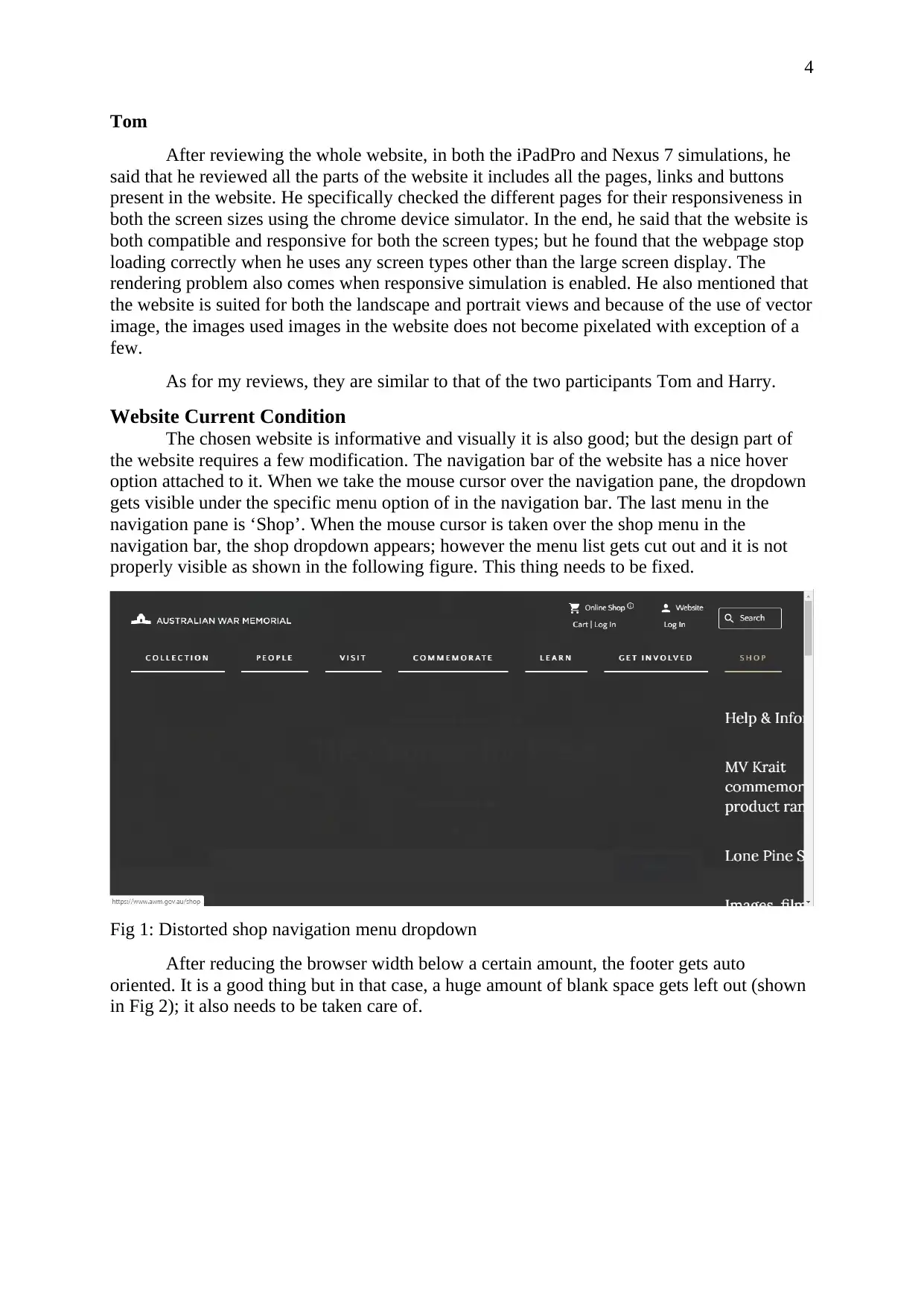
The chosen website is informative and visually it is also good; but the design part of
the website requires a few modification. The navigation bar of the website has a nice hover
option attached to it. When we take the mouse cursor over the navigation pane, the dropdown
gets visible under the specific menu option of in the navigation bar. The last menu in the
navigation pane is ‘Shop’. When the mouse cursor is taken over the shop menu in the
navigation bar, the shop dropdown appears; however the menu list gets cut out and it is not
properly visible as shown in the following figure. This thing needs to be fixed.
Fig 1: Distorted shop navigation menu dropdown
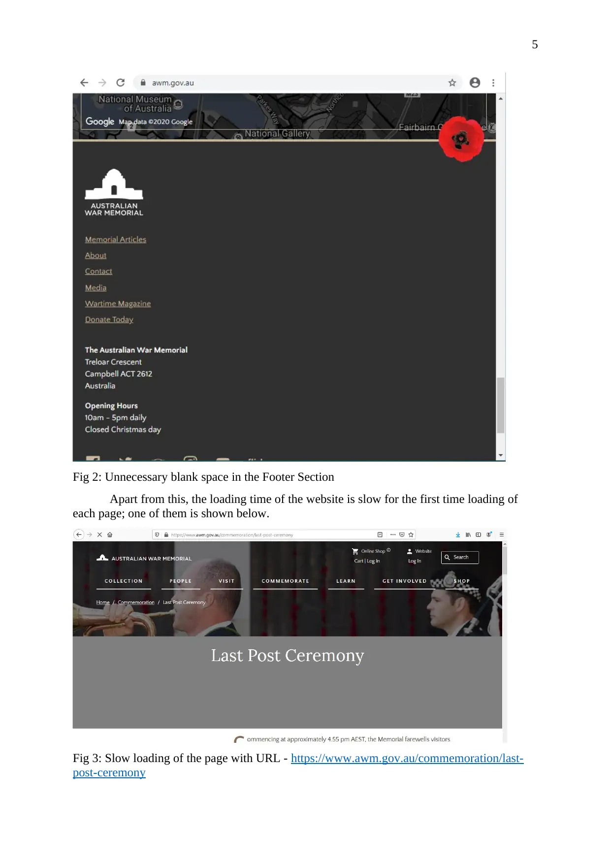
After reducing the browser width below a certain amount, the footer gets auto
oriented. It is a good thing but in that case, a huge amount of blank space gets left out (shown
in Fig 2); it also needs to be taken care of.
Tom
After reviewing the whole website, in both the iPadPro and Nexus 7 simulations, he
said that he reviewed all the parts of the website it includes all the pages, links and buttons
present in the website. He specifically checked the different pages for their responsiveness in
both the screen sizes using the chrome device simulator. In the end, he said that the website is
both compatible and responsive for both the screen types; but he found that the webpage stop
loading correctly when he uses any screen types other than the large screen display. The
rendering problem also comes when responsive simulation is enabled. He also mentioned that
the website is suited for both the landscape and portrait views and because of the use of vector
image, the images used images in the website does not become pixelated with exception of a
few.
As for my reviews, they are similar to that of the two participants Tom and Harry.
Website Current Condition
The chosen website is informative and visually it is also good; but the design part of
the website requires a few modification. The navigation bar of the website has a nice hover
option attached to it. When we take the mouse cursor over the navigation pane, the dropdown
gets visible under the specific menu option of in the navigation bar. The last menu in the
navigation pane is ‘Shop’. When the mouse cursor is taken over the shop menu in the
navigation bar, the shop dropdown appears; however the menu list gets cut out and it is not
properly visible as shown in the following figure. This thing needs to be fixed.
Fig 1: Distorted shop navigation menu dropdown
After reducing the browser width below a certain amount, the footer gets auto
oriented. It is a good thing but in that case, a huge amount of blank space gets left out (shown
in Fig 2); it also needs to be taken care of.
5
Fig 2: Unnecessary blank space in the Footer Section
Apart from this, the loading time of the website is slow for the first time loading of
each page; one of them is shown below.
Fig 3: Slow loading of the page with URL - https://www.awm.gov.au/commemoration/last-
post-ceremony
Fig 2: Unnecessary blank space in the Footer Section
Apart from this, the loading time of the website is slow for the first time loading of
each page; one of them is shown below.
Fig 3: Slow loading of the page with URL - https://www.awm.gov.au/commemoration/last-
post-ceremony
⊘ This is a preview!⊘
Do you want full access?
Subscribe today to unlock all pages.
Trusted by 1+ million students worldwide
6
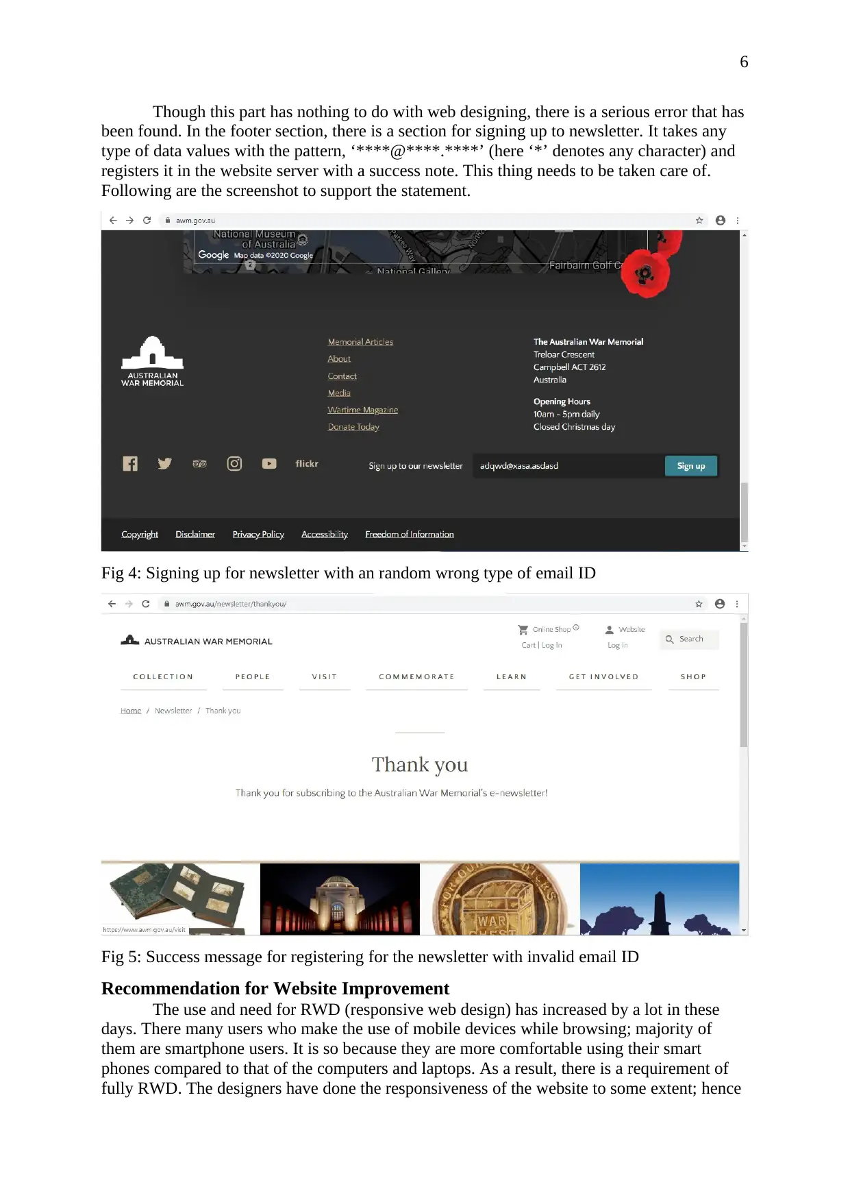
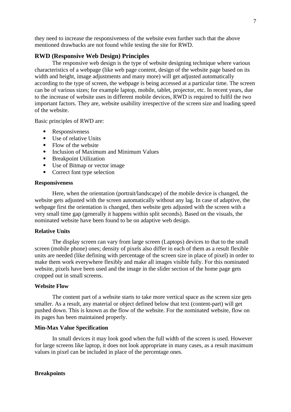
Though this part has nothing to do with web designing, there is a serious error that has
been found. In the footer section, there is a section for signing up to newsletter. It takes any
type of data values with the pattern, ‘****@****.****’ (here ‘*’ denotes any character) and
registers it in the website server with a success note. This thing needs to be taken care of.
Following are the screenshot to support the statement.
Fig 4: Signing up for newsletter with an random wrong type of email ID
Fig 5: Success message for registering for the newsletter with invalid email ID
Recommendation for Website Improvement
The use and need for RWD (responsive web design) has increased by a lot in these
days. There many users who make the use of mobile devices while browsing; majority of
them are smartphone users. It is so because they are more comfortable using their smart
phones compared to that of the computers and laptops. As a result, there is a requirement of
fully RWD. The designers have done the responsiveness of the website to some extent; hence
Paraphrase This Document
Need a fresh take? Get an instant paraphrase of this document with our AI Paraphraser
7
they need to increase the responsiveness of the website even further such that the above
mentioned drawbacks are not found while testing the site for RWD.
RWD (Responsive Web Design) Principles
The responsive web design is the type of website designing technique where various
characteristics of a webpage (like web page content, design of the website page based on its
width and height, image adjustments and many more) will get adjusted automatically
according to the type of screen, the webpage is being accessed at a particular time. The screen
can be of various sizes; for example laptop, mobile, tablet, projector, etc. In recent years, due
to the increase of website uses in different mobile devices, RWD is required to fulfil the two
important factors. They are, website usability irrespective of the screen size and loading speed
of the website.
Basic principles of RWD are:
Responsiveness
Use of relative Units
Flow of the website
Inclusion of Maximum and Minimum Values
Breakpoint Utilization
Use of Bitmap or vector image
Correct font type selection
Responsiveness
Here, when the orientation (portrait/landscape) of the mobile device is changed, the
website gets adjusted with the screen automatically without any lag. In case of adaptive, the
webpage first the orientation is changed, then website gets adjusted with the screen with a
very small time gap (generally it happens within split seconds). Based on the visuals, the
nominated website have been found to be on adaptive web design.
Relative Units
The display screen can vary from large screen (Laptops) devices to that to the small
screen (mobile phone) ones; density of pixels also differ in each of them as a result flexible
units are needed (like defining with percentage of the screen size in place of pixel) in order to
make them work everywhere flexibly and make all images visible fully. For this nominated
website, pixels have been used and the image in the slider section of the home page gets
cropped out in small screens.
Website Flow
The content part of a website starts to take more vertical space as the screen size gets
smaller. As a result, any material or object defined below that text (content-part) will get
pushed down. This is known as the flow of the website. For the nominated website, flow on
its pages has been maintained properly.
Min-Max Value Specification
In small devices it may look good when the full width of the screen is used. However
for large screens like laptop, it does not look appropriate in many cases, as a result maximum
values in pixel can be included in place of the percentage ones.
Breakpoints
8
Breakpoints also plays a vital role in RWD. Using Breakpoints in specific parts will
help the website to adjust according to the screen size. Proper use of breakpoints have been
done in this nominated website.
Bitmap/Vector Image Utilization
It is more useful to use a SVG file (used for vector image) for image as a vector image
does not gets pixelated on zooming in them. For bitmap image that is not the case; the image
gets pixelated on magnification of the same. In this nominated website both type of images
are used. Bitmap image are used in the logos of the website where as bitmap images in the
other parts.
Font Style
Loading time of a website depends on the font style selected for a webpage. System
font based website loads faster than that of the web fonts because the fonts needs to be
downloaded before loading them properly in a device. The nominated website have used
system defined fonts (Times New Roman and Arial).
Chrome Device Simulator Advantage and Disadvantage
The chrome device simulator lets a used imitate a webpage and test its responsiveness
in different screen sizes identical to that of laptop, mobile and tablet. It has a lot of predefined
screen size available and supports both the portrait and landscape views; the scrolling system
in the emulated versions are same to that of the mobile devices.
Advantage
Open source software and is free to use
Has screenshot facility for easy capturing
Disadvantage
Battery issues cannot be simulated
Interrupts that may occur during incoming message and calls it cannot be simulated
It cannot simulate the colour combination of a real device (for dark mode).
⊘ This is a preview!⊘
Do you want full access?
Subscribe today to unlock all pages.
Trusted by 1+ million students worldwide
9
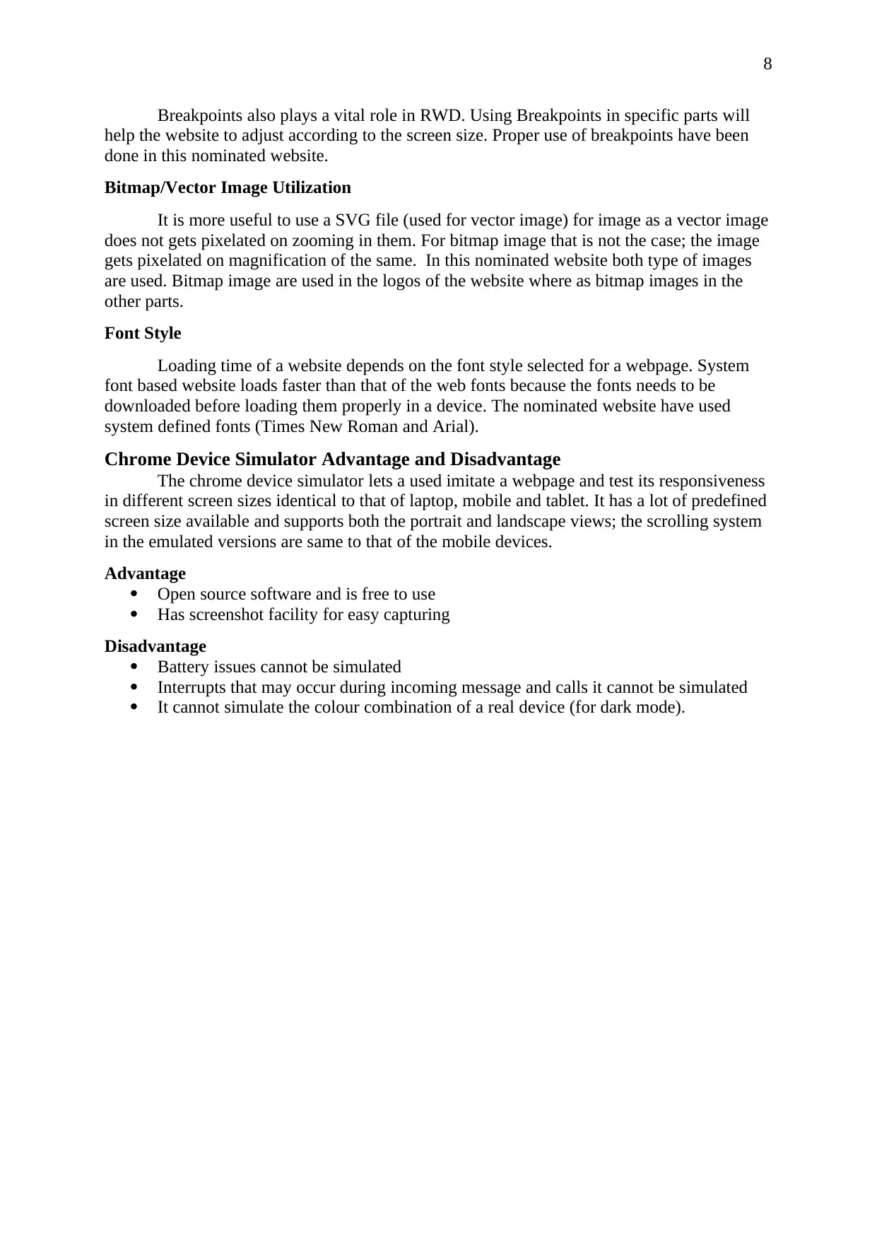
Similar Tools Available for Testing RWD
Ripple Emulator can be used by the developers to test their developed mobile
applications. Below are some images obtained while using Ripple Emulator.
Fig 6: Ripple Emulator interface
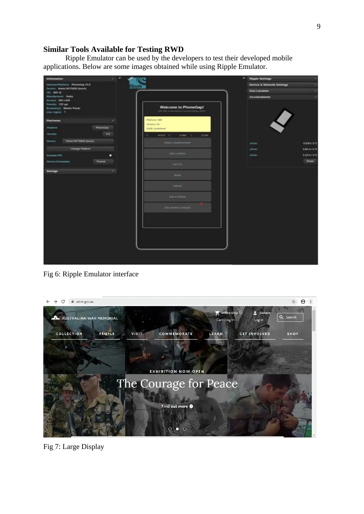
Fig 7: Large Display
Similar Tools Available for Testing RWD
Ripple Emulator can be used by the developers to test their developed mobile
applications. Below are some images obtained while using Ripple Emulator.
Fig 6: Ripple Emulator interface
Fig 7: Large Display
Paraphrase This Document
Need a fresh take? Get an instant paraphrase of this document with our AI Paraphraser
10
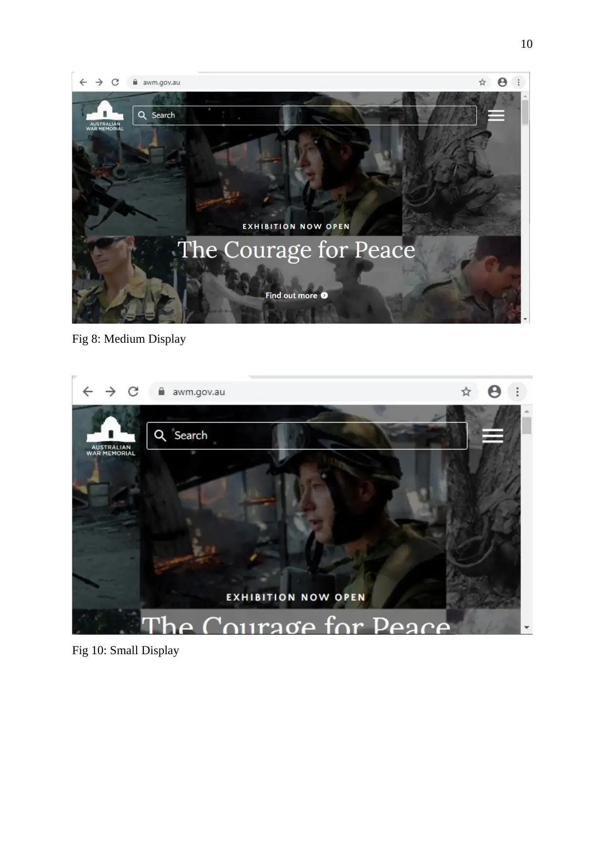
Fig 8: Medium Display
Fig 10: Small Display
Fig 8: Medium Display
Fig 10: Small Display
11
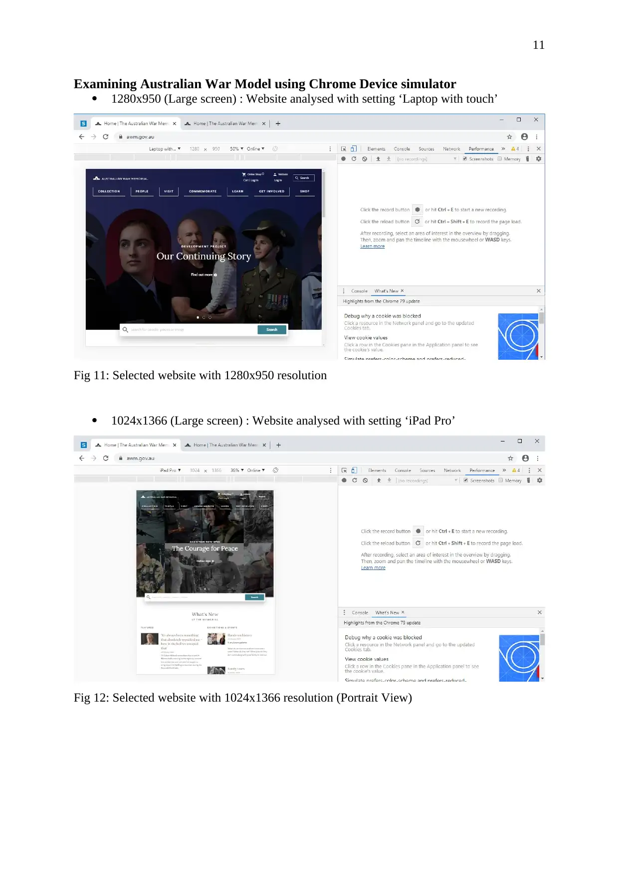
Examining Australian War Model using Chrome Device simulator
1280x950 (Large screen) : Website analysed with setting ‘Laptop with touch’
Fig 11: Selected website with 1280x950 resolution
1024x1366 (Large screen) : Website analysed with setting ‘iPad Pro’
Fig 12: Selected website with 1024x1366 resolution (Portrait View)
⊘ This is a preview!⊘
Do you want full access?
Subscribe today to unlock all pages.
Trusted by 1+ million students worldwide
1 out of 17
Related Documents


Your All-in-One AI-Powered Toolkit for Academic Success.
+13062052269
info@desklib.com
Available 24*7 on WhatsApp / Email
![[object Object]](/_next/static/media/star-bottom.7253800d.svg)
Unlock your academic potential
Copyright © 2020–2026 A2Z Services. All Rights Reserved. Developed and managed by ZUCOL.