COIT 20268 - Responsive Web Design Portfolio 2 - Robot Expo Website

Verified

Added on  2022/08/26

|11
|1476
|22
Practical Assignment
AI Summary
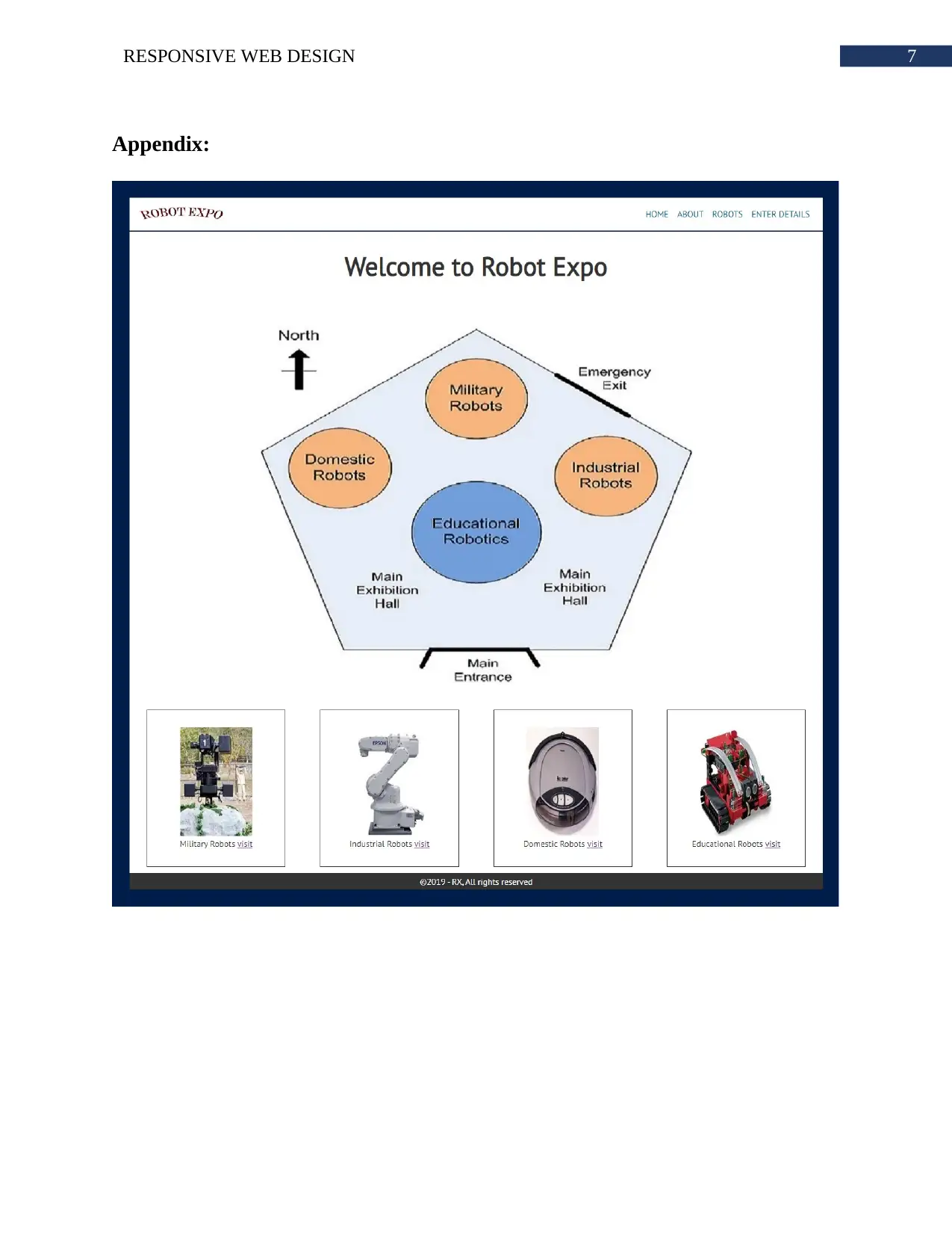
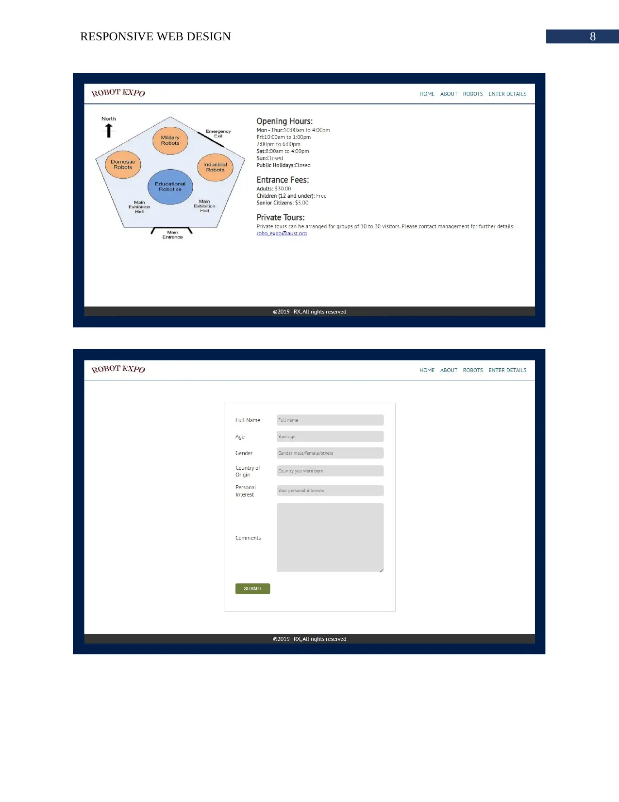
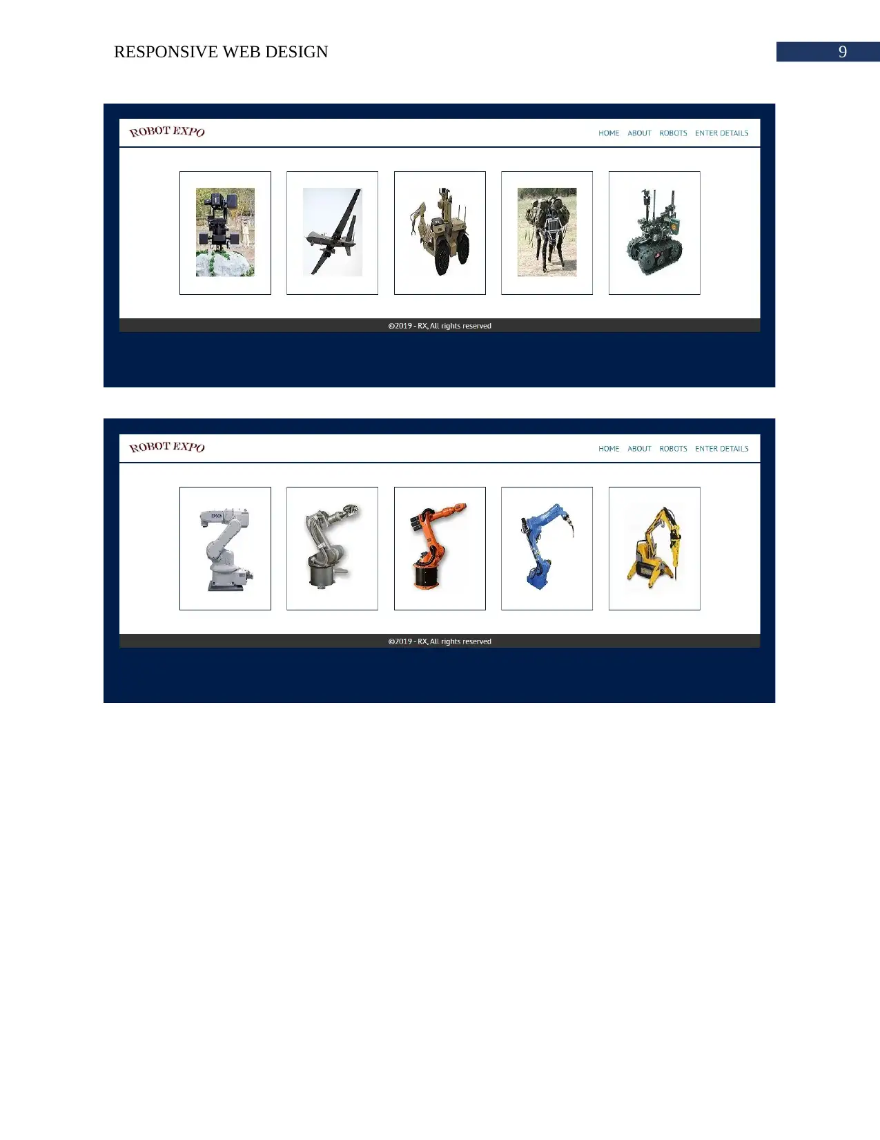
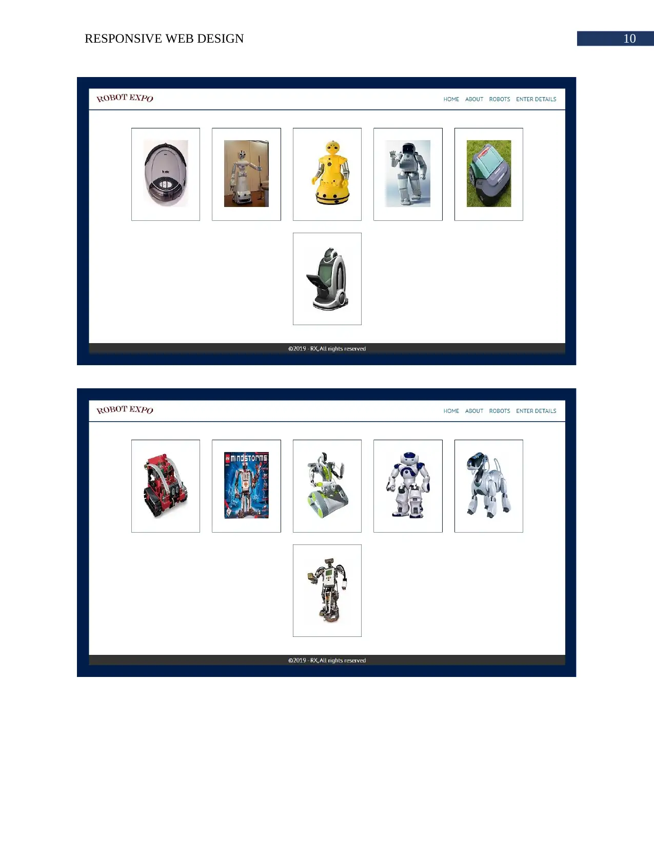
This document presents a student's portfolio for a Responsive Web Design assignment, specifically focusing on the creation of a website for the Robot Expo exhibition. The portfolio details the design and implementation of various website elements, including the home page, about page, and different robotics sections. The website utilizes responsive design principles to ensure optimal viewing across various devices. The portfolio includes the use of a main menu with dropdown functionality, image mapping for navigation, and responsive images. It also covers the use of color schemes, alt attributes, and the implementation of animations. The portfolio also addresses the use of forms and their responsiveness, alongside testing across various browsers and devices. The project utilizes resources such as images and business details provided in a ZIP file. The student has successfully completed all the requirements of the assignment and delivered a high-quality website design.
tabler-icon-diamond-filled.svg

Contribute Materials

Your contribution can guide someone’s learning journey. Share your documents today.
Document Page
Running head: RESPONSIVE WEB DESIGN
Responsive Web Design
Name of the Student
Name of the University
Author’s note:
tabler-icon-diamond-filled.svg

Secure Best Marks with AI Grader

Need help grading? Try our AI Grader for instant feedback on your assignments.
Document Page
1RESPONSIVE WEB DESIGN
Table of Contents
Portfolio 2.1:....................................................................................................................................2
Portfolio 2.2:....................................................................................................................................3
Portfolio 2.3:....................................................................................................................................3
Portfolio 2.4:....................................................................................................................................4
Portfolio 2.5:....................................................................................................................................4
Portfolio 2.6:....................................................................................................................................4
Bibliography:...................................................................................................................................6
Appendix:........................................................................................................................................7
Document Page
2RESPONSIVE WEB DESIGN
Portfolio 2.1:
The home page has a main menu. Main menu has one logo and three links. These links
refers to home page itself and two other sections of the website. The products link is a dropdown
menu. After hovering over products link, the list of sub links will appear. These sub links refers
to domestic, industrial, military and educational robotics page. The home page has a welcome
note stating ‘Welcome to Exhibition Our Hall’. Then the layout of the exhibition hall is provided
by following the heading Exhibition Hall Layout. An image has been used for showing the
layout of the hall. Image mapping has been used for linking different robotics page to the image.
Clicking upon individual robotics section name on the image will redirect the user to that image.
Next section shows the same category of robots available for exhibition. This time, different
images of robots of a specific category has been used for individual robotics section. Text
denoting the name of the section robot has also been used for usability. These images or texts
does not have a link to different robotics section. Finally, a footer is present in the home page
that shows copyright text.
The next section is the about page. In this page same menu and footer has been used. This
page shares all the information required for visiting robot expo. The main body of the page starts
with a heading stating Exhibition Hall Details. Then the same image layout has been used. At the
left side of the body. At the right side, all the information has been provided in the form of text.
Under each heading relevant information is placed. The first heading is opening hours. In this
section information Mon - Thur : 10:00am to 4:00pm, Fri : 10:00am to, 1:00pm, 2:00pm to
6:00pm, Sat: 8:00am to 4:00pm, sun: Closed and Public Holidays: Closed is provided. The
next heading is entrance fees. Here adult, children and senior citizen entrance fees has been
provided. The organization also accept private tour request. The about page provides all the
Document Page
3RESPONSIVE WEB DESIGN
information regarding private tour such as timing and contact method. The email address of
management is also present in this section.
All four of the robotics page has same layout. The images of the robots are visible within
the screen. This images are clickable. Some dummy text will appear at the below of image if it is
clicked. Images appear four per row. If the images are opened in small device it will open as one
per row. Images are responsive. The size of image adjusts based on the screen size.
Portfolio 2.2:
In order to increase visibility of the website, the major factor to consider is colour
scheme. The background and text colour must have some contrast so that texts can be read
easily. Generally, texts are of dark colours and background is of light colours. The standard
amount of white spaces will be used between the images so that each can be separated from each
other. The title and alt attributes will be used for all the img tag. Name of the image with
extension will be used in alt attribute and for title only image name will be used. For every row
only four image will be placed for large screen and for small screen only one image per row will
be used. The menu links will have white colours for both normal and visited state.
Mr./Ms. ______ has successfully completed the assigned task _______ within deadline.
He/she has helped in developing this website. His/her quality of work is remarkable.
Portfolio 2.3:
The revised flowchart includes links to each robotics page through clicking on images
provided for each category at bottom of home page. The new revised flow chart includes all the
main page links within the main menu. Each page within this website will be linked to main
menu. This way the user will be able to move to any page easily. The links within the main menu
tabler-icon-diamond-filled.svg

Secure Best Marks with AI Grader

Need help grading? Try our AI Grader for instant feedback on your assignments.
Document Page
4RESPONSIVE WEB DESIGN
will trigger an animation on hover. The logo will not have any hiver animation. All the animation
will have some duration implemented using transition property.
Portfolio 2.4:
All the information available within BUSINESS_HOURS.TXT file is placed within the
about page. The business hours, entry fees and contact email address is in about page. The timing
of opening hours is present as well as entry fee is shown based on the age category. Images
available in PRORESOURCE.ZIP is used throughout the website. The layout image used in
home and about page. The robots image is also present all the sections.
Portfolio 2.5:
The forms to be used in the website will also be responsive. All the contact forms has
label and input fields. Each label will denote one specific input fields. For accepting large input
details, textarea html input tag will be used. Each form input will have a placeholder. No select
tag will be used. Every data will be provided by the user by typing the value in. Form will have a
submit button which will submit the form to the server. However, for this iteration there is no
need to include server side coding. The form will accept information such as name, age, gender,
country of origin, personal interest and comments. For collecting comments data, textarea html
tag will be used. The form will verify if any input field is not empty.
Portfolio 2.6:
The mock-ups open at every major browser like internet explorer, Google chrome,
Mozilla Firefox, Safari and more. The responsive ness of the website is working great for all
major browsers. The website is tested in mobile browser also and the result was as desired.
Document Page
5RESPONSIVE WEB DESIGN
The results implies that website has good design and interactions. The texts can be clearly
seen because contrast between text colour and background is very good. The images are clearly
visible. Pixels of the image does not get hazy in any screen size. The feedback of form
submission could have been beneficial to improve the project. At the time of developing the
project, it was assumed that different type people such as experienced, inexperienced, old or
techy people will be using the website in different browsers. The website will be accessed from
different mobile devices with different OS. The website should look good in every browser. At
all times, the user must get premium quality user interface and user interaction.
Document Page
6RESPONSIVE WEB DESIGN
Bibliography:
Bernacki, J., Błażejczyk, I., Indyka-Piasecka, A., Kopel, M., Kukla, E. and Trawiński, B., 2016,
March. Responsive web design: testing usability of mobile web applications. In Asian
Conference on Intelligent Information and Database Systems (pp. 257-269). Springer, Berlin,
Heidelberg.
Cletus, W.D., Kakandar, A. and Paul, C.N., 2017. Responsive Web Design Frameworks: A
Review. Int. J. Sci. Res. Comput. Sci. Eng. Inf. Technol, 4(5), pp.132-136.
Krzewińska, J., Indyka-Piasecka, A., Kopel, M., Kukla, E., Telec, Z. and Trawiński, B., 2018,
March. Usability testing of a responsive web system for a school for disabled children. In Asian
Conference on Intelligent Information and Database Systems (pp. 705-716). Springer, Cham.
Wiener, L., Ekholm, T. and Haller, P., 2017, April. Modular Responsive Web Design: An
Experience Report. In Companion to the first International Conference on the Art, Science and
Engineering of Programming (pp. 1-6).
tabler-icon-diamond-filled.svg

Paraphrase This Document

Need a fresh take? Get an instant paraphrase of this document with our AI Paraphraser
Document Page
7RESPONSIVE WEB DESIGN
Appendix:
Document Page
8RESPONSIVE WEB DESIGN
Document Page
9RESPONSIVE WEB DESIGN
tabler-icon-diamond-filled.svg

Secure Best Marks with AI Grader

Need help grading? Try our AI Grader for instant feedback on your assignments.
Document Page
10RESPONSIVE WEB DESIGN
chevron_up_icon
1 out of 11
circle_padding
hide_on_mobile
zoom_out_icon
logo.png

Your All-in-One AI-Powered Toolkit for Academic Success.

Available 24*7 on WhatsApp / Email

[object Object]