Responsive Web Design: In-Depth Evaluation of a Website Report
VerifiedAdded on 2021/05/30
|20
|3825
|112
Report
AI Summary
This report provides an in-depth evaluation of a website's responsive web design, focusing on its adaptability across various devices and browsers. The report begins with an introduction to responsive web design (RWD) and its underlying principles, including fluid grids, flexible images, and media queries. It then outlines the purpose and objectives of the evaluation, which include assessing the website's interactive and design aspects using Google Chrome's device simulator. The nominated website, nationalgeographic.com.au, is analyzed in detail, examining its features, positive and negative aspects, and overall responsiveness. The evaluation covers different device views, such as desktops, tablets, and mobile phones in both landscape and portrait orientations. The report concludes with recommendations for improvement and summarizes the findings, highlighting the importance of responsive design in ensuring a consistent and user-friendly experience across all devices. The report also includes the perspective of invited reviewers, and provides a comprehensive overview of the website's responsiveness, offering valuable insights for web developers and designers.
Running head: RESPONSIVE WEB DESIGN 1
Responsive Web Design:
In-Depth Evaluation of a Website
[Student Name]
[University Name]
Responsive Web Design:
In-Depth Evaluation of a Website
[Student Name]
[University Name]
Paraphrase This Document
Need a fresh take? Get an instant paraphrase of this document with our AI Paraphraser
2RESPONSIVE WEB DESIGN
Table of Contents
Introduction......................................................................................................................................3
Purpose.........................................................................................................................................4
Objective......................................................................................................................................4
Discussion........................................................................................................................................5
Responsive web design (RWD) and development principles......................................................5
Website review using Google Chrome’s device simulator......................................................5
The nominated website identification......................................................................................9
The main feature or features of the website...........................................................................11
Positive and negative aspects of the website..........................................................................12
Invited two other persons to review the nominated website..................................................14
Chrome device simulator tool................................................................................................16
Recommendation...........................................................................................................................17
Conclusion.....................................................................................................................................18
Reference.......................................................................................................................................19
3RESPONSIVE WEB DESIGN
Introduction
In the current technological era there is various use of computing devices which are used by different
people to access the websites.
However the websites designed require to be accessible and fitting in any of the devices which range
from the computers to mobile devices, more over these devices uses various types of browsers and
therefore a website is said to be responsive website if it is accessible by the devices through any of
the browsers.
The responsive websites are developed through the use of responsive web designs to ensure all
website features are responsive irrespective of the device or web browser that is used.
Therefore responsive website design is the website development approach that enables the designers
to create the website with dynamic change features that enable the website to keep on changing
depending on the various screen sizes, platform used and the orientation that is used in viewing of the
website designed.
Therefore the responsive website will be used to solve the problems associated to accessibility and
use of the website by various devices used by the website users which include the smart phones,
tablets, laptop computers and also the desktop devices.
In the designing of the responsive website there is use of below major elements which includes:
i. The fluid grids concepts call: This is used to resizing of the web pages elements in
relative values like percentages instead of using the pixel and points.
ii. Use of Flexible images: This is where the web page images are resized using relative
units in order to prevent them being displayed outside the containers elements.
iii. Use of media query: This is used to allow the use of various CSS style rules by
setting the browser’s width.
iv. Break-points: The break-points are the elements that are used in determination of the site
layouts appearance where one design is used above the break-points and the others
designs below the break points where they are used depending with the browser’s widths.
v. HTML and CSS languages: These two languages are used in the determination of the
webpage’s layouts where the css is used in changing of the web pages appearances and
⊘ This is a preview!⊘
Do you want full access?
Subscribe today to unlock all pages.
Trusted by 1+ million students worldwide
4RESPONSIVE WEB DESIGN
this enable the developer to develop only one code base that will eventually support all
users having different sizes viewport devices which can be either computer, wide screens
monitor, desktop, laptop, tablet and mobile phone devices of any size.
For every responsive website the elements in the web page keep on reshuffling as the view port of
the used device either grow or shrink where the website can have three columns in the desktops ,two
columns on the tablets and one column in a Smartphone and also uses the proportion grids in re-
arrangement of the contents and webpage elements..
Below are the purpose and objective of this report.
Purpose
In this report there will be an evaluation of the http://www.nationalgeoraphicic.com.au/ website
to test its responsiveness which will entail the following.
i. Analyzing the website interactive aspects.
In this the website will be tested using the chrome devices simulator to test the interaction of the
various website elements using a variety of devices which includes desktop computer, tablets and
the mobile devices (Gasston,2011).
ii. Analyzing the website design aspects.
In this case the website will be critically analyzed the various design features and their
limitations, and the respective improvement method of the website design will be highlighted
(Freeman,2015).
Objective
The main objective of this website of this report will be to identify the various uses of the
responsive design which includes the following:
i. To make the website development fast through the use of single code base for all
devices.
ii. To make the website maintenance easy and fast where only one code base is updated
instead of many for all devices.
Paraphrase This Document
Need a fresh take? Get an instant paraphrase of this document with our AI Paraphraser
5RESPONSIVE WEB DESIGN
iii. To make responsive website future proof since through the support of additional
break-point in future.
iv. To enable the website to support any new devices that can be introduced in the
market in the future.
v. To Control a certain website designs to only fit on certain devices and instead support
all devices.
Therefore the responsive website design is applied to make the web page to render successfully
in various devices, platforms, and screen size to ensure the contents, designs and performance
across all the devices is sufficient and thus improves the website usability and user satisfactions
(Gillenwater,2012).
Discussion
Responsive web design (RWD) and development principles
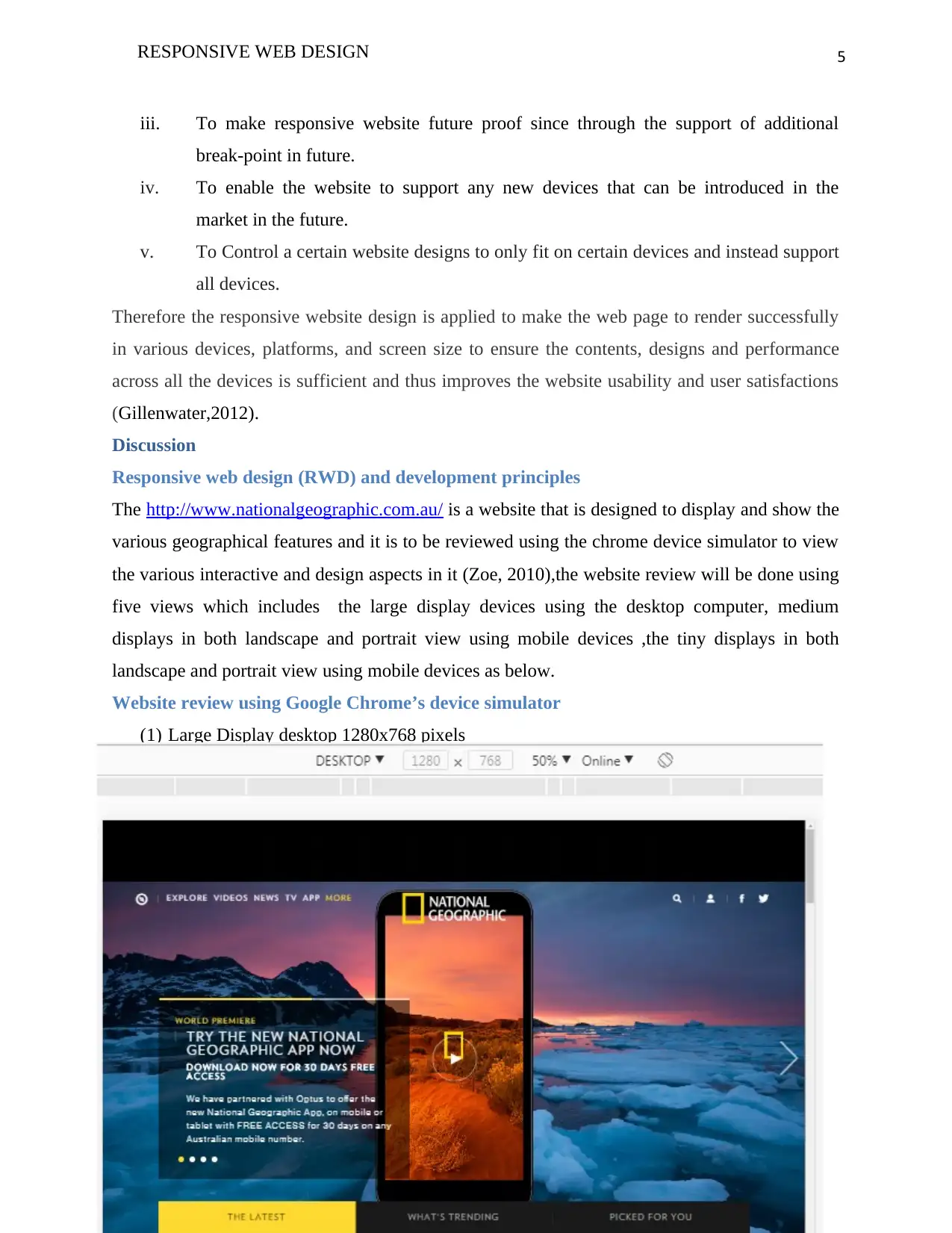
The http://www.nationalgeographic.com.au/ is a website that is designed to display and show the
various geographical features and it is to be reviewed using the chrome device simulator to view
the various interactive and design aspects in it (Zoe, 2010),the website review will be done using
five views which includes the large display devices using the desktop computer, medium
displays in both landscape and portrait view using mobile devices ,the tiny displays in both
landscape and portrait view using mobile devices as below.
Website review using Google Chrome’s device simulator
(1) Large Display desktop 1280x768 pixels
iii. To make responsive website future proof since through the support of additional
break-point in future.
iv. To enable the website to support any new devices that can be introduced in the
market in the future.
v. To Control a certain website designs to only fit on certain devices and instead support
all devices.
Therefore the responsive website design is applied to make the web page to render successfully
in various devices, platforms, and screen size to ensure the contents, designs and performance
across all the devices is sufficient and thus improves the website usability and user satisfactions
(Gillenwater,2012).
Discussion
Responsive web design (RWD) and development principles
The http://www.nationalgeographic.com.au/ is a website that is designed to display and show the
various geographical features and it is to be reviewed using the chrome device simulator to view
the various interactive and design aspects in it (Zoe, 2010),the website review will be done using
five views which includes the large display devices using the desktop computer, medium
displays in both landscape and portrait view using mobile devices ,the tiny displays in both
landscape and portrait view using mobile devices as below.
Website review using Google Chrome’s device simulator
(1) Large Display desktop 1280x768 pixels
6RESPONSIVE WEB DESIGN
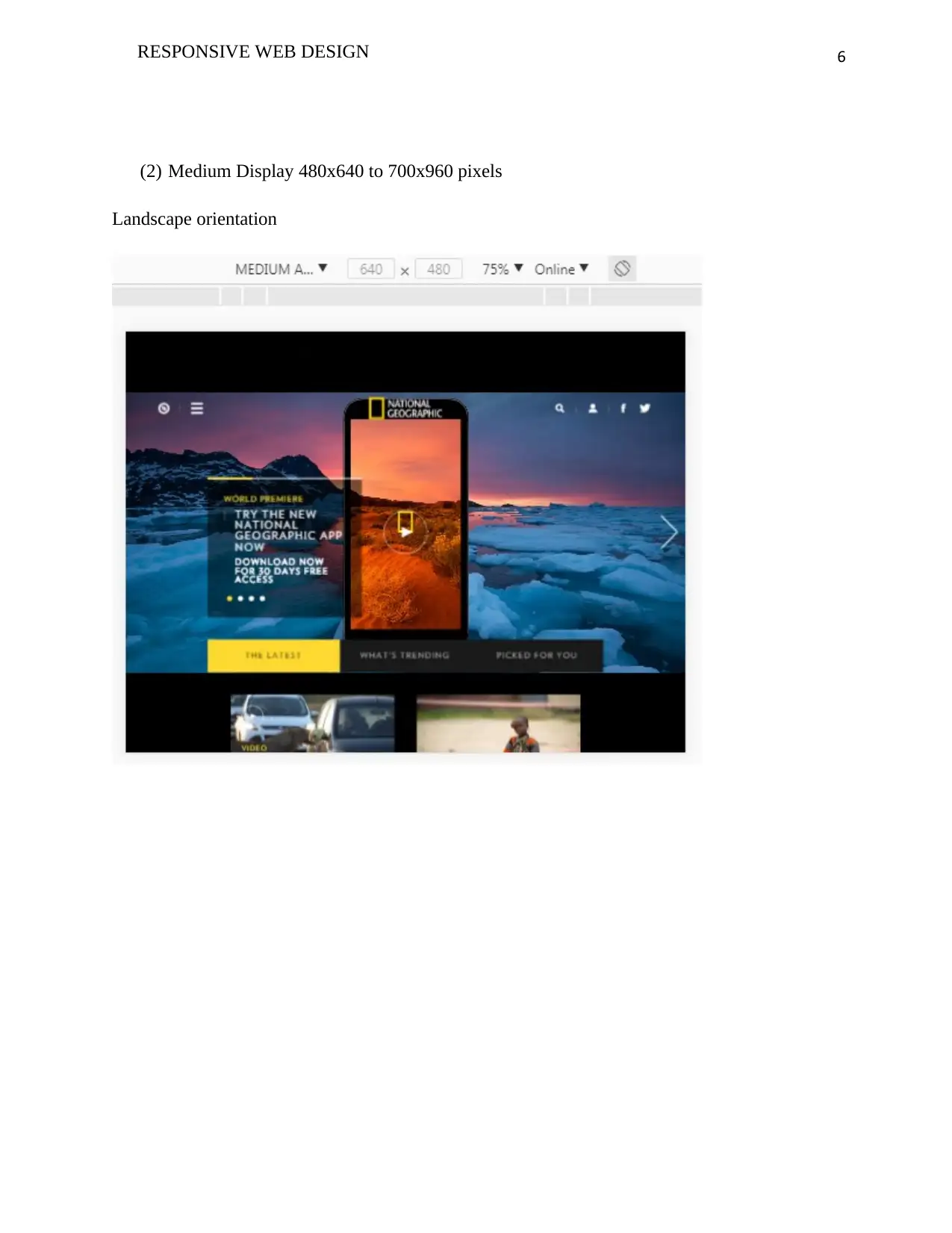
(2) Medium Display 480x640 to 700x960 pixels
Landscape orientation
(2) Medium Display 480x640 to 700x960 pixels
Landscape orientation
⊘ This is a preview!⊘
Do you want full access?
Subscribe today to unlock all pages.
Trusted by 1+ million students worldwide
7RESPONSIVE WEB DESIGN
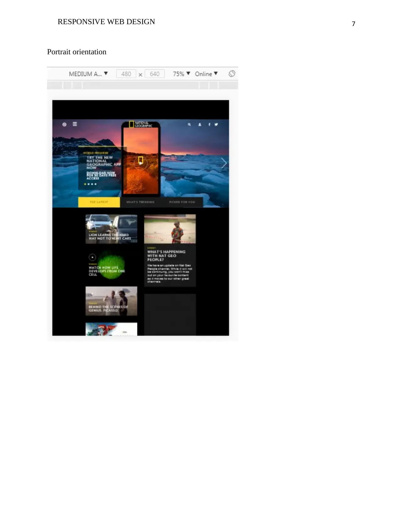
Portrait orientation
Portrait orientation
Paraphrase This Document
Need a fresh take? Get an instant paraphrase of this document with our AI Paraphraser
8RESPONSIVE WEB DESIGN
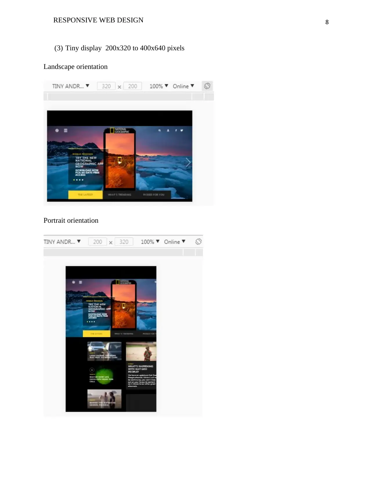
(3) Tiny display 200x320 to 400x640 pixels
Landscape orientation
Portrait orientation
(3) Tiny display 200x320 to 400x640 pixels
Landscape orientation
Portrait orientation
9RESPONSIVE WEB DESIGN
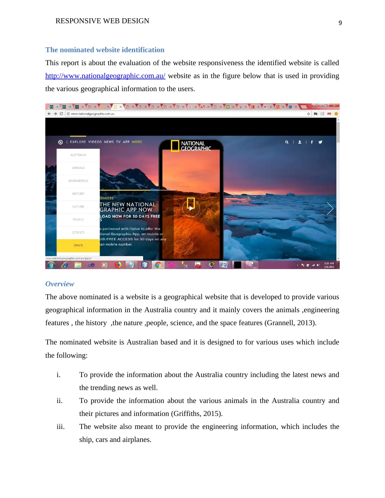
The nominated website identification
This report is about the evaluation of the website responsiveness the identified website is called
http://www.nationalgeographic.com.au/ website as in the figure below that is used in providing
the various geographical information to the users.
Overview
The above nominated is a website is a geographical website that is developed to provide various
geographical information in the Australia country and it mainly covers the animals ,engineering
features , the history ,the nature ,people, science, and the space features (Grannell, 2013).
The nominated website is Australian based and it is designed to for various uses which include
the following:
i. To provide the information about the Australia country including the latest news and
the trending news as well.
ii. To provide the information about the various animals in the Australia country and
their pictures and information (Griffiths, 2015).
iii. The website also meant to provide the engineering information, which includes the
ship, cars and airplanes.
⊘ This is a preview!⊘
Do you want full access?
Subscribe today to unlock all pages.
Trusted by 1+ million students worldwide
10RESPONSIVE WEB DESIGN
iv. The website also is used to provide the information about the historical information
like the killing of Hitler.
v. There is also provision of the nature information which includes the history about
Africa among others.
vi. The website is also used to give the information about the people where it gives their
descriptions and the places that they leave.
vii. The website provides the information about the various scientific facts like the way
the universe works like the asteroid and the acidic life.
viii. In the website has the travel information that gives the explorative information about
the societies and various places like the lost china pyramids and the ASIAN tsunami.
ix. In this website there is also provision of the various videos to provide more
information about the country.
x. The website also is used to provide the information about the various TV shows and
the TV guides
xi. Finally the website is used to provide the information about the upcoming events and
the winners of the various competitions held.
Website Description
The nominated website can be described in various aspects since there was a specific aim and
purpose of it being developed and how it is run as follows:
i. The website was developed in Australia for the Geographical features advertisements.
ii. This website was mainly developed targeting the residence of the Australia country
and the tourists who would like to pay visit to the country.
iii. The website can be accessed using various devices which include the mobile devices,
computer and the tablets without many issues.
iv. The website however is designed to be accessible using various web browsers which
includes the Google chrome, Mozilla Firefox, safari browser, opera browsers and the
internet explorer.
v. However the website receives a lot of traffic from the various mobile and computer
devices users since they are both supported.
Paraphrase This Document
Need a fresh take? Get an instant paraphrase of this document with our AI Paraphraser
11RESPONSIVE WEB DESIGN
vi. The nominated website however has good qualities like the use of the very attractive
color scheme combination.
vii. One of the poor features of the website is long loading time which is attributed to
much use of images that takes long to be loaded to the devices being used.
The main features of the website
The above nominated website has various features as they are identified below.
i. Integration of the social media.
The nominated website has good quality features where in the footer the social media links had
been integrated which includes the Twitter,Facebook,Youtube,and Tumblr this is just to allow
the visitors to comment or suggest some things on social media platform (Holzschlag, 2014). .
ii. It is easy to read.
In this the text font used is easily read and no text is hidden by the images or the background
colors ,however the color scheme used is colorful and very attractive to the eyes of the users
(Clarke,2015).
iii. It has navigation menu.
The website information is well placed and the users require navigating from the web pages
using the menus and they are easy to use where the menus are all grouped in one location for
easy navigation by the visitors of the website (Lie,2015).
iv. Comfortable to view.
The users are able to view website using the various websites where the web pages do not
require to be scrolled left or right side.
v. Quite high loading speed.
The website while being accessed by the various users’ devices is they tend to be slow in the
initial load time, this is due to much use of images and graphics.
vi. Good browsers compatibility.
12RESPONSIVE WEB DESIGN
The web browser tend to be compatible to all the browsers that are used by the users regardless
of the device that they are using ,among the browsers are the Mozilla Firefox, Opera-mini,
internet explorer and the Google chrome (Bos,2015).
vii. Has the internal links.
Another feature in the website is the use of the links within the web pages and these links are
used to link the other web pages or the images in the website which as a result make the
navigation even better and efficient.
viii. It has the search bar.
The website has the search bar which enables the visitors to easily enter the content they want to
search, this is done by entering the key words of the content or the information they want to
search about.
ix. It has the image slider.
The website has the images slides which are accompanied with some description of the images,
this give the visitor quick gist of what the website is all about.
Positive and negative aspects of the website
The nominated website has various aspects that relate to the interaction and the design where
some of them are negative and others are positive aspects as discussed below.
Positive website aspects
i. Top navigation menu.
The website has the navigation menu that is that is placed on the top part o the website and this
enables the users to navigate without much struggle from one web page to the other.
ii. Clear and readable text content.
The website has another good aspect such that all the contents are clear and legible by the user,
this is due to the use of the good text font, color and size and also use of good background
images and color schemes.
⊘ This is a preview!⊘
Do you want full access?
Subscribe today to unlock all pages.
Trusted by 1+ million students worldwide
1 out of 20
Related Documents


Your All-in-One AI-Powered Toolkit for Academic Success.
+13062052269
info@desklib.com
Available 24*7 on WhatsApp / Email
![[object Object]](/_next/static/media/star-bottom.7253800d.svg)
Unlock your academic potential
Copyright © 2020–2026 A2Z Services. All Rights Reserved. Developed and managed by ZUCOL.