RStudio Data Visualization of Energy Consumption Survey Data

Verified

Added on  2022/11/18

|8
|1394
|384
Homework Assignment
AI Summary
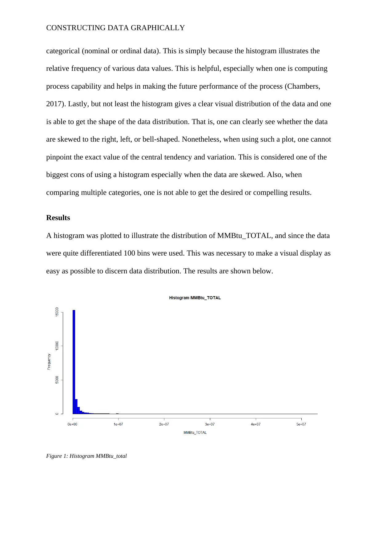
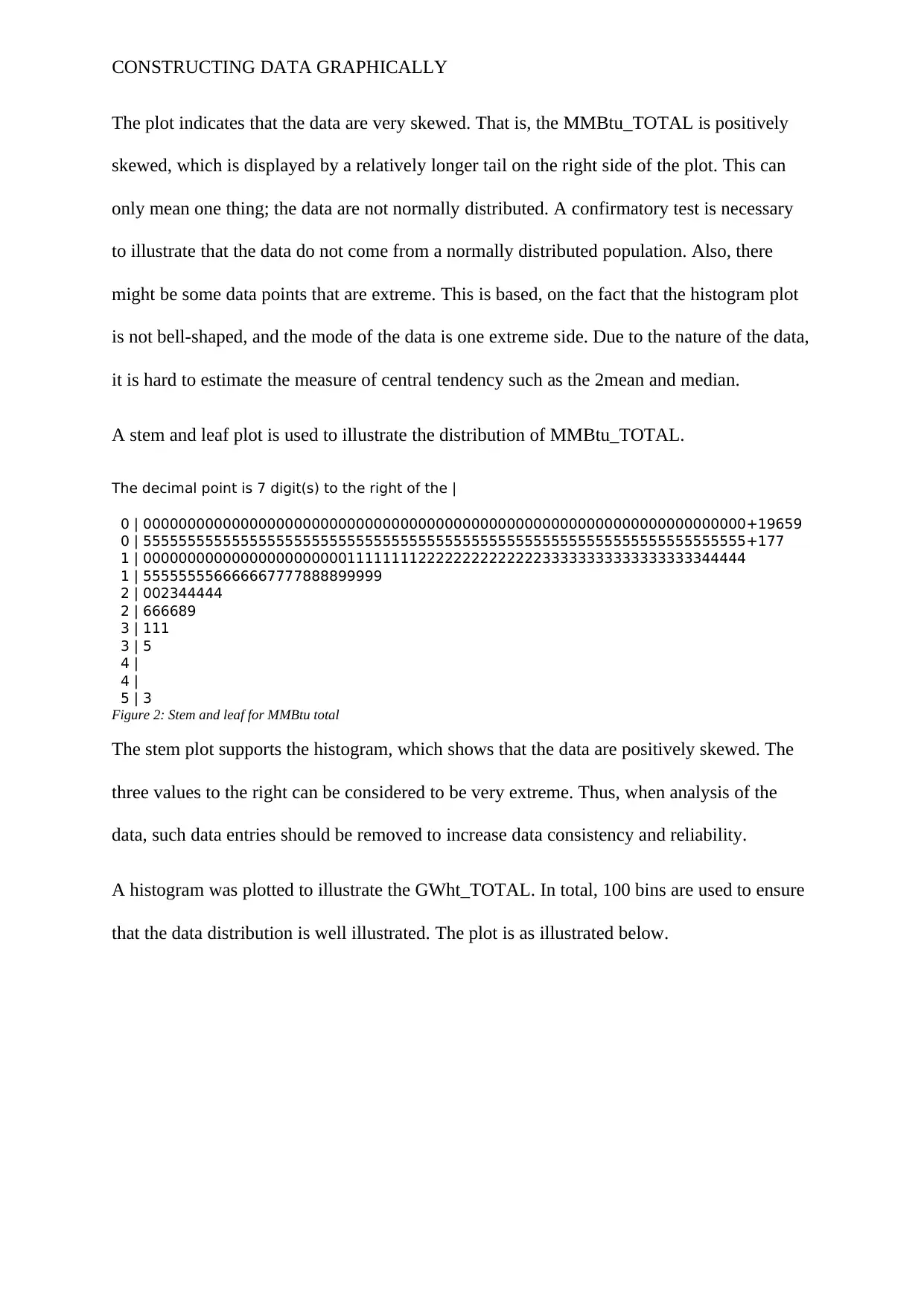
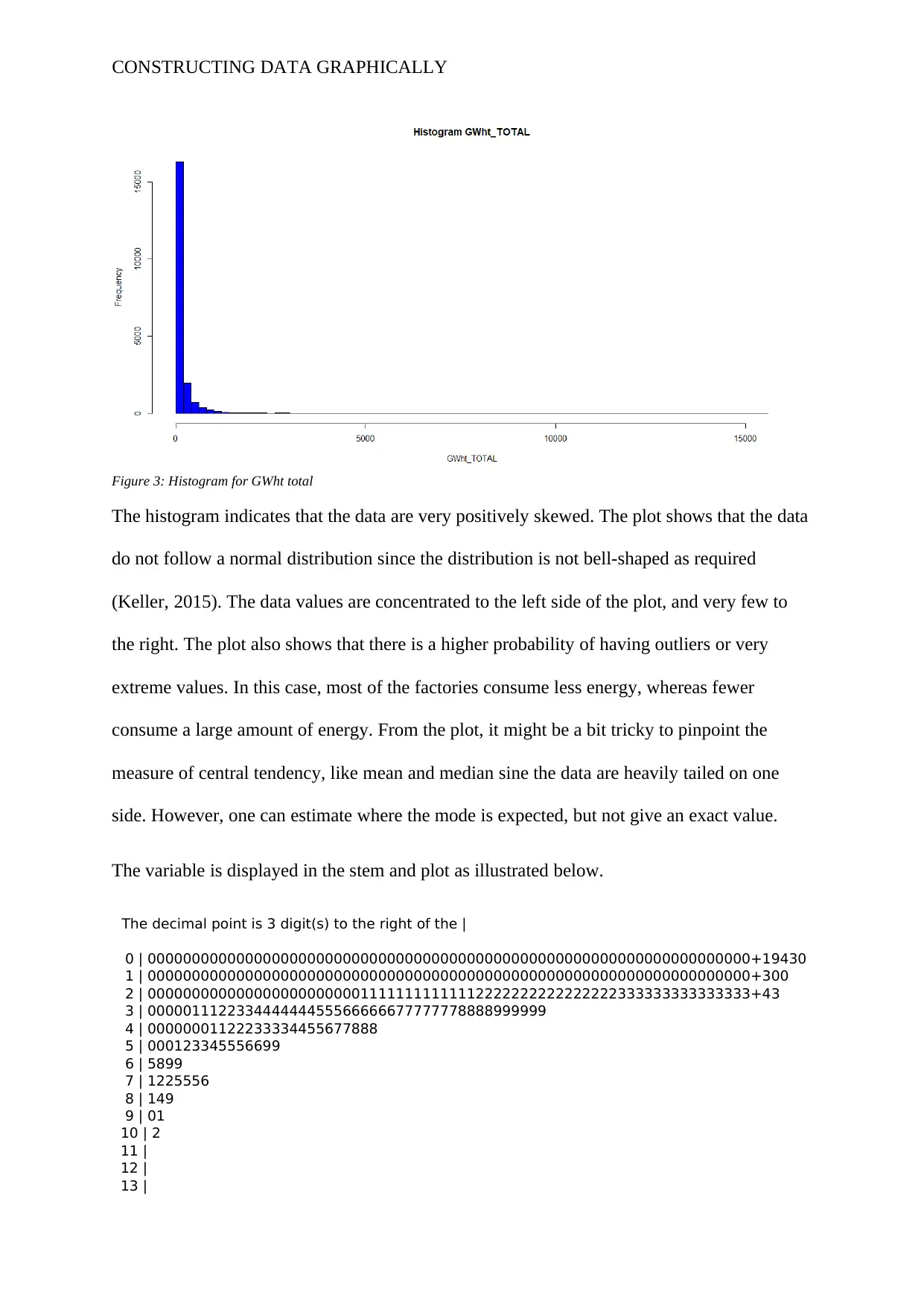
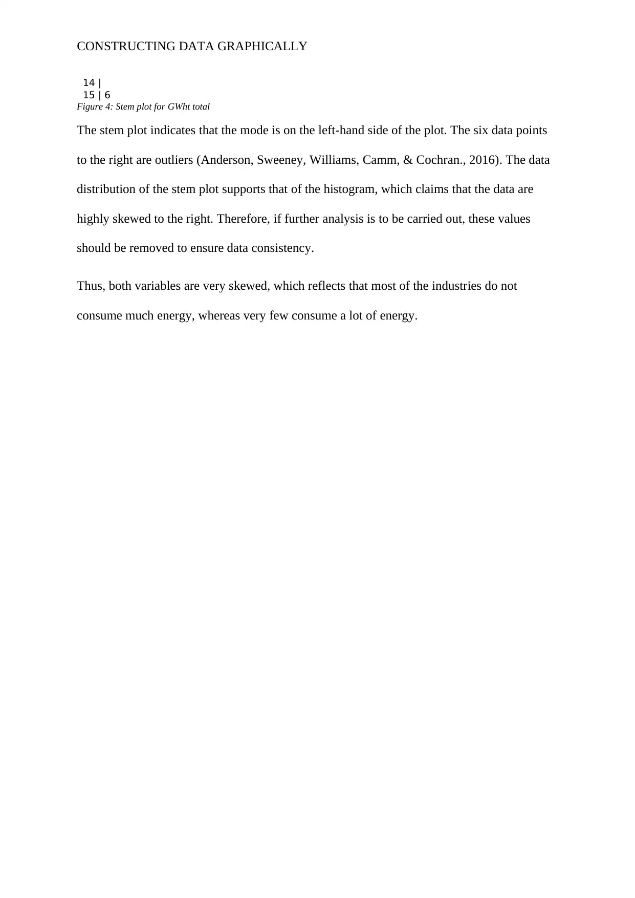
This assignment analyzes energy consumption data from the Manufacturing, Energy Consumption Survey (MECS) using RStudio. The study focuses on two variables: GWht_TOTAL and MMBtu_TOTAL, employing histograms and stem-and-leaf plots to visualize their distributions. The analysis reveals that both variables are positively skewed, indicating that the data are not normally distributed and that the majority of industries consume relatively less energy, while a few consume a significant amount. The assignment provides a detailed graphical representation of the data, identifies potential outliers, and discusses the implications of the data's skewed nature on the measures of central tendency. The R code used for generating the plots is also included in the appendix.
Document Page
Running head: CONSTRUCTING DATA GRAPHICALLY
RStudio/Construct Data Graphically
Name:
Institution:
tabler-icon-diamond-filled.svg

Paraphrase This Document

Need a fresh take? Get an instant paraphrase of this document with our AI Paraphraser
Document Page
CONSTRUCTING DATA GRAPHICALLY
Introduction
The data used was from a survey on Manufacturing, Energy Consumption Survey (MECS)
except the Petroleum Refining Industry by the MECS region. This was a pool of a large
sample, which was ideal in illustrating the population consumptions of energy characteristics
in the US. The survey represents about 97-98% of the manufacturing payroll (U.S. Energy
Information). The underlying assumption of energy consumption was that; i) the energy
produced was used off one-shot, and ii) and the production on-site is consumed first, then
feedstock and lastly the fuel.
The survey applied the PPS (Stratified Probability proportionate to Size) to obtain the sample.
This approach is ideal as it ensures that all the groups are represented and no biased is
introduced when collecting the data. The collected survey data are important in estimating the
amount of energy consumed within certain industries and such information can help come up
with a strategic plan to meet the demand.
In total there are approximately fifty industry groups according to the North American
Industry Classification System (NAICS). The variables used, in this case, are the
GWht_TOTAL and the Metric Million British Thermal Unit total (MMBtu_TOTAL). These
two variables will be analyzed to understand how they are distributed. Only descriptive
analysis using a graphical approach was carried out for these two numerical variables.
Method
In this case, the research will explore the distribution of numerical data. In particular, the
histogram and step plot (stem and leaf) are used to illustrate the distribution of such
numerical data. When one has a large pool of data that has a small numerical difference, it
becomes quite hard to interpret, but when a histogram is used it is easy to interpret. That is,
the for numerical data, a histogram gives a better visual than bar plot, which is ideal for
Document Page
CONSTRUCTING DATA GRAPHICALLY
categorical (nominal or ordinal data). This is simply because the histogram illustrates the
relative frequency of various data values. This is helpful, especially when one is computing
process capability and helps in making the future performance of the process (Chambers,
2017). Lastly, but not least the histogram gives a clear visual distribution of the data and one
is able to get the shape of the data distribution. That is, one can clearly see whether the data
are skewed to the right, left, or bell-shaped. Nonetheless, when using such a plot, one cannot
pinpoint the exact value of the central tendency and variation. This is considered one of the
biggest cons of using a histogram especially when the data are skewed. Also, when
comparing multiple categories, one is not able to get the desired or compelling results.
Results
A histogram was plotted to illustrate the distribution of MMBtu_TOTAL, and since the data
were quite differentiated 100 bins were used. This was necessary to make a visual display as
easy as possible to discern data distribution. The results are shown below.
Figure 1: Histogram MMBtu_total
Document Page
CONSTRUCTING DATA GRAPHICALLY
The plot indicates that the data are very skewed. That is, the MMBtu_TOTAL is positively
skewed, which is displayed by a relatively longer tail on the right side of the plot. This can
only mean one thing; the data are not normally distributed. A confirmatory test is necessary
to illustrate that the data do not come from a normally distributed population. Also, there
might be some data points that are extreme. This is based, on the fact that the histogram plot
is not bell-shaped, and the mode of the data is one extreme side. Due to the nature of the data,
it is hard to estimate the measure of central tendency such as the 2mean and median.
A stem and leaf plot is used to illustrate the distribution of MMBtu_TOTAL.
The decimal point is 7 digit(s) to the right of the |
0 | 00000000000000000000000000000000000000000000000000000000000000000000+19659
0 | 55555555555555555555555555555555555555555555555555555555555555555555+177
1 | 00000000000000000000000111111112222222222222233333333333333333344444
1 | 555555556666667777888899999
2 | 002344444
2 | 666689
3 | 111
3 | 5
4 |
4 |
5 | 3
Figure 2: Stem and leaf for MMBtu total
The stem plot supports the histogram, which shows that the data are positively skewed. The
three values to the right can be considered to be very extreme. Thus, when analysis of the
data, such data entries should be removed to increase data consistency and reliability.
A histogram was plotted to illustrate the GWht_TOTAL. In total, 100 bins are used to ensure
that the data distribution is well illustrated. The plot is as illustrated below.
tabler-icon-diamond-filled.svg

Paraphrase This Document

Need a fresh take? Get an instant paraphrase of this document with our AI Paraphraser
Document Page
CONSTRUCTING DATA GRAPHICALLY
Figure 3: Histogram for GWht total
The histogram indicates that the data are very positively skewed. The plot shows that the data
do not follow a normal distribution since the distribution is not bell-shaped as required
(Keller, 2015). The data values are concentrated to the left side of the plot, and very few to
the right. The plot also shows that there is a higher probability of having outliers or very
extreme values. In this case, most of the factories consume less energy, whereas fewer
consume a large amount of energy. From the plot, it might be a bit tricky to pinpoint the
measure of central tendency, like mean and median sine the data are heavily tailed on one
side. However, one can estimate where the mode is expected, but not give an exact value.
The variable is displayed in the stem and plot as illustrated below.
The decimal point is 3 digit(s) to the right of the |
0 | 00000000000000000000000000000000000000000000000000000000000000000000+19430
1 | 00000000000000000000000000000000000000000000000000000000000000000000+300
2 | 00000000000000000000000011111111111112222222222222222333333333333333+43
3 | 000001112233444444455566666677777778888999999
4 | 00000001122233334455677888
5 | 000123345556699
6 | 5899
7 | 1225556
8 | 149
9 | 01
10 | 2
11 |
12 |
13 |
Document Page
CONSTRUCTING DATA GRAPHICALLY
14 |
15 | 6
Figure 4: Stem plot for GWht total
The stem plot indicates that the mode is on the left-hand side of the plot. The six data points
to the right are outliers (Anderson, Sweeney, Williams, Camm, & Cochran., 2016). The data
distribution of the stem plot supports that of the histogram, which claims that the data are
highly skewed to the right. Therefore, if further analysis is to be carried out, these values
should be removed to ensure data consistency.
Thus, both variables are very skewed, which reflects that most of the industries do not
consume much energy, whereas very few consume a lot of energy.
Document Page
CONSTRUCTING DATA GRAPHICALLY
References
Anderson, D. R., Sweeney, D. J., Williams, T. A., Camm, J. D., & Cochran., J. J. (2016).
Statistics for business & economics (13th ed.). Nelson Education.
Chambers, J. M. (2017). Graphical Methods for Data Analysis: 0. Chapman and Hall/CRC.
Keller, G. (2015). Statistics for Management and Economics, Abbreviated. Cengage
Learning.
tabler-icon-diamond-filled.svg

Paraphrase This Document

Need a fresh take? Get an instant paraphrase of this document with our AI Paraphraser
Document Page
CONSTRUCTING DATA GRAPHICALLY
Appendix
########## developing histogram ######
hist(IndustrialCombEnergy20141$MMBtu_TOTAL,
main="Histogram MMBtu_TOTAL",
xlab="MMBtu_TOTAL",
border="black",
col="blue",100)
#developing step and leaf plot for MMBtu_TOTAL
stem(IndustrialCombEnergy20141$MMBtu_TOTAL)
#Histogram for GWht_TOTAL
hist(IndustrialCombEnergy20141$GWht_TOTAL,
main="Histogram GWht_TOTAL",
xlab="GWht_TOTAL",
border="black",
col="blue",100)
#developing step and leaf plot for GWht_TOTAL
stem(IndustrialCombEnergy20141$GWht_TOTAL)
chevron_up_icon
1 out of 8
circle_padding
hide_on_mobile
zoom_out_icon
[object Object]