Sales Data Analysis, Data Cleaning and Spotfire Visualization Project

Verified

Added on  2020/04/01

|5
|890
|56
Project
AI Summary
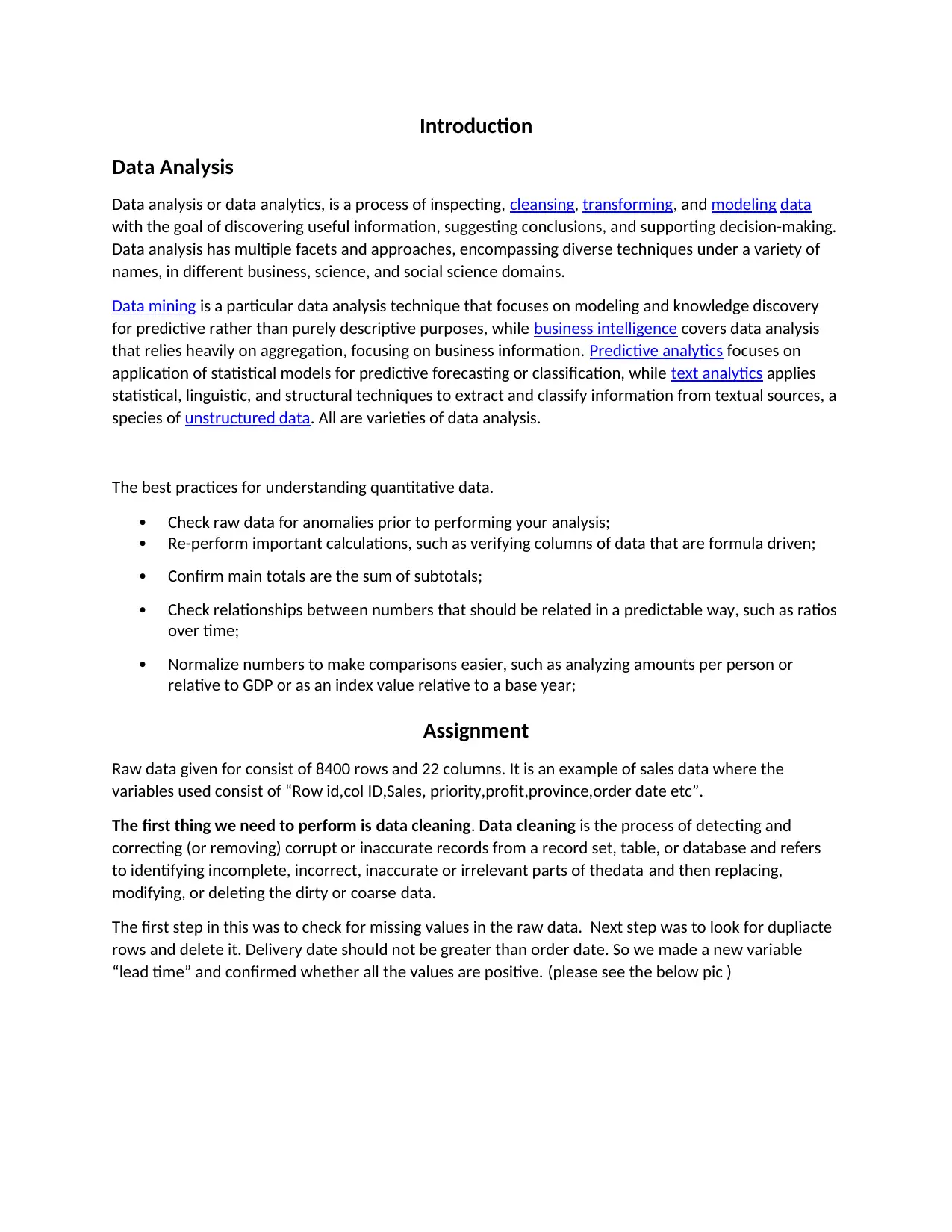
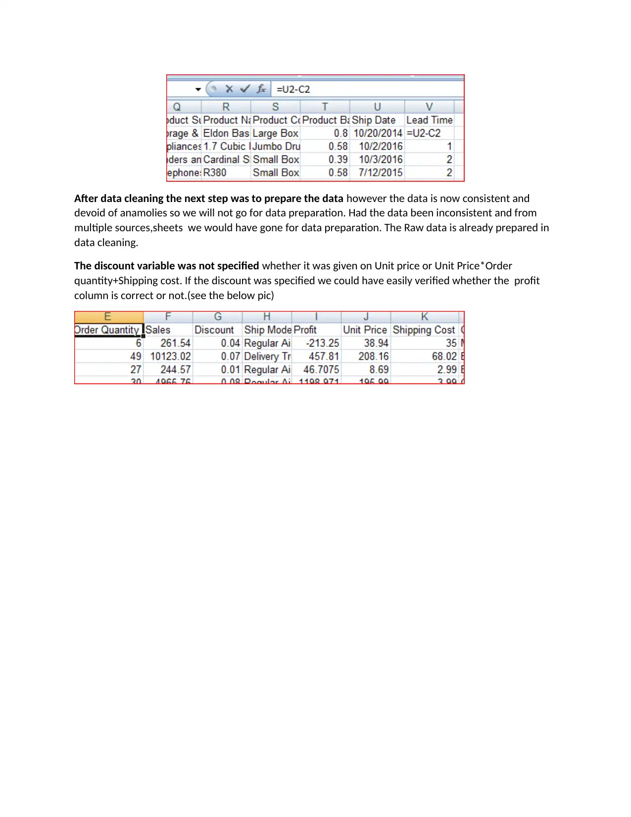
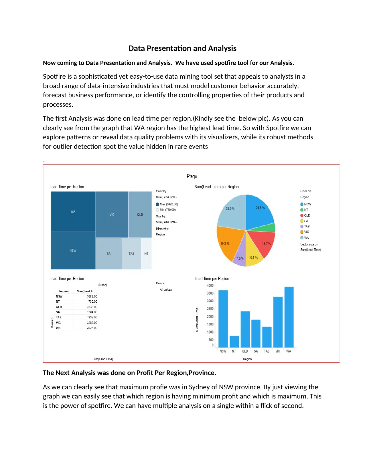
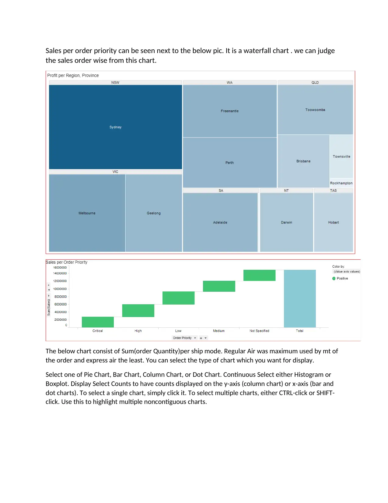
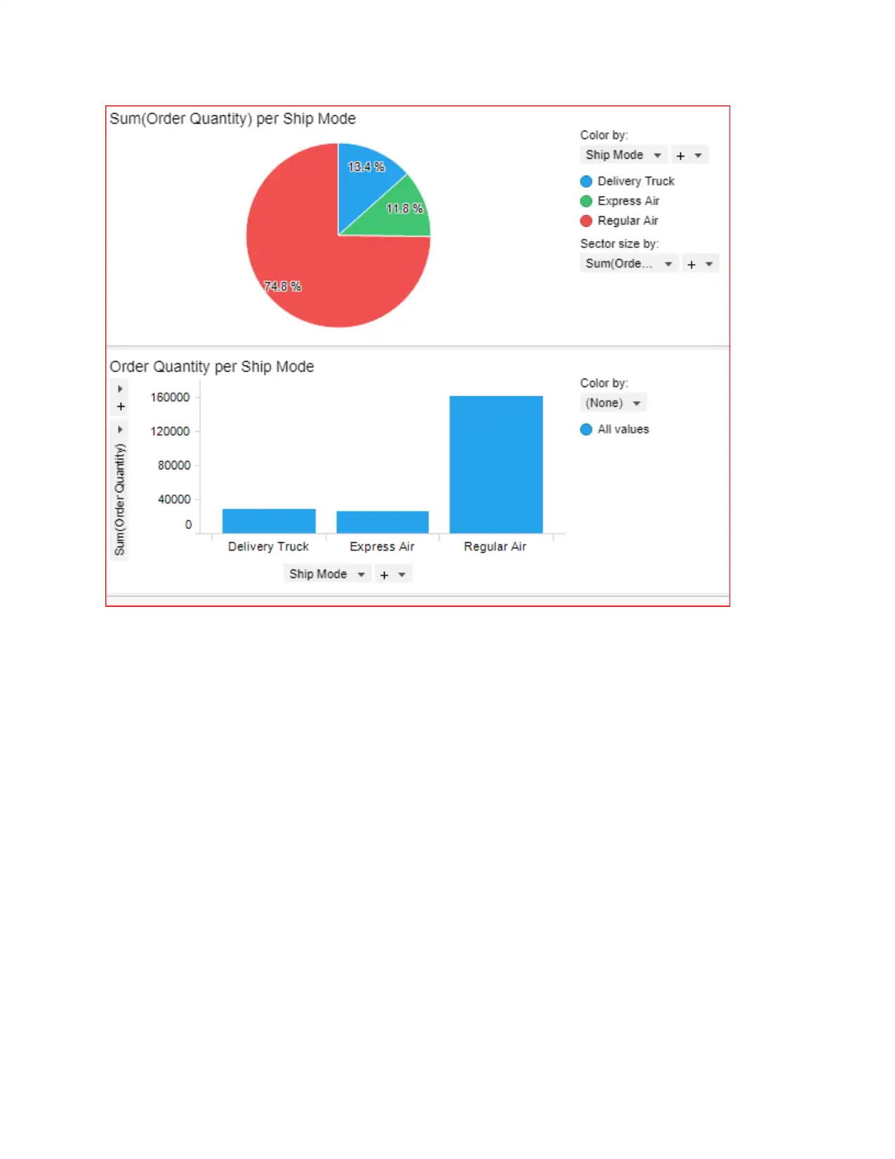
This project presents a comprehensive data analysis of sales data, encompassing data cleaning, preparation, and visualization using Spotfire. The initial steps involve checking for missing values, duplicate rows, and ensuring data consistency, such as validating lead times. The project then moves on to data presentation and analysis, utilizing Spotfire to create visualizations like lead time per region, profit per region and province, sales per order priority, and order quantity per ship mode. The analysis reveals key insights, such as the highest lead time in the WA region and maximum profit in Sydney of NSW province. The project highlights the power of Spotfire in enabling multiple analyses and identifying patterns within the sales data, providing a detailed understanding of the data and its characteristics.
tabler-icon-diamond-filled.svg

Contribute Materials

Your contribution can guide someone’s learning journey. Share your documents today.
Document Page
Introduction
Data Analysis
Data analysis or data analytics, is a process of inspecting, cleansing, transforming, and modeling data
with the goal of discovering useful information, suggesting conclusions, and supporting decision-making.
Data analysis has multiple facets and approaches, encompassing diverse techniques under a variety of
names, in different business, science, and social science domains.
Data mining is a particular data analysis technique that focuses on modeling and knowledge discovery
for predictive rather than purely descriptive purposes, while business intelligence covers data analysis
that relies heavily on aggregation, focusing on business information. Predictive analytics focuses on
application of statistical models for predictive forecasting or classification, while text analytics applies
statistical, linguistic, and structural techniques to extract and classify information from textual sources, a
species of unstructured data. All are varieties of data analysis.
The best practices for understanding quantitative data.
Check raw data for anomalies prior to performing your analysis;
Re-perform important calculations, such as verifying columns of data that are formula driven;
Confirm main totals are the sum of subtotals;
Check relationships between numbers that should be related in a predictable way, such as ratios
over time;
Normalize numbers to make comparisons easier, such as analyzing amounts per person or
relative to GDP or as an index value relative to a base year;
Assignment
Raw data given for consist of 8400 rows and 22 columns. It is an example of sales data where the
variables used consist of “Row id,col ID,Sales, priority,profit,province,order date etc”.
The first thing we need to perform is data cleaning. Data cleaning is the process of detecting and
correcting (or removing) corrupt or inaccurate records from a record set, table, or database and refers
to identifying incomplete, incorrect, inaccurate or irrelevant parts of thedata and then replacing,
modifying, or deleting the dirty or coarse data.
The first step in this was to check for missing values in the raw data. Next step was to look for dupliacte
rows and delete it. Delivery date should not be greater than order date. So we made a new variable
“lead time” and confirmed whether all the values are positive. (please see the below pic )
tabler-icon-diamond-filled.svg

Secure Best Marks with AI Grader

Need help grading? Try our AI Grader for instant feedback on your assignments.
Document Page
After data cleaning the next step was to prepare the data however the data is now consistent and
devoid of anamolies so we will not go for data preparation. Had the data been inconsistent and from
multiple sources,sheets we would have gone for data preparation. The Raw data is already prepared in
data cleaning.
The discount variable was not specified whether it was given on Unit price or Unit Price*Order
quantity+Shipping cost. If the discount was specified we could have easily verified whether the profit
column is correct or not.(see the below pic)
Document Page
Data Presentation and Analysis
Now coming to Data Presentation and Analysis. We have used spotfire tool for our Analysis.
Spotfire is a sophisticated yet easy-to-use data mining tool set that appeals to analysts in a
broad range of data-intensive industries that must model customer behavior accurately,
forecast business performance, or identify the controlling properties of their products and
processes.
The first Analysis was done on lead time per region.(Kindly see the below pic). As you can
clearly see from the graph that WA region has the highest lead time. So with Spotfire we can
explore patterns or reveal data quality problems with its visualizers, while its robust methods
for outlier detection spot the value hidden in rare events
.
The Next Analysis was done on Profit Per Region,Province.
As we can clearly see that maximum profie was in Sydney of NSW province. By just viewing the
graph we can easily see that which region is having minimum profit and which is maximum. This
is the power of spotfire. We can have multiple analysis on a single within a flick of second.
Document Page
Sales per order priority can be seen next to the below pic. It is a waterfall chart . we can judge
the sales order wise from this chart.
The below chart consist of Sum(order Quantity)per ship mode. Regular Air was maximum used by mt of
the order and express air the least. You can select the type of chart which you want for display.
Select one of Pie Chart, Bar Chart, Column Chart, or Dot Chart. Continuous Select either Histogram or
Boxplot. Display Select Counts to have counts displayed on the y-axis (column chart) or x-axis (bar and
dot charts). To select a single chart, simply click it. To select multiple charts, either CTRL-click or SHIFT-
click. Use this to highlight multiple noncontiguous charts.
tabler-icon-diamond-filled.svg

Secure Best Marks with AI Grader

Need help grading? Try our AI Grader for instant feedback on your assignments.
Document Page
chevron_up_icon
1 out of 5
circle_padding
hide_on_mobile
zoom_out_icon
logo.png

Your All-in-One AI-Powered Toolkit for Academic Success.

Available 24*7 on WhatsApp / Email

[object Object]