SIT120 Pirates Restaurant: Front-End Web Development and SDLC
VerifiedAdded on 2022/08/27
|8
|1518
|35
Project
AI Summary
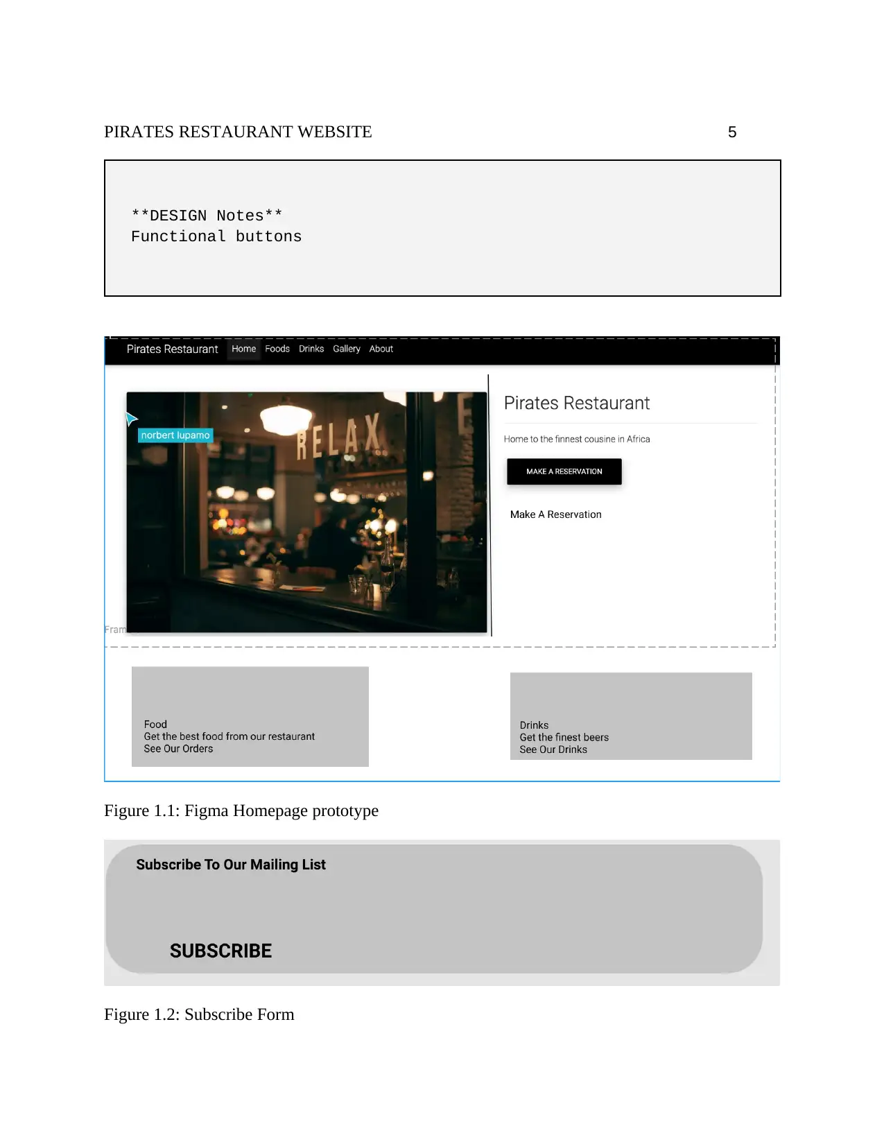
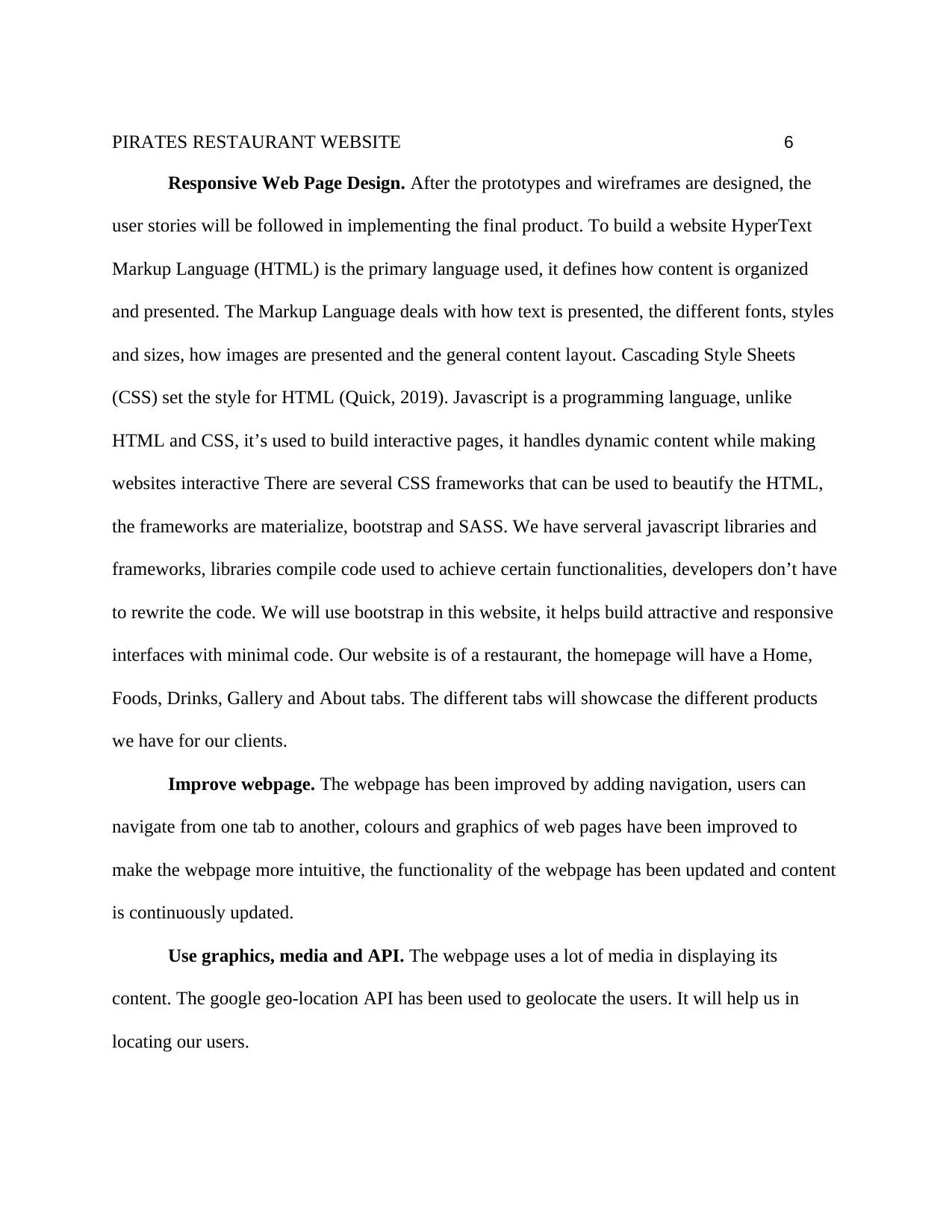
This project outlines the development of a front-end web application for a Pirate's Restaurant website, following the software development life cycle (SDLC). The project covers user stories and UI/UX design using Figma, responsive web design principles, and the implementation of the website using VueJs. It details the use of HTML, CSS, and JavaScript, along with frameworks like Bootstrap, to create an interactive and responsive user interface. The project also incorporates media and the Google Geo-location API to enhance the user experience. The goal is to create a website that is accessible and functional across various devices, providing an intuitive and engaging experience for users. Desklib provides students with access to similar solved assignments and study resources.

Running head: PIRATES RESTAURANT WEBSITE 1
Pirates Restaurant Website
Student’s Name (First Name Middle Name. Last Name)
College Name
Pirates Restaurant Website
Student’s Name (First Name Middle Name. Last Name)
College Name
Paraphrase This Document
Need a fresh take? Get an instant paraphrase of this document with our AI Paraphraser

PIRATES RESTAURANT WEBSITE 2
Abstract
This research covers the development process of a front-end web application, it covers
the entire software development life cycle (SDLC). It covers task 2 and task 3 of the syllabus.
SDLC this includes all the stages involved in shipping software, this range from design, testing
and building (Swerky, 2018). SDLC follows the mantra that failing to plan is actually planning
but to fail. Our SDLC starts with planning, I have created user stories for the User Interface/User
Experience(UI/UX) in this stage. The planning stage involves researching to find the
technologies to use and user interfaces. FIGMA is a tool that will be used to build UI/UX
prototypes (Bracey, 2018). VueJs is the javascript framework used in building this website
application. Responsive web design involves building websites for different screen sizes, the
design should follow the user usage patterns (Wahala, 2011). User stories are just requirements
needed in the software, they contain information on how to implement the different website
functionalities. They show the functionality from the end-users angle (Rouse, 2017).
Responsive Web Pages. Our website can be viewed on different devices, on a laptop
screen, a projected screen, a tablet or a phone screen without losing its functionality (Kirkwood,
2013). Most internet users use mobile phones to surf the web. To make our website responsive
we have employed the use of media queries, fluid grids, minimal use of videos and images that
can resize to smaller sizes and still not lose quality when projected. Media queries are needed to
change websites in line with specific parameters the parameters include screen resolution,
viewport width and content. They’re conditions that are set so that users can still have the best
experience while on different devices, they’re much better than just using Markup and CSS
breakpoints. A user on a phone can have a hamburger menu on their navigation bar whereas a

PIRATES RESTAURANT WEBSITE 3
user on a laptop will have the full navigation bar with no breakpoint. CSS Grids allows you to
design web pages without using floats. Grids are necessary when dividing pages into regions, it
allows for two-dimensional division of pages. To improve our responsiveness we are using a
mobile-first approach, this is designing from a smaller screen, designing a mobile screen before
designing a laptop screen size (Gremillion, 2015). The approach is referred to as progressive
enhancement. A meta viewport should be included in the header, it instructs the computer to the
website to match the different sizes. Mobile-first is a way to develop that emphasizes on the
information being communicated, it forces the developers to have what is very important first.
User Stories and UI/UX design. User Experience design is developing with the user in
mind (Lamprecht, 2019). UX factors in the experience of the websites consumer, the consumer is
the user. User Interface design involves the feel, the aesthetics and interactivity of a product.
Figma will be our prototyping tool, our choice is due to Figma being browser-based hence
enabling collaboration, testing and reusability of designs (Bracey, 2019). The graphical design
will be tested on Figma before the actual development begins. Figma has several instruments that
make it easy to draw prototypes and it provides several design elements. Figma’s only downside
was its pricing, to our advantage Figma has a free version which we used. Figma was the tool
that manifested our user interface design, for our user experience user stories were used. User
stories explain the steps involved in making the product from a consumers perspective, user
stories help developers understand the value of a product and the value of a product’s
functionality from a users perspective. The user experience design should guide the user
interface design of a website.
User Story: Homepage
⊘ This is a preview!⊘
Do you want full access?
Subscribe today to unlock all pages.

Trusted by 1+ million students worldwide

PIRATES RESTAURANT WEBSITE 4
Title: User should be able to view Homepage
_Business/User Value:_ As a website user, when I type the website
URL on my browser it should lead me to a homepage titled Pirates
Restaurant
_Acceptance Criteria_
GIVEN A Website User
WHEN Website User types in the URL on the browser
THEN Website User will be directed to a homepage, with
restaurants available
**DEVELOPER NOTES**
The homepage should have Navbar, a few restaurants and a footers
page
**DESIGN Notes**
The UI should be simple and intuitive
User Story: Navigate Pages
Title: Website User can navigate website pages
_Business/User Value:_ A website client, should move from the
homepage to the foods page.
_Acceptance Criteria_
GIVEN A Website user
WHEN A Website user clicks on a link to another website page
THEN the website should redirect to the user’s selected page
**DEVELOPER NOTES**
The website should have functional Links
Paraphrase This Document
Need a fresh take? Get an instant paraphrase of this document with our AI Paraphraser

PIRATES RESTAURANT WEBSITE 5
**DESIGN Notes**
Functional buttons
Figure 1.1: Figma Homepage prototype
Figure 1.2: Subscribe Form
**DESIGN Notes**
Functional buttons
Figure 1.1: Figma Homepage prototype
Figure 1.2: Subscribe Form

PIRATES RESTAURANT WEBSITE 6
Responsive Web Page Design. After the prototypes and wireframes are designed, the
user stories will be followed in implementing the final product. To build a website HyperText
Markup Language (HTML) is the primary language used, it defines how content is organized
and presented. The Markup Language deals with how text is presented, the different fonts, styles
and sizes, how images are presented and the general content layout. Cascading Style Sheets
(CSS) set the style for HTML (Quick, 2019). Javascript is a programming language, unlike
HTML and CSS, it’s used to build interactive pages, it handles dynamic content while making
websites interactive There are several CSS frameworks that can be used to beautify the HTML,
the frameworks are materialize, bootstrap and SASS. We have serveral javascript libraries and
frameworks, libraries compile code used to achieve certain functionalities, developers don’t have
to rewrite the code. We will use bootstrap in this website, it helps build attractive and responsive
interfaces with minimal code. Our website is of a restaurant, the homepage will have a Home,
Foods, Drinks, Gallery and About tabs. The different tabs will showcase the different products
we have for our clients.
Improve webpage. The webpage has been improved by adding navigation, users can
navigate from one tab to another, colours and graphics of web pages have been improved to
make the webpage more intuitive, the functionality of the webpage has been updated and content
is continuously updated.
Use graphics, media and API. The webpage uses a lot of media in displaying its
content. The google geo-location API has been used to geolocate the users. It will help us in
locating our users.
⊘ This is a preview!⊘
Do you want full access?
Subscribe today to unlock all pages.

Trusted by 1+ million students worldwide

PIRATES RESTAURANT WEBSITE 7
References
Swerky, D. (2018). The SDLC: 7 phases, popular models, benefits & more [2019] | Raygun
Blog. Retrieved 8 January 2020, from
https://raygun.com/blog/software-development-life-cycle/
Bracey, K. (2018). What is Figma?. Retrieved 8 January 2020, from
https://webdesign.tutsplus.com/articles/what-is-figma--cms-32272
Bracey, K. (2019). Collaborative Interface Design With Figma. [online] Web Design Envato
Tuts+. Available at:
https://webdesign.tutsplus.com/articles/collaborative-interface-design-in-with-
figma--cms-30873 [Accessed 23 Nov. 2019].
Gremillion, B. (2015). A Hands-On Guide to Mobile-First Design. Retrieved 8 January 2020,
Paraphrase This Document
Need a fresh take? Get an instant paraphrase of this document with our AI Paraphraser

PIRATES RESTAURANT WEBSITE 8
from https://www.uxpin.com/studio/blog/a-hands-on-guide-to-mobile-first-design/
Kirkwood, J. (2013). 11 Powerful Examples of Responsive Web Design. Retrieved 8 January
2020, from https://www.invisionapp.com/inside-design/examples-responsive-web-
design/
Lamprecht, E. (2019). The Difference Between UX And UI Design - A Layman’s Guide.
Retrieved 8 January 2020, from https://careerfoundry.com/en/blog/ux-design/the-
difference-between-ux-and-ui-design-a-laymans-guide/
Quick, J. (2019). 6 Popular CSS Frameworks to Use in 2019. [online] Scotch.
Available at: https://scotch.io/bar-talk/6-popular-css-frameworks-to-use-in-2019
[Accessed 10 Dec. 2019].
Rouse, M. (2017). What is a User Story? Definition from WhatIs.com. Retrieved 8 January 2020,
from https://searchsoftwarequality.techtarget.com/definition/user-story
Wahala, T. (2011). Responsive Web Design - What It Is And How To Use It — Smashing
Magazine. Retrieved 8 January 2020, from
https://www.smashingmagazine.com/2011/01/guidelines-for-responsive-web-design/
1 out of 8
Related Documents

Your All-in-One AI-Powered Toolkit for Academic Success.
+13062052269
info@desklib.com
Available 24*7 on WhatsApp / Email
Unlock your academic potential
Copyright © 2020–2025 A2Z Services. All Rights Reserved. Developed and managed by ZUCOL.