Report on Interface Usability Design for Solar Management System

Verified

Added on  2023/06/09

|11
|1395
|424
Report
AI Summary
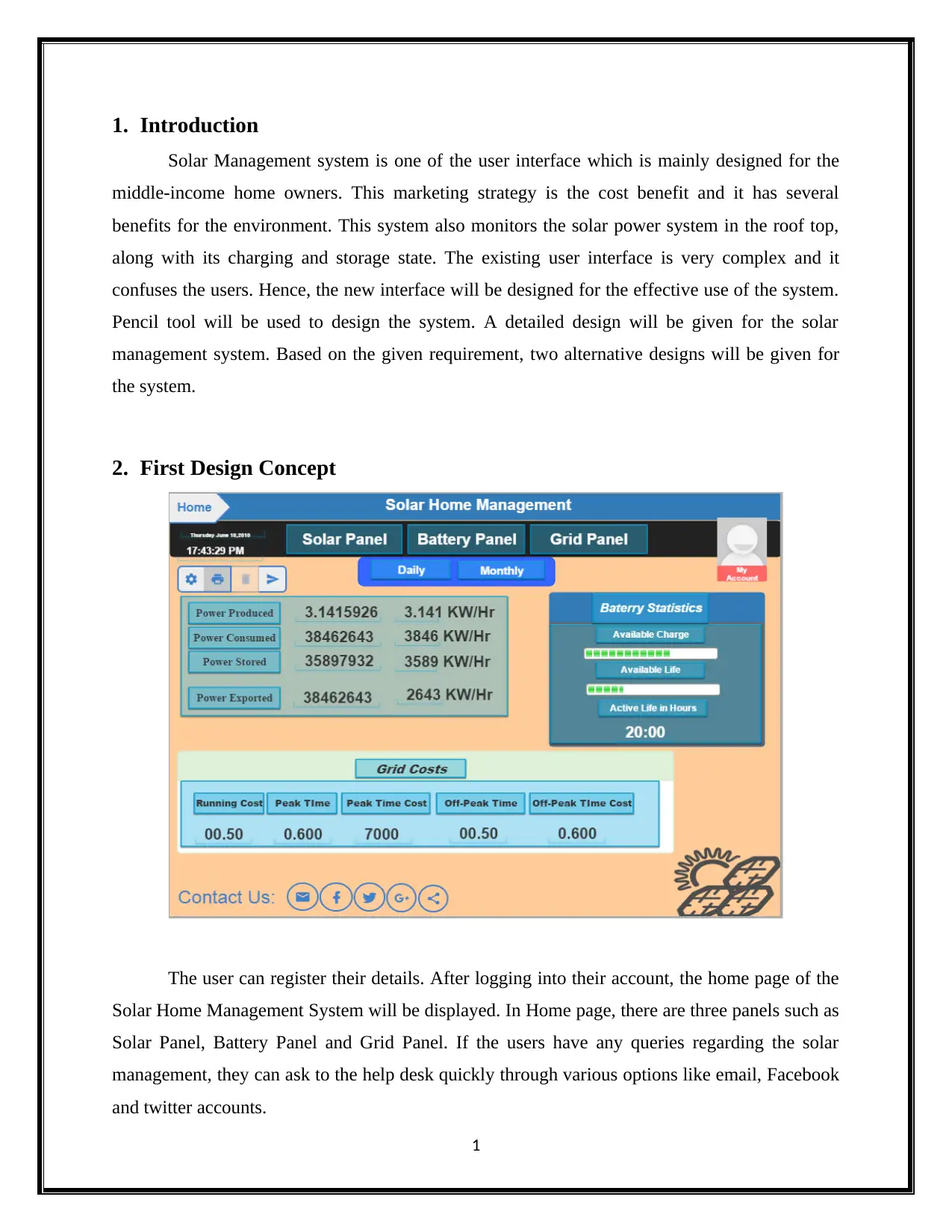
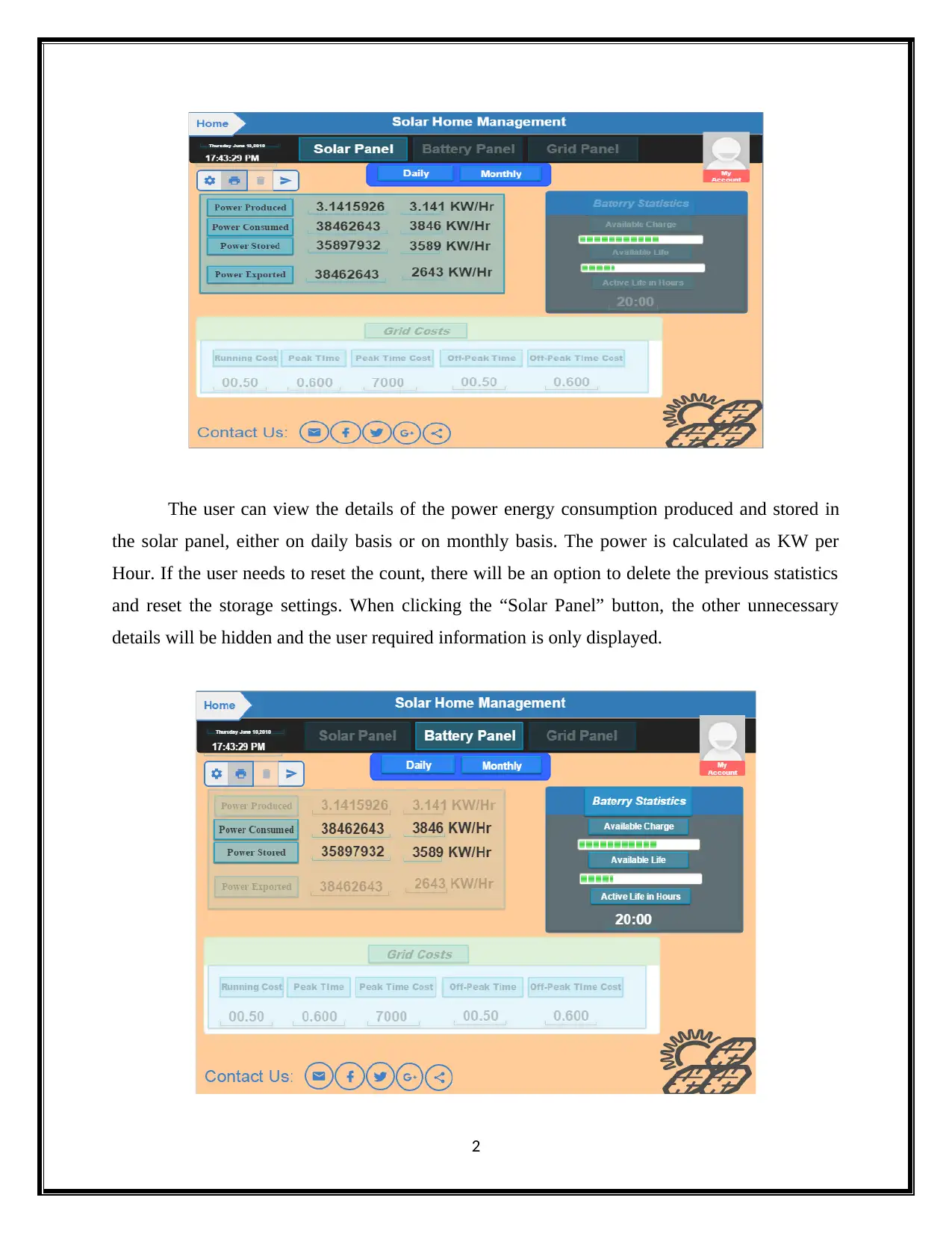
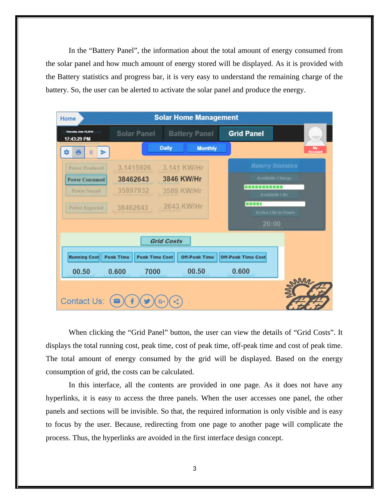
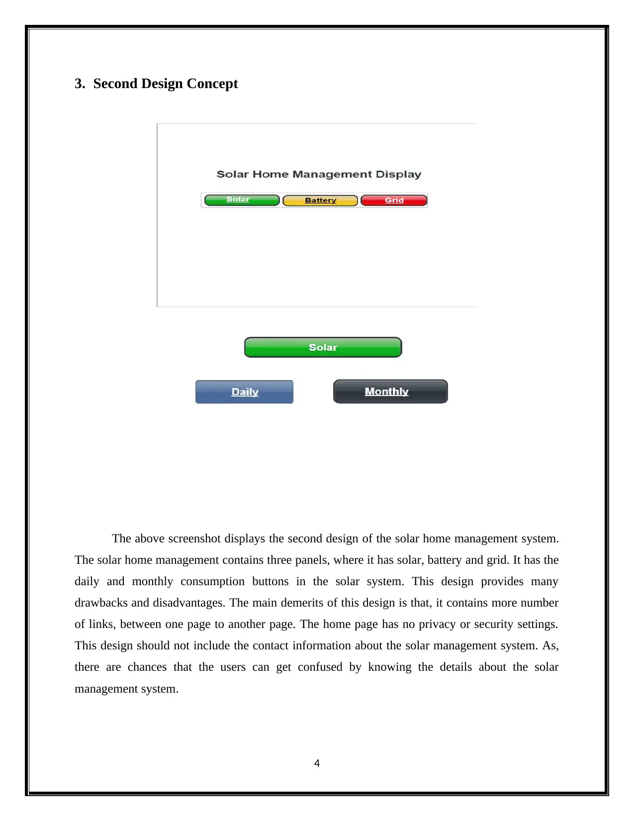
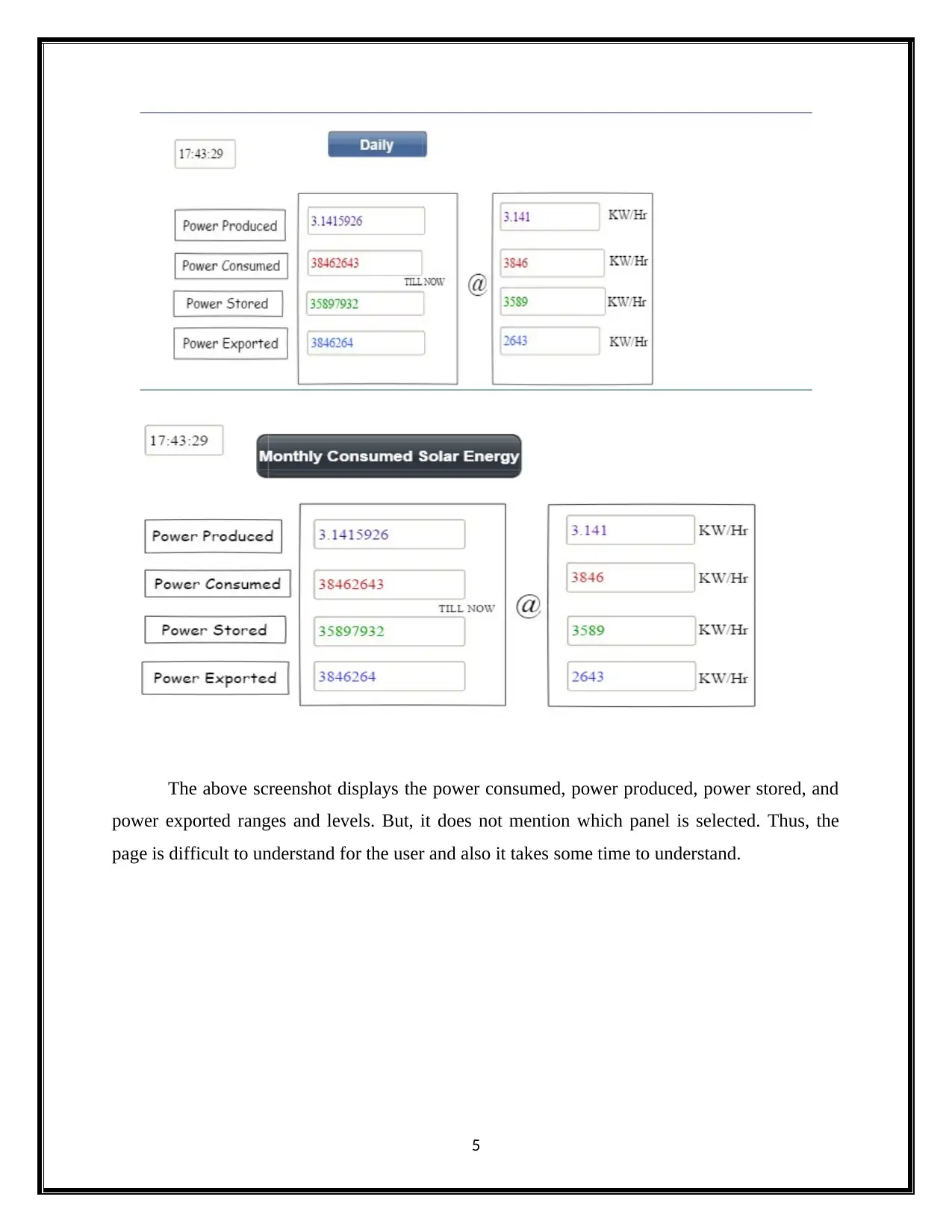
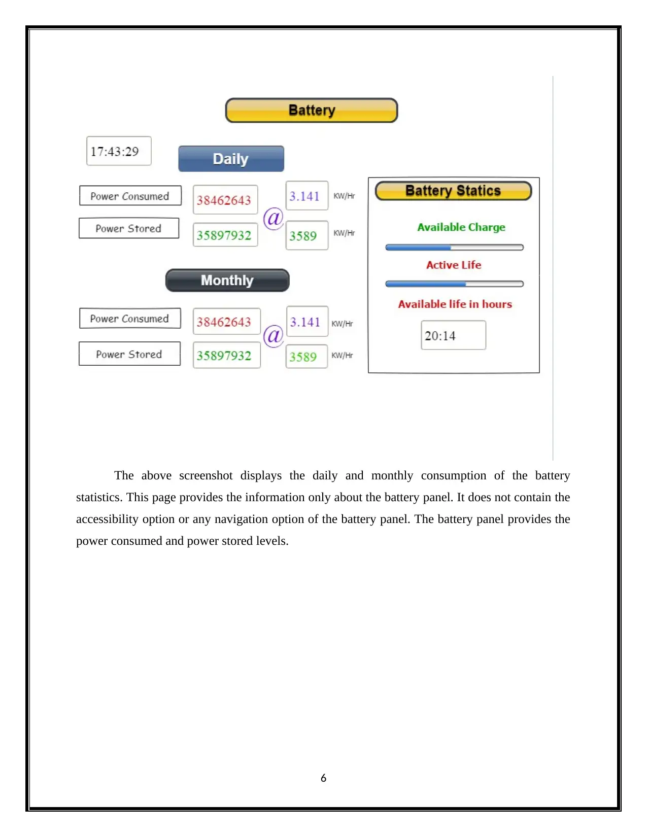
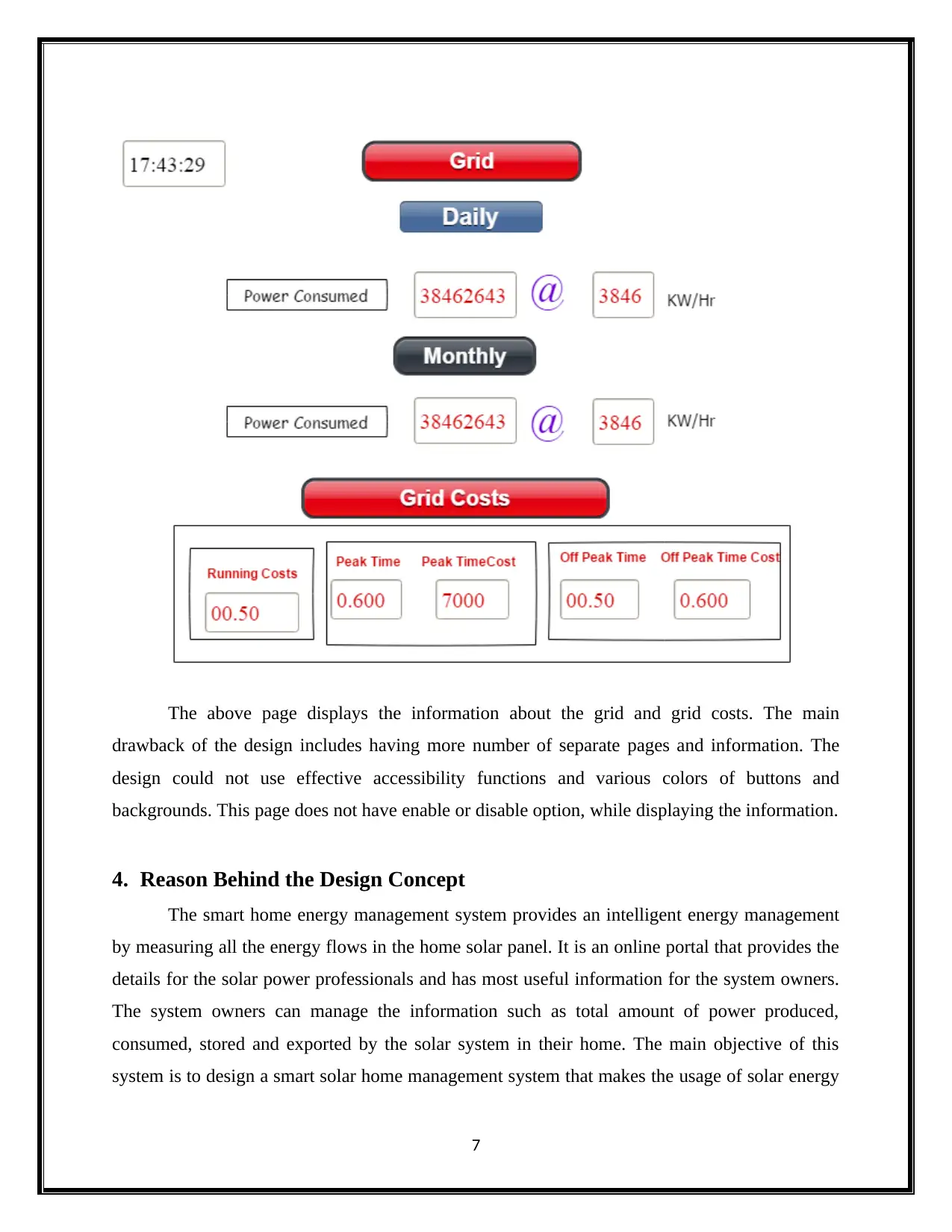
This report presents an analysis of user interface design for a solar management system targeted towards middle-income homeowners. It focuses on improving usability compared to existing complex interfaces. The report details two alternative design concepts, created using the Pencil tool, for a solar home management system. The first design emphasizes a single-page interface with three panels (Solar Panel, Battery Panel, and Grid Panel) to avoid hyperlinks and simplify navigation, enhancing user focus on relevant information. The second design incorporates multiple pages and links, which is deemed less effective due to potential user confusion and reduced accessibility. The report concludes that the first design offers superior usability due to its clear, secure, and accessible single-page layout, making it the recommended solution for an efficient and user-friendly solar home management system.
Document Page
0
Interface USABILITY 1
tabler-icon-diamond-filled.svg

Secure Best Marks with AI Grader

Need help grading? Try our AI Grader for instant feedback on your assignments.
Document Page
Table of Contents
1. Introduction.......................................................................................................................................1
2. First Design Concept.........................................................................................................................1
3. Second Design Concept.....................................................................................................................4
4. Reason Behind the Design Concept..................................................................................................7
5. The Best Solution...............................................................................................................................8
6. Conclusion..........................................................................................................................................8
Document Page
1. Introduction
Solar Management system is one of the user interface which is mainly designed for the
middle-income home owners. This marketing strategy is the cost benefit and it has several
benefits for the environment. This system also monitors the solar power system in the roof top,
along with its charging and storage state. The existing user interface is very complex and it
confuses the users. Hence, the new interface will be designed for the effective use of the system.
Pencil tool will be used to design the system. A detailed design will be given for the solar
management system. Based on the given requirement, two alternative designs will be given for
the system.
2. First Design Concept
The user can register their details. After logging into their account, the home page of the
Solar Home Management System will be displayed. In Home page, there are three panels such as
Solar Panel, Battery Panel and Grid Panel. If the users have any queries regarding the solar
management, they can ask to the help desk quickly through various options like email, Facebook
and twitter accounts.
1
Document Page
The user can view the details of the power energy consumption produced and stored in
the solar panel, either on daily basis or on monthly basis. The power is calculated as KW per
Hour. If the user needs to reset the count, there will be an option to delete the previous statistics
and reset the storage settings. When clicking the “Solar Panel” button, the other unnecessary
details will be hidden and the user required information is only displayed.
2
tabler-icon-diamond-filled.svg

Secure Best Marks with AI Grader

Need help grading? Try our AI Grader for instant feedback on your assignments.
Document Page
In the “Battery Panel”, the information about the total amount of energy consumed from
the solar panel and how much amount of energy stored will be displayed. As it is provided with
the Battery statistics and progress bar, it is very easy to understand the remaining charge of the
battery. So, the user can be alerted to activate the solar panel and produce the energy.
When clicking the “Grid Panel” button, the user can view the details of “Grid Costs”. It
displays the total running cost, peak time, cost of peak time, off-peak time and cost of peak time.
The total amount of energy consumed by the grid will be displayed. Based on the energy
consumption of grid, the costs can be calculated.
In this interface, all the contents are provided in one page. As it does not have any
hyperlinks, it is easy to access the three panels. When the user accesses one panel, the other
panels and sections will be invisible. So that, the required information is only visible and is easy
to focus by the user. Because, redirecting from one page to another page will complicate the
process. Thus, the hyperlinks are avoided in the first interface design concept.
3
Document Page
3. Second Design Concept
The above screenshot displays the second design of the solar home management system.
The solar home management contains three panels, where it has solar, battery and grid. It has the
daily and monthly consumption buttons in the solar system. This design provides many
drawbacks and disadvantages. The main demerits of this design is that, it contains more number
of links, between one page to another page. The home page has no privacy or security settings.
This design should not include the contact information about the solar management system. As,
there are chances that the users can get confused by knowing the details about the solar
management system.
4
Document Page
The above screenshot displays the power consumed, power produced, power stored, and
power exported ranges and levels. But, it does not mention which panel is selected. Thus, the
page is difficult to understand for the user and also it takes some time to understand.
5
tabler-icon-diamond-filled.svg

Paraphrase This Document

Need a fresh take? Get an instant paraphrase of this document with our AI Paraphraser
Document Page
The above screenshot displays the daily and monthly consumption of the battery
statistics. This page provides the information only about the battery panel. It does not contain the
accessibility option or any navigation option of the battery panel. The battery panel provides the
power consumed and power stored levels.
6
Document Page
The above page displays the information about the grid and grid costs. The main
drawback of the design includes having more number of separate pages and information. The
design could not use effective accessibility functions and various colors of buttons and
backgrounds. This page does not have enable or disable option, while displaying the information.
4. Reason Behind the Design Concept
The smart home energy management system provides an intelligent energy management
by measuring all the energy flows in the home solar panel. It is an online portal that provides the
details for the solar power professionals and has most useful information for the system owners.
The system owners can manage the information such as total amount of power produced,
consumed, stored and exported by the solar system in their home. The main objective of this
system is to design a smart solar home management system that makes the usage of solar energy
7
Document Page
in our home in an optimized method. Also to reduce the cost of electricity. To achieve this aim, it
is necessary to design the interface with efficient usability.
5. The Best Solution
When compared to the second interface design, the first Interface design concept
provides effective usability. The reasons are provided below:
The functionalities presented in a single page are very clear. The user won’t get confused.
The interface provides security for the user's information.
The interface is designed without any "Click Here" links.
The visibility of active panel and invisibility of inactive panels provide clear accessibility
to the user.
The main constraint is privacy. The user can login their account by registering their basic
details. It is maintained by the administrator. So, no one can steal the user’s sensitive
information, from the interface.
To attract the user, the professional colors were used in the design so that the user can
understand the functionalities of each panel, without any misunderstanding.
As the first interface design has the efficient usability when compared to the secondary
interface design, it is considered as the best solution.
The Pencil tool is the open source GUI prototyping tool and it supports all the platforms.
It is used to create mockups in popular desktop platforms. The pencil software provides the
default shape’s collection, for drawing various kinds of user interface alternating from desktop to
other platforms. To obtain the best solution for the interface design, the “Pencil Software” is
used. By using the Pencil tool, the interface for solar home management is designed efficiently
and the design file is attached below.
6. Conclusion
User interface is designed for the solar system. It satisfies the given requirements. This
interface contains solar home management page, solar page, daily, monthly page, battery page
8
tabler-icon-diamond-filled.svg

Secure Best Marks with AI Grader

Need help grading? Try our AI Grader for instant feedback on your assignments.
Document Page
and grid page. This user interface has simple design and it is user friendly. Pencil tool is used for
designing the user interface. Advantages of the user interface are listed. It is very easy to
implement this design. This interface is designed based on wire shape. It also has inter page
linking facility. The respective interface diagrams are provided.
9
chevron_up_icon
1 out of 11
circle_padding
hide_on_mobile
zoom_out_icon
logo.png

Your All-in-One AI-Powered Toolkit for Academic Success.

Available 24*7 on WhatsApp / Email

[object Object]