Statistical Analysis of Aptitude Test Scores - Semester 1, 2024

Verified

Added on  2022/08/27

|5
|369
|20
Homework Assignment
AI Summary
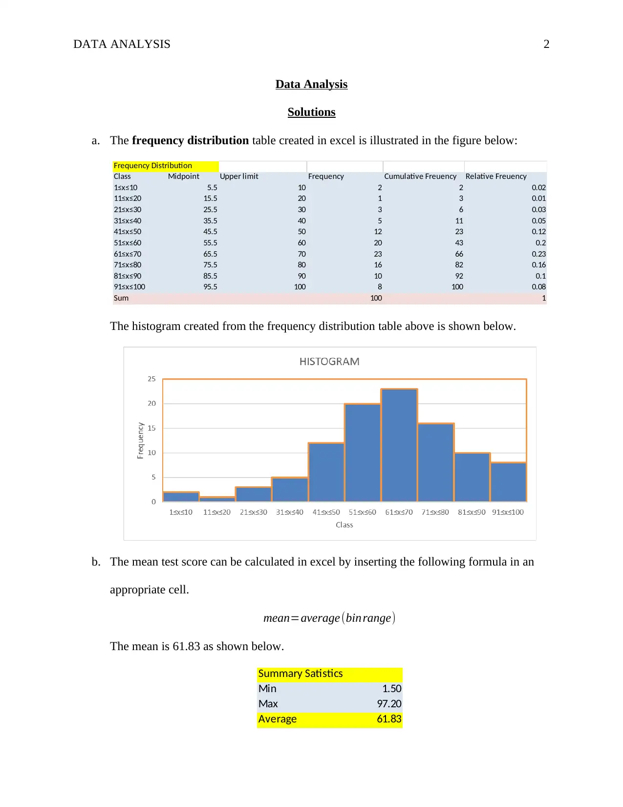
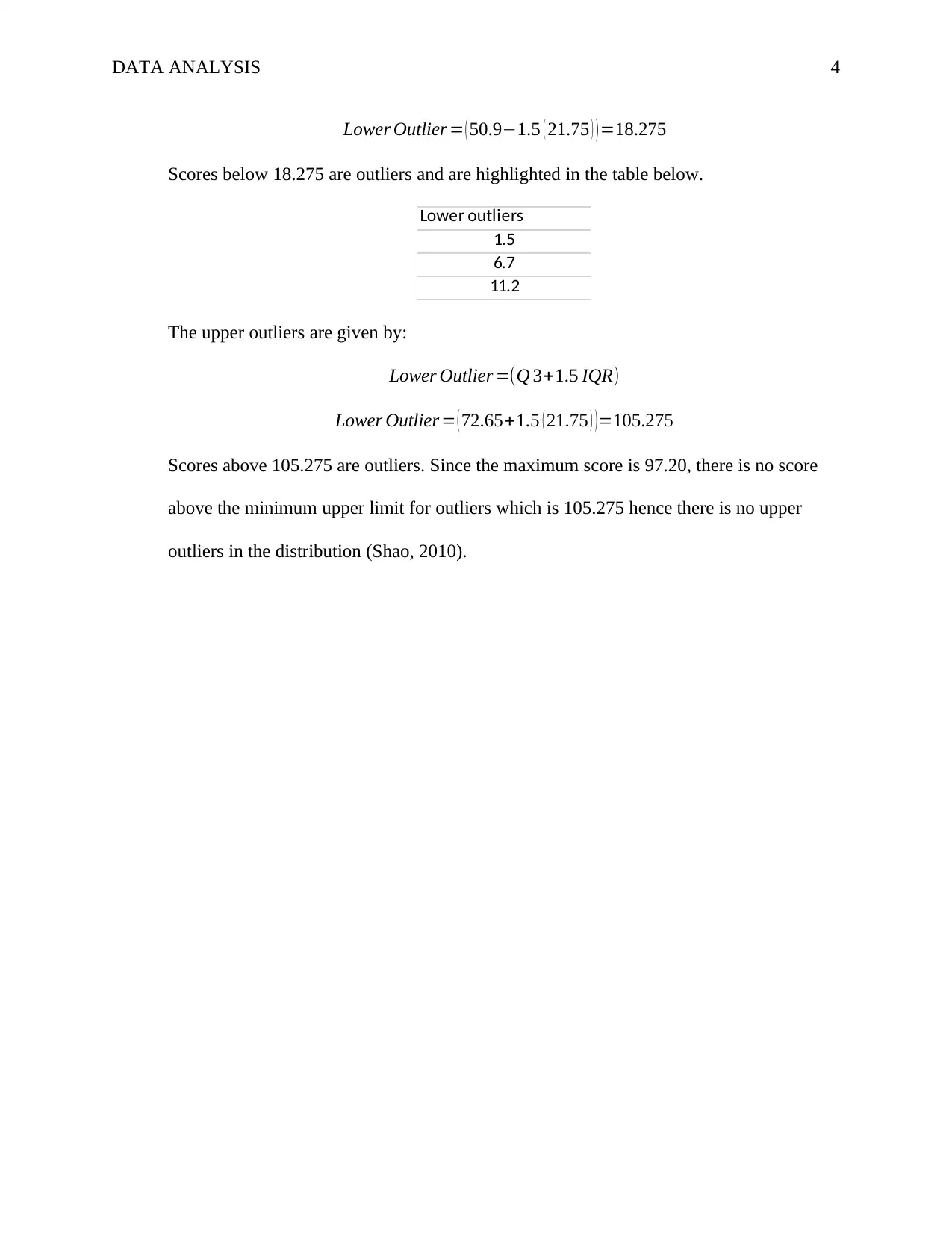
This assignment provides a comprehensive analysis of aptitude test scores. The solution includes constructing a frequency distribution table and a histogram with a class width of 10 using Excel. The mean test score is calculated, and the quartiles (Q1, Q2, and Q3) are determined using the common-sense rule. The assignment then assesses whether the distribution of test scores is bell-shaped based on the calculated statistics. Finally, the solution identifies outliers in the dataset using the 1.5 IQR rule, demonstrating the application of statistical concepts to real-world data analysis. The solution also includes proper referencing.
Document Page
Running head: DATA ANALYSIS 1
Data Analysis
Student Name
Professor’s Name
University Name
Date
tabler-icon-diamond-filled.svg

Secure Best Marks with AI Grader

Need help grading? Try our AI Grader for instant feedback on your assignments.
Document Page
DATA ANALYSIS 2
Data Analysis
Solutions
a. The frequency distribution table created in excel is illustrated in the figure below:
Frequency Distribution
Class Midpoint Upper limit Frequency Cumulative Freuency Relative Freuency
1≤x≤10 5.5 10 2 2 0.02
11≤x≤20 15.5 20 1 3 0.01
21≤x≤30 25.5 30 3 6 0.03
31≤x≤40 35.5 40 5 11 0.05
41≤x≤50 45.5 50 12 23 0.12
51≤x≤60 55.5 60 20 43 0.2
61≤x≤70 65.5 70 23 66 0.23
71≤x≤80 75.5 80 16 82 0.16
81≤x≤90 85.5 90 10 92 0.1
91≤x≤100 95.5 100 8 100 0.08
Sum 100 1
The histogram created from the frequency distribution table above is shown below.
b. The mean test score can be calculated in excel by inserting the following formula in an
appropriate cell.
mean=average (binrange)
The mean is 61.83 as shown below.
Summary Satistics
Min 1.50
Max 97.20
Average 61.83
Document Page
DATA ANALYSIS 3
The common-sense method of determining the quartiles follows the following steps.
Arrange the numbers in ascending order.
Locate the center of the arranged data. In this case its between the 50th and 51st
data points.
From the center point determine the median of either half which will be the first
and the third quartile respectively (Selvanathan & Keller, 2017).
The first quartile is the median of the 1st data point to the 50th data point. Hence
Q 1 ( first quartile )= 50.8+ 51
2 =50.9
Third quartile is the median of the 51st data point to the 100th data point. Hence
Q 3 ( third quartile )= 73.2+72.1
2 =72.65
The second quartile is the median of the overall arranged data which is the sum of
the 50th and 51st data points.
Q 2 ( median )= 62.4+62.8
2 =62.6
c. No, the distribution is not bell shaped but negatively skewed since the left tail of the
histogram is longer and the mean is less than median (Q2).
d. The lower outliers below the first quartiles are values below the score given by:
Lower Outlier =(Q 11.5 IQR)
The interquartile range is given by:
IQR=Q 3Q1
IQR=72.6550.9=21.75
Therefore,
Lower Outlier =(Q 11.5 IQR)
Document Page
DATA ANALYSIS 4
Lower Outlier = ( 50.91.5 ( 21.75 ) ) =18.275
Scores below 18.275 are outliers and are highlighted in the table below.
Lower outliers
1.5
6.7
11.2
The upper outliers are given by:
Lower Outlier =(Q 3+1.5 IQR)
Lower Outlier = ( 72.65+1.5 ( 21.75 ) ) =105.275
Scores above 105.275 are outliers. Since the maximum score is 97.20, there is no score
above the minimum upper limit for outliers which is 105.275 hence there is no upper
outliers in the distribution (Shao, 2010).
tabler-icon-diamond-filled.svg

Secure Best Marks with AI Grader

Need help grading? Try our AI Grader for instant feedback on your assignments.
Document Page
DATA ANALYSIS 5
References
Selvanathan, E. A., & Keller, G. (2017). Business statistics abridged (7th ed). South Melbourne,
Victoria: Cengage Learning.
Shao, J. (2010). Mathematical statistics (2nd ed). New York: Springer.
chevron_up_icon
1 out of 5
circle_padding
hide_on_mobile
zoom_out_icon
[object Object]