Statistics Report: Statistical Data Analysis and Interpretation

Verified

Added on  2020/03/23

|8
|1296
|53
Report
AI Summary
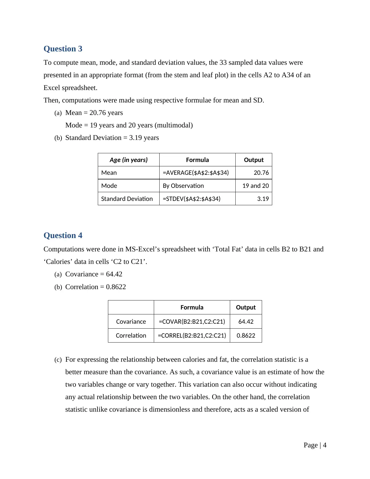
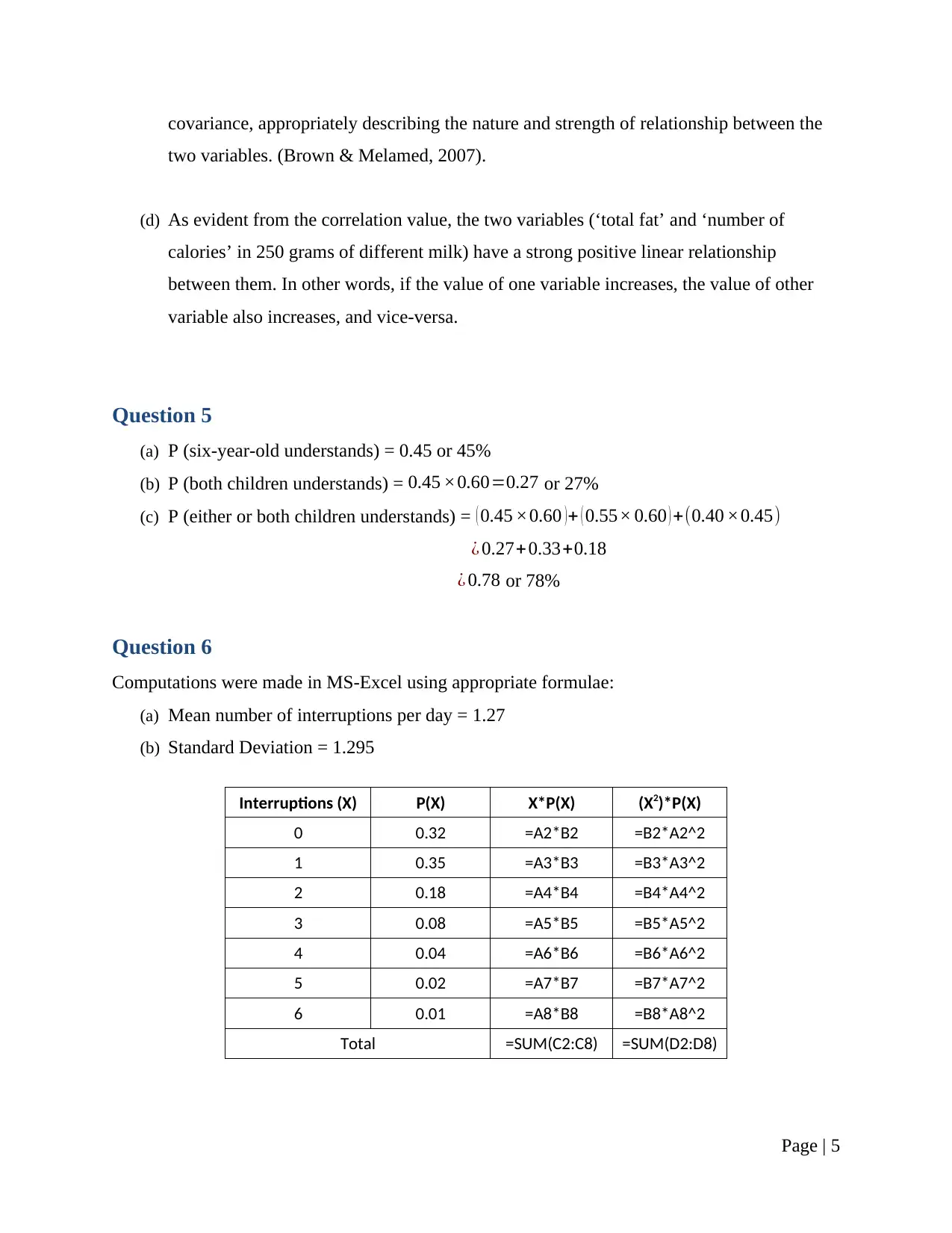
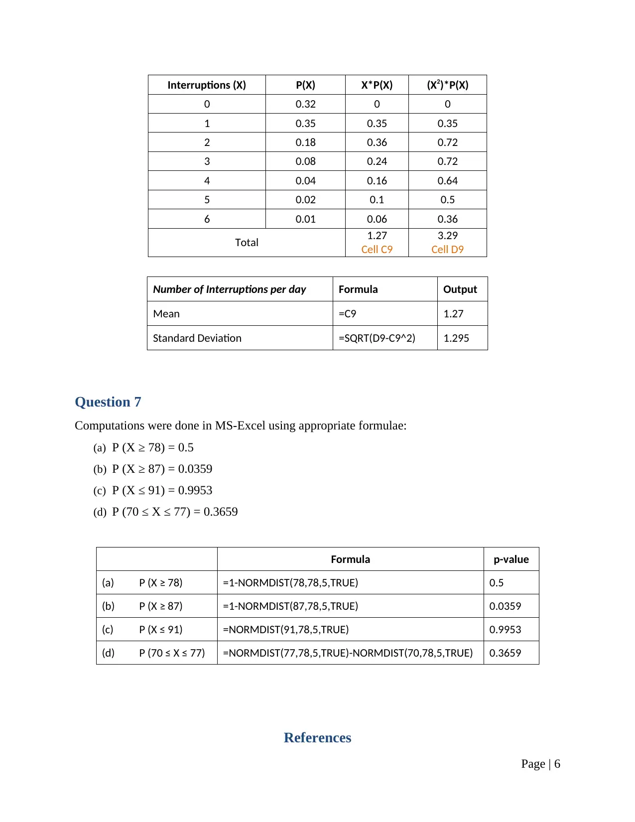
This research report presents a comprehensive analysis of statistical concepts and methods, addressing various aspects of data analysis and interpretation. The report begins with a discussion on sampling techniques, specifically stratified simple random sampling, and considerations for survey design. It then delves into frequency distributions, using MS-Excel to create tables and histograms. Stem and leaf plots are also utilized for data visualization, highlighting their advantages and limitations. The report proceeds to calculate and interpret measures of central tendency, including mean, mode, and standard deviation, using provided sample data. Correlation and covariance are computed to express the relationship between variables, with an emphasis on the interpretation of the correlation statistic. Probability calculations are performed, addressing scenarios involving conditional probabilities. Finally, the report explores probability distributions, computing probabilities using the normal distribution. The analysis is supported by MS-Excel computations and relevant statistical formulas, providing a practical demonstration of statistical principles. The report concludes with a list of cited references.
Document Page
Assessment item 2—Research Report
Student Name
Course
Professor Name
Date Submitted
Page | 0
tabler-icon-diamond-filled.svg

Secure Best Marks with AI Grader

Need help grading? Try our AI Grader for instant feedback on your assignments.
Document Page
Question 1
(a)
(i) Nominal
(ii) Nominal
(iii) Interval
(iv) Nominal
(v) Nominal
(vi) Ratio
(b) To appropriately sample the data, Stratified Simple Random Sampling technique can be
used. This seems a rational choice as the population is comprised of alumnus from
different classes of 2011 to 2015, and the sample should be a representative of this
population. Thus, based on the respective classes (2011, 2012, 2013, and so…), the
population can be classified into 5 strata and equal percentages (or number) of
participants can be randomly sampled from each stratum (Cochran, 2006).
(c) To avoid invading into the survey respondents’ privacy, the ‘Income’ question can be
framed with suitable category options (of range of salaries) rather than determining the
exact salary figures (Brace, 2018). Fundamentally, the variable can be measured on an
ordinal scale. Further, the positioning of ‘Income’ question can be modified (with other
survey questions), so the respondents feel more comfortable (for instance, it should not
be either of first 2 questions).
Page | 1
Document Page
Question 2
(a) Frequency Distribution Table:
Class Interval (grades) Frequency
42 -< 53 (42 to less than 53) 6
53 -< 64 5
64 -< 75 7
75 -< 86 15
86 -< 97 7
97 or more 0
Total 40
To generate the above table, MS-Excel’s Data Analysis ToolPak Kit was used.
The following table (of bins) was used to generate the frequency distribution and
respective chart output or the histogram (described in part (c) below) for the given
sample data of grades of 40 students.
For Histogram
Class Interval Bins
42 -< 53 (42 to less than 53) 52.99
53 -< 64 63.99
64 -< 75 74.99
75 -< 86 85.99
86 -< 97 96.99
97 or more 100.00
Note: The first interval can also be written as 42 – 52, the second as 53 – 63, and so on…
(b) Stem and Leaf plot:
Stem Leaf
4 3 5
5 0 0 0 0 5 6
6 0 0 1 5
7 0 1 2 3 3 3 5 5 5 6 6 6 8 9
8 0 0 1 1 1 4 5 9
9 0 1 3 3 5 6
Page | 2
Document Page
(c) Histogram:
42 -< 53 53 -< 64 64 -< 75 75 -< 86 86 -< 97
0
2
4
6
8
10
12
14
16
6 5
7
15
7
Histogram for Grades of 1st Year Students in
Their First Assignment
Grades
Frequency
(d) The advantage of a histogram plot is that it can display the frequency of occurrences of
data values along an interval. However, the use of intervals prevents the calculation of an
exact measure of central tendency. On the other hand, a stem and leaf plot can be used to
quickly and compactly organize a large dataset. The display arrangement further makes it
easier to determine measures of central tendency (median and mode), clusters, potential
or extreme outliers. However, the plot is not very informative for a small dataset
(Lipschutz & Schiller, 2012).
Page | 3
tabler-icon-diamond-filled.svg

Secure Best Marks with AI Grader

Need help grading? Try our AI Grader for instant feedback on your assignments.
Document Page
Question 3
To compute mean, mode, and standard deviation values, the 33 sampled data values were
presented in an appropriate format (from the stem and leaf plot) in the cells A2 to A34 of an
Excel spreadsheet.
Then, computations were made using respective formulae for mean and SD.
(a) Mean = 20.76 years
Mode = 19 years and 20 years (multimodal)
(b) Standard Deviation = 3.19 years
Age (in years) Formula Output
Mean =AVERAGE($A$2:$A$34) 20.76
Mode By Observation 19 and 20
Standard Deviation =STDEV($A$2:$A$34) 3.19
Question 4
Computations were done in MS-Excel’s spreadsheet with ‘Total Fat’ data in cells B2 to B21 and
‘Calories’ data in cells ‘C2 to C21’.
(a) Covariance = 64.42
(b) Correlation = 0.8622
Formula Output
Covariance =COVAR(B2:B21,C2:C21) 64.42
Correlation =CORREL(B2:B21,C2:C21) 0.8622
(c) For expressing the relationship between calories and fat, the correlation statistic is a
better measure than the covariance. As such, a covariance value is an estimate of how the
two variables change or vary together. This variation can also occur without indicating
any actual relationship between the two variables. On the other hand, the correlation
statistic unlike covariance is dimensionless and therefore, acts as a scaled version of
Page | 4
Document Page
covariance, appropriately describing the nature and strength of relationship between the
two variables. (Brown & Melamed, 2007).
(d) As evident from the correlation value, the two variables (‘total fat’ and ‘number of
calories’ in 250 grams of different milk) have a strong positive linear relationship
between them. In other words, if the value of one variable increases, the value of other
variable also increases, and vice-versa.
Question 5
(a) P (six-year-old understands) = 0.45 or 45%
(b) P (both children understands) = 0.45 ×0.60=0.27 or 27%
(c) P (either or both children understands) = ( 0.45 ×0.60 )+ ( 0.55× 0.60 ) +(0.40 ×0.45)
¿ 0.27+0.33+0.18
¿ 0.78 or 78%
Question 6
Computations were made in MS-Excel using appropriate formulae:
(a) Mean number of interruptions per day = 1.27
(b) Standard Deviation = 1.295
Interruptions (X) P(X) X*P(X) (X2)*P(X)
0 0.32 =A2*B2 =B2*A2^2
1 0.35 =A3*B3 =B3*A3^2
2 0.18 =A4*B4 =B4*A4^2
3 0.08 =A5*B5 =B5*A5^2
4 0.04 =A6*B6 =B6*A6^2
5 0.02 =A7*B7 =B7*A7^2
6 0.01 =A8*B8 =B8*A8^2
Total =SUM(C2:C8) =SUM(D2:D8)
Page | 5
Document Page
Interruptions (X) P(X) X*P(X) (X2)*P(X)
0 0.32 0 0
1 0.35 0.35 0.35
2 0.18 0.36 0.72
3 0.08 0.24 0.72
4 0.04 0.16 0.64
5 0.02 0.1 0.5
6 0.01 0.06 0.36
Total 1.27
Cell C9
3.29
Cell D9
Number of Interruptions per day Formula Output
Mean =C9 1.27
Standard Deviation =SQRT(D9-C9^2) 1.295
Question 7
Computations were done in MS-Excel using appropriate formulae:
(a) P (X ≥ 78) = 0.5
(b) P (X ≥ 87) = 0.0359
(c) P (X ≤ 91) = 0.9953
(d) P (70 ≤ X ≤ 77) = 0.3659
Formula p-value
(a) P (X ≥ 78) =1-NORMDIST(78,78,5,TRUE) 0.5
(b) P (X ≥ 87) =1-NORMDIST(87,78,5,TRUE) 0.0359
(c) P (X ≤ 91) =NORMDIST(91,78,5,TRUE) 0.9953
(d) P (70 ≤ X ≤ 77) =NORMDIST(77,78,5,TRUE)-NORMDIST(70,78,5,TRUE) 0.3659
References
Page | 6
tabler-icon-diamond-filled.svg

Paraphrase This Document

Need a fresh take? Get an instant paraphrase of this document with our AI Paraphraser
Document Page
Brace, I. (2018). QUESTIONNAIRE DESIGN: how to plan, structure and write survey material
for effective market research. S.l.: Kogan Page.
Brown, S. R., & Melamed, L. E. (2007). Experimental design and analysis. Newbury Park,
Calif.: Sage Publ.
Cochran, W. G. (2006). Sampling techniques (3rd ed.). New York: J. Wiley.
Lipschutz, S., & Schiller, J. J. (2012). Introduction to probability and statistics. New York:
McGraw-Hill.
Page | 7
chevron_up_icon
1 out of 8
circle_padding
hide_on_mobile
zoom_out_icon
[object Object]