Statistical Management Report: Evaluation and Application of Data
VerifiedAdded on 2020/10/22
|22
|5015
|472
Report
AI Summary
This report delves into the core aspects of statistical management, emphasizing data analysis, business planning, and effective communication. It begins by exploring the evaluation of business and economic data, differentiating between qualitative and quantitative data, and analyzing key economic indicators like CPI, CPIH, and RPI. The report then progresses to the evaluation of raw business data, including a comparison of samples and populations, along with various sampling techniques. Furthermore, it demonstrates the use of scatter diagrams to illustrate relationships between variables and calculates the correlation coefficient. The application of statistical methods in business planning, along with justifications for their use, is also discussed. Finally, the report addresses the importance of using appropriate charts and tables to effectively communicate findings, providing a comprehensive understanding of statistical management principles and their practical application in business contexts.
Statistical Management
Paraphrase This Document
Need a fresh take? Get an instant paraphrase of this document with our AI Paraphraser
Table of Contents
INTRODUCTION...........................................................................................................................1
ACTIVITY 1....................................................................................................................................1
P1 Evaluation of business and economic data........................................................................1
P2 Data from variety of sources using various methods of analysis......................................4
M1 Analysis of price indices other than Office of National Statistics...................................6
D1 Differentiation between the exploratory, confirmatory and descriptive analysis with
examples.................................................................................................................................6
ACTIVITY 2....................................................................................................................................7
P3 Evaluation of raw business data using a number of statistical methods...........................7
M2 Assessment of different statistical application...............................................................11
ACTIVITY 3..................................................................................................................................12
P4 Application of statistical methods in business planning.................................................12
M3 Justification and use of statistical methods....................................................................13
D2 Explanation and recommendation for activity 3.............................................................13
ACTIVITY 4..................................................................................................................................14
P5 Using of appropriate charts finding communicate..........................................................14
M4 Graphical representation assessed in activity one and second.......................................18
D3 Use of tables and graphical representations in activity 1 and 2......................................18
CONLUSION................................................................................................................................18
REFERENCES..............................................................................................................................20
INTRODUCTION
Statistical management is the process of formulating right decisions so that uncertainties
can be faced appropriately in future. It is used in financial analysis, auditing, production,
econometrics and operations that are performed to modify services and market research. The
procedure of statistical management involves collection and scrutinisation of business data.
Managers of the organisations need to collect quantitative history of occurrence elements on
optimal repairs and procedures. It helps to forecast the use of material in every sector of the
business so that the shortage can be ignored. It is very important for a business entity as it can
help to ensure quality, make connections and for provide effective judgements.
This report covers various topics such as evaluation of business, economic data, raw
business data by using a number of statistical methods, application of statistical methods in
business planning, communication of findings by using appropriate charts and tables.
ACTIVITY 1
P1 Evaluation of business and economic data
Nature of data and information can help to manipulate them by different techniques of
statistical analysis. There are two different types of data these are qualitative and quantitative.
First one is qualitative that includes characteristics and the another type contain the data in
numeric format. Data can be turned into information and information in to knowledge (Carlson
and Wu, 2012). Data is unprocessed facts and figures that are recorded without interpretation
when the recorded data get interpreted than it will become information. Knowledge is the
combination of different type of information.
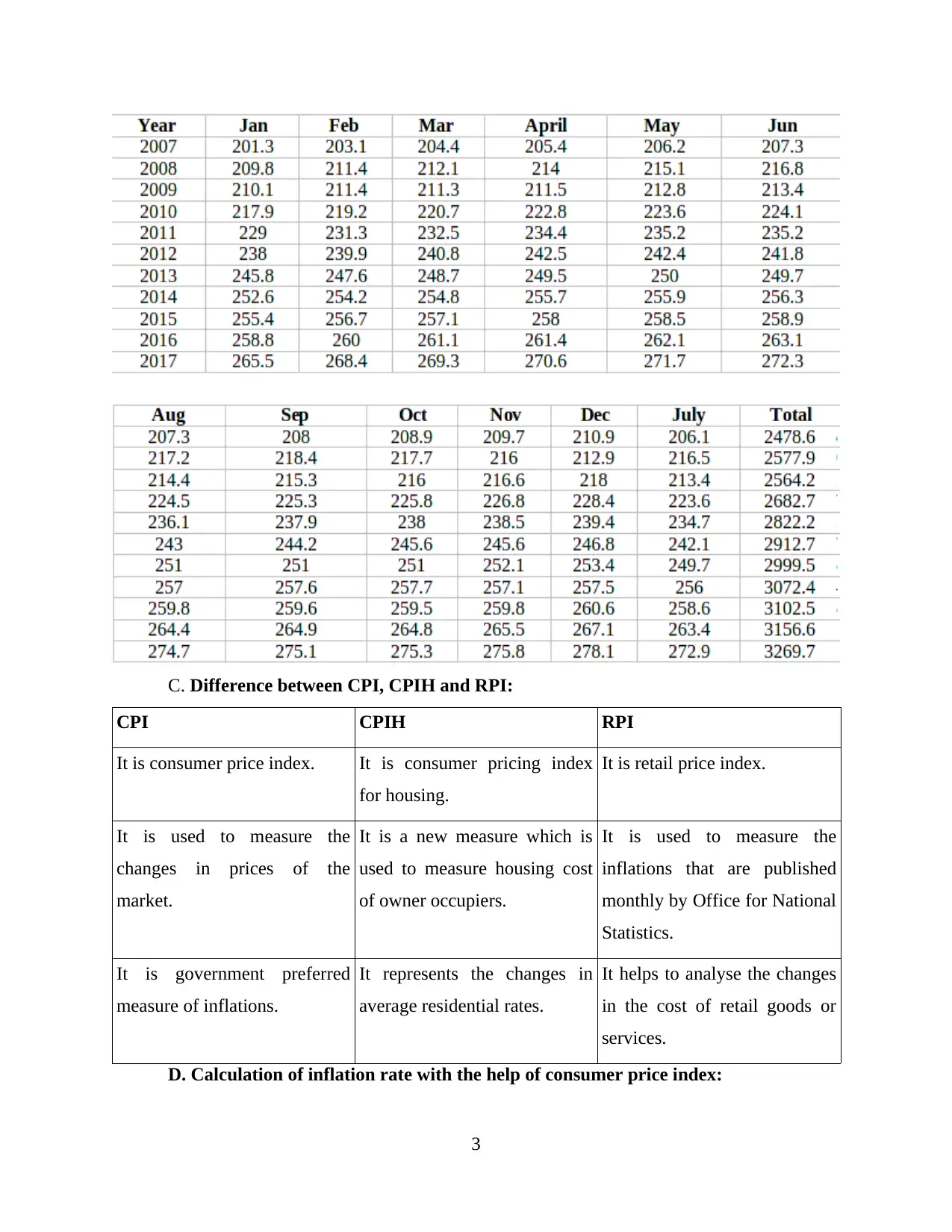
A. & B. CPI, CPIH and RPI by using office of national statistics website and
appropriate tables and graphs for all of them:
CPI and CPIH: Consumer price index is used to measure the changes ion the price level
of the market and CPIH is a new addition in the CPI in which housing cost of owner
occupiers is measured. CPIH rate was 2.2% in September 2018 which has been decreased
as compare to 2.4% which is for August 2018 (Chen and et. al., 2012). consumer price
index rate was 2.4% in September 2018 which has been decreased as compare to August
which is 2.7%. the rate has been decreased because prices of food, non alcoholic
1
Statistical management is the process of formulating right decisions so that uncertainties
can be faced appropriately in future. It is used in financial analysis, auditing, production,
econometrics and operations that are performed to modify services and market research. The
procedure of statistical management involves collection and scrutinisation of business data.
Managers of the organisations need to collect quantitative history of occurrence elements on
optimal repairs and procedures. It helps to forecast the use of material in every sector of the
business so that the shortage can be ignored. It is very important for a business entity as it can
help to ensure quality, make connections and for provide effective judgements.
This report covers various topics such as evaluation of business, economic data, raw
business data by using a number of statistical methods, application of statistical methods in
business planning, communication of findings by using appropriate charts and tables.
ACTIVITY 1
P1 Evaluation of business and economic data
Nature of data and information can help to manipulate them by different techniques of
statistical analysis. There are two different types of data these are qualitative and quantitative.
First one is qualitative that includes characteristics and the another type contain the data in
numeric format. Data can be turned into information and information in to knowledge (Carlson
and Wu, 2012). Data is unprocessed facts and figures that are recorded without interpretation
when the recorded data get interpreted than it will become information. Knowledge is the
combination of different type of information.
A. & B. CPI, CPIH and RPI by using office of national statistics website and
appropriate tables and graphs for all of them:
CPI and CPIH: Consumer price index is used to measure the changes ion the price level
of the market and CPIH is a new addition in the CPI in which housing cost of owner
occupiers is measured. CPIH rate was 2.2% in September 2018 which has been decreased
as compare to 2.4% which is for August 2018 (Chen and et. al., 2012). consumer price
index rate was 2.4% in September 2018 which has been decreased as compare to August
which is 2.7%. the rate has been decreased because prices of food, non alcoholic
1
⊘ This is a preview!⊘
Do you want full access?
Subscribe today to unlock all pages.
Trusted by 1+ million students worldwide
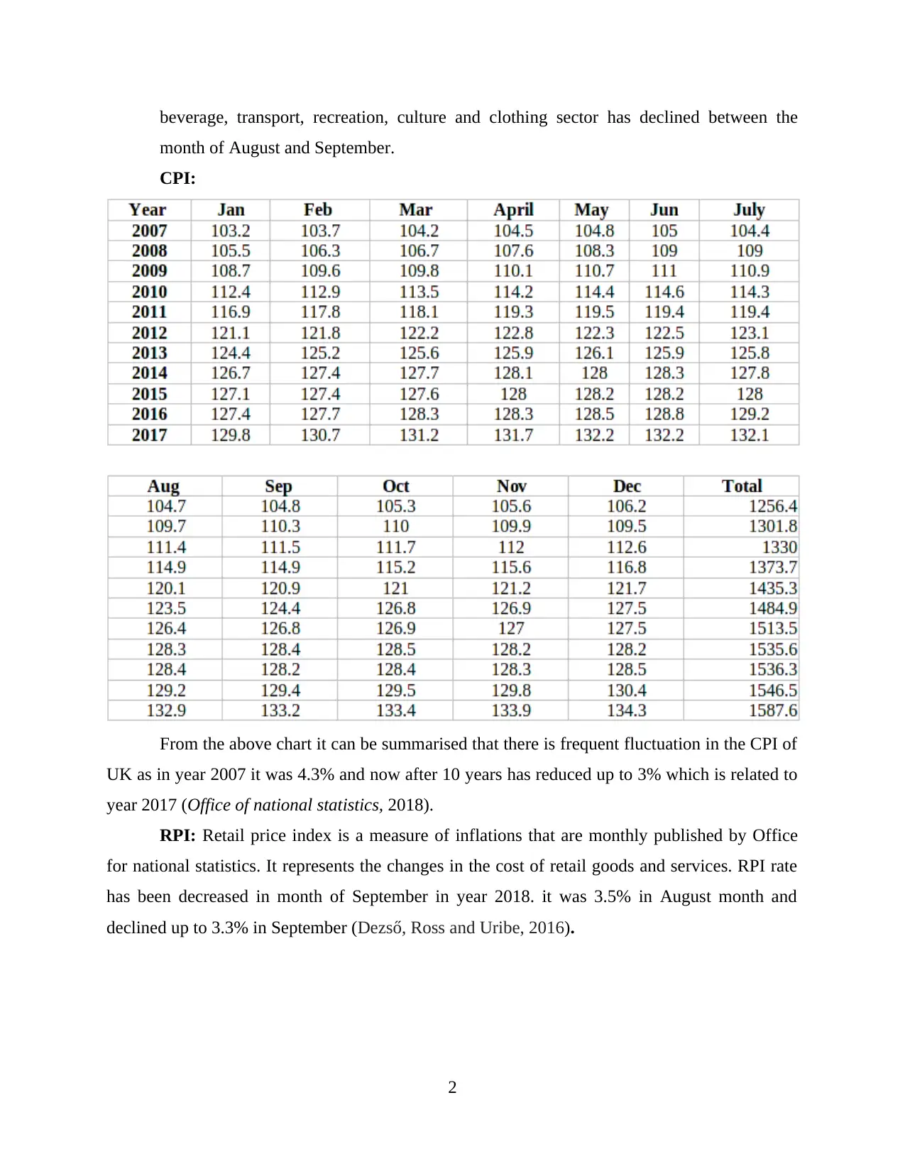
beverage, transport, recreation, culture and clothing sector has declined between the
month of August and September.
CPI:
From the above chart it can be summarised that there is frequent fluctuation in the CPI of
UK as in year 2007 it was 4.3% and now after 10 years has reduced up to 3% which is related to
year 2017 (Office of national statistics, 2018).
RPI: Retail price index is a measure of inflations that are monthly published by Office
for national statistics. It represents the changes in the cost of retail goods and services. RPI rate
has been decreased in month of September in year 2018. it was 3.5% in August month and
declined up to 3.3% in September (Dezső, Ross and Uribe, 2016).
2
Paraphrase This Document
Need a fresh take? Get an instant paraphrase of this document with our AI Paraphraser
C. Difference between CPI, CPIH and RPI:
CPI CPIH RPI
It is consumer price index. It is consumer pricing index
for housing.
It is retail price index.
It is used to measure the
changes in prices of the
market.
It is a new measure which is
used to measure housing cost
of owner occupiers.
It is used to measure the
inflations that are published
monthly by Office for National
Statistics.
It is government preferred
measure of inflations.
It represents the changes in
average residential rates.
It helps to analyse the changes
in the cost of retail goods or
services.
D. Calculation of inflation rate with the help of consumer price index:
3
Inflation rate is calculated with the help of consumer price index which is shown by
Office of national statistics on monthly basis. If the CPI is continuously decreasing than it will
affect the inflation rate of the nation and will also result in fluctuation of inflation rates. The
changed rate is converted to the percentage to calculate inflation (Easterby-Smith, Thorpe and
Jackson, 2012). For example, as CPI of year 2017 has increased up to 132 from 129 which is for
year 2016. The total difference is 2% which has resulted in the increment of inflation rate.
E. Why it is important to have information of Inflation:
For every organisation it is very important top have information of inflation rate as it
directly affect the efficiency of executing business operations. It helps to plan for upcoming
year's activities so that, this may not result adversely. If the managers of the companies are
having proper information of inflation than they may formulate effective strategies to perform
their operational activities efficiently at the time of increased or decreased inflation rate. Inflation
rate of UK is 2% that affects the purchasing power of customers and also affect the CPI and RPI
because it changes with the fluctuation in inflation.
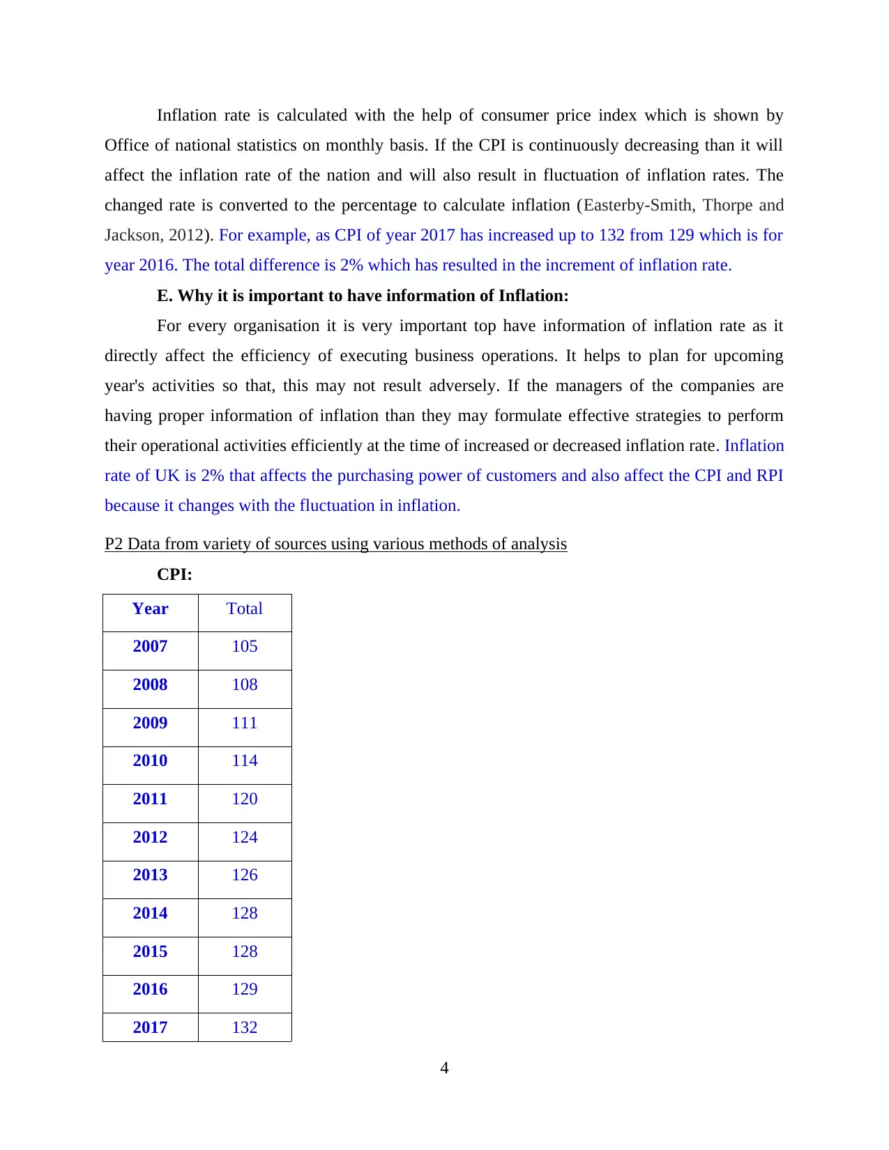
P2 Data from variety of sources using various methods of analysis
CPI:
Year Total
2007 105
2008 108
2009 111
2010 114
2011 120
2012 124
2013 126
2014 128
2015 128
2016 129
2017 132
4
Office of national statistics on monthly basis. If the CPI is continuously decreasing than it will
affect the inflation rate of the nation and will also result in fluctuation of inflation rates. The
changed rate is converted to the percentage to calculate inflation (Easterby-Smith, Thorpe and
Jackson, 2012). For example, as CPI of year 2017 has increased up to 132 from 129 which is for
year 2016. The total difference is 2% which has resulted in the increment of inflation rate.
E. Why it is important to have information of Inflation:
For every organisation it is very important top have information of inflation rate as it
directly affect the efficiency of executing business operations. It helps to plan for upcoming
year's activities so that, this may not result adversely. If the managers of the companies are
having proper information of inflation than they may formulate effective strategies to perform
their operational activities efficiently at the time of increased or decreased inflation rate. Inflation
rate of UK is 2% that affects the purchasing power of customers and also affect the CPI and RPI
because it changes with the fluctuation in inflation.
P2 Data from variety of sources using various methods of analysis
CPI:
Year Total
2007 105
2008 108
2009 111
2010 114
2011 120
2012 124
2013 126
2014 128
2015 128
2016 129
2017 132
4
⊘ This is a preview!⊘
Do you want full access?
Subscribe today to unlock all pages.
Trusted by 1+ million students worldwide
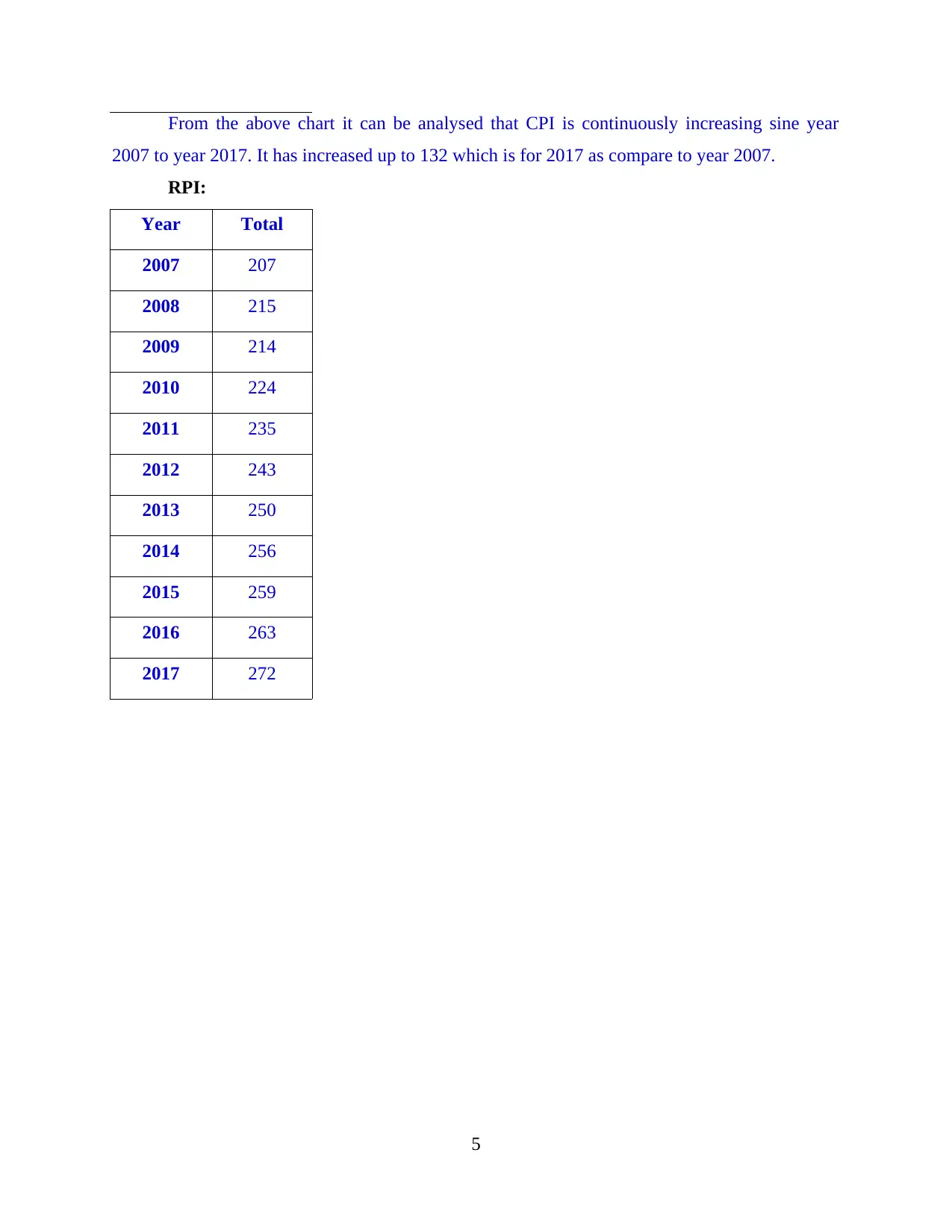
From the above chart it can be analysed that CPI is continuously increasing sine year
2007 to year 2017. It has increased up to 132 which is for 2017 as compare to year 2007.
RPI:
Year Total
2007 207
2008 215
2009 214
2010 224
2011 235
2012 243
2013 250
2014 256
2015 259
2016 263
2017 272
5
2007 to year 2017. It has increased up to 132 which is for 2017 as compare to year 2007.
RPI:
Year Total
2007 207
2008 215
2009 214
2010 224
2011 235
2012 243
2013 250
2014 256
2015 259
2016 263
2017 272
5
Paraphrase This Document
Need a fresh take? Get an instant paraphrase of this document with our AI Paraphraser
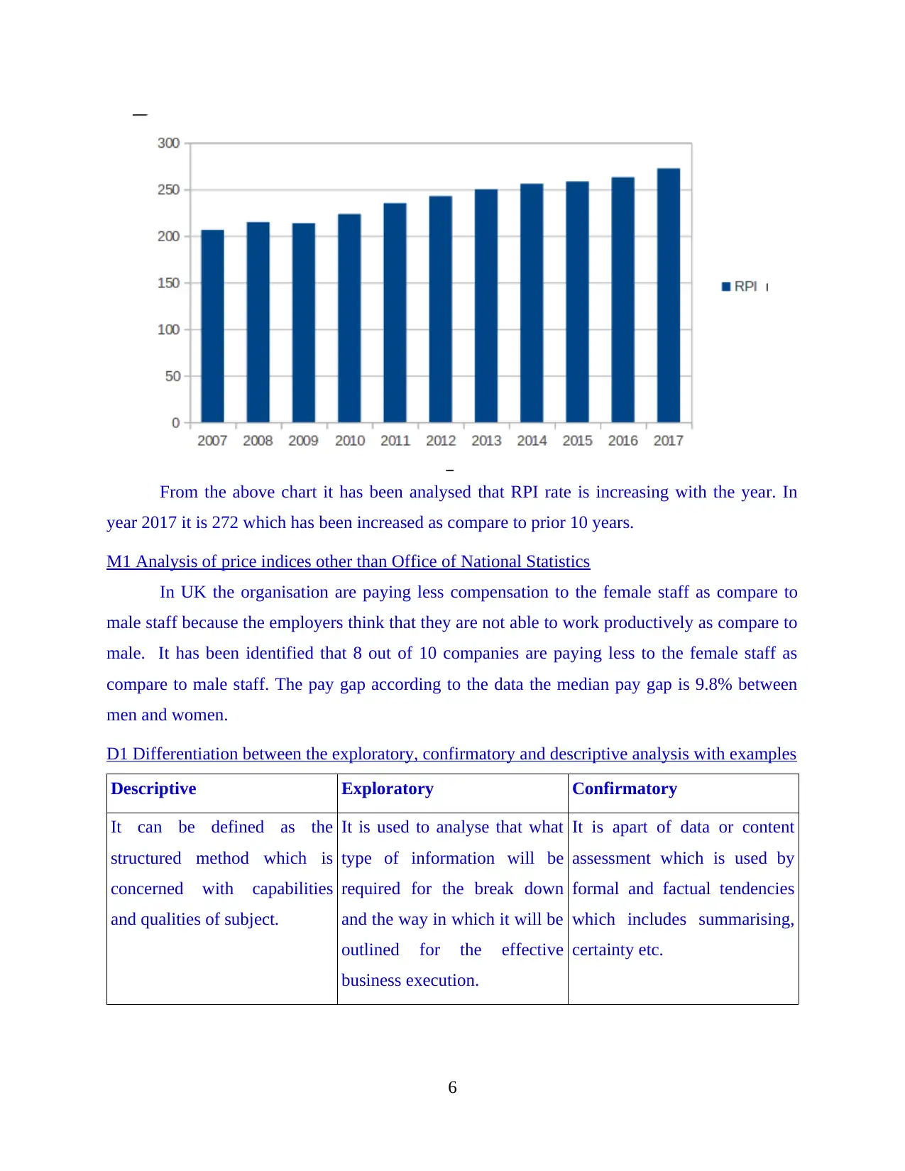
From the above chart it has been analysed that RPI rate is increasing with the year. In
year 2017 it is 272 which has been increased as compare to prior 10 years.
M1 Analysis of price indices other than Office of National Statistics
In UK the organisation are paying less compensation to the female staff as compare to
male staff because the employers think that they are not able to work productively as compare to
male. It has been identified that 8 out of 10 companies are paying less to the female staff as
compare to male staff. The pay gap according to the data the median pay gap is 9.8% between
men and women.
D1 Differentiation between the exploratory, confirmatory and descriptive analysis with examples
Descriptive Exploratory Confirmatory
It can be defined as the
structured method which is
concerned with capabilities
and qualities of subject.
It is used to analyse that what
type of information will be
required for the break down
and the way in which it will be
outlined for the effective
business execution.
It is apart of data or content
assessment which is used by
formal and factual tendencies
which includes summarising,
certainty etc.
6
ACTIVITY 2
P3 Evaluation of raw business data using a number of statistical methods
Difference between sample and population:
Basis Sample Population
Meaning Sample is the sub group of total selected
population selected for a particular
research.
Population is the collection of all the
factors processing same characteristics
that reflects universe.
Measurem
ent
It is measured in statistic. It is measured in parameter.
Focus It is focused wit5h making inferences
regarding the population.
It is focused with identifying the
characteristics.
Method of
data
collection
Data is collected by sample survey or
sampling process.
Data is collected by complete recites or
census.
Techniques of sampling: There are two different sampling techniques that can be used
by a researcher while the research program. Both the methods are described below:
Probability sampling: This techniques of sampling is based on random sample of the
selected population for research purpose. It make sure that every element of the
population get an equal chance to be the part of the sample so that an accurate result can
be received. It is also known as random sampling (Fleming and et. al., 2013).
Non Probability sampling: It does not depends upon the random selection of sample
form the selected population. It is more dependent upon the researcher's cognition to
select elements for a sample. It is also known as non random sampling technique. There
is possibility that the outcome of this method can be biased and make it difficult for all
the factors of selected population to be the part of sample evenly.
A. Scatter diagram to show relation between hot drink sale and average weekly
temperature.
Use of scatter plots: It can be defined as the use of multidimensional data measurement
and visualisation in which the data has been presented upon a chart in the form of dots and all of
7
⊘ This is a preview!⊘
Do you want full access?
Subscribe today to unlock all pages.
Trusted by 1+ million students worldwide
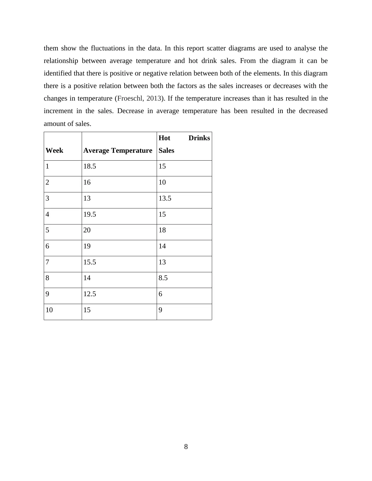
them show the fluctuations in the data. In this report scatter diagrams are used to analyse the
relationship between average temperature and hot drink sales. From the diagram it can be
identified that there is positive or negative relation between both of the elements. In this diagram
there is a positive relation between both the factors as the sales increases or decreases with the
changes in temperature (Froeschl, 2013). If the temperature increases than it has resulted in the
increment in the sales. Decrease in average temperature has been resulted in the decreased
amount of sales.
Week Average Temperature
Hot Drinks
Sales
1 18.5 15
2 16 10
3 13 13.5
4 19.5 15
5 20 18
6 19 14
7 15.5 13
8 14 8.5
9 12.5 6
10 15 9
8
Paraphrase This Document
Need a fresh take? Get an instant paraphrase of this document with our AI Paraphraser
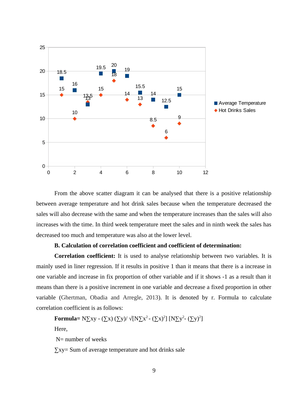
From the above scatter diagram it can be analysed that there is a positive relationship
between average temperature and hot drink sales because when the temperature decreased the
sales will also decrease with the same and when the temperature increases than the sales will also
increases with the time. In third week temperature meet the sales and in ninth week the sales has
decreased too much and temperature was also at the lower level.
B. Calculation of correlation coefficient and coefficient of determination:
Correlation coefficient: It is used to analyse relationship between two variables. It is
mainly used in liner regression. If it results in positive 1 than it means that there is a increase in
one variable and increase in fix proportion of other variable and if it shows -1 as a result than it
means than there is a positive increment in one variable and decrease a fixed proportion in other
variable (Ghertman, Obadia and Arregle, 2013). It is denoted by r. Formula to calculate
correlation coefficient is as follows:
Formula= N∑xy - (∑x) (∑y)/ √[N∑x2 - (∑x)2] [N∑y2- (∑y)2]
Here,
N= number of weeks
∑xy= Sum of average temperature and hot drinks sale
9
0 2 4 6 8 10 12
0
5
10
15
20
25
15
10
13.5
15
18
14 13
8.5
6
9
18.5
16
13
19.5 20 19
15.5
14
12.5
15
Average Temperature
Hot Drinks Sales
(∑x)= Sum of average temperature
(∑y)= Sum of hot drink sales
∑x2= Sum of squared average temperature
∑y2= Sum of squared hot drink sales
Calculation is as follows:
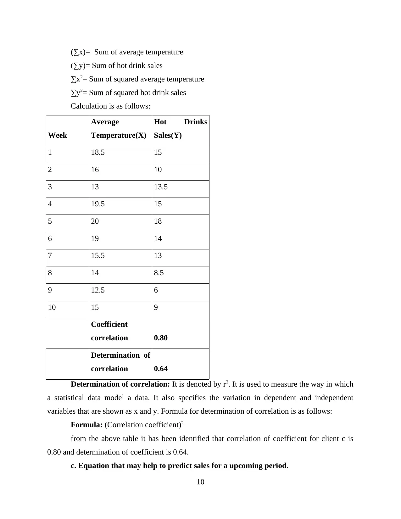
Week
Average
Temperature(X)
Hot Drinks
Sales(Y)
1 18.5 15
2 16 10
3 13 13.5
4 19.5 15
5 20 18
6 19 14
7 15.5 13
8 14 8.5
9 12.5 6
10 15 9
Coefficient
correlation 0.80
Determination of
correlation 0.64
Determination of correlation: It is denoted by r2. It is used to measure the way in which
a statistical data model a data. It also specifies the variation in dependent and independent
variables that are shown as x and y. Formula for determination of correlation is as follows:
Formula: (Correlation coefficient)2
from the above table it has been identified that correlation of coefficient for client c is
0.80 and determination of coefficient is 0.64.
c. Equation that may help to predict sales for a upcoming period.
10
(∑y)= Sum of hot drink sales
∑x2= Sum of squared average temperature
∑y2= Sum of squared hot drink sales
Calculation is as follows:
Week
Average
Temperature(X)
Hot Drinks
Sales(Y)
1 18.5 15
2 16 10
3 13 13.5
4 19.5 15
5 20 18
6 19 14
7 15.5 13
8 14 8.5
9 12.5 6
10 15 9
Coefficient
correlation 0.80
Determination of
correlation 0.64
Determination of correlation: It is denoted by r2. It is used to measure the way in which
a statistical data model a data. It also specifies the variation in dependent and independent
variables that are shown as x and y. Formula for determination of correlation is as follows:
Formula: (Correlation coefficient)2
from the above table it has been identified that correlation of coefficient for client c is
0.80 and determination of coefficient is 0.64.
c. Equation that may help to predict sales for a upcoming period.
10
⊘ This is a preview!⊘
Do you want full access?
Subscribe today to unlock all pages.
Trusted by 1+ million students worldwide
1 out of 22
Related Documents


Your All-in-One AI-Powered Toolkit for Academic Success.
+13062052269
info@desklib.com
Available 24*7 on WhatsApp / Email
![[object Object]](/_next/static/media/star-bottom.7253800d.svg)
Unlock your academic potential
Copyright © 2020–2026 A2Z Services. All Rights Reserved. Developed and managed by ZUCOL.