Statistical Analysis of Health Data - Health Sciences Lab Assignment
VerifiedAdded on 2022/10/18
|7
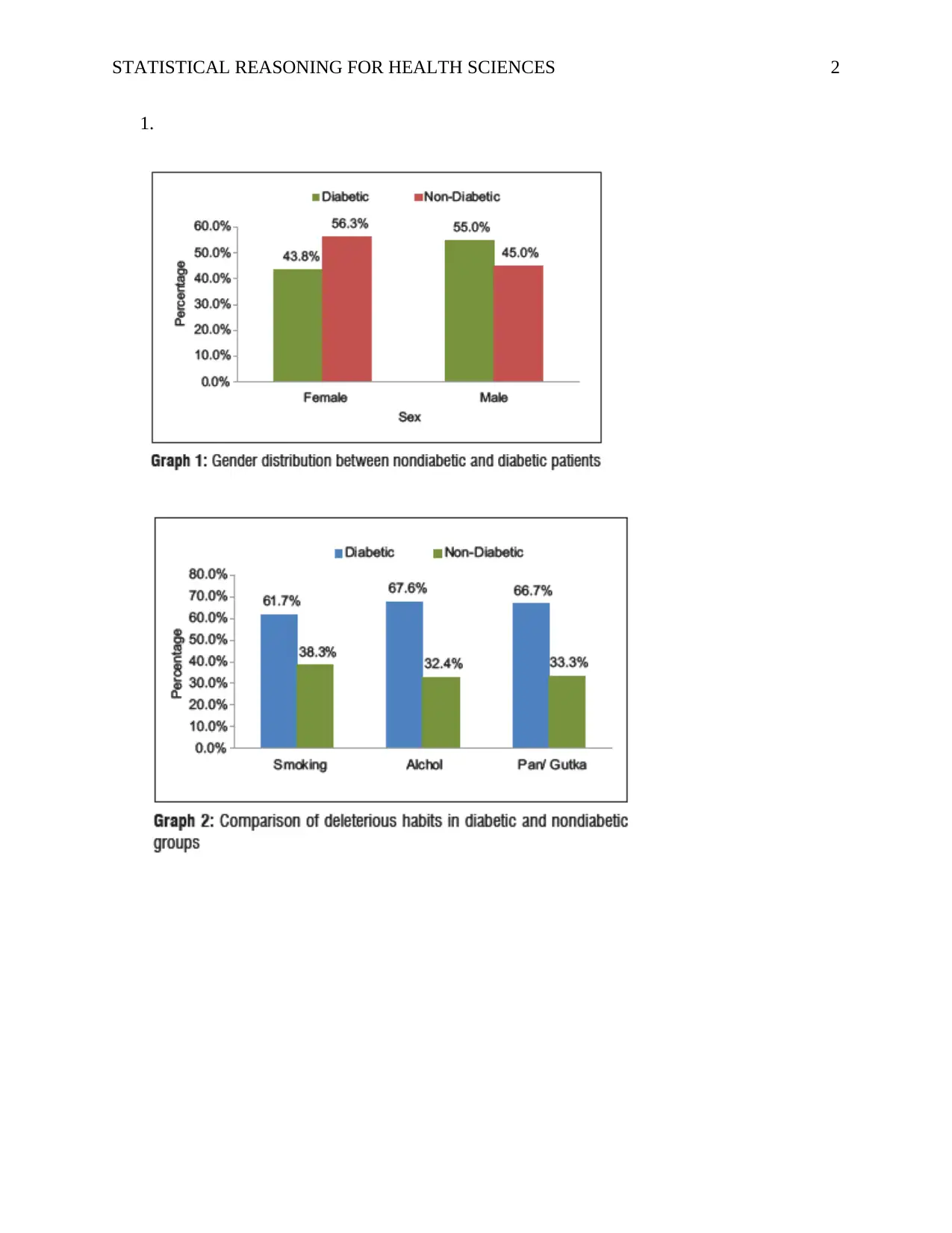
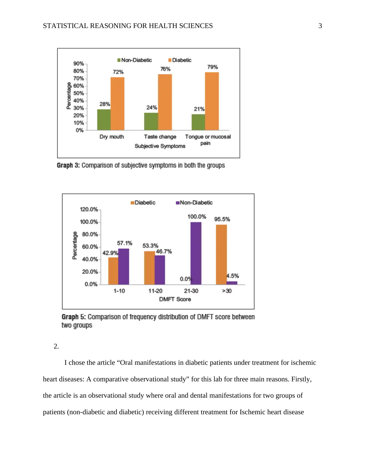
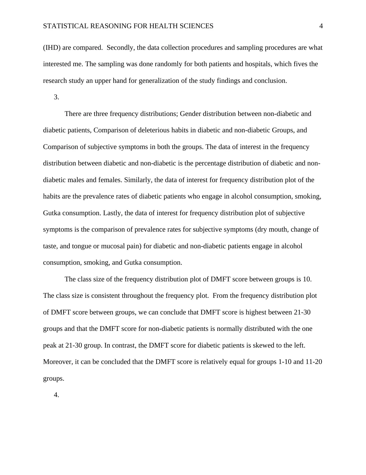
|1119
|20
Homework Assignment
AI Summary
This assignment analyzes an article titled "Oral manifestations in diabetic patients under treatment for ischemic heart diseases: A comparative observational study." The student selected this article because it compares oral and dental manifestations in diabetic and non-diabetic patients with ischemic heart disease, focusing on data collection and sampling procedures. The assignment includes frequency distributions of gender, habits, and subjective symptoms, as well as the DMFT score. The student concludes that the DMFT score is highest in the 21-30 group and is normally distributed for non-diabetic patients, but skewed for diabetic patients. The student also discusses alternative data presentation methods, including pie charts and bar graphs, evaluating their pros and cons. Pie charts are easy to interpret but less effective with many variables, while bar graphs can handle large datasets but require additional explanations. The student provides references for all sources used.

1 out of 7

Your All-in-One AI-Powered Toolkit for Academic Success.
+13062052269
info@desklib.com
Available 24*7 on WhatsApp / Email
![[object Object]](/_next/static/media/star-bottom.7253800d.svg)
Copyright © 2020–2026 A2Z Services. All Rights Reserved. Developed and managed by ZUCOL.