Statistical Analysis of Earnings: Public, Private Sectors and Regions
VerifiedAdded on 2020/12/09
|21
|3211
|62
Report
AI Summary
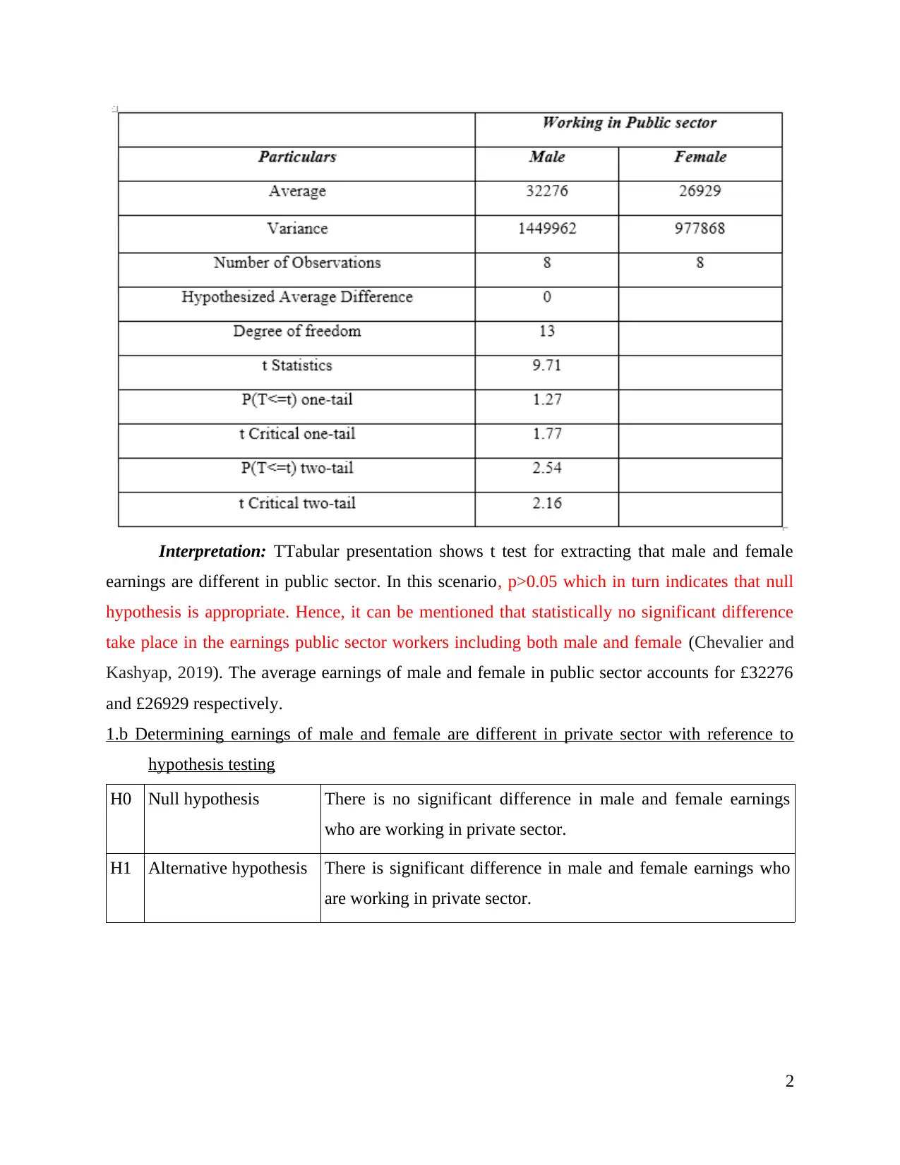
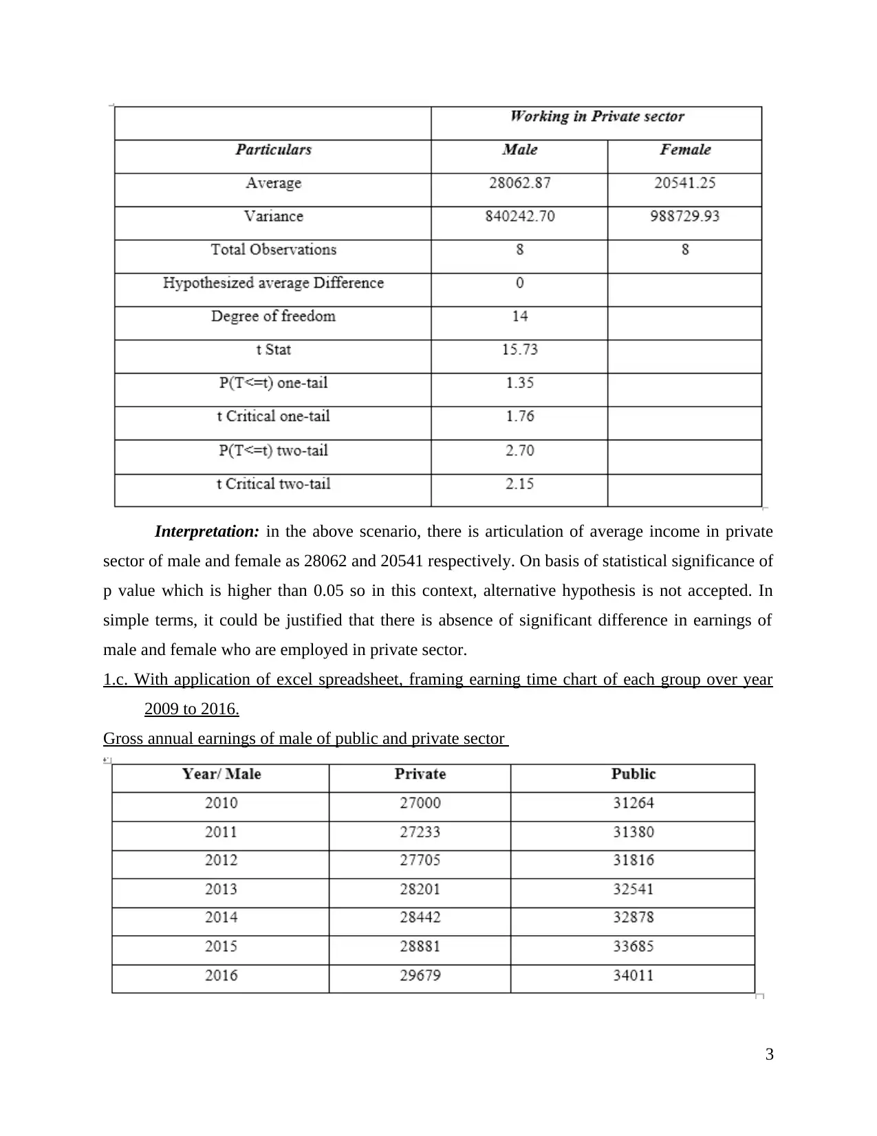
This report presents a statistical analysis of earnings across various sectors and regions. It begins with an introduction to statistical concepts and then delves into a comparison of male and female earnings in both public and private sectors using hypothesis testing. The report includes time charts illustrating gross annual earnings for both genders in each sector, from 2010 to 2016, and discusses annual growth rates. Furthermore, it analyzes leisure staff earnings in the London area, utilizing ogive charts and descriptive statistics like quartiles, mean, and standard deviation. A comparative analysis of earnings between London and Manchester is also provided. The report concludes with the calculation of the Economic Order Quantity (EOQ) for a given scenario. The analysis provides valuable insights into earning trends, sectorial differences, and regional variations, using statistical tools to derive meaningful conclusions.

STATISTICS FOR
MANAGEMENT
MANAGEMENT
Paraphrase This Document
Need a fresh take? Get an instant paraphrase of this document with our AI Paraphraser


INTRODUCTION
Statistics is replicated as branch of mathematics which directly deals with organising,
interpretation, collection, presentation and analysis. This term is used for summarising process
which one could use for developing interpretations related to population primarily on basis of
statistical outcome via sample (Bzdok, Altman and Krzywinski, 2018). This analysis involves
process of collecting and evaluating data and then data is summarised in mathematical form. It is
science for appropriate decision making with context to uncertainty and implied is many
disciplines like financial analysis, auditing, operations and production which considers
improvement in services along with marketing research. It allows undertaking smarter decision
and this helps for offering organization with appropriate information that one could rely for
reference. The present report will discuss about earnings of men and women employed in public
and private sector. In the same series, it will articulate about earnings of leisure staff with Ogive
and other descriptive statistics in London area. Furthermore, it will articulate comparison in
earnings of London and Manchester region.
ACTIVITY 1
1.a Determining earnings of male and female are different in public sector with reference to
hypothesis testing
H0 Null hypothesis There is no significant difference in male and female earnings
who are working in public sector.
H1 Alternative hypothesis There is significant difference in male and female earnings who
are working in public sector.
1
⊘ This is a preview!⊘
Do you want full access?
Subscribe today to unlock all pages.

Trusted by 1+ million students worldwide

Interpretation: TTabular presentation shows t test for extracting that male and female
earnings are different in public sector. In this scenario, p>0.05 which in turn indicates that null
hypothesis is appropriate. Hence, it can be mentioned that statistically no significant difference
take place in the earnings public sector workers including both male and female (Chevalier and
Kashyap, 2019). The average earnings of male and female in public sector accounts for £32276
and £26929 respectively.
1.b Determining earnings of male and female are different in private sector with reference to
hypothesis testing
H0 Null hypothesis There is no significant difference in male and female earnings
who are working in private sector.
H1 Alternative hypothesis There is significant difference in male and female earnings who
are working in private sector.
2
Paraphrase This Document
Need a fresh take? Get an instant paraphrase of this document with our AI Paraphraser

Interpretation: in the above scenario, there is articulation of average income in private
sector of male and female as 28062 and 20541 respectively. On basis of statistical significance of
p value which is higher than 0.05 so in this context, alternative hypothesis is not accepted. In
simple terms, it could be justified that there is absence of significant difference in earnings of
male and female who are employed in private sector.
1.c. With application of excel spreadsheet, framing earning time chart of each group over year
2009 to 2016.
Gross annual earnings of male of public and private sector
3

Interpretation: The above table and graph is articulating about time chart for earnings of
male category who are working in public and private sector as well over year 2010 to 2016. it
could be clearly observed about significant growth but will less proportion. On basis of private
sector as in every year it raised but in 2016, it had major change of 2.76%. In the similar aspect,
its lowest change was in year 2014 as 0.85%. While extracting change, it has been evaluated that
earnings of private sector is raising at rapid pace comparatively to public sector. Numerically, it
could be elaborated as public sector from 2007 to 2017 was 8.78% as smaller than private sector
of same duration by 9.92% (Lachowska and Myck, 2018). Thus, it shows presence of high
potential in private sector along with variation in earnings of male in public and private sector as
well.
Gross annual earnings of female of public and private sector
4
⊘ This is a preview!⊘
Do you want full access?
Subscribe today to unlock all pages.

Trusted by 1+ million students worldwide

Interpretation: The above table and graph is reflecting gross annual earnings of female
over year 2010 to 2016 of both public and private sector. It has been viewed that, it is increasing
on significant aspect as depicted graph had entailed about earnings of female in year 2010 as
26113 and in year 2016 it reached on 28053 respectively. On the contrary, by considering private
sector earnings of female had inclined as 19532 to 22251 on respective basis. As this graph is
clearly showing variation which undertakes in female earnings with context to private and public
sector (Puri and Sengupta, 2018). Furthermore, this time graph provides clear exhibit about
females employed in public sector are higher than compared to private sector.
1.d Identifying annual growth rate of earnings of each group
Female Male
Year Private Rate of Public Rate of Private Rate of Public Rate of
5
Paraphrase This Document
Need a fresh take? Get an instant paraphrase of this document with our AI Paraphraser

sector
(Women)
growth
(in
percentag
e)
sector
(Women)
growth
(in
percentag
e)
sector
(Men)
growth
(in
percentag
e)
sector
(Men)
growth
(in
percentag
e)
2009 19551 25224 NA 27362 NA 30638 NA
2010 19532 -0.1 26113 3.5 27000 -1.3 31264 2
2011 19565 0.2 26470 1.4 27233 0.9 31380 0.4
2012 20313 3.8 26636 0.6 27705 1.7 31816 1.4
2013 20698 1.9 27338 2.6 28201 1.8 32541 2.3
2014 21017 1.5 27705 1.3 28442 0.9 32878 1
2015 21403 1.8 27900 0.7 28881 1.5 33685 2.5
2016 22251 4 28053 0.5 29679 2.8 34011 1
Growth rate of males and female in the context of both private & public sector is
enumerated below:
Females (Private sector): There is articulation of gross annual earnings which is raising
on annual aspect with reference to fluctuation outcome. On basis of this table, in 2016 it inclines
with high variation as it was about 4%. In simple words, it could be elaborated that women are
giving priority to private sector comparatively to public because of raise in involvements and
earnings as well.
Females (in public sector): With reference to gross annual earnings of women, there is
clear articulation about drastic impact in each year (Walker, Michailov and Trukhanov, 2019).
However, in year 2013, it faced raise with high proportion and this was leading change over
2010 to 2016. On the similar note, in year 2016 it has presence of little change of approx 0.53%.
Male (private sector): The above table is reflecting gross annual earnings of male with
context to private sector. It has been clearly viewed that, it raised in every year but in year 2016
it had alteration of huge proportion of 2.76%. Simultaneously, there was the least increase in
year 2014 was about 0.85%.
Male (public sector): The above scenario is depicting gross annual earnings of public
sector of male category over year 2010 to 2016. It is clearly viewed that in 2015 there was
alteration with high proportion as it was about 2.45% with this specified duration. In this aspect,
6
(Women)
growth
(in
percentag
e)
sector
(Women)
growth
(in
percentag
e)
sector
(Men)
growth
(in
percentag
e)
sector
(Men)
growth
(in
percentag
e)
2009 19551 25224 NA 27362 NA 30638 NA
2010 19532 -0.1 26113 3.5 27000 -1.3 31264 2
2011 19565 0.2 26470 1.4 27233 0.9 31380 0.4
2012 20313 3.8 26636 0.6 27705 1.7 31816 1.4
2013 20698 1.9 27338 2.6 28201 1.8 32541 2.3
2014 21017 1.5 27705 1.3 28442 0.9 32878 1
2015 21403 1.8 27900 0.7 28881 1.5 33685 2.5
2016 22251 4 28053 0.5 29679 2.8 34011 1
Growth rate of males and female in the context of both private & public sector is
enumerated below:
Females (Private sector): There is articulation of gross annual earnings which is raising
on annual aspect with reference to fluctuation outcome. On basis of this table, in 2016 it inclines
with high variation as it was about 4%. In simple words, it could be elaborated that women are
giving priority to private sector comparatively to public because of raise in involvements and
earnings as well.
Females (in public sector): With reference to gross annual earnings of women, there is
clear articulation about drastic impact in each year (Walker, Michailov and Trukhanov, 2019).
However, in year 2013, it faced raise with high proportion and this was leading change over
2010 to 2016. On the similar note, in year 2016 it has presence of little change of approx 0.53%.
Male (private sector): The above table is reflecting gross annual earnings of male with
context to private sector. It has been clearly viewed that, it raised in every year but in year 2016
it had alteration of huge proportion of 2.76%. Simultaneously, there was the least increase in
year 2014 was about 0.85%.
Male (public sector): The above scenario is depicting gross annual earnings of public
sector of male category over year 2010 to 2016. It is clearly viewed that in 2015 there was
alteration with high proportion as it was about 2.45% with this specified duration. In this aspect,
6

it was followed by year 2013 as on the contrary, there was presence of increment but with small
proportion as of 0.37%. Furthermore, this tabular format is reflecting fluctuating trend in
earnings of males with duration of 7 years as in 2012 and 2013 there was high percentage change
in earnings was greater over past year. Conversely, in year 2013, its percentage change related to
earnings of male in public sector falls by 2.28% to 1.04% which is not replicated as good signal.
ACTIVITY 2- CLIENT B
2.A
2.A.a Using ogive for estimating median hourly earnings along with quartile
Ogive may be served as a statistical tool which is used to exhibit curve pertaining to
cumulative distribution function. In other words, ogive chart provides high level of assistance in
exhibiting CF distribution function of grouped data set. It is the most effectual way which helps
in understanding data set and deriving appropriate results from the same. By using such
statistical tool concerned authority can assess the extent to which many figures vary from
particular value in data set. In Ogive graph, cumulative percentage figures are presented from left
to right. In this aspect, mean, standard deviation and median are referred as basic tool which are
applicable for plotting outcome which appeared on direct basis. In the similar aspects, CF is
plotted on graph on y axis as every class boundary is on x axis. Usually, it is used for
determining number of data points which is equalised to specific value in specific data set.
Thus, it is unique by frequency polygon because of plotting of cumulative values rather
than plot of valuing themselves. There is presence of analysis of variation in hourly earnings of
London area with application of multiple statistical tools. With this consideration, there is
reflection of descriptive analysis of specific data base which consist of analysis of quartile,
standard deviation along with mean and median.
Discussion on Median:
This is replicated as value which categorise higher half with lower half of sample data as
value which is likely to fall above or below it. In simple terms, median is referred as middle
value in the list of numericals where it is replicated as simple measure of central tendency as for
extracting this, observations are arranged in increasing order and then formula is implicated. This
is not influenced through outliers at extreme of data set (Nisar, Prabhakar and Strakova, 2019).
Due to this reason, it is used with presence of extreme values which could greatly influence
7
⊘ This is a preview!⊘
Do you want full access?
Subscribe today to unlock all pages.

Trusted by 1+ million students worldwide

distort and mean which is typically considered. In the same series, it is replicated as primary
method to extract statistical data. With context to above statement, median could be calculated in
the easiest way comparatively to other descriptive statistics. Simultaneously, this could be
reflected as method for determining average of grouped number which is common mean as
middle value in specified number list is known as median.
Hourly
Earnings CI
Number of
Leisure
Employees R frequency Cumulative frequency CRF
0 to 10 4 4% 4 4%
10 to 20 23 23% 27 27%
20 to 30 13 13% 40 40%
30 to 40 7 7% 47 47%
40 to 50 3 3% 50 50%
8
Paraphrase This Document
Need a fresh take? Get an instant paraphrase of this document with our AI Paraphraser

Interpretation: the above graph is showing ogive chart related to leisure employee's
hourly earnings of specific London region. In this aspect, it is clearly observed that there is
increment till 10 to 20 hours but after that till 40 to 50 is decreasing. On the contrary, cumulative
is raising from left to right as observation of trend has been viewed that hours are increasing
whereas frequency is falling. Thus, most important aspect is all about last plot of cumulative
frequency is at 50 which shows about appropriateness.
Discussion on quartile:
Quartile is replicated as statistical term which provides description of division of
observations into four categorised intervals on basis of data value which provides differences in
whole observations. Such tool helps in analysing and evaluating performance over the quarters.
Through this, business owner can assess trend and thereby develops strategic framework for the
upcoming time period. It must be noted that this is not limited to discrete variables but applies
on equal basis with context to continuous variables (Quartile, 2019). As this is measure of
9

central tendency of data but does not reflect that how distributed data in two arms on either side
of median with context to quartile.
Quartile Outcome
Quartile 1 Value of 50 / 4 th item
Value of 12.5 th item
10 + (20 – 10) / 23 * (12.5 – 4)
= 13.69
Quartile 3 Value of (3 * 50) / 4 th item
Value of 37.5 th item
20 + (30 – 20) / 13 * (37.5 – 23)
= 31.15
Inter-quartile 31.5 – 13.69
= 18.46
Interpretation: The above outcome of quartile of leisure employees has been clearly
viewed first quartile is 13.69 which is far away from median whereas 3 quartile is 31.15 which is
closer to it. In simple words, 25th percentile of data is smaller than first quartile by 25% and 75%
10
⊘ This is a preview!⊘
Do you want full access?
Subscribe today to unlock all pages.

Trusted by 1+ million students worldwide
1 out of 21
Related Documents

Your All-in-One AI-Powered Toolkit for Academic Success.
+13062052269
info@desklib.com
Available 24*7 on WhatsApp / Email
Unlock your academic potential
Copyright © 2020–2025 A2Z Services. All Rights Reserved. Developed and managed by ZUCOL.