Statistics for Business Decisions Report - Adelaide Plant Analysis
VerifiedAdded on 2021/02/20
|15
|2803
|23
Report
AI Summary
This report provides a comprehensive statistical analysis addressing three key business problems. The first section compares CO2 emissions across fifteen countries, utilizing graphical techniques to highlight changes between 2009 and 2013, and then compares the percentage change in CO2 emissions. The second part focuses on analyzing the time of assembly at a car plant in Adelaide, including frequency and cumulative frequency distributions, histograms, and ogive curves. The report also determines the number of workers taking less than 65 and more than 75 seconds to complete a weld. The third section explores the relationship between the rate of inflation and the all ordinaries index, using scatter plots, numerical data reports, correlation analysis, and a simple linear regression model to assess the significance of the relationship between these variables.

Statistics for Business
Decision
Decision
Paraphrase This Document
Need a fresh take? Get an instant paraphrase of this document with our AI Paraphraser
Contents
Contents...........................................................................................................................................2
INTRODUCTION...........................................................................................................................1
1. CO2 EMISSION........................................................................................................................1
a) Graphical technique for comparing values.......................................................................1
b) Graphical technique for comparing the percentage value.............................................2
c) Comparing a & b...................................................................................................................4
2. ANALYSIS OF TIME OF ASSEMBLY...................................................................................4
a) Adequate frequency distribution........................................................................................4
b) Proper Cumulative frequency distribution........................................................................5
c) Histogram...............................................................................................................................5
d) Ogive......................................................................................................................................6
e) When data is less than 65...................................................................................................8
f) When data is more than 75..................................................................................................8
3. ESTIMATION AND TESTING SIGNIFICANCE LEVEL.....................................................8
a) Graphical Descriptive Measure of two variables.............................................................8
b) Scatter plot..........................................................................................................................10
c) Numerical brief report of data...........................................................................................11
d) Coefficient of correlation between the rate of inflation and all ordinaries index.......11
e) Simple loner regression model and the linear equation model...................................12
f) Coefficient of Determination R2.........................................................................................12
g) Evaluation of significant relationship at 5% significance level....................................12
h) Value of the standard error of the estimate (se).............................................................12
CONCLUSION.............................................................................................................................13
REFERENCES............................................................................................................................14
INTRODUCTION
Statistics analysis plays essential role in business decision making, planning and
strategy formulation (Berman,and Wang, 2016). This report provides a brief introduction
about the fundamental statistical approach and techniques used to sort out the business
problems and improving the decision making process. This report covers the application
of statistical techniques to solve the business problems. Three business problems are
given as evaluation of climate change to unstable activities, second is analysing the
basis statistical aspects based upon car assembly plant in Adelaide that contains the
data of 40 workers and the third problem is related to analysis of purchasing power of
the dollar in order to determine the investments to provide protection against inflation.
1. CO2 EMISSION
a) Graphical technique for comparing values
Country
2009 (in millions of metric
tons)
2013 (in millions of metric
tons)
United States 5957 5300
China 5323 10330
Russia 1696 1800
Japan 1230 1360
India 1166 2070
Germany 844 840
Canada 631 550
United
Kingdom 577 480
South Korea 500 630
Italy 467 390
Iran 451 410
South Africa 424 330
France 415 370
Saudi Arabia 412 490
Australia 407 390
1
⊘ This is a preview!⊘
Do you want full access?
Subscribe today to unlock all pages.
Trusted by 1+ million students worldwide
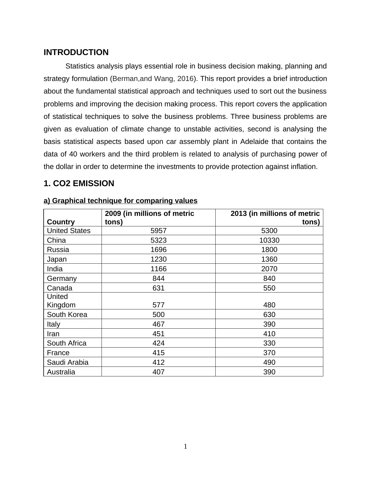
The above table states the position of CO2 emission in fifteen countries. The
emission is measured in millions of metric tonnes for the year 2013 and 2009. China is
recorded as highest CO2 emission country within the gap of four years. The United
states controlled the emission of CO2 by implementing strong environment friendly rules
and legislations (Hutton, Jiang and Kumar, 2014). Australia was the only country that
maintained the same level of the emission.
b) Graphical technique for comparing the percentage value
2
Paraphrase This Document
Need a fresh take? Get an instant paraphrase of this document with our AI Paraphraser
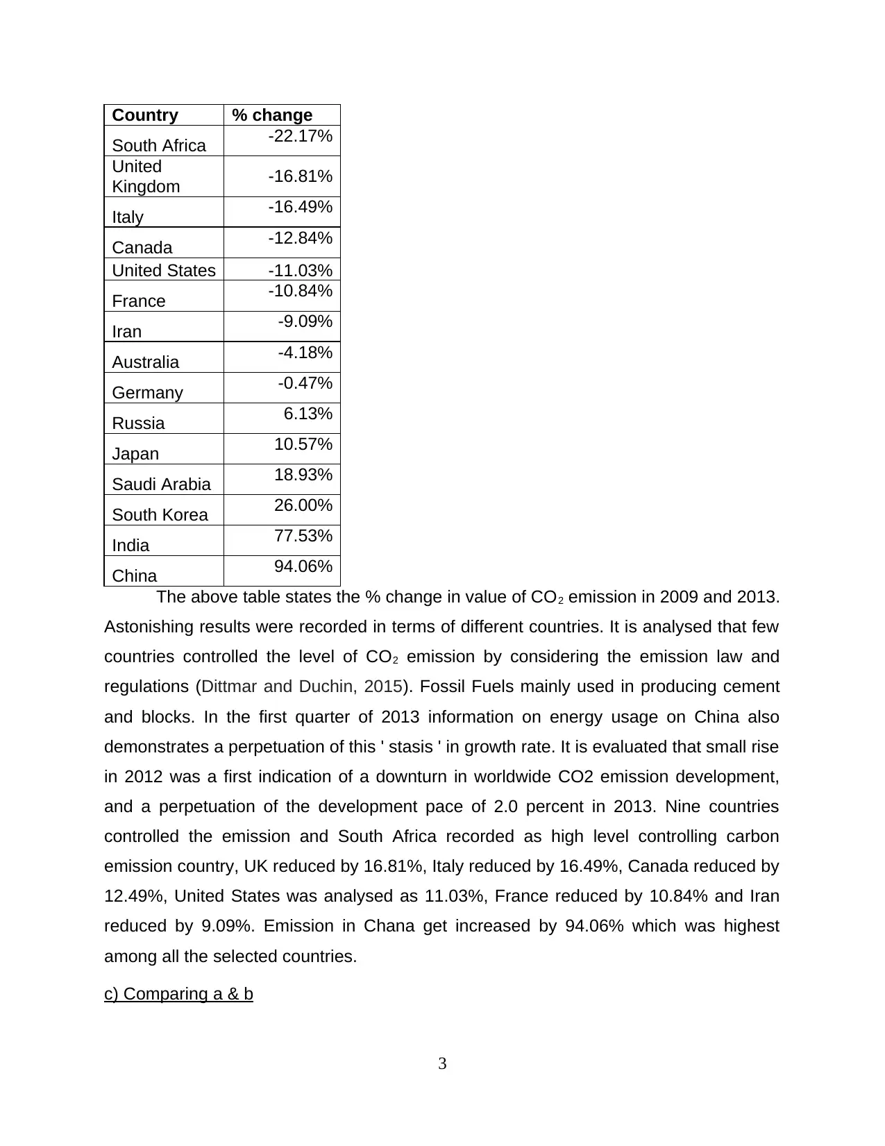
Country % change
South Africa -22.17%
United
Kingdom -16.81%
Italy -16.49%
Canada -12.84%
United States -11.03%
France -10.84%
Iran -9.09%
Australia -4.18%
Germany -0.47%
Russia 6.13%
Japan 10.57%
Saudi Arabia 18.93%
South Korea 26.00%
India 77.53%
China 94.06%
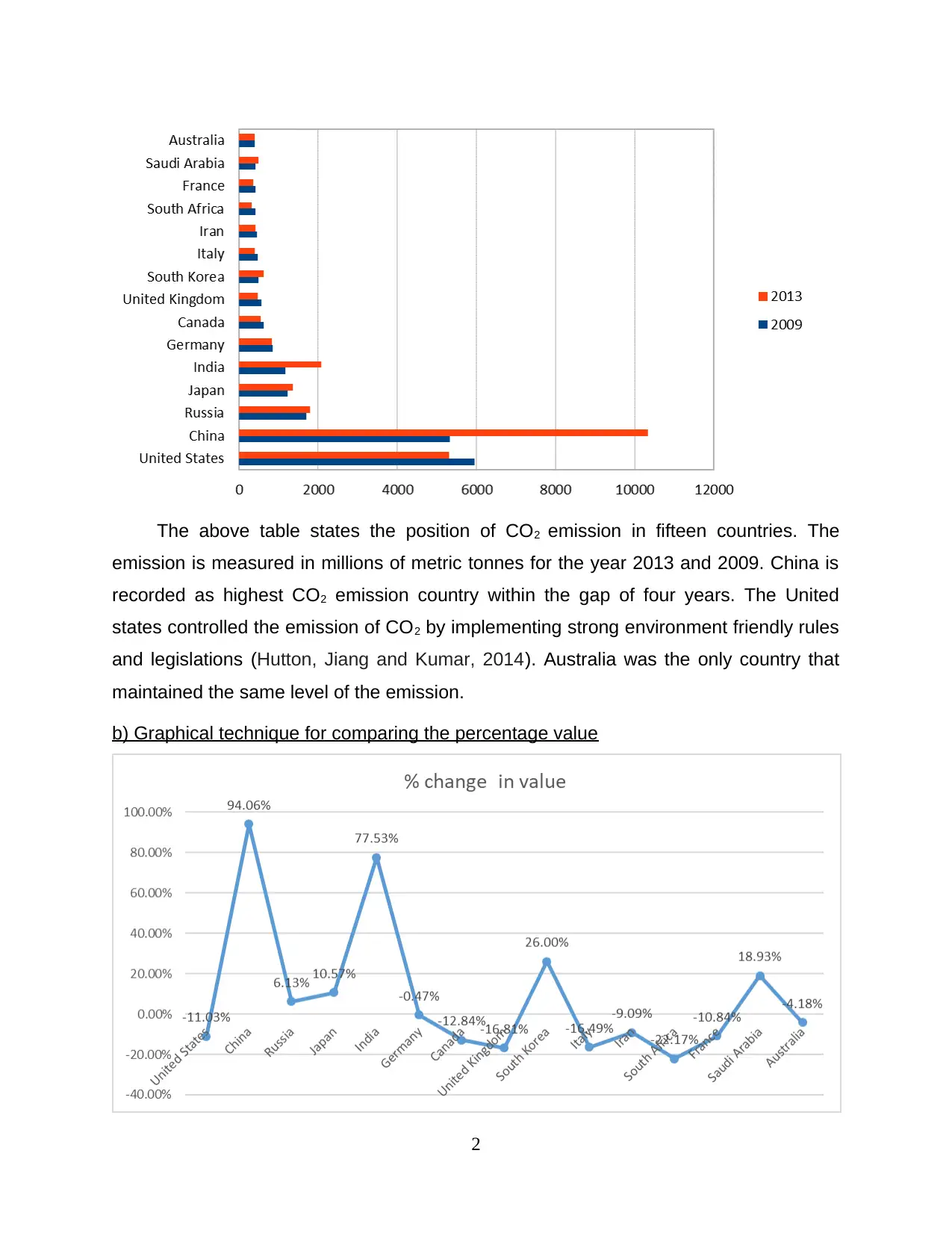
The above table states the % change in value of CO2 emission in 2009 and 2013.
Astonishing results were recorded in terms of different countries. It is analysed that few
countries controlled the level of CO2 emission by considering the emission law and
regulations (Dittmar and Duchin, 2015). Fossil Fuels mainly used in producing cement
and blocks. In the first quarter of 2013 information on energy usage on China also
demonstrates a perpetuation of this ' stasis ' in growth rate. It is evaluated that small rise
in 2012 was a first indication of a downturn in worldwide CO2 emission development,
and a perpetuation of the development pace of 2.0 percent in 2013. Nine countries
controlled the emission and South Africa recorded as high level controlling carbon
emission country, UK reduced by 16.81%, Italy reduced by 16.49%, Canada reduced by
12.49%, United States was analysed as 11.03%, France reduced by 10.84% and Iran
reduced by 9.09%. Emission in Chana get increased by 94.06% which was highest
among all the selected countries.
c) Comparing a & b
3
South Africa -22.17%
United
Kingdom -16.81%
Italy -16.49%
Canada -12.84%
United States -11.03%
France -10.84%
Iran -9.09%
Australia -4.18%
Germany -0.47%
Russia 6.13%
Japan 10.57%
Saudi Arabia 18.93%
South Korea 26.00%
India 77.53%
China 94.06%
The above table states the % change in value of CO2 emission in 2009 and 2013.
Astonishing results were recorded in terms of different countries. It is analysed that few
countries controlled the level of CO2 emission by considering the emission law and
regulations (Dittmar and Duchin, 2015). Fossil Fuels mainly used in producing cement
and blocks. In the first quarter of 2013 information on energy usage on China also
demonstrates a perpetuation of this ' stasis ' in growth rate. It is evaluated that small rise
in 2012 was a first indication of a downturn in worldwide CO2 emission development,
and a perpetuation of the development pace of 2.0 percent in 2013. Nine countries
controlled the emission and South Africa recorded as high level controlling carbon
emission country, UK reduced by 16.81%, Italy reduced by 16.49%, Canada reduced by
12.49%, United States was analysed as 11.03%, France reduced by 10.84% and Iran
reduced by 9.09%. Emission in Chana get increased by 94.06% which was highest
among all the selected countries.
c) Comparing a & b
3
After comparing the level of emission of CO2 in fifteen countries due to use of
fossil fuel the results were counted effectively. It is observed that the level of emission of
transportation by 28.9% of 2017 considered in various levels and high consumption
level of petroleum resources is one of the reason of increasing emission level.
Industries uses fossil fuel for producing energy and the level and this energy is used to
generate other goods and convert the energy in other forms. In the year 2009 the use of
fossil fuel. It is evaluated that effect of gas emission in US get increased in comparison
to Fossil fuel.
2. ANALYSIS OF TIME OF ASSEMBLY
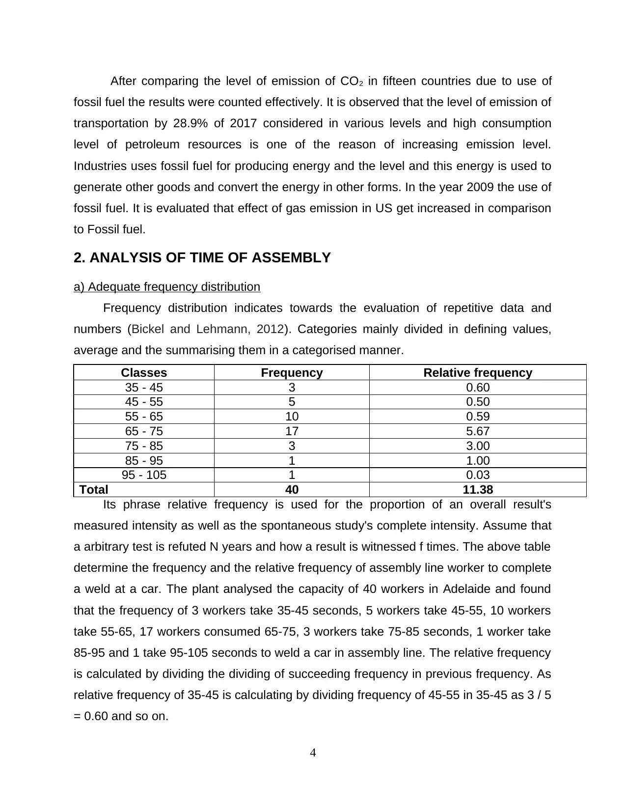
a) Adequate frequency distribution
Frequency distribution indicates towards the evaluation of repetitive data and
numbers (Bickel and Lehmann, 2012). Categories mainly divided in defining values,
average and the summarising them in a categorised manner.
Classes Frequency Relative frequency
35 - 45 3 0.60
45 - 55 5 0.50
55 - 65 10 0.59
65 - 75 17 5.67
75 - 85 3 3.00
85 - 95 1 1.00
95 - 105 1 0.03
Total 40 11.38
Its phrase relative frequency is used for the proportion of an overall result's
measured intensity as well as the spontaneous study's complete intensity. Assume that
a arbitrary test is refuted N years and how a result is witnessed f times. The above table
determine the frequency and the relative frequency of assembly line worker to complete
a weld at a car. The plant analysed the capacity of 40 workers in Adelaide and found
that the frequency of 3 workers take 35-45 seconds, 5 workers take 45-55, 10 workers
take 55-65, 17 workers consumed 65-75, 3 workers take 75-85 seconds, 1 worker take
85-95 and 1 take 95-105 seconds to weld a car in assembly line. The relative frequency
is calculated by dividing the dividing of succeeding frequency in previous frequency. As
relative frequency of 35-45 is calculating by dividing frequency of 45-55 in 35-45 as 3 / 5
= 0.60 and so on.
4
fossil fuel the results were counted effectively. It is observed that the level of emission of
transportation by 28.9% of 2017 considered in various levels and high consumption
level of petroleum resources is one of the reason of increasing emission level.
Industries uses fossil fuel for producing energy and the level and this energy is used to
generate other goods and convert the energy in other forms. In the year 2009 the use of
fossil fuel. It is evaluated that effect of gas emission in US get increased in comparison
to Fossil fuel.
2. ANALYSIS OF TIME OF ASSEMBLY
a) Adequate frequency distribution
Frequency distribution indicates towards the evaluation of repetitive data and
numbers (Bickel and Lehmann, 2012). Categories mainly divided in defining values,
average and the summarising them in a categorised manner.
Classes Frequency Relative frequency
35 - 45 3 0.60
45 - 55 5 0.50
55 - 65 10 0.59
65 - 75 17 5.67
75 - 85 3 3.00
85 - 95 1 1.00
95 - 105 1 0.03
Total 40 11.38
Its phrase relative frequency is used for the proportion of an overall result's
measured intensity as well as the spontaneous study's complete intensity. Assume that
a arbitrary test is refuted N years and how a result is witnessed f times. The above table
determine the frequency and the relative frequency of assembly line worker to complete
a weld at a car. The plant analysed the capacity of 40 workers in Adelaide and found
that the frequency of 3 workers take 35-45 seconds, 5 workers take 45-55, 10 workers
take 55-65, 17 workers consumed 65-75, 3 workers take 75-85 seconds, 1 worker take
85-95 and 1 take 95-105 seconds to weld a car in assembly line. The relative frequency
is calculated by dividing the dividing of succeeding frequency in previous frequency. As
relative frequency of 35-45 is calculating by dividing frequency of 45-55 in 35-45 as 3 / 5
= 0.60 and so on.
4
⊘ This is a preview!⊘
Do you want full access?
Subscribe today to unlock all pages.
Trusted by 1+ million students worldwide
b) Proper Cumulative frequency distribution
Classes Frequency
Relative
frequency
Cumulative
frequency
Cumulative relative
frequency
35 - 45 3 0.60 3 0.60
45 - 55 5 0.50 8 1.10
55 - 65 10 0.59 18 1.69
65 - 75 17 5.67 35 7.35
75 - 85 3 3.00 38 10.35
85 - 95 1 1.00 39 11.35
95 - 105 1 0.03 40 11.38
Total 40 11.38
From the above evaluation the cumulative frequency is calculated the cumulative
relative frequency by considering the same method of analysing the relative frequency.
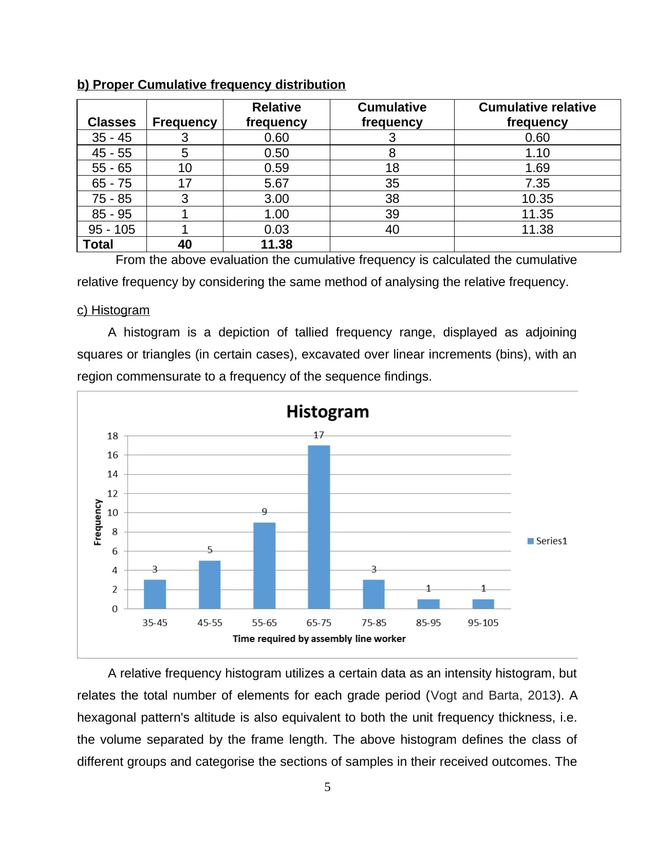
c) Histogram
A histogram is a depiction of tallied frequency range, displayed as adjoining
squares or triangles (in certain cases), excavated over linear increments (bins), with an
region commensurate to a frequency of the sequence findings.
A relative frequency histogram utilizes a certain data as an intensity histogram, but
relates the total number of elements for each grade period (Vogt and Barta, 2013). A
hexagonal pattern's altitude is also equivalent to both the unit frequency thickness, i.e.
the volume separated by the frame length. The above histogram defines the class of
different groups and categorise the sections of samples in their received outcomes. The
5
Classes Frequency
Relative
frequency
Cumulative
frequency
Cumulative relative
frequency
35 - 45 3 0.60 3 0.60
45 - 55 5 0.50 8 1.10
55 - 65 10 0.59 18 1.69
65 - 75 17 5.67 35 7.35
75 - 85 3 3.00 38 10.35
85 - 95 1 1.00 39 11.35
95 - 105 1 0.03 40 11.38
Total 40 11.38
From the above evaluation the cumulative frequency is calculated the cumulative
relative frequency by considering the same method of analysing the relative frequency.
c) Histogram
A histogram is a depiction of tallied frequency range, displayed as adjoining
squares or triangles (in certain cases), excavated over linear increments (bins), with an
region commensurate to a frequency of the sequence findings.
A relative frequency histogram utilizes a certain data as an intensity histogram, but
relates the total number of elements for each grade period (Vogt and Barta, 2013). A
hexagonal pattern's altitude is also equivalent to both the unit frequency thickness, i.e.
the volume separated by the frame length. The above histogram defines the class of
different groups and categorise the sections of samples in their received outcomes. The
5
Paraphrase This Document
Need a fresh take? Get an instant paraphrase of this document with our AI Paraphraser
bars in chards define the group in selected group of classes subject to assembly line
workers. Histogram easily defines the groups by their size and present a valid
information to record them in effective manner. The histogram states that the class
group of 65-75 seconds retain high number of workers to weld a car.
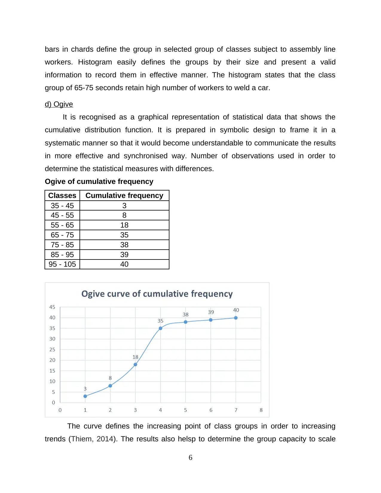
d) Ogive
It is recognised as a graphical representation of statistical data that shows the
cumulative distribution function. It is prepared in symbolic design to frame it in a
systematic manner so that it would become understandable to communicate the results
in more effective and synchronised way. Number of observations used in order to
determine the statistical measures with differences.
Ogive of cumulative frequency
Classes Cumulative frequency
35 - 45 3
45 - 55 8
55 - 65 18
65 - 75 35
75 - 85 38
85 - 95 39
95 - 105 40
The curve defines the increasing point of class groups in order to increasing
trends (Thiem, 2014). The results also helsp to determine the group capacity to scale
6
workers. Histogram easily defines the groups by their size and present a valid
information to record them in effective manner. The histogram states that the class
group of 65-75 seconds retain high number of workers to weld a car.
d) Ogive
It is recognised as a graphical representation of statistical data that shows the
cumulative distribution function. It is prepared in symbolic design to frame it in a
systematic manner so that it would become understandable to communicate the results
in more effective and synchronised way. Number of observations used in order to
determine the statistical measures with differences.
Ogive of cumulative frequency
Classes Cumulative frequency
35 - 45 3
45 - 55 8
55 - 65 18
65 - 75 35
75 - 85 38
85 - 95 39
95 - 105 40
The curve defines the increasing point of class groups in order to increasing
trends (Thiem, 2014). The results also helsp to determine the group capacity to scale
6
them in different categories. It works as a compass that helps in considering the
different categories in various terms.
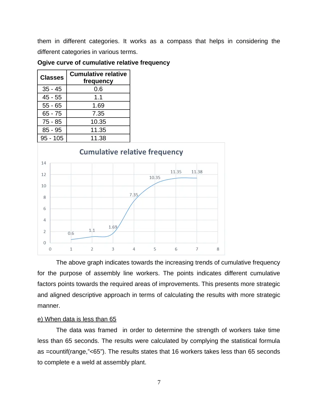
Ogive curve of cumulative relative frequency
Classes Cumulative relative
frequency
35 - 45 0.6
45 - 55 1.1
55 - 65 1.69
65 - 75 7.35
75 - 85 10.35
85 - 95 11.35
95 - 105 11.38
The above graph indicates towards the increasing trends of cumulative frequency
for the purpose of assembly line workers. The points indicates different cumulative
factors points towards the required areas of improvements. This presents more strategic
and aligned descriptive approach in terms of calculating the results with more strategic
manner.
e) When data is less than 65
The data was framed in order to determine the strength of workers take time
less than 65 seconds. The results were calculated by complying the statistical formula
as =countif(range,”<65”). The results states that 16 workers takes less than 65 seconds
to complete e a weld at assembly plant.
7
different categories in various terms.
Ogive curve of cumulative relative frequency
Classes Cumulative relative
frequency
35 - 45 0.6
45 - 55 1.1
55 - 65 1.69
65 - 75 7.35
75 - 85 10.35
85 - 95 11.35
95 - 105 11.38
The above graph indicates towards the increasing trends of cumulative frequency
for the purpose of assembly line workers. The points indicates different cumulative
factors points towards the required areas of improvements. This presents more strategic
and aligned descriptive approach in terms of calculating the results with more strategic
manner.
e) When data is less than 65
The data was framed in order to determine the strength of workers take time
less than 65 seconds. The results were calculated by complying the statistical formula
as =countif(range,”<65”). The results states that 16 workers takes less than 65 seconds
to complete e a weld at assembly plant.
7
⊘ This is a preview!⊘
Do you want full access?
Subscribe today to unlock all pages.
Trusted by 1+ million students worldwide
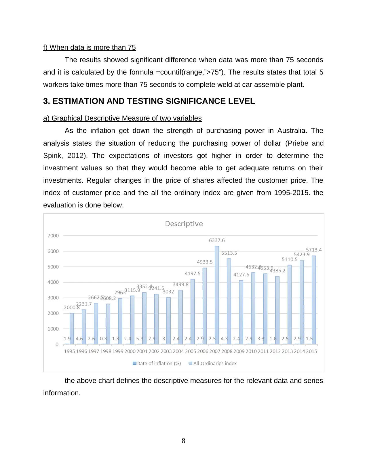
f) When data is more than 75
The results showed significant difference when data was more than 75 seconds
and it is calculated by the formula =countif(range,”>75”). The results states that total 5
workers take times more than 75 seconds to complete weld at car assemble plant.
3. ESTIMATION AND TESTING SIGNIFICANCE LEVEL
a) Graphical Descriptive Measure of two variables
As the inflation get down the strength of purchasing power in Australia. The
analysis states the situation of reducing the purchasing power of dollar (Priebe and
Spink, 2012). The expectations of investors got higher in order to determine the
investment values so that they would become able to get adequate returns on their
investments. Regular changes in the price of shares affected the customer price. The
index of customer price and the all the ordinary index are given from 1995-2015. the
evaluation is done below;
the above chart defines the descriptive measures for the relevant data and series
information.
8
Paraphrase This Document
Need a fresh take? Get an instant paraphrase of this document with our AI Paraphraser
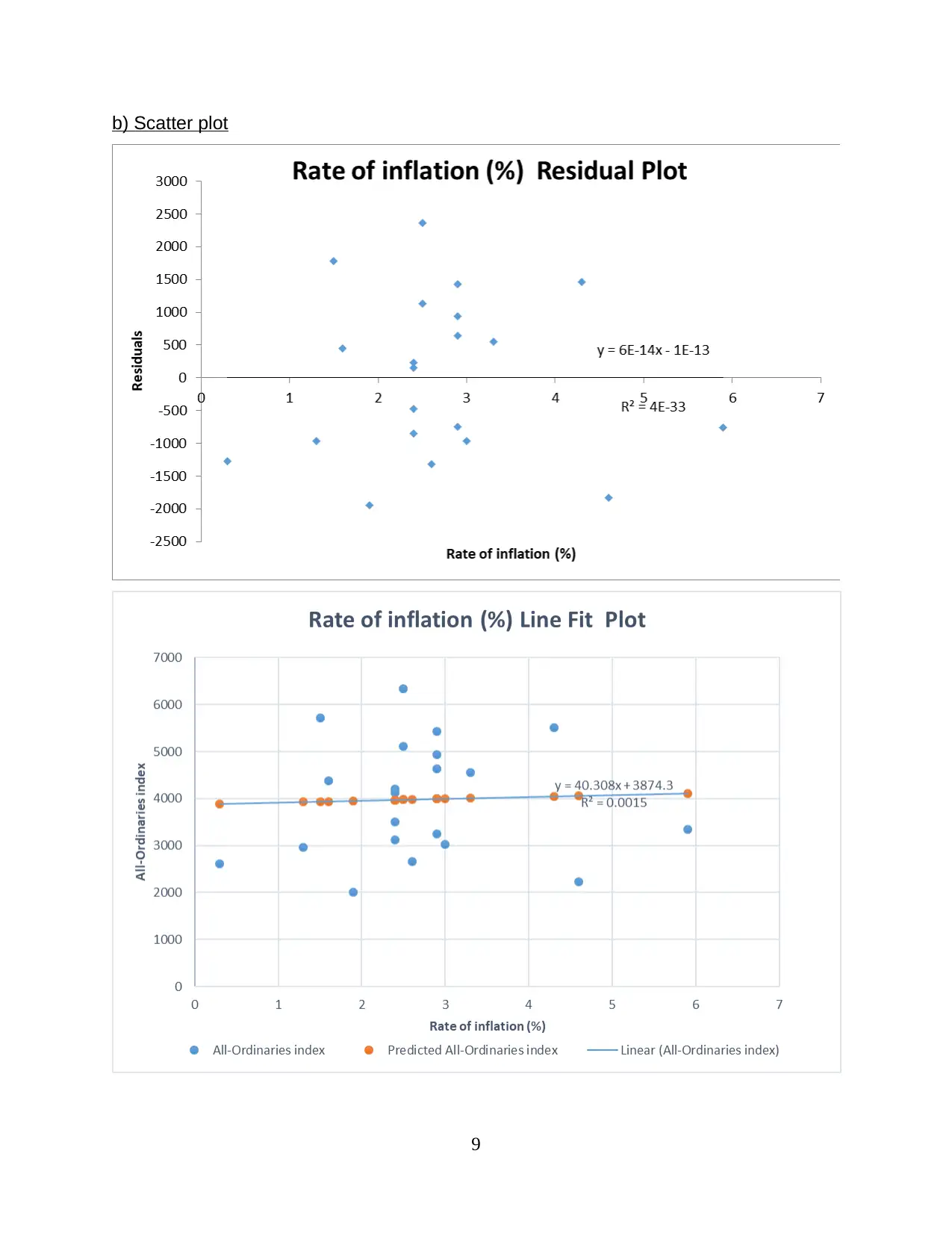
b) Scatter plot
9
9
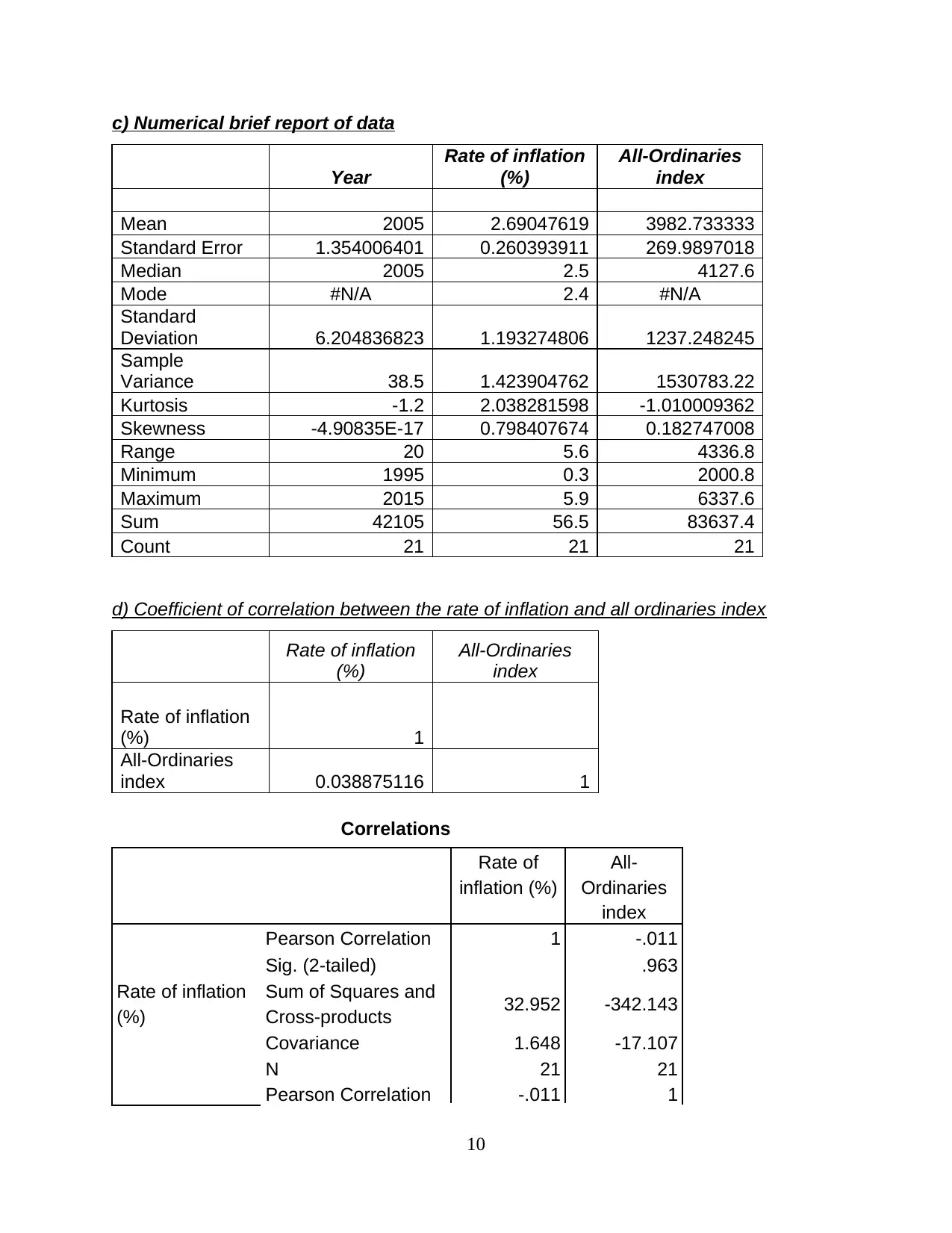
c) Numerical brief report of data
Year
Rate of inflation
(%)
All-Ordinaries
index
Mean 2005 2.69047619 3982.733333
Standard Error 1.354006401 0.260393911 269.9897018
Median 2005 2.5 4127.6
Mode #N/A 2.4 #N/A
Standard
Deviation 6.204836823 1.193274806 1237.248245
Sample
Variance 38.5 1.423904762 1530783.22
Kurtosis -1.2 2.038281598 -1.010009362
Skewness -4.90835E-17 0.798407674 0.182747008
Range 20 5.6 4336.8
Minimum 1995 0.3 2000.8
Maximum 2015 5.9 6337.6
Sum 42105 56.5 83637.4
Count 21 21 21
d) Coefficient of correlation between the rate of inflation and all ordinaries index
Rate of inflation
(%)
All-Ordinaries
index
Rate of inflation
(%) 1
All-Ordinaries
index 0.038875116 1
Correlations
Rate of
inflation (%)
All-
Ordinaries
index
Rate of inflation
(%)
Pearson Correlation 1 -.011
Sig. (2-tailed) .963
Sum of Squares and
Cross-products 32.952 -342.143
Covariance 1.648 -17.107
N 21 21
Pearson Correlation -.011 1
10
⊘ This is a preview!⊘
Do you want full access?
Subscribe today to unlock all pages.
Trusted by 1+ million students worldwide
1 out of 15
Related Documents


Your All-in-One AI-Powered Toolkit for Academic Success.
+13062052269
info@desklib.com
Available 24*7 on WhatsApp / Email
![[object Object]](/_next/static/media/star-bottom.7253800d.svg)
Unlock your academic potential
Copyright © 2020–2026 A2Z Services. All Rights Reserved. Developed and managed by ZUCOL.