MSIN0154 Statistics: Real Estate Market Analysis in England 2019
VerifiedAdded on 2023/04/22
|15
|3455
|295
Report
AI Summary
This report provides a statistical analysis of the real estate market in England, utilizing measures of central tendency, dispersion, and percentiles to understand price variations across different regions. Regression analysis is performed to explore the relationship between earnings and real estate prices in England and Wales, as well as in London. The report discusses the interpretation of regression results, including R-squared values and p-values, and calculates expected property prices based on earnings data. It also addresses potential differences in results when using sample data versus population data and explores the implications of sampling techniques. The analysis includes a discussion of the benefits and limitations of box plots and linear regression graphs, along with suggestions for alternative data presentation methods. Desklib offers a wealth of resources, including similar reports and past papers, to support students in their academic pursuits.

Statistics
Student Name:
Student Number:
Date: 16th January 2019
Student Name:
Student Number:
Date: 16th January 2019
Paraphrase This Document
Need a fresh take? Get an instant paraphrase of this document with our AI Paraphraser
Table of Contents
Introduction......................................................................................................................................2
Measures of centrality......................................................................................................................2
Measures of dispersion....................................................................................................................3
Percentiles........................................................................................................................................4
Regression analysis 1.......................................................................................................................6
Regression analysis 2.......................................................................................................................6
Conclusion.....................................................................................................................................12
References......................................................................................................................................13
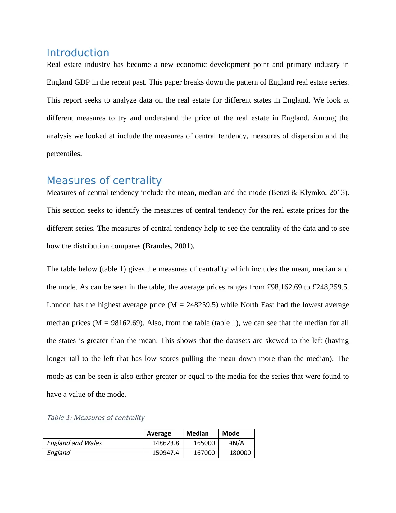
Introduction
Real estate industry has become a new economic development point and primary industry in
England GDP in the recent past. This paper breaks down the pattern of England real estate series.
This report seeks to analyze data on the real estate for different states in England. We look at
different measures to try and understand the price of the real estate in England. Among the
analysis we looked at include the measures of central tendency, measures of dispersion and the
percentiles.
Measures of centrality
Measures of central tendency include the mean, median and the mode (Benzi & Klymko, 2013).
This section seeks to identify the measures of central tendency for the real estate prices for the
different series. The measures of central tendency help to see the centrality of the data and to see
how the distribution compares (Brandes, 2001).
The table below (table 1) gives the measures of centrality which includes the mean, median and
the mode. As can be seen in the table, the average prices ranges from £98,162.69 to £248,259.5.
London has the highest average price (M = 248259.5) while North East had the lowest average
median prices (M = 98162.69). Also, from the table (table 1), we can see that the median for all
the states is greater than the mean. This shows that the datasets are skewed to the left (having
longer tail to the left that has low scores pulling the mean down more than the median). The
mode as can be seen is also either greater or equal to the media for the series that were found to
have a value of the mode.
Table 1: Measures of centrality
Average Median ModeEngland and Wales 148623.8 165000 #N/AEngland 150947.4 167000 180000
⊘ This is a preview!⊘
Do you want full access?
Subscribe today to unlock all pages.
Trusted by 1+ million students worldwide
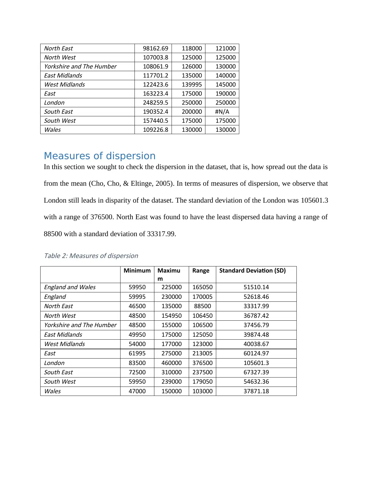
North East 98162.69 118000 121000North West 107003.8 125000 125000Yorkshire and The Humber 108061.9 126000 130000East Midlands 117701.2 135000 140000West Midlands 122423.6 139995 145000East 163223.4 175000 190000London 248259.5 250000 250000South East 190352.4 200000 #N/ASouth West 157440.5 175000 175000Wales 109226.8 130000 130000
Measures of dispersion
In this section we sought to check the dispersion in the dataset, that is, how spread out the data is
from the mean (Cho, Cho, & Eltinge, 2005). In terms of measures of dispersion, we observe that
London still leads in disparity of the dataset. The standard deviation of the London was 105601.3
with a range of 376500. North East was found to have the least dispersed data having a range of
88500 with a standard deviation of 33317.99.
Table 2: Measures of dispersion
Minimum Maximu
m
Range Standard Deviation (SD)
England and Wales 59950 225000 165050 51510.14England 59995 230000 170005 52618.46North East 46500 135000 88500 33317.99North West 48500 154950 106450 36787.42Yorkshire and The Humber 48500 155000 106500 37456.79East Midlands 49950 175000 125050 39874.48West Midlands 54000 177000 123000 40038.67East 61995 275000 213005 60124.97London 83500 460000 376500 105601.3South East 72500 310000 237500 67327.39South West 59950 239000 179050 54632.36Wales 47000 150000 103000 37871.18
Paraphrase This Document
Need a fresh take? Get an instant paraphrase of this document with our AI Paraphraser
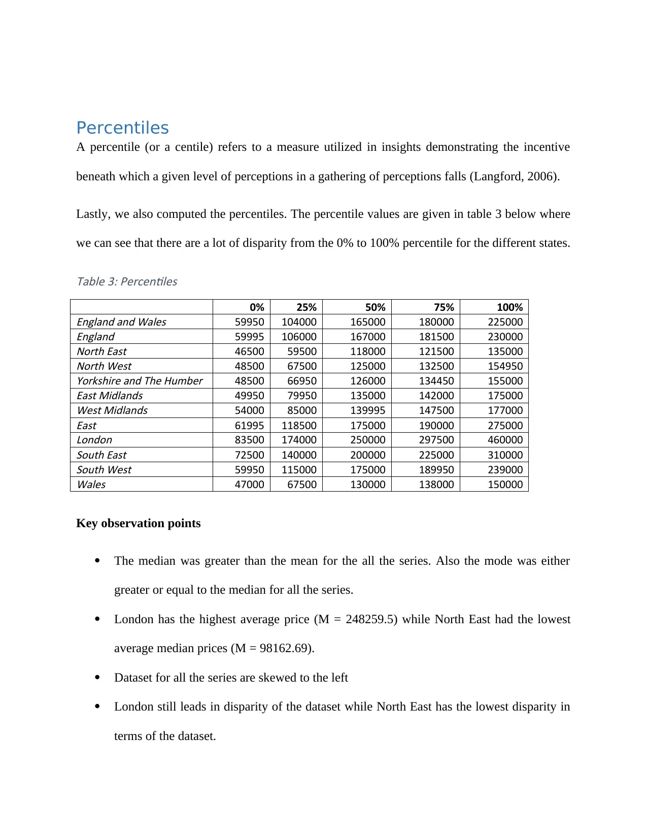
Percentiles
A percentile (or a centile) refers to a measure utilized in insights demonstrating the incentive
beneath which a given level of perceptions in a gathering of perceptions falls (Langford, 2006).
Lastly, we also computed the percentiles. The percentile values are given in table 3 below where
we can see that there are a lot of disparity from the 0% to 100% percentile for the different states.
Table 3: Percentiles
0% 25% 50% 75% 100%England and Wales 59950 104000 165000 180000 225000England 59995 106000 167000 181500 230000North East 46500 59500 118000 121500 135000North West 48500 67500 125000 132500 154950Yorkshire and The Humber 48500 66950 126000 134450 155000East Midlands 49950 79950 135000 142000 175000West Midlands 54000 85000 139995 147500 177000East 61995 118500 175000 190000 275000London 83500 174000 250000 297500 460000South East 72500 140000 200000 225000 310000South West 59950 115000 175000 189950 239000Wales 47000 67500 130000 138000 150000
Key observation points
The median was greater than the mean for the all the series. Also the mode was either
greater or equal to the median for all the series.
London has the highest average price (M = 248259.5) while North East had the lowest
average median prices (M = 98162.69).
Dataset for all the series are skewed to the left
London still leads in disparity of the dataset while North East has the lowest disparity in
terms of the dataset.

The second part of the question seeks to analyze the graph provided. The information
represented in the graph is on the symmetry and skewness of the data. Basically, the plot presents
the distribution of the data. We can also tell from the graph that London has the highest average
prices for the real estates while North East has the lowest average prices. However, from the
graph we cannot tell what the average values are. The reasons why a professional would use this
format to present similar data to an audience include the following;
It is a decent method to abridge a lot of information; Due to the five-number information
rundown, a case plot can deal with and present an outline of a lot of information. A box plot
comprises of the middle, which is the midpoint of the scope of information; the upper and
lower quartiles, which speak to the numbers above and beneath the most noteworthy and
lower quarters of the information and the base and greatest information esteems. Sorting out
information in a crate plot by utilizing five key ideas is an effective method for managing
expansive information unreasonably unmanageable for different diagrams, for example, line
plots or stem and leaf plots.
Displays Outliers; A box plot is one of not very many factual diagram techniques that
indicate exceptions. There may be one exception or various anomalies inside a lot of
information, which happens both underneath or more the base and most extreme information
esteems. By broadening the lesser and more prominent information esteems to a maximum of
1.5 occasions the between quartile run, the crate plot conveys exceptions or cloud results.
Any consequences of information that fall outside of the base and most extreme qualities
known as anomalies are anything but difficult to decide on a box plot chart.
The limitation of this plot is that original data is not clearly shown in the box plot; also, mean
and mode cannot be identified in a box plot. The limitation of not showing original data in the
⊘ This is a preview!⊘
Do you want full access?
Subscribe today to unlock all pages.
Trusted by 1+ million students worldwide
box plot can be overcome by having a histogram that shows the distribution of original data from
the lowest data point to the highest data point. The limitation of not able to show the mean and
the mode (most frequent) can be overcome by having the bar chart.
The next section which is question 3 seeks to analyze the regression equation. We performed
regression equation models for different series.
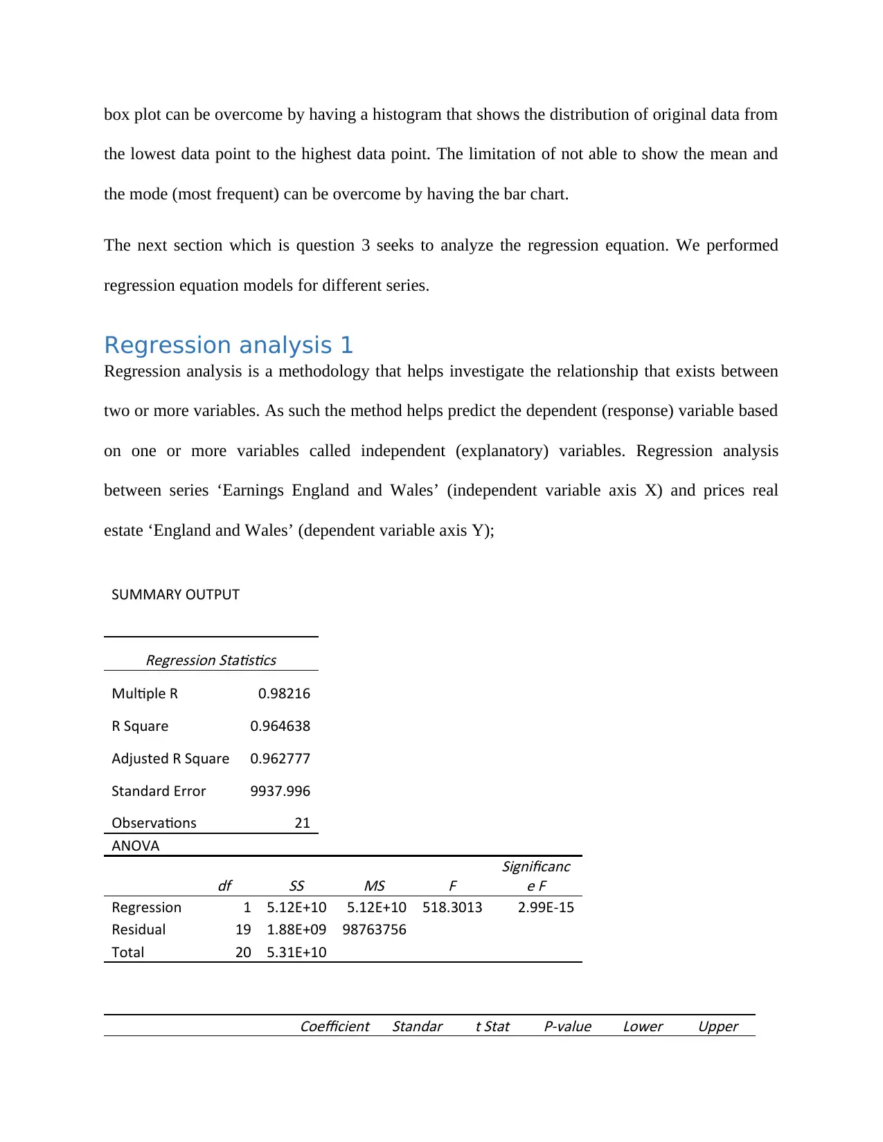
Regression analysis 1
Regression analysis is a methodology that helps investigate the relationship that exists between
two or more variables. As such the method helps predict the dependent (response) variable based
on one or more variables called independent (explanatory) variables. Regression analysis
between series ‘Earnings England and Wales’ (independent variable axis X) and prices real
estate ‘England and Wales’ (dependent variable axis Y);
SUMMARY OUTPUT
Regression Statistics
Multiple R 0.98216
R Square 0.964638
Adjusted R Square 0.962777
Standard Error 9937.996
Observations 21
ANOVA
df SS MS
F
Significanc
e F
Regression 1 5.12E+10 5.12E+10 518.3013 2.99E-15
Residual 19 1.88E+09 98763756
Total 20 5.31E+10Coefficient Standar t Stat P-value Lower Upper
the lowest data point to the highest data point. The limitation of not able to show the mean and
the mode (most frequent) can be overcome by having the bar chart.
The next section which is question 3 seeks to analyze the regression equation. We performed
regression equation models for different series.
Regression analysis 1
Regression analysis is a methodology that helps investigate the relationship that exists between
two or more variables. As such the method helps predict the dependent (response) variable based
on one or more variables called independent (explanatory) variables. Regression analysis
between series ‘Earnings England and Wales’ (independent variable axis X) and prices real
estate ‘England and Wales’ (dependent variable axis Y);
SUMMARY OUTPUT
Regression Statistics
Multiple R 0.98216
R Square 0.964638
Adjusted R Square 0.962777
Standard Error 9937.996
Observations 21
ANOVA
df SS MS
F
Significanc
e F
Regression 1 5.12E+10 5.12E+10 518.3013 2.99E-15
Residual 19 1.88E+09 98763756
Total 20 5.31E+10Coefficient Standar t Stat P-value Lower Upper
Paraphrase This Document
Need a fresh take? Get an instant paraphrase of this document with our AI Paraphraser
s d Error
95% 95%
Intercept -165795
13979.9
8 -11.8595 3.16E-10 -195055 -136535
Earnings England & Wales 13.3024
0.58430
4
22.7662
3 2.99E-15
12.0794
4
14.5253
7
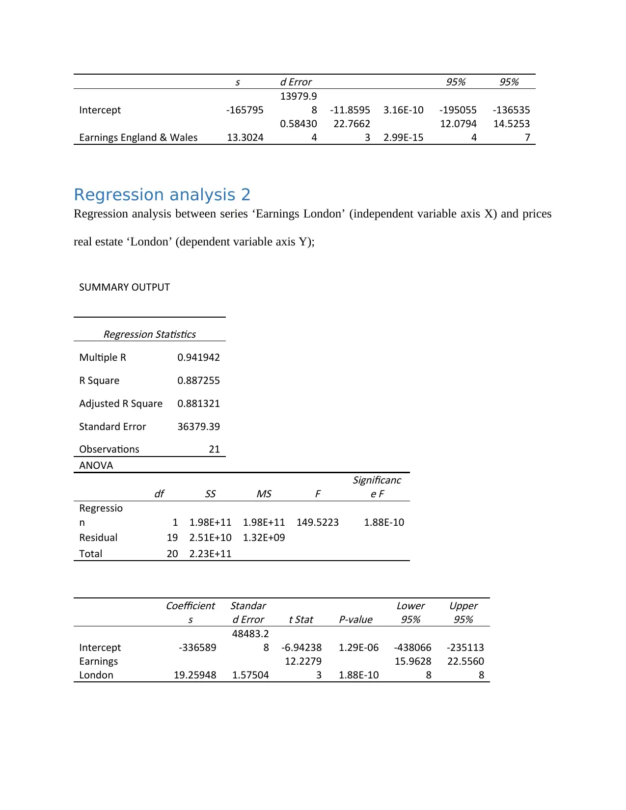
Regression analysis 2
Regression analysis between series ‘Earnings London’ (independent variable axis X) and prices
real estate ‘London’ (dependent variable axis Y);
SUMMARY OUTPUT
Regression Statistics
Multiple R 0.941942
R Square 0.887255
Adjusted R Square 0.881321
Standard Error 36379.39
Observations 21
ANOVA
df SS MS
F
Significanc
e F
Regressio
n 1 1.98E+11 1.98E+11 149.5223 1.88E-10
Residual 19 2.51E+10 1.32E+09
Total 20 2.23E+11
Coefficient
s
Standar
d Error t Stat P-value
Lower
95%
Upper
95%
Intercept -336589
48483.2
8 -6.94238 1.29E-06 -438066 -235113
Earnings
London 19.25948 1.57504
12.2279
3 1.88E-10
15.9628
8
22.5560
8
95% 95%
Intercept -165795
13979.9
8 -11.8595 3.16E-10 -195055 -136535
Earnings England & Wales 13.3024
0.58430
4
22.7662
3 2.99E-15
12.0794
4
14.5253
7
Regression analysis 2
Regression analysis between series ‘Earnings London’ (independent variable axis X) and prices
real estate ‘London’ (dependent variable axis Y);
SUMMARY OUTPUT
Regression Statistics
Multiple R 0.941942
R Square 0.887255
Adjusted R Square 0.881321
Standard Error 36379.39
Observations 21
ANOVA
df SS MS
F
Significanc
e F
Regressio
n 1 1.98E+11 1.98E+11 149.5223 1.88E-10
Residual 19 2.51E+10 1.32E+09
Total 20 2.23E+11
Coefficient
s
Standar
d Error t Stat P-value
Lower
95%
Upper
95%
Intercept -336589
48483.2
8 -6.94238 1.29E-06 -438066 -235113
Earnings
London 19.25948 1.57504
12.2279
3 1.88E-10
15.9628
8
22.5560
8

From the above results, we can see that the value of R-Squared (R2) for the England and Wales
series was 0.9646 while that for the London series was 0.8873. Clearly, the R-Squared (R2) for
the England and Wales series is higher than that of the London series. The value of R-Squared
say for England and Wales series implies that 96.46% of the variation in the dependent variable
(prices real estate ‘England and Wales’) is explained by the ‘Earnings England and Wales’
(independent variable axis X). Also, value of R-Squared say for London series implies that
88.73% of the variation in the dependent variable (prices real estate ‘London’) is explained by
the ‘Earnings London’ (independent variable axis X).
Considering the magnitude of the relationships between variables, the p-value of the two cases is
likely to be small with the England and Wales series expected to be much smaller than the
London series. The smaller the p-value the more significant it is. As we can see for the two
cases, we observe the p-value to be way smaller than 1% thus we can conclude that the two
model series are statistically significant at 1% level of significance.
For question this question (question 4) we sought to represent linear regression graph between
the series ‘Earnings London’ (axis X, independent variable) and prices of real estate ‘London’
(axis Y, dependent variable). The graph has included the regression line and R2, and the equation
which represents the regression line.
⊘ This is a preview!⊘
Do you want full access?
Subscribe today to unlock all pages.
Trusted by 1+ million students worldwide
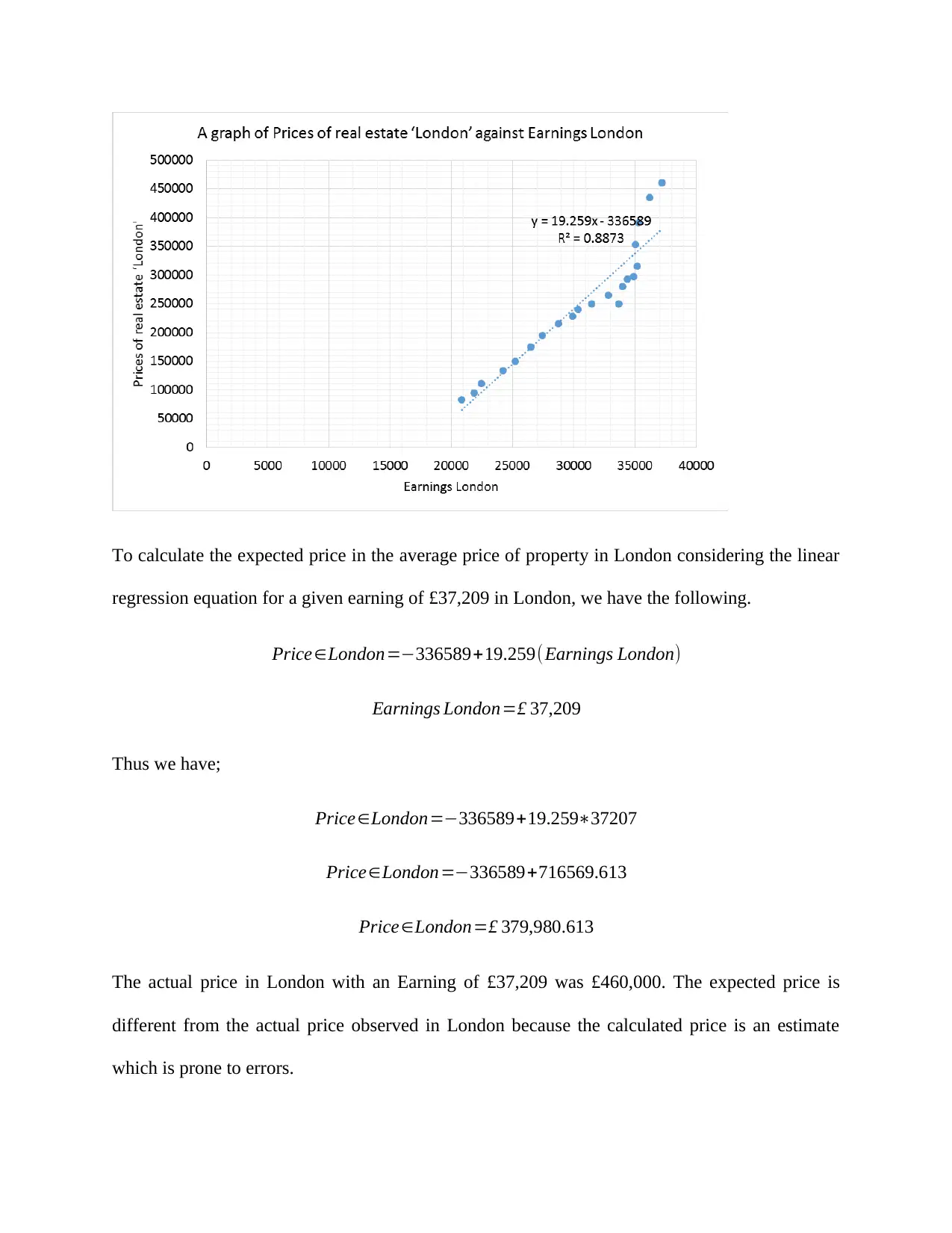
To calculate the expected price in the average price of property in London considering the linear
regression equation for a given earning of £37,209 in London, we have the following.
Price∈London=−336589+19.259(Earnings London)
Earnings London=£ 37,209
Thus we have;
Price∈London=−336589+19.259∗37207
Price∈London=−336589+716569.613
Price∈London=£ 379,980.613
The actual price in London with an Earning of £37,209 was £460,000. The expected price is
different from the actual price observed in London because the calculated price is an estimate
which is prone to errors.
Paraphrase This Document
Need a fresh take? Get an instant paraphrase of this document with our AI Paraphraser
This part represents question 5 where we sought to investigate the differences in the graphs. The
differences in the dataset if the data has been collected from MSIN0154: Statistics for Business
Research 7 MSIN0154 2018/19 samples, and not from whole populations (income, real estate
price) will entirely depend on the sampling and sampling techniques used. If a random sampling
technique was employed to choose on the sample then there is likelihood that the data collected
on income, real estate price will not significantly differ for the sample and the population (Meng,
2013). This based on the fact that well-chosen sample has similar attributes to the population
where the sample comes from (Lucas, 2012). However, there is possibility of huge differences if
the sample is biased. A biased sample will yield biased results and if the results are biased then
automatically the results will be different from the population data. The biased results could be
larger or smaller than the population dataset. To solve the problem in the differences in the
sample and the population, a random sample should be drawn from the population. Random
sampling is also referred to as the probability sampling (Shahrokh Esfahani & Dougherty, 2014).
Some of the probability sampling that could be used include; simple random sampling, stratified
sampling, systematic sampling among other sampling techniques.
Question 6 seeks to investigate the difference in the graphs. Both the two graphs show the
relationship between two variables. Figure 2 shows the relationship between competitiveness and
income while figure 9 shows the relationship between institutional strength and income. The two
graphs are similar in the sense that both shows a positive linear relationship between the
variables being tested. However, the difference arises in the strengths of the relationship between
the variables in the two graphs. Figure 2 shows that the relationship between competitiveness
and income is very strong relationship (r = 0.9055) while figure 9 shows that the relationship
between institutional strength and income is a strong relationship (r = 0.7937). The value of R-
Squared (R2) in figure 2 is 0.82 while that in figure 9 is 0.63. This shows that figure 2 has a
higher R2 and as such a large proportion of variation in the dependent variable is explained in
figure 2 than in 9. Actually, figure 2 shows that 82% of the variation in the dependent variable is
explained by the independent variable in the model while figure 9 shows that 63% of the
variation in the dependent variable is explained by the independent variable in the model. The
differences shows that results in figure 2 are best to use in predicting the future behaviour of the
series unlike figure 9. This is because more of the variation in the dependent variable is
explained by factors inside the model in figure 2 unlike in figure 9 where close 37% of the
variation in the dependent variable is explained by factors outside the model.
Figure 11 shows the deviation of the data points from the mean while figure 12 shows the
deviation of the data points from the regression line. The consequences of choosing descriptive
statistics only is that the researcher can only depict the distribution of data and not make
inferences of the data. The limitations of graph in figure 11 in relation to graph in figure 12 is
that in figure 11 we cannot make predictions which is possible from figure 12 given regression
equation.
Looking at the graph in figure 13, we can identify that there is a negative linear relationship
between the variables (competitiveness and inequality). The graph shows some significant
variation of the data points from the trend line. From the graph, I could predict the value of R-
Squared (R2) in this regression to be medium. I have reached this conclusion based on the way
the data points are spread out from the trend line. Had the data points been closer to the trend line
then I would have expected the R2 to be high and since the data points are also not that widely
spread out from the trend lie then the best expected value of R-Squared (R2) would be medium
value.
⊘ This is a preview!⊘
Do you want full access?
Subscribe today to unlock all pages.
Trusted by 1+ million students worldwide
1 out of 15

Your All-in-One AI-Powered Toolkit for Academic Success.
+13062052269
info@desklib.com
Available 24*7 on WhatsApp / Email
![[object Object]](/_next/static/media/star-bottom.7253800d.svg)
Unlock your academic potential
Copyright © 2020–2026 A2Z Services. All Rights Reserved. Developed and managed by ZUCOL.