Statistics for Management: Comprehensive Data Analysis Report
VerifiedAdded on 2020/06/04
|21
|4763
|104
Report
AI Summary
This report provides a comprehensive analysis of statistical data relevant to management. It begins with hypothesis testing, comparing male and female income levels in both public and private sectors using t-tests. The report includes earning time charts and determines annual growth rates across different sectors and genders. Further analysis involves graphical presentations of data, including student marks trends, and calculations of mean, mode, and standard deviation. The report also explores economic order quantity and evaluates housing data based on the number of bedrooms. Various charts and tables are used to visualize and interpret the data, leading to a conclusion summarizing the findings. The report demonstrates a strong understanding of statistical methods and their application in management contexts.

STATISTICS FOR MANAGEMENT
Paraphrase This Document
Need a fresh take? Get an instant paraphrase of this document with our AI Paraphraser
TABLE OF CONTENTS
INTRODUCTION...........................................................................................................................1
TASK 1............................................................................................................................................1
(a)Testing of hypothesis..............................................................................................................1
(b)Identification of difference between male and female income level in private sector............2
© Earning time chart for year 2009 to 2016................................................................................3
d) Determining annual growth rate..............................................................................................3
.....................................................................................................................................................4
TASK 2............................................................................................................................................5
Section A.........................................................................................................................................5
2.1 Graphical presentation of data...............................................................................................5
2.2 Analysis of data.....................................................................................................................5
2.3 Report on analysis of students performance in the exam......................................................8
Section B..........................................................................................................................................9
2.4 Line of best fit........................................................................................................................9
TASK 3..........................................................................................................................................11
(a)Number of delieveries made in a years.................................................................................11
(b) Deliveries made on each round............................................................................................11
©Economic order quantity.........................................................................................................11
(d) Comparison of EOQ and cost..............................................................................................12
TASK 4..........................................................................................................................................14
4.1 Evaluation of figures by using different charts for number of houses with different
bedrooms....................................................................................................................................14
4.2 Relationship between number of bedrooms and their prices in varied streets....................16
CONCLUSION..............................................................................................................................17
REFERENCES..............................................................................................................................18
Figure 1Earning time chart from year 2009 to 2016.......................................................................3
Figure 2Graphical representation of percentage change in variable................................................4
Figure 3Student marks trends..........................................................................................................5
Figure 4Number of bedrooms in varied areas...............................................................................14
Figure 5Number of homes having specific number of bedrooms in Church Lane.......................14
Figure 6Number of homes having specific number of bedrooms in Church Lane.......................15
Figure 7Number of homes having specific number of bedrooms in Church Lane.......................15
Figure 8Number of bedrooms and house prices............................................................................16
Table 1T table..................................................................................................................................1
Table 2T test for male and female income in private sector............................................................2
Table 3Percentage change in income level in public and private sector across male and female...3
Table 4Calculation of mean and standard deviation........................................................................5
Table 5Number of bottles transported...........................................................................................11
Table6 Calculation of economic order quantity............................................................................11
Table 7 Cost at different level of EOQ..........................................................................................12
⊘ This is a preview!⊘
Do you want full access?
Subscribe today to unlock all pages.
Trusted by 1+ million students worldwide
INTRODUCTION
Analytics is the one of the growing domain in the most of nations of the world. In
current time period descriptive statistics tools are applied on dataset. By analyzing facts and
figures lots of facts are identified. Apart from this, charts in respect to different variables are
prepared in the report and same are analyzed in proper manner. In middle part of the report
varied calculations like economic order quantity are performed and on that basis varied facts are
identified. Apart from this, different areas houses data in terms of bedrooms are analyzed by
preparing pie and bar charts. Trends that prevailed in these areas are identified through charts. It
can be said that extensive analysis is done in the present research study. At end of the research
report, coorelation analysis is done and by doing so relationship is identified between multiple
variables. Along with this, conclusion section is also prepared and in this way research work is
carried out.
TASK 1
(a)Testing of hypothesis
H0: There is no significent difference betweeen male income level in public sector and female
income level in public sector.
H1: There is significent difference betweeen male income level in public sector and female
income level in public sector.
Table 1T table
Male Public
sector
Female Public
sector
Mean 32276.625 26929.875
Variance 1449962.268 977868.4107
Observations 8 8
Hypothesized Mean Difference 0
df 13
t Stat 9.705673424
P(T<=t) one-tail 1.2709E-07
t Critical one-tail 1.770933396
P(T<=t) two-tail 2.54179E-07
t Critical two-tail 2.160368656
Interpretation
1 | P a g e
Paraphrase This Document
Need a fresh take? Get an instant paraphrase of this document with our AI Paraphraser
T test is the one of the important method that is used to identify whether there is
significent difference between multiple variables. It can be observed that value of level of
significence is 2.16>0.05 and this is indicating that there is no significent mean difference
between variables. It can be said that almost same salary is issued to male and female at the
workplace. Mean value of salary in case of male is 32276.62 and same for female is 26929.87. It
can be said that higher amount of salary is paid to male relative to female. However, in temrs of
variation at 95% confidence interval there is similarity in income level of individuals. It can be
said that there is no big difference in income level of male and female. On basis of facts it can be
said that there is significent importance of t test for the individuals.
(b)Identification of difference between male and female income level in private sector
Table 2T test for male and female income in private sector
Male Private sector
Female Private
sector
Mean 28062.875 20541.25
Variance 840242.6964 988729.9286
Observations 8 8
Hypothesized Mean Difference 0
df 14
t Stat 15.73088181
P(T<=t) one-tail 1.35387E-10
t Critical one-tail 1.761310136
P(T<=t) two-tail 2.70773E-10
t Critical two-tail 2.144786688
Interpretation
It can be observed from the table that value of level of significence is 2.144>0.05 and this
is again reflecting that there is no significent difference between male and female in the private
sector in terms of income level. On average basis male are earning amount of 28062.87 in private
sector and female are earning 20541.25. It can be said that again in th private sector higher
amount of salary is offered to male then female. Thus, overall it can be said that in private sector
and public sector both male earning level is higher then same of female. So, it can be said that to
some extent there is difference between income level of both and in both sectors difference is
made in respect to gender. It can be said that there is great significence of the t test for the
analysis purpose. In T test basically t distribution is taken in to account for calculation purpose.
T distribution is similar to z distribution and there is small difference between both. Hence, it
2 | P a g e
can be said that t distribution technique have wide application and due to this reaosn t test is
quite popular among the analysts.
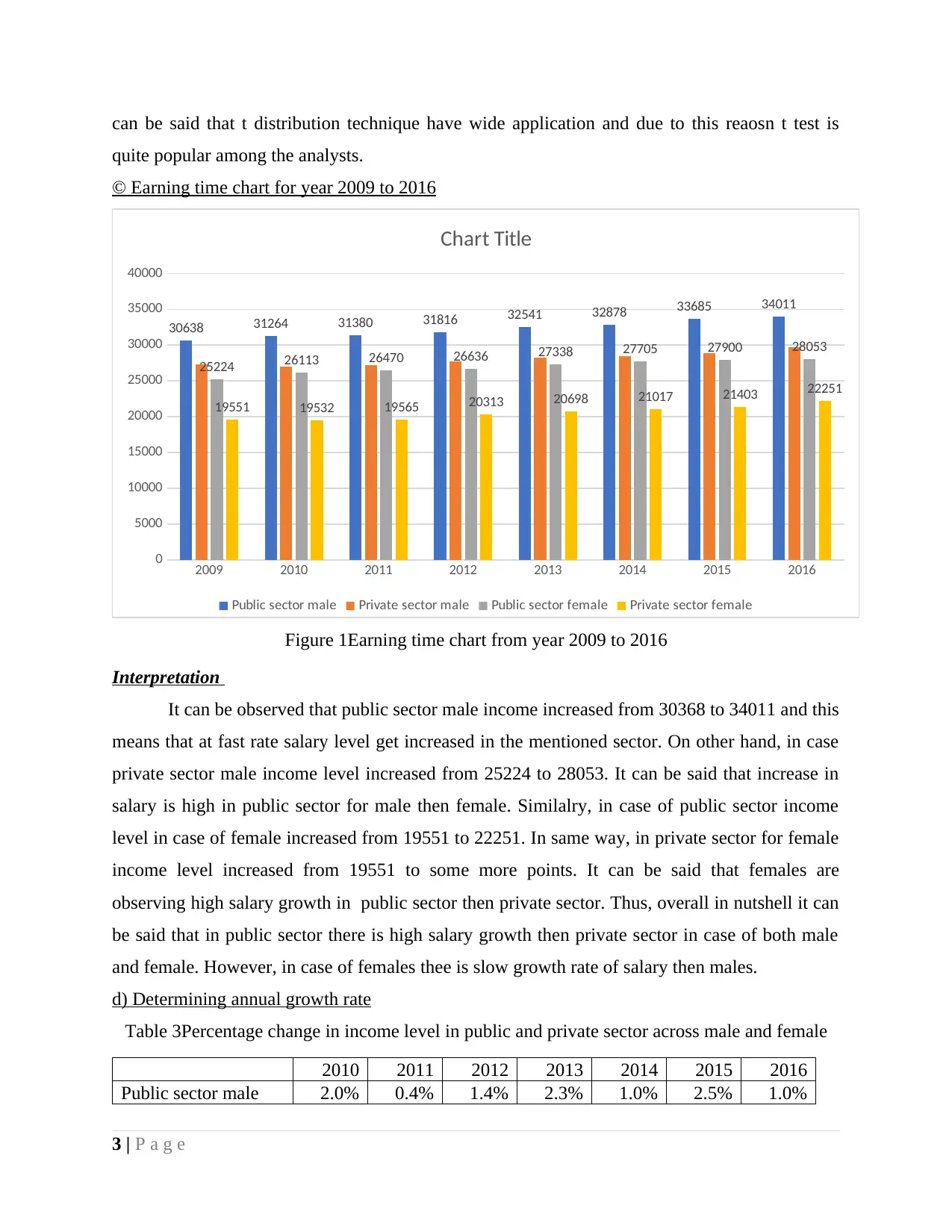
© Earning time chart for year 2009 to 2016
2009 2010 2011 2012 2013 2014 2015 2016
0
5000
10000
15000
20000
25000
30000
35000
40000
30638 31264 31380 31816 32541 32878 33685 34011
25224 26113 26470 26636 27338 27705 27900 28053
19551 19532 19565 20313 20698 21017 21403 22251
Chart Title
Public sector male Private sector male Public sector female Private sector female
Figure 1Earning time chart from year 2009 to 2016
Interpretation
It can be observed that public sector male income increased from 30368 to 34011 and this
means that at fast rate salary level get increased in the mentioned sector. On other hand, in case
private sector male income level increased from 25224 to 28053. It can be said that increase in
salary is high in public sector for male then female. Similalry, in case of public sector income
level in case of female increased from 19551 to 22251. In same way, in private sector for female
income level increased from 19551 to some more points. It can be said that females are
observing high salary growth in public sector then private sector. Thus, overall in nutshell it can
be said that in public sector there is high salary growth then private sector in case of both male
and female. However, in case of females thee is slow growth rate of salary then males.
d) Determining annual growth rate
Table 3Percentage change in income level in public and private sector across male and female
2010 2011 2012 2013 2014 2015 2016
Public sector male 2.0% 0.4% 1.4% 2.3% 1.0% 2.5% 1.0%
3 | P a g e
quite popular among the analysts.
© Earning time chart for year 2009 to 2016
2009 2010 2011 2012 2013 2014 2015 2016
0
5000
10000
15000
20000
25000
30000
35000
40000
30638 31264 31380 31816 32541 32878 33685 34011
25224 26113 26470 26636 27338 27705 27900 28053
19551 19532 19565 20313 20698 21017 21403 22251
Chart Title
Public sector male Private sector male Public sector female Private sector female
Figure 1Earning time chart from year 2009 to 2016
Interpretation
It can be observed that public sector male income increased from 30368 to 34011 and this
means that at fast rate salary level get increased in the mentioned sector. On other hand, in case
private sector male income level increased from 25224 to 28053. It can be said that increase in
salary is high in public sector for male then female. Similalry, in case of public sector income
level in case of female increased from 19551 to 22251. In same way, in private sector for female
income level increased from 19551 to some more points. It can be said that females are
observing high salary growth in public sector then private sector. Thus, overall in nutshell it can
be said that in public sector there is high salary growth then private sector in case of both male
and female. However, in case of females thee is slow growth rate of salary then males.
d) Determining annual growth rate
Table 3Percentage change in income level in public and private sector across male and female
2010 2011 2012 2013 2014 2015 2016
Public sector male 2.0% 0.4% 1.4% 2.3% 1.0% 2.5% 1.0%
3 | P a g e
⊘ This is a preview!⊘
Do you want full access?
Subscribe today to unlock all pages.
Trusted by 1+ million students worldwide
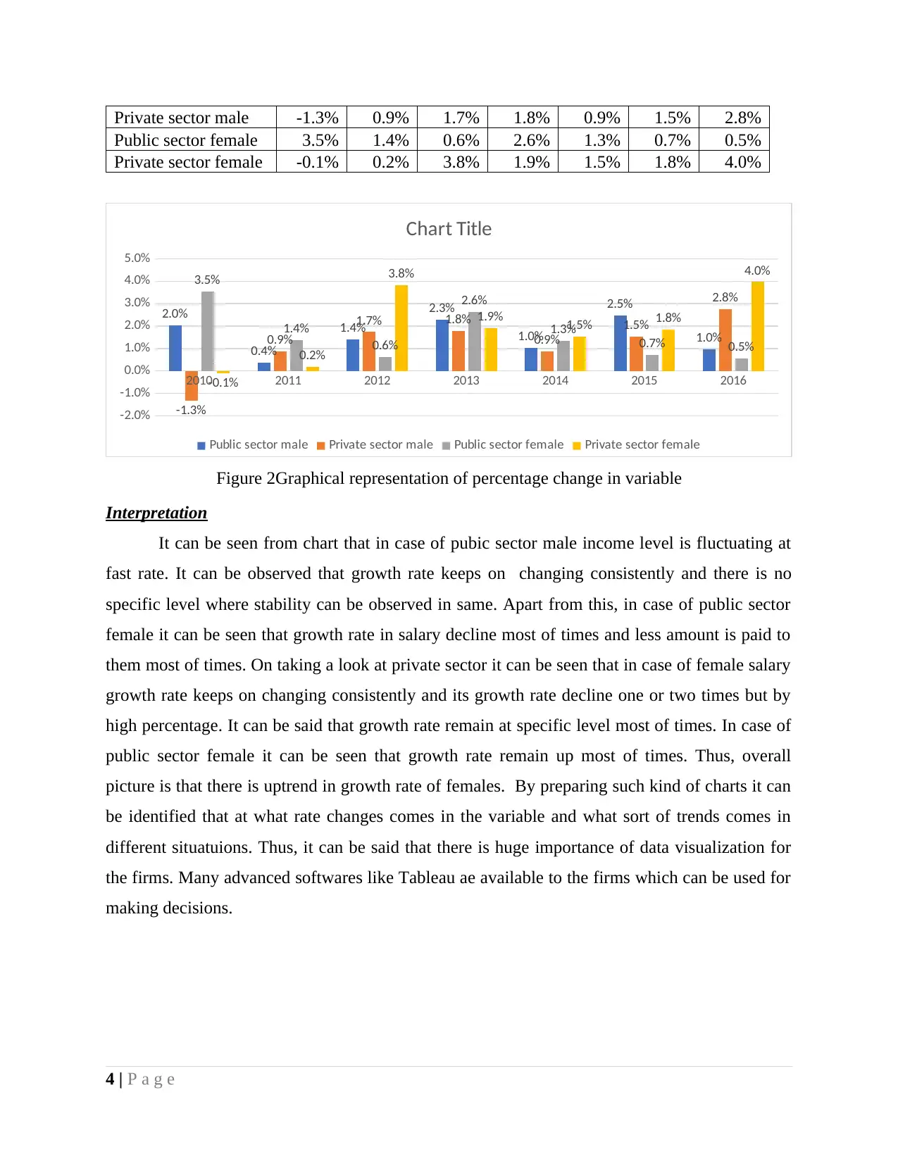
Private sector male -1.3% 0.9% 1.7% 1.8% 0.9% 1.5% 2.8%
Public sector female 3.5% 1.4% 0.6% 2.6% 1.3% 0.7% 0.5%
Private sector female -0.1% 0.2% 3.8% 1.9% 1.5% 1.8% 4.0%
2010 2011 2012 2013 2014 2015 2016
-2.0%
-1.0%
0.0%
1.0%
2.0%
3.0%
4.0%
5.0%
2.0%
0.4%
1.4%
2.3%
1.0%
2.5%
1.0%
-1.3%
0.9%
1.7% 1.8%
0.9%
1.5%
2.8%
3.5%
1.4%
0.6%
2.6%
1.3%
0.7% 0.5%
-0.1%
0.2%
3.8%
1.9% 1.5% 1.8%
4.0%
Chart Title
Public sector male Private sector male Public sector female Private sector female
Figure 2Graphical representation of percentage change in variable
Interpretation
It can be seen from chart that in case of pubic sector male income level is fluctuating at
fast rate. It can be observed that growth rate keeps on changing consistently and there is no
specific level where stability can be observed in same. Apart from this, in case of public sector
female it can be seen that growth rate in salary decline most of times and less amount is paid to
them most of times. On taking a look at private sector it can be seen that in case of female salary
growth rate keeps on changing consistently and its growth rate decline one or two times but by
high percentage. It can be said that growth rate remain at specific level most of times. In case of
public sector female it can be seen that growth rate remain up most of times. Thus, overall
picture is that there is uptrend in growth rate of females. By preparing such kind of charts it can
be identified that at what rate changes comes in the variable and what sort of trends comes in
different situatuions. Thus, it can be said that there is huge importance of data visualization for
the firms. Many advanced softwares like Tableau ae available to the firms which can be used for
making decisions.
4 | P a g e
Paraphrase This Document
Need a fresh take? Get an instant paraphrase of this document with our AI Paraphraser
TASK 2
Section A
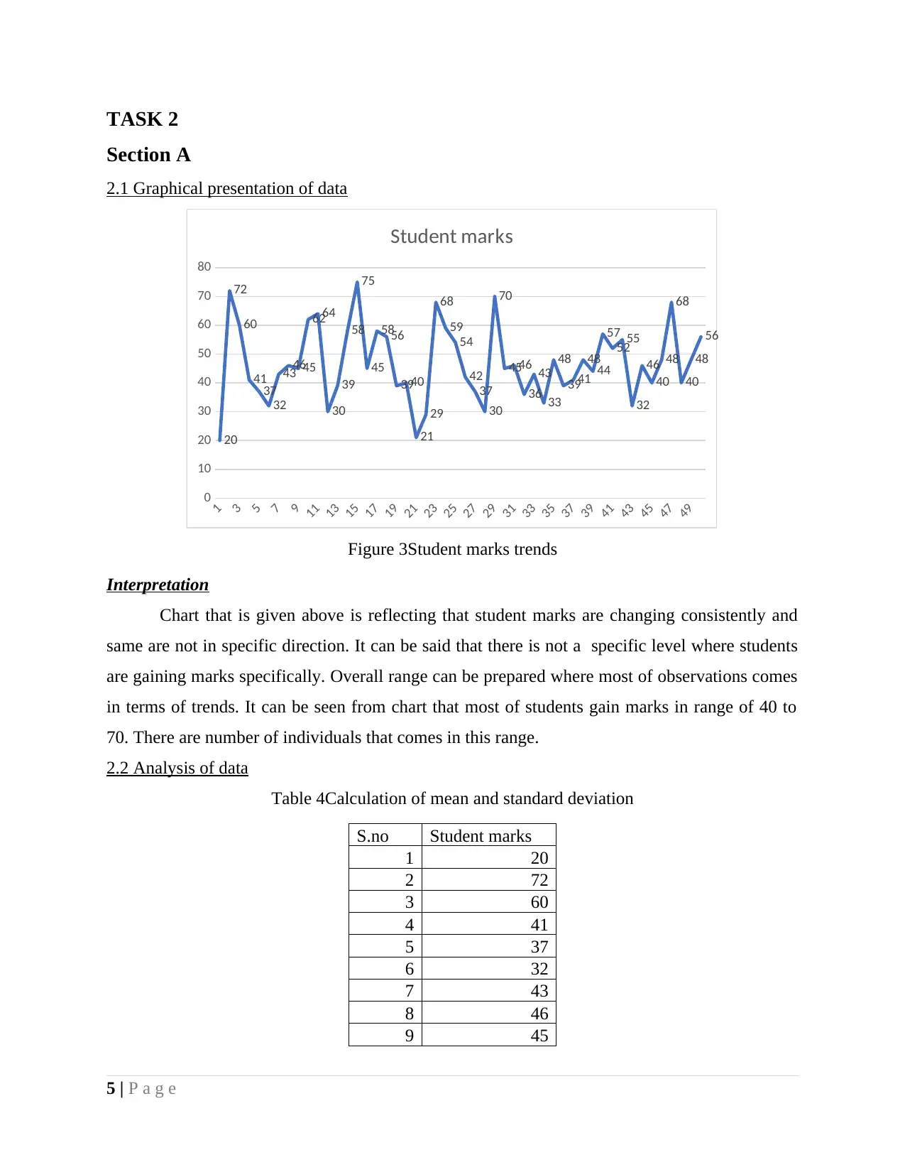
2.1 Graphical presentation of data
1
3
5
7
9
11
13
15
17
19
21
23
25
27
29
31
33
35
37
39
41
43
45
47
49
0
10
20
30
40
50
60
70
80
20
72
60
41
37
32
43
4645
6264
30
39
58
75
45
5856
3940
21
29
68
59
54
42
37
30
70
4546
36
43
33
48
3941
48
44
57
52
55
32
46
40
48
68
40
48
56
Student marks
Figure 3Student marks trends
Interpretation
Chart that is given above is reflecting that student marks are changing consistently and
same are not in specific direction. It can be said that there is not a specific level where students
are gaining marks specifically. Overall range can be prepared where most of observations comes
in terms of trends. It can be seen from chart that most of students gain marks in range of 40 to
70. There are number of individuals that comes in this range.
2.2 Analysis of data
Table 4Calculation of mean and standard deviation
S.no Student marks
1 20
2 72
3 60
4 41
5 37
6 32
7 43
8 46
9 45
5 | P a g e
Section A
2.1 Graphical presentation of data
1
3
5
7
9
11
13
15
17
19
21
23
25
27
29
31
33
35
37
39
41
43
45
47
49
0
10
20
30
40
50
60
70
80
20
72
60
41
37
32
43
4645
6264
30
39
58
75
45
5856
3940
21
29
68
59
54
42
37
30
70
4546
36
43
33
48
3941
48
44
57
52
55
32
46
40
48
68
40
48
56
Student marks
Figure 3Student marks trends
Interpretation
Chart that is given above is reflecting that student marks are changing consistently and
same are not in specific direction. It can be said that there is not a specific level where students
are gaining marks specifically. Overall range can be prepared where most of observations comes
in terms of trends. It can be seen from chart that most of students gain marks in range of 40 to
70. There are number of individuals that comes in this range.
2.2 Analysis of data
Table 4Calculation of mean and standard deviation
S.no Student marks
1 20
2 72
3 60
4 41
5 37
6 32
7 43
8 46
9 45
5 | P a g e
10 62
11 64
12 30
13 39
14 58
15 75
16 45
17 58
18 56
19 39
20 40
21 21
22 29
23 68
24 59
25 54
26 42
27 37
28 30
29 70
30 45
31 46
32 36
33 43
34 33
35 48
36 39
37 41
38 48
39 44
40 57
41 52
42 55
43 32
44 46
45 40
46 48
47 68
48 40
49 48
50 56
Mean 46.74
Mode 48
6 | P a g e
11 64
12 30
13 39
14 58
15 75
16 45
17 58
18 56
19 39
20 40
21 21
22 29
23 68
24 59
25 54
26 42
27 37
28 30
29 70
30 45
31 46
32 36
33 43
34 33
35 48
36 39
37 41
38 48
39 44
40 57
41 52
42 55
43 32
44 46
45 40
46 48
47 68
48 40
49 48
50 56
Mean 46.74
Mode 48
6 | P a g e
⊘ This is a preview!⊘
Do you want full access?
Subscribe today to unlock all pages.
Trusted by 1+ million students worldwide
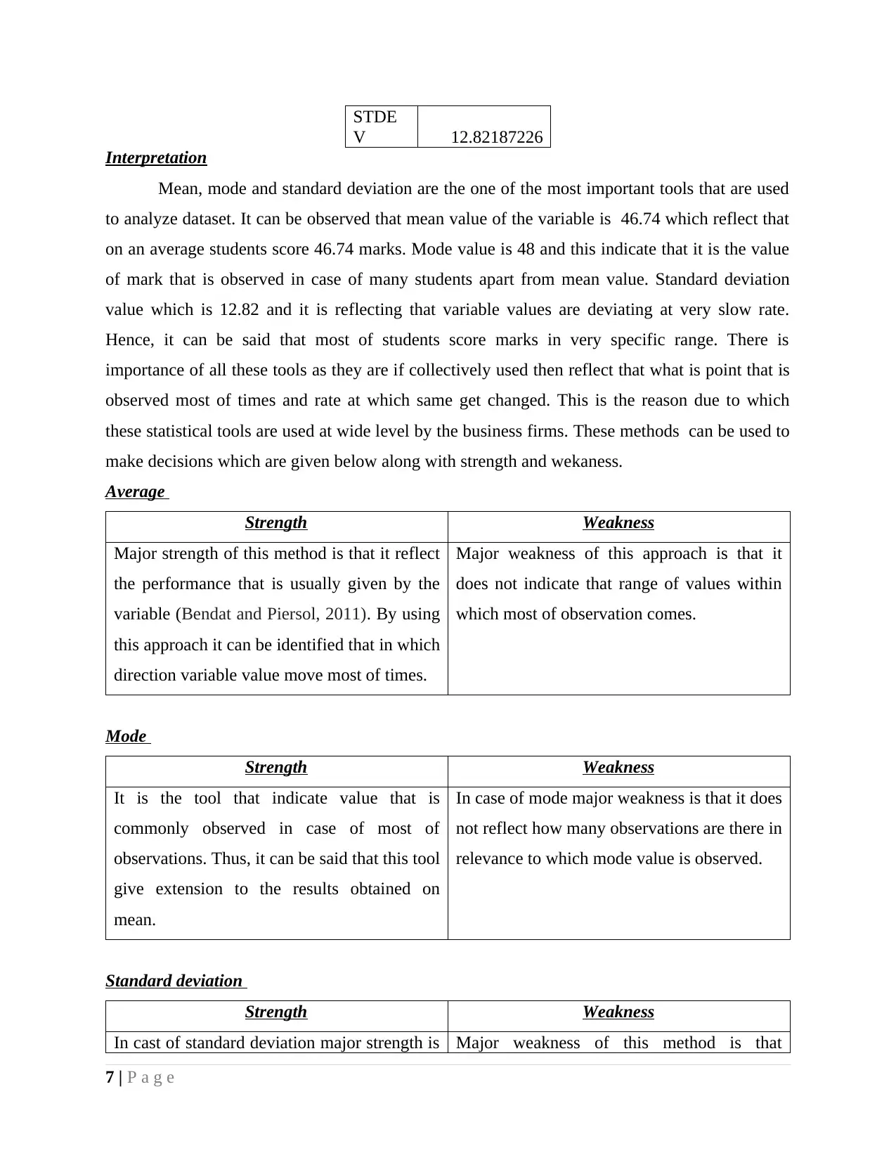
STDE
V 12.82187226
Interpretation
Mean, mode and standard deviation are the one of the most important tools that are used
to analyze dataset. It can be observed that mean value of the variable is 46.74 which reflect that
on an average students score 46.74 marks. Mode value is 48 and this indicate that it is the value
of mark that is observed in case of many students apart from mean value. Standard deviation
value which is 12.82 and it is reflecting that variable values are deviating at very slow rate.
Hence, it can be said that most of students score marks in very specific range. There is
importance of all these tools as they are if collectively used then reflect that what is point that is
observed most of times and rate at which same get changed. This is the reason due to which
these statistical tools are used at wide level by the business firms. These methods can be used to
make decisions which are given below along with strength and wekaness.
Average
Strength Weakness
Major strength of this method is that it reflect
the performance that is usually given by the
variable (Bendat and Piersol, 2011). By using
this approach it can be identified that in which
direction variable value move most of times.
Major weakness of this approach is that it
does not indicate that range of values within
which most of observation comes.
Mode
Strength Weakness
It is the tool that indicate value that is
commonly observed in case of most of
observations. Thus, it can be said that this tool
give extension to the results obtained on
mean.
In case of mode major weakness is that it does
not reflect how many observations are there in
relevance to which mode value is observed.
Standard deviation
Strength Weakness
In cast of standard deviation major strength is Major weakness of this method is that
7 | P a g e
Paraphrase This Document
Need a fresh take? Get an instant paraphrase of this document with our AI Paraphraser
that it reflect how far data points are moving
away from mean value (Cressie, 2015). It can
be said that it give overview of the
performance of the variable.
calculation process is complex and for non
technical person it is diffiult to understand
calculation process and meaning of
calculation.
2.3 Report on analysis of students performance in the exam
To
The Director of Company Date: 31-1-2018
Subject: Evaluation of dataset to meausre students performance.
Deriving meaning of output of descriptive statistics
Tables given above reflect that on average basis students score marks 46.74 and their mode
value is 48 which means that most of entities are making score of 46.74 but there are few one
that make score of 48. It can be said that presumable in range of 46.74 to 48 most of
observations comes. Standard deviatuon value is equal to 12.82 which is indicating that
variables values are not deviating at fast rate. Hence, it can be concluded that most of students
are making score within mentioned range.
Technique use for comparing subjects
ANOVA or analysis of variance is the one of the most important method that can be used to
make comparison between subjects. At specific significence level testing of values can be
done. It is the tool that is used to evaluate categorical variable by using specific variable in the
dataset (DeGroot and Schervish, 2012). Thus, ANOVA reflect that on certain parameter
whether there is similarity or difference among varied groups. Thus, there is huge significence
of the mentioed tool for data analysts and business firms. This is the reason due to which in
current time period more and more firms are making use of relevant method at workplace.
Ways to measure association between subjects
There are number of ways in which association is identified between varied subjects or
variables by using coorelation analysis. It is the one of the method that is used to identify
relationship that exist between variables. Apart from coorelation analysis chi square test
method can also be used under which relation between expected and actual facts is identified.
Hence, it can be said that there are multiple ways in which statistical analysis can be done.
8 | P a g e
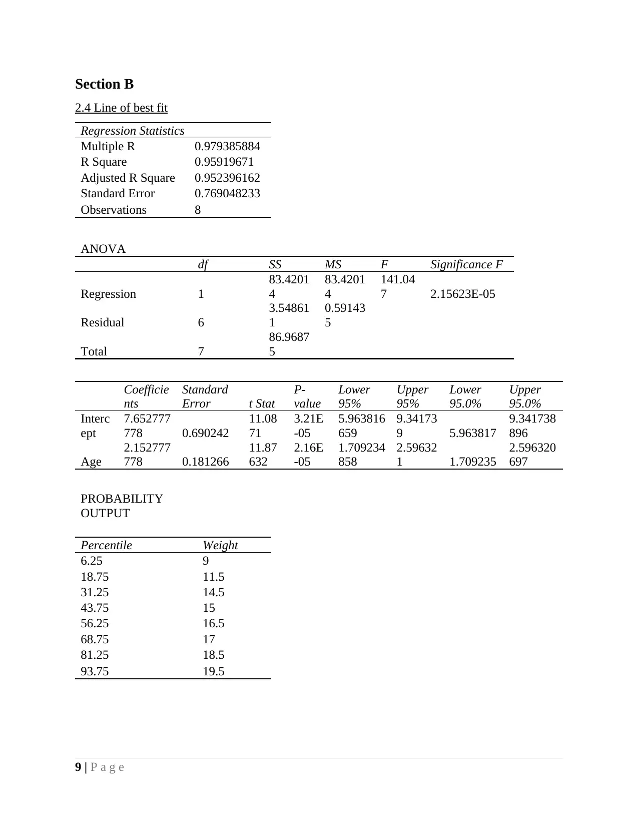
Section B
2.4 Line of best fit
Regression Statistics
Multiple R 0.979385884
R Square 0.95919671
Adjusted R Square 0.952396162
Standard Error 0.769048233
Observations 8
ANOVA
df SS MS F Significance F
Regression 1
83.4201
4
83.4201
4
141.04
7 2.15623E-05
Residual 6
3.54861
1
0.59143
5
Total 7
86.9687
5
Coefficie
nts
Standard
Error t Stat
P-
value
Lower
95%
Upper
95%
Lower
95.0%
Upper
95.0%
Interc
ept
7.652777
778 0.690242
11.08
71
3.21E
-05
5.963816
659
9.34173
9 5.963817
9.341738
896
Age
2.152777
778 0.181266
11.87
632
2.16E
-05
1.709234
858
2.59632
1 1.709235
2.596320
697
PROBABILITY
OUTPUT
Percentile Weight
6.25 9
18.75 11.5
31.25 14.5
43.75 15
56.25 16.5
68.75 17
81.25 18.5
93.75 19.5
9 | P a g e
⊘ This is a preview!⊘
Do you want full access?
Subscribe today to unlock all pages.
Trusted by 1+ million students worldwide
1 out of 21
Related Documents


Your All-in-One AI-Powered Toolkit for Academic Success.
+13062052269
info@desklib.com
Available 24*7 on WhatsApp / Email
![[object Object]](/_next/static/media/star-bottom.7253800d.svg)
Unlock your academic potential
Copyright © 2020–2026 A2Z Services. All Rights Reserved. Developed and managed by ZUCOL.