Statistics for Managerial Decisions Assignment - Semester 1, 2024

Verified

Added on  2022/10/18

|13
|1157
|12
Homework Assignment
AI Summary
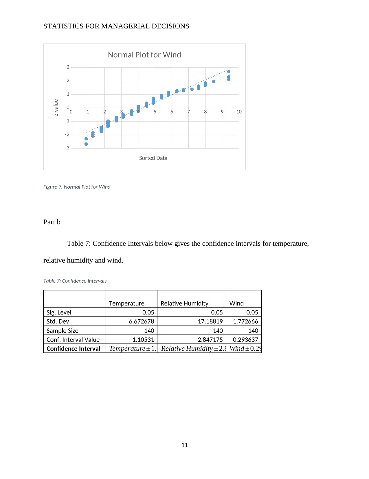
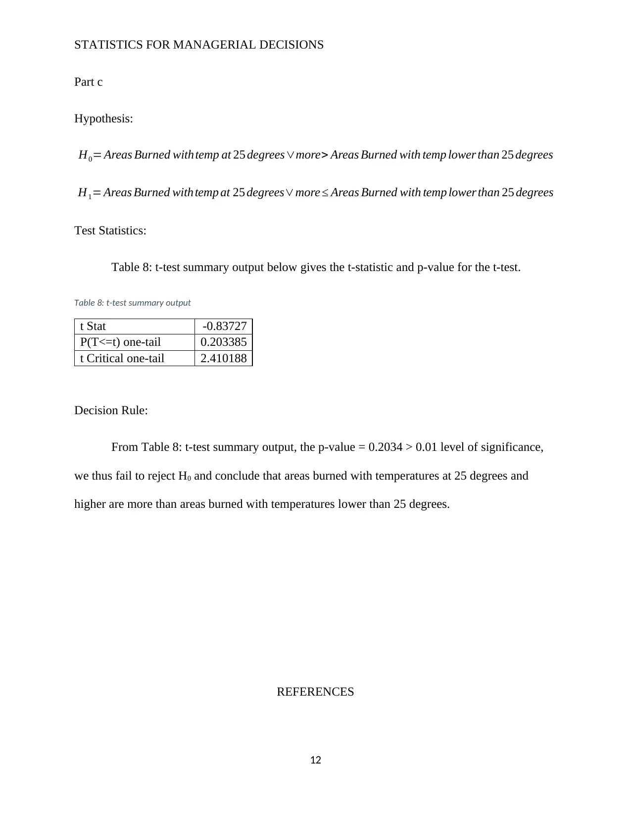
This assignment solution addresses various statistical concepts and their application in managerial decision-making. It begins with an analysis of stock prices using stem and leaf plots, frequency polygons, and bar charts, comparing companies' market capital. Descriptive statistics, including mean, median, standard deviation, and box and whisker plots, are calculated and interpreted for different publishers. Probability calculations are performed to determine the likelihood of events related to farm water supply and rainfall. Finally, the assignment delves into hypothesis testing, utilizing normal plots and t-tests to analyze temperature, relative humidity, and wind data, concluding with a decision based on the p-value. The solution incorporates data from various sources and demonstrates a comprehensive understanding of statistical techniques.
Document Page
STATISTICS FOR MANAGERIAL DECISIONS
tabler-icon-diamond-filled.svg

Paraphrase This Document

Need a fresh take? Get an instant paraphrase of this document with our AI Paraphraser
Document Page
STATISTICS FOR MANAGERIAL DECISIONS
QUESTION ONE
Part a
The stem and leaf plot for the quarterly stock prices of WPL and WOR from the year
2003 to 2015 is as given in the plot in Figure 1: Stem and Leaf plot for WPL and WOR below:
Data source: (Yahoo Finance, 2019).
Figure 1: Stem and Leaf plot for WPL and WOR
Part b
The combined plot of the frequency polygon for WOR and relative frequency polygon
for WPL for the quarterly stock prices of WPL and WOR from the year 2003 to 2015 is as given
in the plot in Figure 2: Combined WOR-WPL Frequency Plot below. Data Source: (Yahoo
Finance, 2019)
2
Document Page
STATISTICS FOR MANAGERIAL DECISIONS
1
4
7
10
13
16
19
22
25
28
31
34
37
40
43
46
49
52
0
10
20
30
40
50
60
wor - wpl compar ison
WOR WPL
Share Prices
Figure 2: Combined WOR-WPL Frequency Plot
Part c
The bar chart plot for the comparison of the Market Capital for the 2015 for the different
companies in the Australian energy sector is as given in the plot in Figure 3: Energy Sector
Market Capital 2015 below. The plot shows WPL had the highest market capital while WOR had
the lowest. Data Source: (ASX, 2019)
3
Document Page
STATISTICS FOR MANAGERIAL DECISIONS
WPL WOR ORG STO CTX SOL
0
5
10
15
20
25
30
Market Capital 2015
Companies
Market Capital (billions A$)
Figure 3: Energy Sector Market Capital 2015
Part d
Table 1: Quarterly Opening Values Comparison below shows the comparison of the
quarterly opening values for WPL and WOR from 2003 to 2015. From the table, 36.54% of the
quarterly opening values of WPL were over $40 while 1.9% of the quarterly opening values of
the WOR were over $40.
Table 1: Quarterly Opening Values Comparison
WPL WOR
Number of quarterly opening values greater than
$40
19 1
Proportions of quarterly opening values greater
than $40
36.538461
54
1.92307
7
4
tabler-icon-diamond-filled.svg

Paraphrase This Document

Need a fresh take? Get an instant paraphrase of this document with our AI Paraphraser
Document Page
STATISTICS FOR MANAGERIAL DECISIONS
QUESTION TWO
Part a and b
Table 2: Descriptive Statistics for Publishers below shows the descriptive statistics of all
the publishers for part a and b.
Table 2: Descriptive Statistics for Publishers
Part
Pearson
Education
John
Wiley &
Sons
Cengage
Learning
Oxford
University
Press
McGraw-
Hill
Education
a Mean $156.67 $128.67 $182.14 $83.02 $202.09
Median $138.32 $114.94 $181.12 $77.89 $199.21
First
Quartile 106.935 66.48 130.08 59.6925 144.94
Third
Quartile 207.34 198.455 222.2 97.9425 215.83
b
Standard
Deviation 72.1296795 87.710263 56.4047172 36.987781 70.8869125
Range $230.80 $224.29 $167.58 $116.59 $229.91
Coefficient
of
Variation 217.206012 146.69728 322.916254 224.46264 285.089453
Part c
The box and whisker plot for the prices for the different publishers is as given in the plot
in Figure 4: Box and Whisker Plot below. From the plot, the McGraw-Hill had the highest
median price with Oxford University Press having the lowest. The John Wiley & Sons had the
largest range of prices.
5
Document Page
STATISTICS FOR MANAGERIAL DECISIONS
Figure 4: Box and Whisker Plot
Part d
Alfred, AJ & James, OH 2015, The Human Record: Sources of Global History, 8th edn, Cengage
Learning, Florence, United States. ISBN13 9781285870236.
QUESTION THREE
Part a
The probability of a farm in Australia being supplied water from on-farm dams or tanks
is as given below.
Total amount of water supplied by onfarm damstanks Australia
Total Amount of water supplied ¿ farms Australia ¿
6
Document Page
STATISTICS FOR MANAGERIAL DECISIONS
1163.9
9779.7 =0.119
Part b
The probability that a farm in Queensland is being supplied by water from groundwater is
a given below:
Total amount of water supplied by groundwater damstanksQueenland
Total Amount of water supplied ¿ farmsQueenland ¿
631.1
2467.3 =0.2558
Part c
The probability that a farm located in MDB is supplied water from rivers, creeks or lakes
is as given below:
Total amount of water supplied by rivers , creekslakesMDB
Total Amount of water supplied ¿ farms MDB ¿
103.5
6174.3 =0.0168
Part d
The proportion of farms that are not supplied by irrigation channels or pipelines is New
South Wales is given as follows
7
tabler-icon-diamond-filled.svg

Paraphrase This Document

Need a fresh take? Get an instant paraphrase of this document with our AI Paraphraser
Document Page
STATISTICS FOR MANAGERIAL DECISIONS
1 Total Number of Agri. Businesses Irrigating NSW
Total Number of Agri. BusinessesNSW
1 8.6
39.9 =0.7845=78.45 %
QUESTION FOUR
Part a
Table 3: Probabilities 1 below gives the probability that there would be no rain and
probability there would be three or more rainy days, which were 0.019 and 0.6923 respectively.
Data Source: (Australian Government, 2019)
Table 3: Probabilities 1
No of
Days
Probabil
ity
No rain in a week 1 0.01923
1
Three or more rainy
days
36 0.69230
8
Part b
Table 4: Descriptive Statistics below shows the descriptive statistics for the mean and
standard deviation of the rainfall data.
Table 4: Descriptive Statistics
Mean 10.342
31
Standard Deviation 14.605
85
8
Document Page
STATISTICS FOR MANAGERIAL DECISIONS
Table 5: Probabilities 2 shows the probability that in a week the amount of rainfall would
be between 6mm and 12mm, this probability is equal to 0.2115.
Table 5: Probabilities 2
No. of
Days
Probability
11 0.211538
Table 6: Percentile below gives the 80th percentile of the weekly rainfall data. From the
table only 20% of the weeks have 17.24mm of rain or higher.
Table 6: Percentile
80th Percentile 17.24
QUESTION FIVE
Part a
The normal plots for the Temperature, Relative Humidity and Wind are as given in the
plots from Figure 5: Normal Plot for Temperature to Figure 7: Normal Plot for Wind. From all
the three graphs we observe that the data displays an s-shaped plot and all the data points do not
fall on the trend line. Hence, the temperature, relative humidity and wind are not normally
distributed.
9
Document Page
STATISTICS FOR MANAGERIAL DECISIONS
0 5 10 15 20 25 30 35
-3
-2
-1
0
1
2
3
Normal Plot for Temperature
Sorted Data
z-value
Figure 5: Normal Plot for Temperature
10 20 30 40 50 60 70 80 90 100 110
-3
-2
-1
0
1
2
3
Normal Plot for Relative Humidity
Sorted Data
z-value
Figure 6: Normal Plot for Relative Humidity
10
tabler-icon-diamond-filled.svg

Paraphrase This Document

Need a fresh take? Get an instant paraphrase of this document with our AI Paraphraser
Document Page
STATISTICS FOR MANAGERIAL DECISIONS
0 1 2 3 4 5 6 7 8 9 10
-3
-2
-1
0
1
2
3
Normal Plot for Wind
Sorted Data
z-value
Figure 7: Normal Plot for Wind
Part b
Table 7: Confidence Intervals below gives the confidence intervals for temperature,
relative humidity and wind.
Table 7: Confidence Intervals
Temperature Relative Humidity Wind
Sig. Level 0.05 0.05 0.05
Std. Dev 6.672678 17.18819 1.772666
Sample Size 140 140 140
Conf. Interval Value 1.10531 2.847175 0.293637
Confidence Interval Temperature ± 1.1053Relative Humidity ± 2.872Wind ± 0.2936
11
Document Page
STATISTICS FOR MANAGERIAL DECISIONS
Part c
Hypothesis:
H0= Areas Burned withtemp at 25 degreesmore> Areas Burned with temp lower than 25 degrees
H1= Areas Burned with temp at 25 degreesmore Areas Burned with temp lower than 25 degrees
Test Statistics:
Table 8: t-test summary output below gives the t-statistic and p-value for the t-test.
Table 8: t-test summary output
t Stat -0.83727
P(T<=t) one-tail 0.203385
t Critical one-tail 2.410188
Decision Rule:
From Table 8: t-test summary output, the p-value = 0.2034 > 0.01 level of significance,
we thus fail to reject H0 and conclude that areas burned with temperatures at 25 degrees and
higher are more than areas burned with temperatures lower than 25 degrees.
REFERENCES
12
chevron_up_icon
1 out of 13
circle_padding
hide_on_mobile
zoom_out_icon
[object Object]