Statistical Analysis: Frequency Distribution, Charts, and Correlation
VerifiedAdded on 2023/06/08
|8
|1135
|423
Homework Assignment
AI Summary
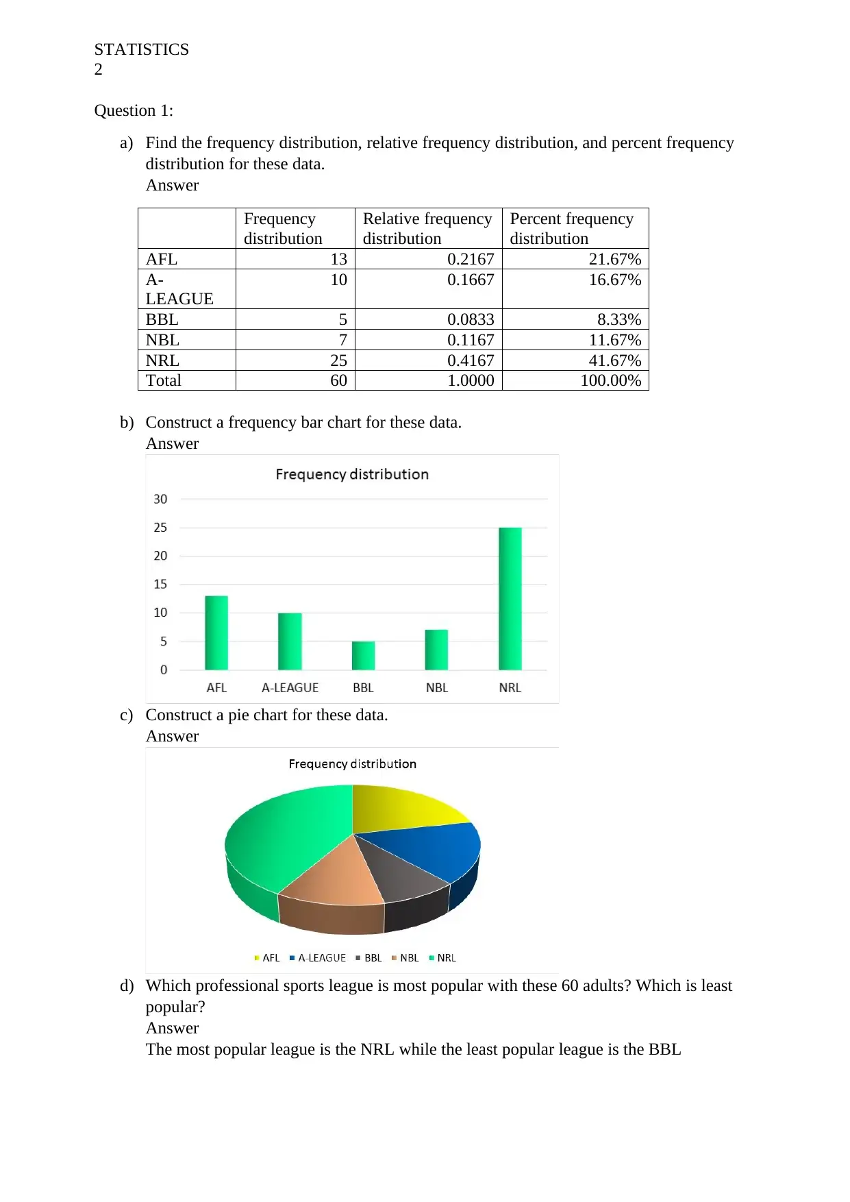
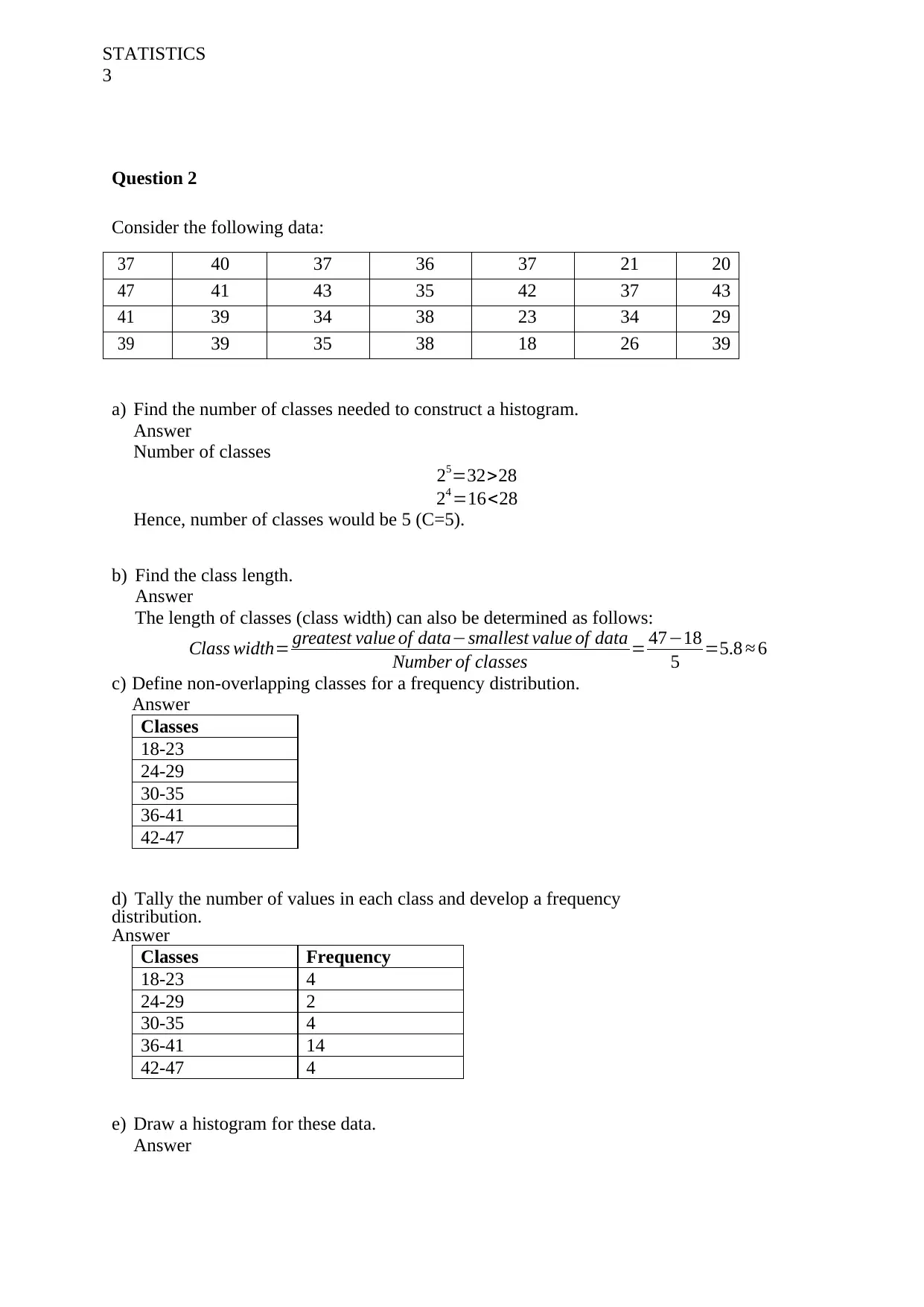
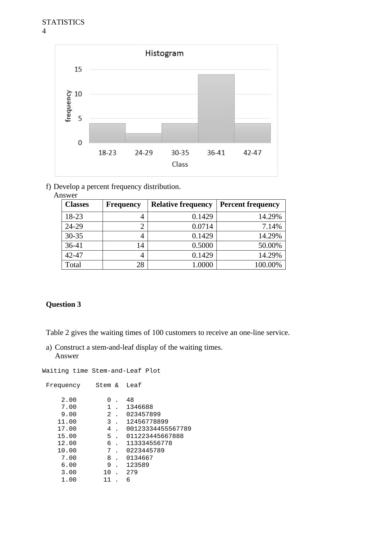
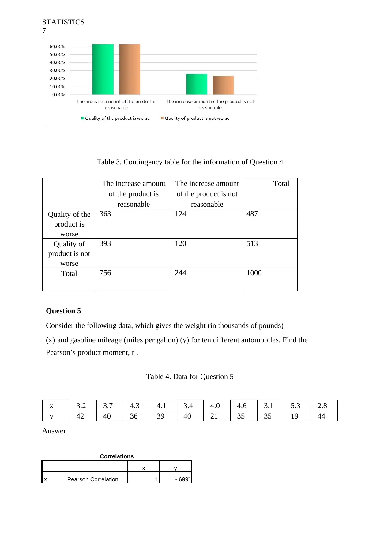
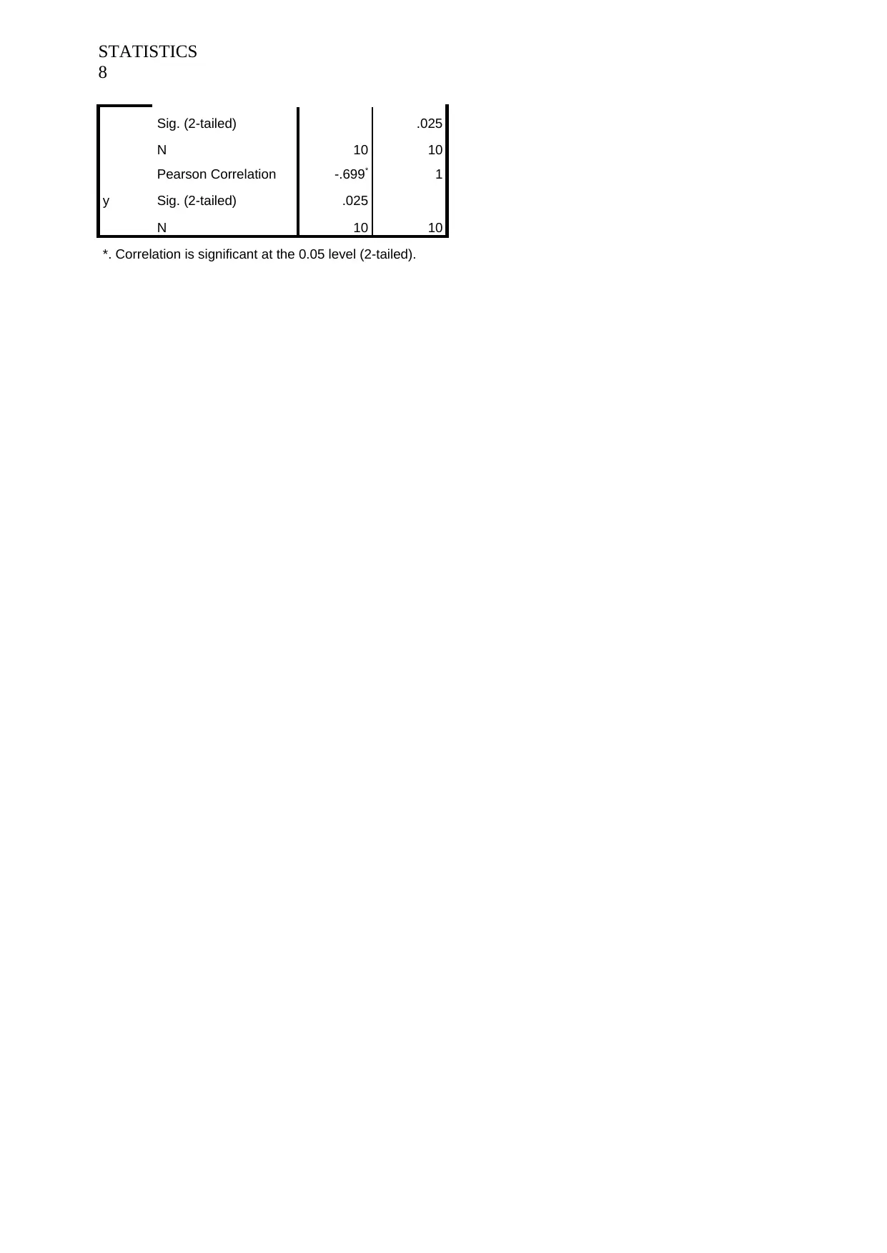
This statistics assignment covers various aspects of descriptive statistics, including frequency distributions, relative frequency distributions, and percent frequency distributions. It involves constructing frequency bar charts, pie charts, and histograms to analyze data sets. The assignment also explores the creation of stem-and-leaf displays to describe data distributions and uses contingency tables to analyze relationships between variables, including calculating row and column percentages. Additionally, it includes calculating Pearson’s product-moment correlation coefficient to determine the relationship between two variables. This solved assignment is available on Desklib, where students can find more past papers and solutions.

Running Head: STATISTICS 1
Statistics
Student Name:
Instructor Name:
Course Number:
13 August 2018
Statistics
Student Name:
Instructor Name:
Course Number:
13 August 2018
Paraphrase This Document
Need a fresh take? Get an instant paraphrase of this document with our AI Paraphraser

STATISTICS
2
Question 1:
a) Find the frequency distribution, relative frequency distribution, and percent frequency
distribution for these data.
Answer
Frequency
distribution
Relative frequency
distribution
Percent frequency
distribution
AFL 13 0.2167 21.67%
A-
LEAGUE
10 0.1667 16.67%
BBL 5 0.0833 8.33%
NBL 7 0.1167 11.67%
NRL 25 0.4167 41.67%
Total 60 1.0000 100.00%
b) Construct a frequency bar chart for these data.
Answer
c) Construct a pie chart for these data.
Answer
d) Which professional sports league is most popular with these 60 adults? Which is least
popular?
Answer
The most popular league is the NRL while the least popular league is the BBL

STATISTICS
3
Question 2
Consider the following data:
37 40 37 36 37 21 20
47 41 43 35 42 37 43
41 39 34 38 23 34 29
39 39 35 38 18 26 39
a) Find the number of classes needed to construct a histogram.
Answer
Number of classes
25=32>28
24 =16<28
Hence, number of classes would be 5 (C=5).
b) Find the class length.
Answer
The length of classes (class width) can also be determined as follows:
Class width= greatest value of data−smallest value of data
Number of classes = 47−18
5 =5.8 ≈ 6
c) Define non-overlapping classes for a frequency distribution.
Answer
Classes
18-23
24-29
30-35
36-41
42-47
d) Tally the number of values in each class and develop a frequency
distribution.
Answer
Classes Frequency
18-23 4
24-29 2
30-35 4
36-41 14
42-47 4
e) Draw a histogram for these data.
Answer
⊘ This is a preview!⊘
Do you want full access?
Subscribe today to unlock all pages.

Trusted by 1+ million students worldwide

STATISTICS
4
f) Develop a percent frequency distribution.
Answer
Classes Frequency Relative frequency Percent frequency
18-23 4 0.1429 14.29%
24-29 2 0.0714 7.14%
30-35 4 0.1429 14.29%
36-41 14 0.5000 50.00%
42-47 4 0.1429 14.29%
Total 28 1.0000 100.00%
Question 3
Table 2 gives the waiting times of 100 customers to receive an one-line service.
a) Construct a stem-and-leaf display of the waiting times.
Answer
Waiting time Stem-and-Leaf Plot
Frequency Stem & Leaf
2.00 0 . 48
7.00 1 . 1346688
9.00 2 . 023457899
11.00 3 . 12456778899
17.00 4 . 00123334455567789
15.00 5 . 011223445667888
12.00 6 . 113334556778
10.00 7 . 0223445789
7.00 8 . 0134667
6.00 9 . 123589
3.00 10 . 279
1.00 11 . 6
Paraphrase This Document
Need a fresh take? Get an instant paraphrase of this document with our AI Paraphraser

STATISTICS
5
Stem width: 1.00
Each leaf: 1 case(s)
b) Describe the distribution of the waiting times.
Answer
The stem-and-leaf above reveals that most waiting time is between 15 and 17.9 minutes.
Table 2. Waiting Times (in Minutes) for an on-line service
1.6 1.6 3.2 5.6 7.9 6.1 7.2
6.6 5.4 6.5 4.4 1.1 3.8 7.3
5.6 4.9 2.3 4.5 7.2 10.7 4.1
5.1 5.4 8.7 6.7 2.9 7.5 6.7
3.9 0.8 4.7 8.1 9.1 7 3.5
4.6 2.5 3.6 4.3 7.7 5.3 6.3
6.5 8.3 2.7 2.2 4 4.5 4.3
6.4 6.1 3.7 5.8 1.4 4.5 3.8
8.6 6.3 0.4 8.6 7.8 1.8 5.1
4.2 6.8 10.2 2 5.2 3.7 5.5
5.8 9.8 2.8 8 8.4 4
3.4 2.9 11.6 9.5 6.3 5.7
9.3 10.9 4.3 1.3 4.4 2.4
7.4 4.7 3.1 4.8 5.2 9.2
1.8 3.9 5.8 9.9 7.4 5
Question 4
In a survey of 1,000 randomly selected people, 756 believed that the price of the particular
product of is reasonable compared to the last year increase, 487 believed that the quality of
that product is worse than the last year, and 363 believed both.
a) Use this information to fill in the contingency Table 3.
Answer
The increase amount
of the product is
reasonable
The increase amount
of the product is not
reasonable
Total
Quality of the
product is
worse
363 124 487
Quality of
product is not
worse
393 120 513
Total 756 244 1000
b) Using the completed contingency table, construct a table of row
percentages.

STATISTICS
6
Answer
The increase amount
of the product is
reasonable
The increase amount
of the product is not
reasonable
Total
Quality of the
product is
worse
74.54% 25.46% 100.00%
Quality of
product is not
worse
76.61% 23.39% 100.00%
Total 75.60% 24.40% 100.00%
c) Using the completed contingency table, construct a table of column
percentages.
Answer
The increase amount
of the product is
reasonable
The increase amount
of the product is not
reasonable
Total
Quality of the
product is
worse
48.02% 50.82% 48.70%
Quality of
product is not
worse
51.98% 49.18% 51.30%
Total 100.00% 100.00% 100.00%
d) What kind of relationship, if any, seems to exist between whether a person believed that
the increased price of the particular product of the company is reasonable and whether
someone believed that the quality of that product is worse than the last year?
Answer
There is a significant association between those who believe in quality and whether the
increase in price is reasonable. For instance, a higher proportion was observed for those
who believed that the increase amount of the product is reasonable as compared to those
who believed that increase amount of the product is not reasonable.
e) Illustrate your answer to part (d) by constructing bar charts of appropriate row
percentages.
Answer
⊘ This is a preview!⊘
Do you want full access?
Subscribe today to unlock all pages.

Trusted by 1+ million students worldwide

STATISTICS
7
Table 3. Contingency table for the information of Question 4
The increase amount
of the product is
reasonable
The increase amount
of the product is not
reasonable
Total
Quality of the
product is
worse
363 124 487
Quality of
product is not
worse
393 120 513
Total 756 244 1000
Question 5
Consider the following data, which gives the weight (in thousands of pounds)
(x) and gasoline mileage (miles per gallon) (y) for ten different automobiles. Find the
Pearson’s product moment, r .
Table 4. Data for Question 5
x 3.2 3.7 4.3 4.1 3.4 4.0 4.6 3.1 5.3 2.8
y 42 40 36 39 40 21 35 35 19 44
Answer
Correlations
x y
x Pearson Correlation 1 -.699*
Paraphrase This Document
Need a fresh take? Get an instant paraphrase of this document with our AI Paraphraser

STATISTICS
8
Sig. (2-tailed) .025
N 10 10
y
Pearson Correlation -.699* 1
Sig. (2-tailed) .025
N 10 10
*. Correlation is significant at the 0.05 level (2-tailed).
8
Sig. (2-tailed) .025
N 10 10
y
Pearson Correlation -.699* 1
Sig. (2-tailed) .025
N 10 10
*. Correlation is significant at the 0.05 level (2-tailed).
1 out of 8

Your All-in-One AI-Powered Toolkit for Academic Success.
+13062052269
info@desklib.com
Available 24*7 on WhatsApp / Email
Unlock your academic potential
Copyright © 2020–2025 A2Z Services. All Rights Reserved. Developed and managed by ZUCOL.