HI6007 Statistics Assignment: Interval Estimation and Regression

Verified

Added on  2022/12/30

|12
|1418
|20
Homework Assignment
AI Summary
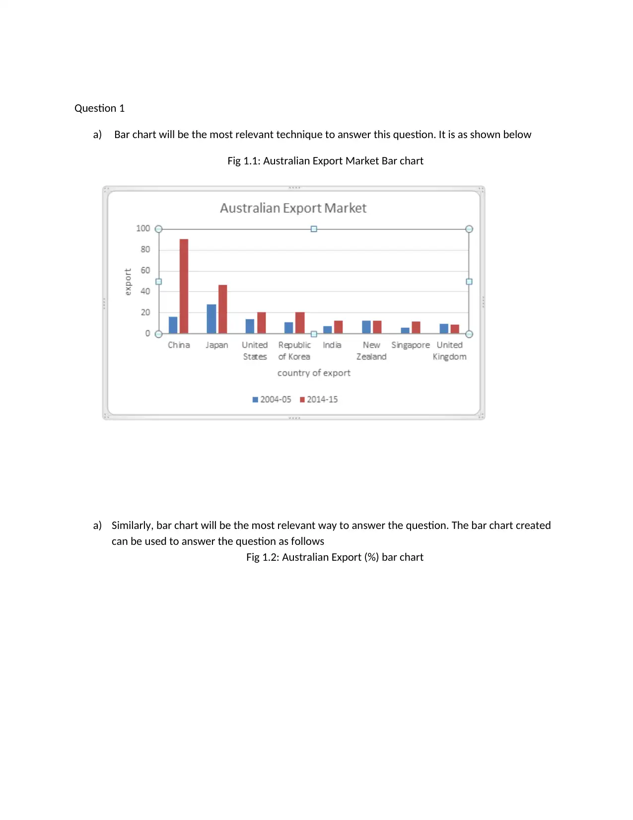
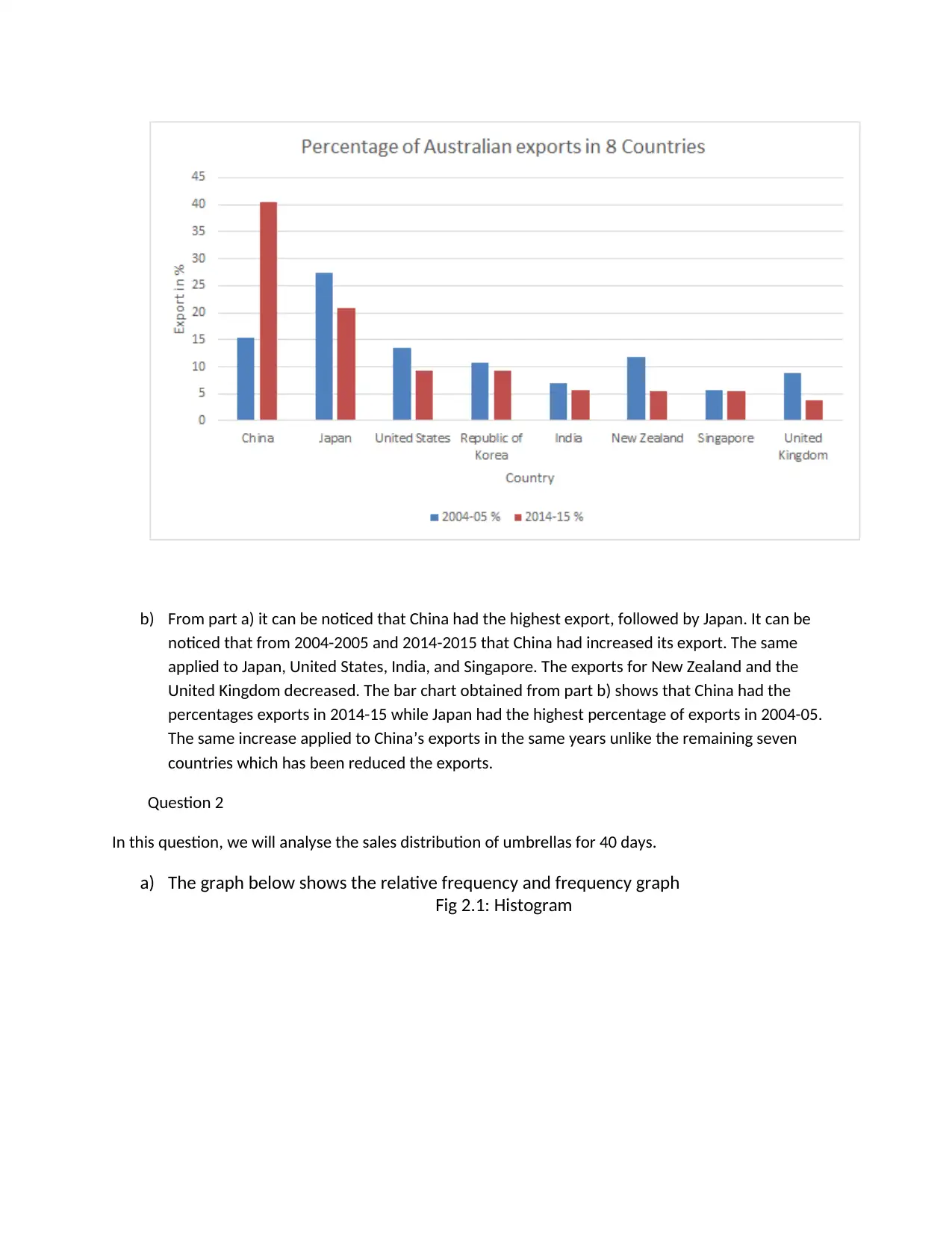
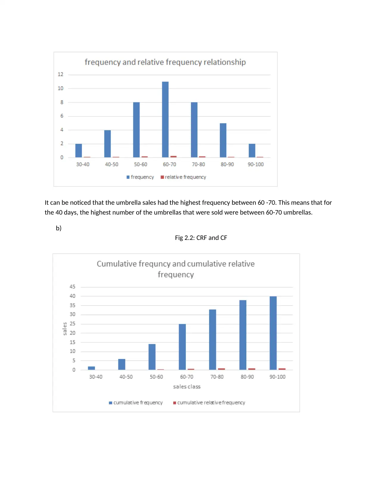
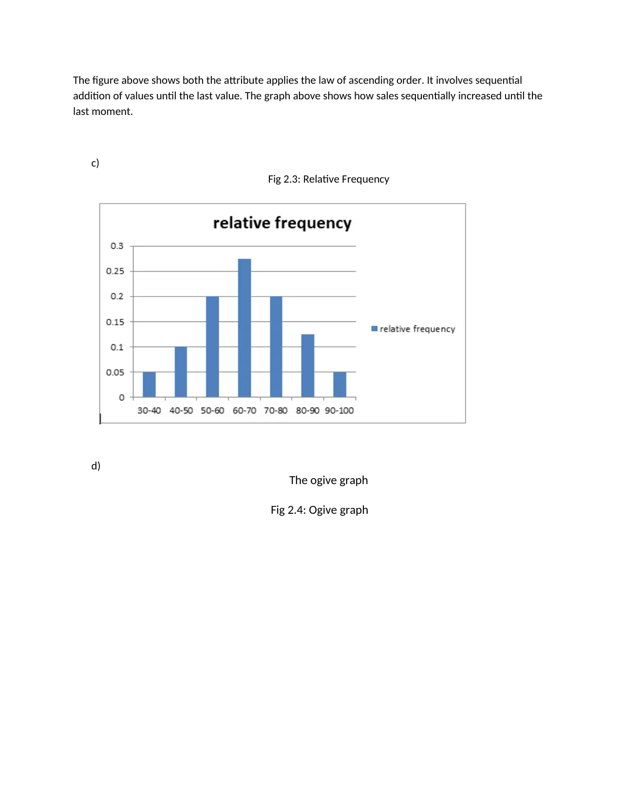
This assignment solution addresses several statistical concepts, including interval estimation, regression analysis, and correlation. Question 1 utilizes bar charts to analyze Australian export market data, comparing exports across different countries and time periods. Question 2 delves into descriptive statistics, employing histograms, cumulative frequency graphs, and ogive graphs to analyze umbrella sales data over 40 days, calculating proportions and interpreting sales patterns. Question 3 focuses on predicting final consumption expenditure using retail turnover per capita, employing line graphs, scatter plots, descriptive statistics, correlation analysis, and regression analysis. The analysis includes constructing a linear regression model, interpreting its coefficients, assessing the model's goodness of fit, and conducting hypothesis testing to determine the significance of the relationship between the two variables. The solution provides detailed interpretations, tables, and figures to support the statistical findings and conclusions.
Document Page
Name
Institution
Course
Date
tabler-icon-diamond-filled.svg

Paraphrase This Document

Need a fresh take? Get an instant paraphrase of this document with our AI Paraphraser
Document Page
Question 1
a) Bar chart will be the most relevant technique to answer this question. It is as shown below
Fig 1.1: Australian Export Market Bar chart
a) Similarly, bar chart will be the most relevant way to answer the question. The bar chart created
can be used to answer the question as follows
Fig 1.2: Australian Export (%) bar chart
Document Page
b) From part a) it can be noticed that China had the highest export, followed by Japan. It can be
noticed that from 2004-2005 and 2014-2015 that China had increased its export. The same
applied to Japan, United States, India, and Singapore. The exports for New Zealand and the
United Kingdom decreased. The bar chart obtained from part b) shows that China had the
percentages exports in 2014-15 while Japan had the highest percentage of exports in 2004-05.
The same increase applied to China’s exports in the same years unlike the remaining seven
countries which has been reduced the exports.
Question 2
In this question, we will analyse the sales distribution of umbrellas for 40 days.
a) The graph below shows the relative frequency and frequency graph
Fig 2.1: Histogram
Document Page
It can be noticed that the umbrella sales had the highest frequency between 60 -70. This means that for
the 40 days, the highest number of the umbrellas that were sold were between 60-70 umbrellas.
b)
Fig 2.2: CRF and CF
tabler-icon-diamond-filled.svg

Paraphrase This Document

Need a fresh take? Get an instant paraphrase of this document with our AI Paraphraser
Document Page
The figure above shows both the attribute applies the law of ascending order. It involves sequential
addition of values until the last value. The graph above shows how sales sequentially increased until the
last moment.
c)
Fig 2.3: Relative Frequency
d)
The ogive graph
Fig 2.4: Ogive graph
Document Page
30-40 40-50 50-60 60-70 70-80 80-90 90-100
0
5
10
15
20
25
30
35
40
45
ogive curve
Sale class
cumulative frequency
The ogive data above shows that the sales are increasing even if it is not a linear increase.
e) The proportion can be expressed as a decimal and as a percentage. 0.35 (35 %) of the
sales were less than 60.
f) The sales proportion can also be expressed as a decimal and as a percentage. 17.5 % of
the data were found to have sales more than 70 and this is equivalent to a 0.175
proportion.
Question 3
This section will involve making prediction of the given two variables. Final consumption will be
used as the predictor variable and per capita as the outcome variable. The data that we have
provided with contains these information and now, we will analyze it ad get some relevant
results from the two variables. Some of the analysis that will be conducted include regression
analysis and the correlation analysis. Correlation will be used to determine the association of
the two variables while regression will be used to determine the effect of per capita on the
consumption expenditure. Some line graphs will also be constructed to view the association of
the two variables.
.
Document Page
a)
Fig 3.1: Line graph
The graph above shows that the consumption expenditure and per capital are increasing. They are
moving together in the same direction. Since they are moving together in the same direction, then we
can conclude that they are directly independent towards each other.
b) The aim of the research was to predict the final consumption expenditure and therefore it is our
predictor variable i.e. the dependent variable (y –axis) while per capita is the independent
variable (x-axis). The scatter plot can be used to check the association of the two. A scatter plot
is the best graphical technique for determining the association between two variables.
.
tabler-icon-diamond-filled.svg

Paraphrase This Document

Need a fresh take? Get an instant paraphrase of this document with our AI Paraphraser
Document Page
Fig 3.2: Scatter Plot
1200.0 1400.0 1600.0 1800.0 2000.0 2200.0 2400.0 2600.0 2800.0 3000.0 3200.0
0
50000
100000
150000
200000
250000
f(x) = 85.2868091205818 x − 42102.5333746251
R² = 0.975545621096024
A scatter plot of Final Consumption expenditure
vs Retail turnover per capita
Retail turnover per capita
Final Consumption Expenditure
It can be observed from the figure above that the data type for the two variables is compact together.
This means that there is a high relationship between the two variables. Also, the gradient of the two
variables is positive and it shows a strong association. The two variables increase simultaneously.
c) We will use descriptive function under the data analysis Add-Ins available in the excel to conduct
the above problems. Below is the table containing the entire numerical summary for the data
Descriptive summary
Table 3.1: Descriptive Summary
Document Page
The table above shows that the mean of Retail Turnover per capita is 2205.761832 million, the median is
2180.2 million, the mode is 2852.8 million. The standard deviation of the variable is 543.2 and this
means that the data Is widely spread from the mean. The skewness of the variable is 0.074 and this
means that the variable is asymmetrical. This can be confirmed by the values of the mean and median.
They almost have the same values. The minimum value for the retail turnover per capita is 1455.9
million and the highest is 3014.6 million. The mean of the final consumption expenditure is 146,019.855
million, and the median is 139137 million. The standard deviation of the variable is 46904 million and
this means that the data Is widely spread from the mean. The skewness of the variable is 0.3068 and this
means that the variable is asymmetrical. This can be confirmed by the values of the mean and median.
They almost have the same values. The minimum value is 81889 million and the maximum is 233148
million
d) Correlation analysis between the two variables will answer the question.
Table 3.2: The correlation analysis
Document Page
The coefficient of correlation was obtained to be 0.9877. This means that the relationship
between the two variables is 98.77 %. The correlation coefficients proves that these two
variables have a strong and positive association.
e) In this part, we will estimate the simple linear regression model of the two variables and
explain what their coefficient of estimate means.
tabler-icon-diamond-filled.svg

Paraphrase This Document

Need a fresh take? Get an instant paraphrase of this document with our AI Paraphraser
Document Page
Table 3.3
The regression analysis
The linear model from the table is given by
FinalConsumption Expenditure=85.2868 ( Retail turnover per capita ) 42,102.53
From this model, we can deduce that final consumption expenditure of -$42,103.53 M is not affected by
the retail turnover per capita. Again, 1 unit of retail turnover per capita increases the final expenditure
by $85.2868 Million (Benoit, 2011).
f) From the regression analysis obtained in table above, the coefficient of determination was
obtained to be 0.97755. This means that the model explains 97.55 % variation of the dependent
variable (Final consumption expenditure). Thus, the model is extremely good (Austin and
Steyerberg, 2015).
g) In this part, we need to test whether final consumption expenditure positively and
significantly increases the retail turnover per capita at the 5th significance level. This will
be the alternate hypothesis while the null hypothesis will state that the final
consumption expenditure does not positively significantly increase the retail turnover
per capita. To answer this, we will focus on the p-value, since the p-value obtained is
less than 0.05 (5 %) we accept this statement and therefore, we conclude that final
consumption expenditure positively and significantly increases the retail turnover per
capita.
h) The standard error obtained from Table 3.3 is given by 1.1.9, and this shows that the
regression model fits the data very well.
Document Page
References
Austin, P.C. and Steyerberg, E.W., 2015. The number of subjects per variable required in linear
regression analyses. Journal of clinical epidemiology, 68(6), pp.627-636.
Benoit, K., 2011. Linear regression models with logarithmic transformations. London School of
Economics, London, 22(1), pp.23-36.
chevron_up_icon
1 out of 12
circle_padding
hide_on_mobile
zoom_out_icon
[object Object]