MATH 2610: Survey of Statistics Lab Assignment 1 - Data Visualization

Verified

Added on  2023/04/08

|9
|863
|389
Homework Assignment
AI Summary
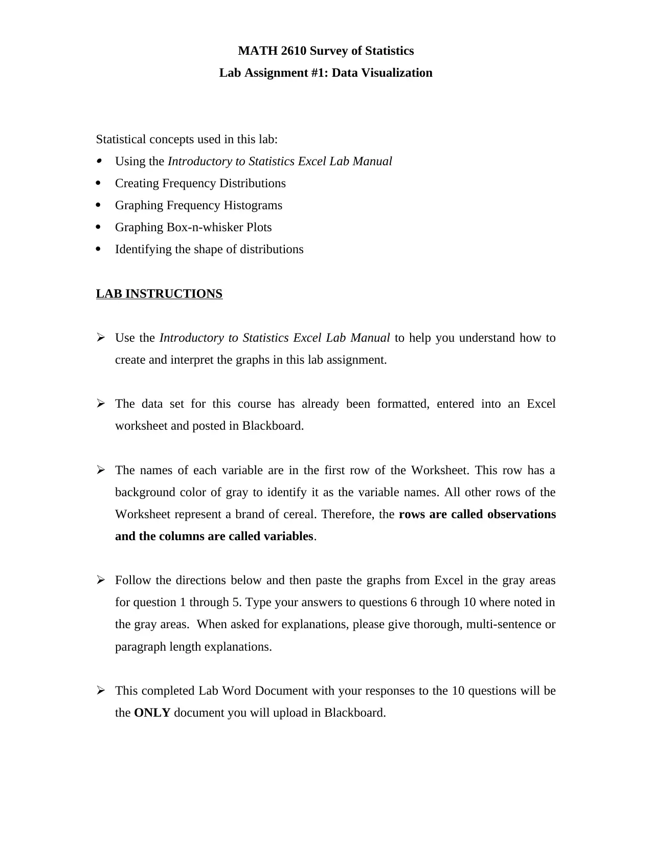
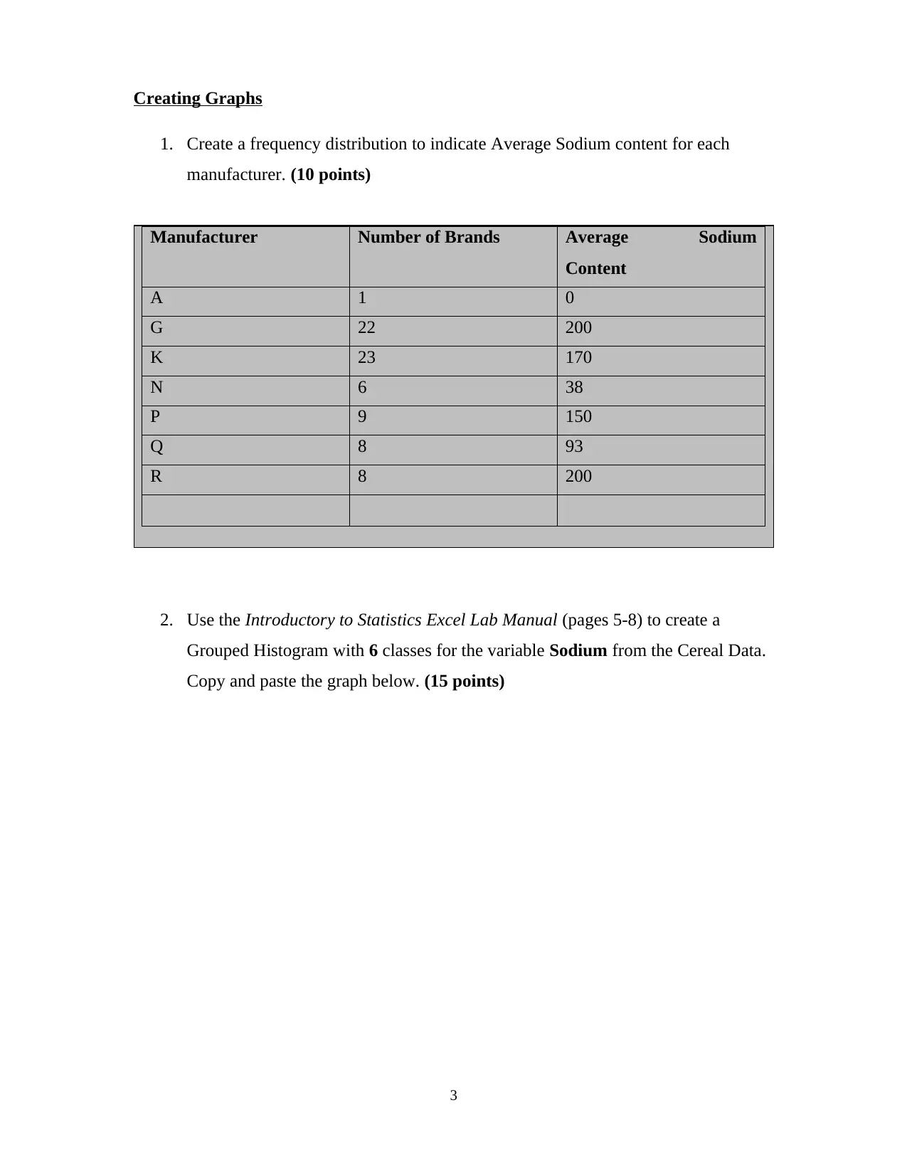
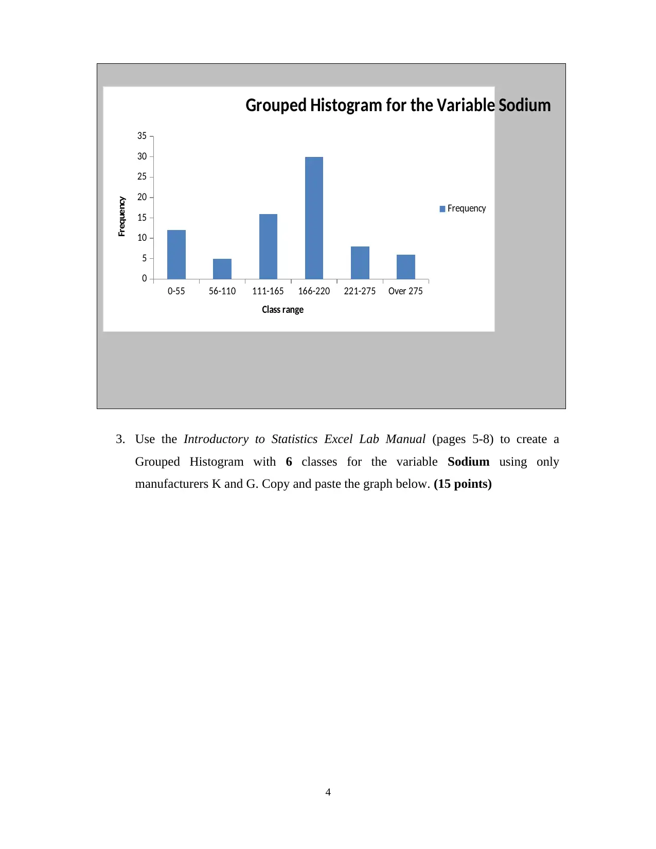
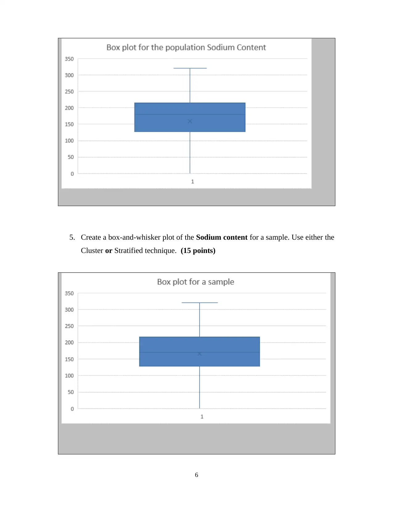
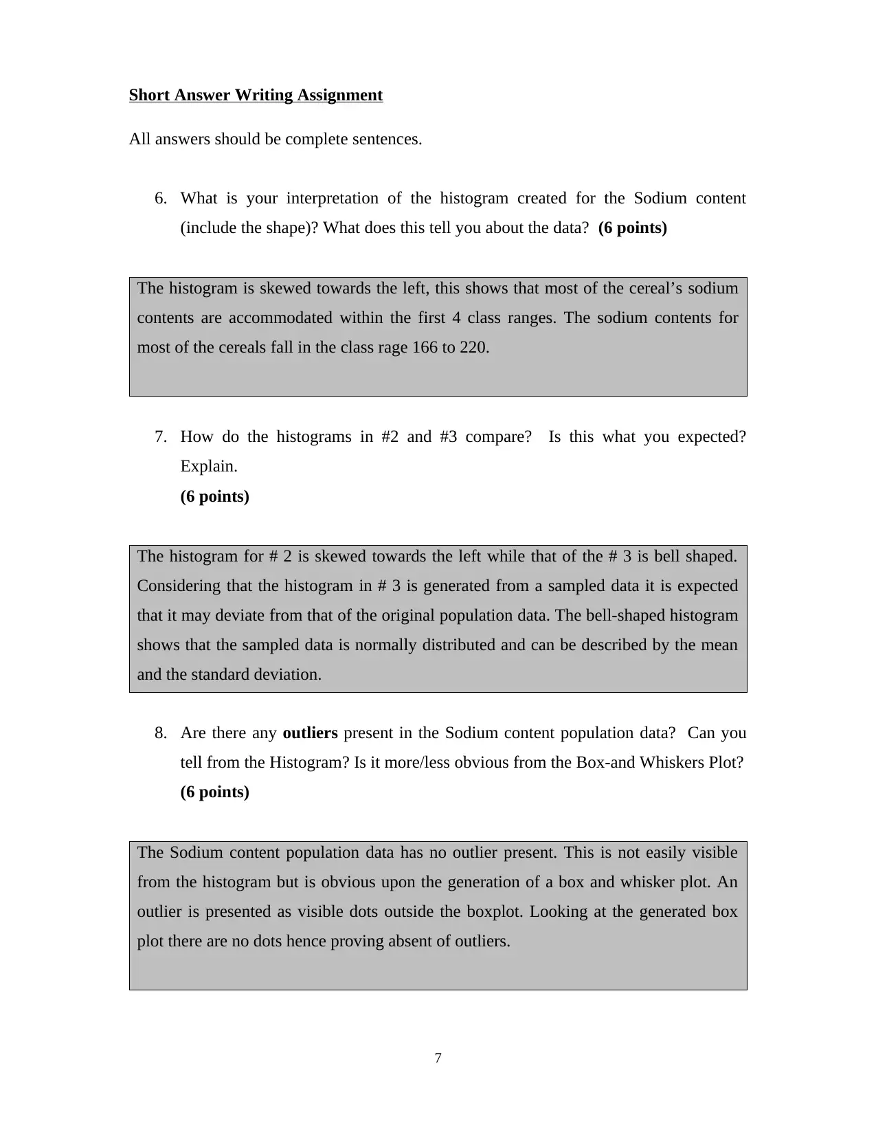
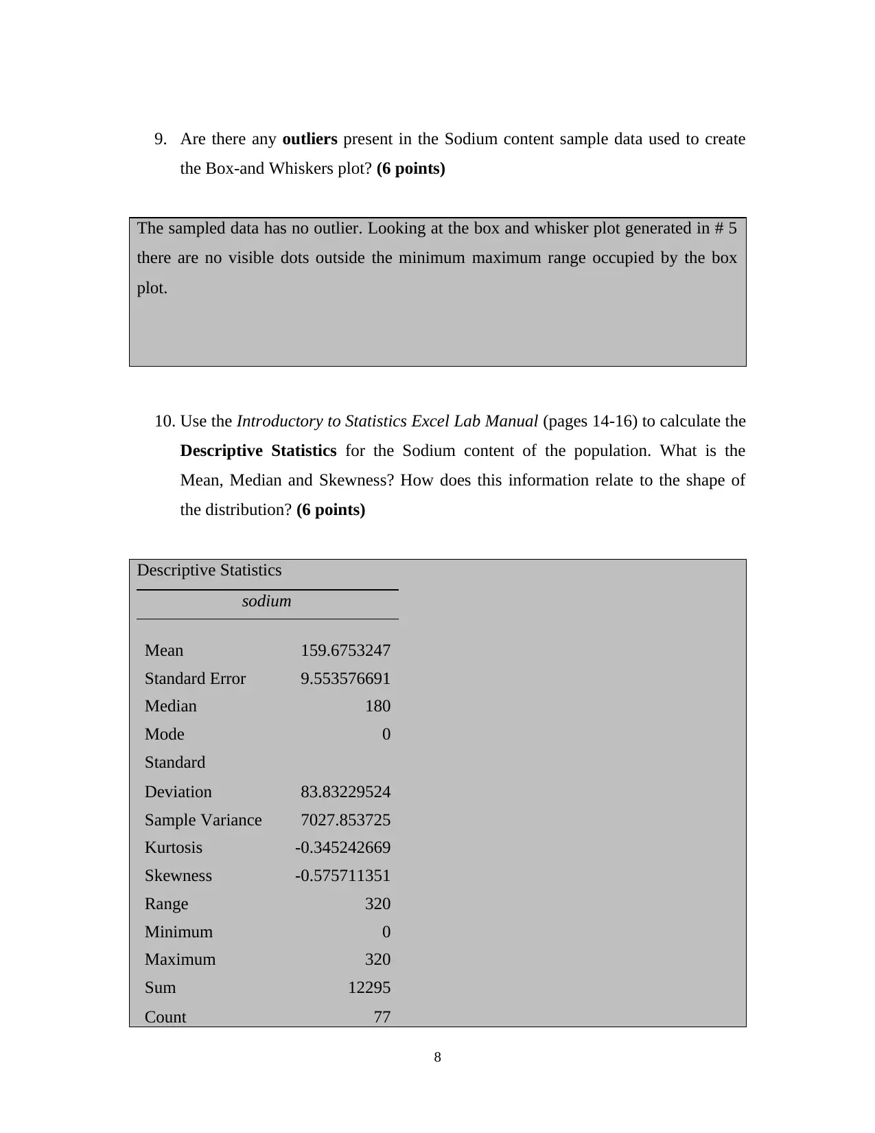
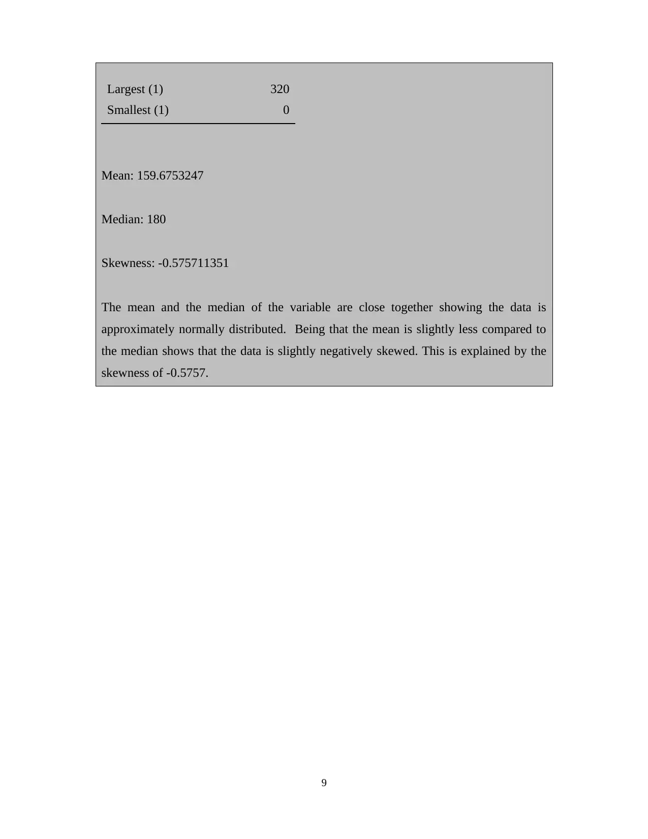
This assignment is a lab report for a Survey of Statistics course (MATH 2610) focusing on data visualization techniques using Microsoft Excel. The student was tasked with creating frequency distributions, grouped histograms, and box-and-whisker plots for a cereal dataset. The assignment involved analyzing the sodium content of various cereal brands, comparing histograms, identifying outliers, and calculating descriptive statistics such as mean, median, and skewness. The student interpreted the shapes of the distributions, compared different graphical representations of the data, and provided explanations related to the data's characteristics, including the presence or absence of outliers and the relationship between descriptive statistics and the shape of the distribution. The assignment demonstrates the application of statistical concepts in a practical context.
Document Page
MATH 2610 Survey of Statistics
Lab Assignment #1: Data Visualization
Statistical concepts used in this lab:ï‚· Using the Introductory to Statistics Excel Lab Manual
ï‚· Creating Frequency Distributions
ï‚· Graphing Frequency Histograms
ï‚· Graphing Box-n-whisker Plots
ï‚· Identifying the shape of distributions
LAB INSTRUCTIONS
 Use the Introductory to Statistics Excel Lab Manual to help you understand how to
create and interpret the graphs in this lab assignment.
 The data set for this course has already been formatted, entered into an Excel
worksheet and posted in Blackboard.
 The names of each variable are in the first row of the Worksheet. This row has a
background color of gray to identify it as the variable names. All other rows of the
Worksheet represent a brand of cereal. Therefore, the rows are called observations
and the columns are called variables.
 Follow the directions below and then paste the graphs from Excel in the gray areas
for question 1 through 5. Type your answers to questions 6 through 10 where noted in
the gray areas. When asked for explanations, please give thorough, multi-sentence or
paragraph length explanations.
 This completed Lab Word Document with your responses to the 10 questions will be
the ONLY document you will upload in Blackboard.
tabler-icon-diamond-filled.svg

Paraphrase This Document

Need a fresh take? Get an instant paraphrase of this document with our AI Paraphraser
Document Page
2
Document Page
Creating Graphs
1. Create a frequency distribution to indicate Average Sodium content for each
manufacturer. (10 points)
Manufacturer Number of Brands Average Sodium
Content
A 1 0
G 22 200
K 23 170
N 6 38
P 9 150
Q 8 93
R 8 200
2. Use the Introductory to Statistics Excel Lab Manual (pages 5-8) to create a
Grouped Histogram with 6 classes for the variable Sodium from the Cereal Data.
Copy and paste the graph below. (15 points)
3
Document Page
0-55 56-110 111-165 166-220 221-275 Over 275
0
5
10
15
20
25
30
35
Grouped Histogram for the Variable Sodium
Frequency
Class range
Frequency
3. Use the Introductory to Statistics Excel Lab Manual (pages 5-8) to create a
Grouped Histogram with 6 classes for the variable Sodium using only
manufacturers K and G. Copy and paste the graph below. (15 points)
4
tabler-icon-diamond-filled.svg

Paraphrase This Document

Need a fresh take? Get an instant paraphrase of this document with our AI Paraphraser
Document Page
0-55 56-110 111-165 166-220 221-275 over 275
0
5
10
15
20
25
Histogram for manufactures of K and G
Frequency
Class range
Frequency
4. Use the Introductory to Statistics Excel Lab Manual (pages 17-19) to create a
Box-and-Whisker plot (Box Plot) for the Sodium content of the population.
(15 points)
5
Document Page
5. Create a box-and-whisker plot of the Sodium content for a sample. Use either the
Cluster or Stratified technique. (15 points)
6
Document Page
Short Answer Writing Assignment
All answers should be complete sentences.
6. What is your interpretation of the histogram created for the Sodium content
(include the shape)? What does this tell you about the data? (6 points)
The histogram is skewed towards the left, this shows that most of the cereal’s sodium
contents are accommodated within the first 4 class ranges. The sodium contents for
most of the cereals fall in the class rage 166 to 220.
7. How do the histograms in #2 and #3 compare? Is this what you expected?
Explain.
(6 points)
The histogram for # 2 is skewed towards the left while that of the # 3 is bell shaped.
Considering that the histogram in # 3 is generated from a sampled data it is expected
that it may deviate from that of the original population data. The bell-shaped histogram
shows that the sampled data is normally distributed and can be described by the mean
and the standard deviation.
8. Are there any outliers present in the Sodium content population data? Can you
tell from the Histogram? Is it more/less obvious from the Box-and Whiskers Plot?
(6 points)
The Sodium content population data has no outlier present. This is not easily visible
from the histogram but is obvious upon the generation of a box and whisker plot. An
outlier is presented as visible dots outside the boxplot. Looking at the generated box
plot there are no dots hence proving absent of outliers.
7
tabler-icon-diamond-filled.svg

Paraphrase This Document

Need a fresh take? Get an instant paraphrase of this document with our AI Paraphraser
Document Page
9. Are there any outliers present in the Sodium content sample data used to create
the Box-and Whiskers plot? (6 points)
The sampled data has no outlier. Looking at the box and whisker plot generated in # 5
there are no visible dots outside the minimum maximum range occupied by the box
plot.
10. Use the Introductory to Statistics Excel Lab Manual (pages 14-16) to calculate the
Descriptive Statistics for the Sodium content of the population. What is the
Mean, Median and Skewness? How does this information relate to the shape of
the distribution? (6 points)
Descriptive Statistics
sodium
Mean 159.6753247
Standard Error 9.553576691
Median 180
Mode 0
Standard
Deviation 83.83229524
Sample Variance 7027.853725
Kurtosis -0.345242669
Skewness -0.575711351
Range 320
Minimum 0
Maximum 320
Sum 12295
Count 77
8
Document Page
Largest (1) 320
Smallest (1) 0
Mean: 159.6753247
Median: 180
Skewness: -0.575711351
The mean and the median of the variable are close together showing the data is
approximately normally distributed. Being that the mean is slightly less compared to
the median shows that the data is slightly negatively skewed. This is explained by the
skewness of -0.5757.
9
chevron_up_icon
1 out of 9
circle_padding
hide_on_mobile
zoom_out_icon
[object Object]